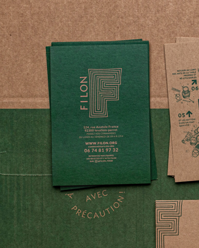
Ambiance Filon traiteur Food Photography and Visual Identity · vrai studio
Filon traiteur Brand Filon traiteur Visual Identity and Food Branding · vrai studio

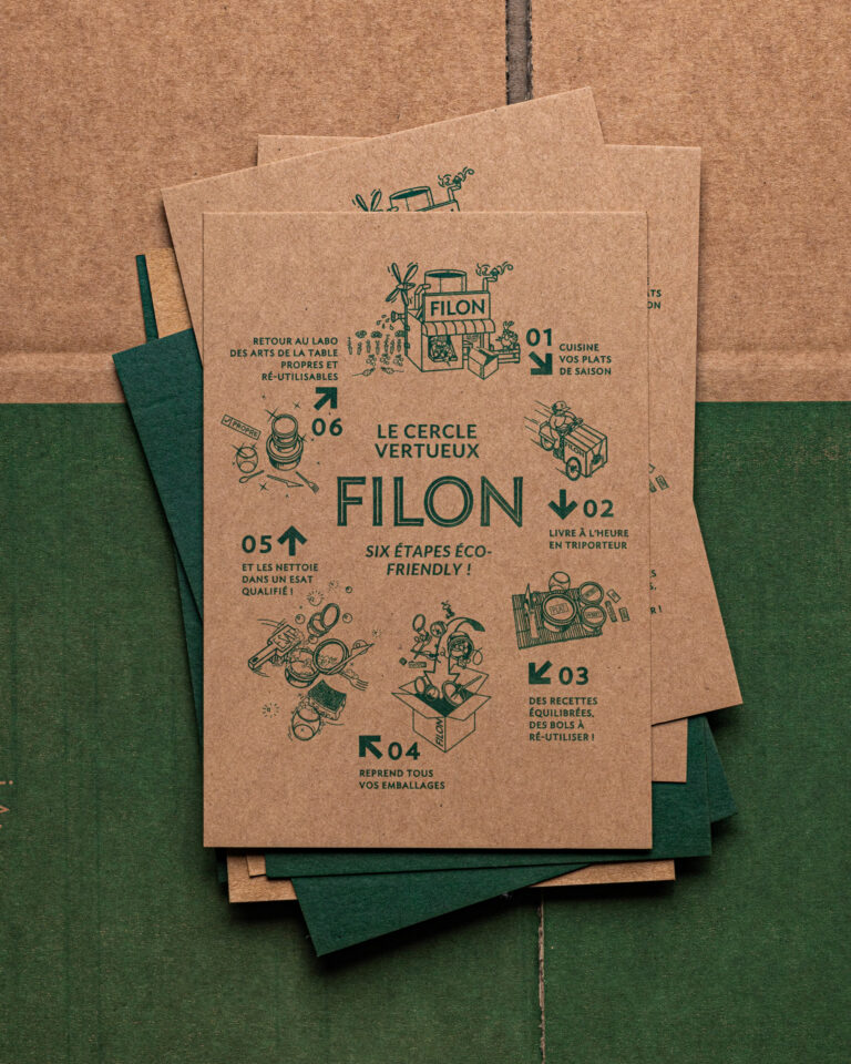
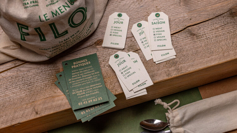
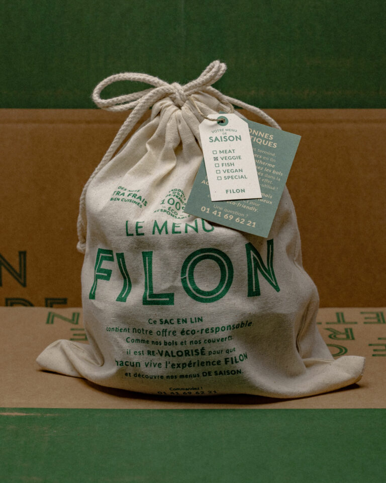
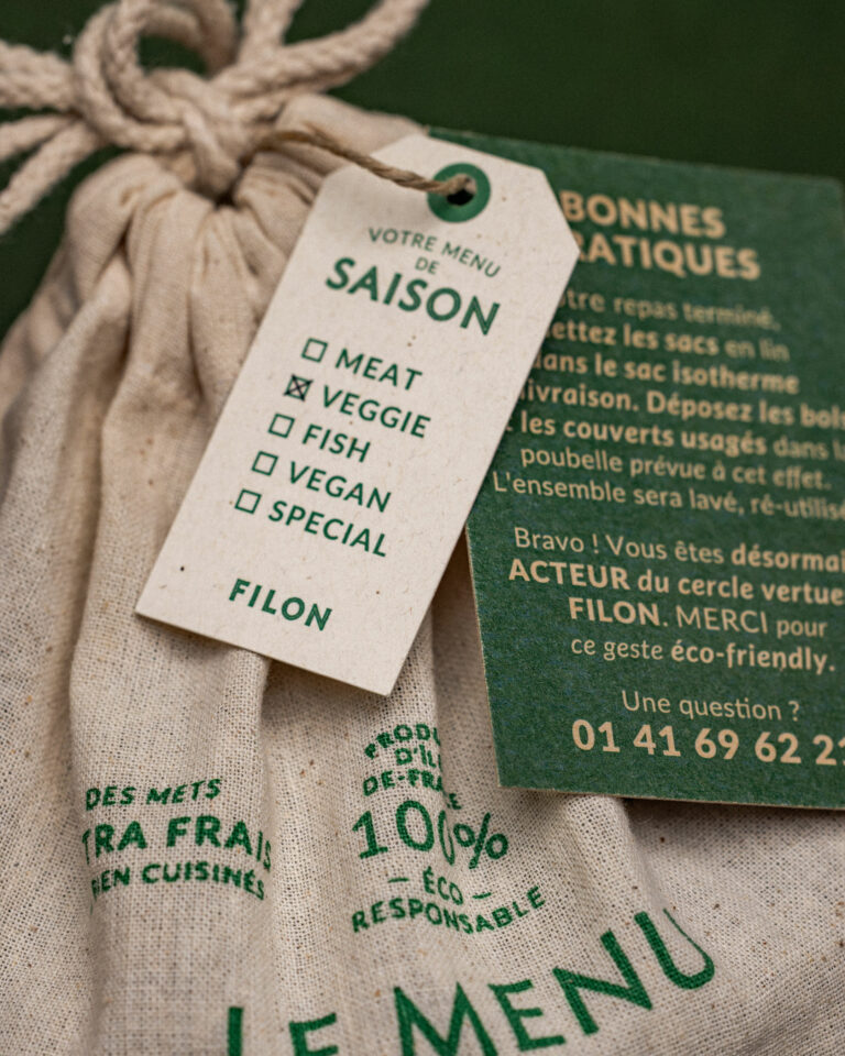
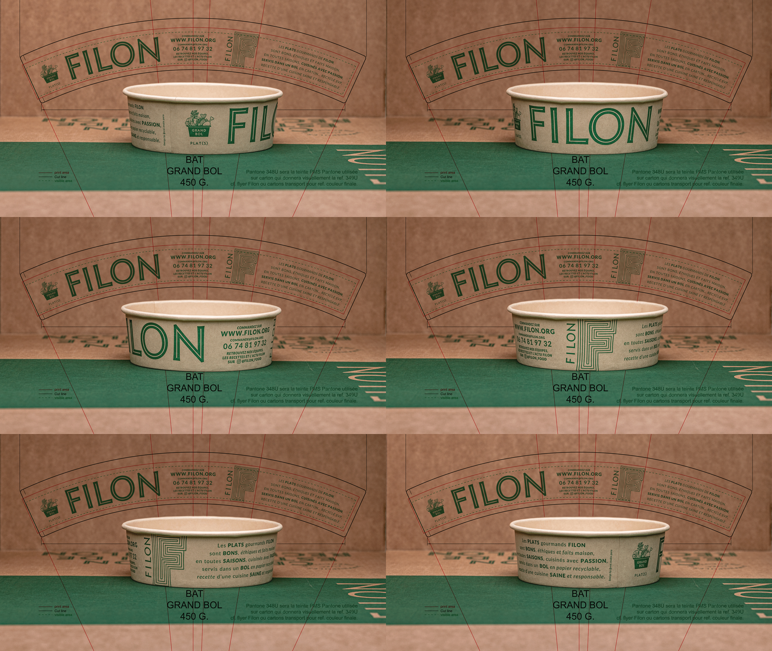
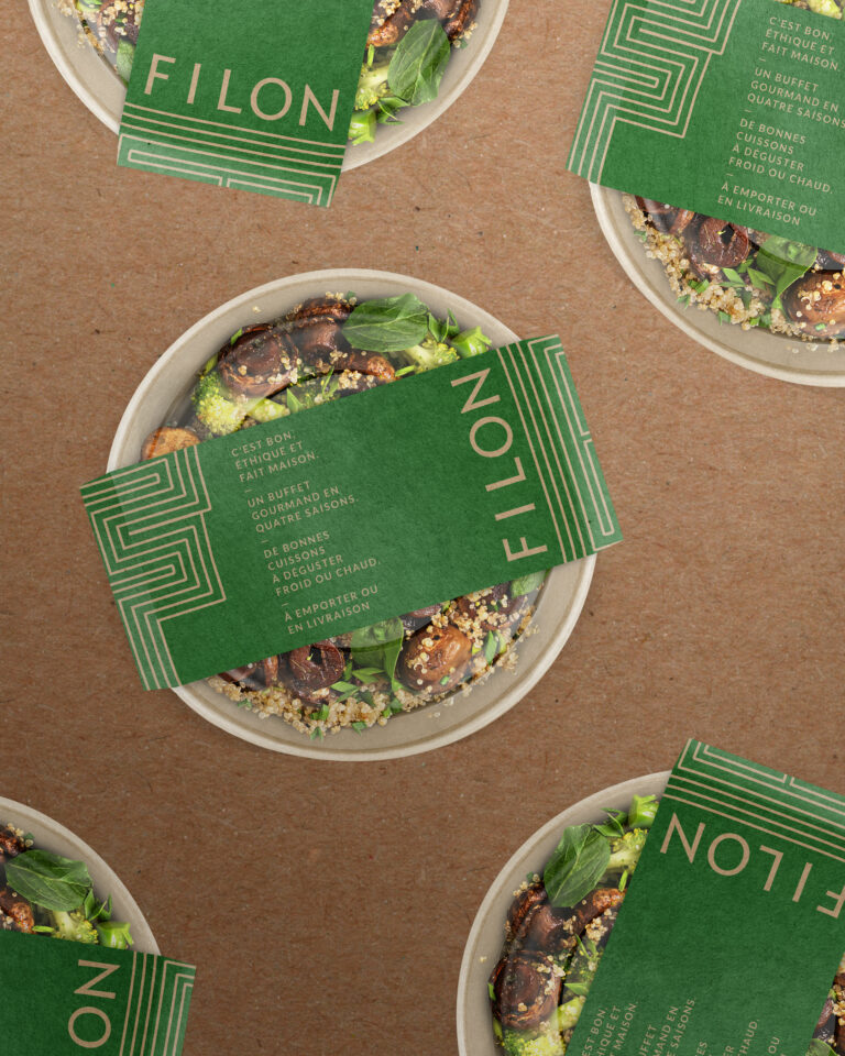
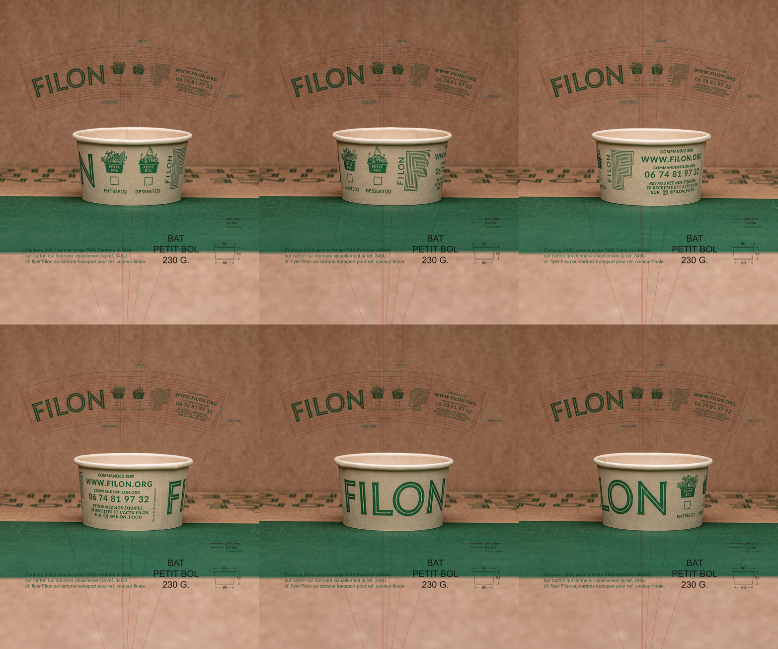
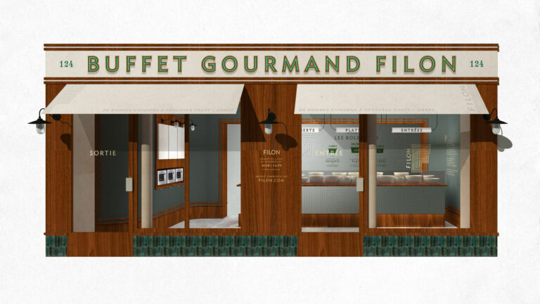
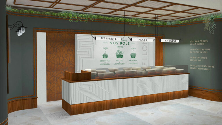
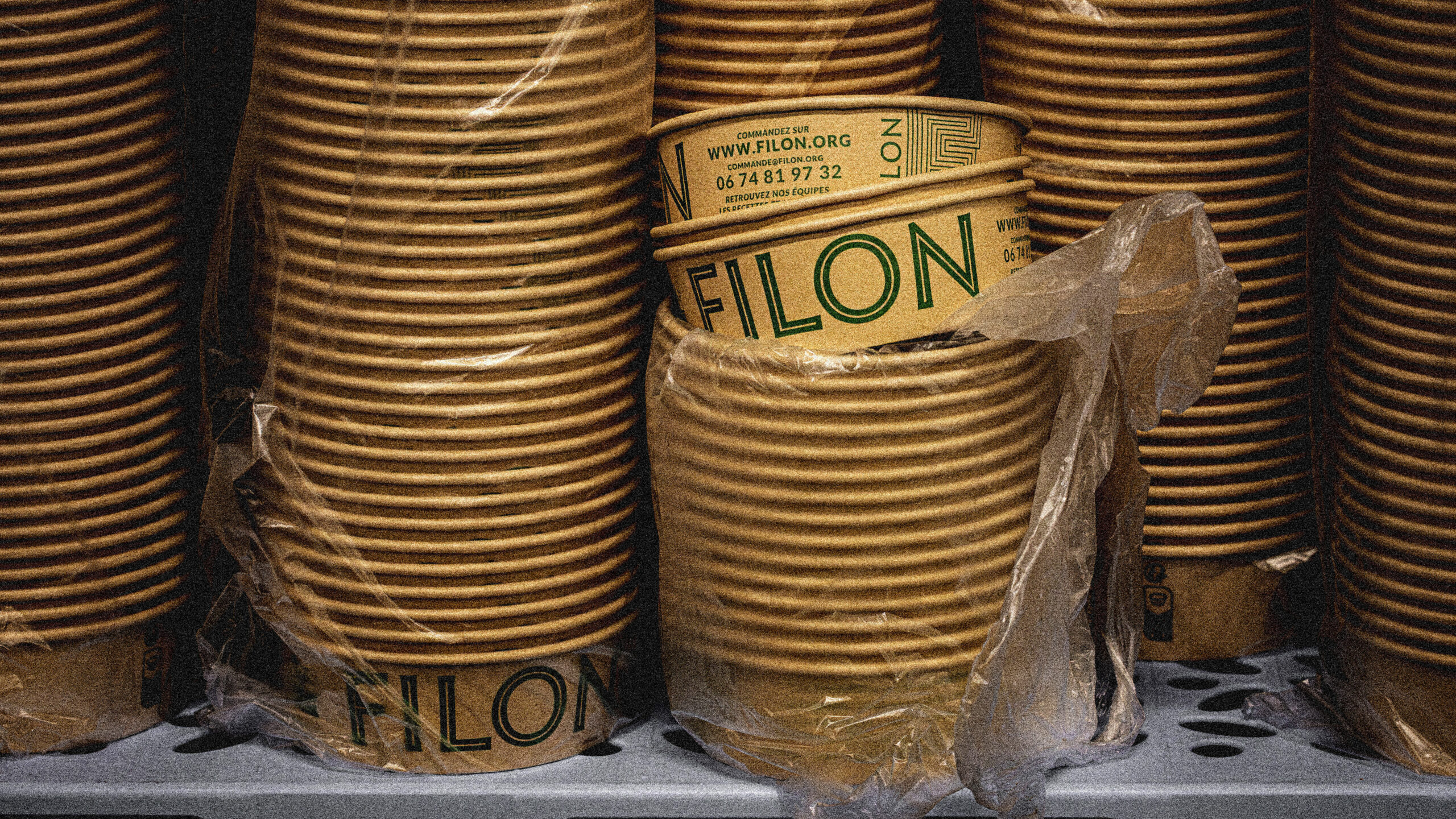
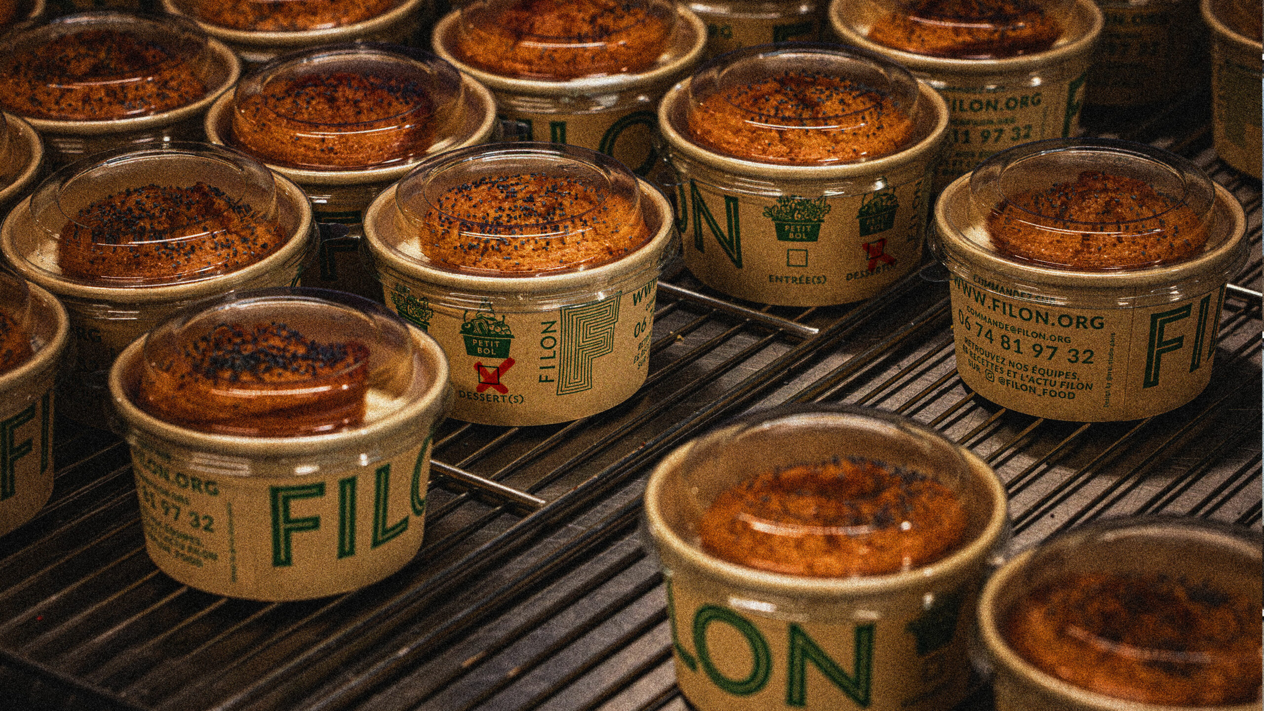
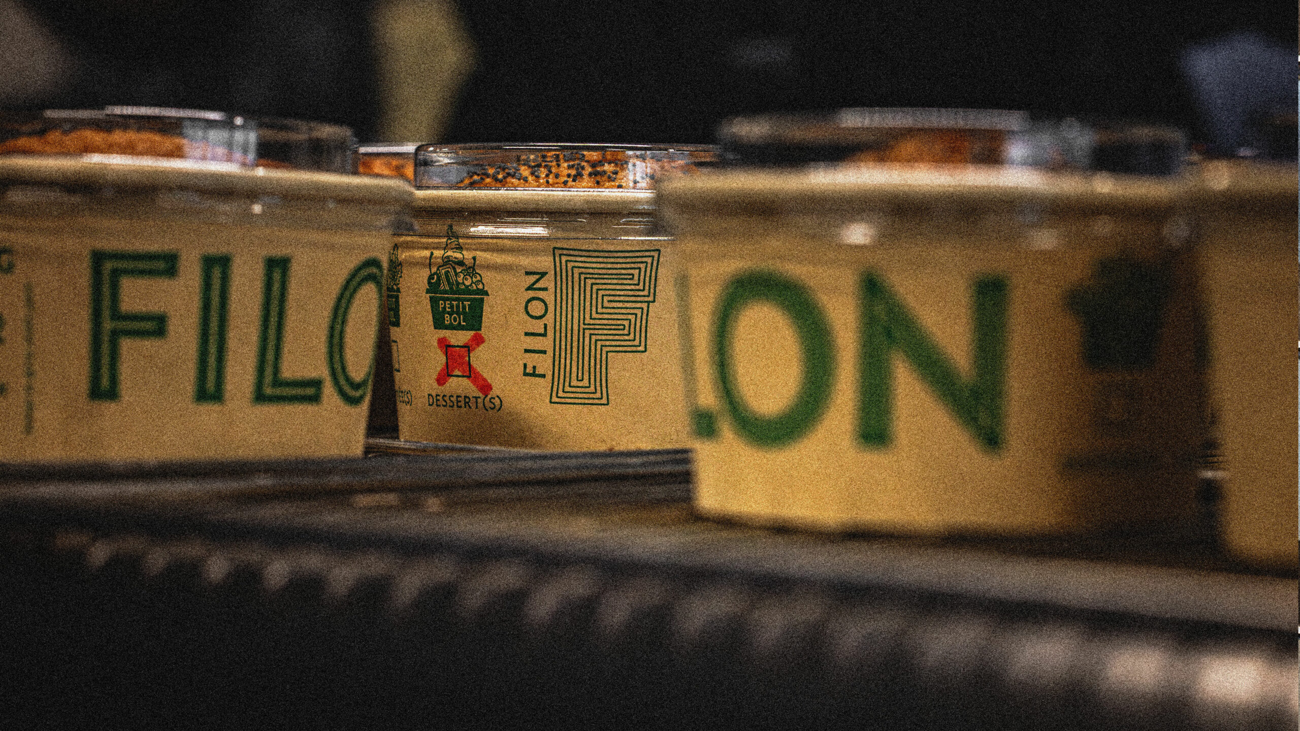
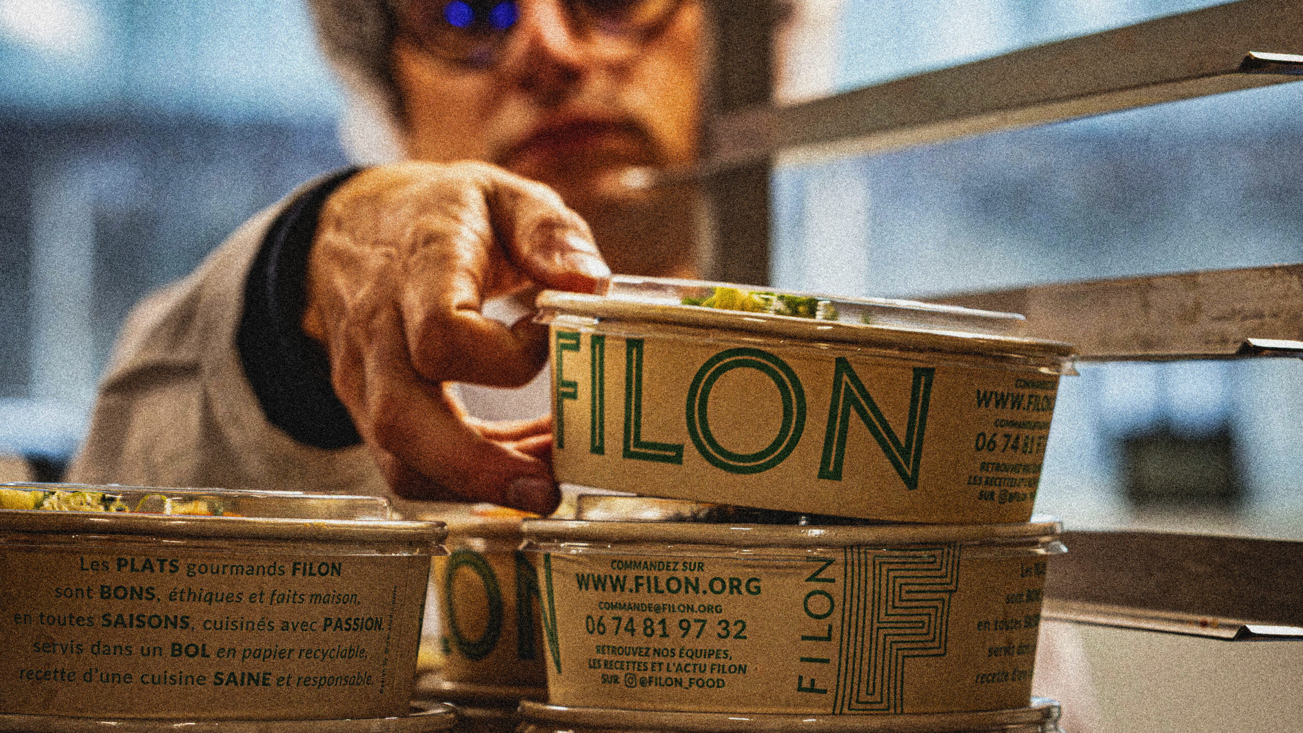
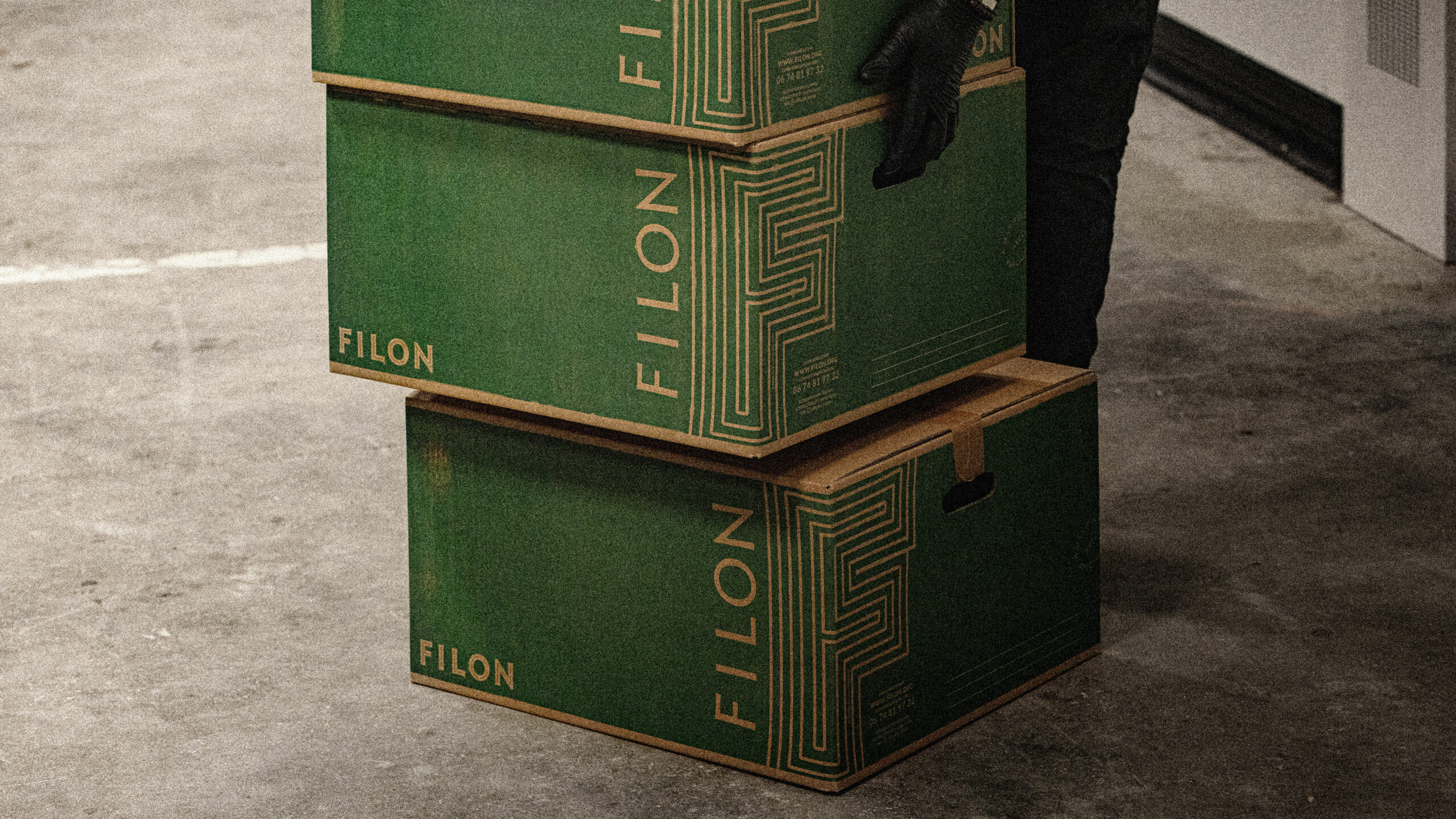
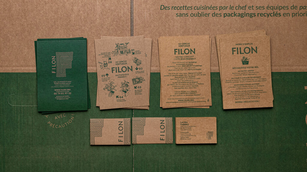
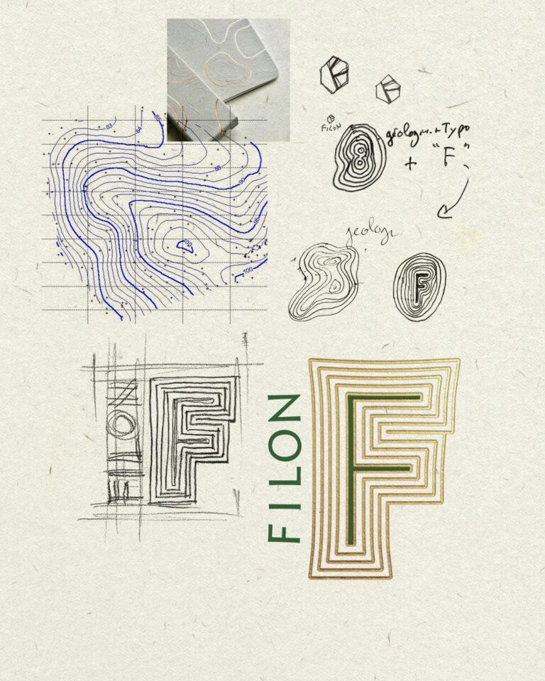
Filon is a gourmet caterer that cooks good, ethical, homemade food. We created an F monogram for them, to accompany the architecture of the brand's furnishings, locations and proximity supports. Initially a delivery-only offer - starter, main course and dessert menus in 2 recycled cardboard bowls - Filon has since opened company restaurants in Paris and the Paris region.

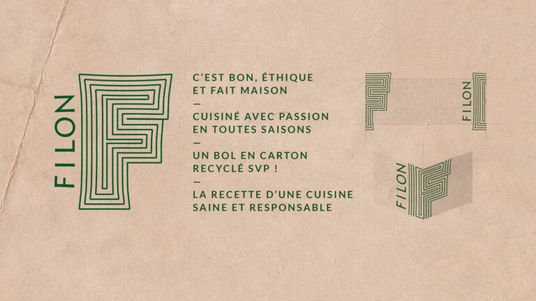
Atmospheric photography for Filon traiteur socially conscious food branding · vrai studio
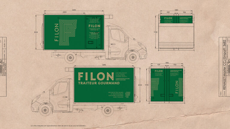
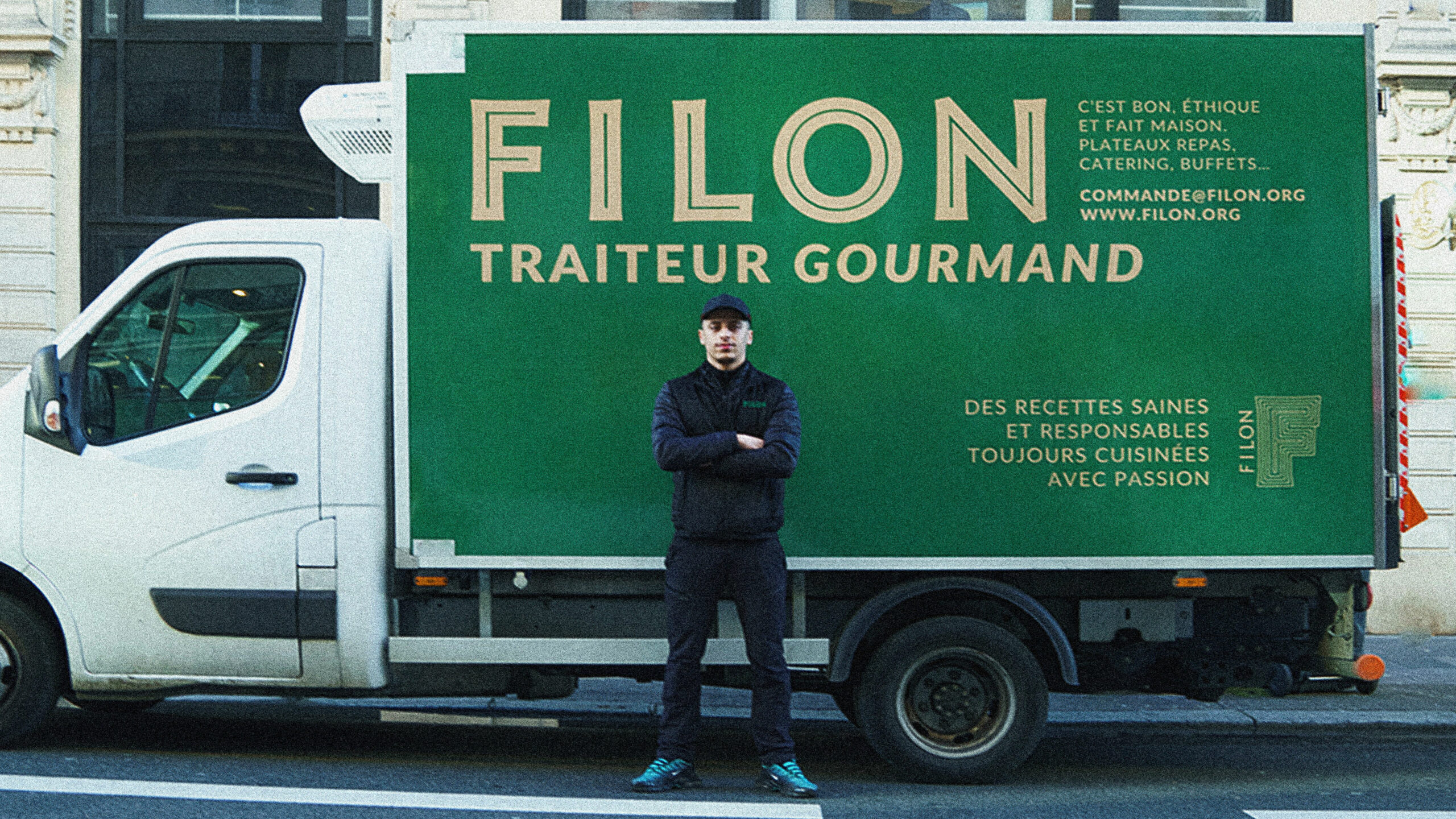
Filon traiteur Truck Filon traiteur Socially Conscious Food Brand Identity, Bordeaux · vrai studio
Filon traiteur Branding Campaign Filon traiteur Food Photography · vrai studio
Ambiance Filon traiteur Food Photography and Visual Identity · vrai studio
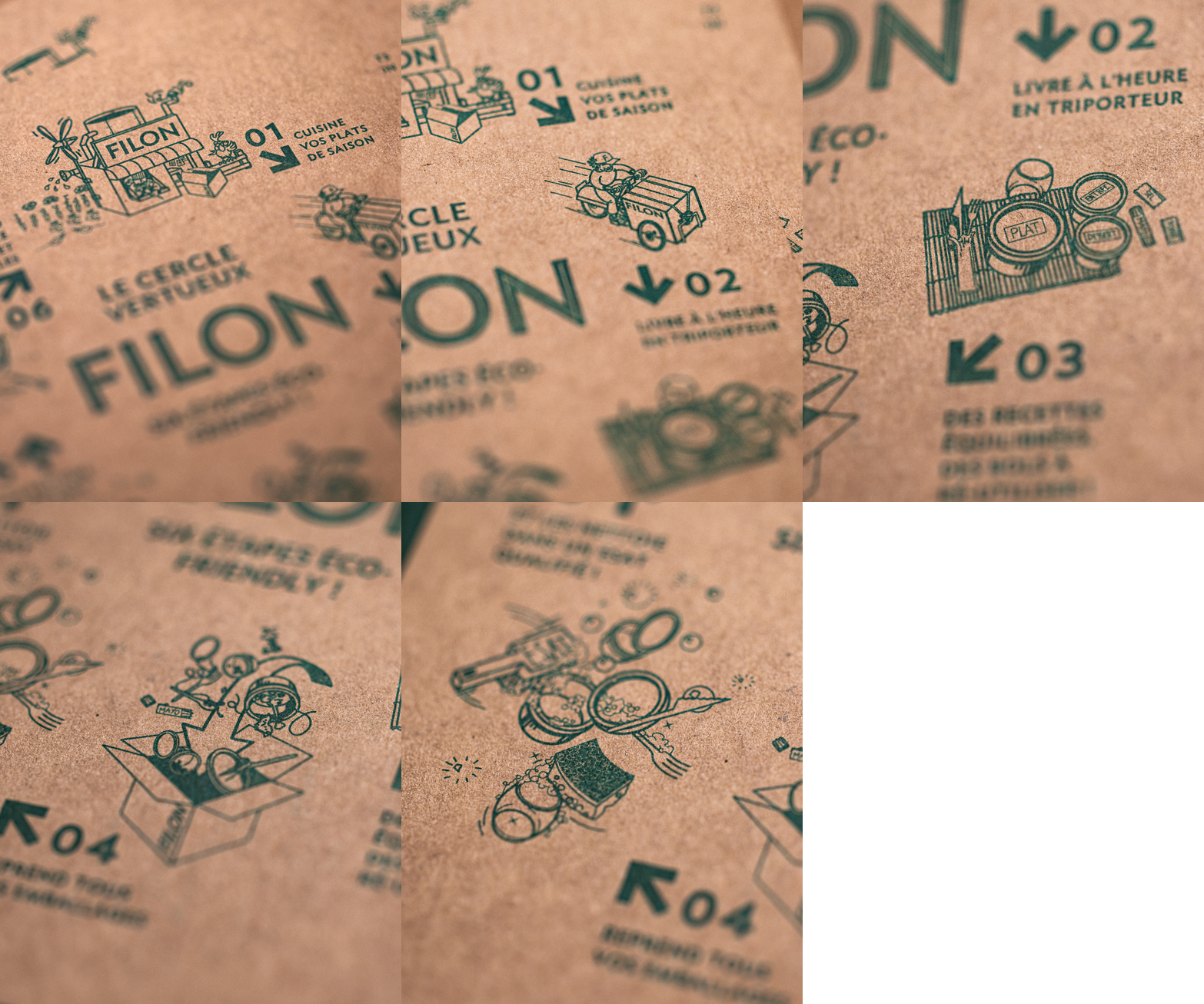
Animated illustration for Filon traiteur food branding · vrai studio
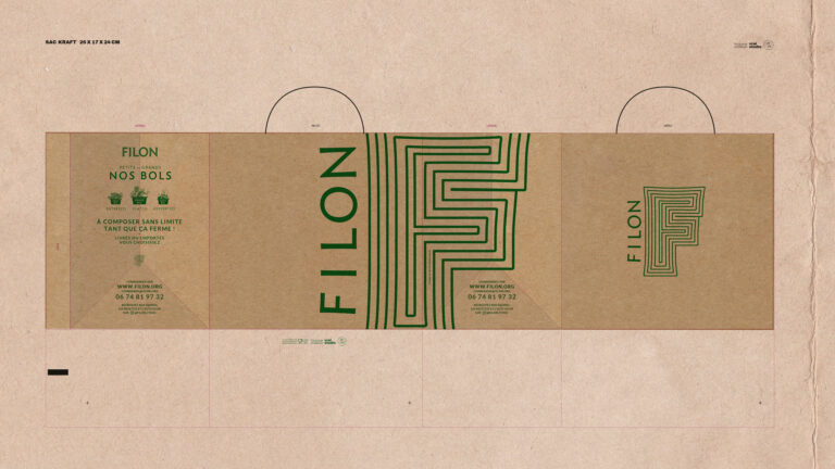
Branding for Filon traiteur packaging and visual identity for food · vrai studio
Ambiance Filon traiteur Food Photography and Visual Identity · vrai studio
Filon traiteur Brand Filon traiteur Visual Identity and Food Packaging · vrai studio
Filon traiteur Branding, Visual Identity, Food · vrai studio
Filon Large Bowl Animation — Food Visual Identity · vrai studio
Filon traiteur Salads Filon traiteur Food Photography, Socially Conscious Branding · vrai studio
Animation for Filon traiteur small bowl Filon traiteur visual identity illustration · vrai studio

We work with commissioned architects to design the first corner, including signage.
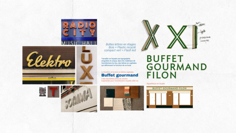
Ambiance Filon traiteur Visual Identity for Socially Conscious Food · vrai studio
Filon traiteur : Committed to Sustainable Filon traiteur — Photography, Ambience, Brand Identity · vrai studio
Filon traiteur Photography Filon traiteur Food Branding Atmosphere · vrai studio
Lifestyle Filon traiteur Socially Conscious Filon traiteur — Brand Photography · vrai studio
Lifestyle Photography: Filon traiteur Socially Conscious Food Branding · vrai studio
Lifestyle Filon traiteur — atmospheric photography · vrai studio
Filon traiteur — Food Photography · vrai studio
Lifestyle Filon traiteur Socially Conscious Food Photography · vrai studio
Lifestyle Photography: Filon traiteur Food in Bordeaux · vrai studio

Filon is a high-end Parisian catering company founded on seasonal cuisine, an eco-friendly approach, and a family-oriented philosophy. The project was born out of a partnership between an entrepreneur and a chef, both of whom are familiar with the work of vrai studio have confidence in its vision.

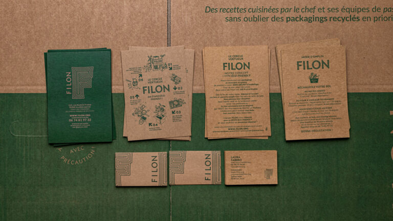
The project encompasses the entire brand identity—including the logo, graphic system, and typography—as well as its implementation in the physical space of the takeout location: the storefront, signage, wall-mounted menus, and wall graphics. The paper bags, boxes, bowls, business cards, and promotional materials all contribute to a cohesive brand experience, from the point of sale right through to the act of packaging. Filon’s brand identity is designed to be accessible without being generic, and recognizable without being flashy. A caterer who knows what they’re doing doesn’t need to say more than is necessary.

Art Direction and Photography: Camille Gabarra
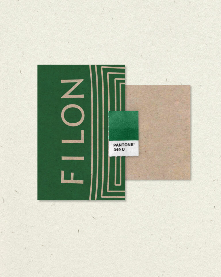
Branding for Filon traiteur Food Visual Identity · vrai studio

PALETTE

One support, one shade

Visual Identity for Filon traiteur Packaging, Branding, and Socially Conscious Food · vrai studio

STUDY

When geology and monograms go hand in hand

The Procop Cube — A Guide to Artistic and Editorial Design Papers · vrai studio
The Procop Cube — a two-page guide to fine art papers · editorial design, just like vrai studio

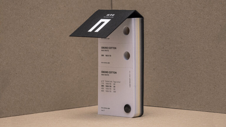
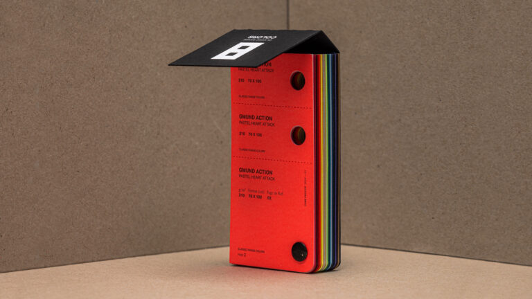
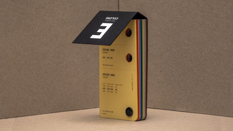
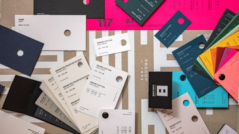
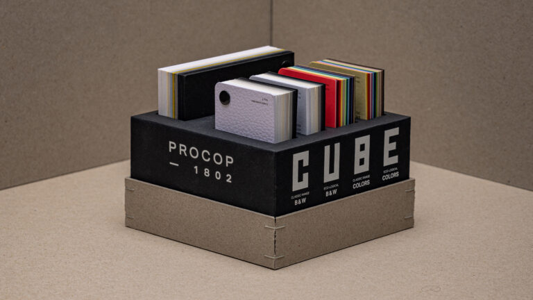
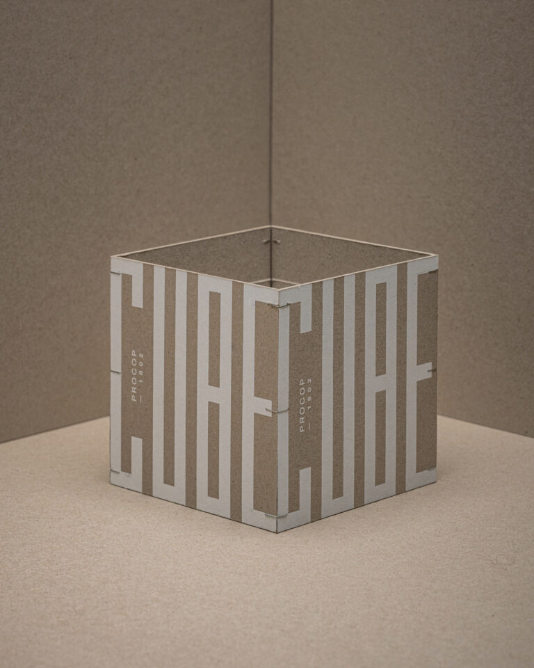
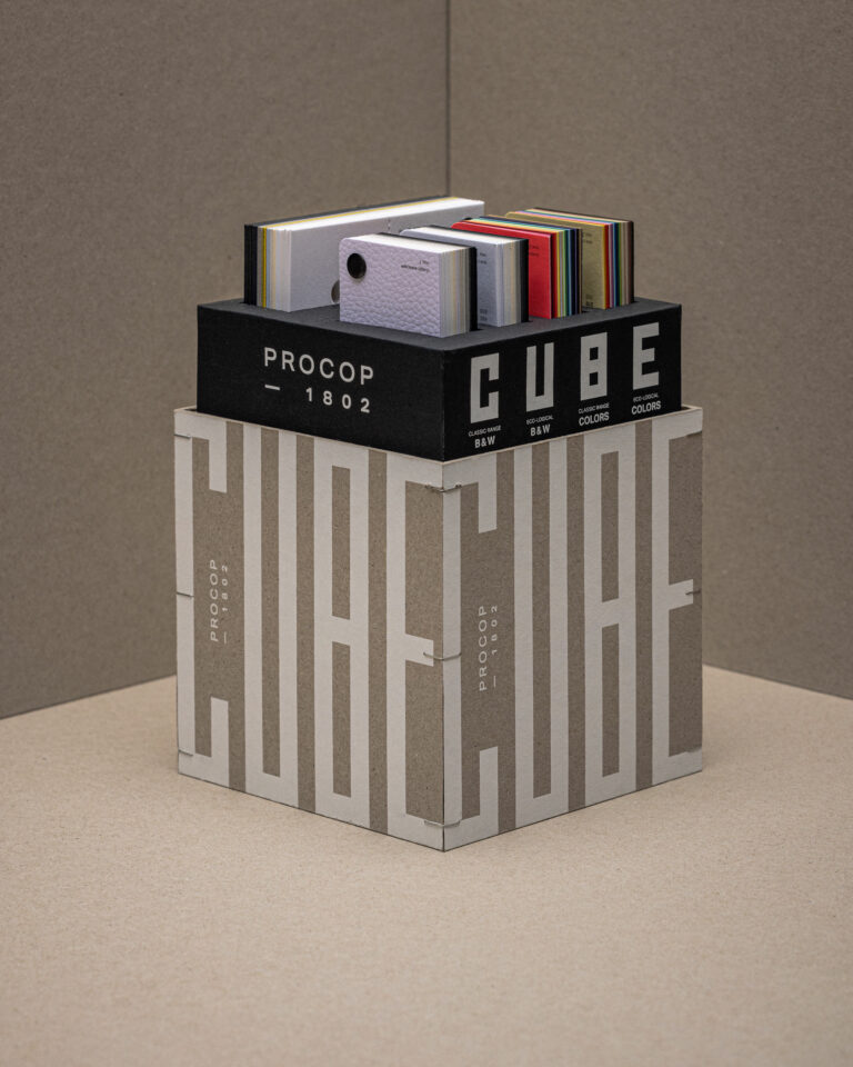
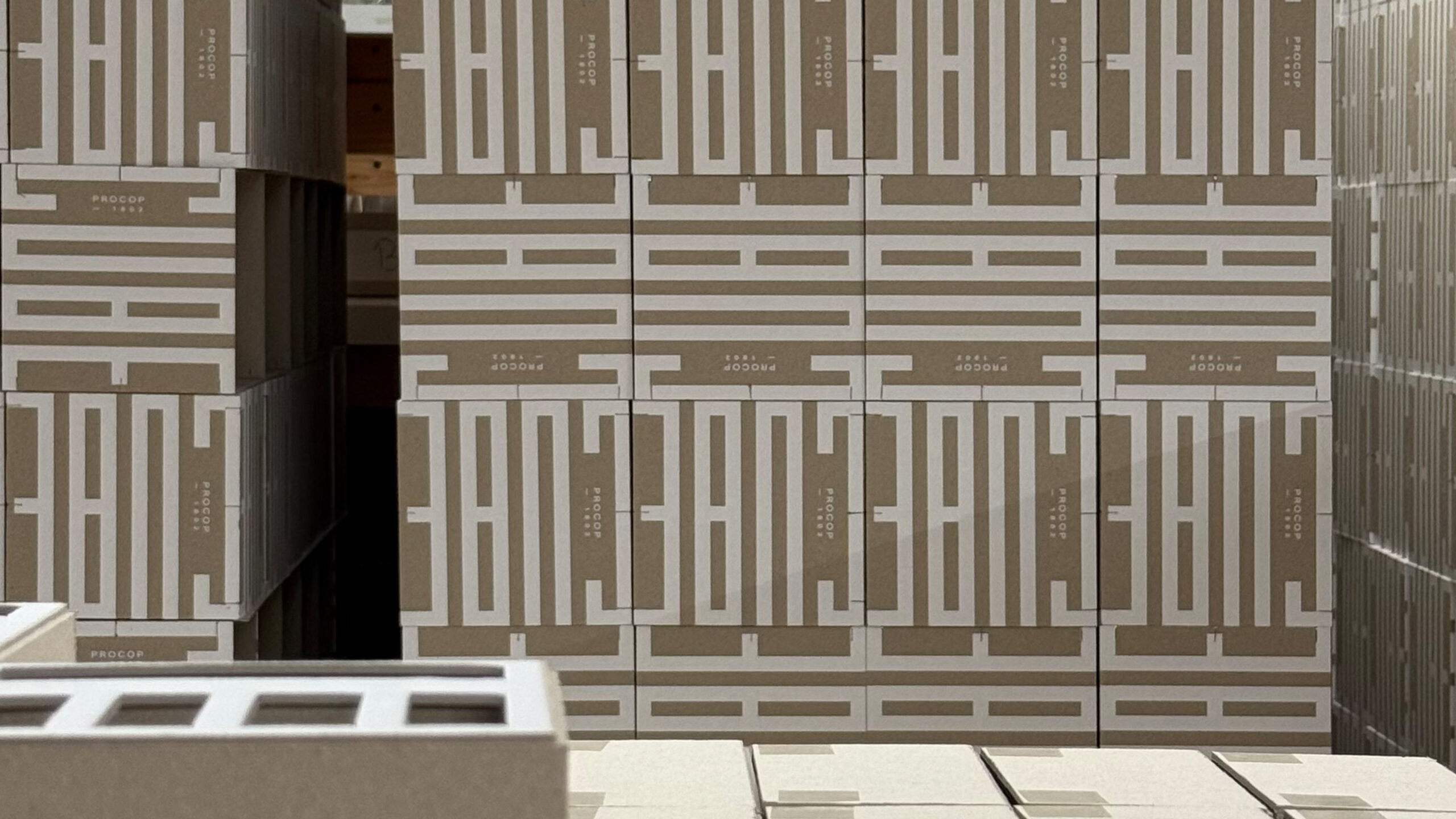
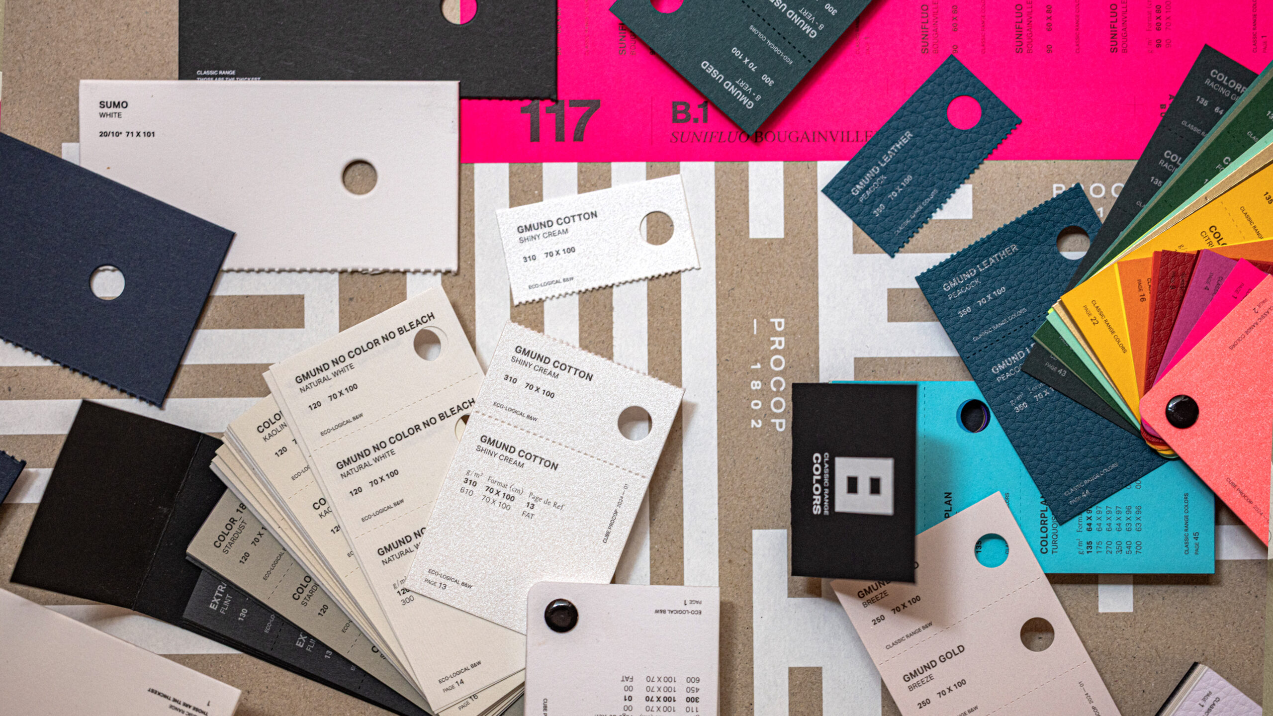
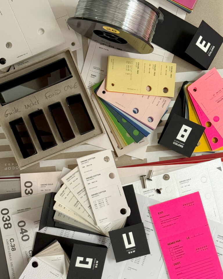
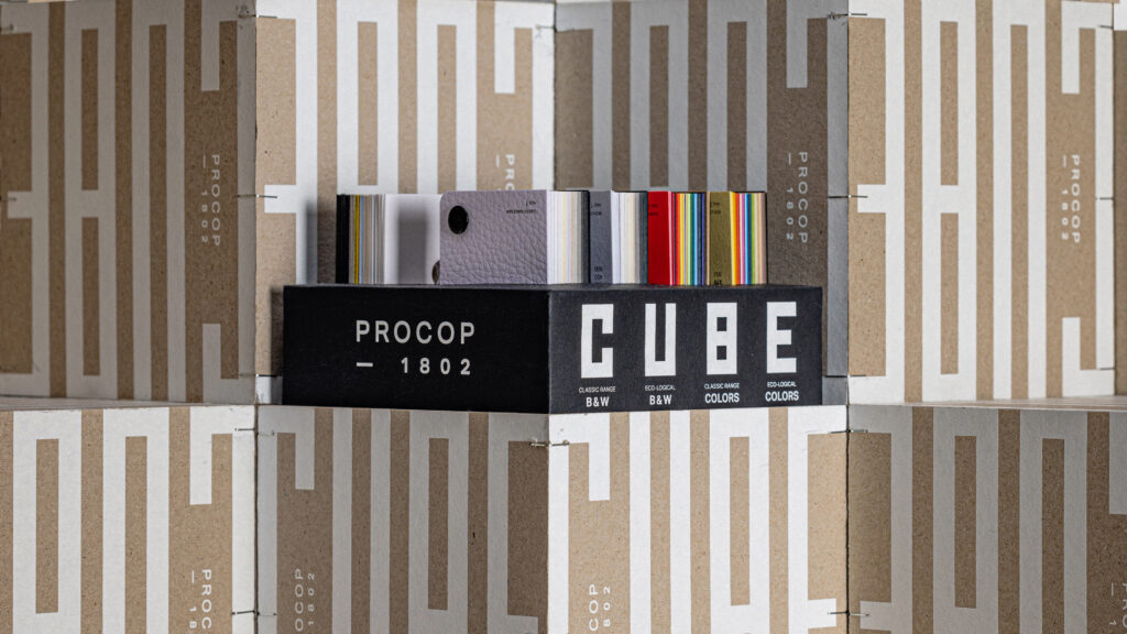
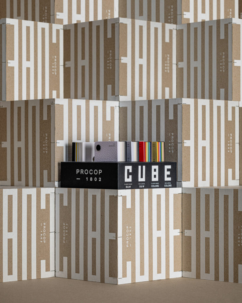
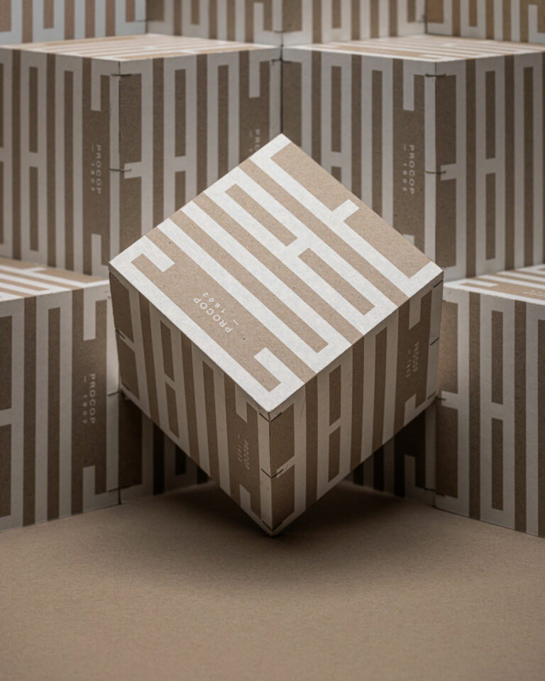
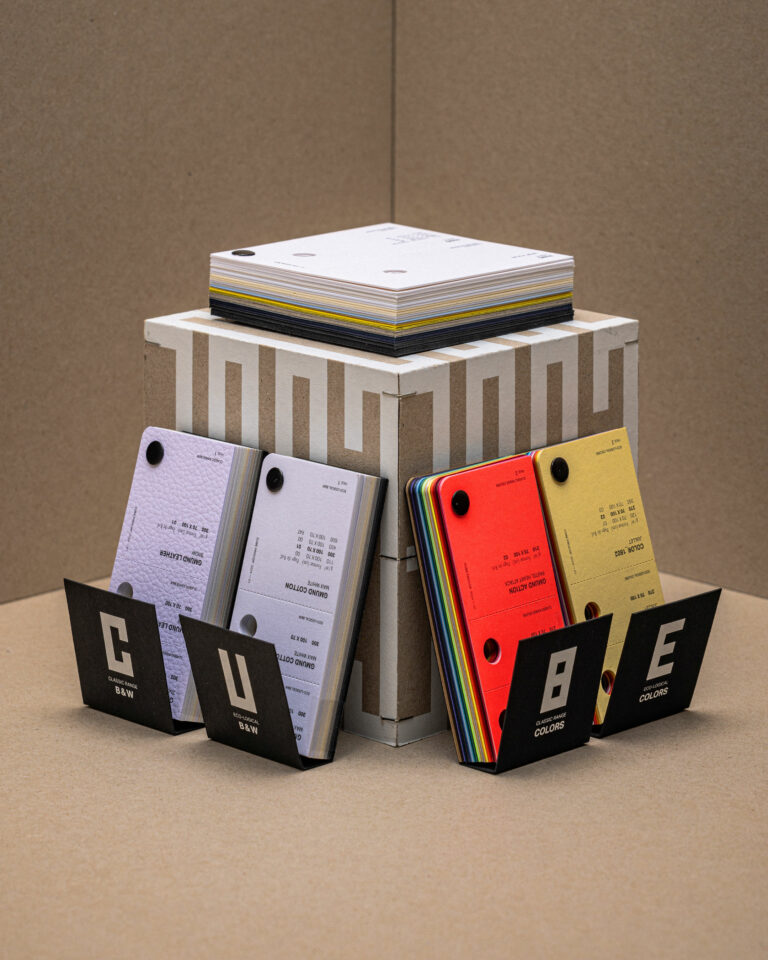
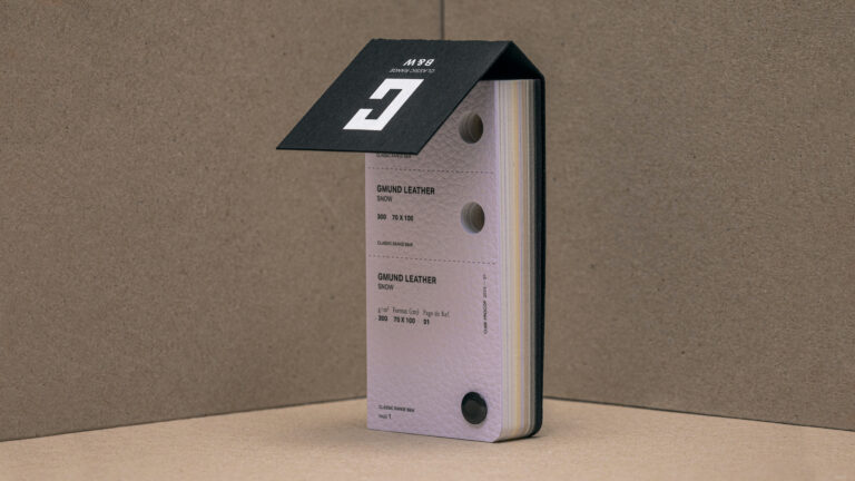
Procop entrusts us with the redesign of its print guide. The Cube becomes an object box for print professionals. Beyond the samples, each range makes it easy to interact with other media or to leave a reference for your contact.

The Procop Cube — Procop Specialty Papers Overview Page · vrai studio
The Procop Cube — Procop Handmade Paper Guide Page · vrai studio
The Procop Cube — A Guide to Suppliers of Art Papers · vrai studio
Editorial Design: Le Cube Procop — printed guide on the table · vrai studio
The Procop Cube — Paper and Materials Page · vrai studio
The Procop Cube — A Guide to Artistic Papers: Ambience · vrai studio
The Procop Cube — Guide to Paper Set Design · vrai studio
The Procop Cube — Procop Paper Guide: Studio-Style · vrai studio
The Procop Cube — Special Papers Samples Page · vrai studio
The Procop Cube — Paper Samples Page · vrai studio

Our mission: to design an original, functional and easy-to-use swatch book

The Procop Cube in Action — Browse the Special Papers Guide · vrai studio
Procop Paper Guide in Context — Editorial Design · vrai studio
The Procop Cube — Guide to Paper Set Design · vrai studio

Procop is one of Europe's leading distributors of art and commercial papers, with a presence throughout the continent. The Cube is their main color swatch book, a standard reference for printers and graphic designers.

The existing product combined all the color swatch sets into a single block weighing one to two kilos—difficult to handle and not very user-friendly. The challenge for vrai studio was to redesign it as a desirable, modular object, designed for real-world use. The project falls under the category of product design: it involved considering handling, structure, content presentation, functionality, and user experience. The goal was not simply to create a beautiful object. It was to create an object that works—and that is beautiful precisely because it works. The photographic direction accompanies the launch of the redesigned color chart.

Art Direction and Photography: Camille Gabarra
The Procop Cube — Art Paper Guide Cover · Editorial Design: vrai studio Experience

PUZZLE

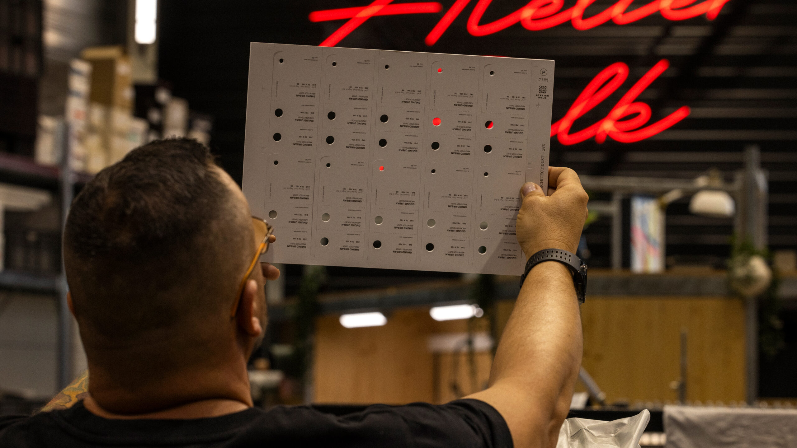
A snapshot of a workshop around the Cube

The Procop Cube — Inside Page: Paper Supplier Guide · vrai studio

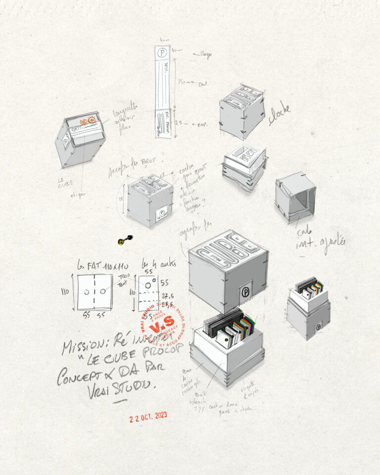
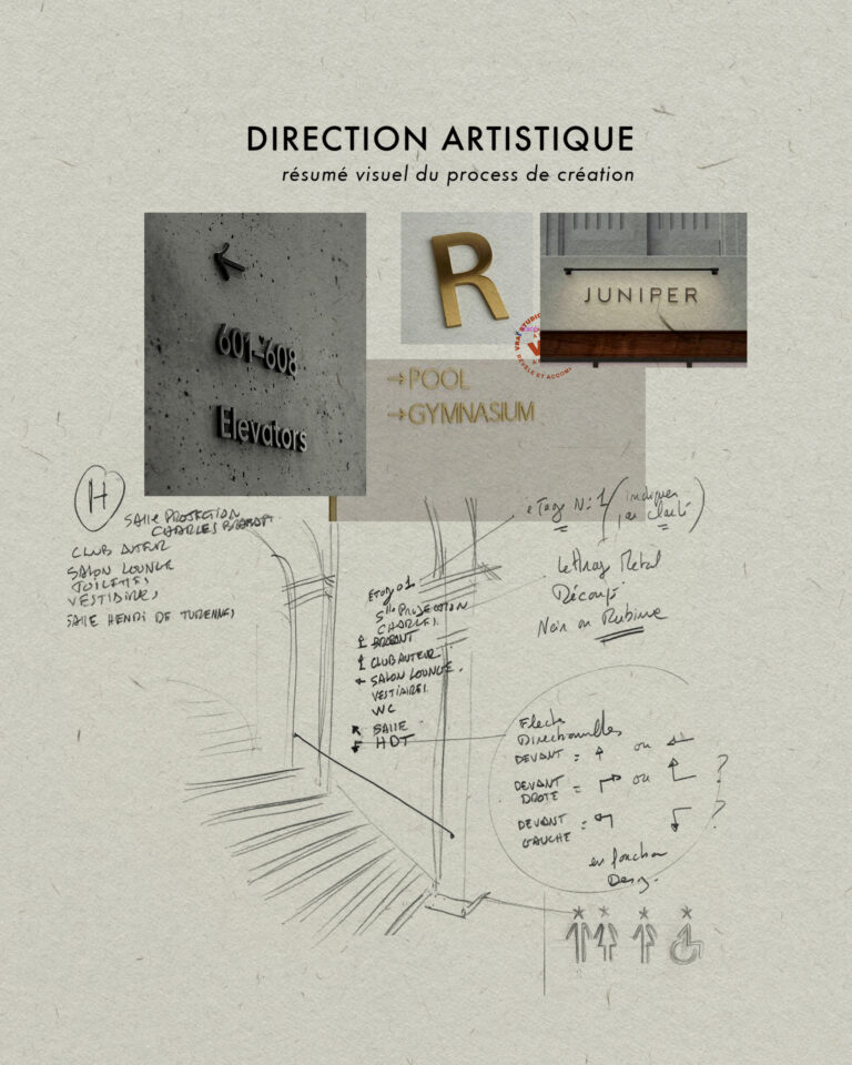
STUDY

Every project has its sketches

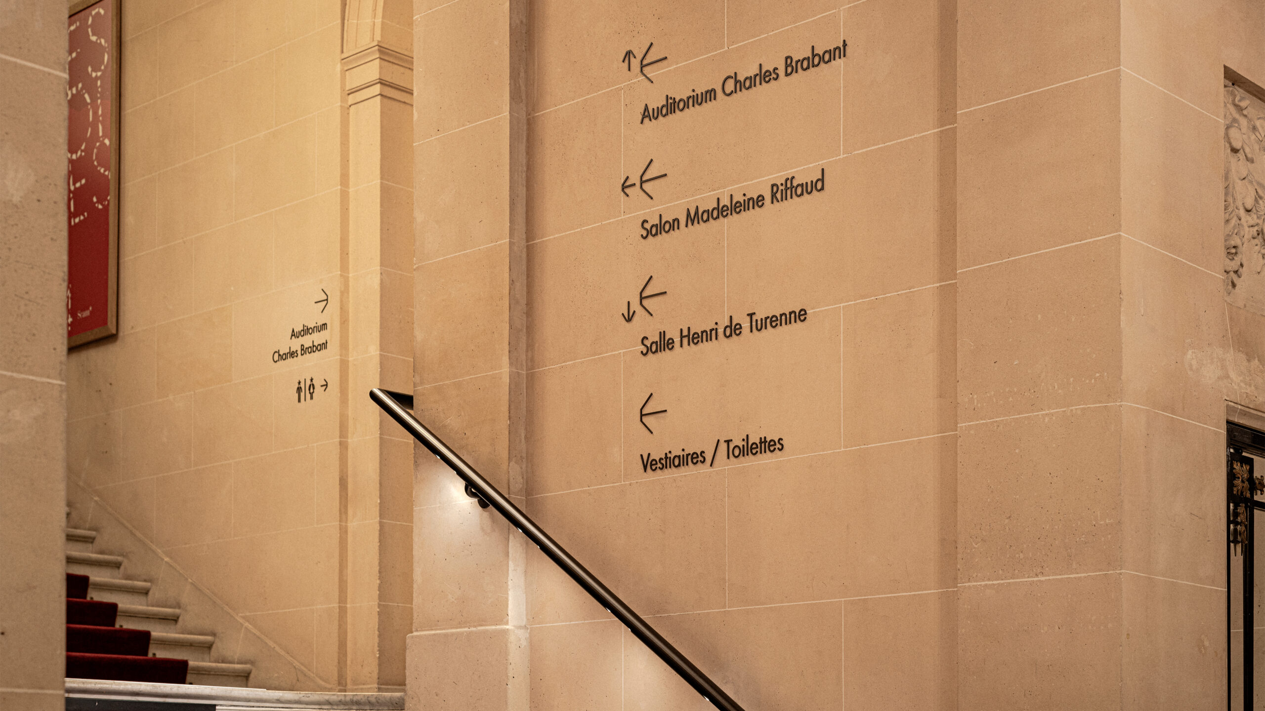
LaScam Mansion — Parisian Design Signage Ambience · vrai studio
LaScam Signage — close-up of lettering on a private mansion · vrai studio
  • Art Direction
  • Signage
  • Manufacturing management
  • Project management

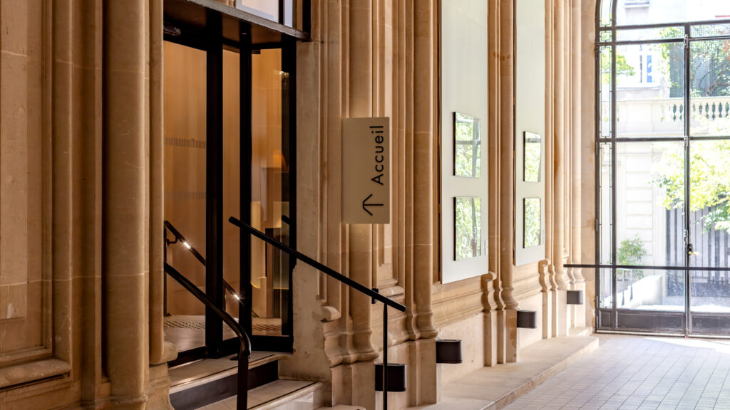
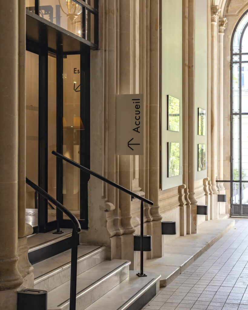
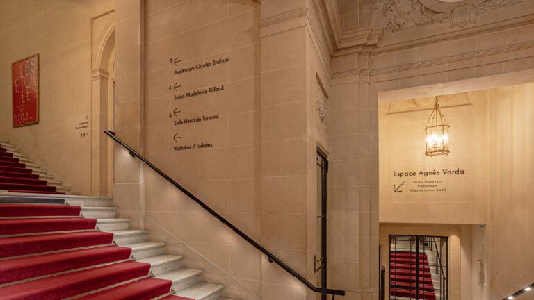
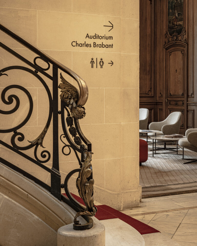
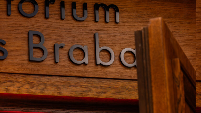
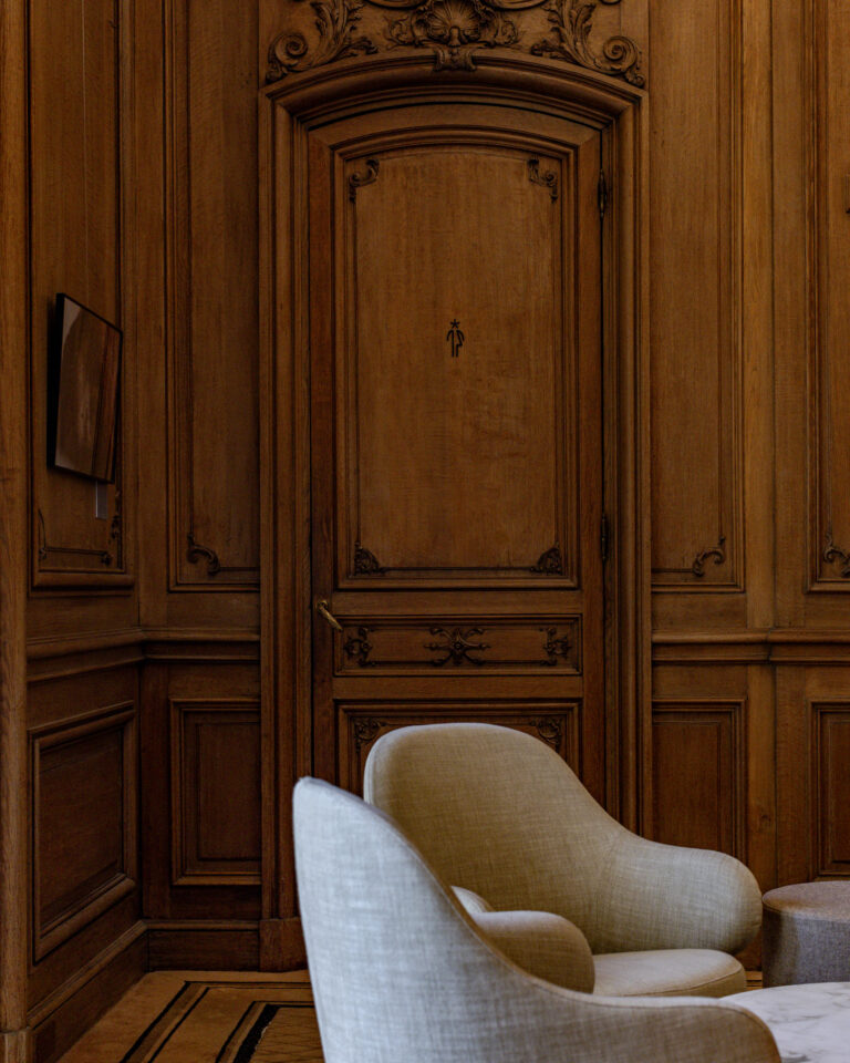
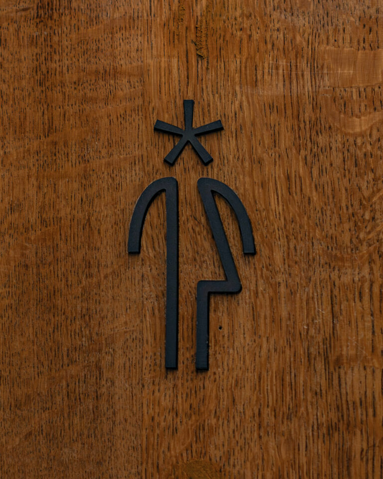
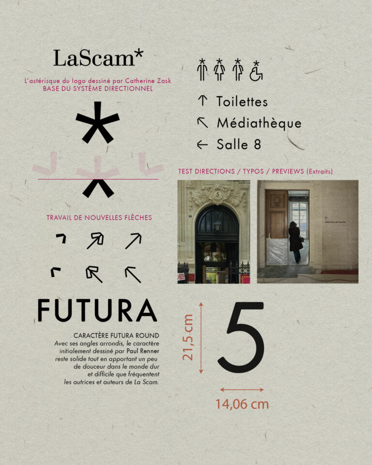
vrai studio the wayfinding system for the LaScam* (Société civile des auteurs multimédia) mansion, which manages and defends the rights of its members. The graphic design is understated, consisting of lettering and directional arrows—drawn based on the asterisk in the logo—and the wayfinding system fits respectfully into this historic setting.

LaScam Environmental Design — Paris Mansion · vrai studio
LaScam Paris Nameplate — Close-up of Environmental Design · vrai studio
LaScam Nameplate — Environmental Design for a Mansion · vrai studio
LaScam Signage — Private Mansion Ambiance, Authors' Society, Paris · vrai studio
LaScam Paris Signage — detail of lettering plaque · vrai studio
Close-up LaScam — Nameplate on a Paris townhouse · vrai studio apartment
LaScam Sign — environmental design sign detail, Paris · vrai studio

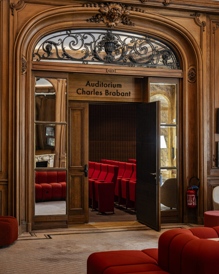
Executed to perfection, the signage designed by vrai studio discreetly vrai studio these century-old walls, as if it had always been there

LaScam Paris — signage for a private mansion with a designer vibe · vrai studio

LaScam is the Société Civile des Auteurs Multimédia, a cultural institution housed in a historic Parisian building. The project involves designing the interior wayfinding system for its spaces, covering nearly 1,200 square meters.

The design philosophy is one of absolute simplicity: a graphic system composed solely of black lettering and directional arrows, drawn using the asterisk from the LaScam logo. This choice respectfully fits within a space that does not need to be adorned, only guided. The signage—present yet discreet, executed with precision—guides visitors without imposing itself on the eye. No color coding, no superfluous pictograms. Readability is built on the typography and the consistency of the system. Camille Gabarra has been working with LaScam for over fifteen years on editorial, communications, and photography projects, including the design of the annual report.

Art Direction and Photography: Camille Gabarra
LaScam Nameplate — Detail of the lettering on a Paris townhouse · vrai studio
LaScam Signage — Close-up of a Parisian townhouse · vrai studio
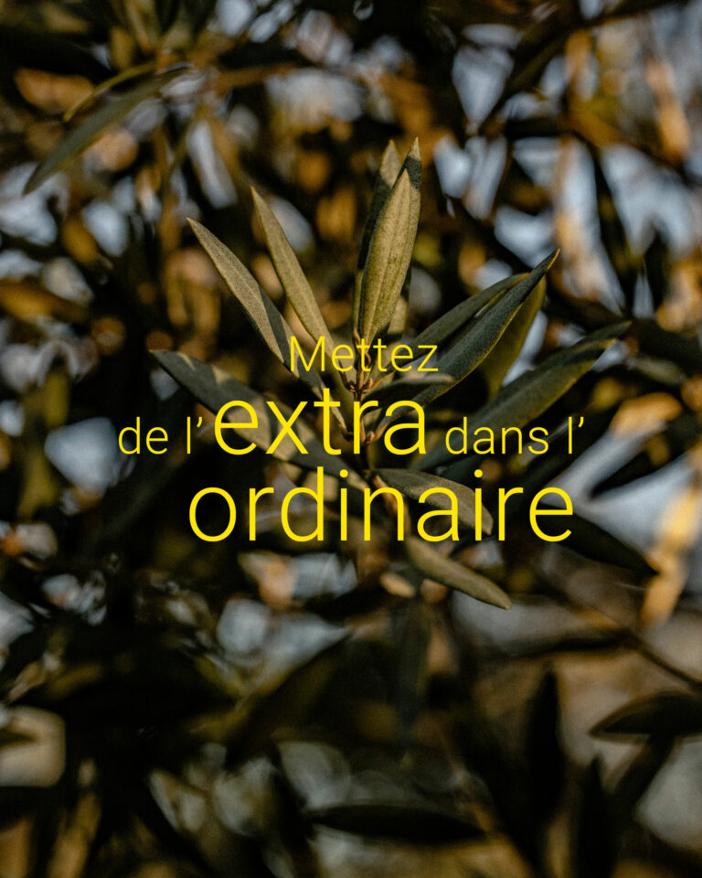
Olearius Brand Logo — Olive Oil Visual Identity · vrai studio
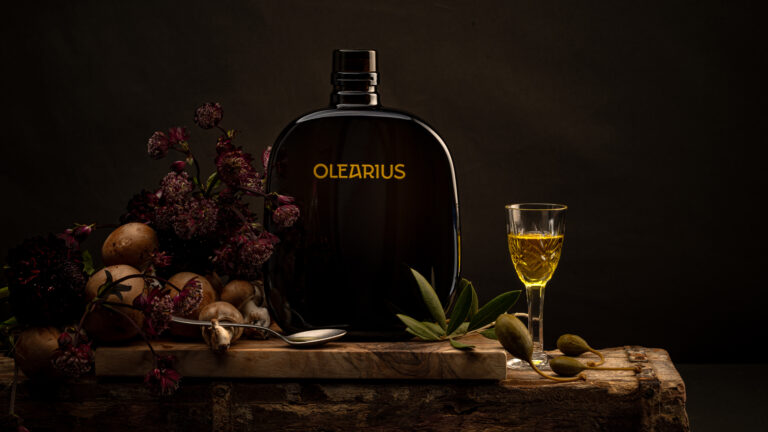
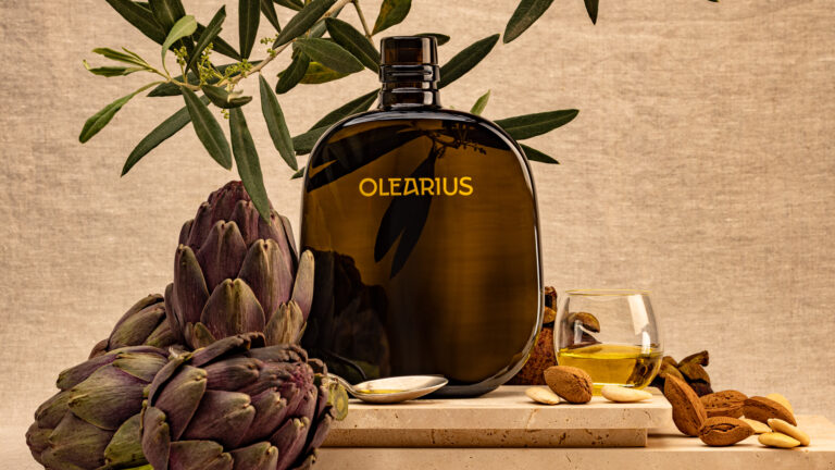
Olearius Product Shot — Olive Oil Lifestyle Photography · vrai studio

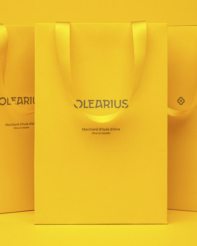
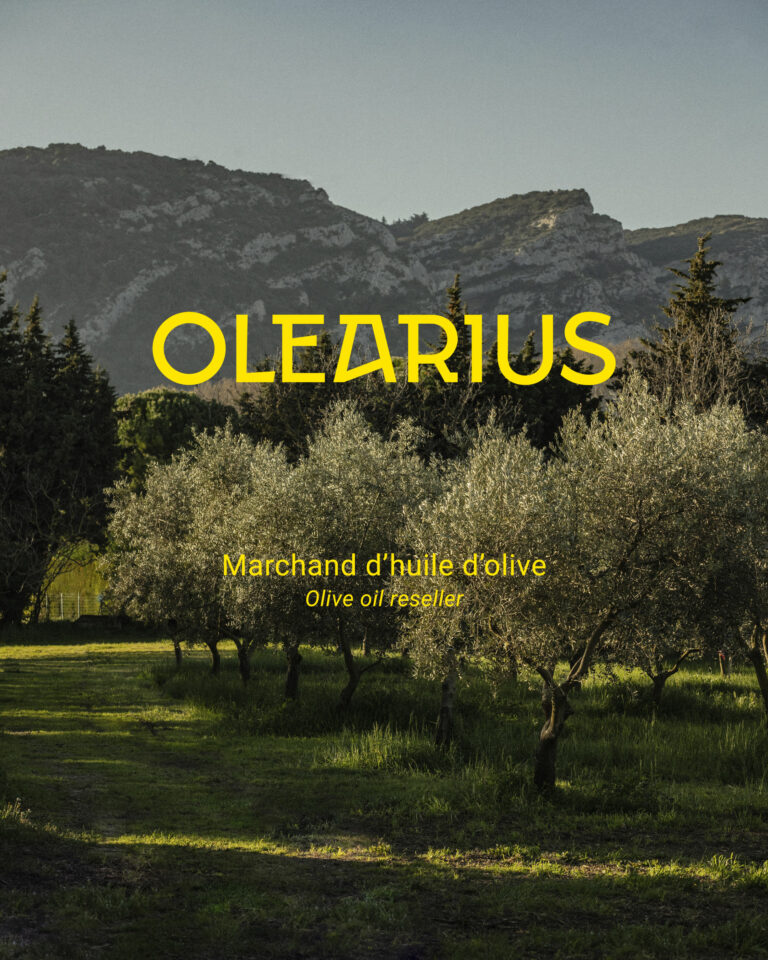
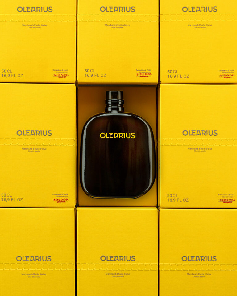
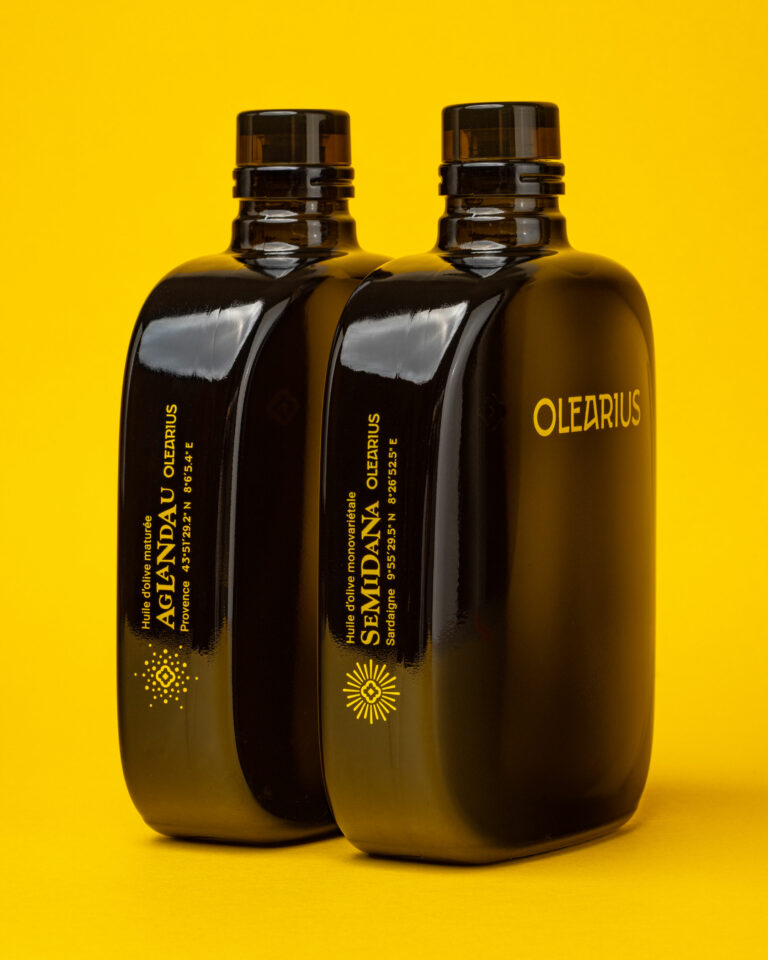
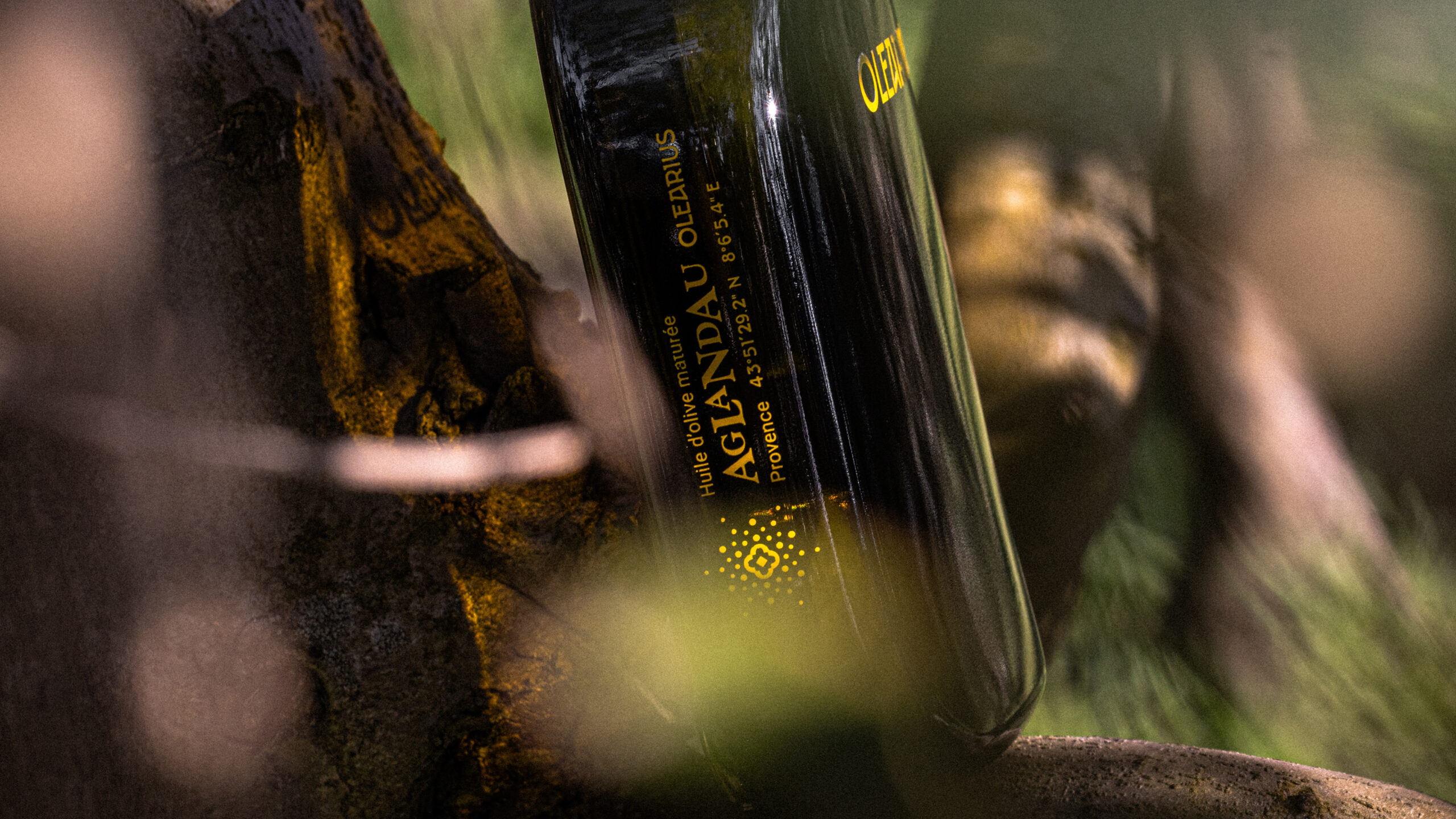
In the summer of 2024, vrai studio approached to develop the brand identity for a premium olive oil brand. We’re proud of the name we came up with: Olearius. Working alongside the founder ever since, we’ve been overseeing the creative direction for all of Olearius’s needs in terms of art direction, photography, and communications.

Olearius Olive Oil — packshot and visual identity · vrai studio
Olearius Olive Oil — Spring Lifestyle Food Photography · vrai studio
Olearius Brand Identity — Olive Oil Brand Photography · vrai studio
Olearius Oil in Context — Lifestyle Photography · vrai studio
Olearius Brand Identity Animation — Olive Oil · vrai studio
Olearius Branding — Olive Oil Brand · vrai studio
Olearius Brand — Olive Oil Visual Identity · vrai studio
Olearius Oil Lifestyle — Brand Photography · vrai studio
Olearius Olive Oil Packshot — Product Photography · vrai studio
Olearius Olive Oil Branding — brand · vrai studio
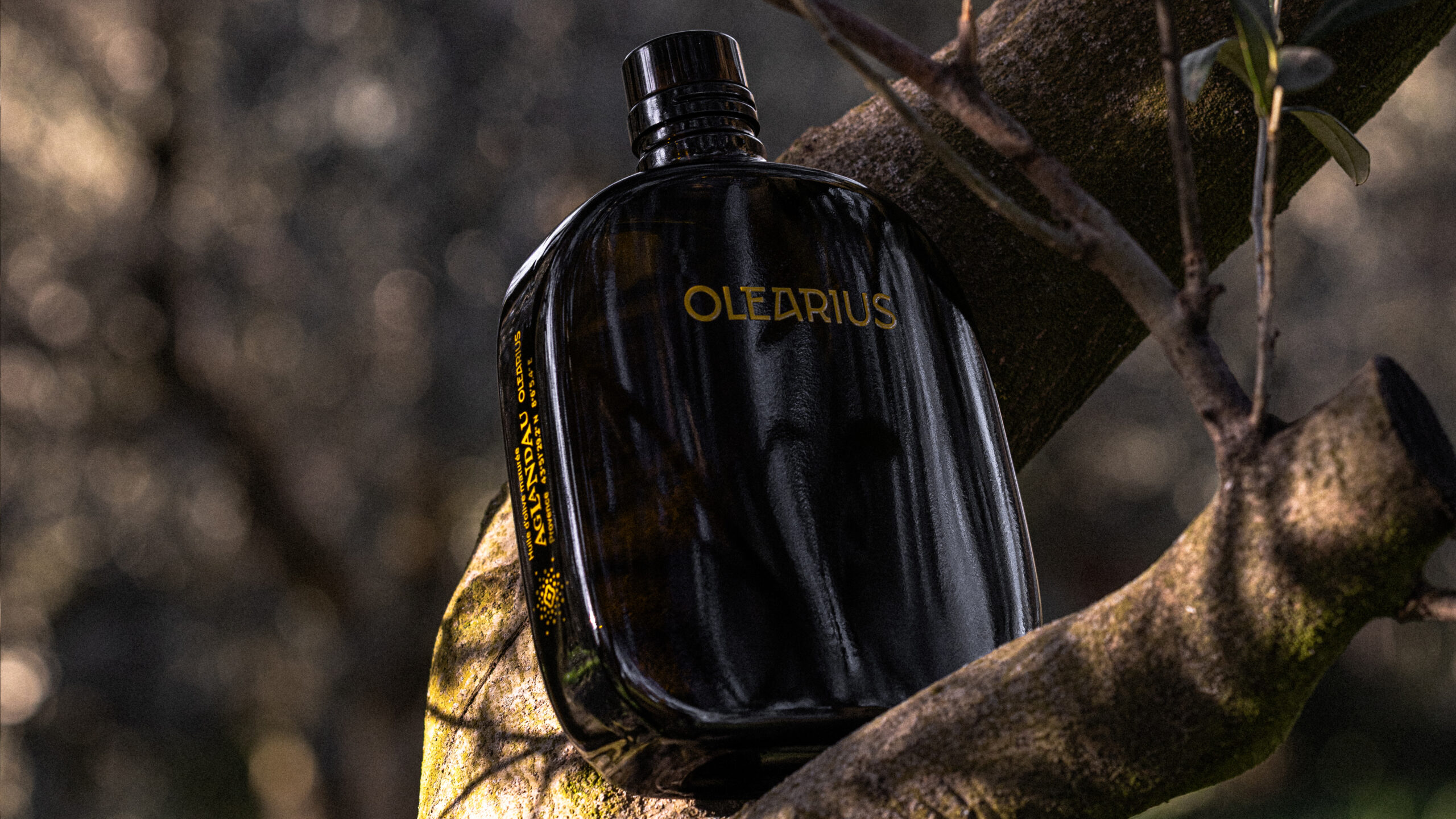
Olearius Olive Oil Lifestyle — Outdoor Product Photography · vrai studio
Olearius Olive Oil — Visual Identity, Photography · vrai studio

Creation of visuals for brand communication. The two iconic worlds in studio and lifestyle for instagram

Olearius Brand Identity — Olive Oil · vrai studio
Olearius Oil Product Photography — Visual Identity · vrai studio
Olearius in Action — Olive Oil Identity Photography · vrai studio
Olearius Visual Identity — Olive Oil Branding · vrai studio
Olearius Olive Oil Lifestyle — Visual Identity · vrai studio
Olearius Product Shot — Olive Oil Photography · vrai studio
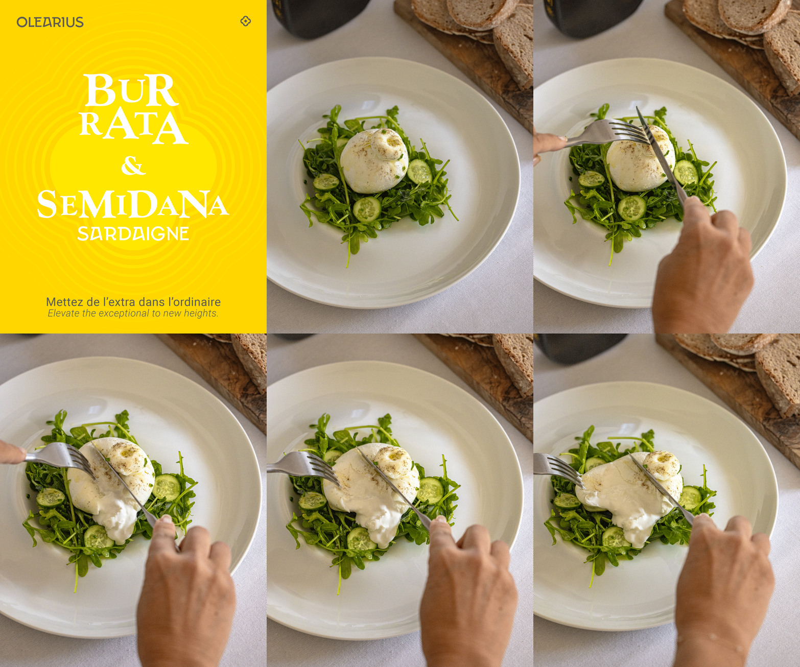
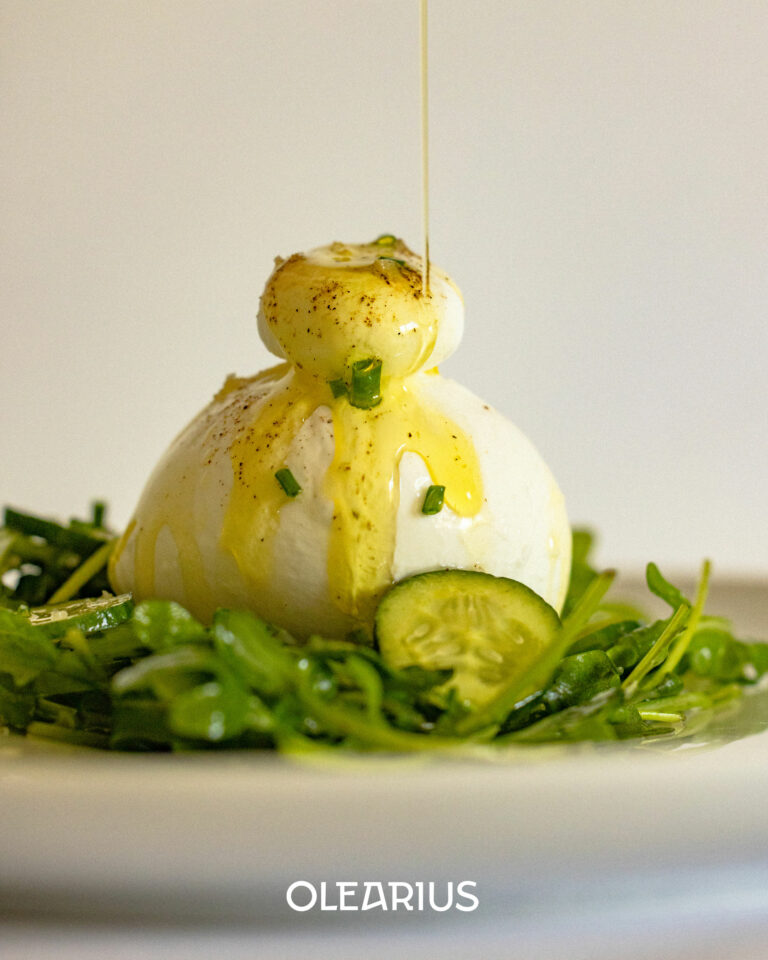
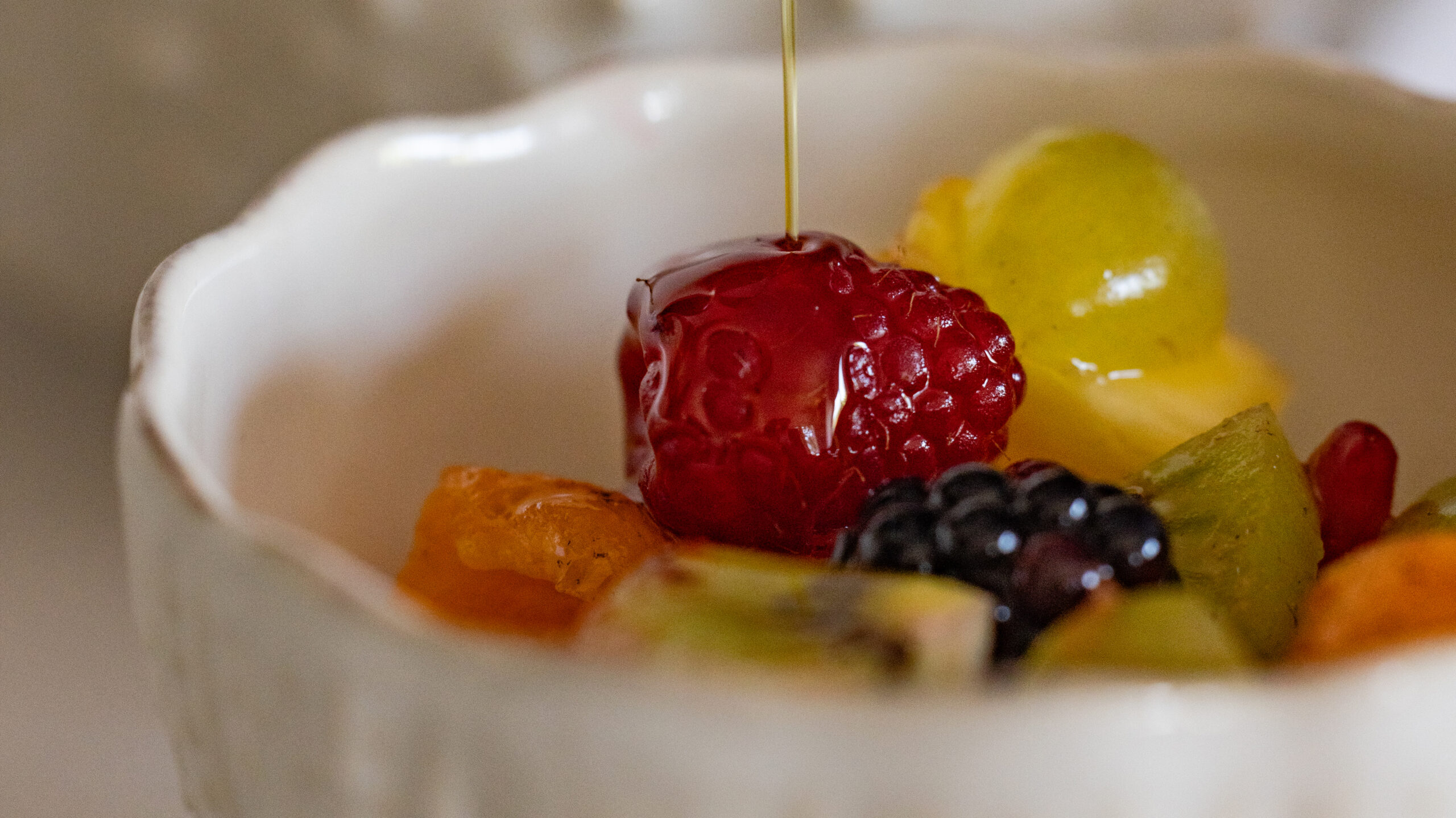
Burrata and Olearius Olive Oil Animation — lifestyle food · vrai studio
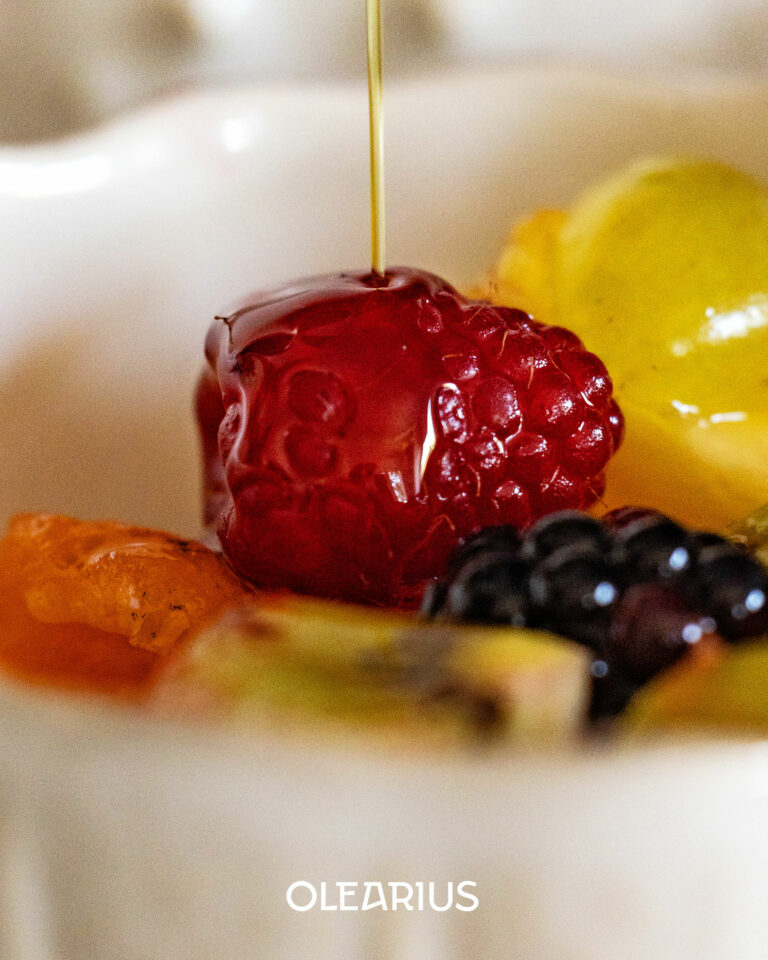
Olearius Olive Oil Lifestyle — food photography with a summery vibe · vrai studio
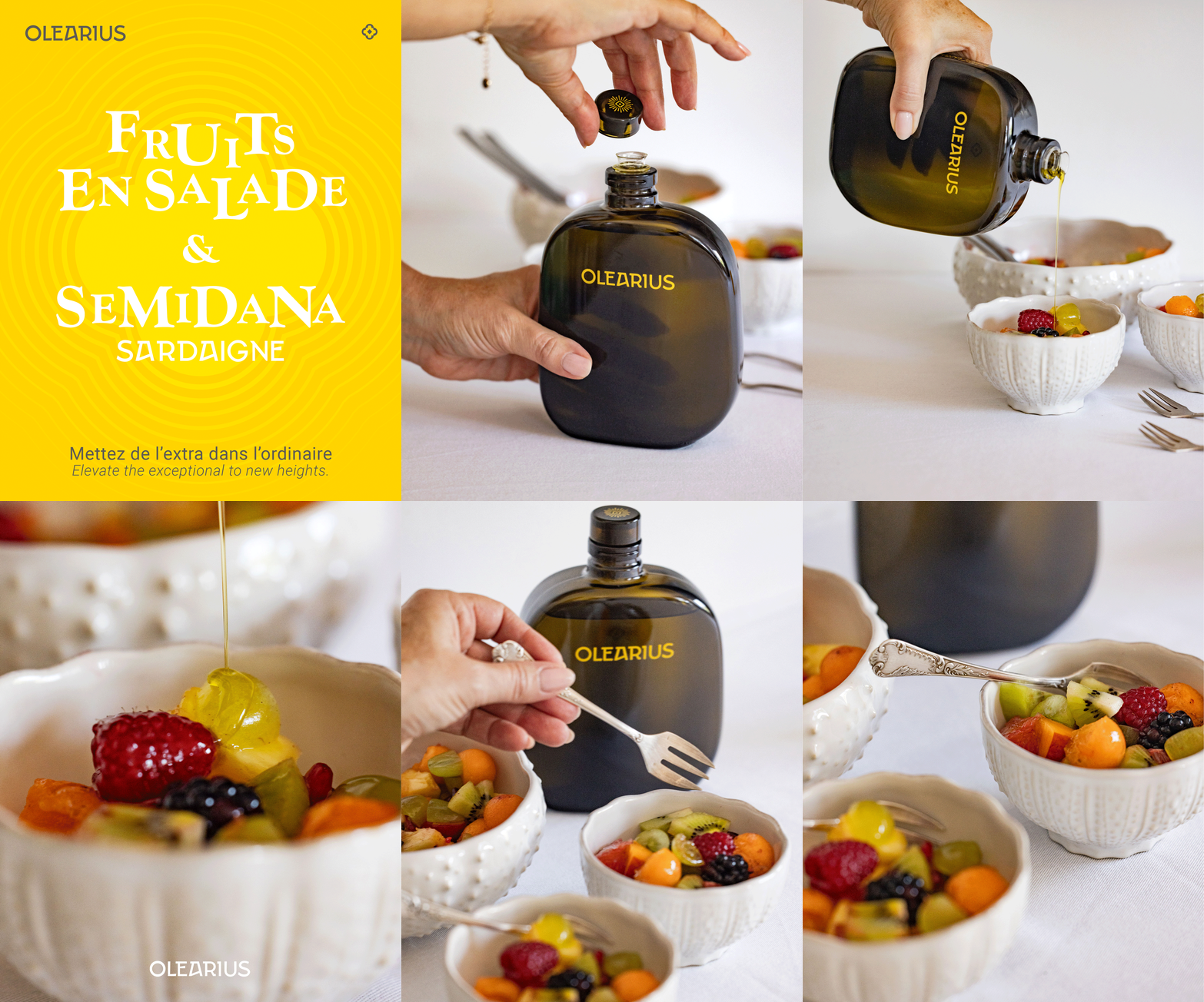
Semidana Fruit Salad Animation — Olearius Olive Oil · vrai studio
Olearius Olive Oil — Summer Lifestyle Photography · vrai studio

ŏlĕārĭus o.leˈaː.ri.us : Derived from "oleum" (oil) with the suffix "-arius" (one who makes), olearius means oil maker, oil manufacturer or oil merchant

Olearius olive oil — packshot photography · vrai studio
Olearius Natural Olive Oil — lifestyle photography · vrai studio
Lifestyle Olearius — olive oil photography · vrai studio
Olearius Packshot — Olive Oil Product Photography · vrai studio
Olearius olive oil bottle — lifestyle packshot on a neutral background · vrai studio
Olearius Olive Oil Bottle — Light-Colored Packaging · vrai studio

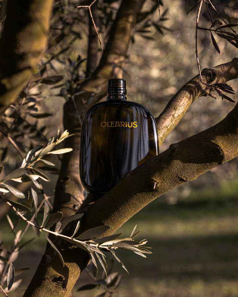
It all started with a dream: to create an olive oil brand using olives from an olive grove purchased in Sardinia. vrai studio the project from that initial idea—through naming, positioning, and visual identity—all the way to the final production files.

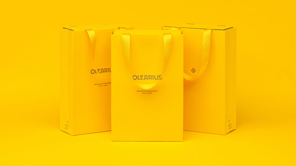
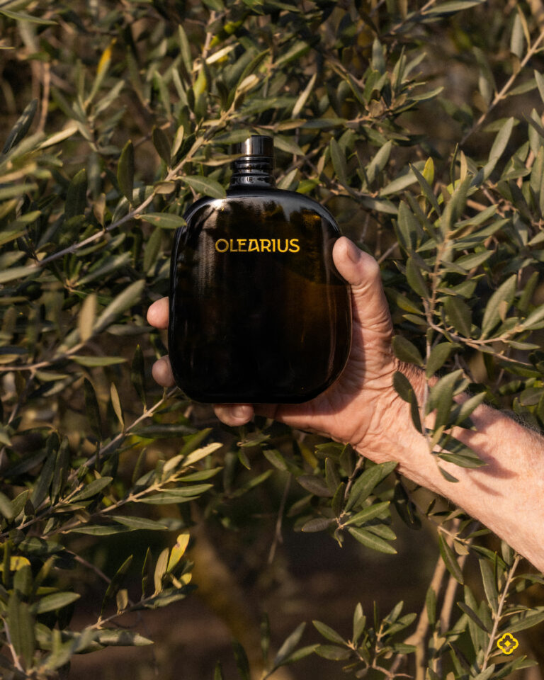
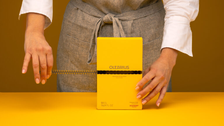
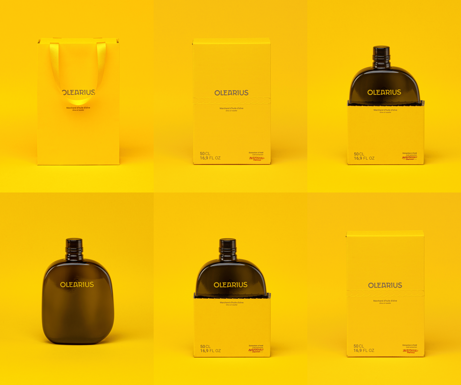
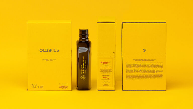
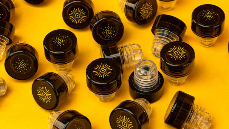
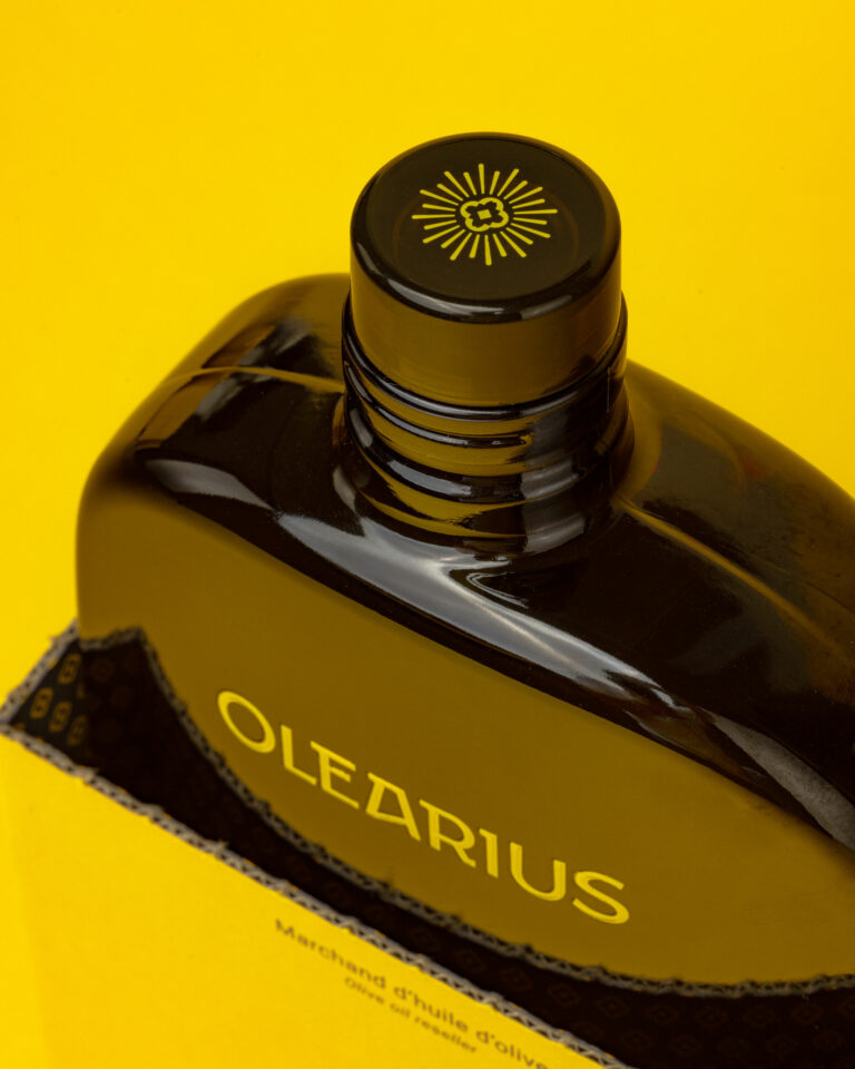
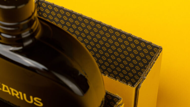
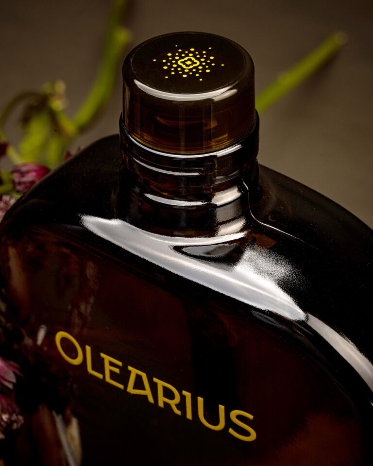
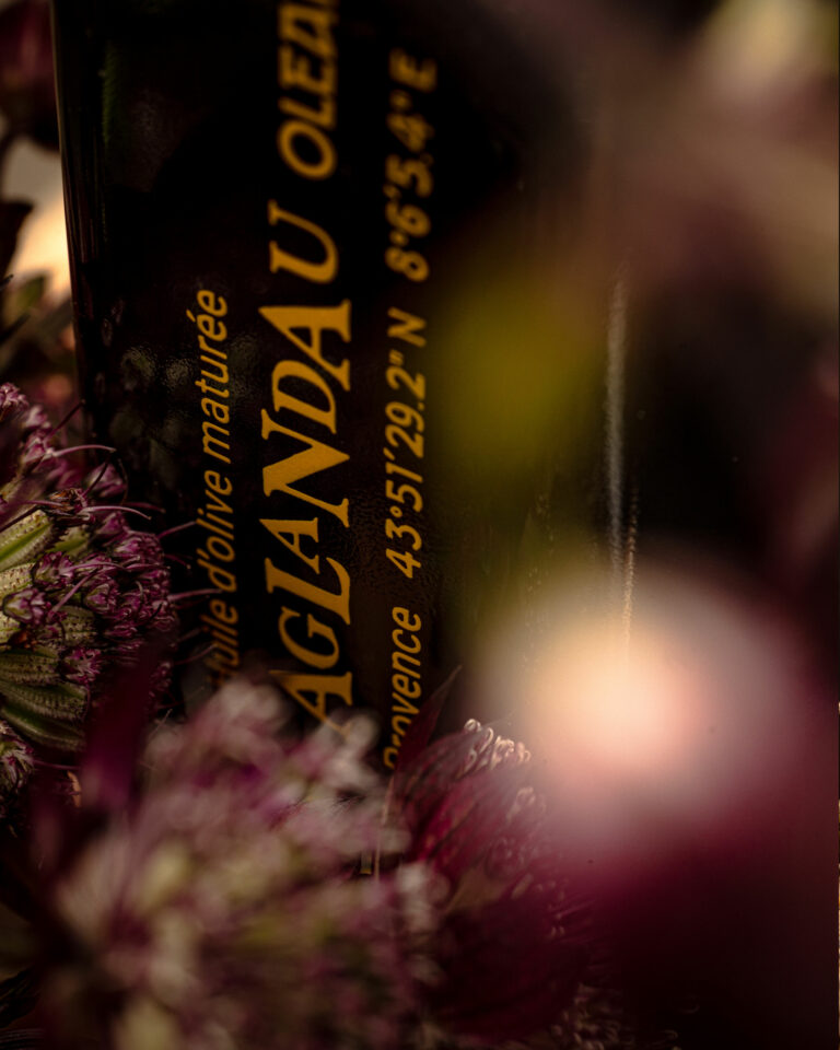
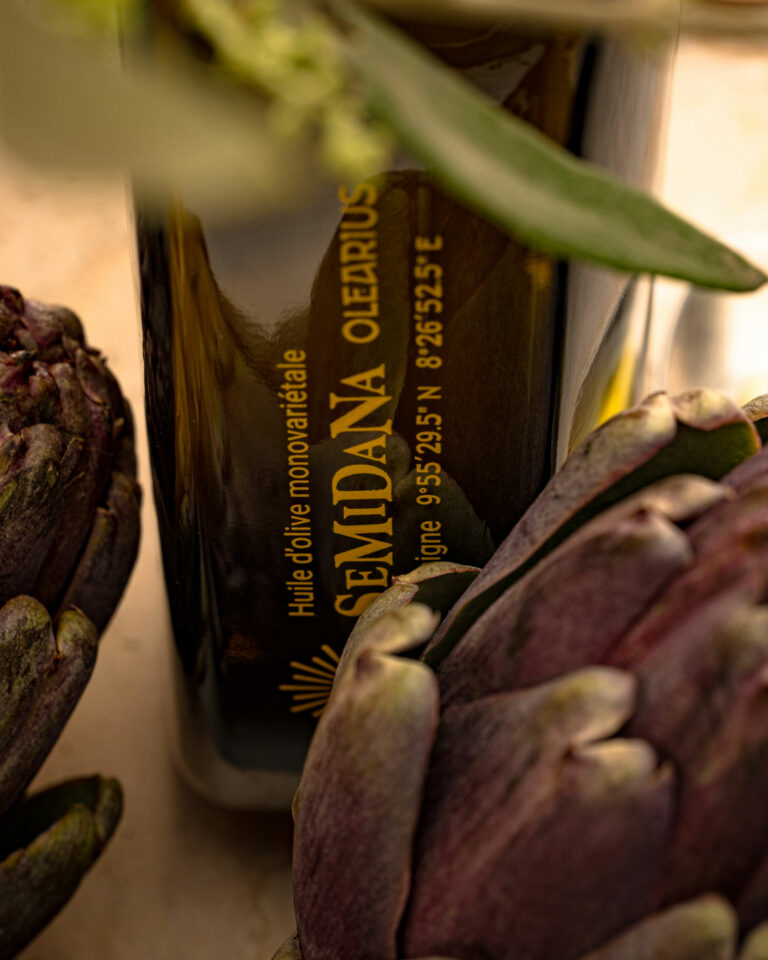
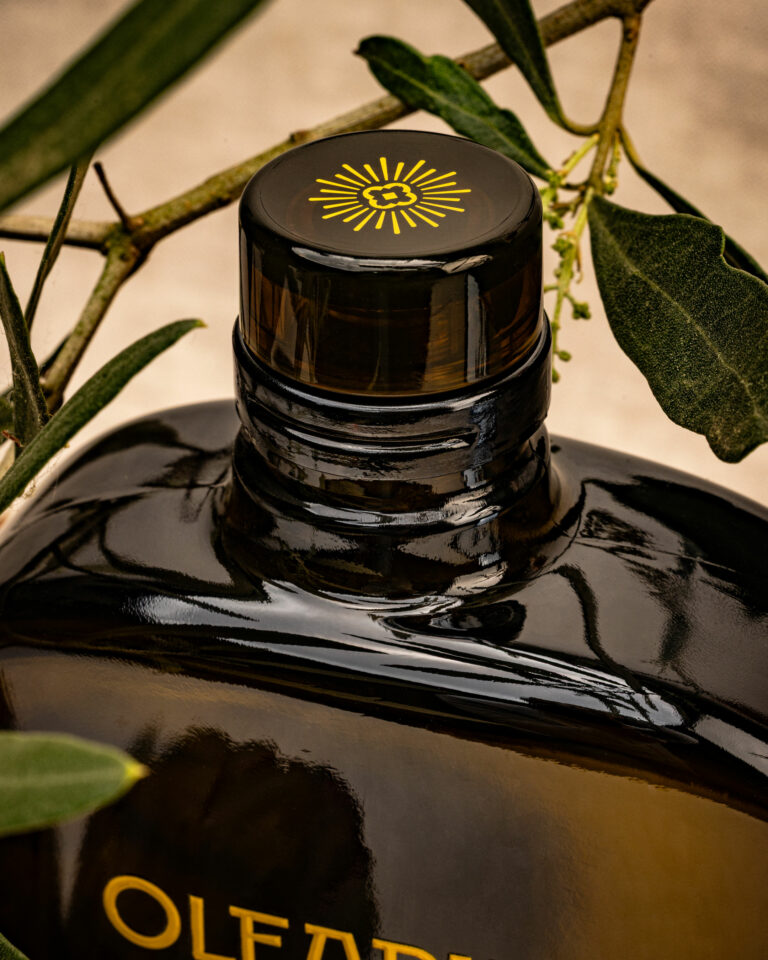
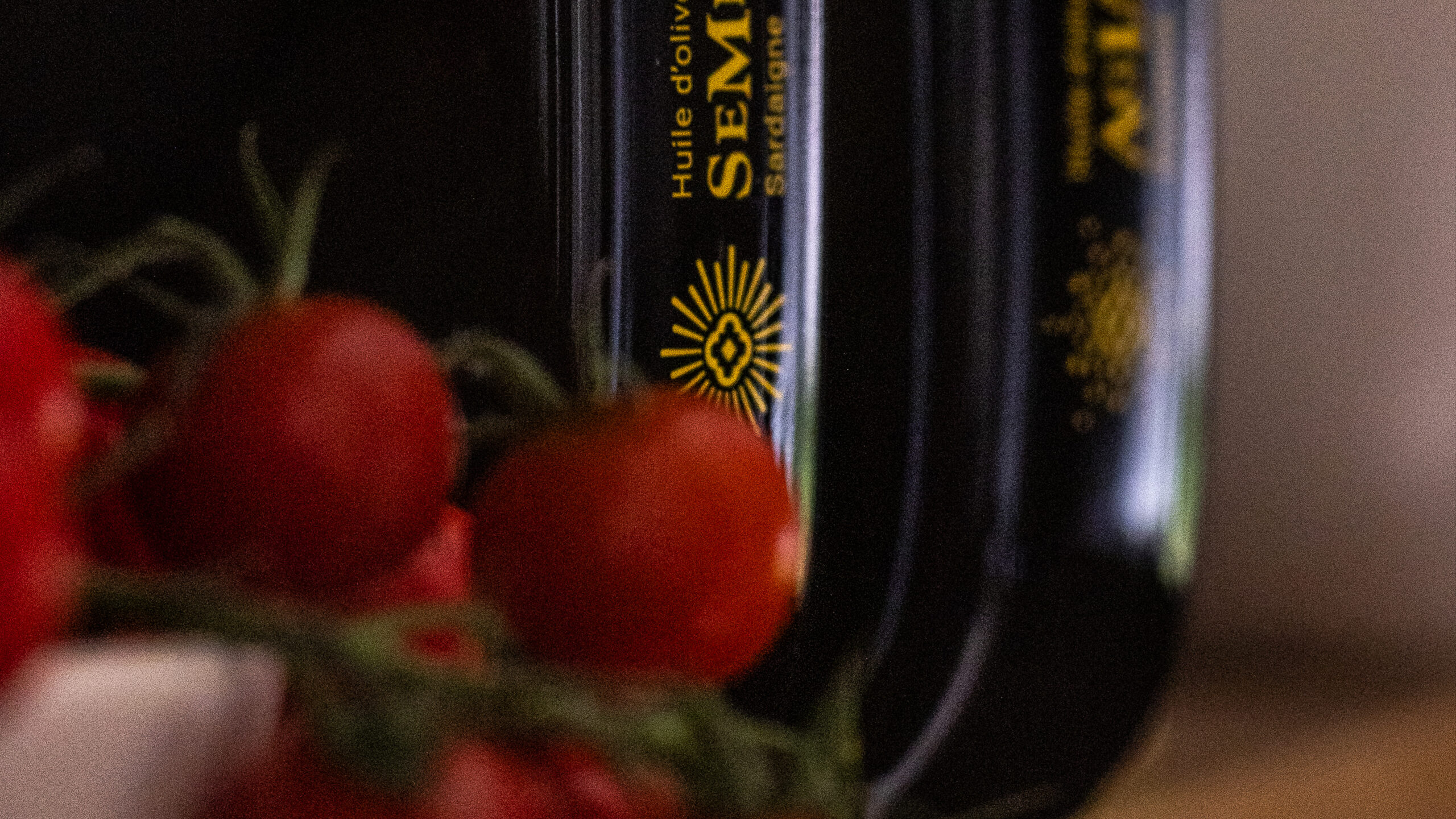
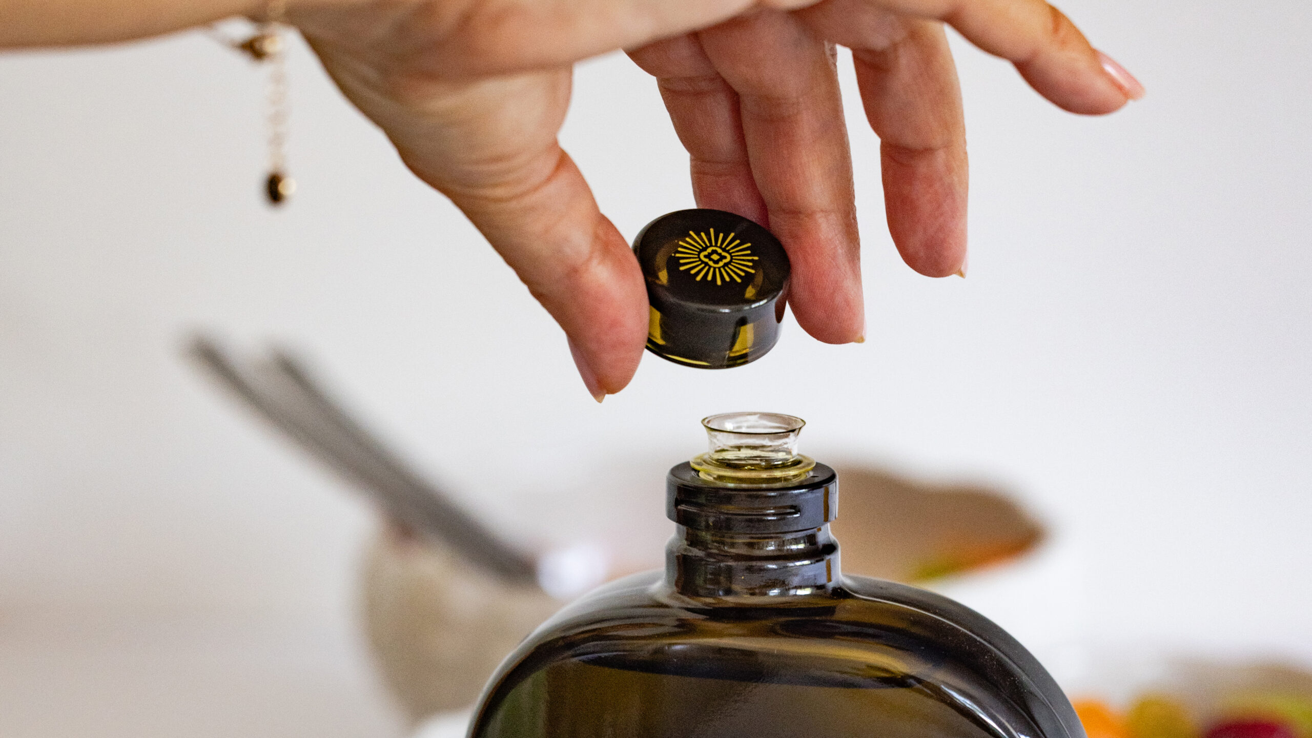
The name Olearius is derived from a Latin root that refers to an oil specialist, an olive oil merchant. It immediately positions the brand as one of knowledge and expertise. The project encompassed naming, the logo, the main monogram and its variations for each product, the typographic style, packaging on a custom-designed bottle developed in collaboration with a glassmaker, the cap, and the carrying bag. Two origins form the basis of the range: Semidana from Sardinia and Aglandau from Provence. The product photography direction combines iconic studio shoots, lifestyle shoots, and product shots on a white background for the online store. vrai studio also vrai studio the website olearius.fr.

Art Direction and Photography: Camille Gabarra
Lifestyle Olearius — olive oil photography, branding · vrai studio

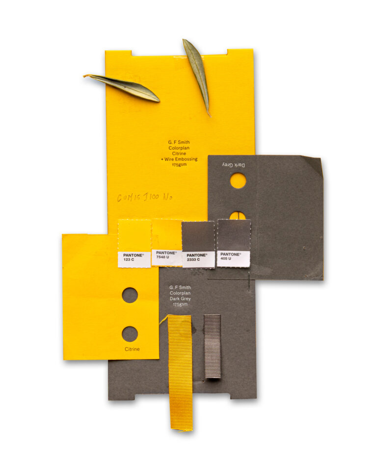
BRAND PALETTE

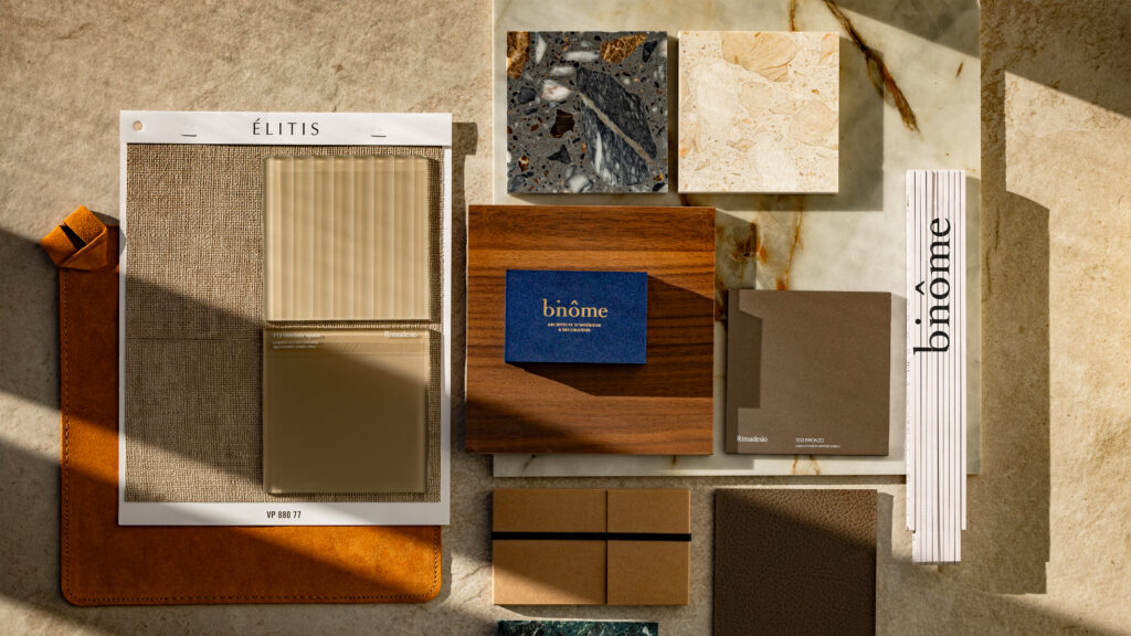
Summary of Olearius brand materials and colors

Olearius Olive Oil Packshot — Product Photography · vrai studio

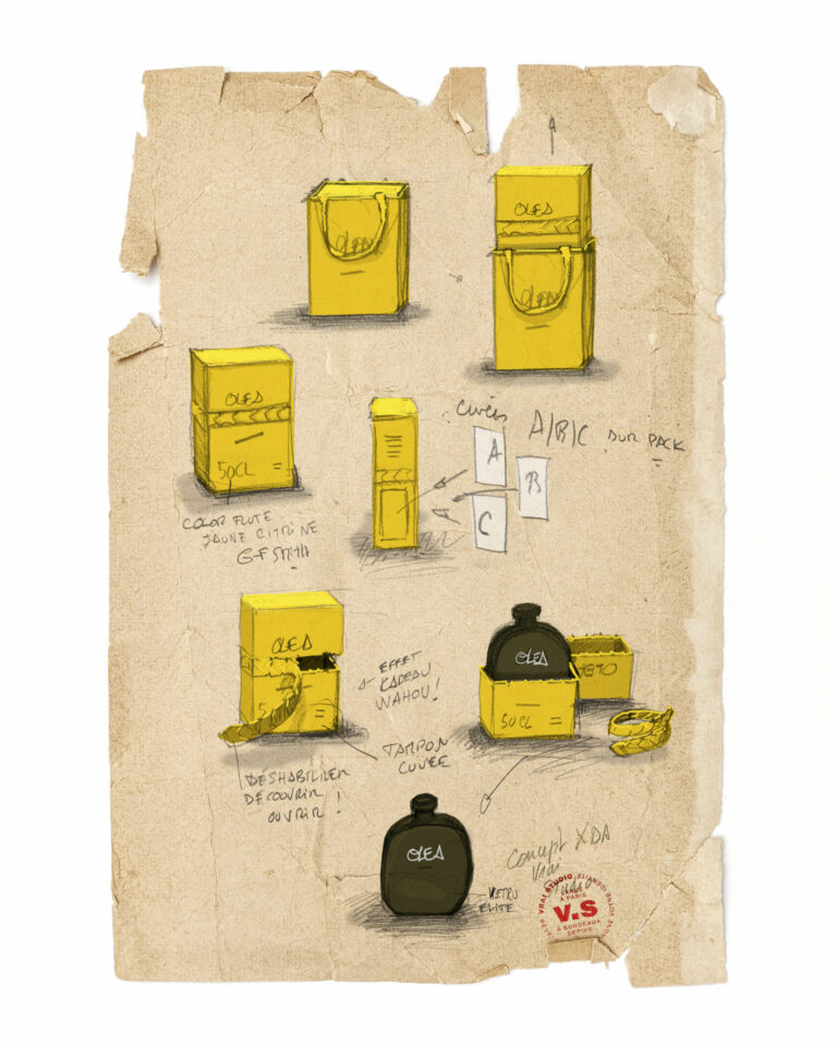
STUDY

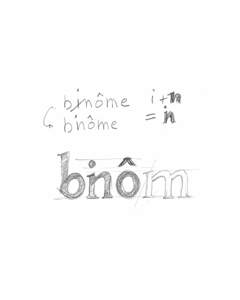
Every project has its sketches

Binôme Visual Identity Binôme Atmosphere Branding for an Architecture Firm · vrai studio
Ambiance Identité: Binôme in Bordeaux · vrai studio

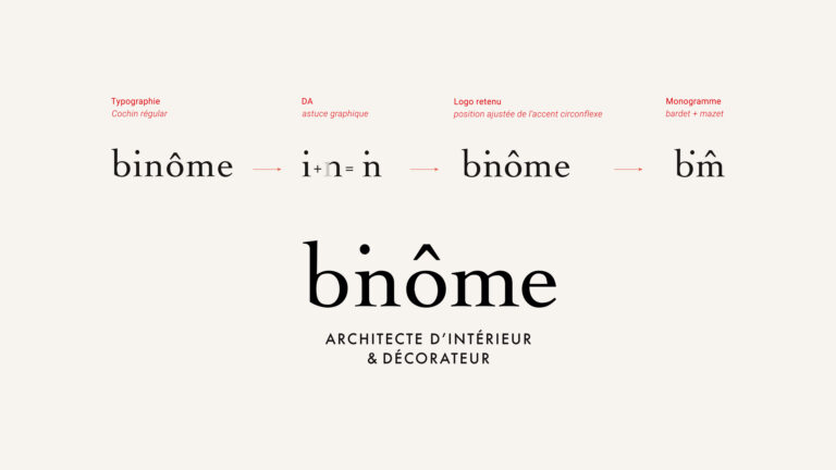
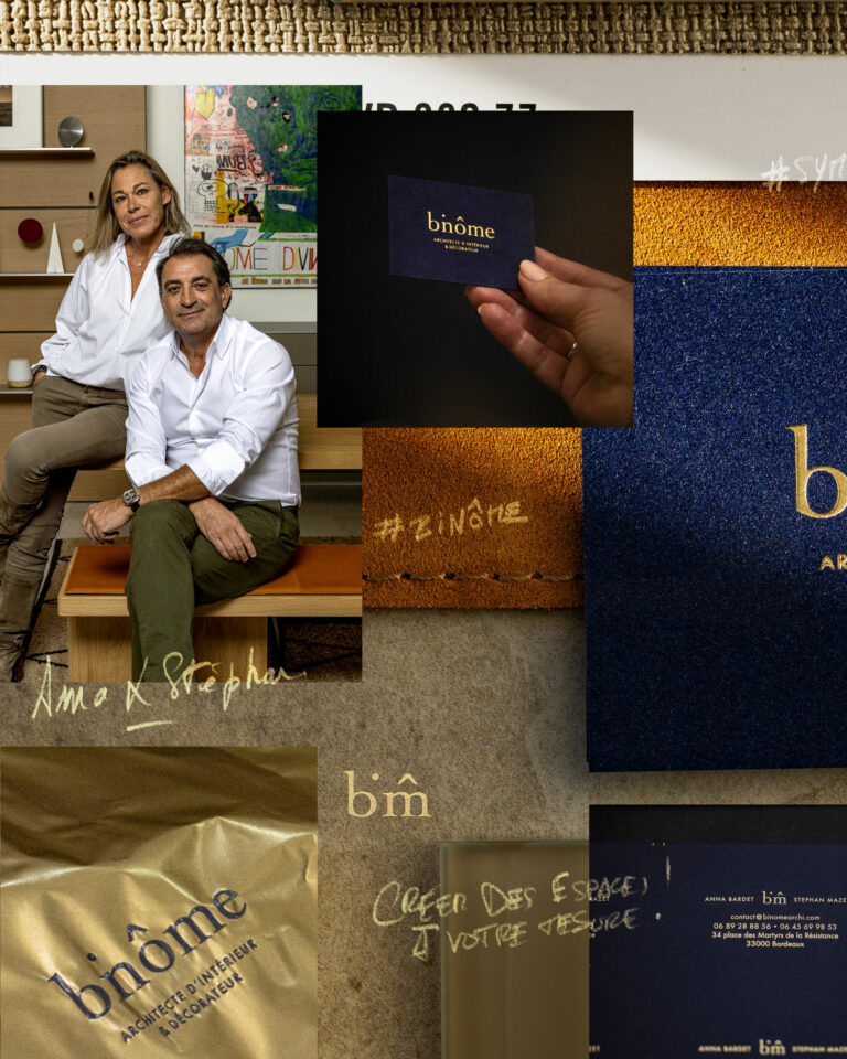
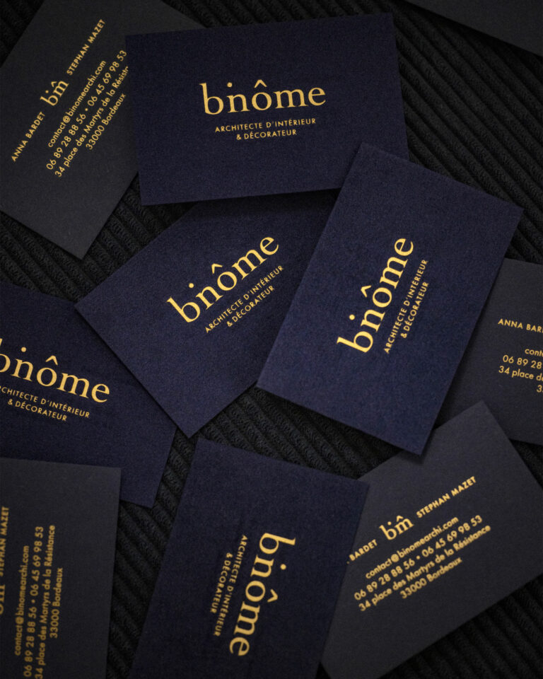
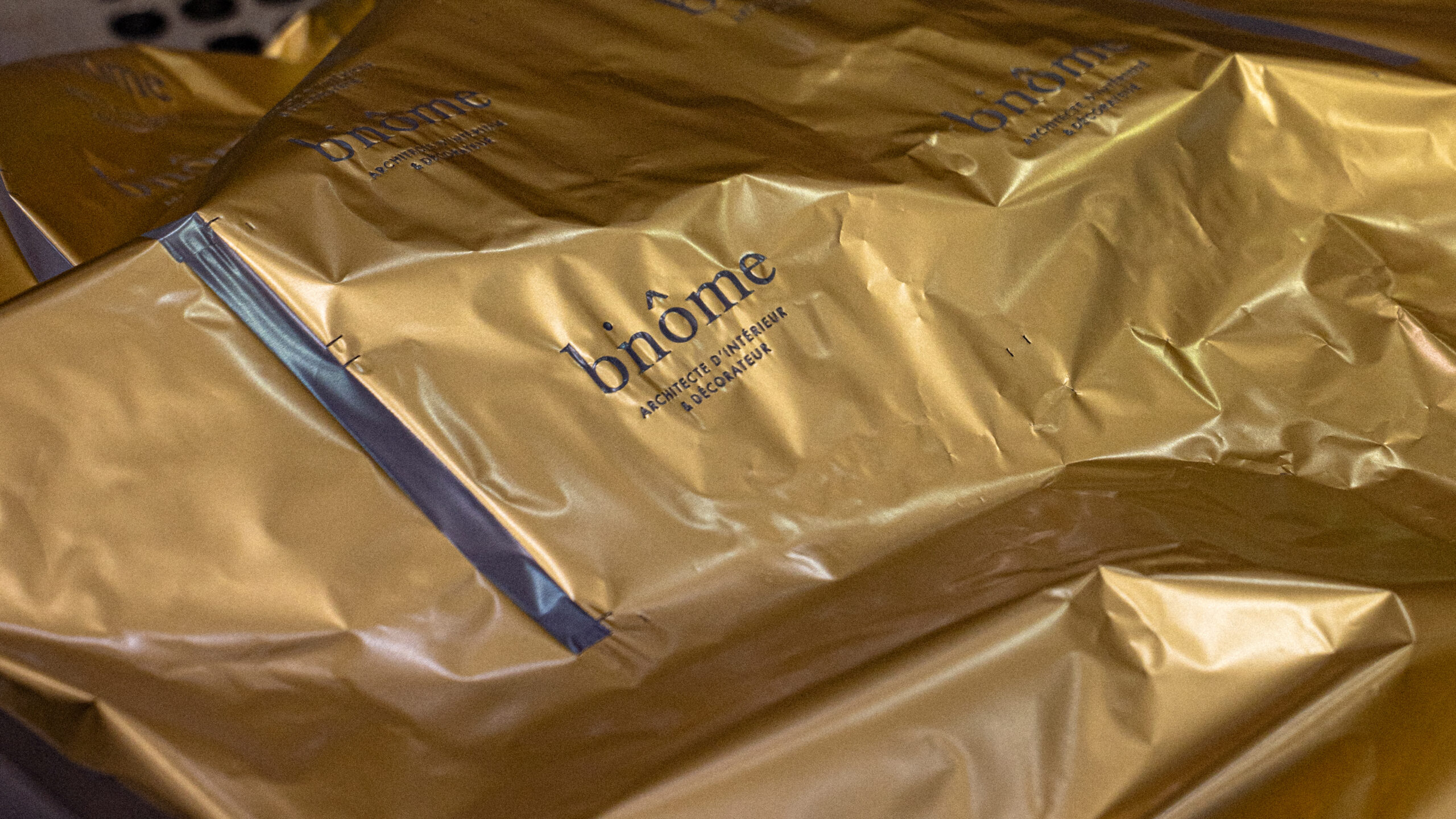
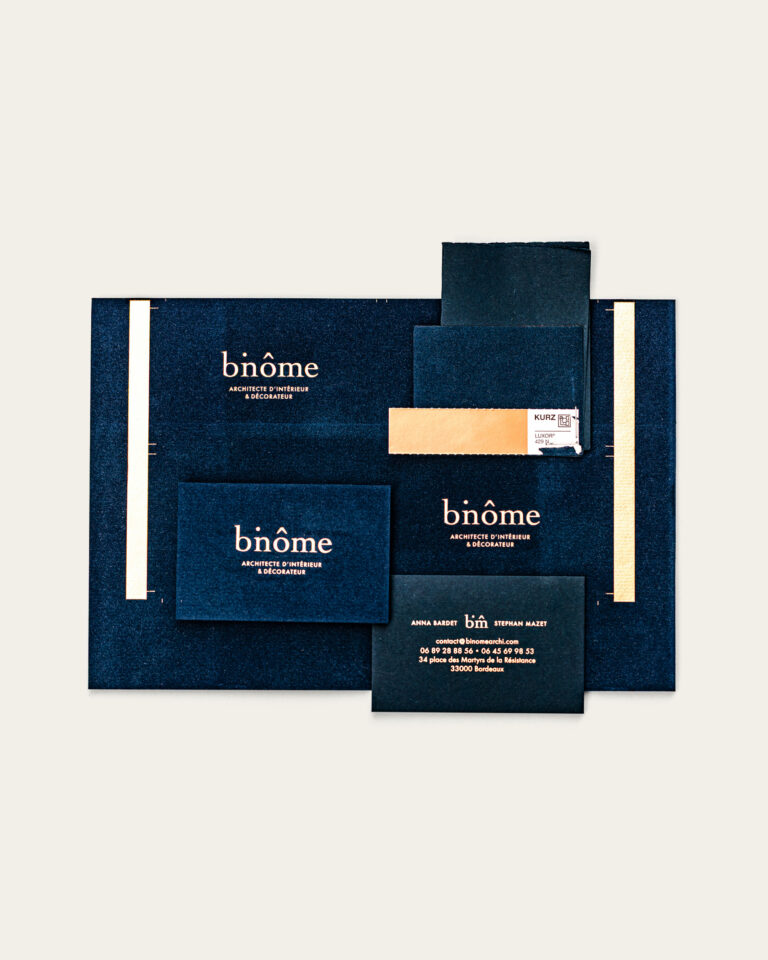
Two talents, a decorator and an architect, who wanted just one medium: the business card. We relied on a graphic trick and an emblematic velvet, to create a strong marker right from the first meeting.

Ambiance Identité: Binôme in Bordeaux · vrai studio
Binôme Communications Binôme Architectural Visual Identity · vrai studio
Binôme Identity Binôme in Bordeaux · vrai studio

Our visual impact is also noticeable: with velvet gilding, we create a surprise and an original card.

Branding Binôme atmosphere, visual identity, architect · vrai studio

Binôme a partnership between an interior architect and an interior designer, driven by a high standard and a complementary vision of spaces. The name was already decided upon from the start; all that remained was to give it a visual identity that lived up to it.

The project entrusted to vrai studio the creation of the logo, monogram, and graphic identity system, as well as their implementation on business cards, letterhead, and email signatures. Particular attention is paid to the business card—its format, paper, finish, and weight. It is often the first item an architect or interior designer hands to a potential client. It must be up to standard. The photographic direction for the project rounds out the assignment, capturing in the images the visual world established by the brand identity.

Art Direction and Photography: Camille Gabarra
Binôme : Visual Identity and Ambience · vrai studio

GRAPHIC TIP

Unexpected but timely liaison

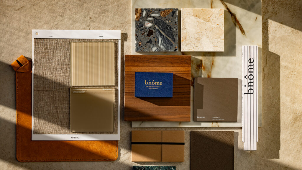
Binôme Color Palette — Visual Identity & Branding · vrai studio

EVENT

Retrieved the day of the B.A.T.

Jewelry Branding in Paris — Visual Identity for a Jewelry House · vrai studio
Luxury jewelry ring, Paris — photography, art direction · vrai studio
  • Project management
  • Creative Direction
  • Art Direction
  • Brand story
  • Brand identity
  • Brand vocabulary
  • Packaging
  • Manufacturing management
  • Photography
  • Web design

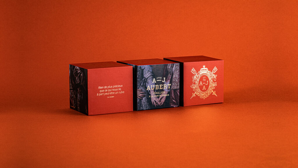
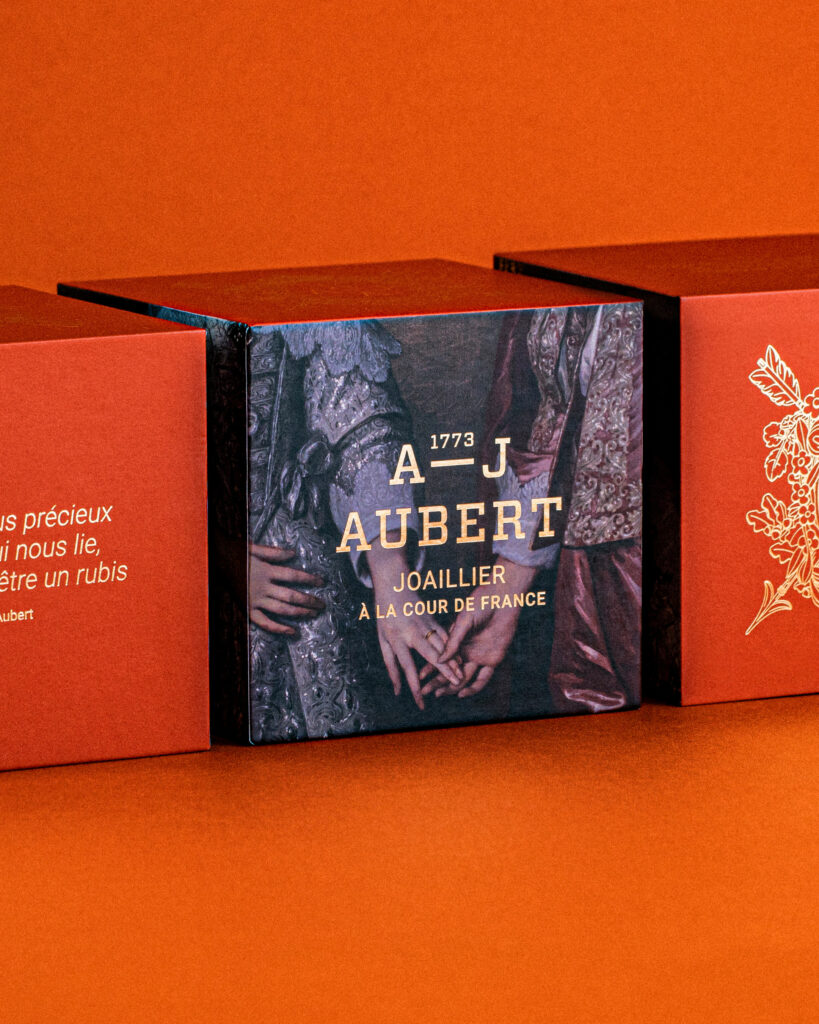
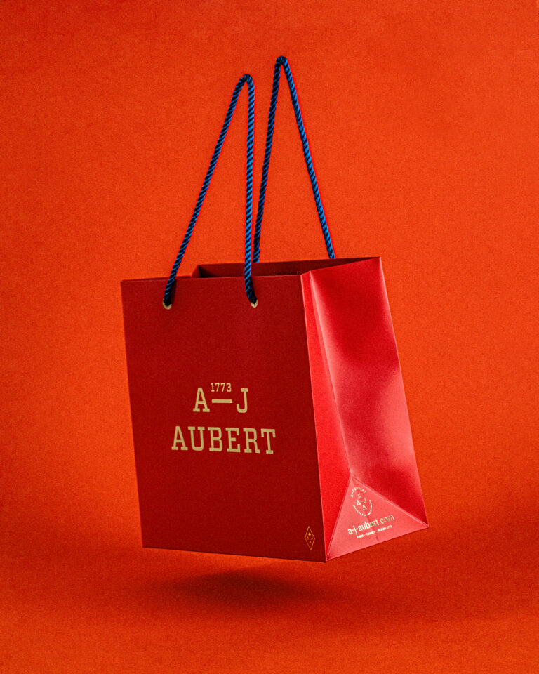
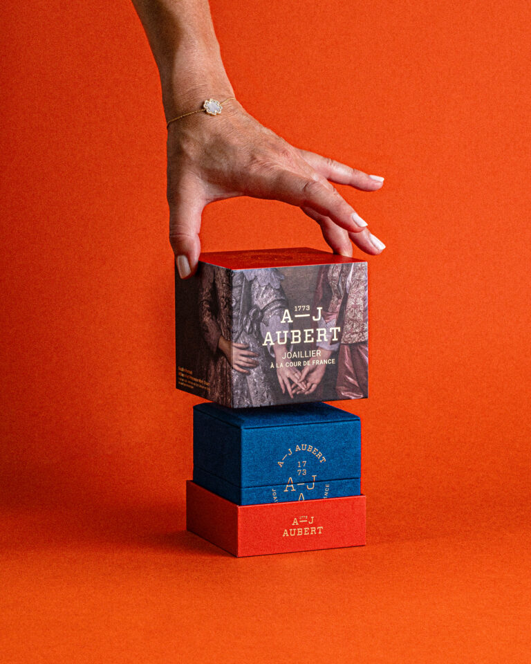
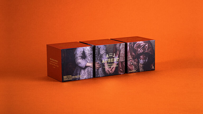
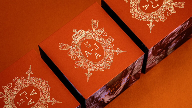
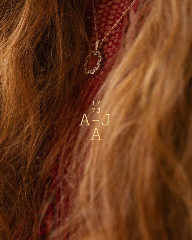
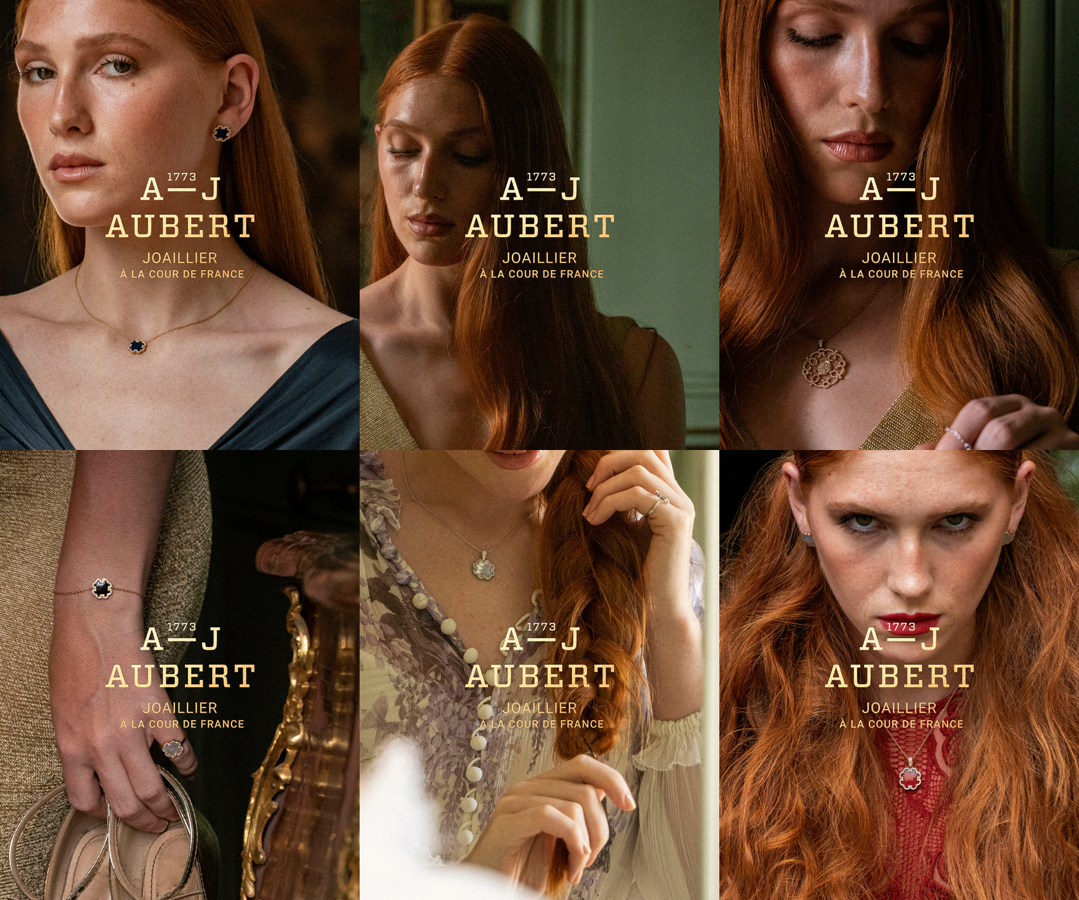
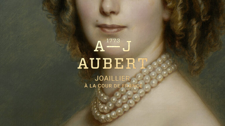
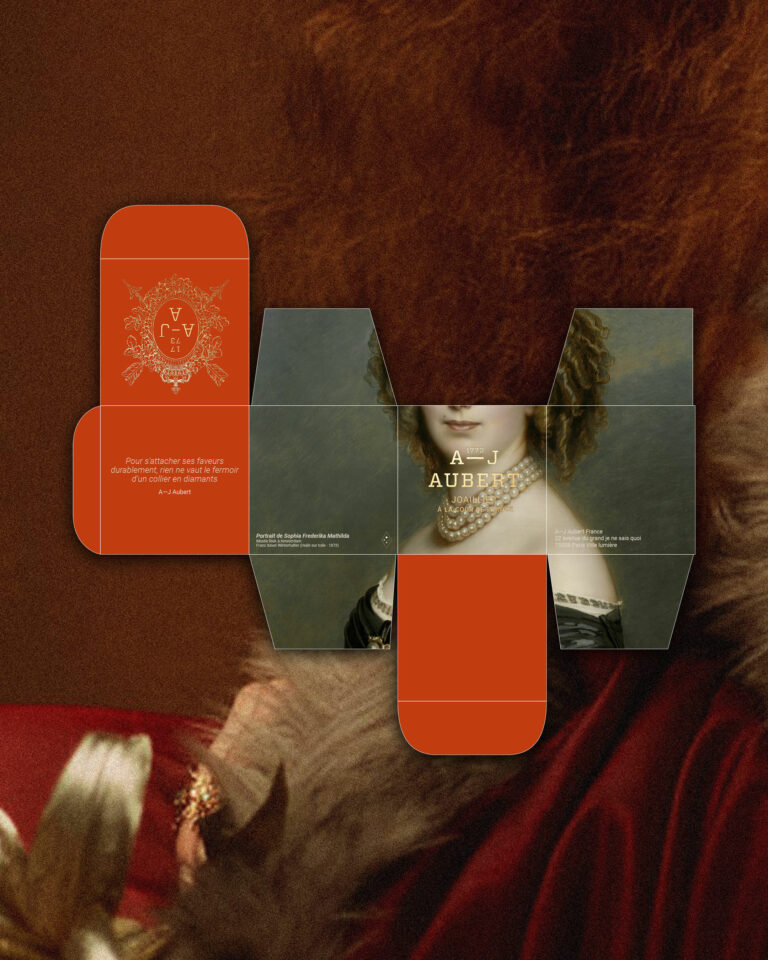
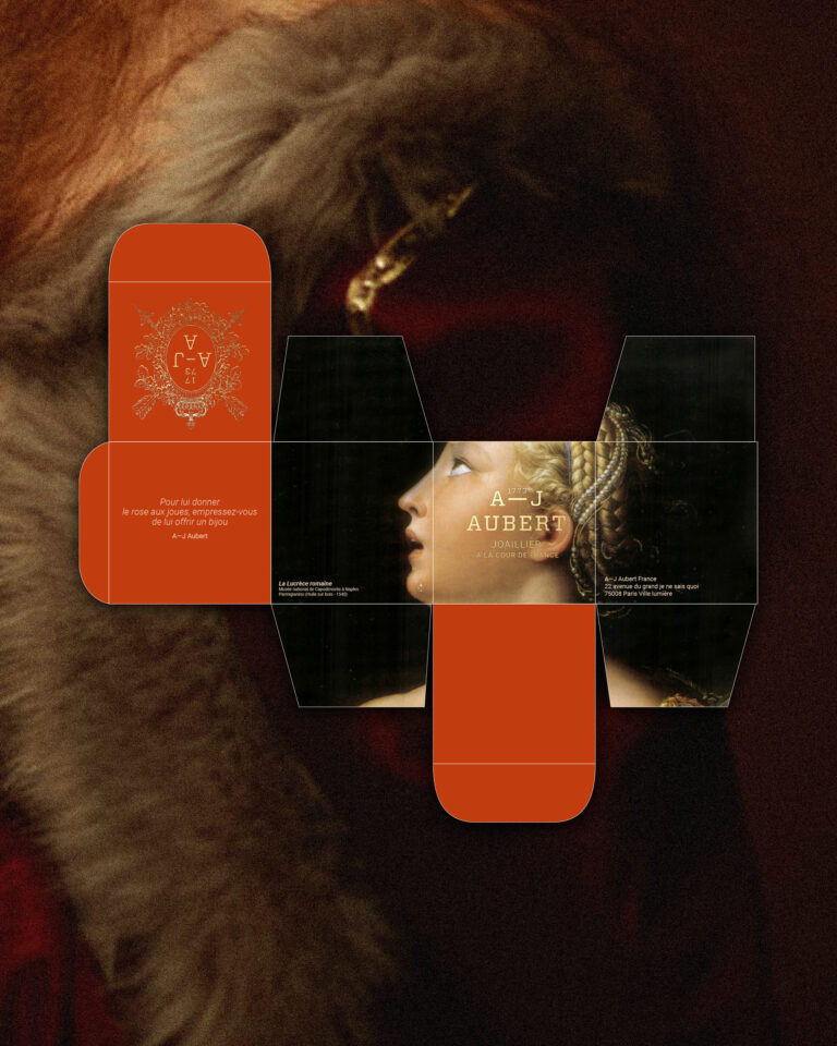
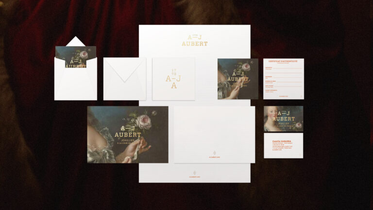
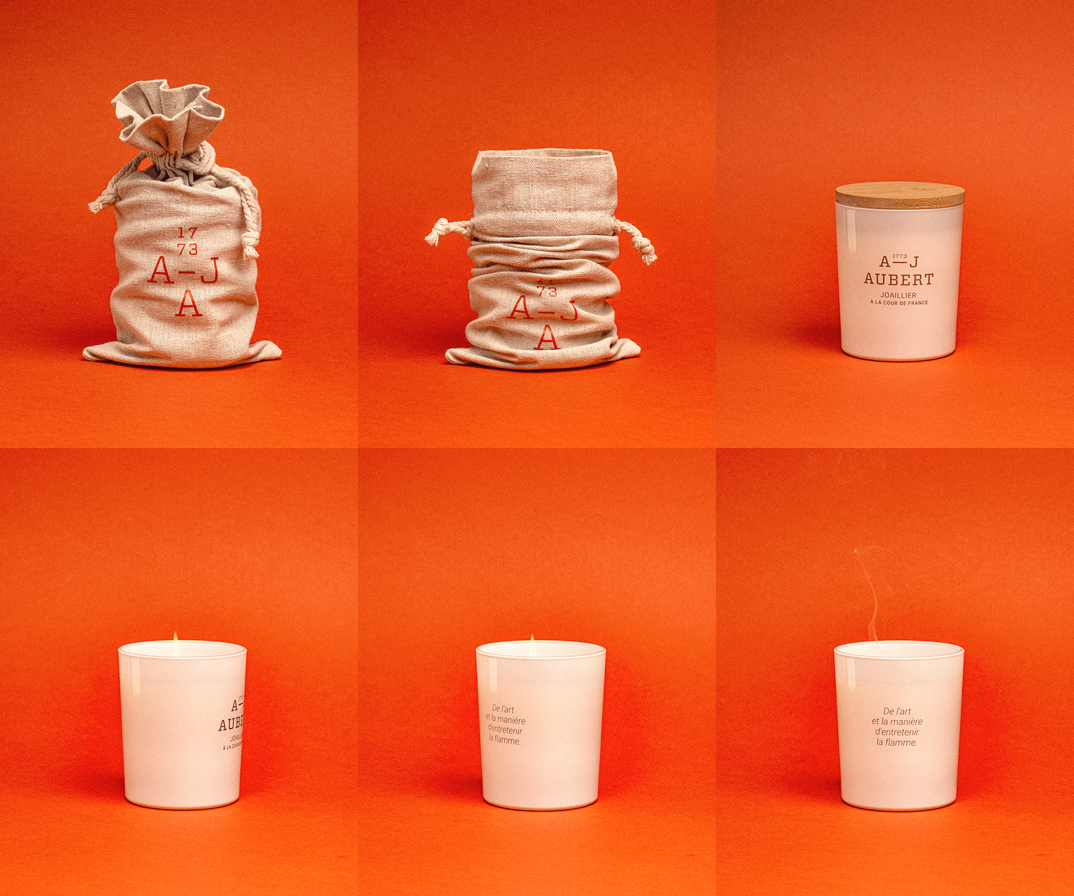
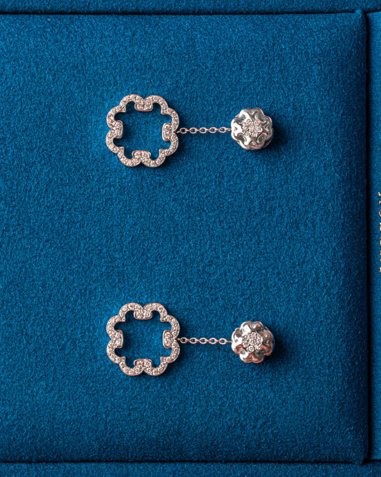
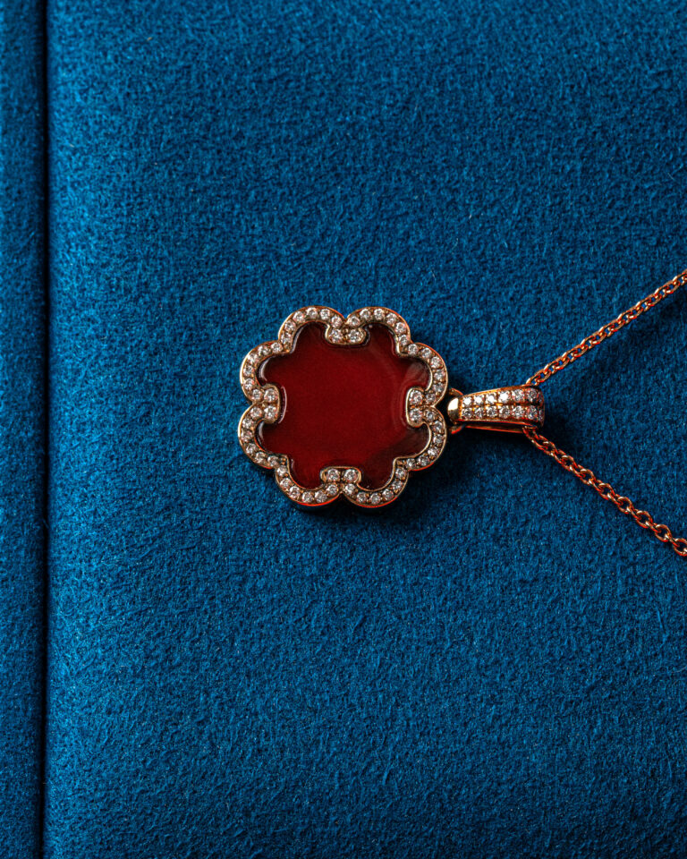
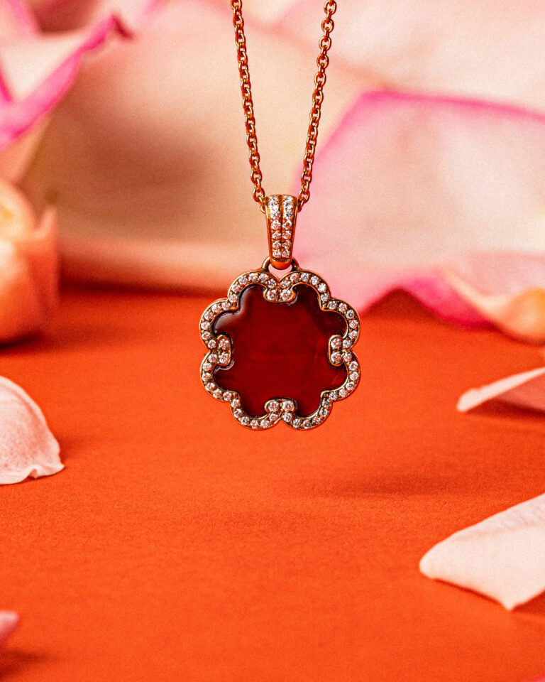
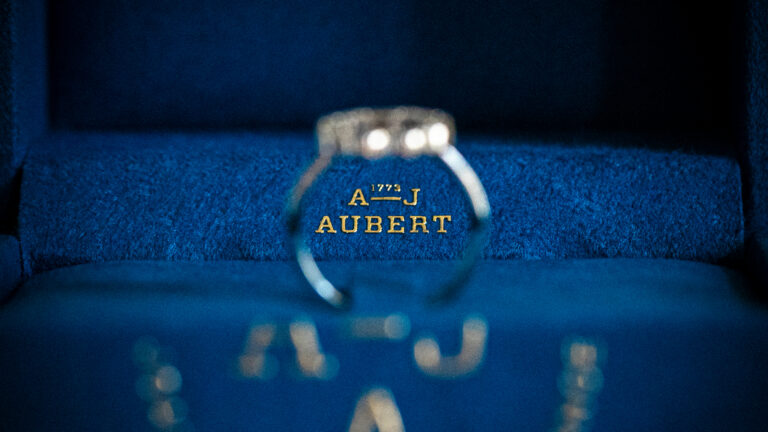
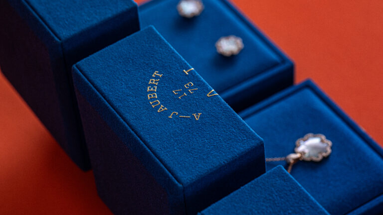
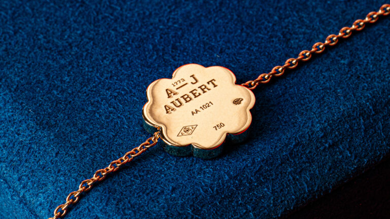
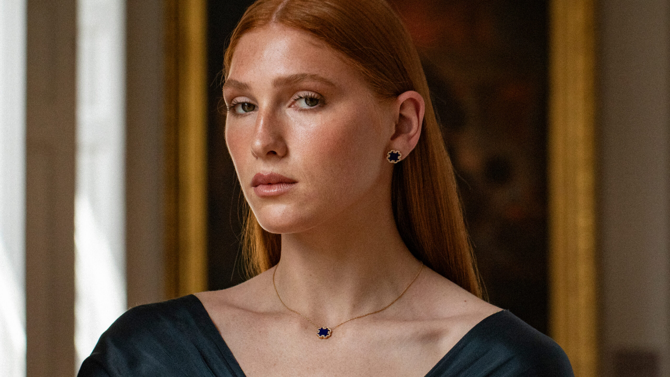
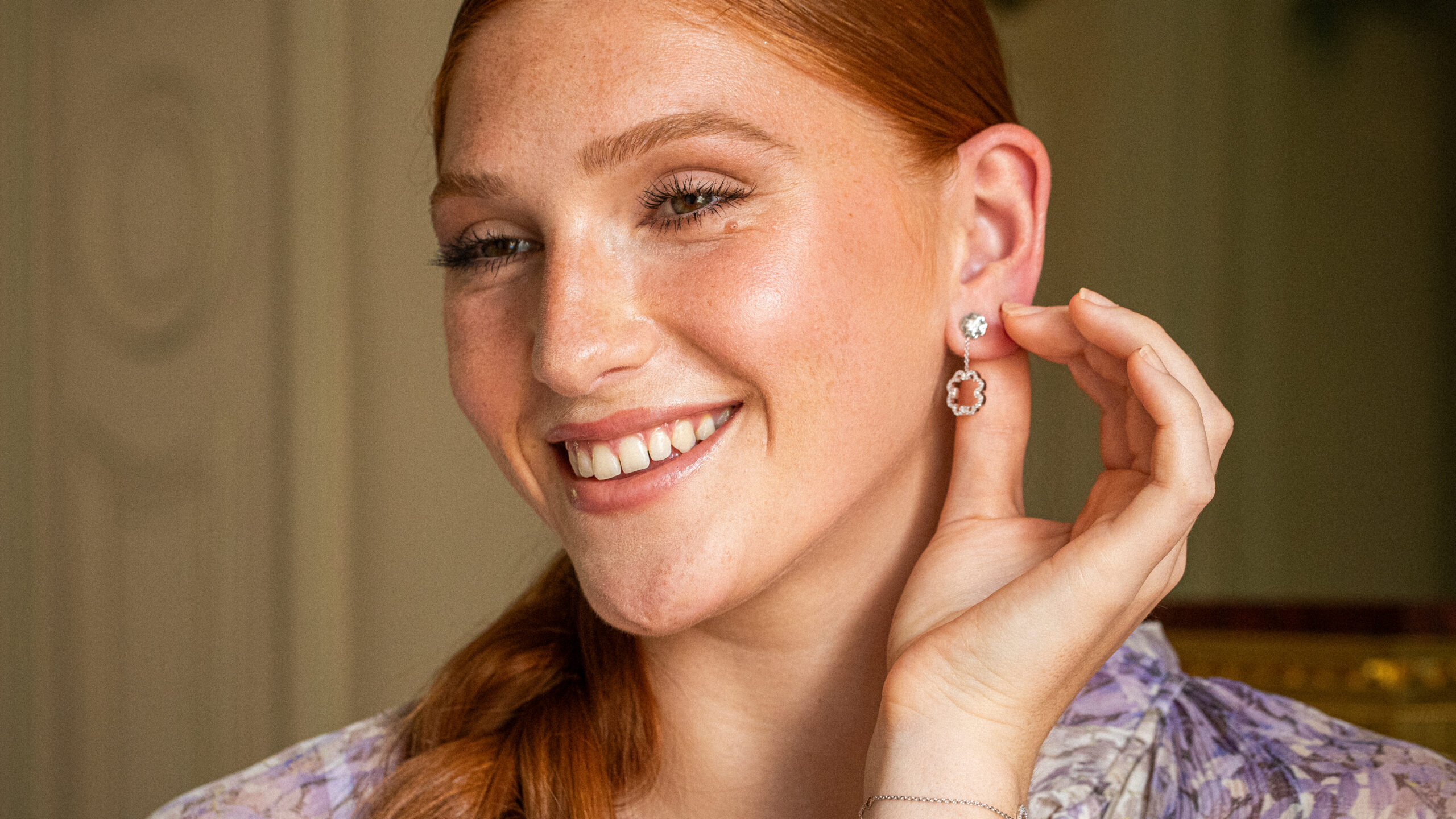
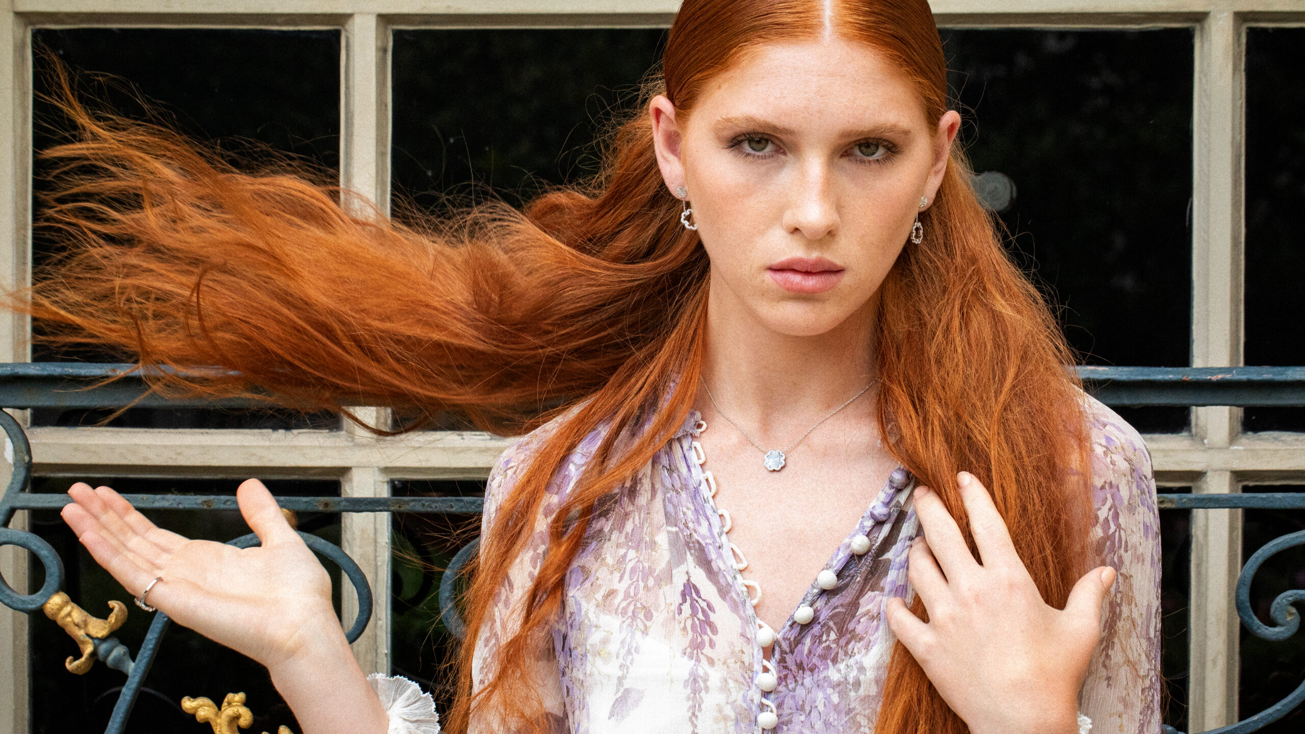
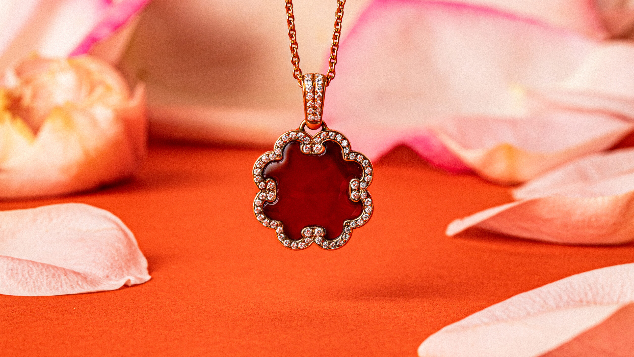
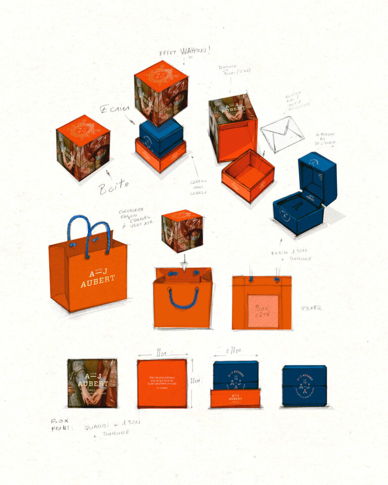
A-J Aubert is a Parisian fine jewelry house. To support its launch, vrai studio designed the entire visual identity: logo, typographic system, stationery, and jewelry packaging—jewelry boxes, pouches, ribbons, and warranty cards.

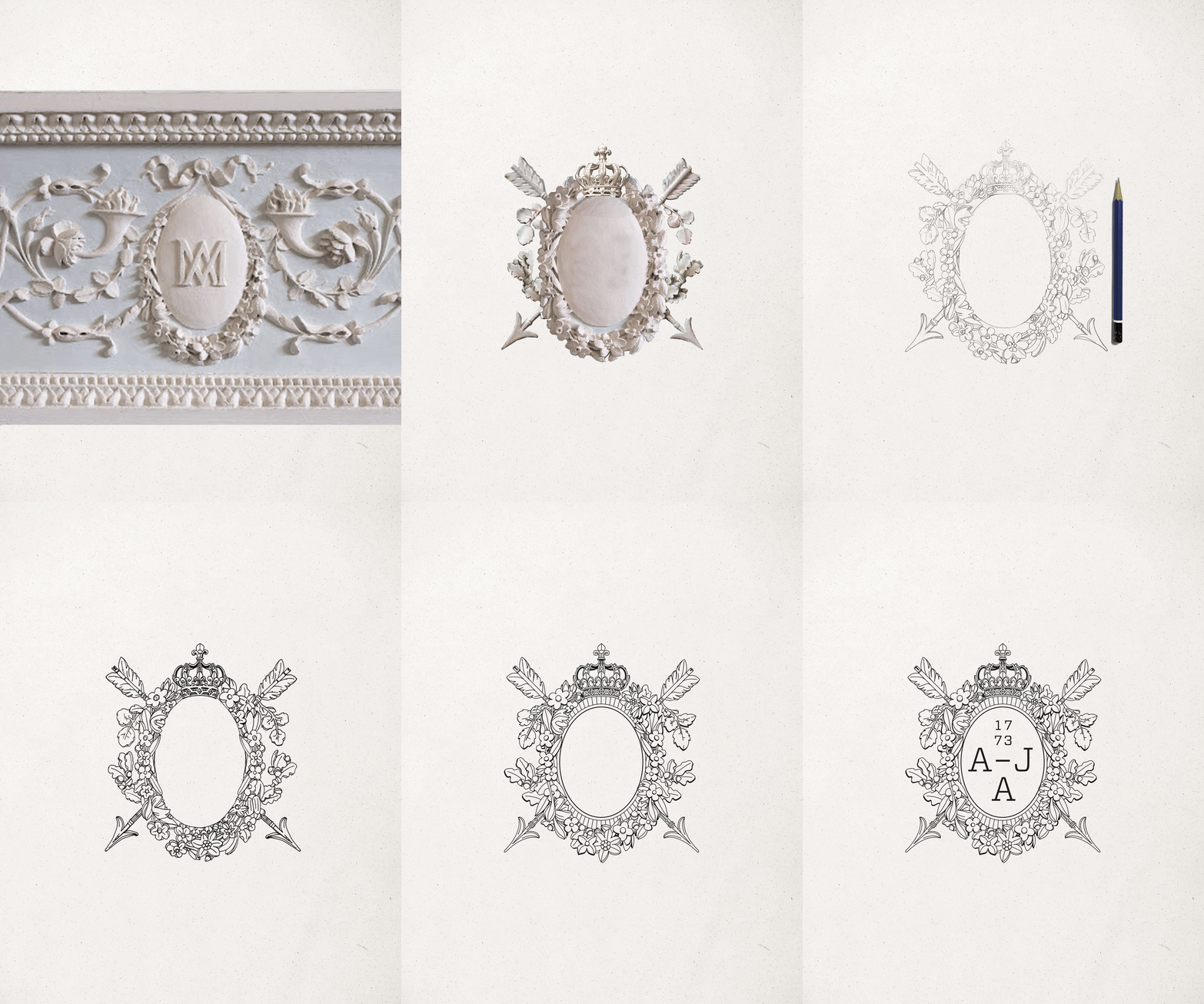
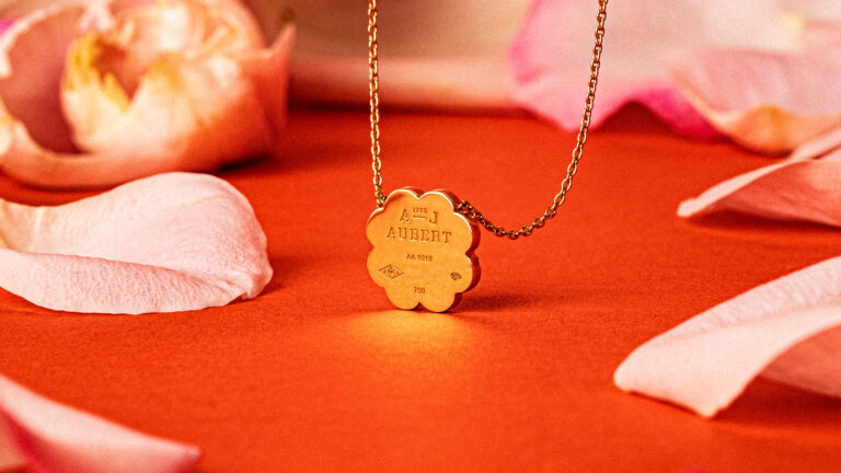
The creative vision: a refined and elegant aesthetic, where every material—hot foil stamping, embossing, textured papers, and slipcases—reflects the jeweler’s commitment to craftsmanship. The custom-designed AJA monogram serves as a signature, a seal, and a repeating motif.

The brand’s visual identity guides its campaigns and communication materials. The comprehensive graphic system allows A-J Aubert to consistently apply its brand identity across all platforms, from storefronts to digital media.

High-end jewelry in Paris — luxury product photography · vrai studio
Paris Jewelry Collection — Photography and Visual Identity · vrai studio

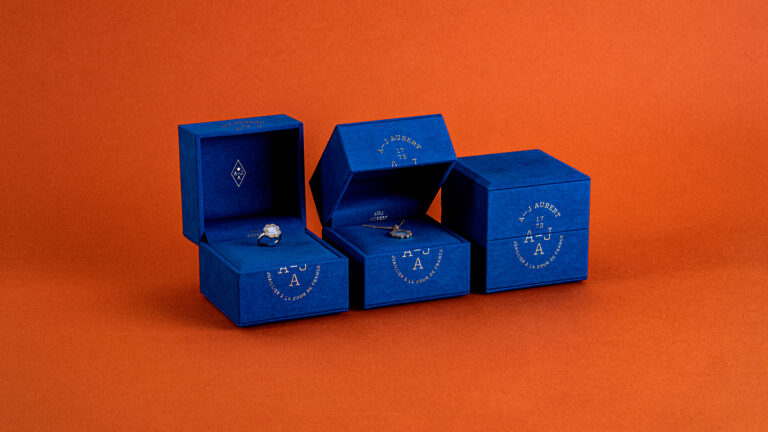
UNBOXING

The brand at every stage

Paris Jewelry — Visual Identity, Art Direction · vrai studio
Paris Jewelry Collection — Luxury Branding Photography · vrai studio
Jewelry Medallion Animation — Visual Identity for a Parisian Jewelry House · vrai studio

VISUAL CREATION

From pencil to reality

High-end jewelry in Paris — packshot photography, visual identity · vrai studio

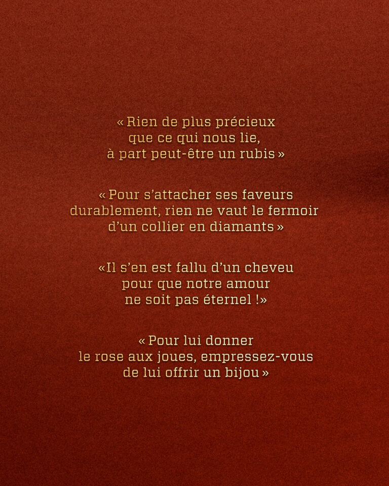
EDITORIAL CREATION

Wit and poetry

© Florence Valencourt / Original Soundtrack

Paris Jewelry Brand Identity — Branding for a Luxury Jewelry House · vrai studio
Paris Jewelry Collection — Photography by the Jewelry House · vrai studio
Animated jewelry logo in Paris — visual identity design for a jewelry house · vrai studio
Paris Jewelry Storefront — Luxury Branding and Visual Identity · vrai studio
Jewelry Packaging in Paris — Luxury Packaging Design, Visual Identity · vrai studio

ALTERNATIVE NECKLACE PACK

Iconic brand phrases by Florence Valencourt / Original soundtrack

Alternative Jewelry Packaging in Paris — Luxury Visual Identity · vrai studio

PACK ALTERNATIF BIJOUX DE CHEVEUX

Iconic brand phrases by Florence Valencourt / Original soundtrack

Paris Jewelry — luxury packshot photography and branding · vrai studio
Luxury Jewelry in Paris — Artistic Direction Photography · vrai studio
Jewelry Brand Identity Design in Paris — Jewelry Brand Branding · vrai studio

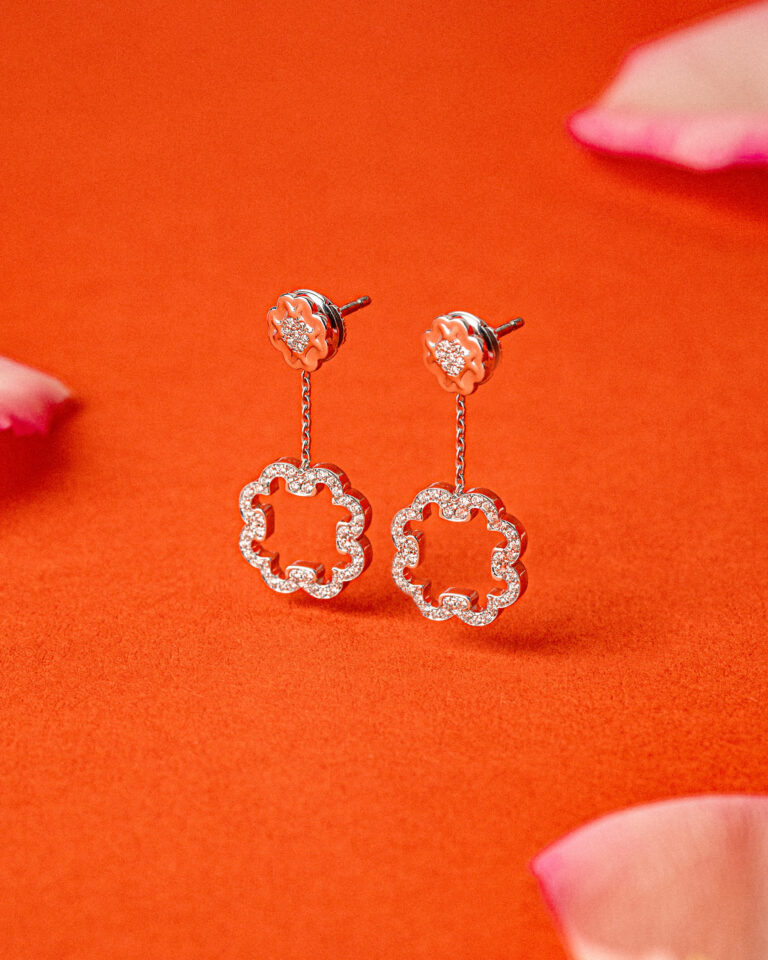
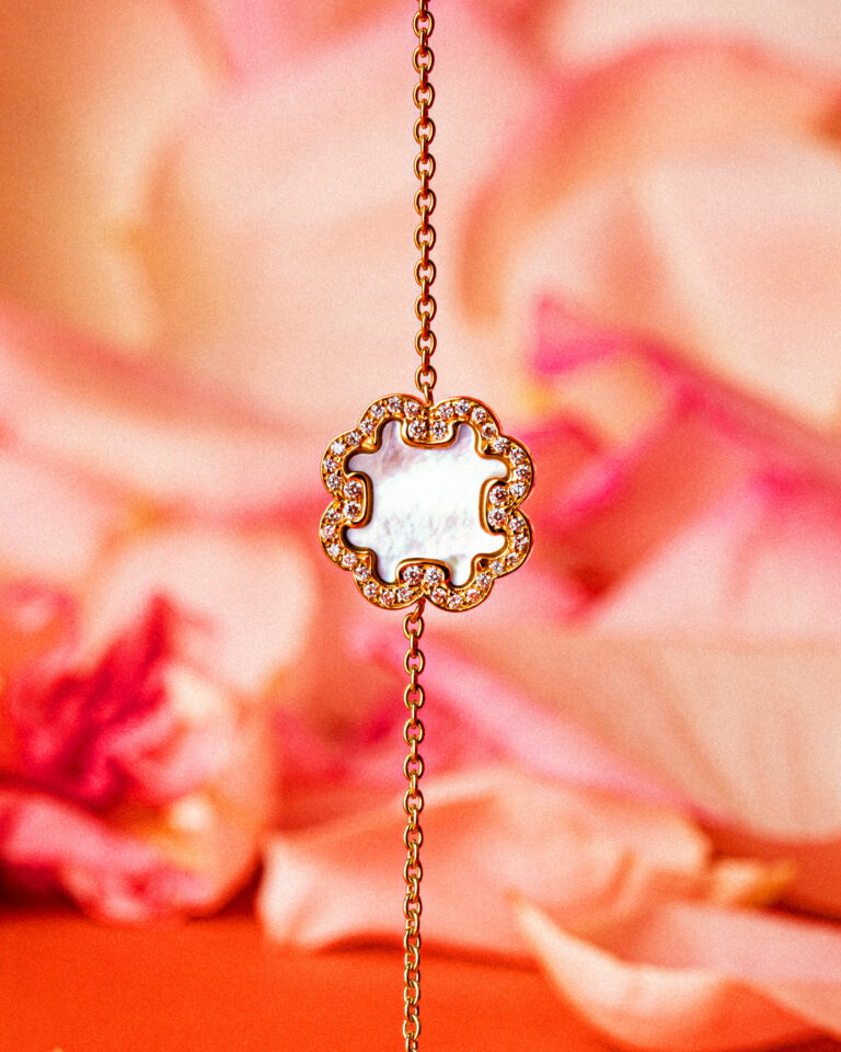
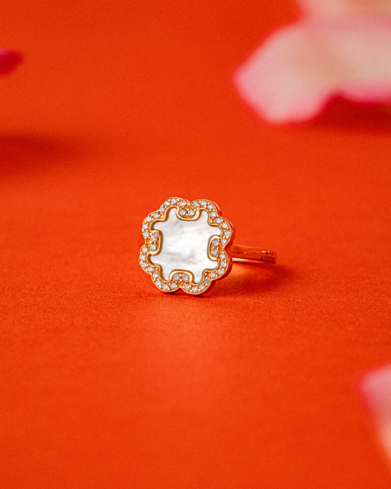
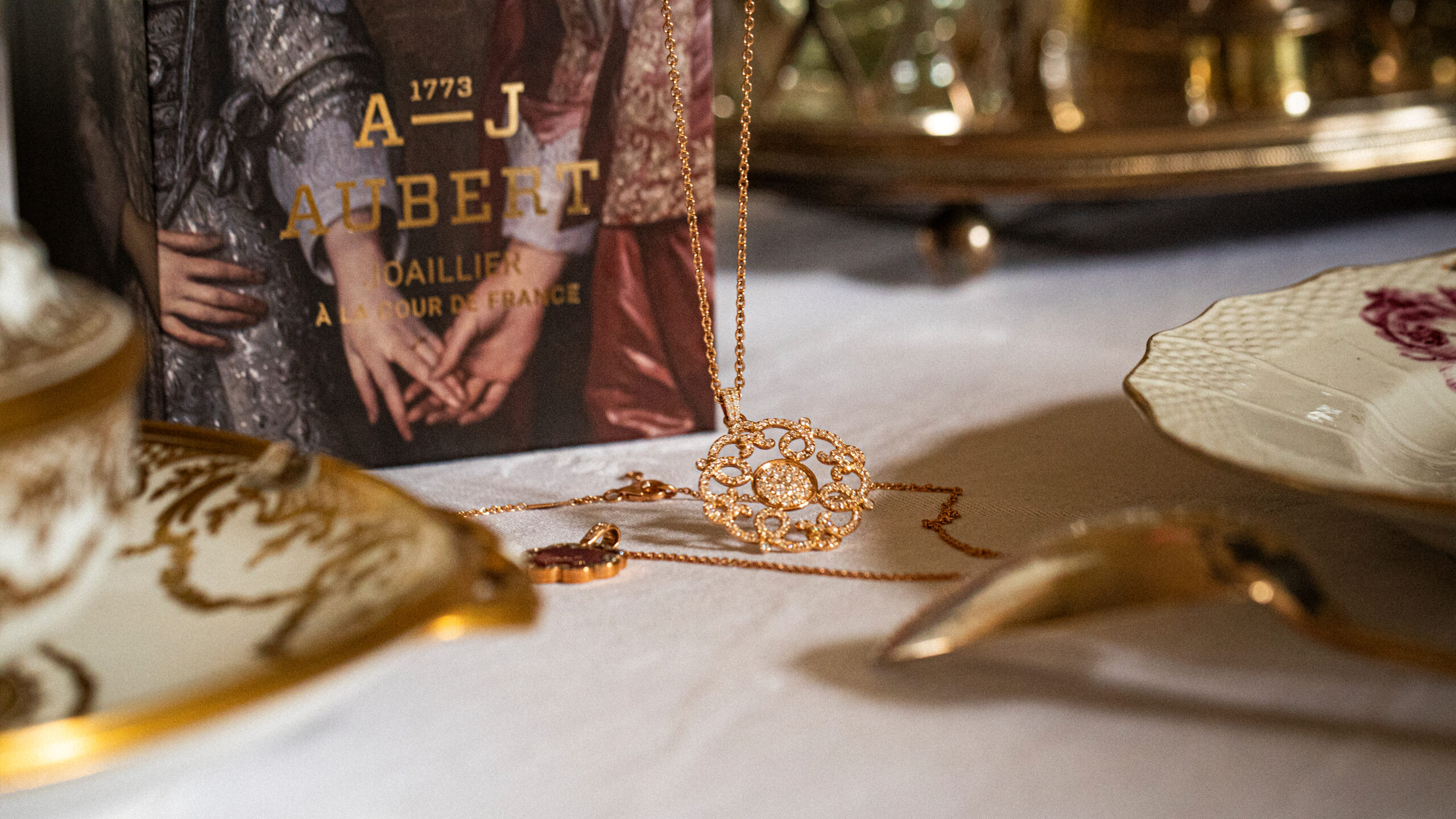
Creation of visuals for the brand's communication. Jewelry and roses, Marie-Antoinette's favorite flowers

Paris Jewelry Collection — Photography, Visual Identity, Branding · vrai studio
Paris Jewelry — luxury visual identity photography · vrai studio
Paris Jewelry — Luxury Visual Identity Photography · vrai studio
Luxury jewelry ring, Paris — photography by a jewelry house · vrai studio
High-End Jewelry in Paris — Luxury Branding Photography · vrai studio
Jewelry Branding in Paris — Visual Identity, Art Direction · vrai studio

THE BRAND

Present at every stage of unboxing

Luxury Jewelry Collection, Paris — Branding Photography for a Jewelry House · vrai studio
Paris Jewelry Collection — Luxury Branding Photography · vrai studio
Paris Jewelry Collection — Photography, Visual Identity, Branding · vrai studio
Paris High Jewelry Collection — Luxury Branding Photography · vrai studio
Luxury Jewelry in Paris — Branding Photography · vrai studio

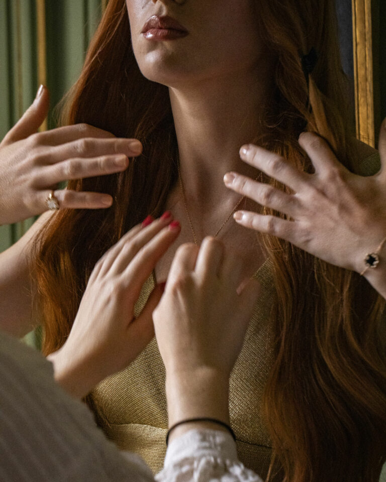
To capture the soul of 1773, the shoot took place at the Musée Lambinet, a discreet showcase for the forgotten Versailles. Michaela Frino lent her mischievous hand to accompany the brand. Video : Mathieu Palacin

Paris Jewelry Storefront — Visual Identity & Branding · vrai studio
Jewelry Branding in Paris — Visual Identity for Luxury Brands · vrai studio
Luxury Jewelry in Paris — Branding and Visual Identity · vrai studio
Paris Jewelry Brand — Visual Identity, Branding, Art Direction · vrai studio
Jewelry Branding in Paris — Visual Identity and Brand Creation · vrai studio
Paris Jewelry — Luxury Visual Identity Photography · vrai studio

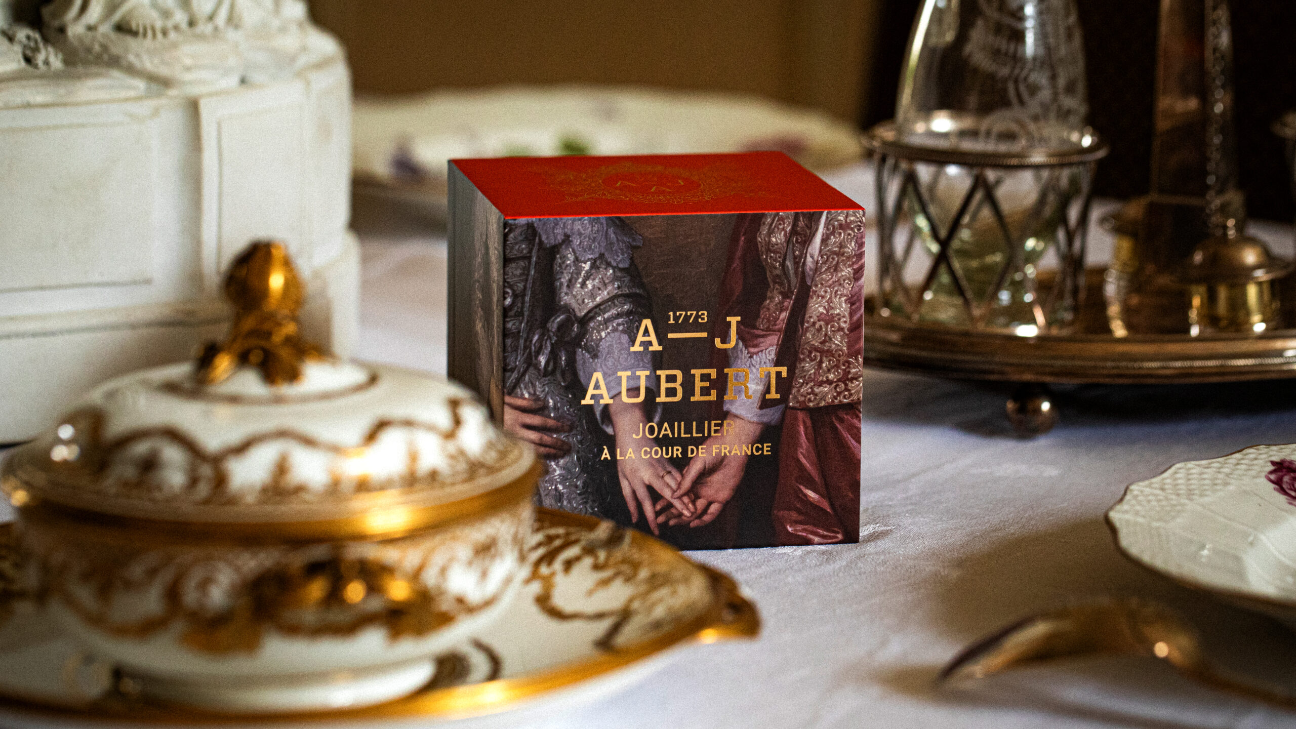
The license acquired by the client belongs to a jewelry brand associated with the French royal court of the 18th century, which had been dormant for decades. Reviving this Parisian jewelry brand required restoring its historical identity without weighing it down, and creating a contemporary visual identity without compromising its uniqueness.

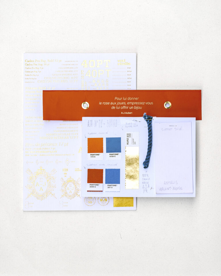
The project entrusted to vrai studio naming, the creation of the logo, monogram, and graphic patterns, as well as all brand materials, including gift boxes, outer boxes, bags, certificates of authenticity, stationery, and correspondence. The combination of serif and sans-serif typefaces ensures readability and absolute uniqueness. The color palette, built around a reddish-brown hue reminiscent of the ermine worn at court and a deep blue, anchors the brand in its history.vrai studio alsovrai studio the photographic production of the jewelry and supports the implementation of the brand identity on the boutique’s website.

Art Direction and Photography: Camille Gabarra
Luxury Jewelry Set, Paris — Artistic Direction Photography · vrai studio

NUANCIER

A-J Aubert brand materials and colors

Paris Jewelry — Luxury Art Direction Photography · vrai studio

STUDY

Every project has its sketches

Champagne Ambiance by M. Marcoult — Art Direction and Visual Identity Rebranding · vrai studio
Vue — Visual Identity by vrai studio
  • Project management
  • Creative Direction
  • Art Direction
  • Brand story
  • Brand identity
  • Packaging
  • Manufacturing management
  • Photography
  • Web design

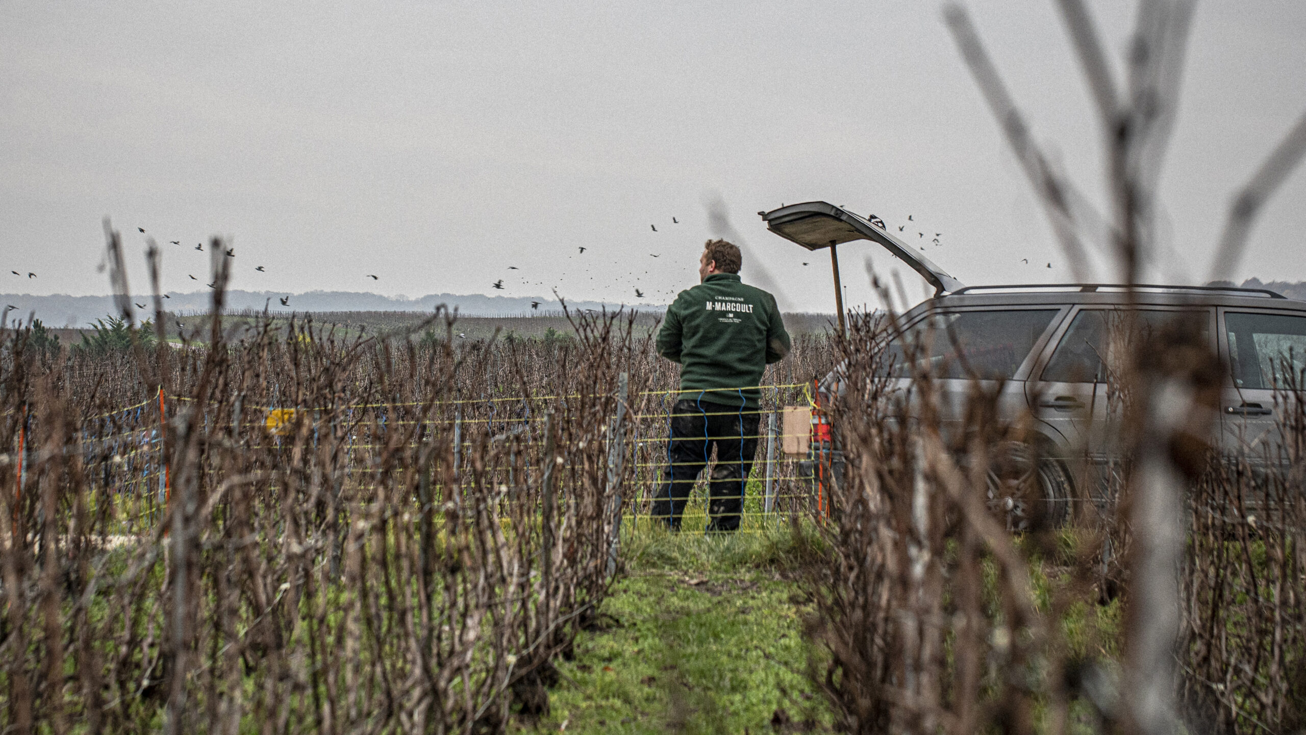
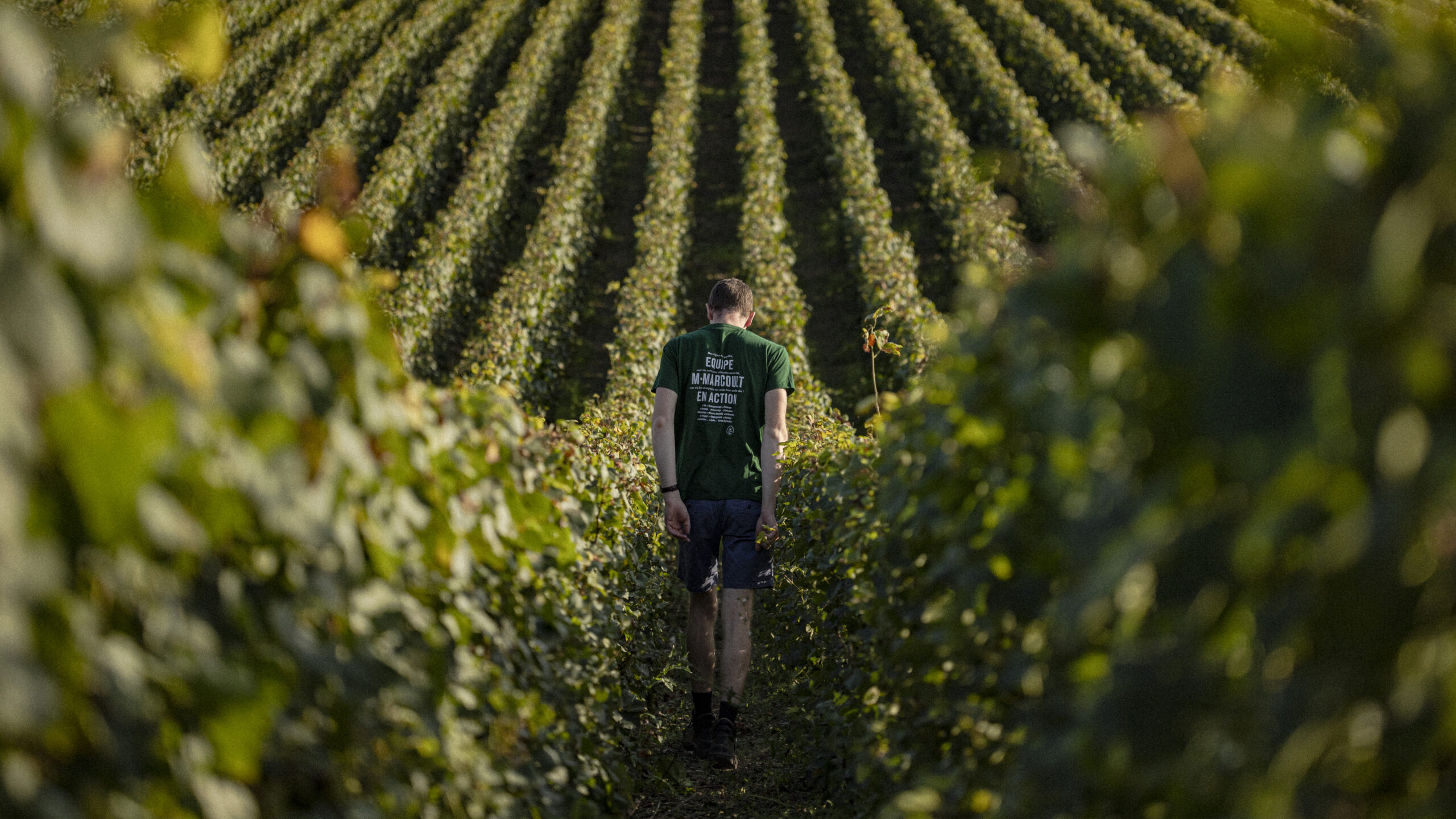
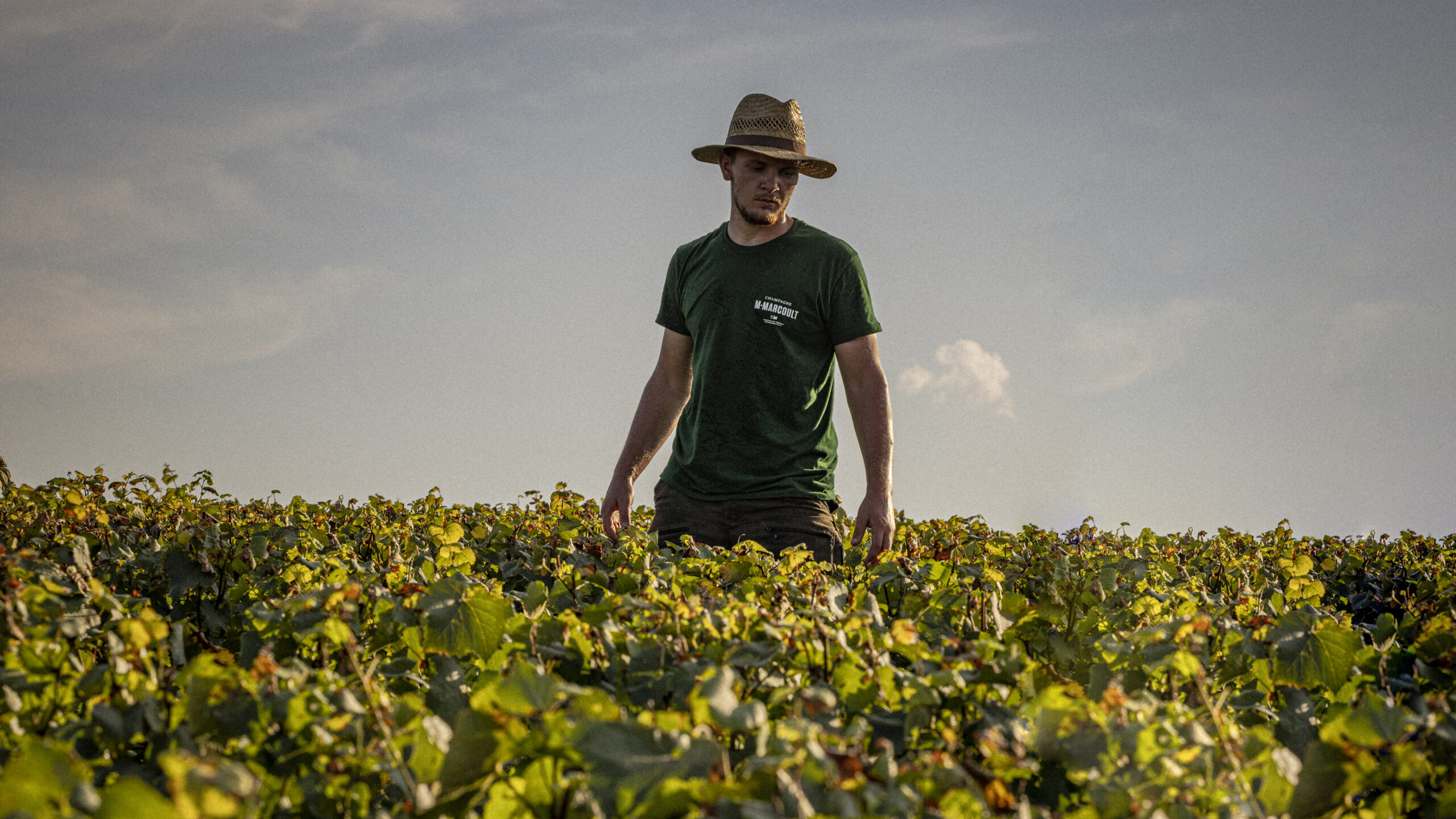
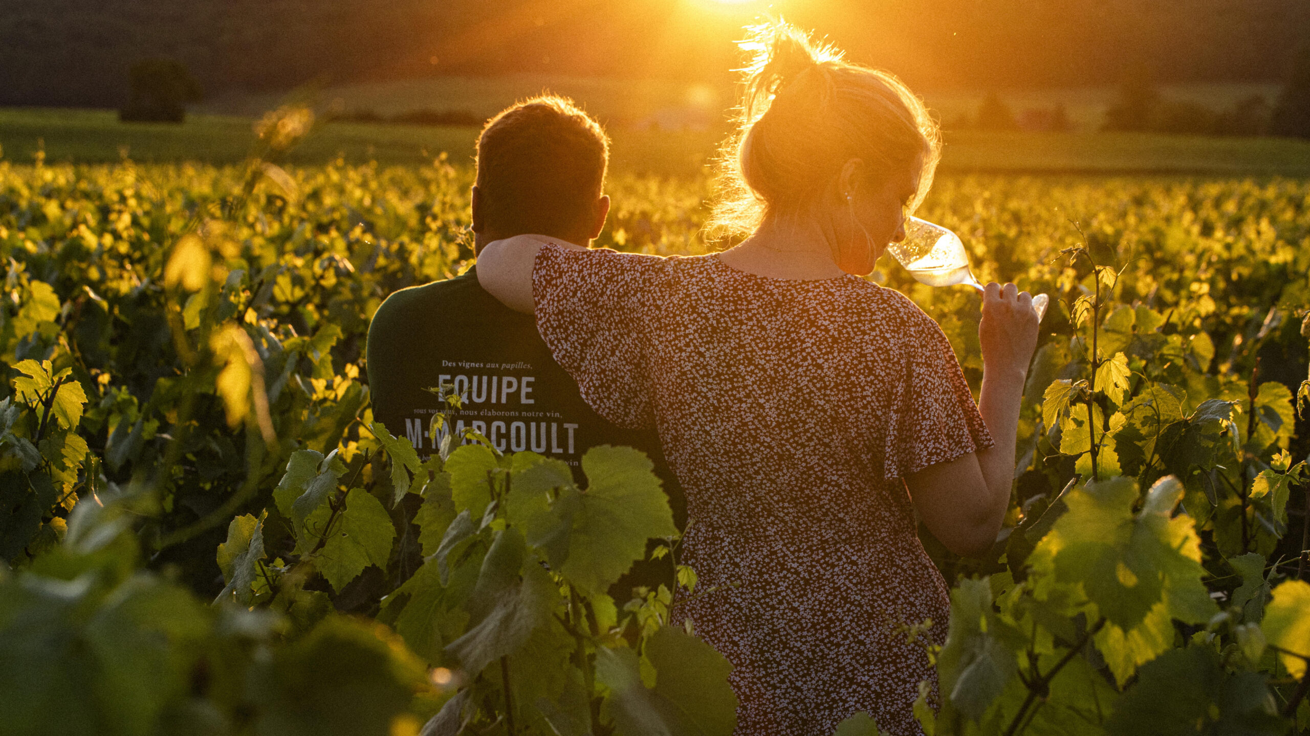
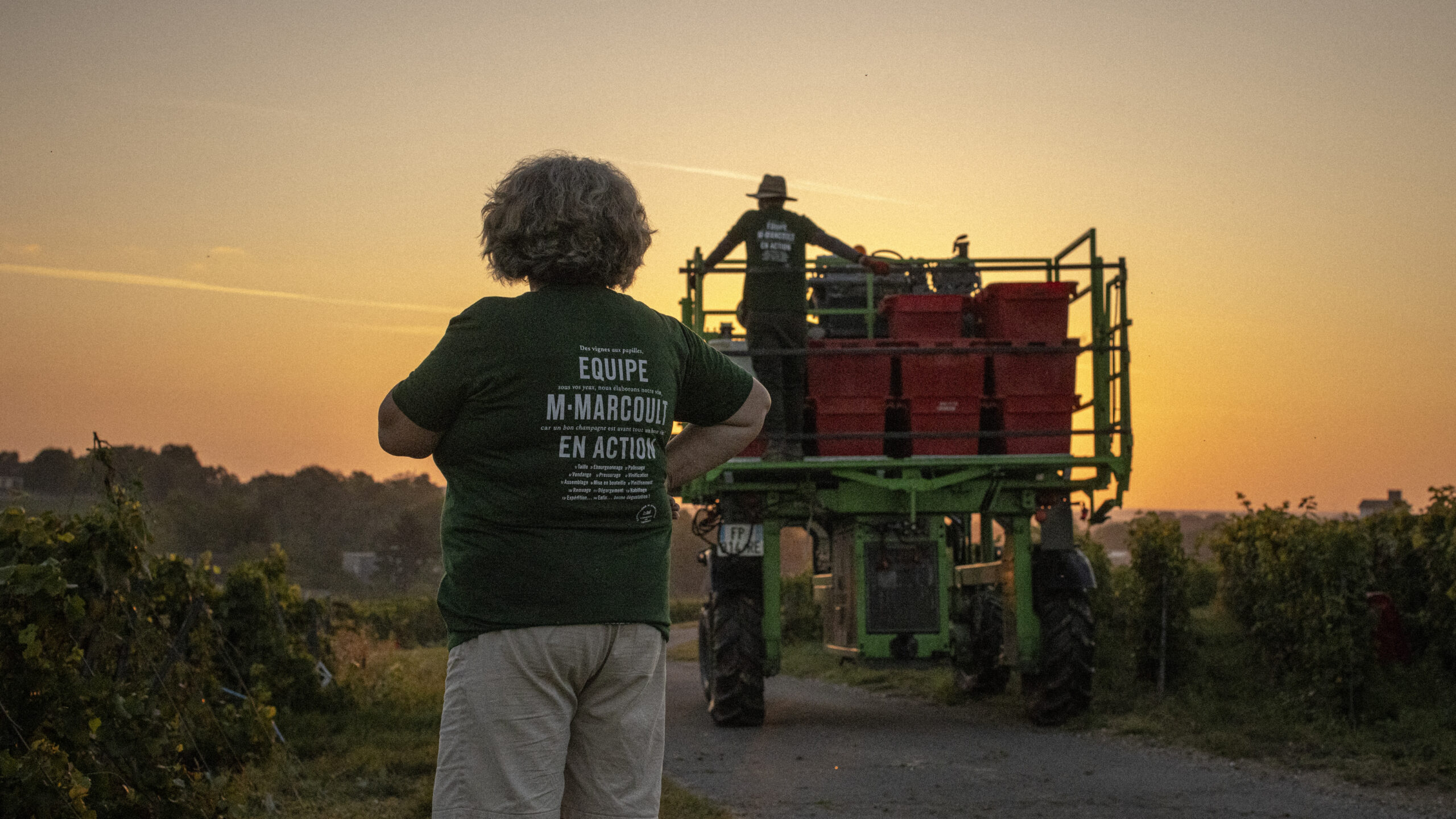
Florence and Julien Marcoult are independent winemakers deeply rooted in both their land and their values. From their estate on chalky soil in the Marne region, they produce a champagne that reflects their character: precise, unique, and uncompromising. Driven by a desire to fully express themselves, they share their name, their story, and their vision with us. Since 2021, united by a passion for authenticity, we have been supporting them in developing their brand identity, packaging, and photographic direction.

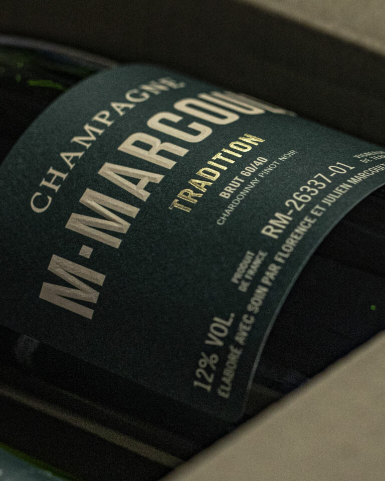
M. Marcoult Champagne Label — Typography and Visual Identity Branding · vrai studio
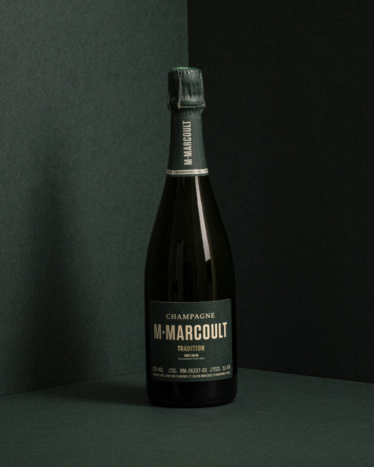
M. Marcoult Champagne Bottle — Packshot of packaging on a dark background · vrai studio
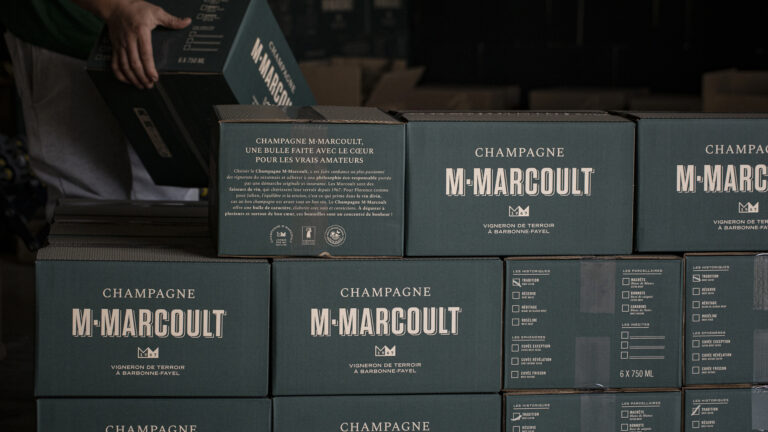
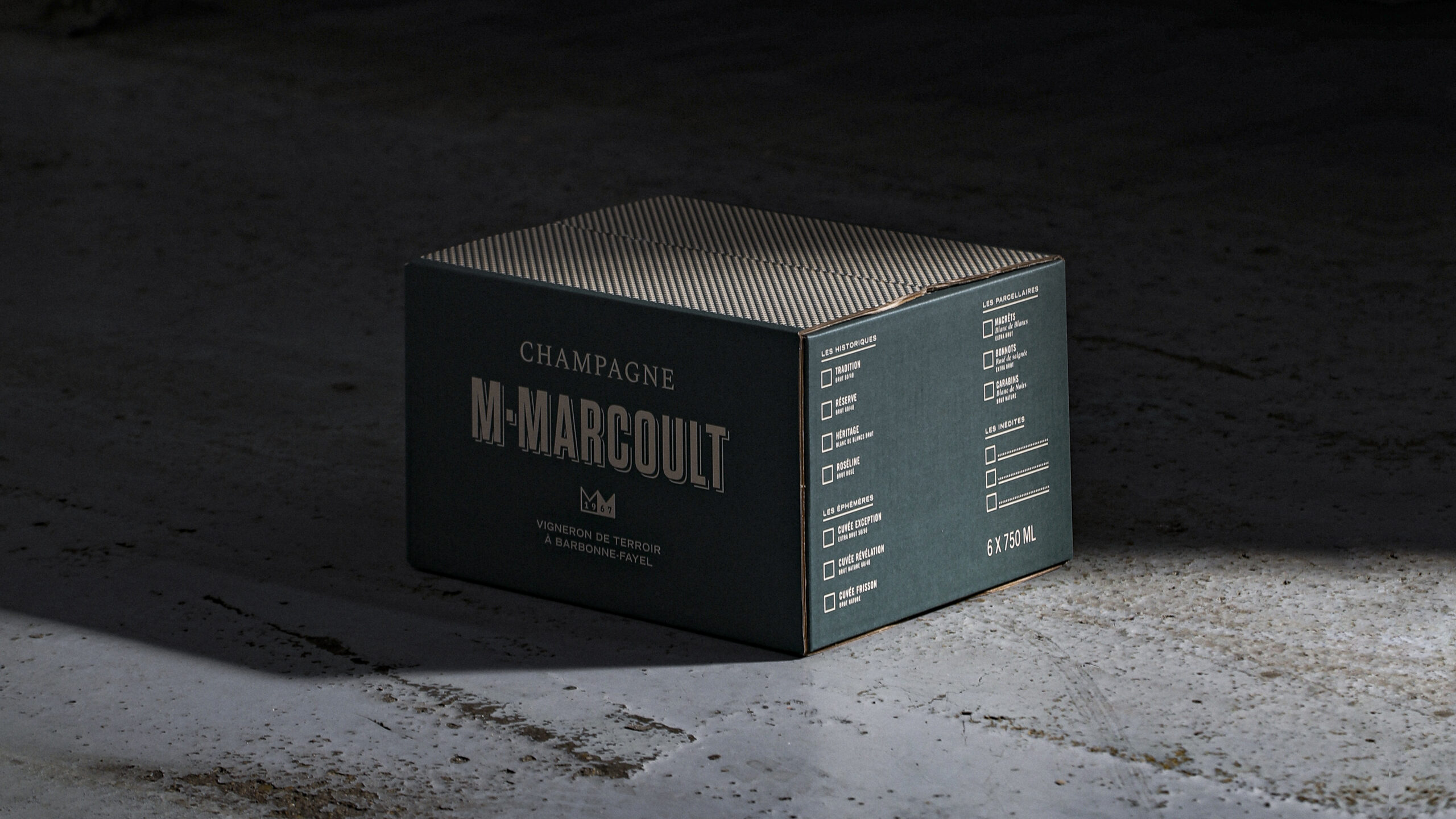
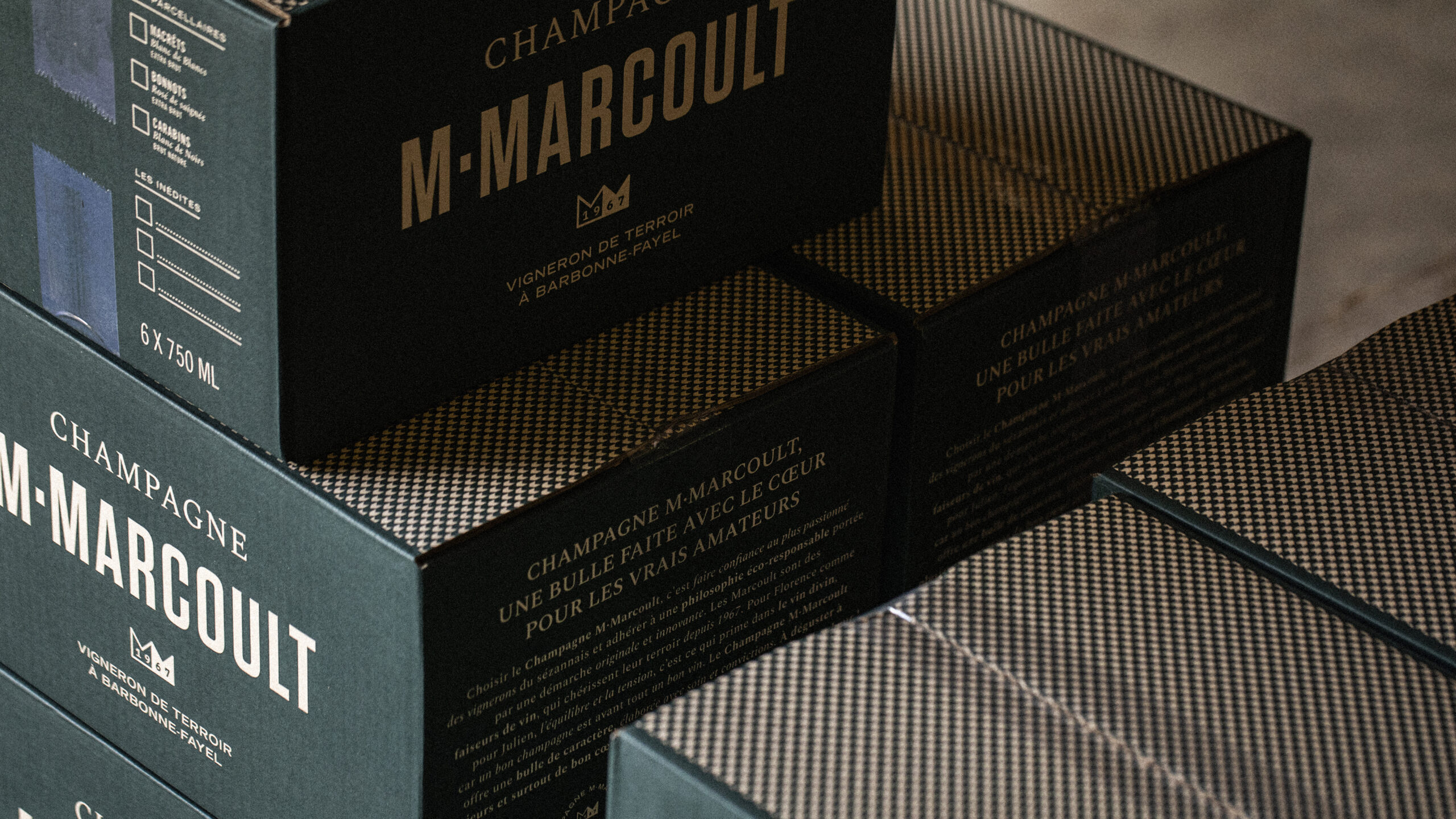
Stacked M. Marcoult champagne cases — packaging and brand identity · vrai studio
Close-up of M. Marcoult champagne cork — packaging close-up · vrai studio
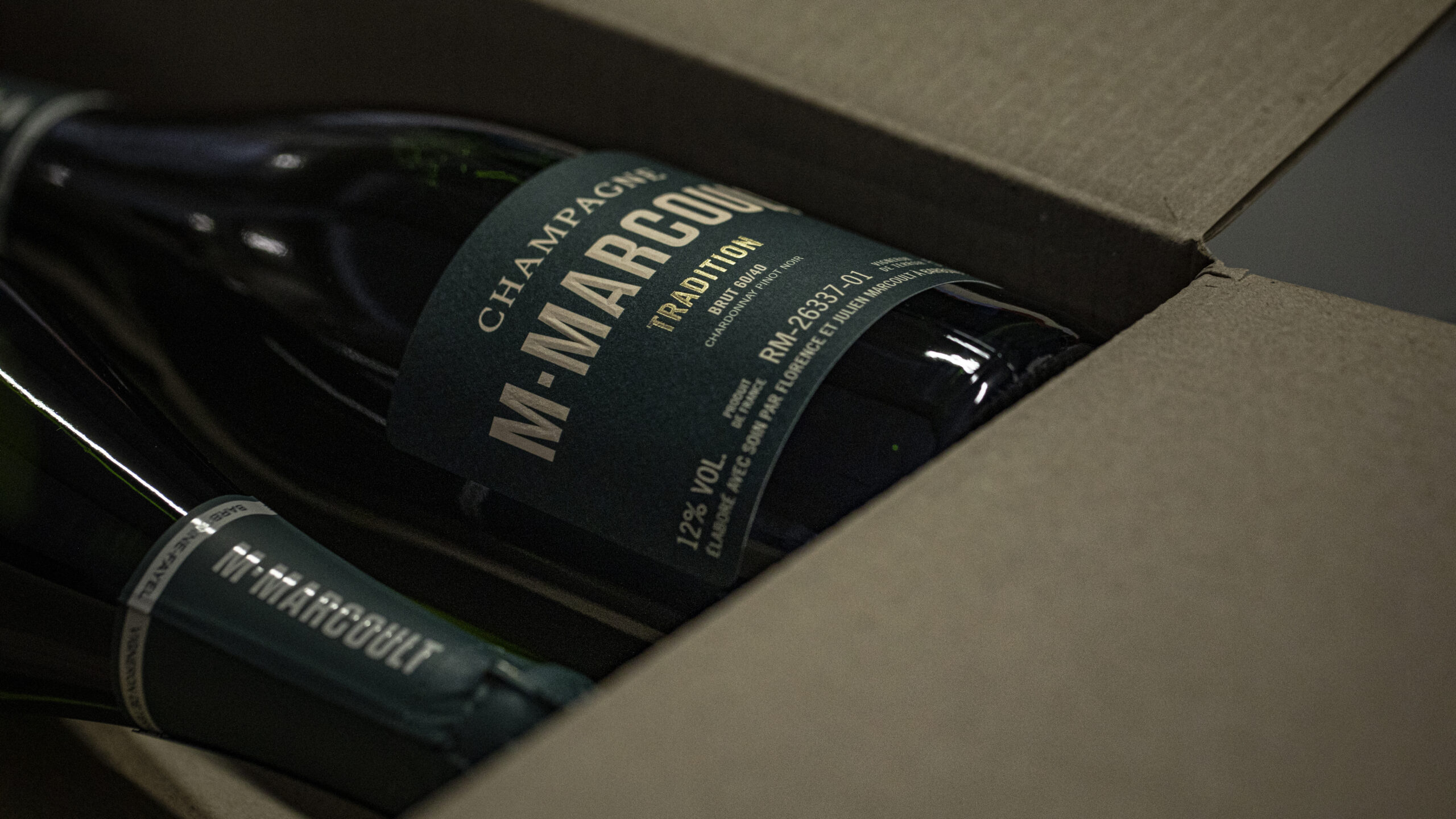
Close-up of the M. Marcoult champagne label and logo — visual identity redesign · vrai studio
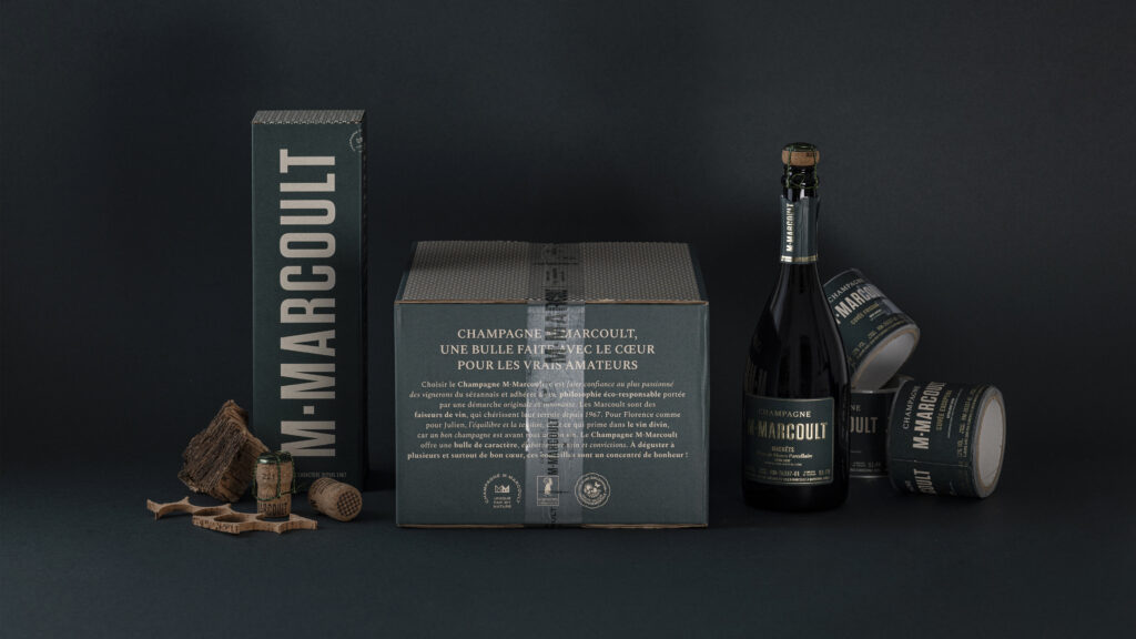
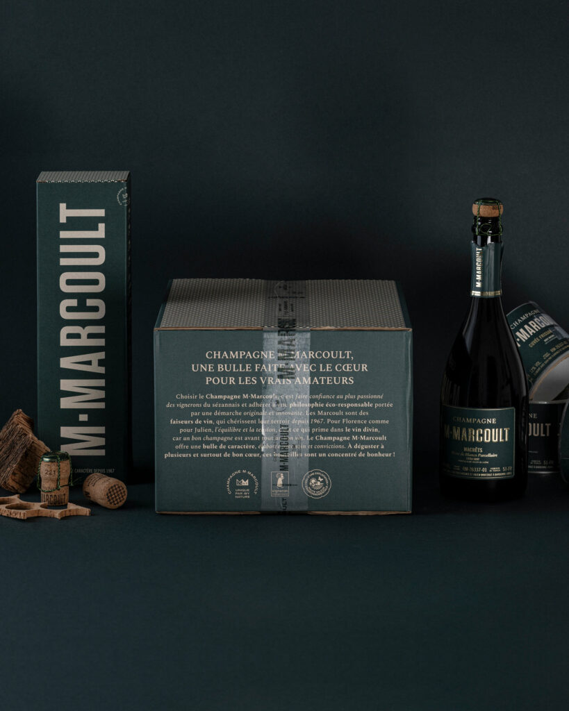
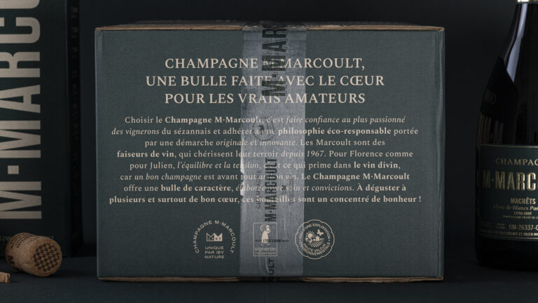
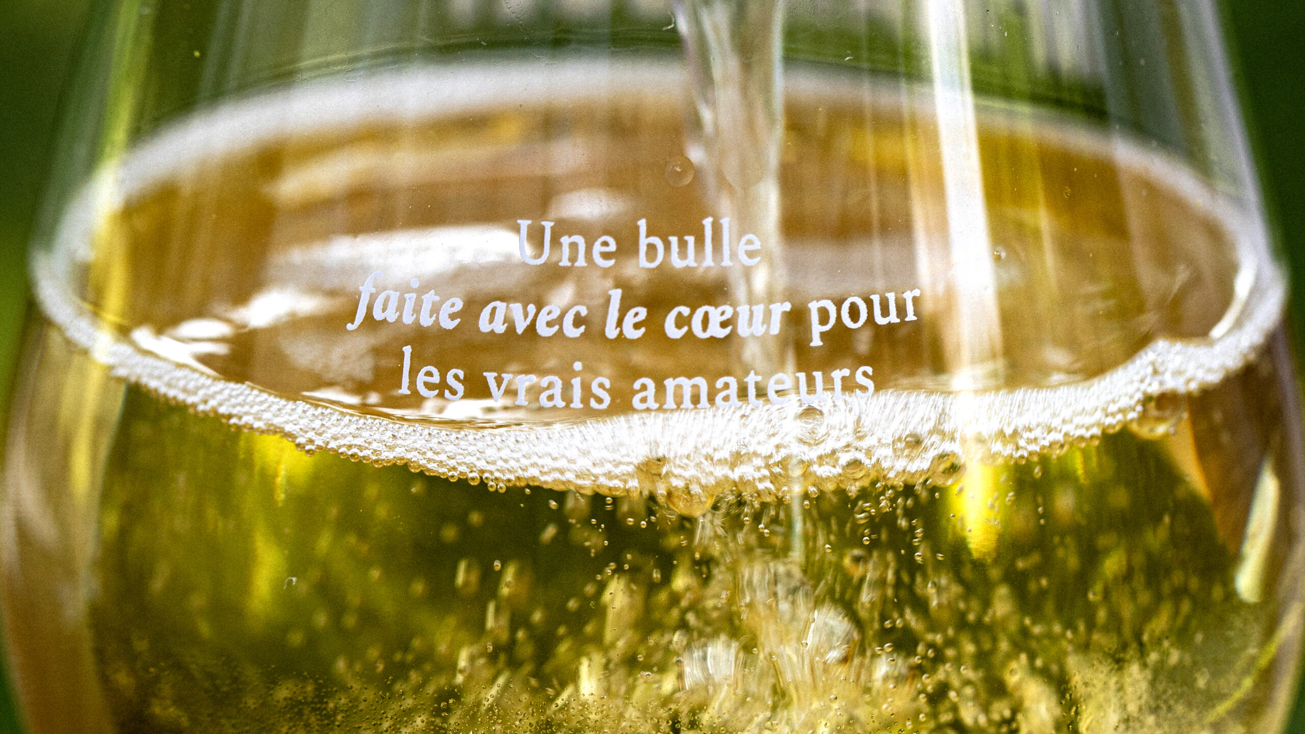
M. Marcoult Champagne Gift Set — tagline: “A bubbly made with love for true connoisseurs” · vrai studio

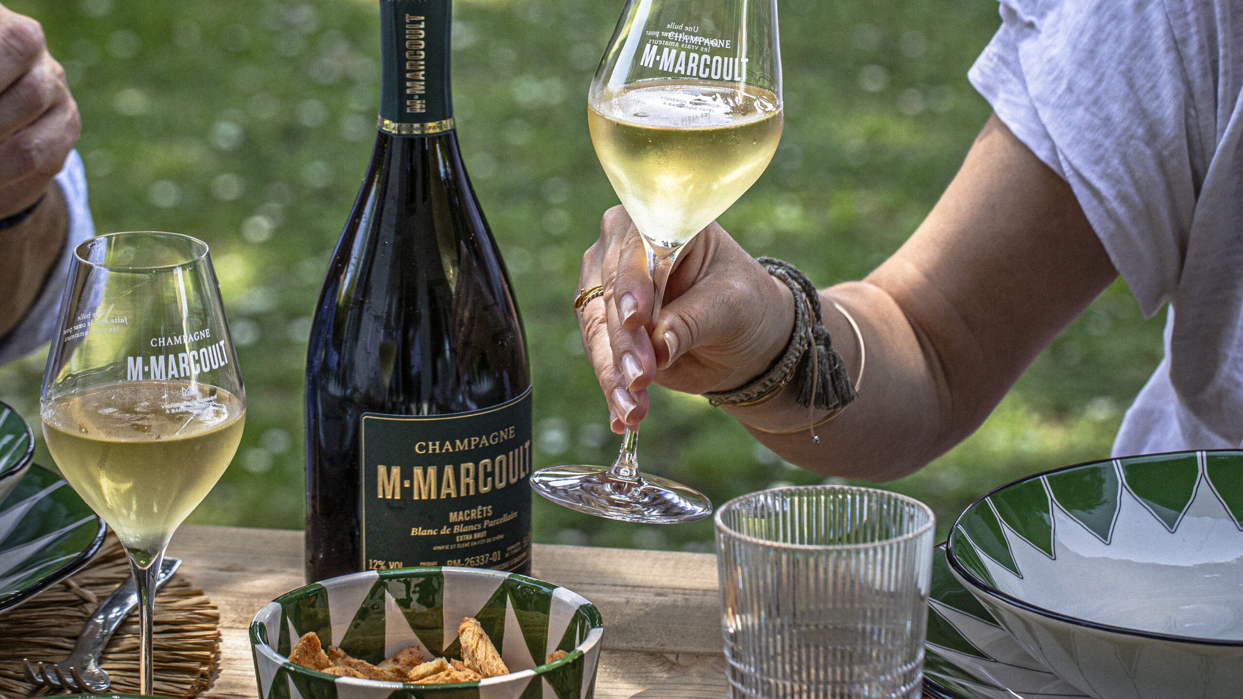
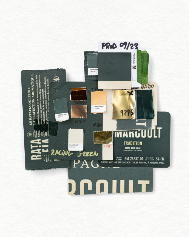
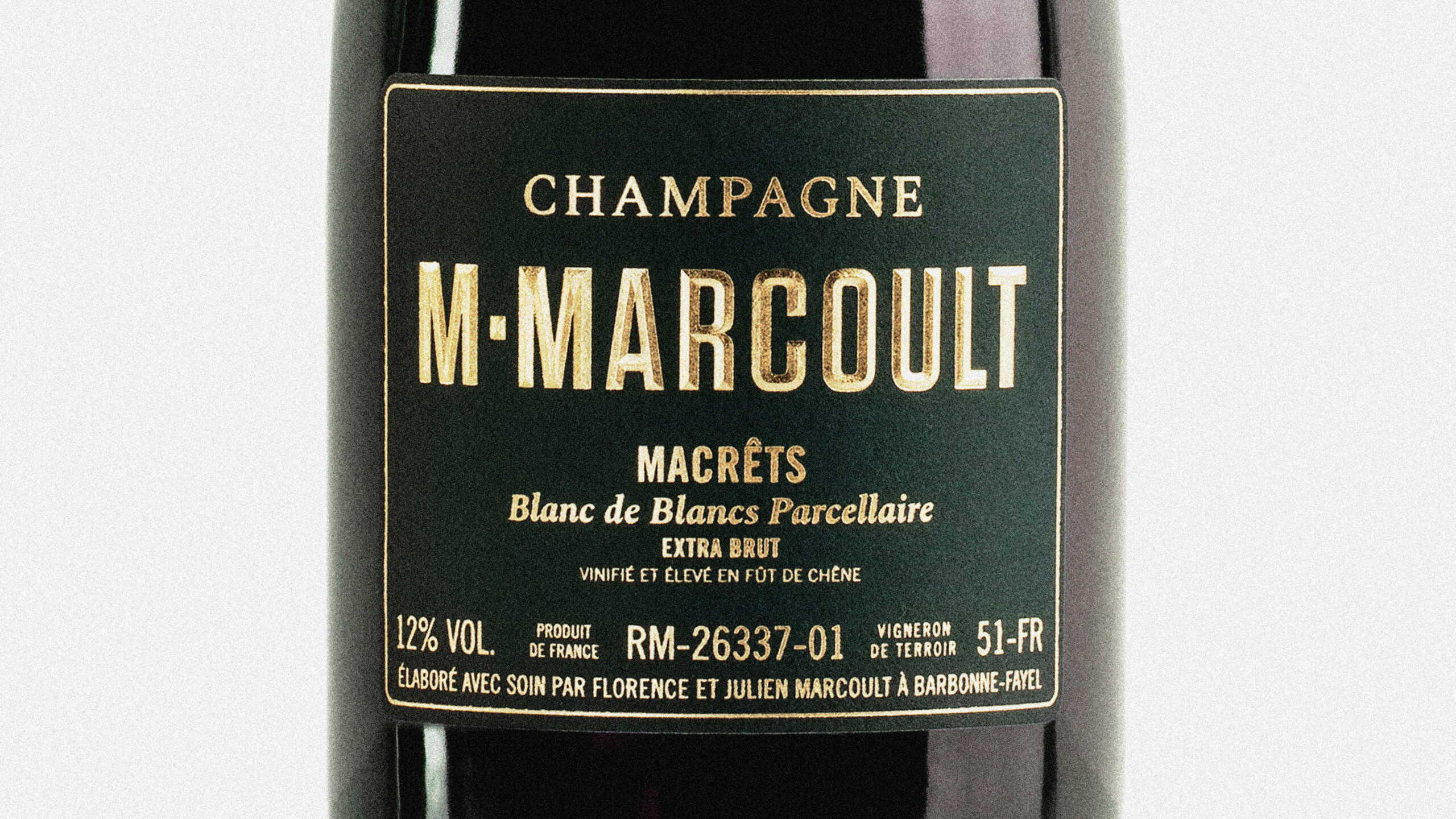
Our mission: to make the brand visible in a highly competitive environment. The keys to this identity: strong, contrasting colors, vineyard green and chalk greige; clear labelling with a neat hierarchy of information.

M. Marcoult Vigneron de Terroir Green Champagne Capsule — packaging close-up · vrai studio
Champagne Ambiance by M. Marcoult — photography for a local Champagne brand · vrai studio
M. Marcoult Champagne Cases in the Cellar — Storage and Packaging Design · vrai studio
Champagne Photography by M. Marcoult — Packaging and Visual Identity · vrai studio
Champagne M. Marcoult — bottle packshot and brand identity · vrai studio
Champagne styling by M. Marcoult — lifestyle and branding · vrai studio
Champagne M. Marcoult in a stylish setting — handcrafted bottle and packaging · vrai studio
Champagne Detail: M. Marcoult — Product Photography by an Independent Winemaker · vrai studio
M. Marcoult Champagne Brand Identity — Photography for a Winery · vrai studio
Champagne M. Marcoult — Packaging and Branding for Independent Winemakers · vrai studio
Champagne Tasting Atmosphere at M. Marcoult — Artisanal Lifestyle Brand · vrai studio
Champagne Photography by M. Marcoult — the atmosphere of a local winemaker’s cellar · vrai studio
Champagne M. Marcoult — Cellar Ambiance and Brand Identity Rebranding · vrai studio
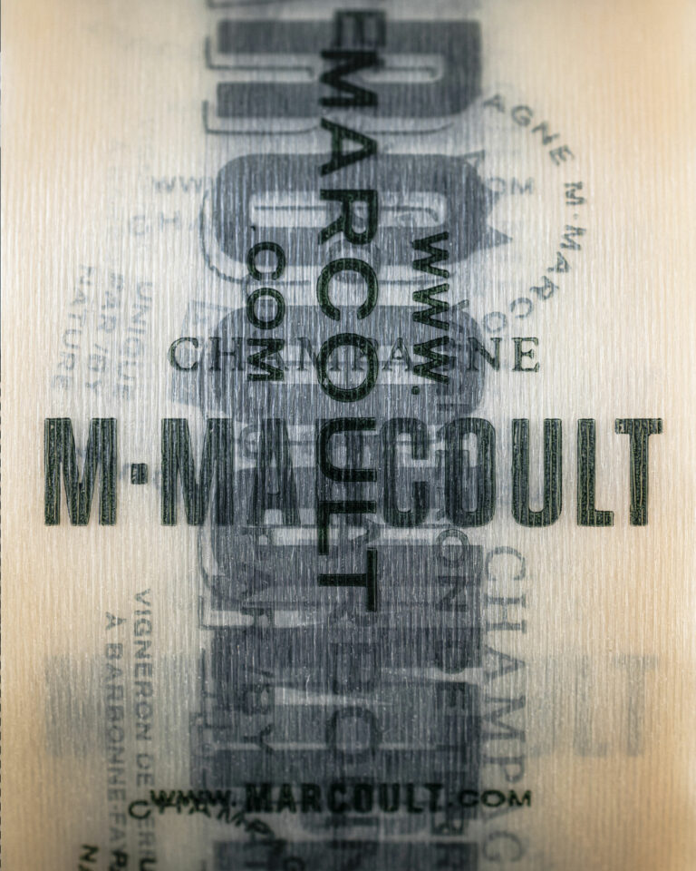
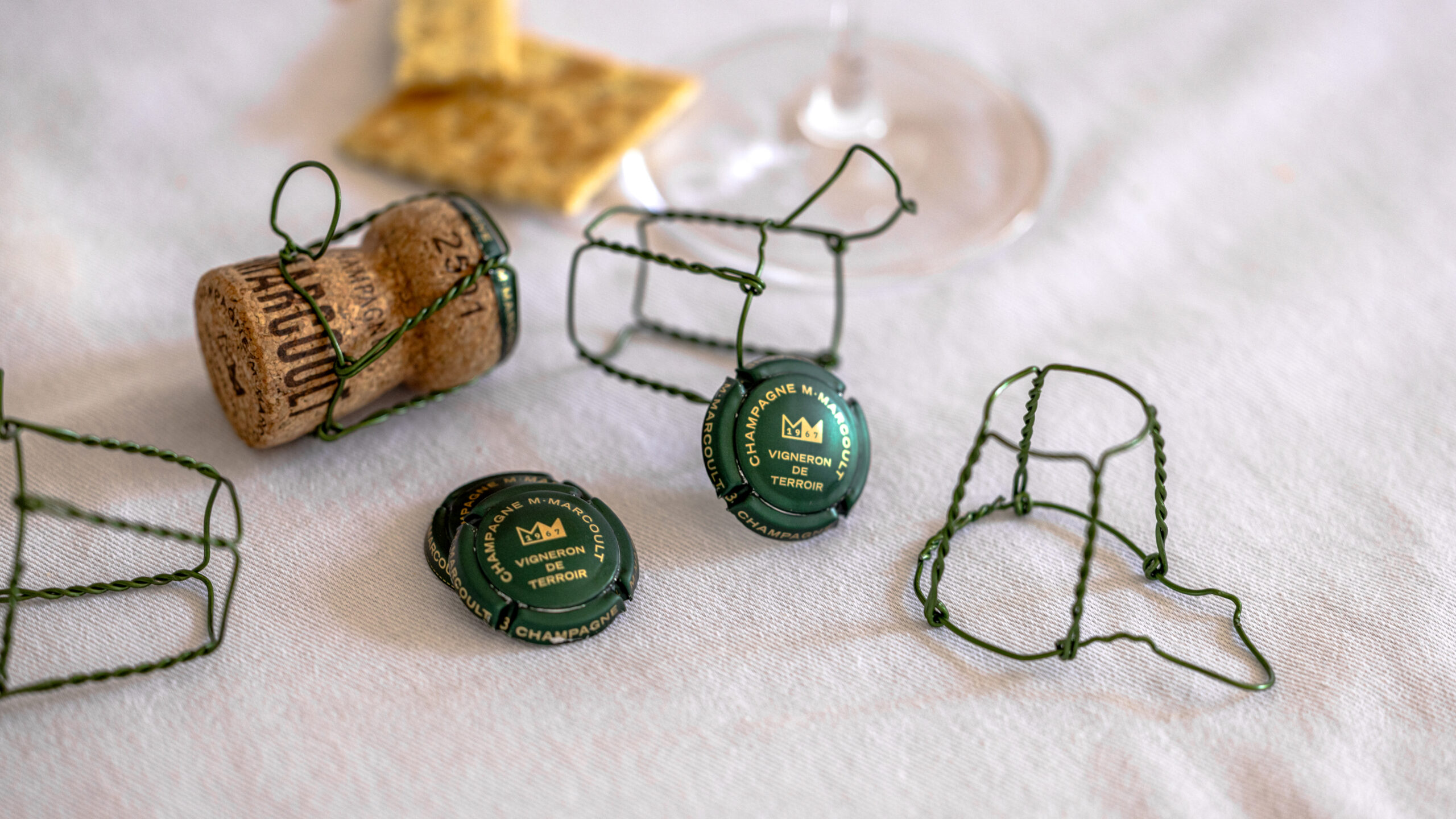
M. Marcoult Champagne Capsules and Wire Cages — Brand Identity Accessories Details · vrai studio
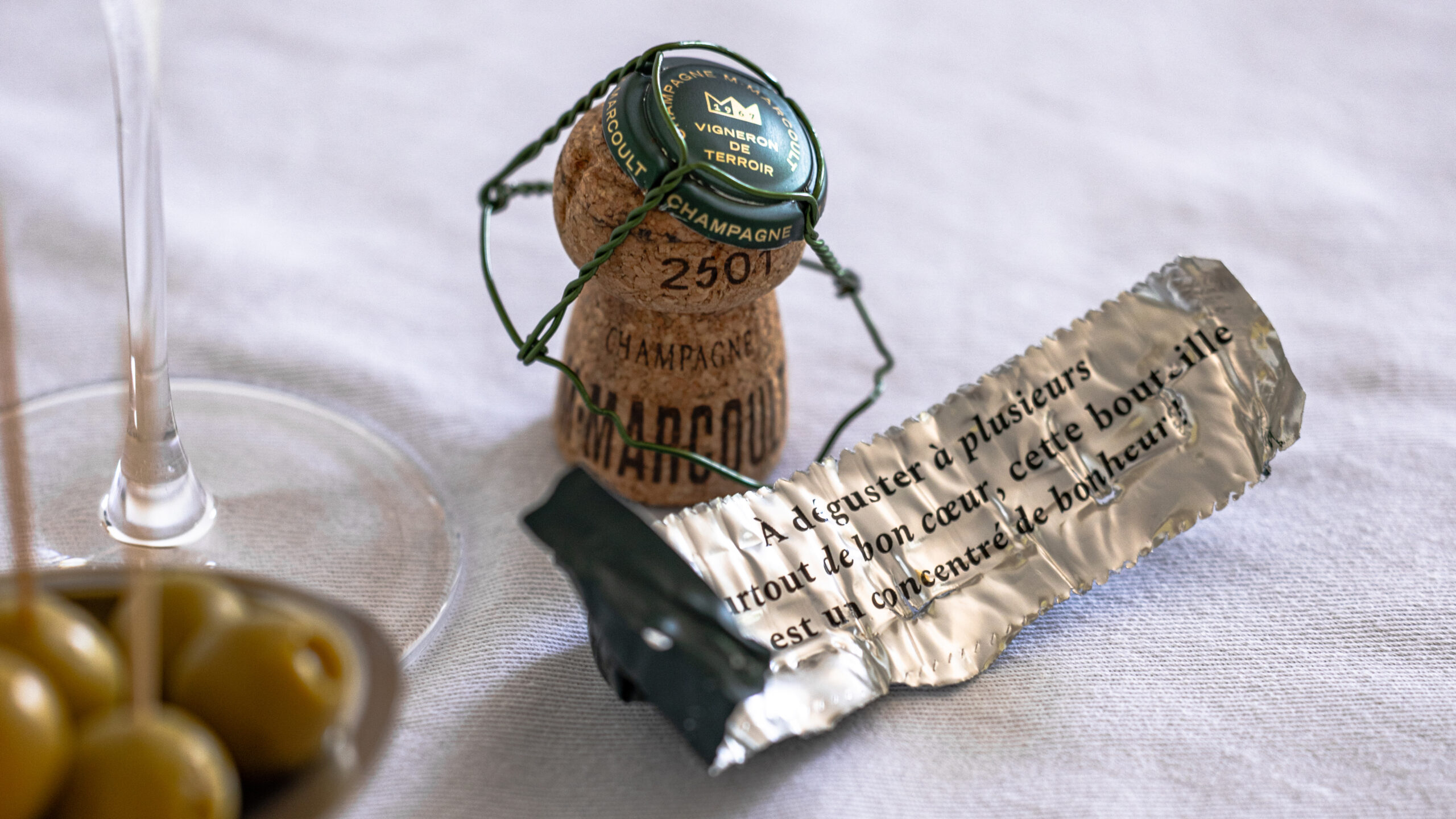
M. Marcoult Champagne Wire Cage and Foil — Artisanal Tasting Lifestyle · vrai studio

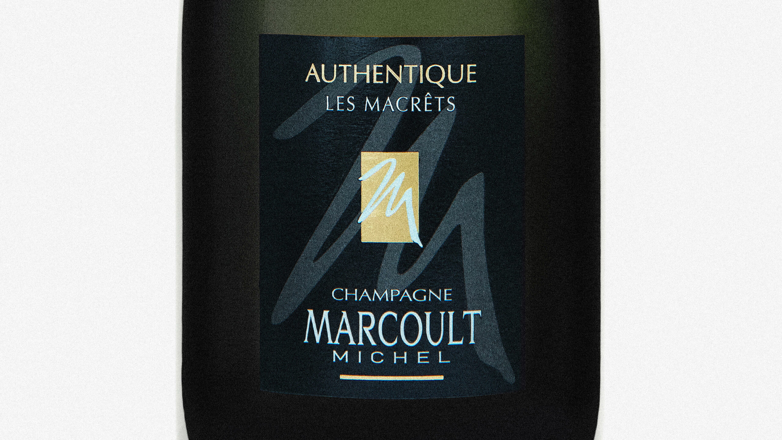
Champagne M. Marcoult, a family-owned Champagne house founded in 1967, began the transition to the third generation in 2020 with a clear goal: to transform a long-established estate into a distinctive and desirable brand.

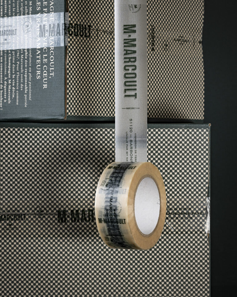
The project entrusted to vrai studio the entire brand identity, including naming, logo, monogram, typography, and color palette, as well as packaging for the full product line—labels, caps, neck labels, stoppers, and boxes. The color scheme—vineyard green and the “greige” of the Craillères—deliberately breaks with conventional champagne design conventions. Upon delivery, the impact was immediate: within six months, the house sold the equivalent of a full year’s worth of product. The partnership has naturally continued, encompassing photo shoots at the estate, studio product shots, the website, and print materials. Since 2024, vrai studio the house through an annual partnership.

Art Direction and Photography: Camille Gabarra
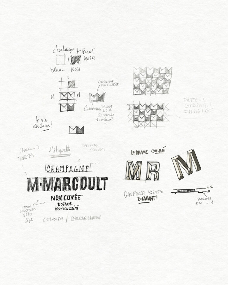
M. Marcoult Champagne Study — Sketches and Concepts for Visual Identity and Rebranding · vrai studio

STUDY

Every project has its sketches

M. Marcoult Champagne Color Chart — Materials and Colors Palette for Visual Identity · vrai studio

NUANCIER

A good summary of the materials and shades of the M.Marcoult champagne brand

M. Marcoult Champagne Brand Identity Before Redesign — Old Brand Packaging · vrai studio M. Marcoult Champagne Identity After Redesign — New Branding · vrai studio