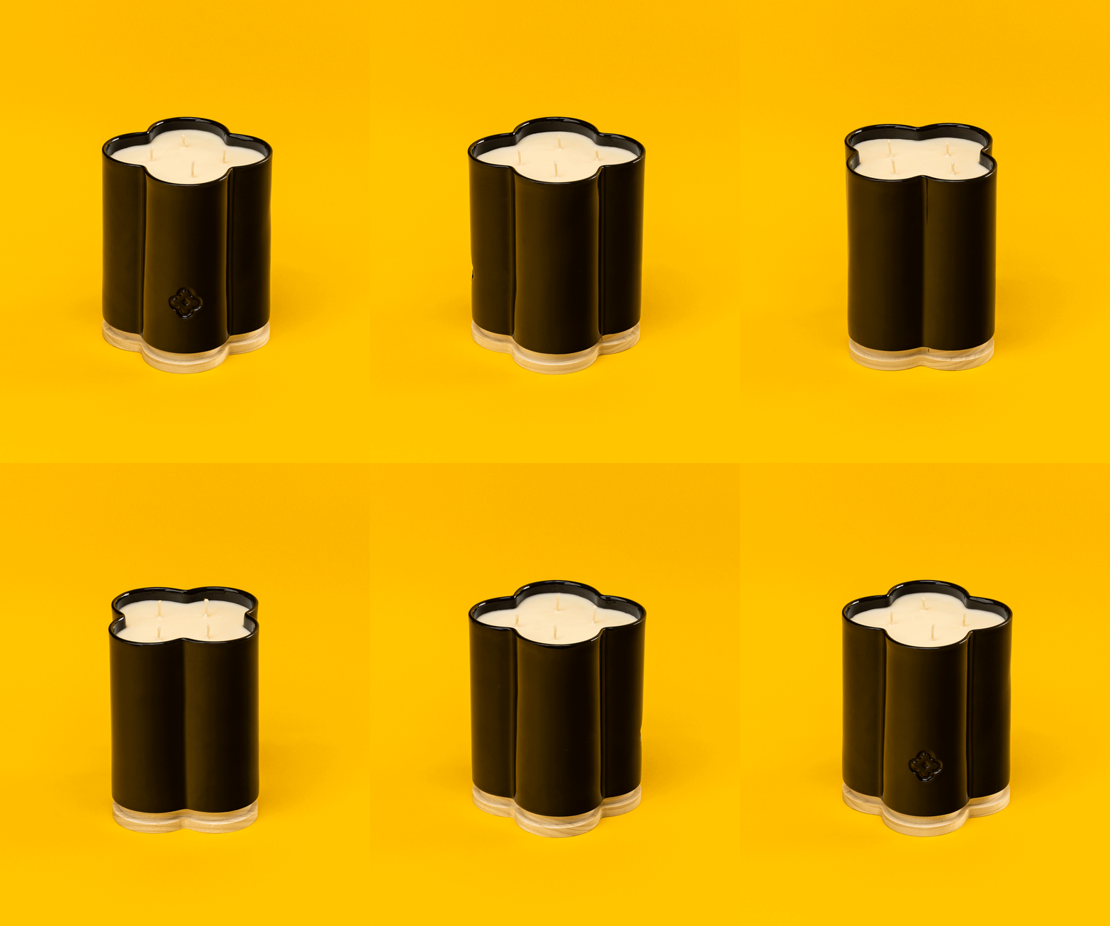
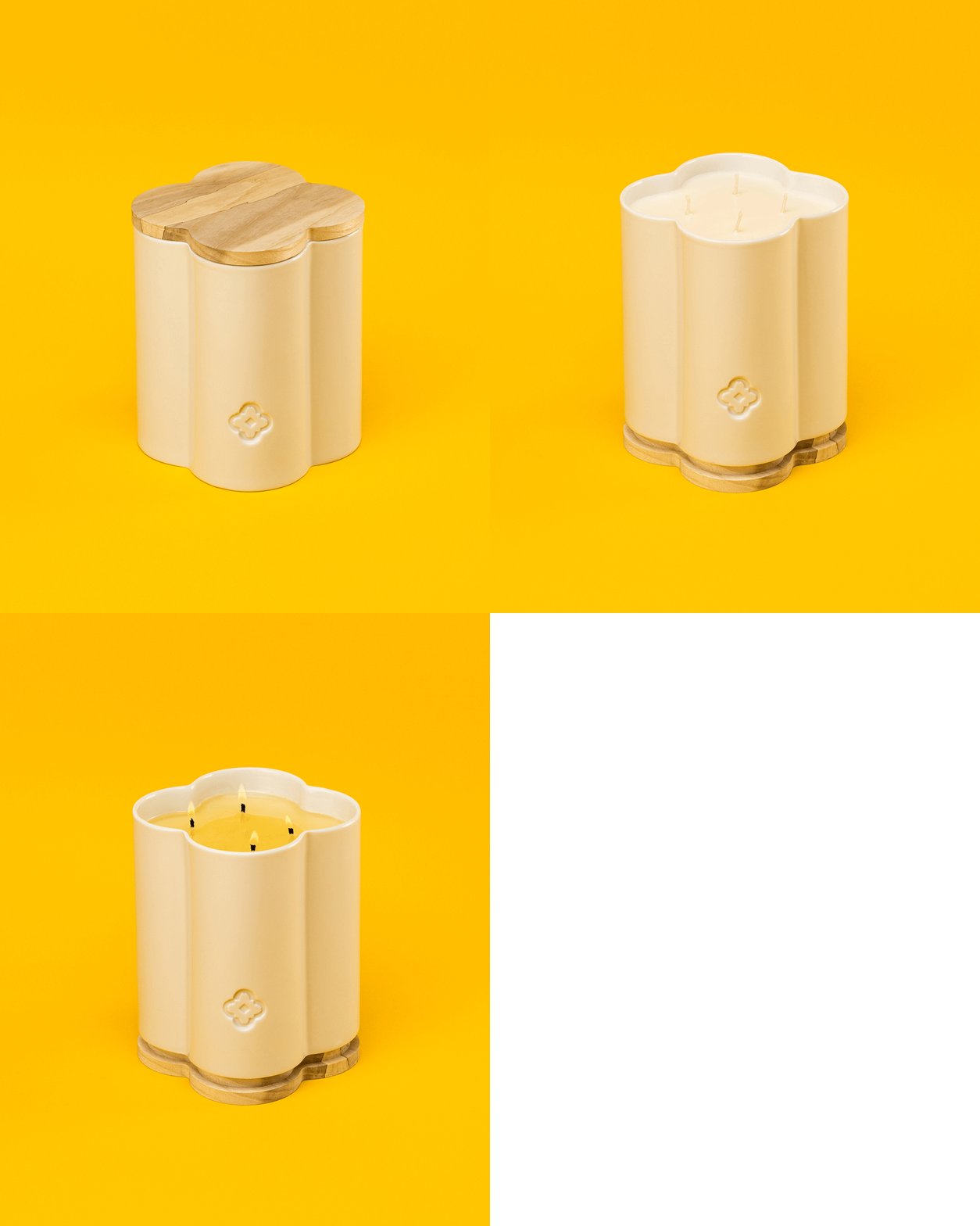
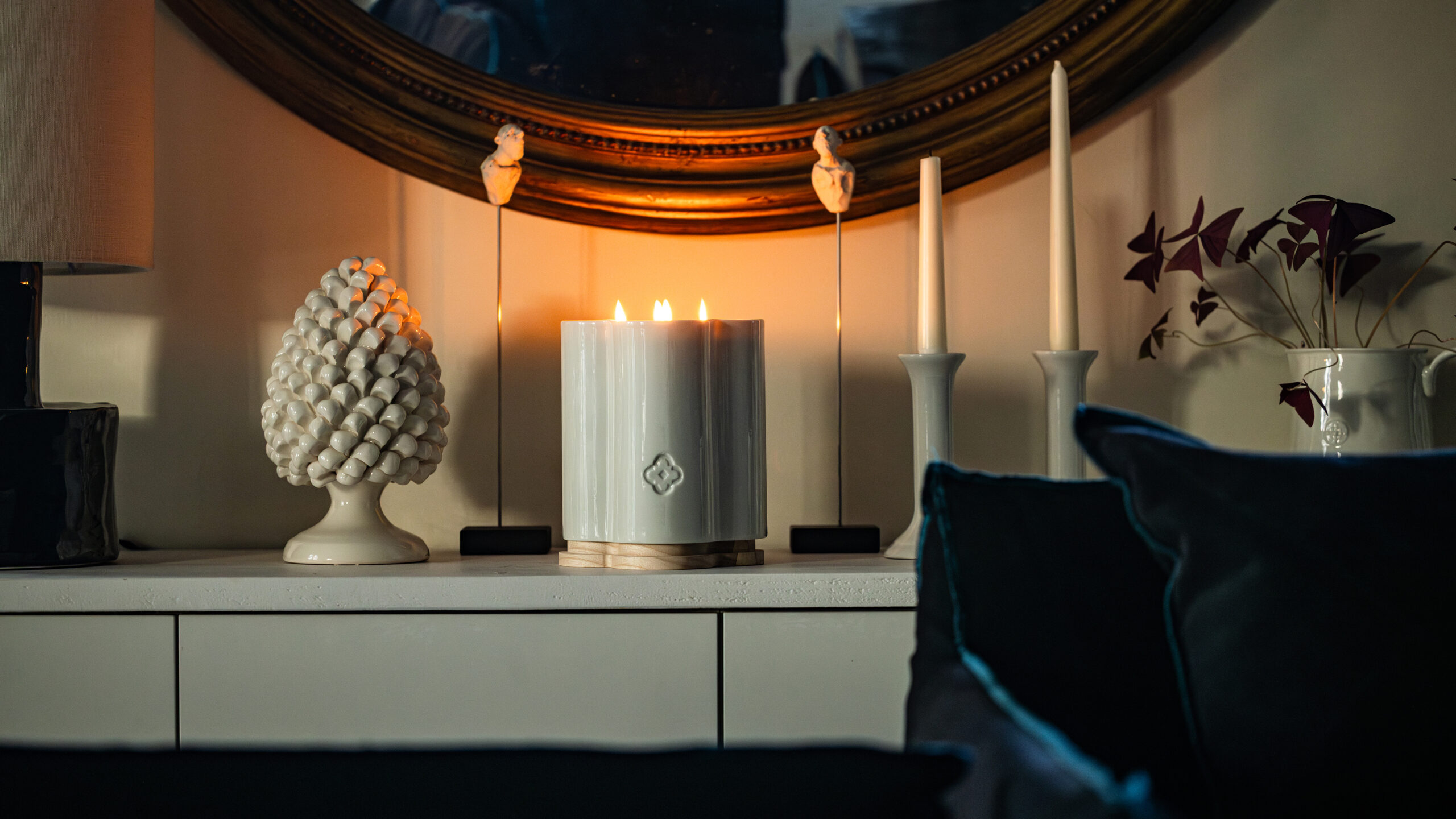
Noa Candle Duo Product Shot — Photography by Olearius · vrai studio
Nes Candle Pack Shot Cover — Photography by Olearius · vrai studio
  • Art Direction
  • Object design
  • Packaging
  • Project management
  • Manufacturing management
  • Photography

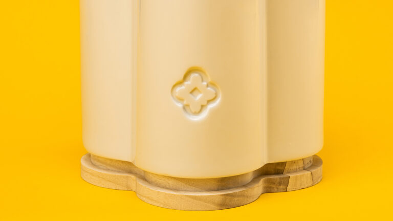
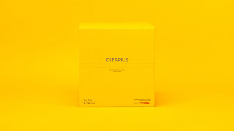
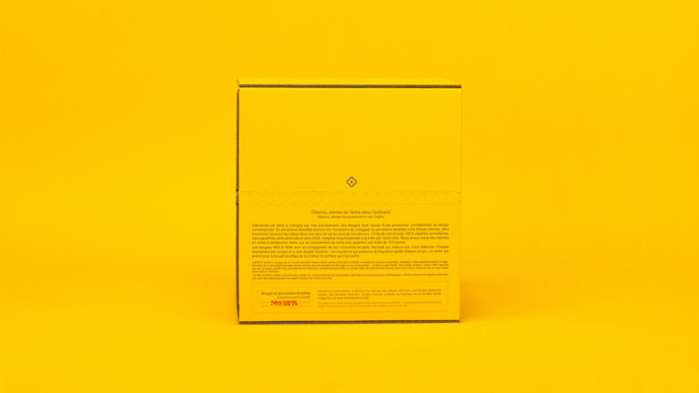
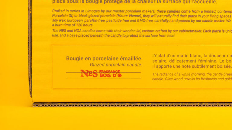
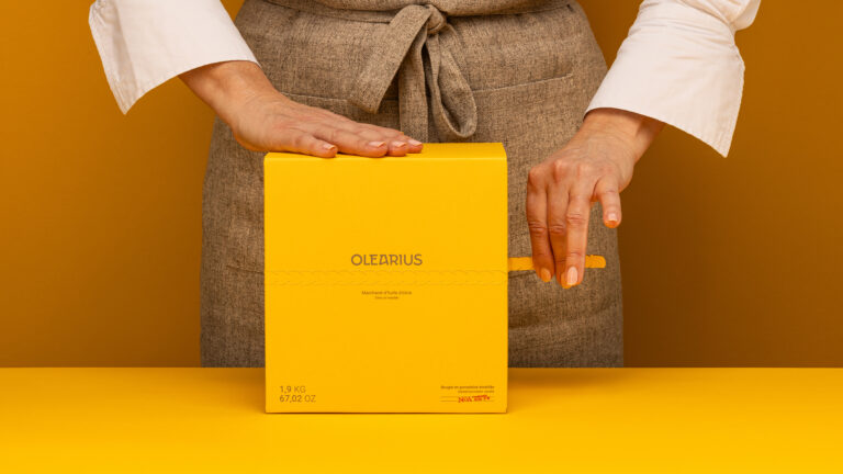
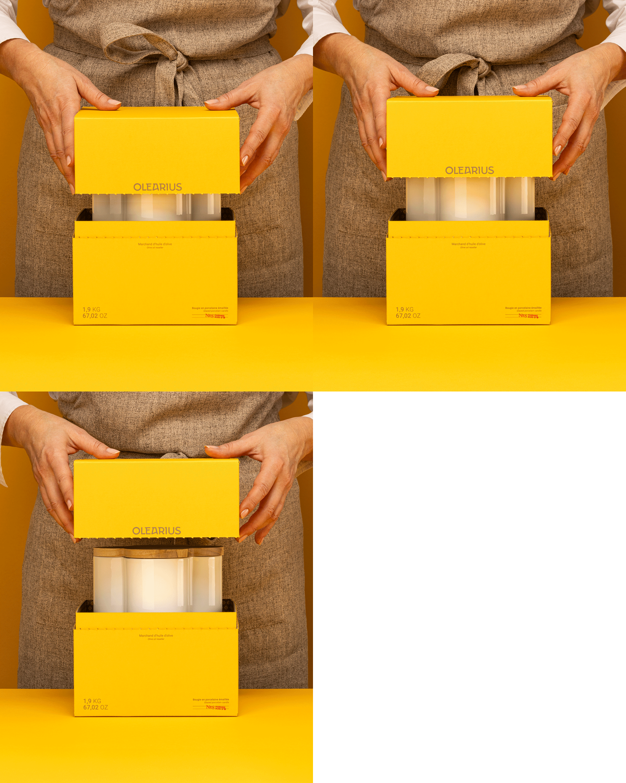
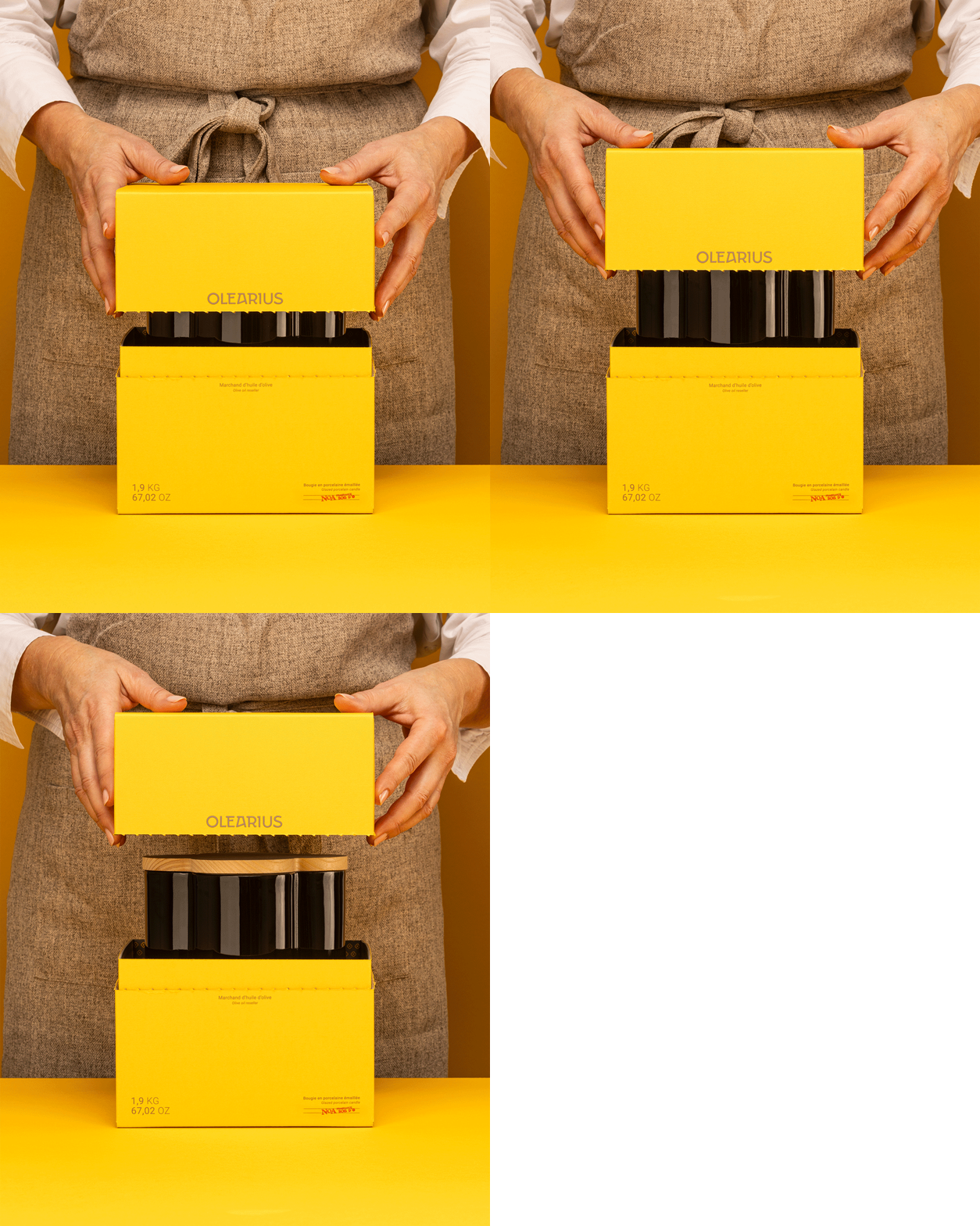
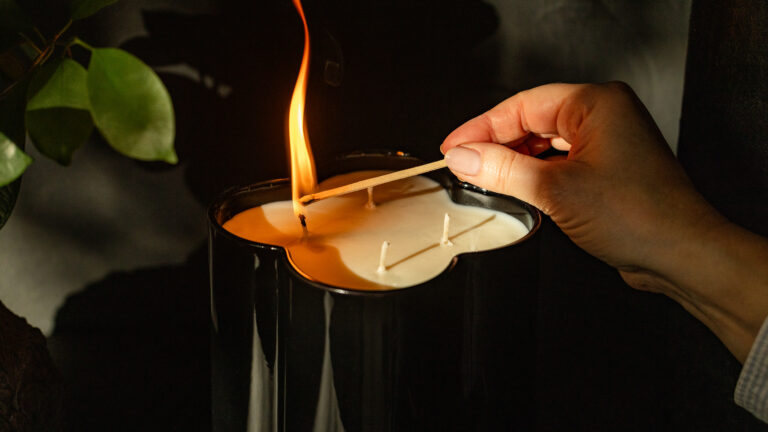
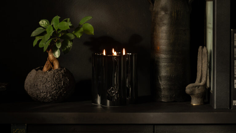
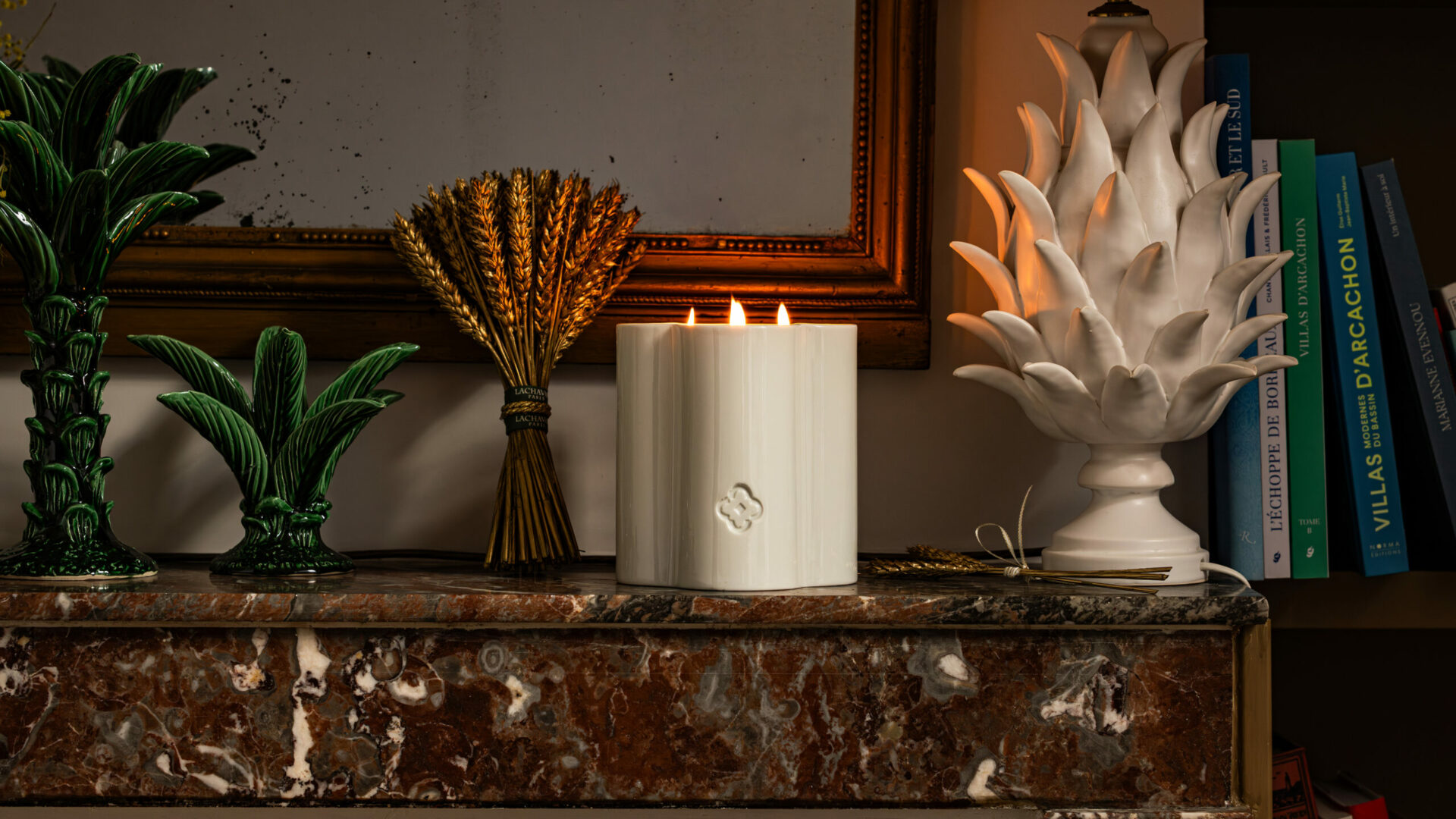
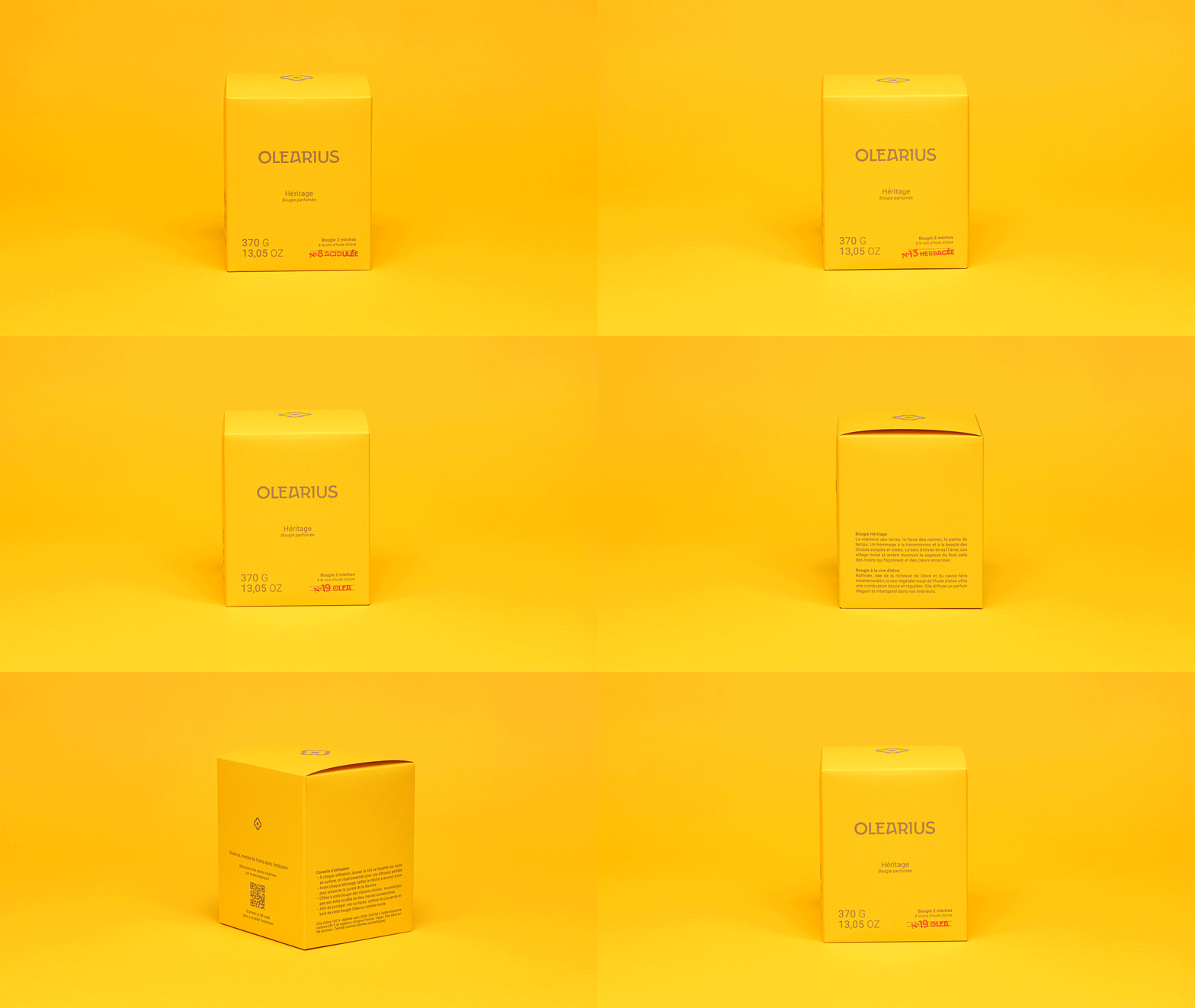
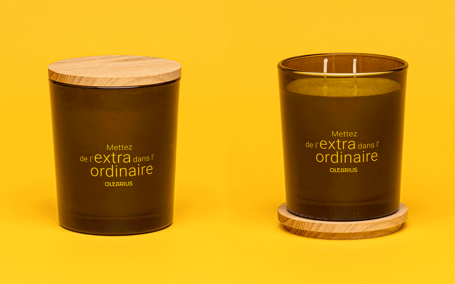
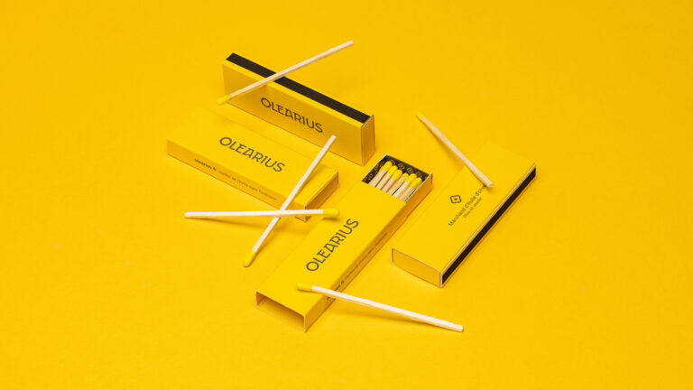
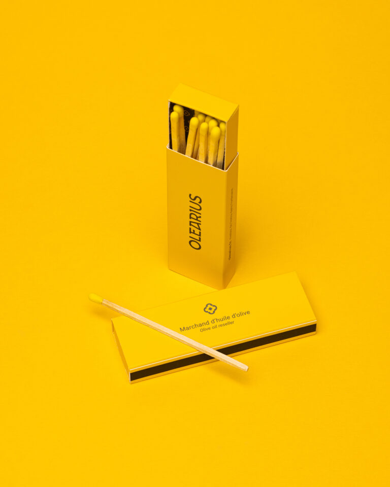
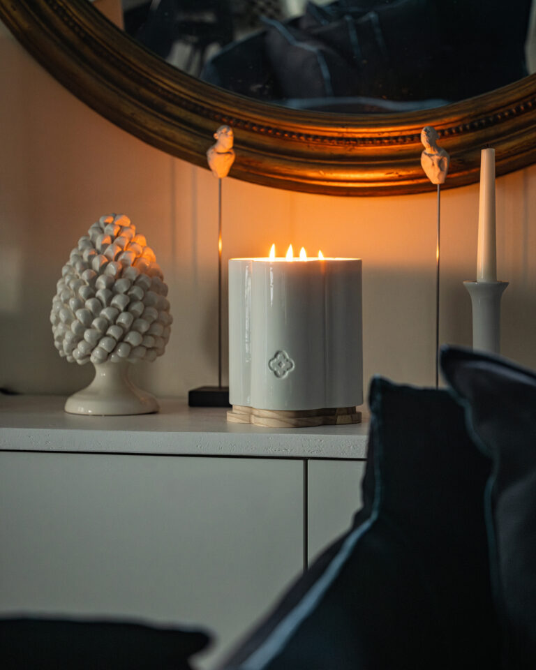
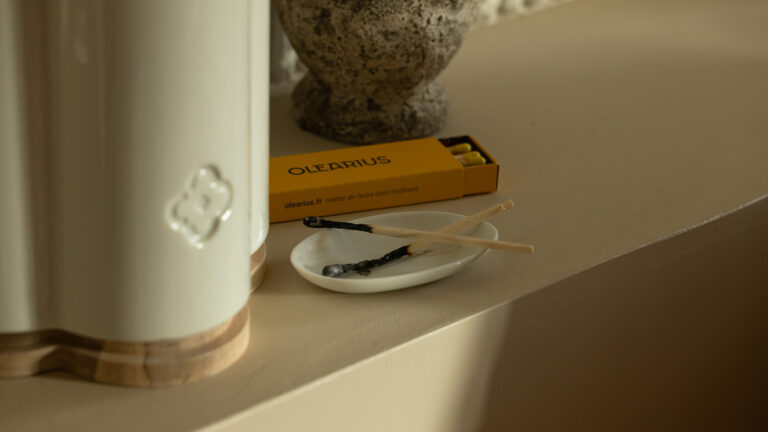
Olearius has entrusted us with the creation of their home candles and packaging. This time, vrai studio also took on the object design itself. These handcrafted candles, featuring a contemporary design created by us, are made of Limoges porcelain. Accompanied by a box of matches, these two candles expand the product line.

Nes Candle Packshot Animation — Olearius Visual Identity · vrai studio
Nes Candle Rotation Animation — Olearius 360° Packshot · vrai studio
Nes Candle packshot on a white background — photography by Olearius · vrai studio
Noa Candle Animation — Olearius Candles Visual Identity · vrai studio
Noa Candle Rotation Animation — Olearius Packshot · vrai studio
Noa Candle, white background packshot — photography by Olearius · vrai studio
Nes Candle Box Pack Shot — Olearius Packaging Identity · vrai studio
Nes Candle Gift Set — Olearius Branding and Packaging · vrai studio
Nes Candle Packaging Box — Design by Olearius · vrai studio
Unboxing the Noa Candle Set — Packaging by Olearius · vrai studio
Unboxing the Nes Candle — Olearius Packaging Set · vrai studio
Nes Candle Unboxing Animation — Olearius Packaging Set · vrai studio
Noa Candle Unboxing Video — Olearius Packaging Set · vrai studio
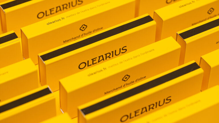
Matchbox — Olearius candle packaging · vrai studio
Matchbox product shot — Olearius candle packaging · vrai studio
Green matchbox — Olearius candle packaging · vrai studio
Olearius Candle Duo Product Shot — Visual Identity · vrai studio

Products in their environment, decorative mood for communication

Nes Candle Display — Olearius Lifestyle Ambiance · vrai studio
Nes Candle Photography — Olearius Lifestyle · vrai studio
Noa Candle in Use — Olearius Lifestyle Packshot · vrai studio
Noa Lifestyle Candle Photography — Olearius Visual Identity · vrai studio
Noa Candle in a Real-Life Setting — Lifestyle Photography by Olearius · vrai studio
Noa Candle Lifestyle Product Shot — Photography by Olearius · vrai studio
Nes Candle, Dark Base — atmospheric photography by Olearius · vrai studio
Nes Textured Candle Holder — Olearius Lifestyle · vrai studio
Nes Candle as Decor — Lifestyle Photography by Olearius · vrai studio
Nes Natural Scented Candle — lifestyle photography by Olearius · vrai studio
Noa Candlelight Ambience — Olearius Lifestyle · vrai studio
Nes Lifestyle Natural-Colored Candle — Photography by Olearius · vrai studio
Nes Candle Lifestyle — atmospheric photography by Olearius · vrai studio
Nes Candle Lifestyle — Olearius Natural Ambience · vrai studio

For Olearius, the candle is not a spin-off product. It is a natural extension of the brand into the world of home goods, designed with the same attention to detail as its olive oils.

The project began with a search for French porcelain manufacturers, followed by a prototyping phase to find the exact container that would match the brand’s premium positioning. The choice fell on white Limoges porcelain and black Haute-Vienne porcelain, two noble materials associated with durability and quality. The artistic direction for the packaging is identical to that of the olive oil. The product photography creates a minimalist aesthetic, with compositions based on contrasts between materials—ceramic, wax, and natural light. The object is prominent, clear, and authentic. The packaging does not seek to overshadow the object itself.

Art Direction and Photography: Camille Gabarra
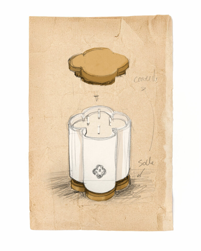
Functional sketch of candle packaging — Olearius visual identity · vrai studio

FUNCTIONAL

A base cover

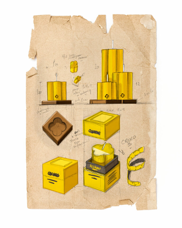
Candle Packaging Design — Olearius Visual Identity · vrai studio

STUDY

Every project has its sketches

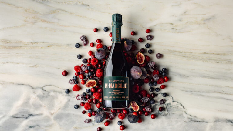
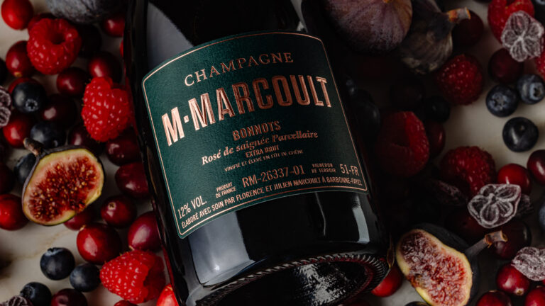
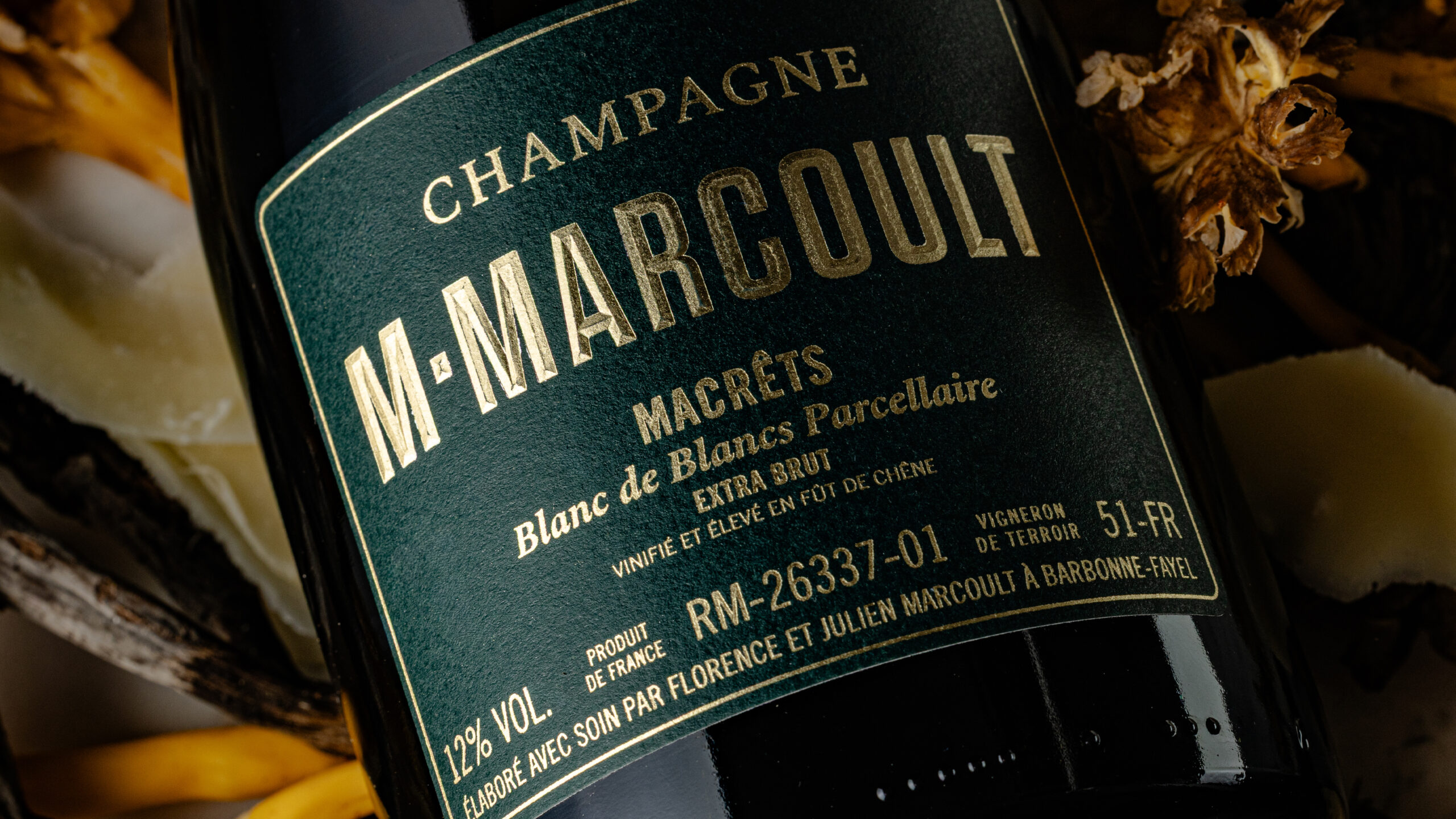
Champagne M. Marcoult — Iconic Photography: Independent Winemaker · vrai studio
M. Marcoult's Bistronomique Cuvée — Champagne advertising campaign 2026 · vrai studio
  • Art Direction
  • Photography

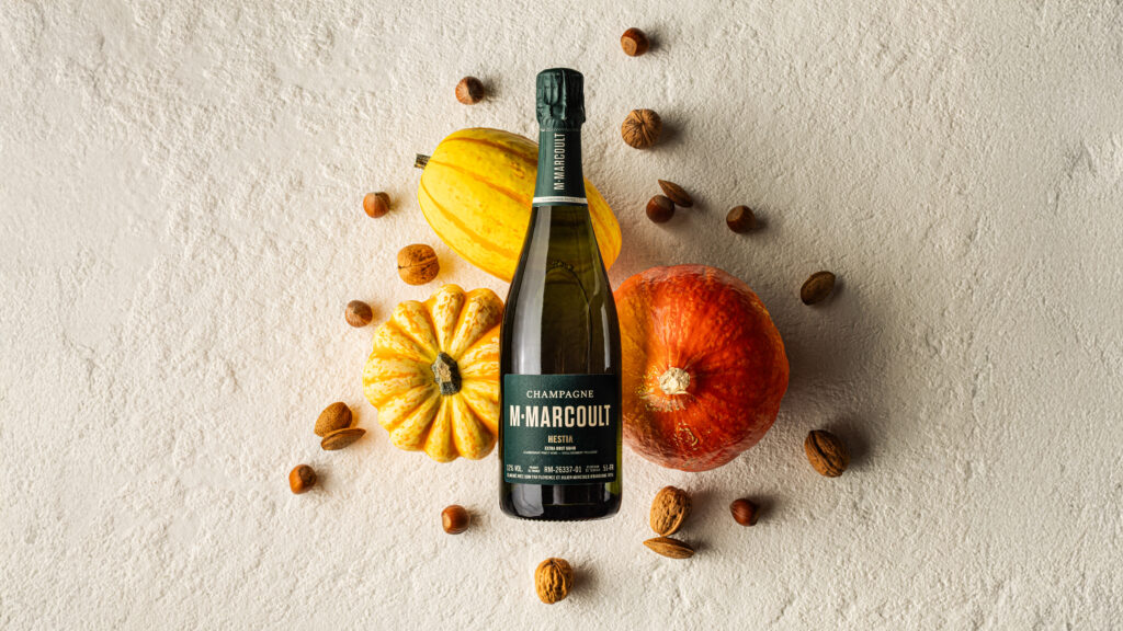
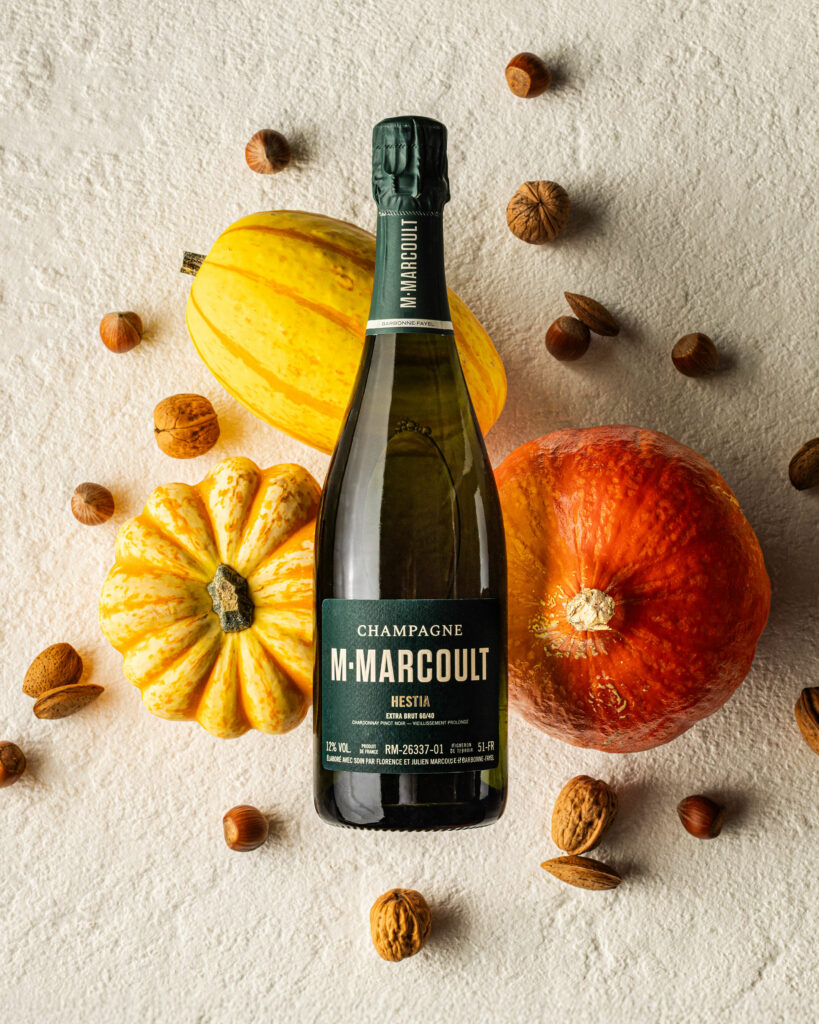
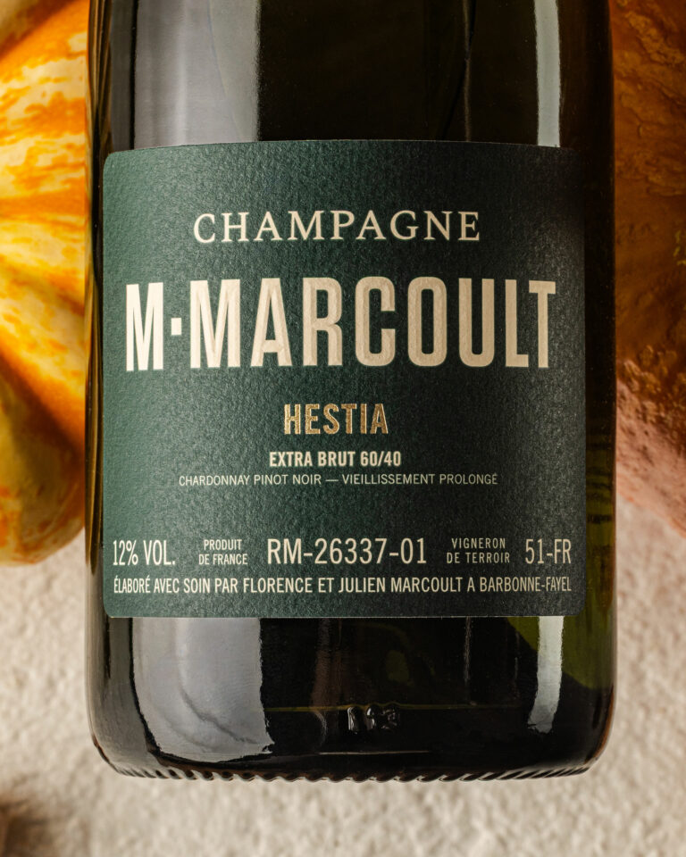
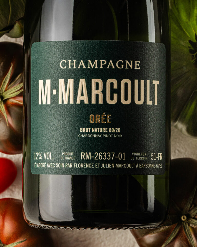
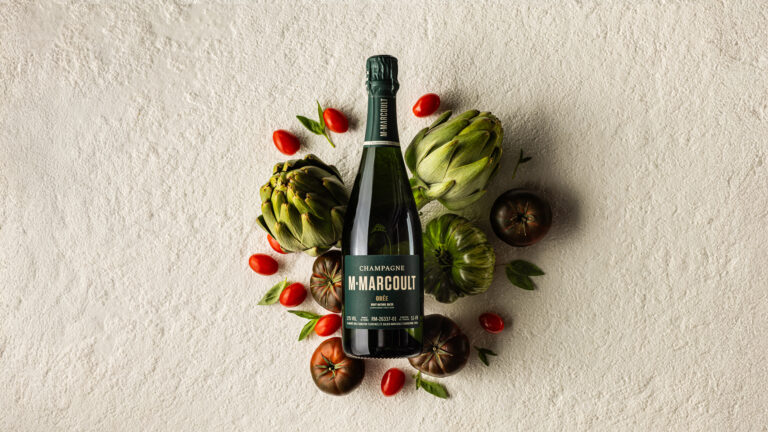
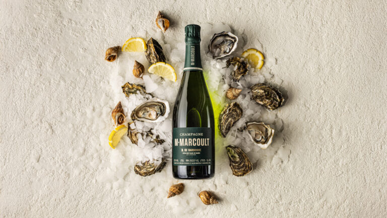
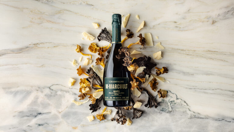
At the end of 2025, Mr. Marcoult entrusted us with the creation of his future communication visuals. As true epicureans, this time Florence and Julien asked us to highlight their pairings. We created compositions like color palettes. The visual impact comes from the unity of the whole, with no photomontage and no AI.

M. Marcoult Champagne Iconic Cuvées — 2026 campaign packshot · vrai studio
M. Marcoult's Iconic Champagne Collection — Brand Identity Photography 2026 · vrai studio
M.Marcoult Iconiques Bottle — Champagne 2026 packshot · vrai studio
M.Marcoult Iconic Collection — 2026 Champagne Campaign Packshot · vrai studio
M. Marcoult's Iconic Collection — Champagne advertising campaign 2026 · vrai studio
M. Marcoult Champagne's Iconic Cuvées — 2026 Photo Campaign Packshot · vrai studio
M. Marcoult Champagne Collection — Iconic Photography, 2026 Campaign · vrai studio
Champagne M. Marcoult — "Iconiques 2026" Photo Campaign · vrai studio
M. Marcoult Bottle — Iconiques Champagne 2026 packshot · vrai studio
Cuvée M.Marcoult Iconiques — Champagne campaign product shot · vrai studio

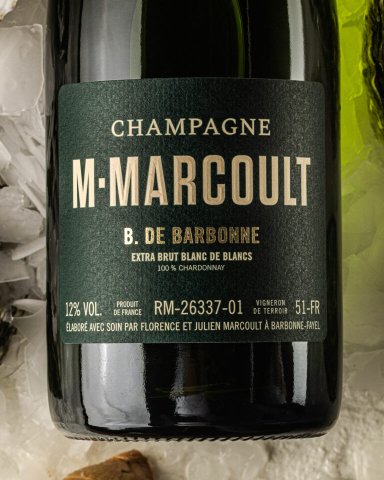
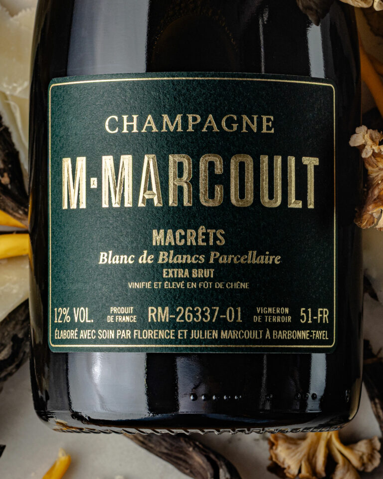
For the 2026 Champagne M. Marcoult campaign, the brief is clear: highlight the food-and-wine pairings within the range. The campaign is structured around two themes: the “Cuvées Bistronomiques,” photographed against a backdrop of “craillères”—the limestone formations of the Champagne region’s underground cellars—and the “Cuvées Gastronomiques,” set against a backdrop of white marble, which conveys a more formal, more elite feel.

The visual concept creates a carefully curated palette of pairings for each vintage. The bottle is simply positioned, in balance, always without any photo manipulation. The composition is built around the product and the elements that complement it, without artifice. Zero AI. One hundred percent real. This campaign is part of vrai studio annual partnership vrai studio the house, vrai studio the fifth year of continuous collaboration between Camille Gabarra and the teams at Champagne M.Marcoult.

Art Direction and Photography: Camille Gabarra
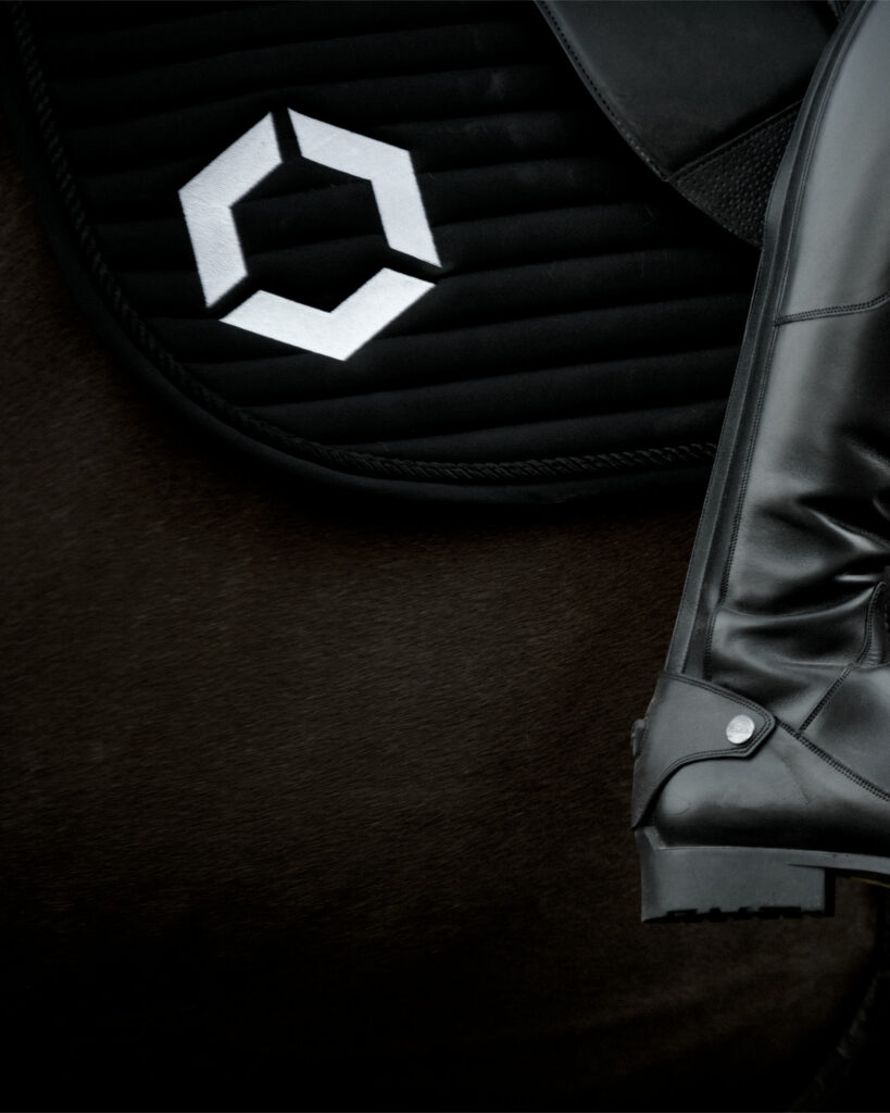
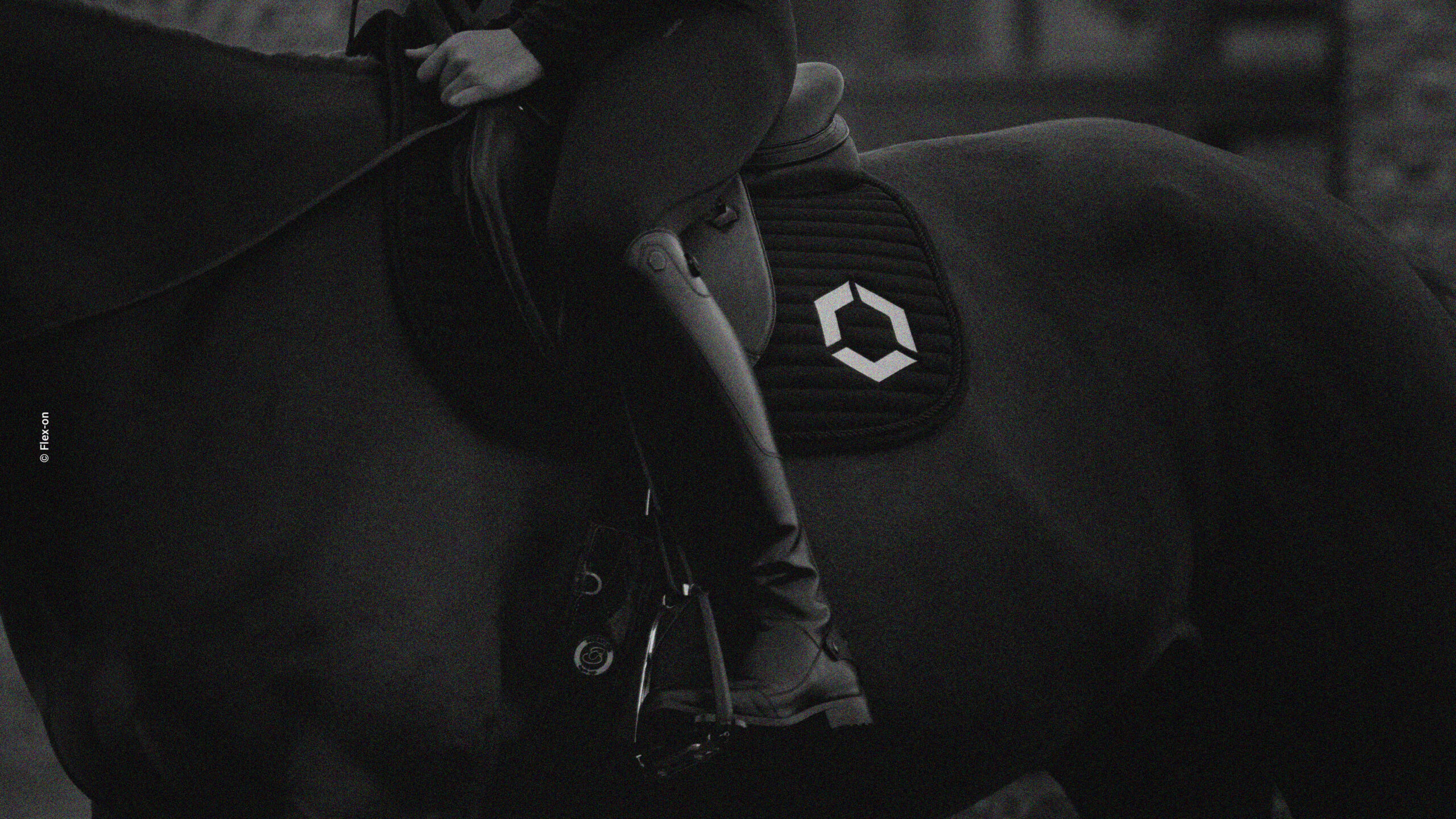
Flex-on logo on a horse — Flex-on lifestyle photography · vrai studio
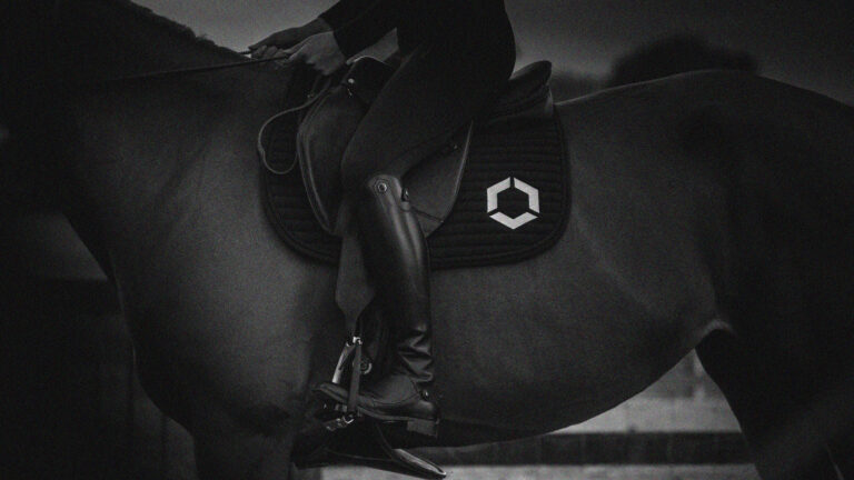
Flex-on Visual Identity — Redesign of an Equestrian Equipment Brand · vrai studio

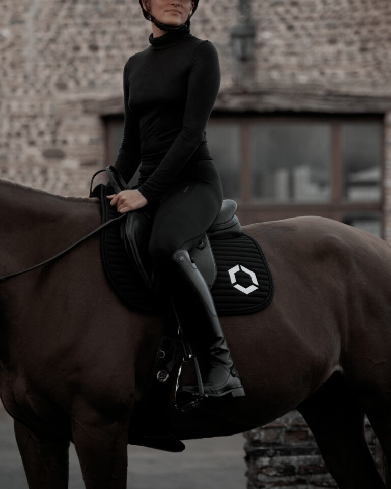
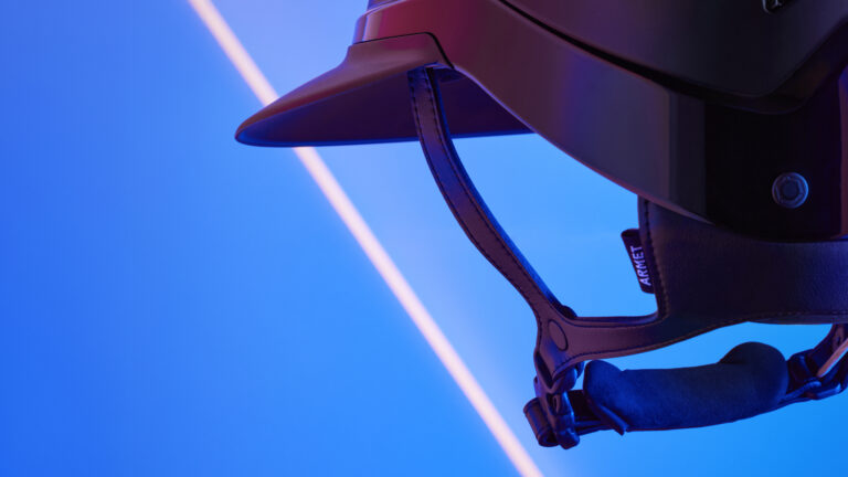
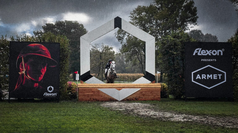
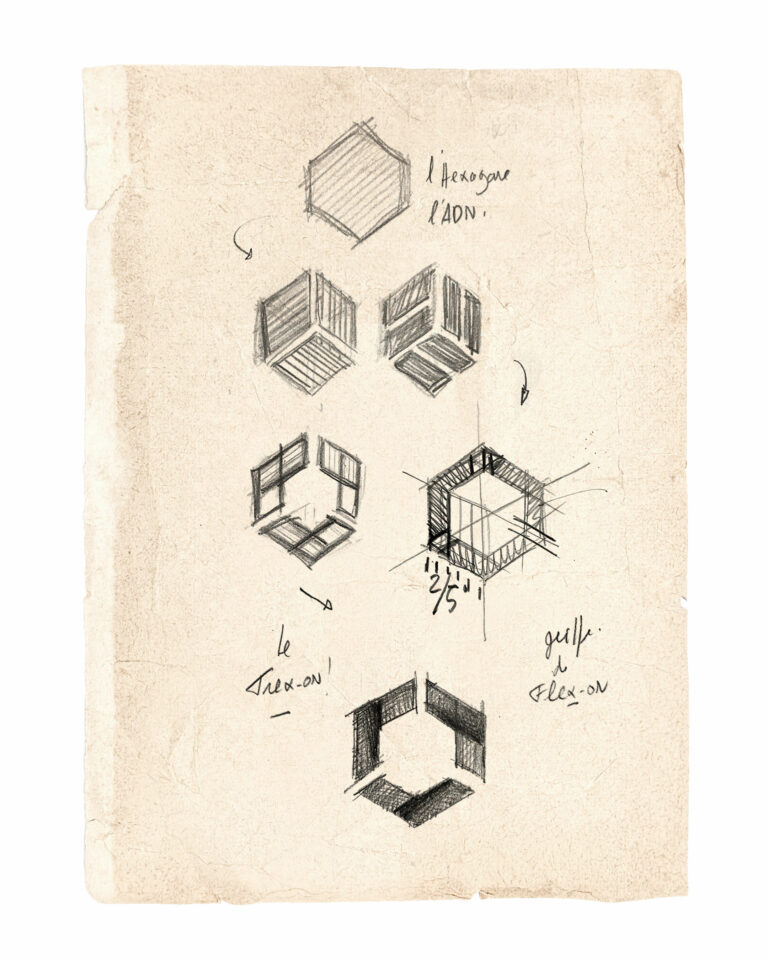
A benchmark in equestrian equipment, Flex-on has entrusted us with the redesign of its hexagon into a more breathable sign: Trex-on. Three chevrons accompany the unchanged typography. At the same time, Flex-on is researching and developing its future product: a riding helmet, and has entrusted us with the naming. It will be Armet! In reference to the first closed helmets worn by fifteenth-century knights.

Horse with Flex-on saddle — Flex-on lifestyle photography homepage image · vrai studio

© Flex-on

Flex-on logo featuring a horse — redesign of the equestrian visual identity · vrai studio

© Flex-on

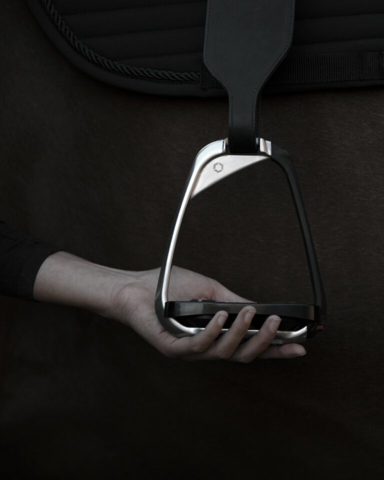
Flex-on hexagon symbol on stirrups — equestrian visual identity · vrai studio

© Flex-on

Flex-on Helmet — Visual Identity for Equestrian Gear · vrai studio

© Flex-on

Flex-on Helmet Shoot — Equestrian Branding Photography · vrai studio

© Flex-on

Flex-on Horizontal Logo — Flex-on Brand Identity Redesign · vrai studio
Hexagone Flex-on on a horse in a real-life setting — Flex-on lifestyle photography · vrai studio

© Flex-on

Flex-on Packaging Box — Flex-on Visual Identity · vrai studio
Hexagone Flex-on on a horse in a real-life setting — Flex-on lifestyle photography · vrai studio

Flex-On is a French brand of equestrian equipment that specializes in manufacturing safety stirrups and helmets for competitive riders and the luxury equestrian market.

The project entrusted to vrai studio redesigning the logo. The helmet's name was created by Camille Gabarra.

Artistic Director: Camille Gabarra

Flex-on Identity Sketch — Sketch for an Equestrian Logo Design · vrai studio

RESTRUCTURING

Trex-on, a sign that breathes

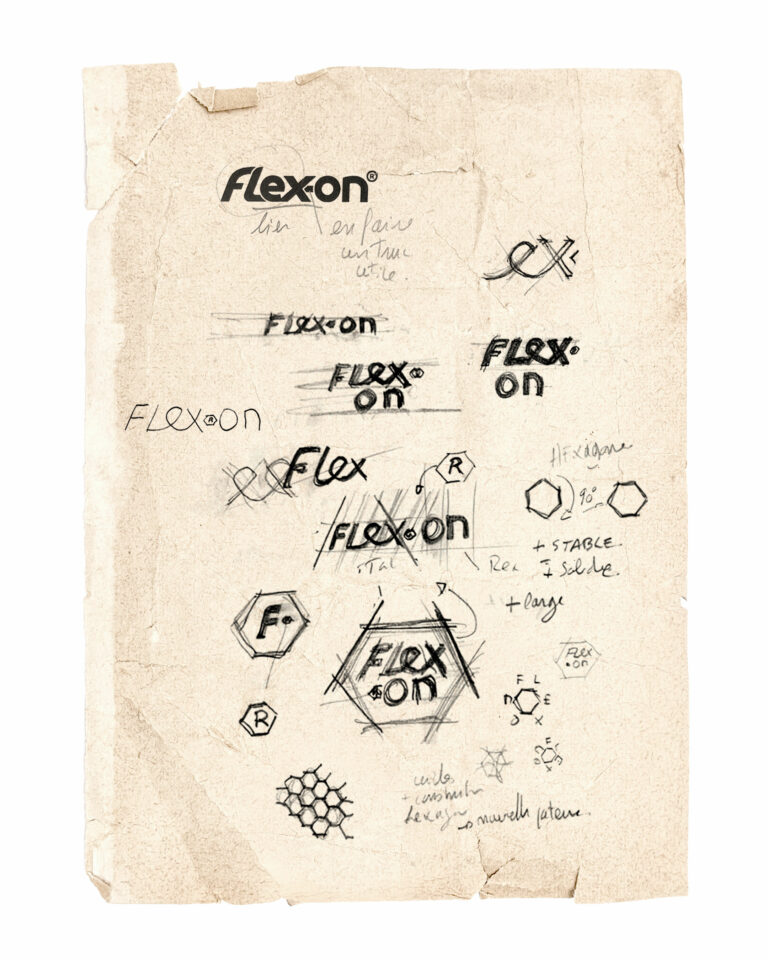
Flex-on Identity Sketches — Sketch for an Equestrian Logo Redesign · vrai studio

STUDIES

Some parallel research

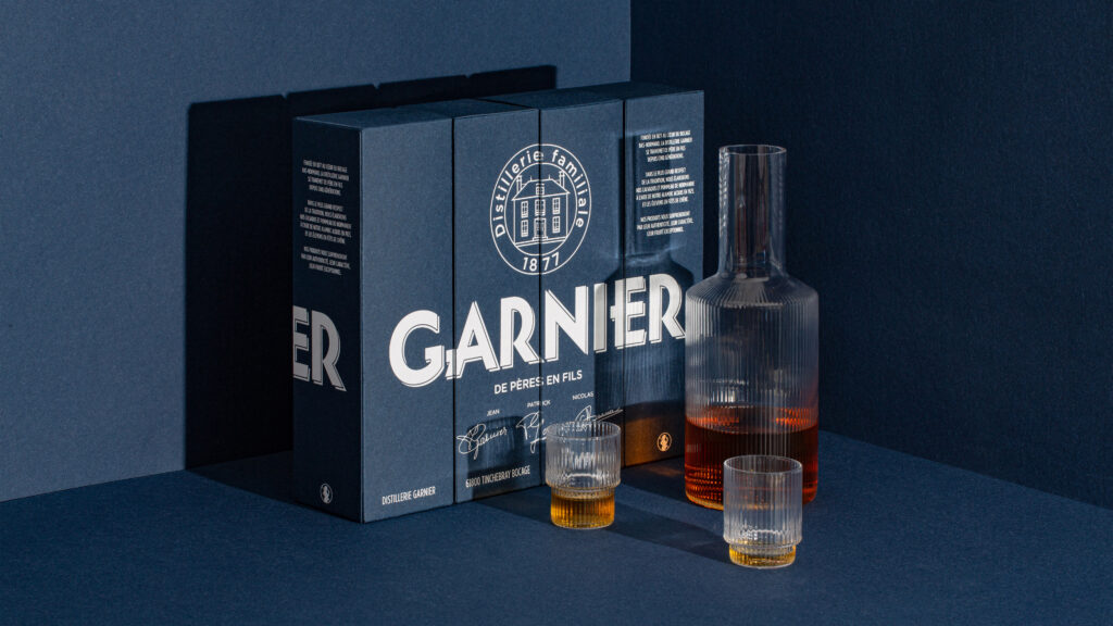
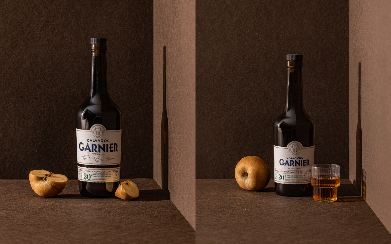
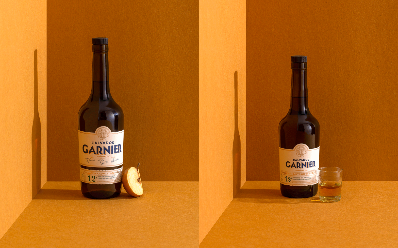
Calvados product shot setting, view 1 — Garnier branding · vrai studio
Product Line Promotion — Garnier Visual Identity · vrai studio
  • Creative Direction
  • Art Direction
  • Project management
  • Brand identity
  • Packaging
  • Photography
  • Brand story
  • Manufacturing management
  • Web design

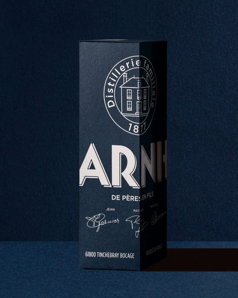
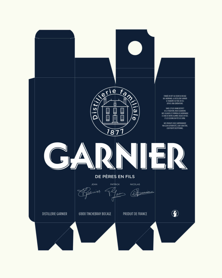
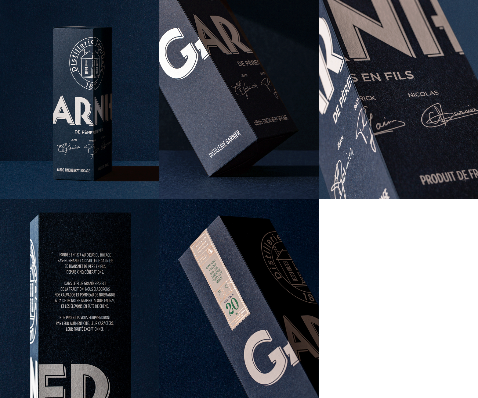
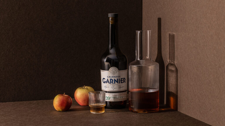
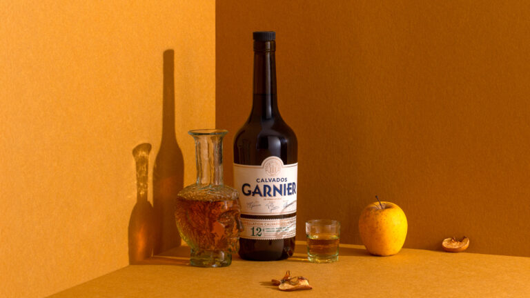
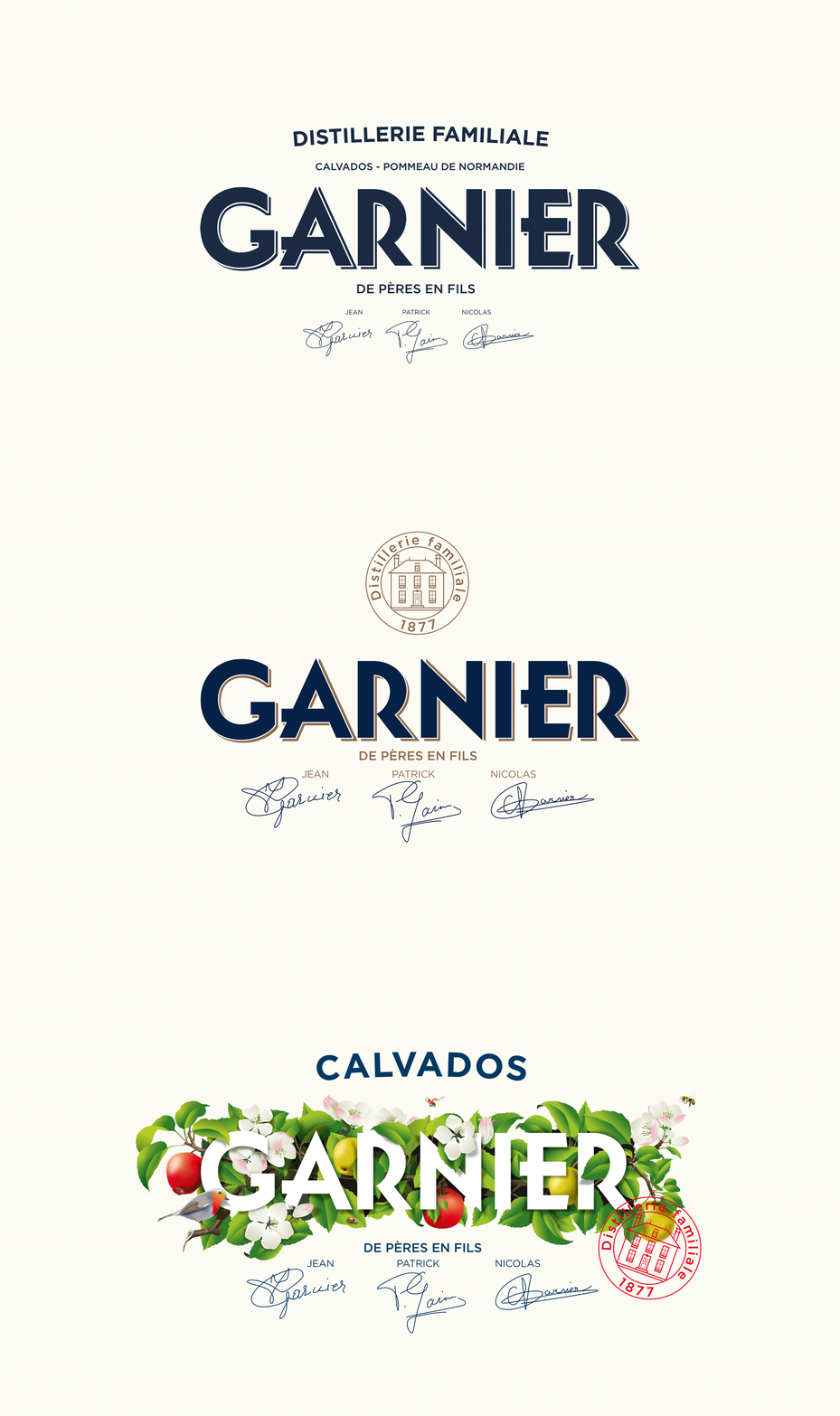
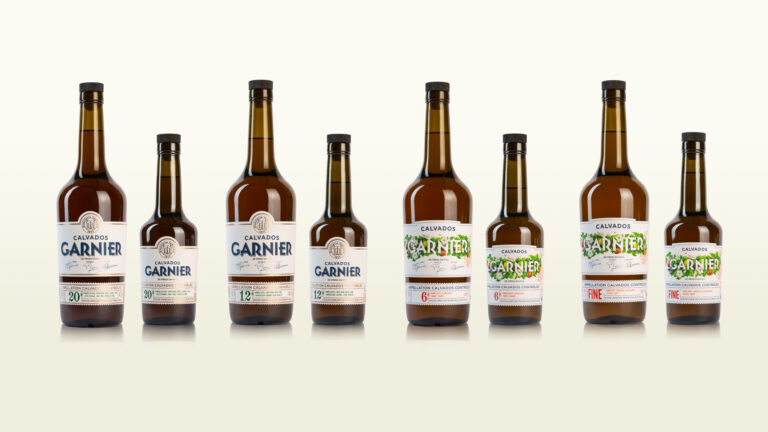
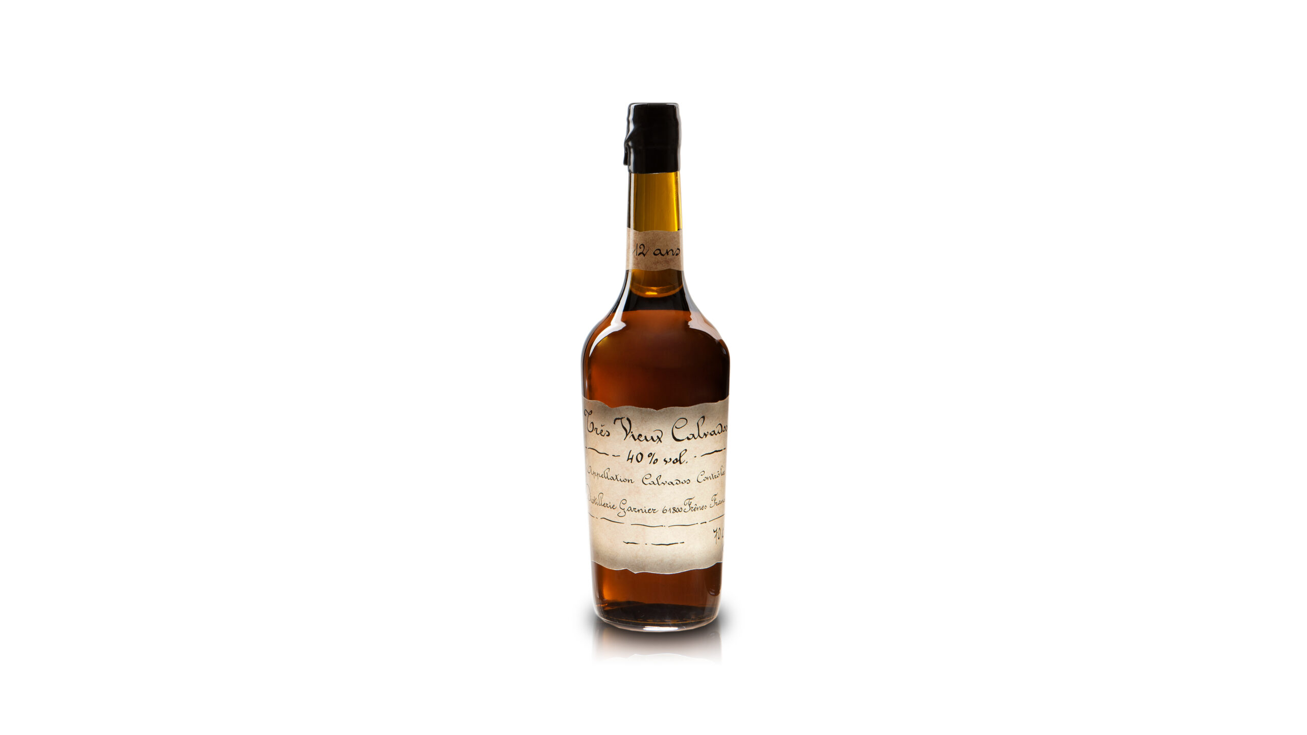
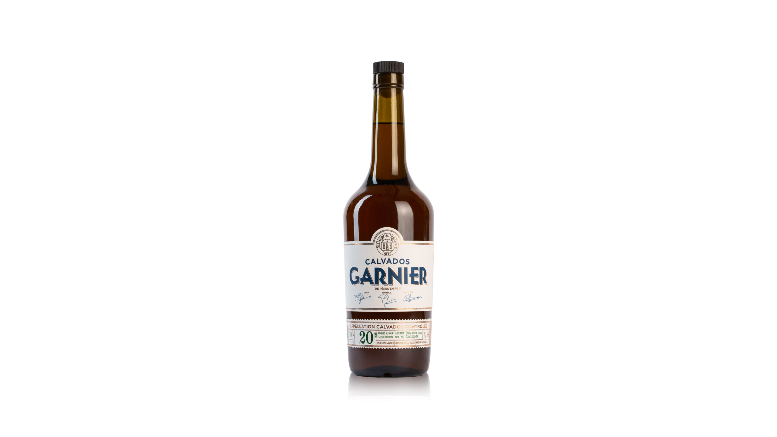
Since 1877, the Garnier family has been producing and distilling in the Normandy Bocage. Nicolas entrusted us with the redesign of his identity after aligning us with several agencies. The human touch and a taste for the real thing made the difference. A family crest, Art Deco typography and midnight blue set the brand apart. The offer was reorganized into two ranges: one young, with a metaphorical illustration of the apple tree cycle; the other traditional, with classic graphic codes.

Calvados product photography — Garnier branding · vrai studio

© Le Goff & Gabarra

Product Line Promotion — Garnier Visual Identity · vrai studio

© Le Goff & Gabarra

Calvados product shot setting, view 2 — Garnier branding · vrai studio

© Le Goff & Gabarra

Product Line Promotion — Garnier Visual Identity · vrai studio

© Le Goff & Gabarra

Product Line Promotion — Garnier Visual Identity · vrai studio

© Le Goff & Gabarra

Calvados product shot setting, view 3 — Garnier branding · vrai studio

© Le Goff & Gabarra

Logo Animation — Garnier Visual Identity · vrai studio

© Le Goff & Gabarra

Calvados product shot setting, view 5 — Garnier branding · vrai studio

© Le Goff & Gabarra

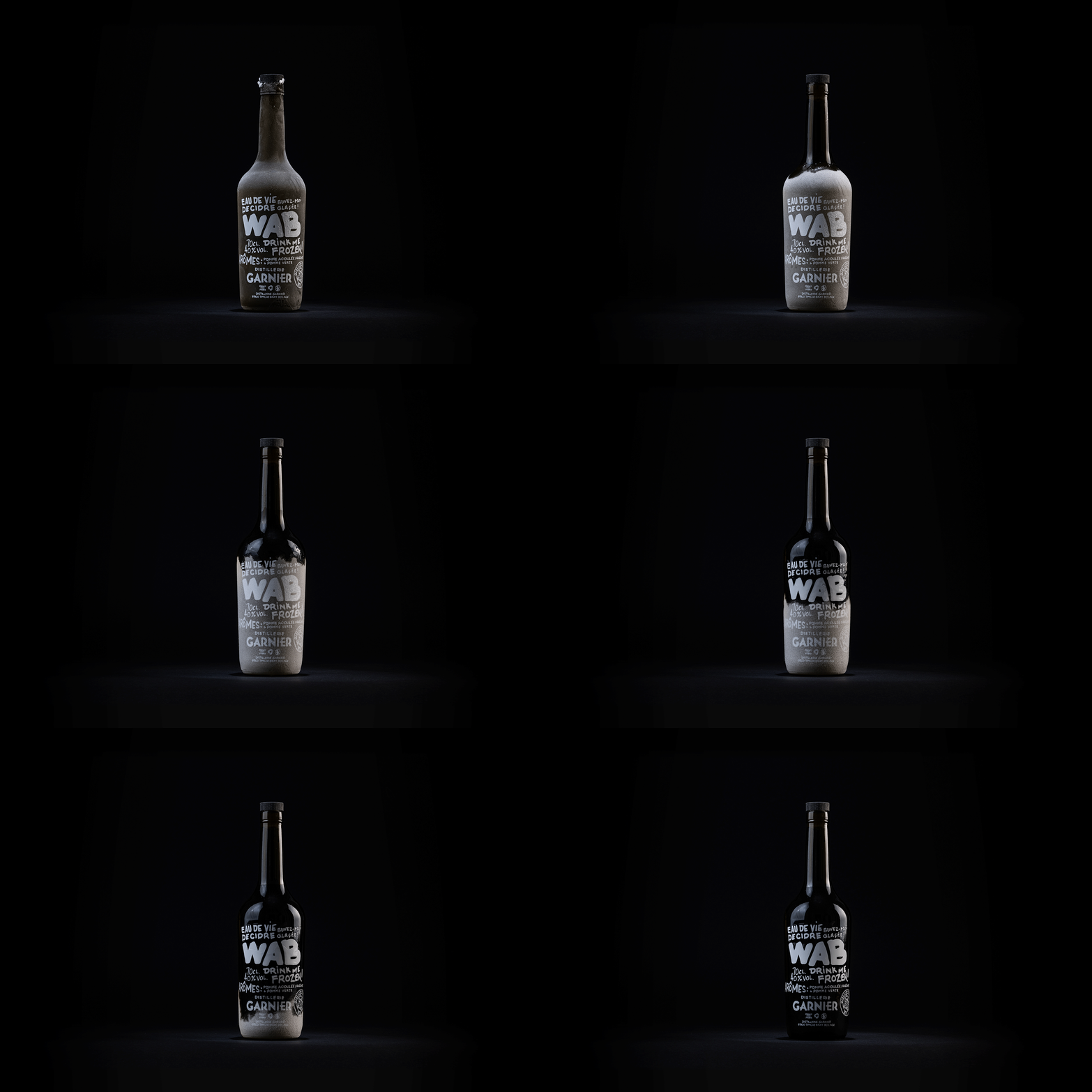
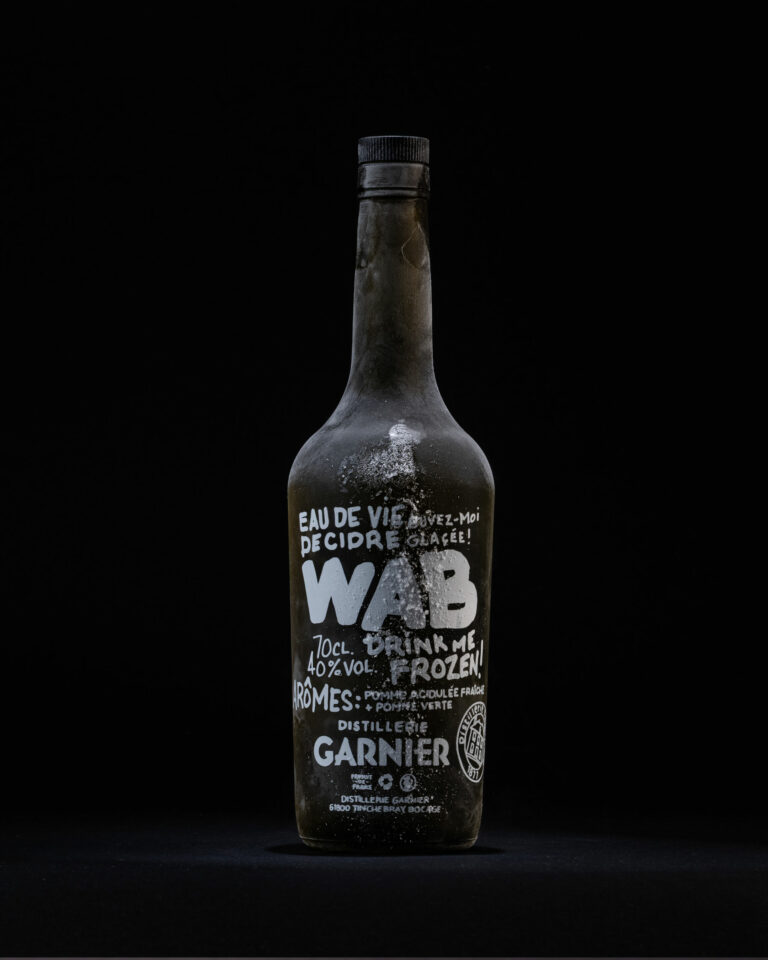
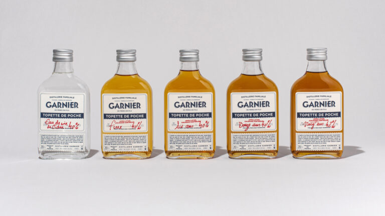
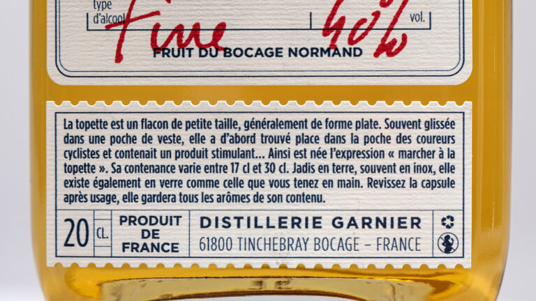
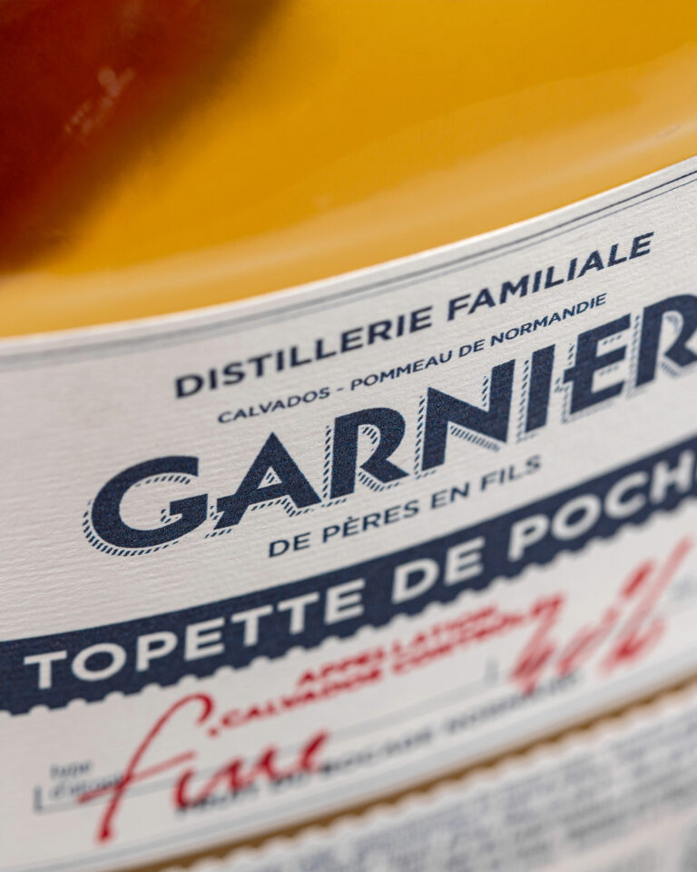
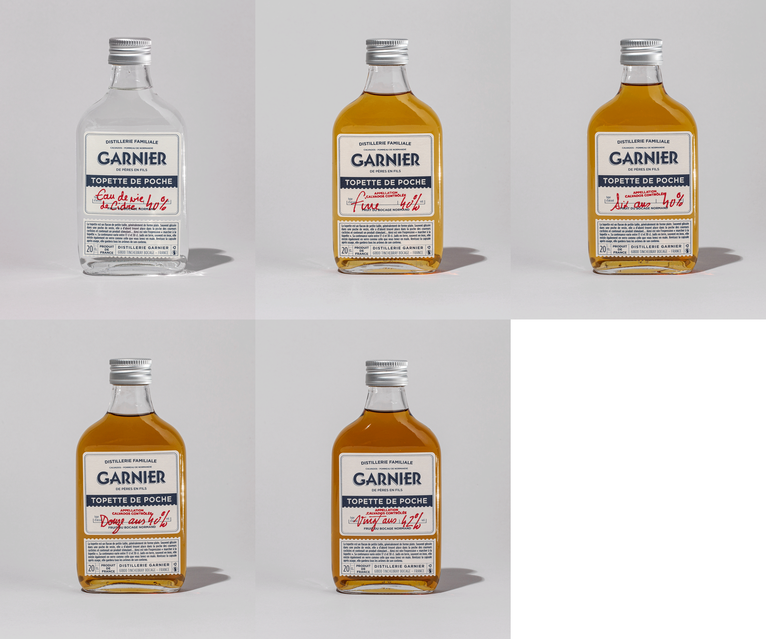
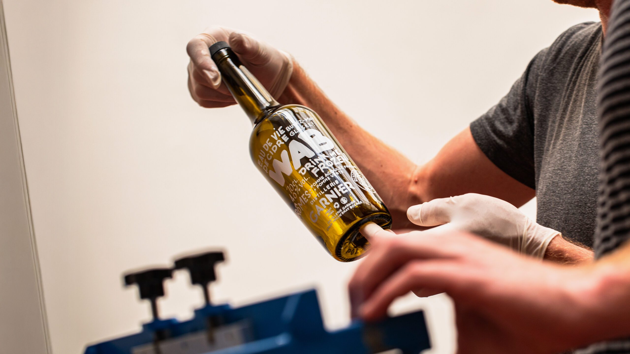
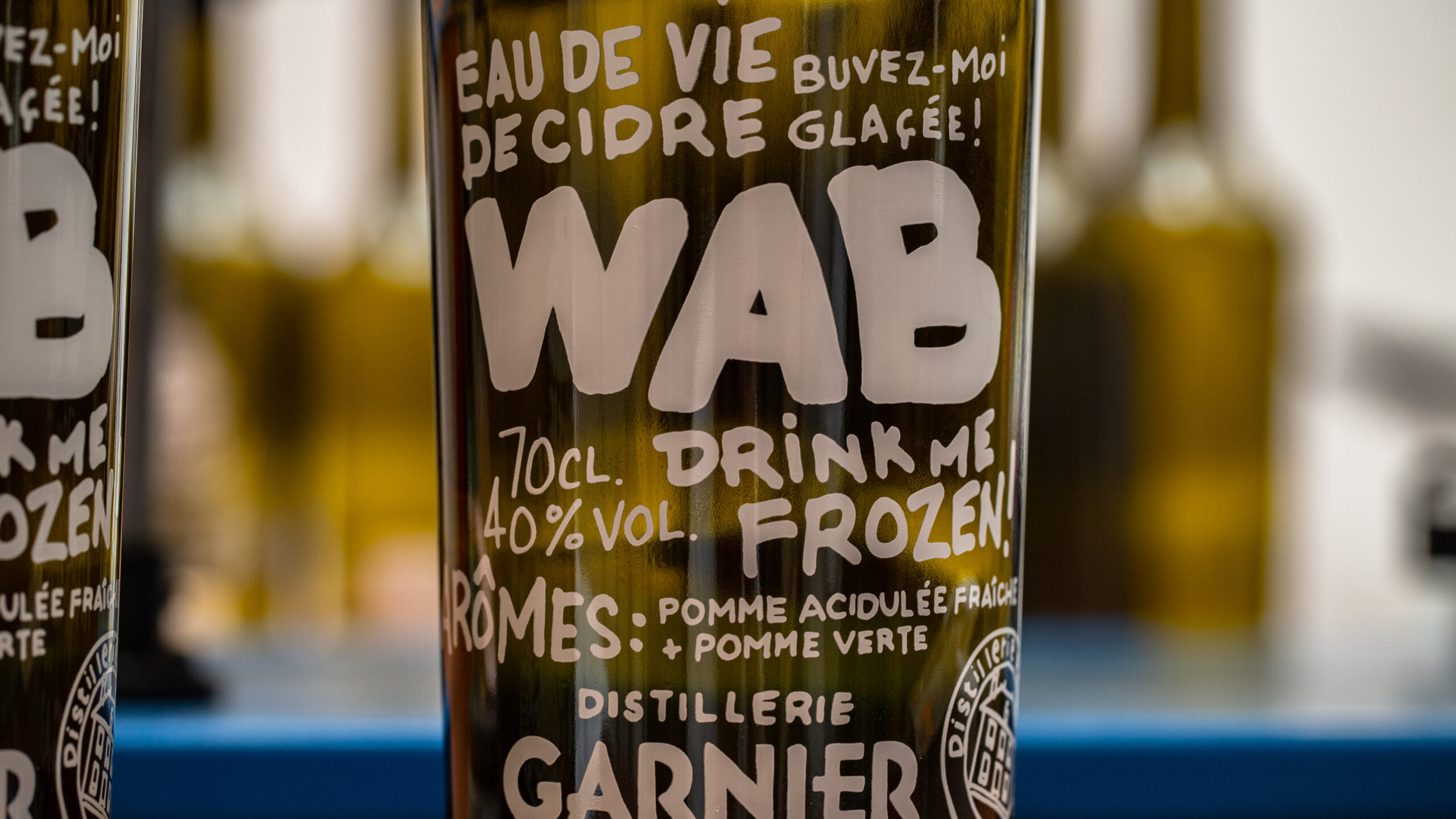
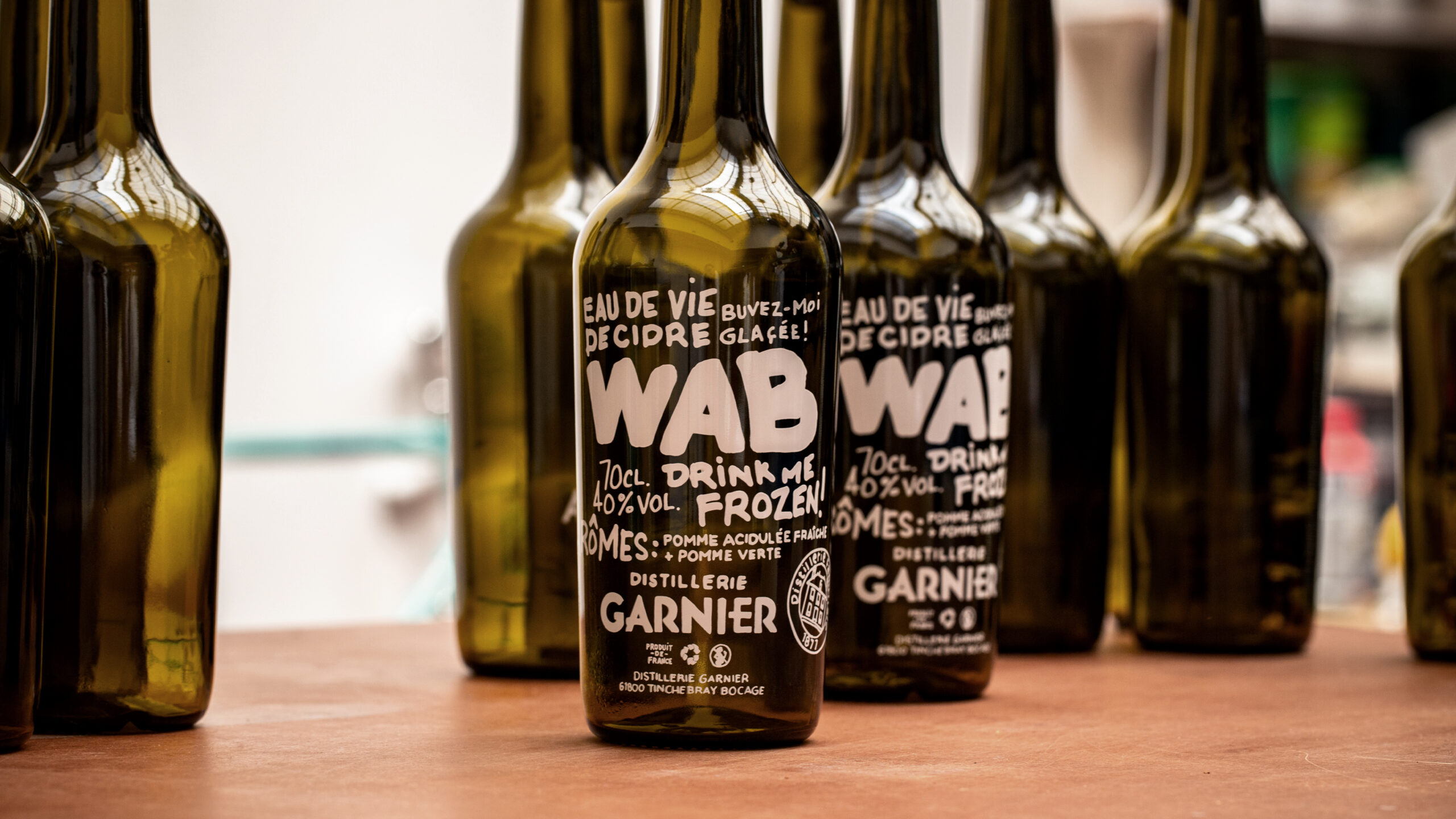
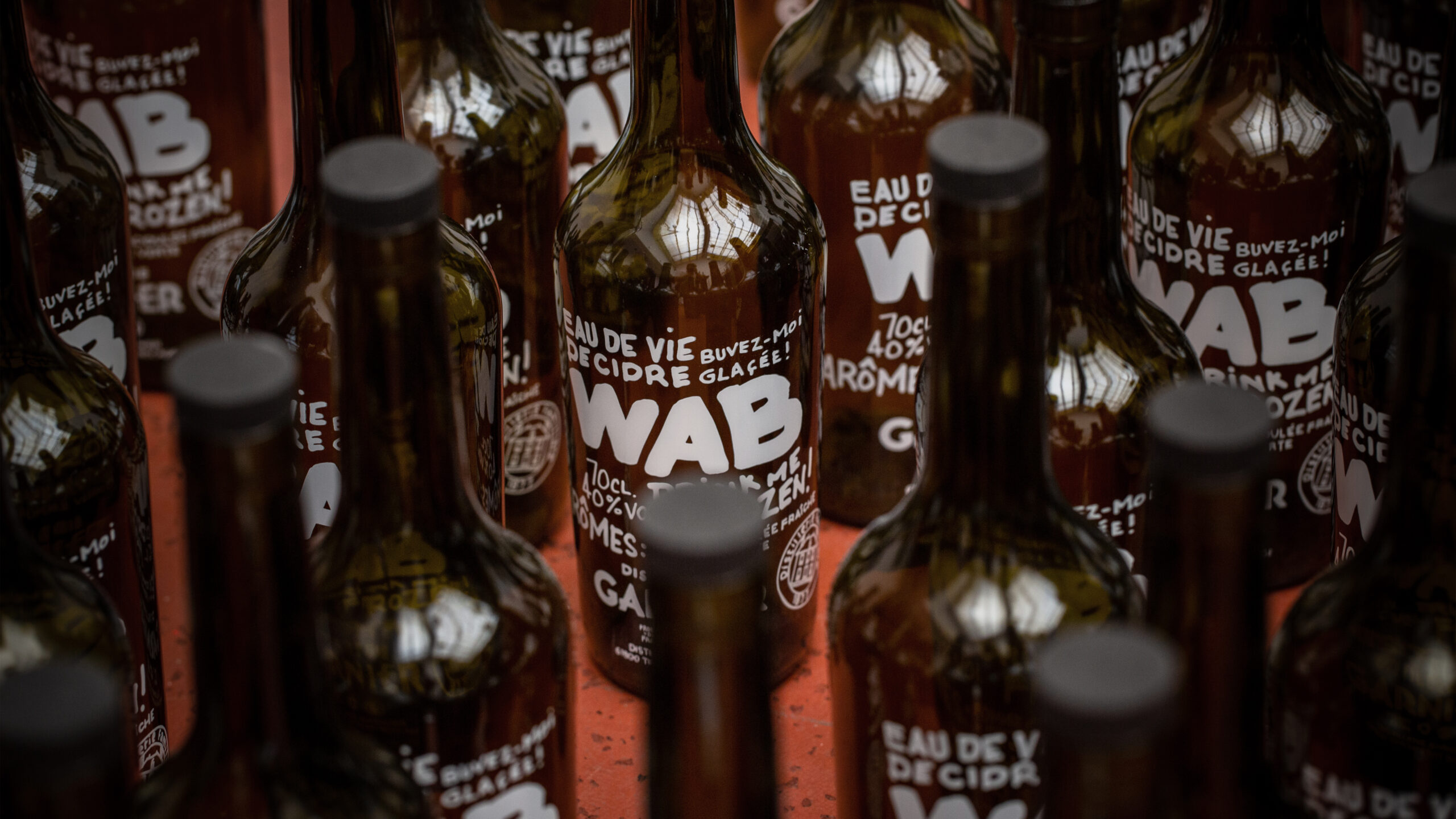
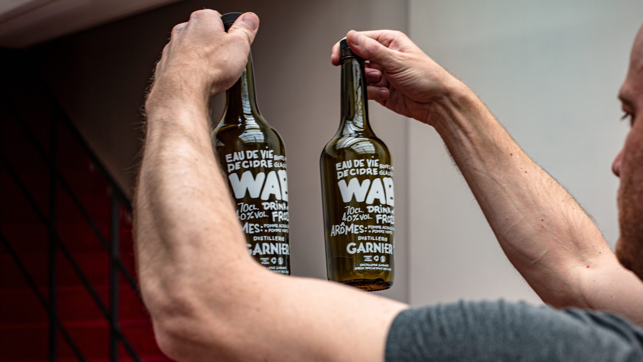
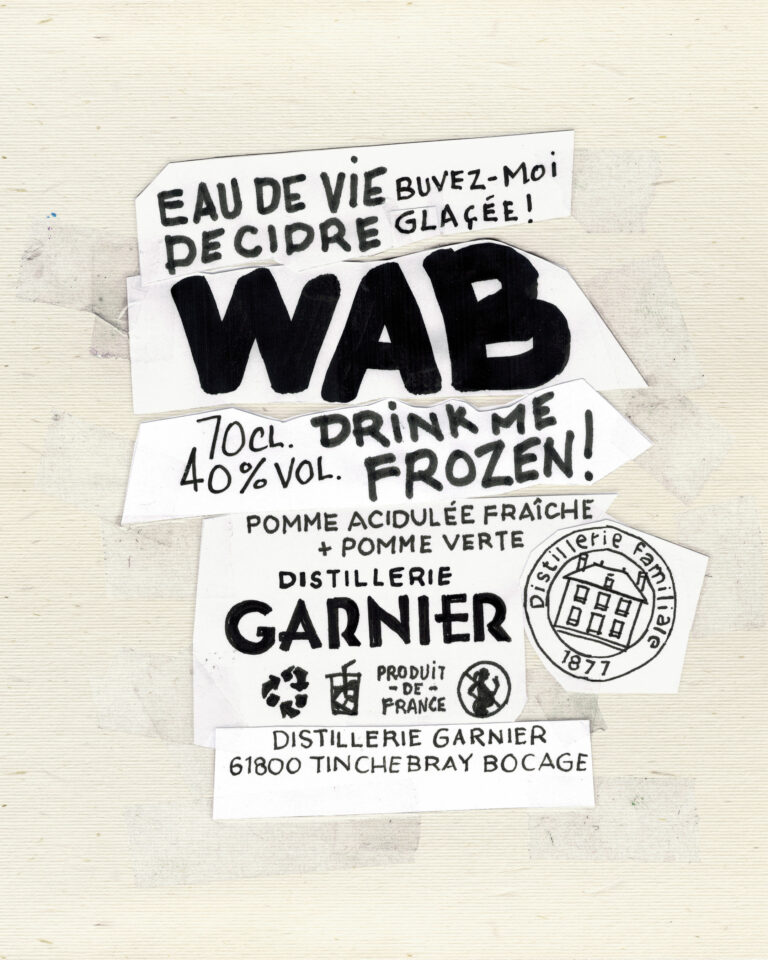
Two purely marketing-oriented products are developed on our advice: WAB – White Apple Brandy – echoes the codes of contraband, with no label and a message written by hand directly on the bottle; and the topette, a portable product that leaves a lasting impression and which Nicolas can fill on demand.

WAB Petite — Garnier Calvados packaging · vrai studio
WAB White Apple Brandy bottle, view 2 — packaging by Garnier · vrai studio
WAB White Apple Brandy bottle, view 1 — packaging by Garnier · vrai studio
Topette Nomade, View 1 — Garnier Calvados packaging · vrai studio

© Le Goff & Gabarra

Topette Nomade, View 7 — Garnier Calvados packaging · vrai studio

© Le Goff & Gabarra

Topette Nomade, View 6 — Garnier Calvados packaging · vrai studio

© Le Goff & Gabarra

"Topette Nomade" Animation — Garnier Calvados Packaging · vrai studio

© Le Goff & Gabarra

WAB in context, view 3 — Garnier product photography · vrai studio
WAB in use, view 2 — Garnier product photography · vrai studio
WAB in context, view 1 — Garnier product photography · vrai studio
WAB in context, view 4 — Garnier product photography · vrai studio
WAB in context, view 5 — Garnier product photography · vrai studio

Calvados Garnier is a Normandy-based calvados producer. Camille Gabarra was entrusted with the artistic direction and product photography during the first twenty years of her career, making this project one of the seminal works in the wine and spirits industry.
The project encompasses the brand’s visual identity and the photographic direction for its products. Rooting the brand in the traditions of artisanal Normandy spirits—without imitating generic market standards—is the same principle that now guides projects for Champagne M.Marcoult, Distillerie de la Forge Distillerie Monéger. In fact, it was through Calvados Garnier that Champagne M.Marcoult first discovered Camille Gabarra’s work, before contacting him several years later for a collaboration that has been ongoing since 2020.

Art Direction and Photography: Camille Gabarra
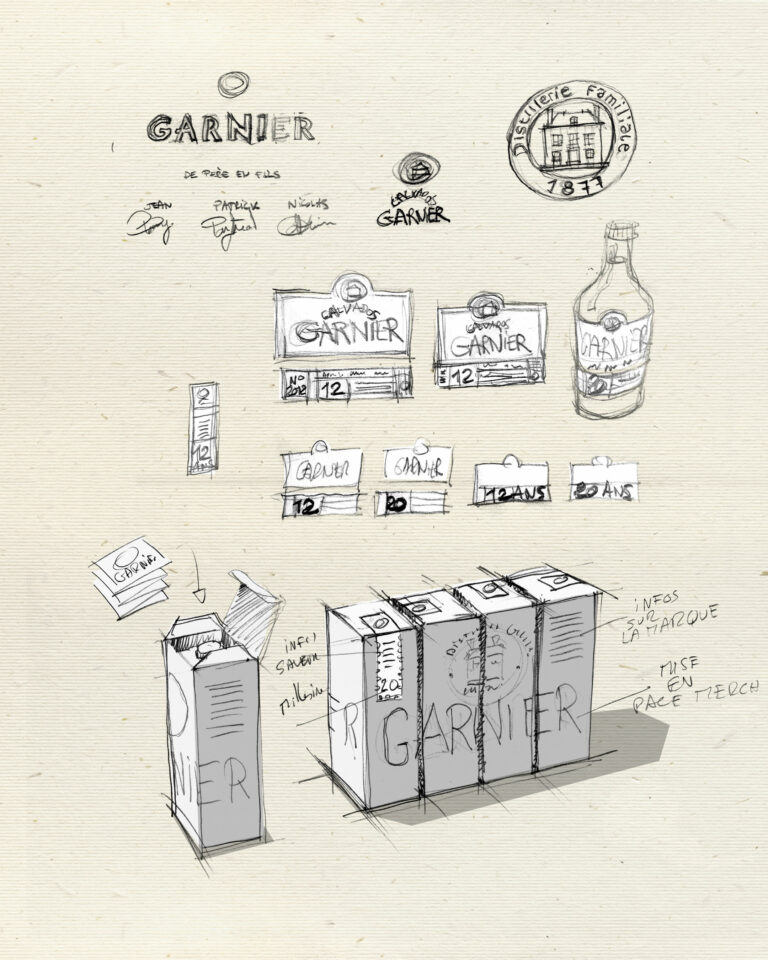
Concept Sketch 2 — Garnier Visual Identity · vrai studio

ASSEMBLY

Drawing, cutting, gluing...

Concept Sketch 1 — Garnier Visual Identity · vrai studio

STUDY

Starting with a sketch of intent, always

Brand Redesign, Before and After, View 1 — Garnier Calvados Branding · vrai studio Brand Redesign, Before and After, View 2 — Garnier Calvados Branding · vrai studio
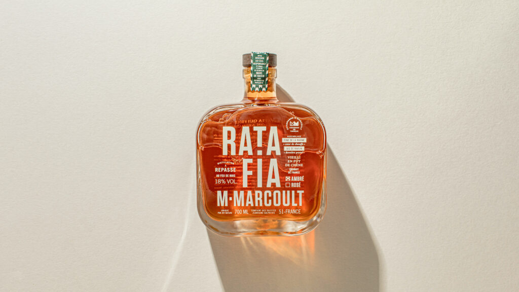
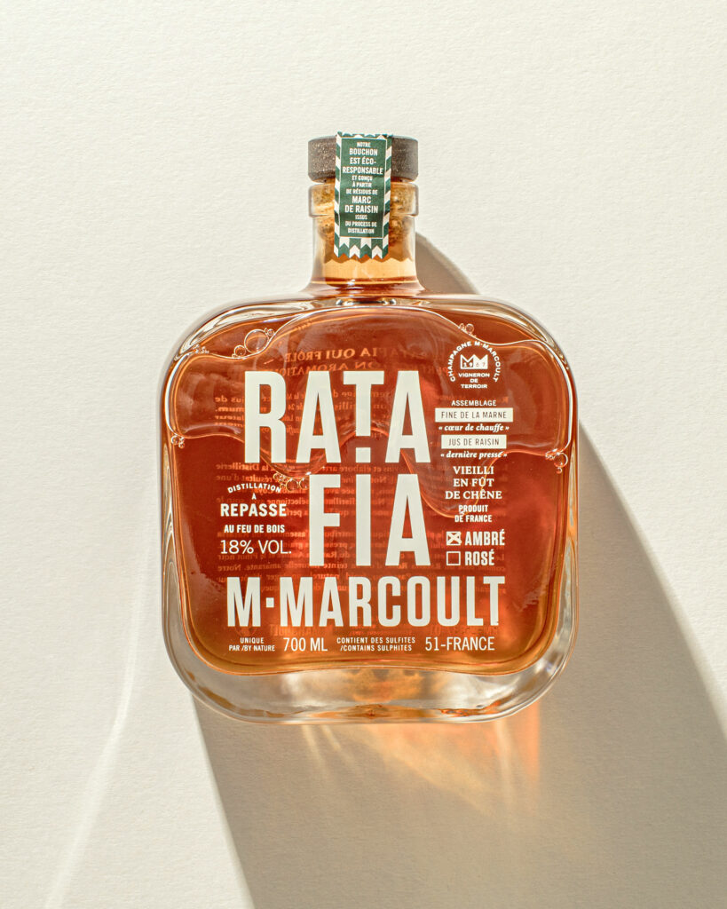
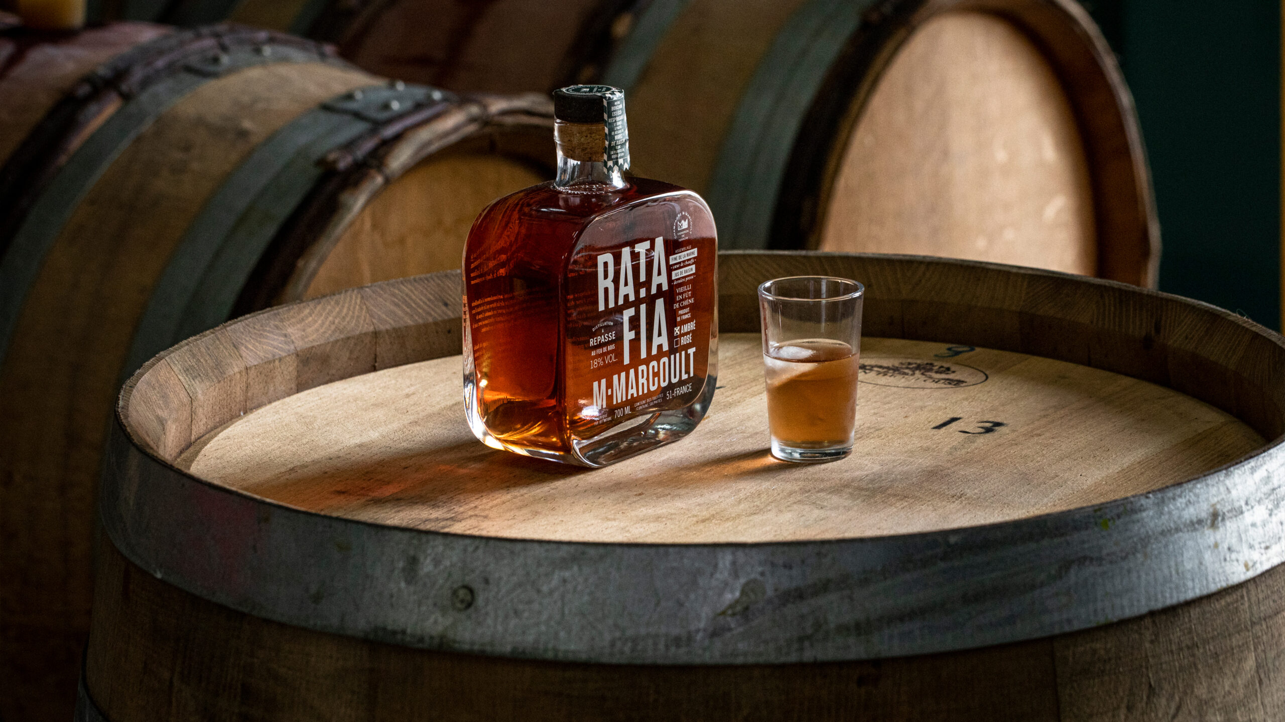
Ratafia Atmosphere by M. Marcoult — Artisanal Brand Photography · vrai studio
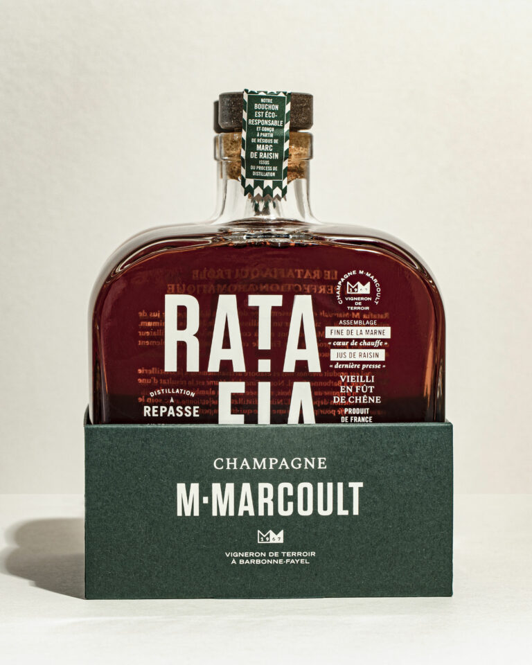
Ratafia M. Marcoult — bottle packshot, dark background, side view · vrai studio
  • Art Direction
  • Brand story
  • Brand vocabulary
  • Packaging
  • Manufacturing management
  • Photography

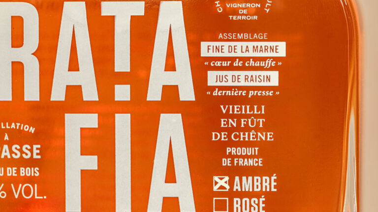
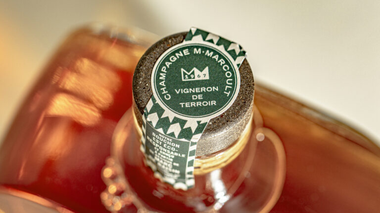
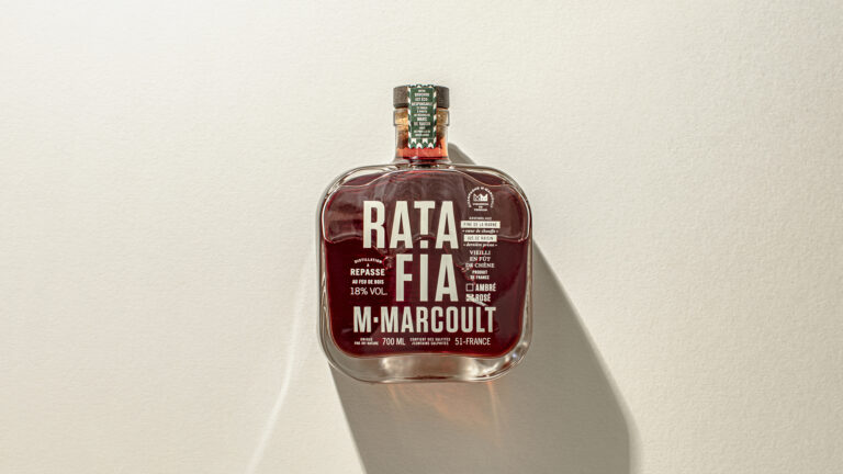
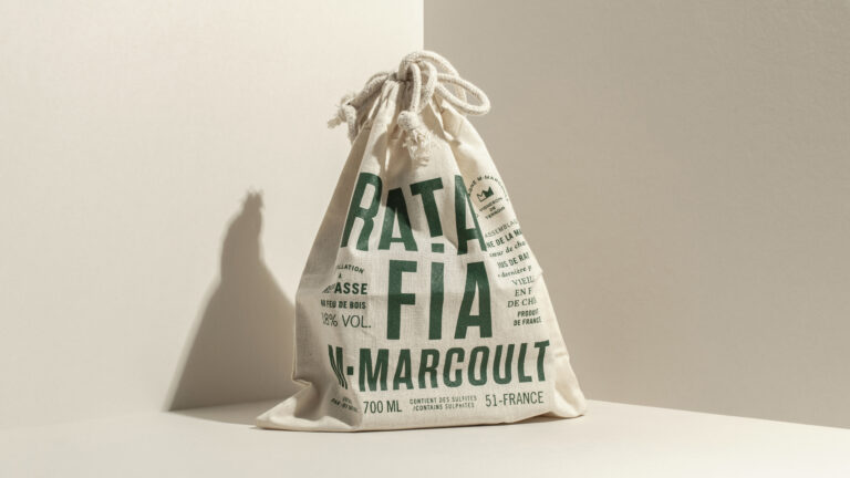
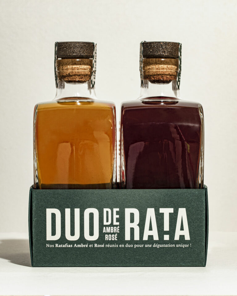
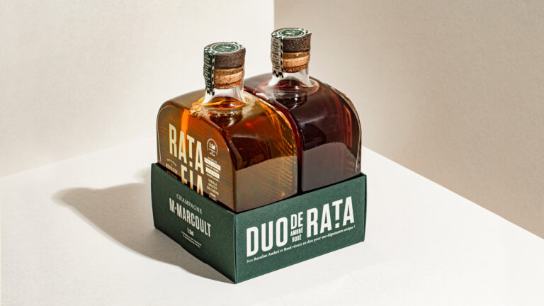
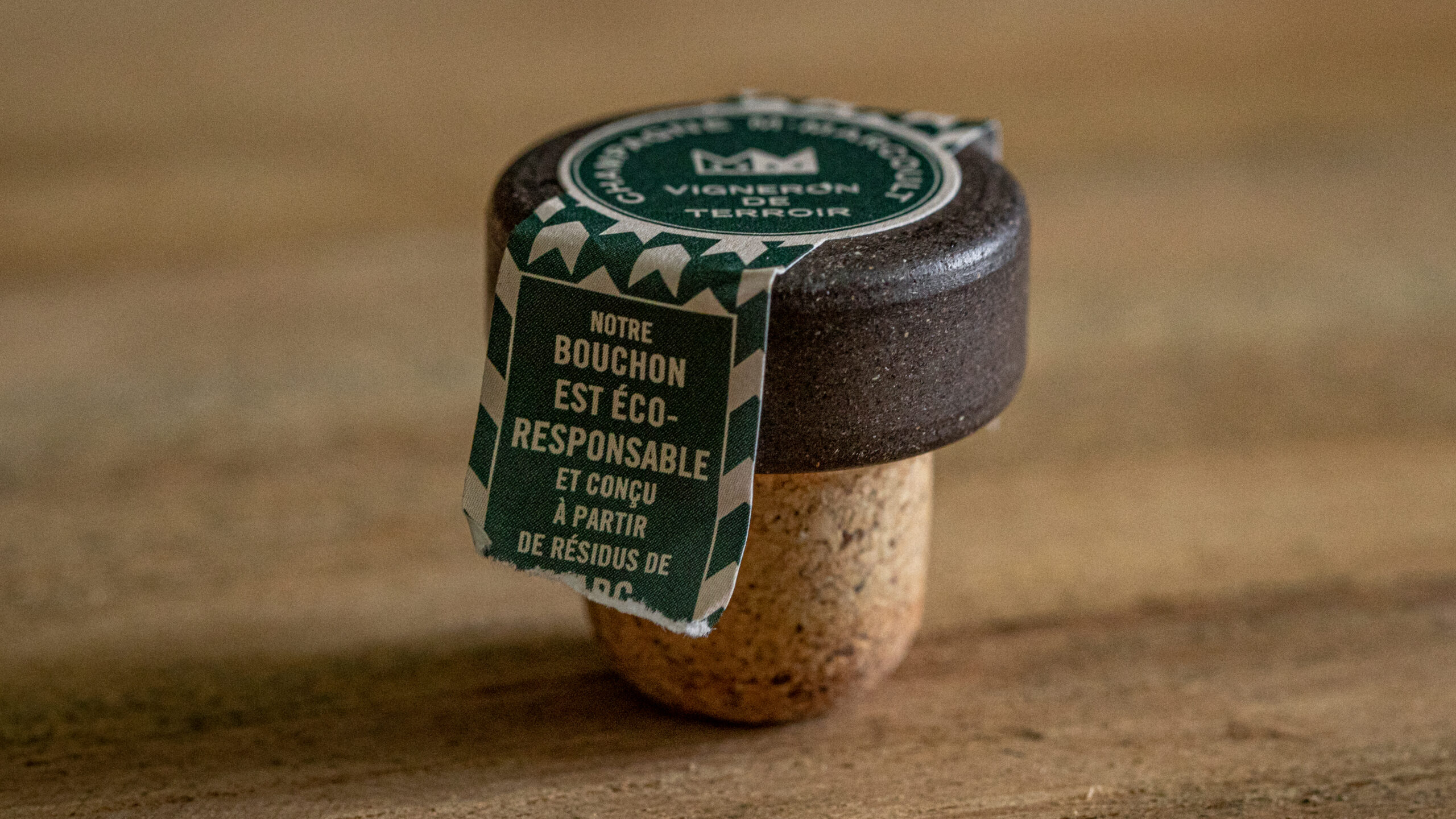
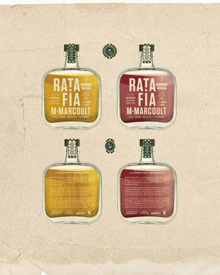
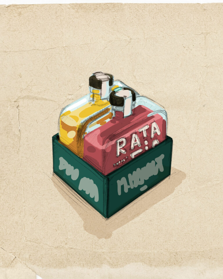
Following the rebranding of their champagne by us, Florence and Julien entrusted us with the creation of their flask of Ratafia, an artisanal amber (Chardonnay) or rosé (Pinot noir) spirit derived from champagne. A Peaky Blinders-style creation screen-printed directly on the glass in the Champagne brand's emblematic greige.

M. Marcoult Champagne Ratafia — atmosphere, visual identity, rebranding · vrai studio
Ratafia M. Marcoult — atmosphere, staging, lifestyle photography · vrai studio
Ratafia M. Marcoult — product photography capturing the atmosphere of champagne and local terroir · vrai studio
M. Marcoult Champagne Ratafia — atmospheric cellar photography · vrai studio
Ratafia M. Marcoult — bottle packshot, independent winemaker, Champagne · vrai studio
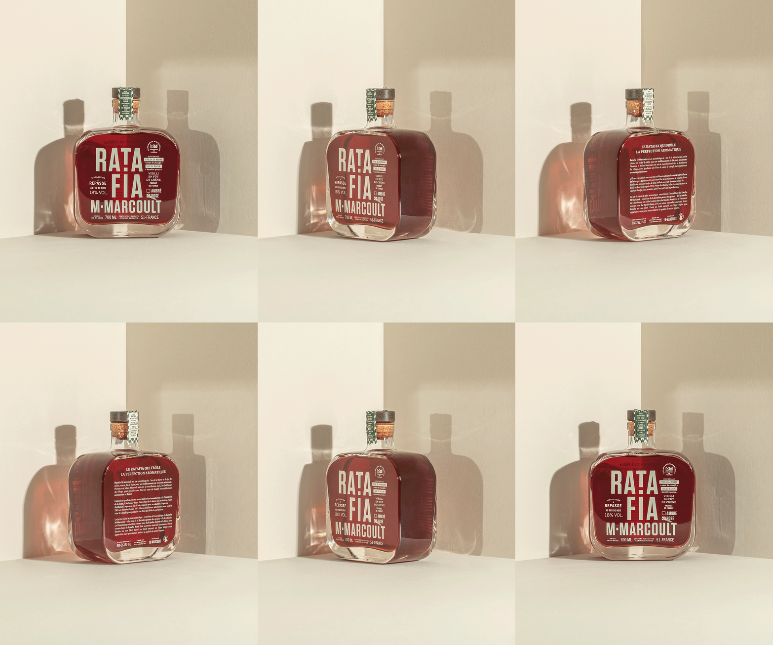
M. Marcoult Rosé Ratafia — 360° rotating packaging views · vrai studio
M. Marcoult Champagne Ratafia — atmospheric photography · vrai studio
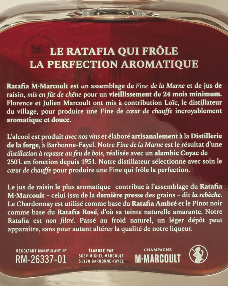
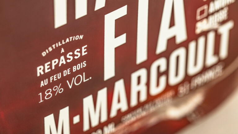
Close-up of the M. Marcoult Ratafia label — packaging typography · vrai studio
Ratafia M. Marcoult — product shots of the amber and rosé varieties · vrai studio
M. Marcoult Rosé Ratafia — packaging and label design · vrai studio
Ratafia Atmosphere by M. Marcoult — featuring artisanal champagne · vrai studio
Ratafia M. Marcoult Lifestyle — Tasting Table Set-Up · vrai studio
Ratafia M. Marcoult — lifestyle photography for a champagne brand · vrai studio

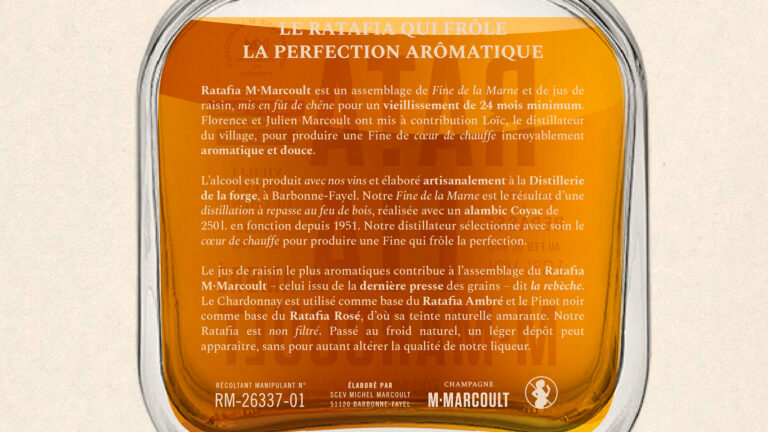
Champagne ratafia is a brandy made from grape juice and Champagne brandy—a niche, technically sophisticated product that deserves its own distinct identity within the M. Marcoult lineup.

vrai studio the bottles and designs the packaging for the white and rosé ratafia, ensuring direct consistency with the graphic system developed for the house’s champagnes. The bottle, the label’s silhouette, the color palette, and the typographic style are all crafted so that the ratafia stands as a natural extension of the brand, without any break in tone or formal imitation. The product photography direction combines scenes shot in the cellar with studio product shots, anchoring each image within the estate’s world. The ratafia tells the story of the same house, but in a different way—through a different product, a different light, and a different moment in the harvest.

Art Direction and Photography: Camille Gabarra
Ratafia Sketch by M. Marcoult — Visual Identity Creation Process for Champagne · vrai studio

VIRTUAL

Vector before production

Ratafia Study by M. Marcoult — packaging and brand identity design sketches · vrai studio

STUDY

Every project has its sketches

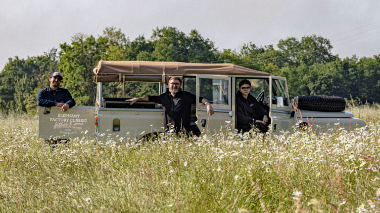
Behind the Scenes at EFC Elephant Factory Classic — Automotive Branding · vrai studio
EFC Elephant Factory Classic — automotive brand visual identity · vrai studio

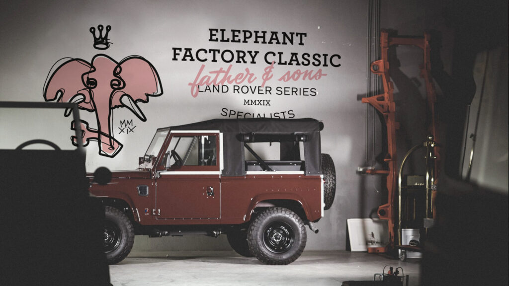
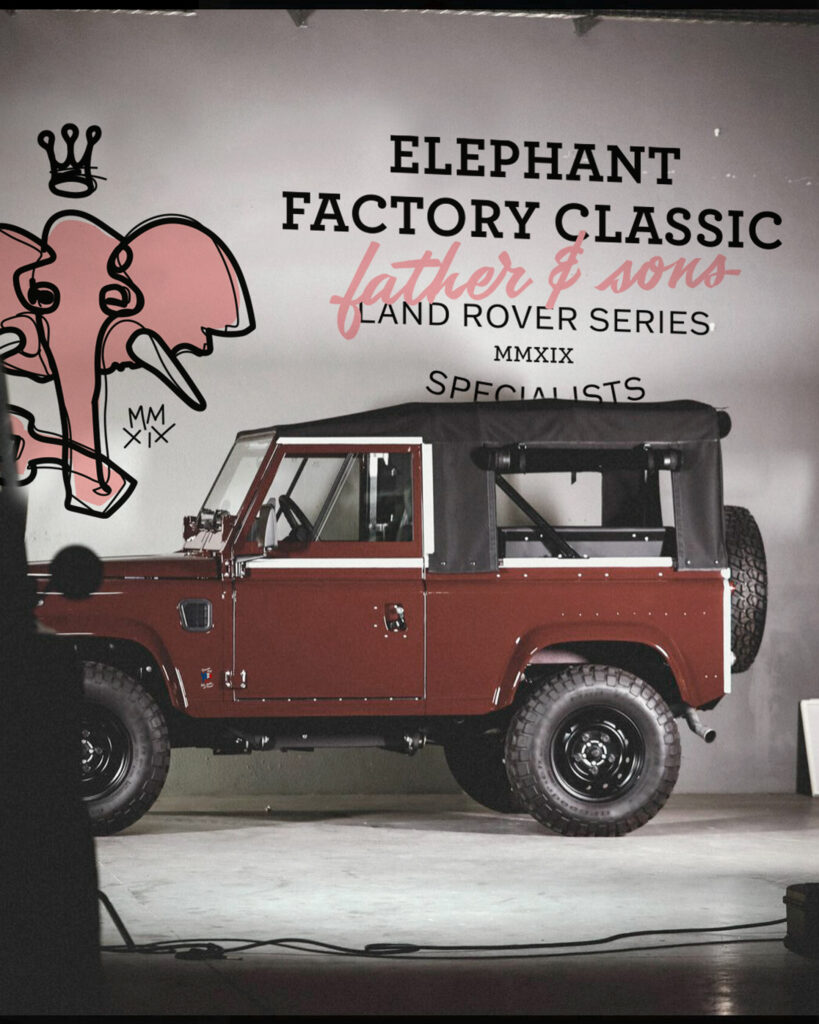
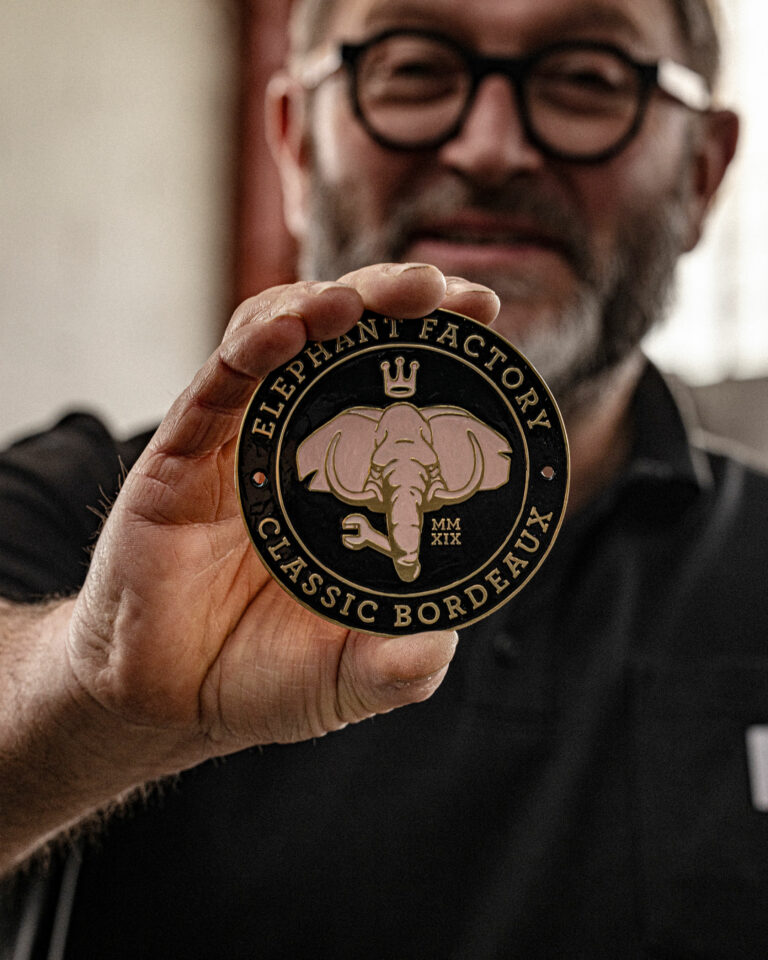
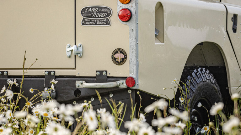
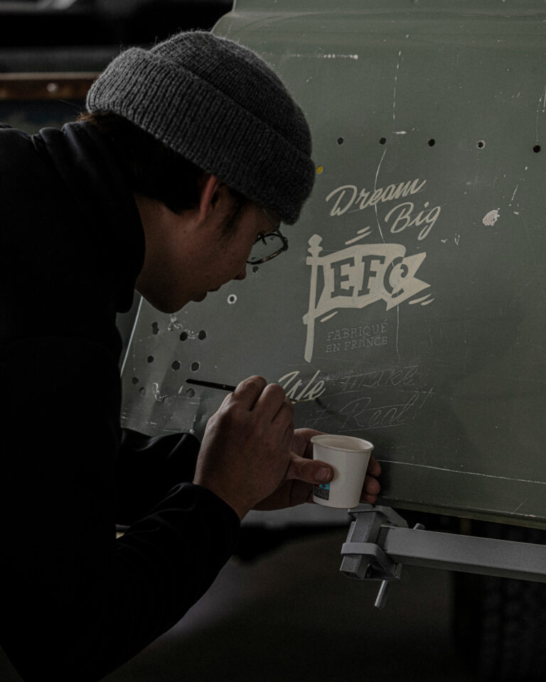
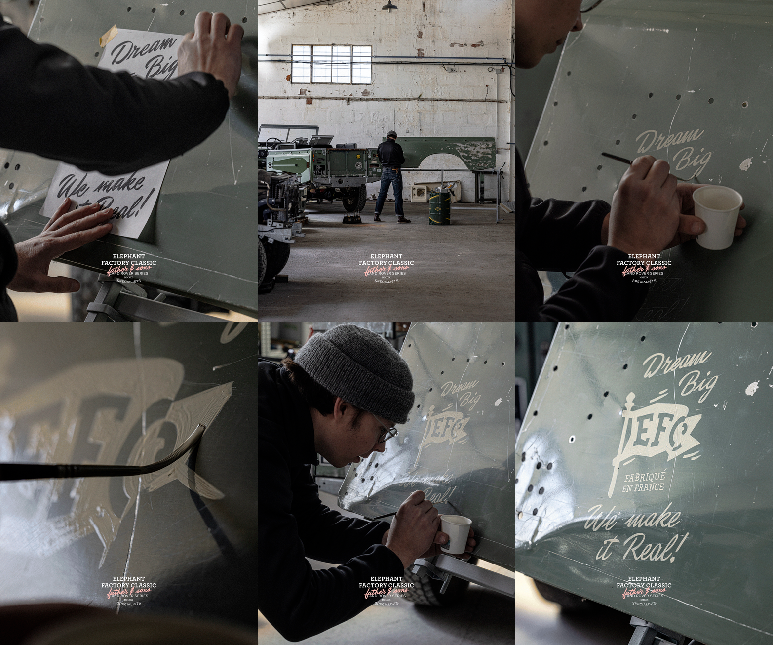
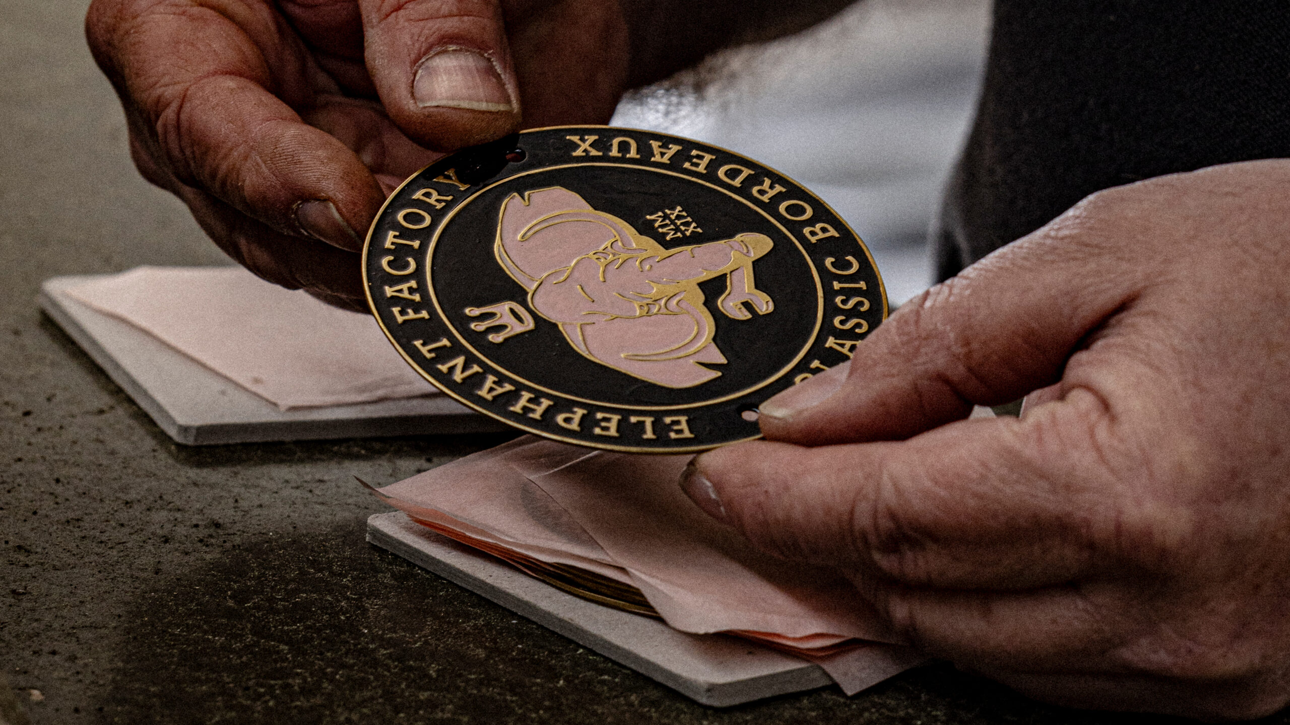
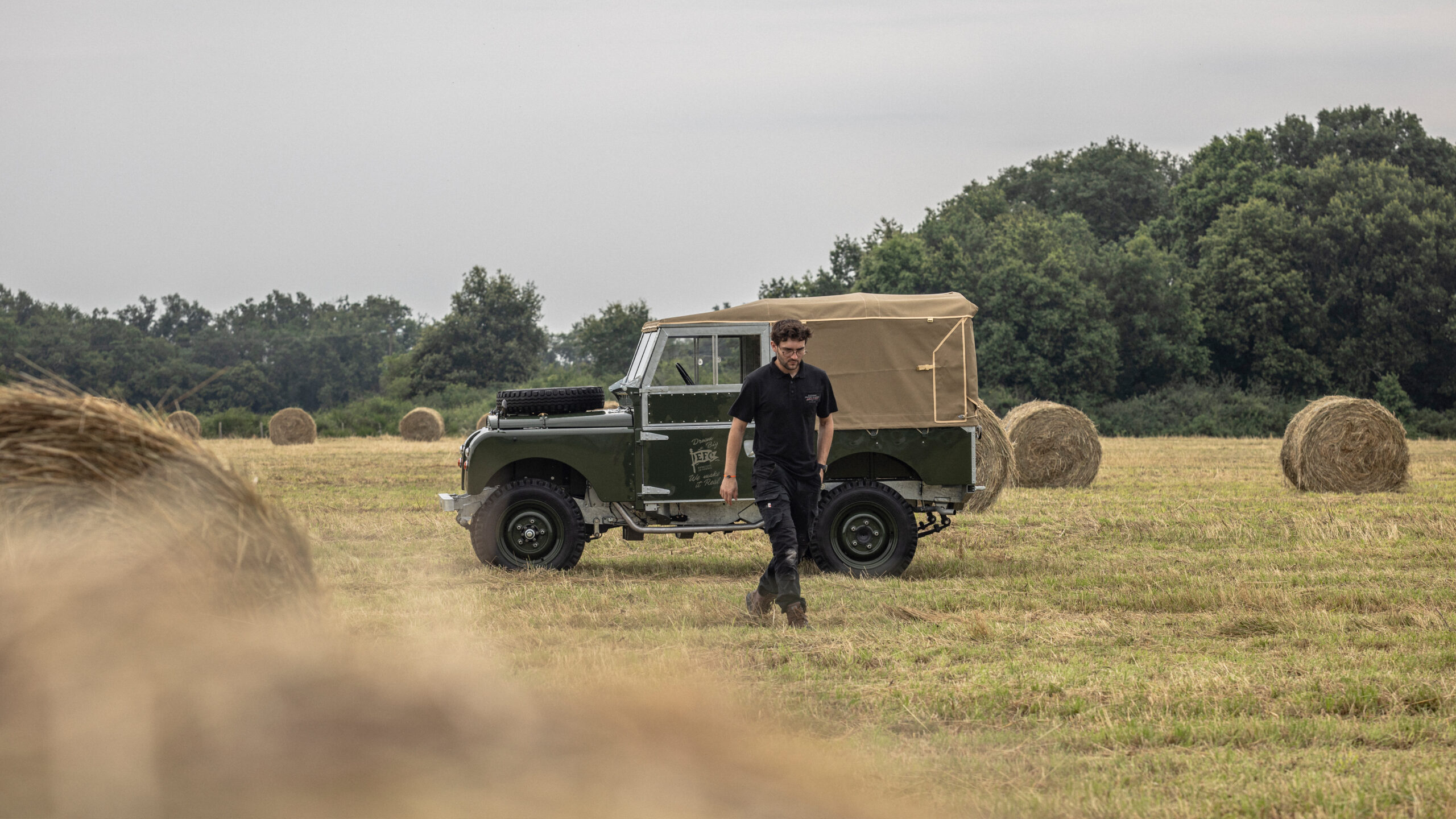
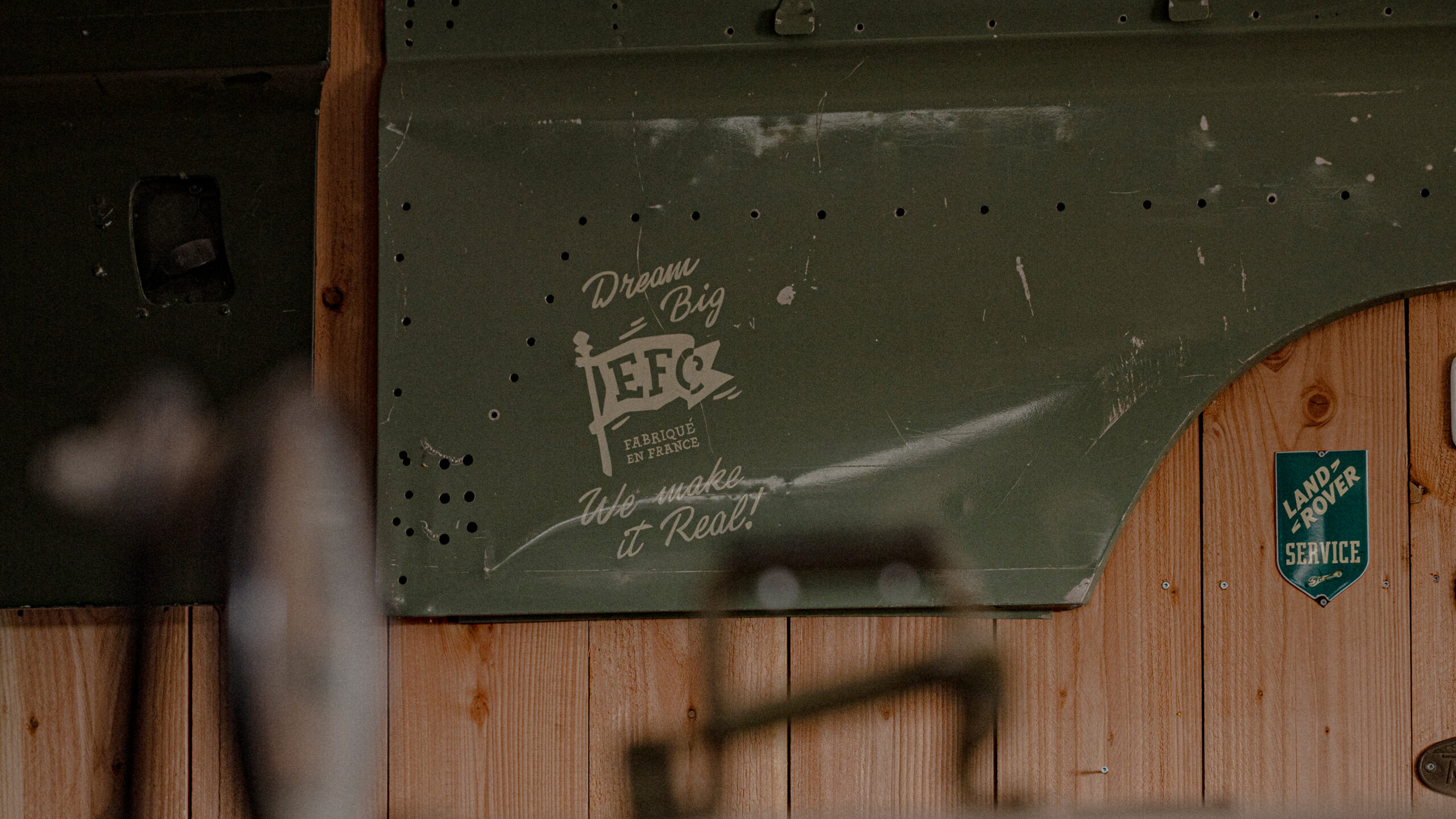
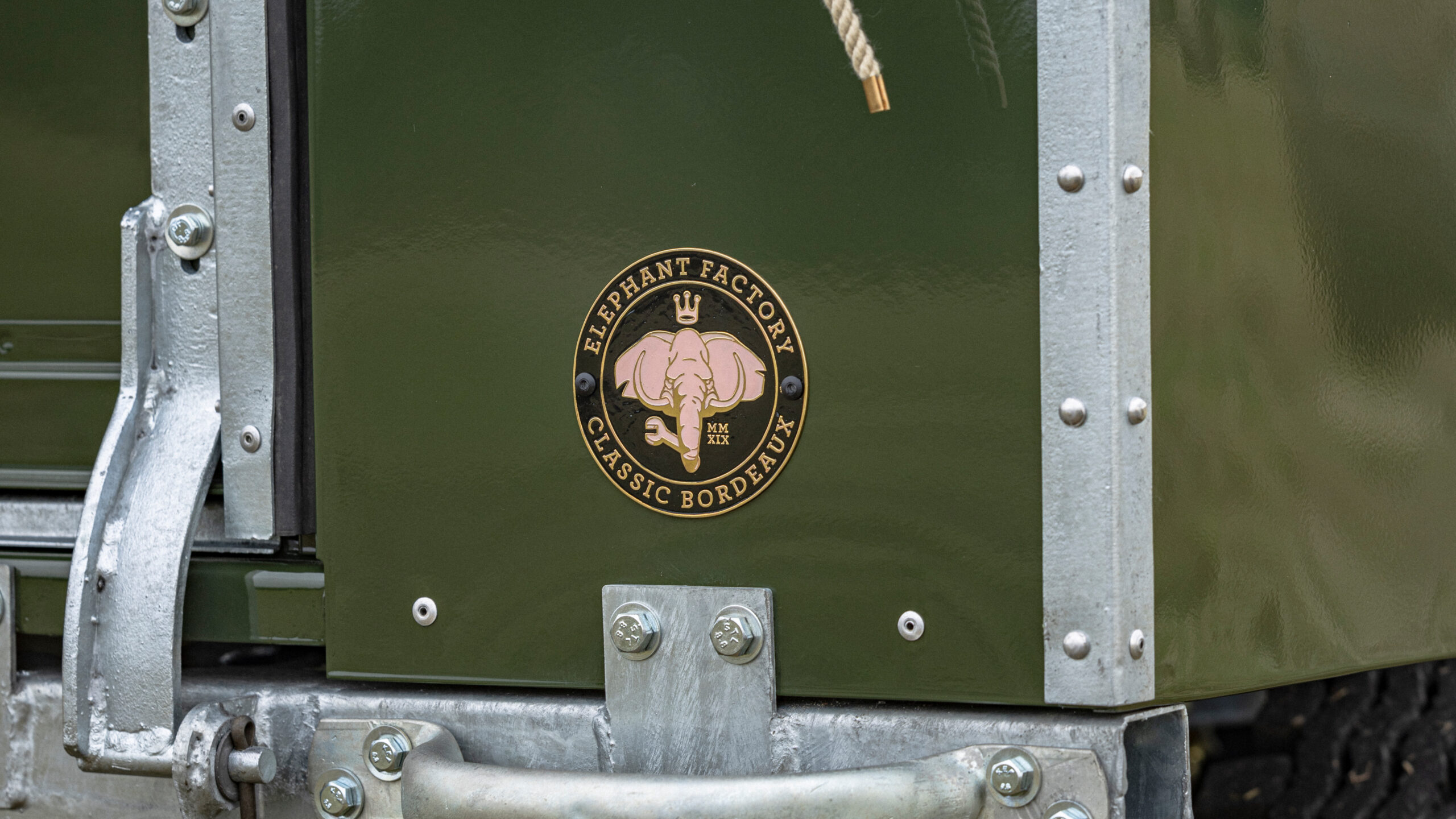
A four-speed identity: the family garage logo for stationery and the garage facade; the iconic badge, an absolute identity target riveted to the rear of restored Land Rovers; the EFC banner, the authentic signature of the garage specializing in the made-in-France restoration of Land Rover Classics; the crazy elephant as a work of art painted on the garage's main wall.

EFC Elephant Factory Classic Brand — Handcrafted Automotive Branding · vrai studio
EFC Elephant Factory Classic Brand Identity — Handcrafted Car Badge · vrai studio

ICONIC BADGE

Proudly presented by Jean-François Saulières, garage founder

Lifestyle EFC Elephant Factory Classic — artisanal automotive branding photography · vrai studio
EFC Elephant Factory Classic Atmosphere — automotive branding photography · vrai studio
EFC Elephant Factory Classic Logo Animation — Automotive Branding · vrai studio
EFC Elephant Factory Classic — visual identity and packaging for handcrafted automobiles · vrai studio
Behind the Scenes at EFC Elephant Factory Classic — Brand Photography · vrai studio
EFC Elephant Factory Classic — Handcrafted Automotive Branding · vrai studio

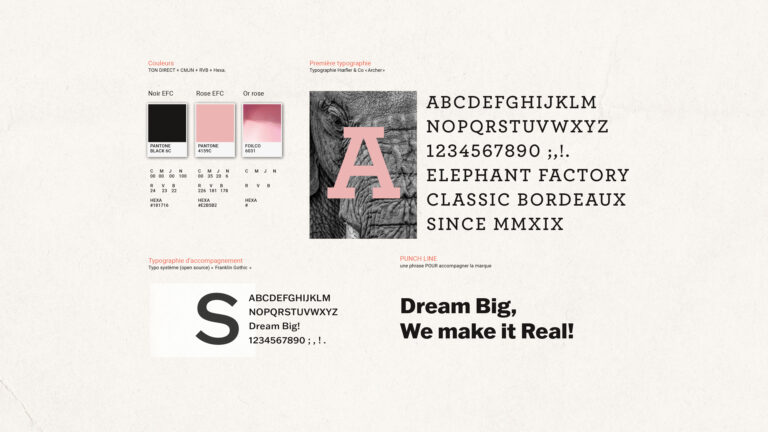
COLORS & TYPOGRAPHY

Complementary tones for an identity that blends heritage and modernity

EFC Elephant Factory Classic — automotive atmosphere and branding photography · vrai studio

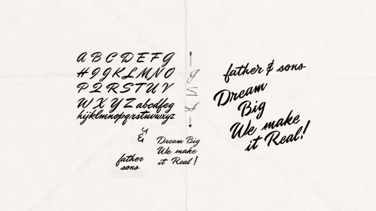
CUSTOM LETTERING

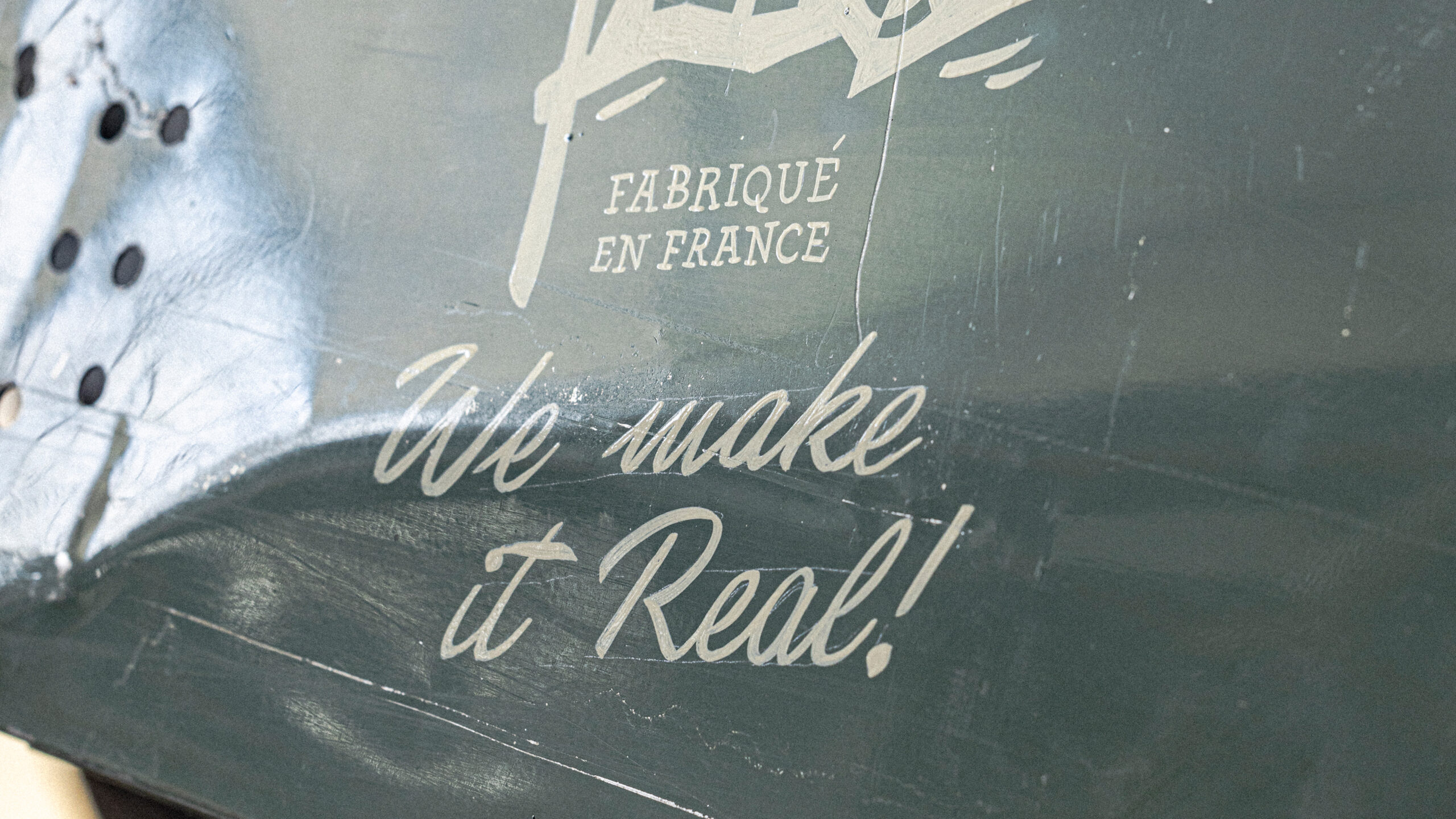
Script created for the project

EFC Elephant Factory Classic Brand Identity — automotive brand badge · vrai studio

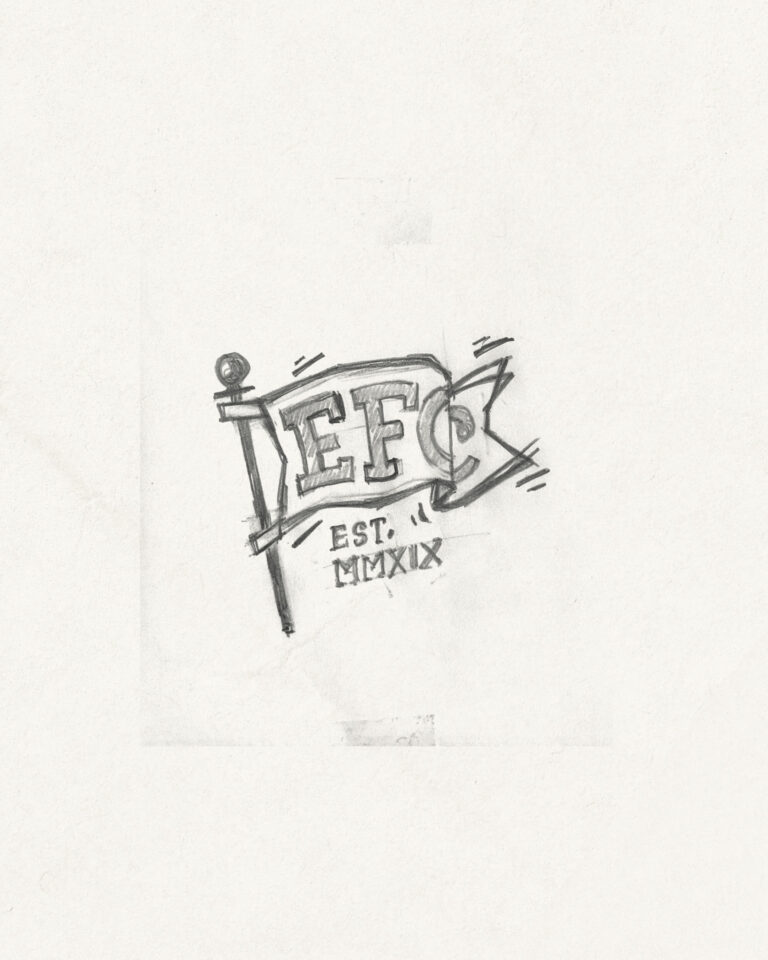
STUDY

Sketch of intent

EFC Elephant Factory Classic — branding, packaging, identity · vrai studio

TRICOLOR FLAG

The garage's final banner

EFC Elephant Factory Classic — automotive packaging and visual identity · vrai studio
EFC Auto Body Painting Animation — Artisanal Automotive Brand Identity · vrai studio
Lifestyle EFC Elephant Factory Classic — automotive branding photography · vrai studio
EFC Elephant Factory Classic — a lifestyle atmosphere in a car workshop · vrai studio

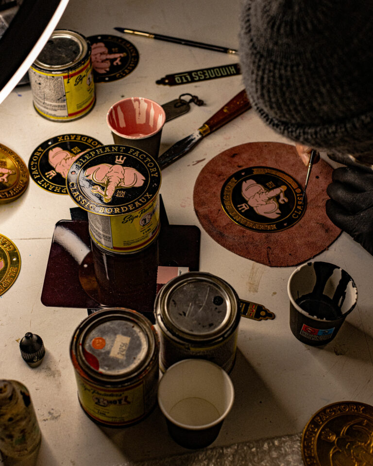
Iconic, handmade, cold-enameled badges

EFC Elephant Factory Classic — lifestyle photography, automotive workshop · vrai studio
Founder of EFC Elephant Factory Classic — Profile: Automotive Brand Identity · vrai studio
EFC Elephant Factory Classic Branding — Visual Identity Logo · vrai studio

REALIZATION

The first badge in the series by Clément

EFC Elephant Factory Classic Lifestyle Photography — Automotive Branding · vrai studio
EFC Elephant Factory Classic — a lifestyle atmosphere in a car workshop · vrai studio
Lifestyle EFC Elephant Factory Classic — branding photography studio · vrai studio
EFC Elephant Factory Classic — artisanal automotive lifestyle photography · vrai studio
EFC Elephant Factory Classic — lifestyle, photography, automotive branding · vrai studio
EFC Elephant Factory Classic — lifestyle atmosphere, automotive photography · vrai studio

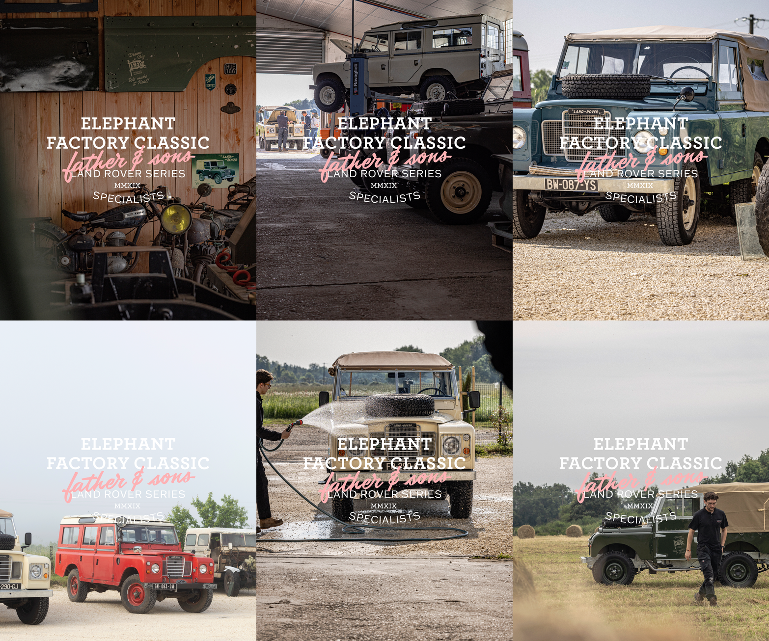
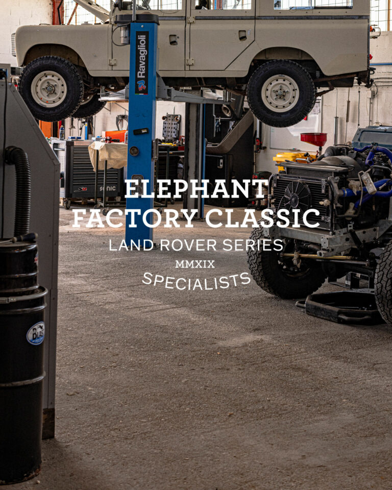
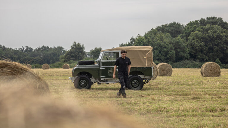
Elephant Factory Classic is a family-run workshop specializing in the complete restoration of classic Land Rovers, bolt by bolt. Jean-François Saulières and his sons Thomas and Raphaël offer a full vehicle restoration—a rare service that deserved a brand identity to match.

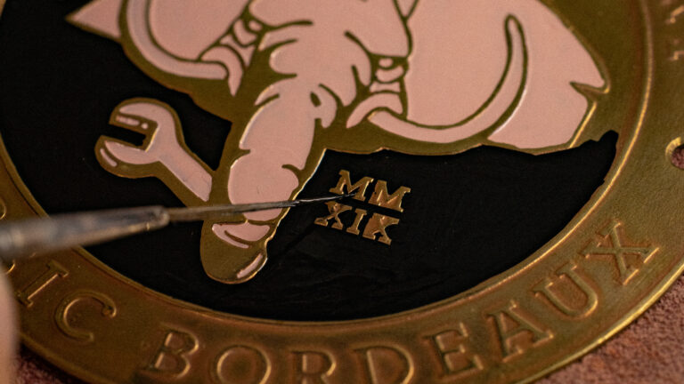
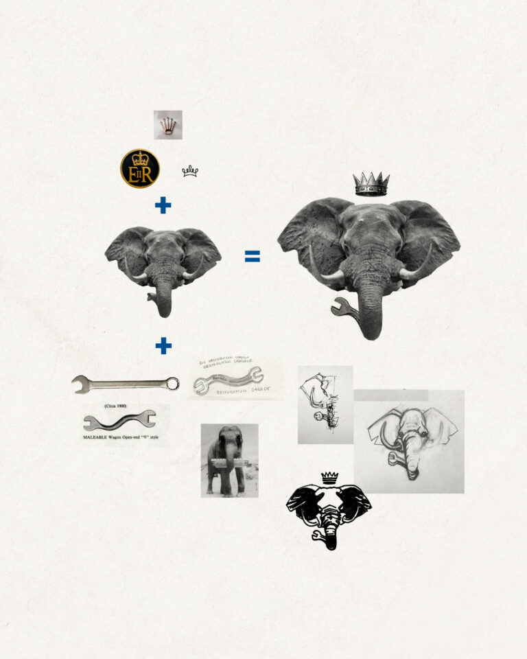
The project entrusted to vrai studio a simple observation: the existing brand identity did not do justice to the precision and high standards of the work. The creative solution is a mascot—a pink elephant whose trunk transforms into a wrench, a direct metaphor for the trade. The symbol is strong, memorable, and instantly recognizable. The key deliverable is a physical plaque mounted on the rear of refurbished vehicles, certifying that the work was performed by Elephant Factory Classic. The accompanying photography project supports the brand, notably featuring an image created for an advertisement published in a trade magazine.

Art Direction and Photography: Camille Gabarra
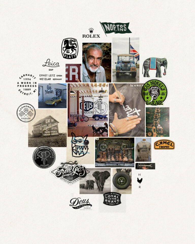
EFC Elephant Factory Classic Mood Board — Automotive Visual Identity Universe · vrai studio

CREATIVE CONCEPT

Visual metaphor: a mechanical elephant

EFC Elephant Factory Classic Mood Board — Automotive Branding Guidelines · vrai studio

UNIVERSITY

What the brand should strive for

Elen Larcebeau Jewelry Store Ambience — Bordeaux Boutique Photography · vrai studio
Elen Larcebeau Bordeaux — portrait photography for a jewelry boutique · vrai studio
  • Art Direction
  • Photography

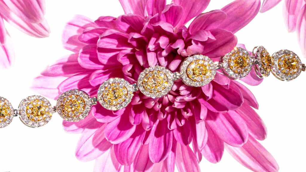
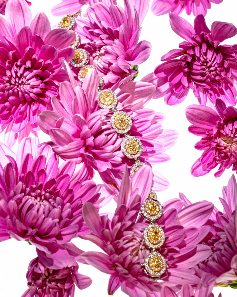
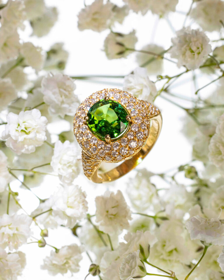
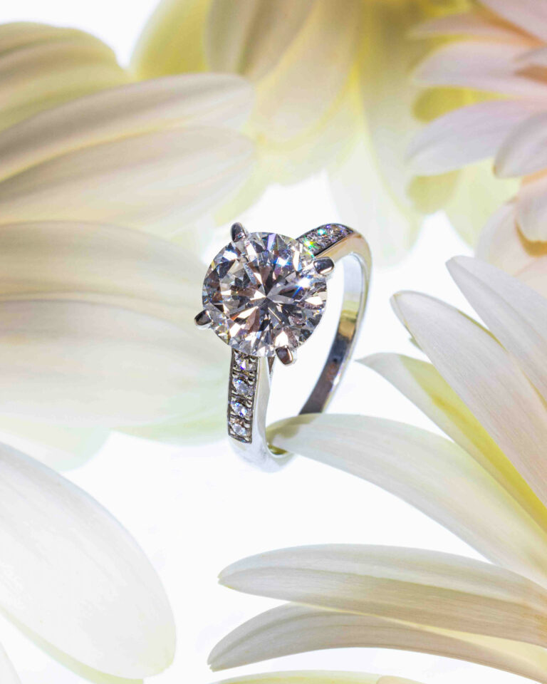
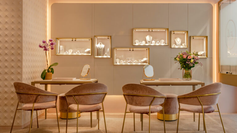
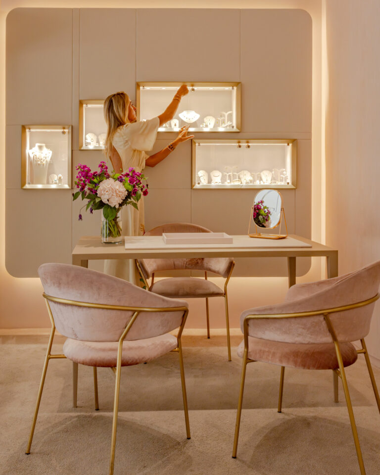
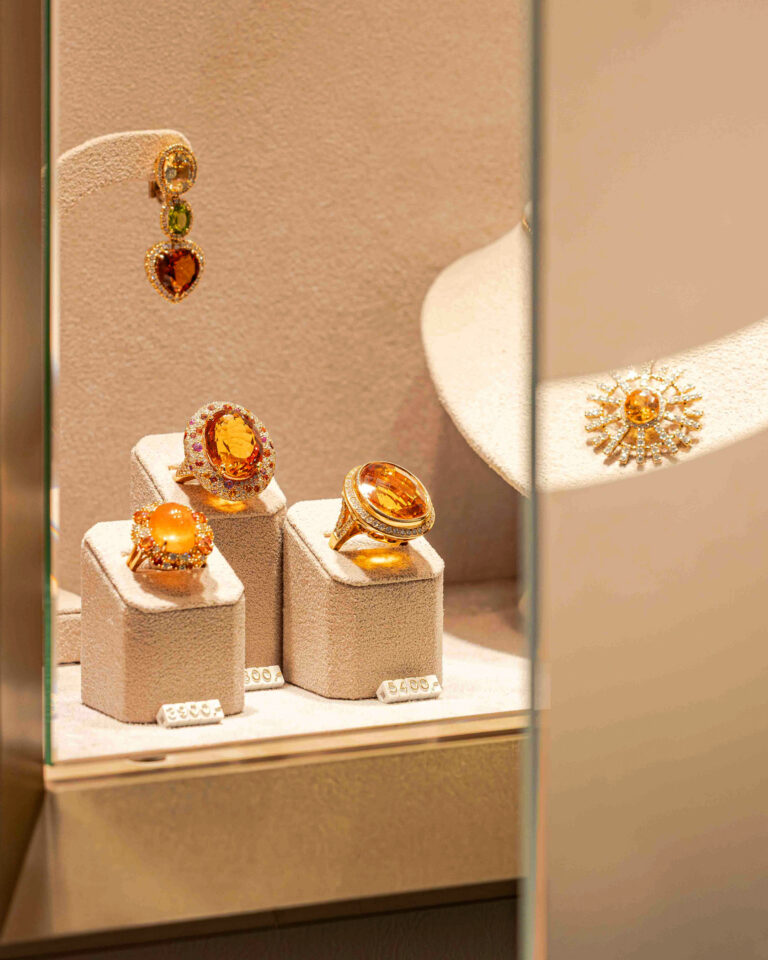
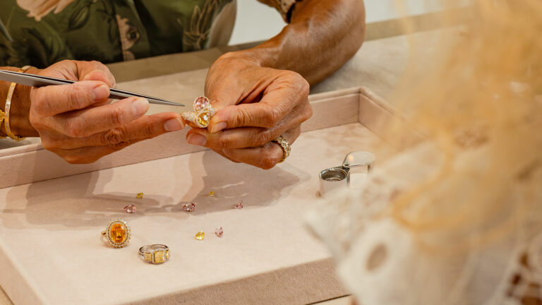
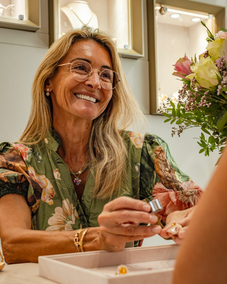
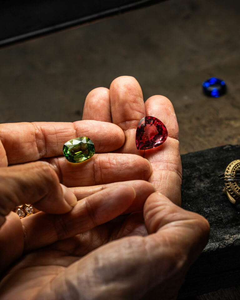
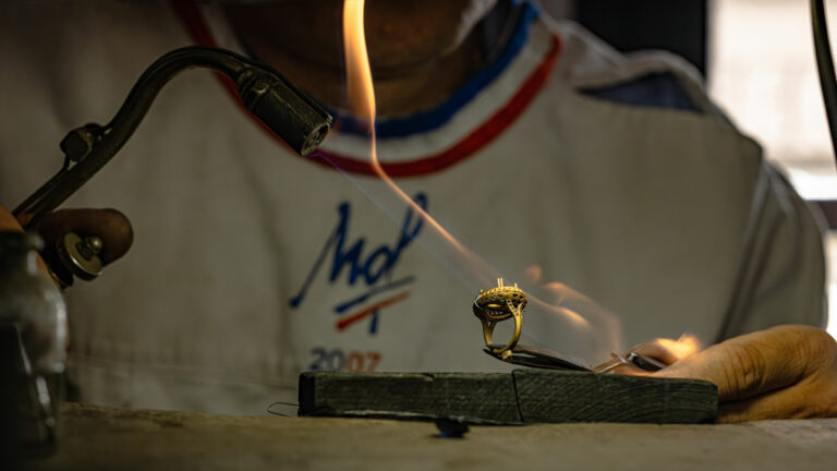
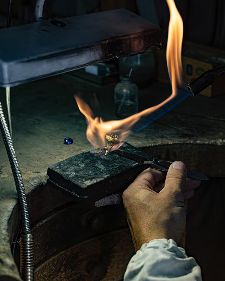
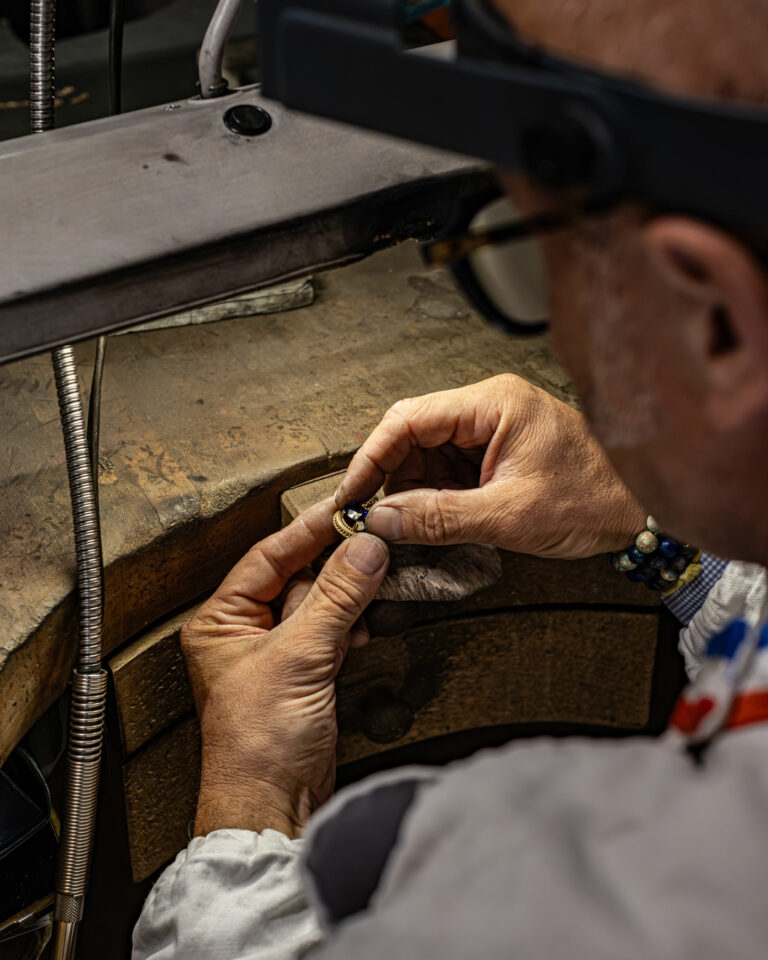
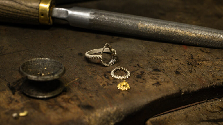
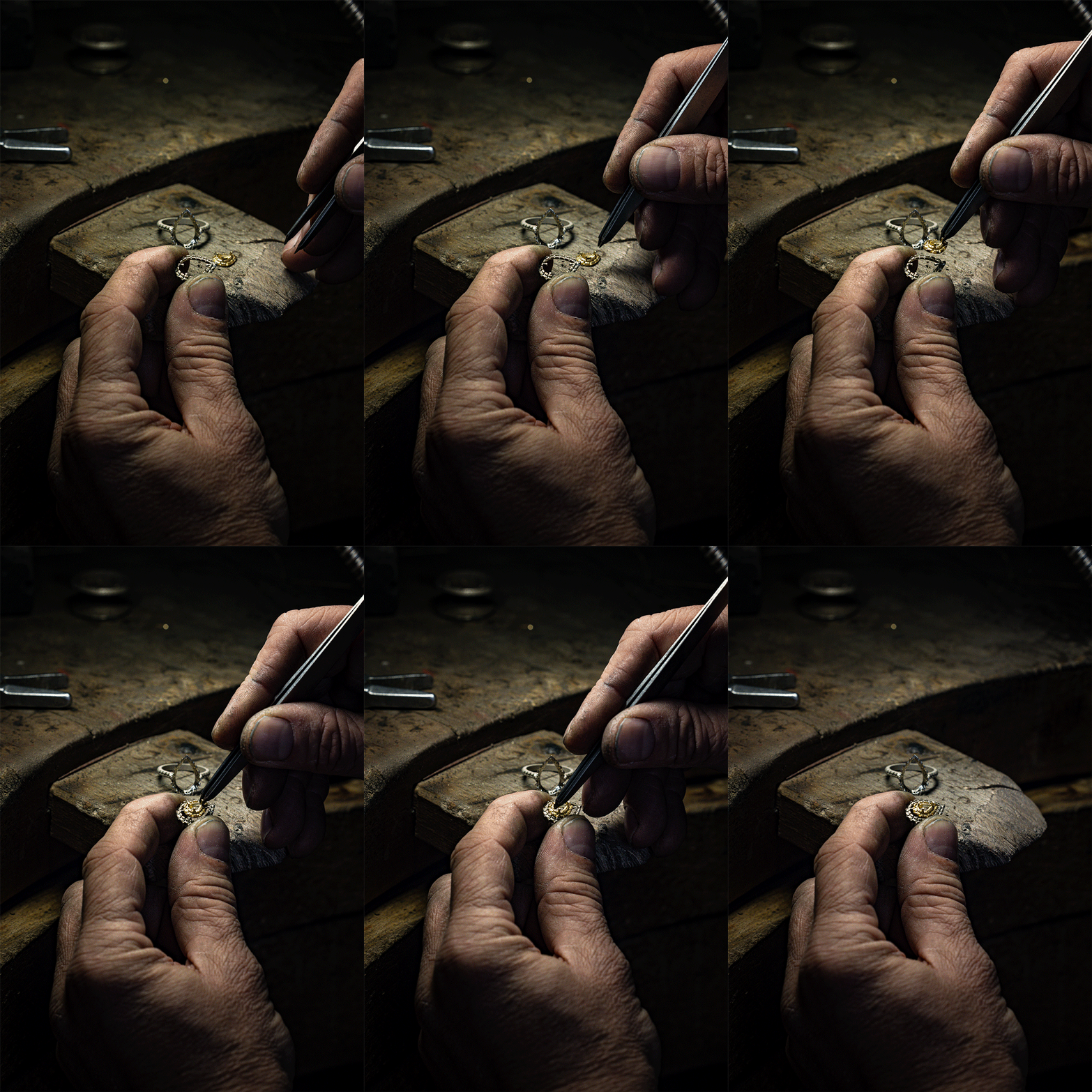
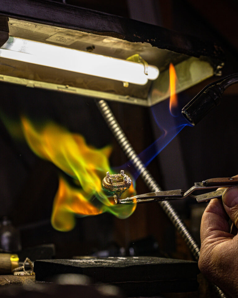
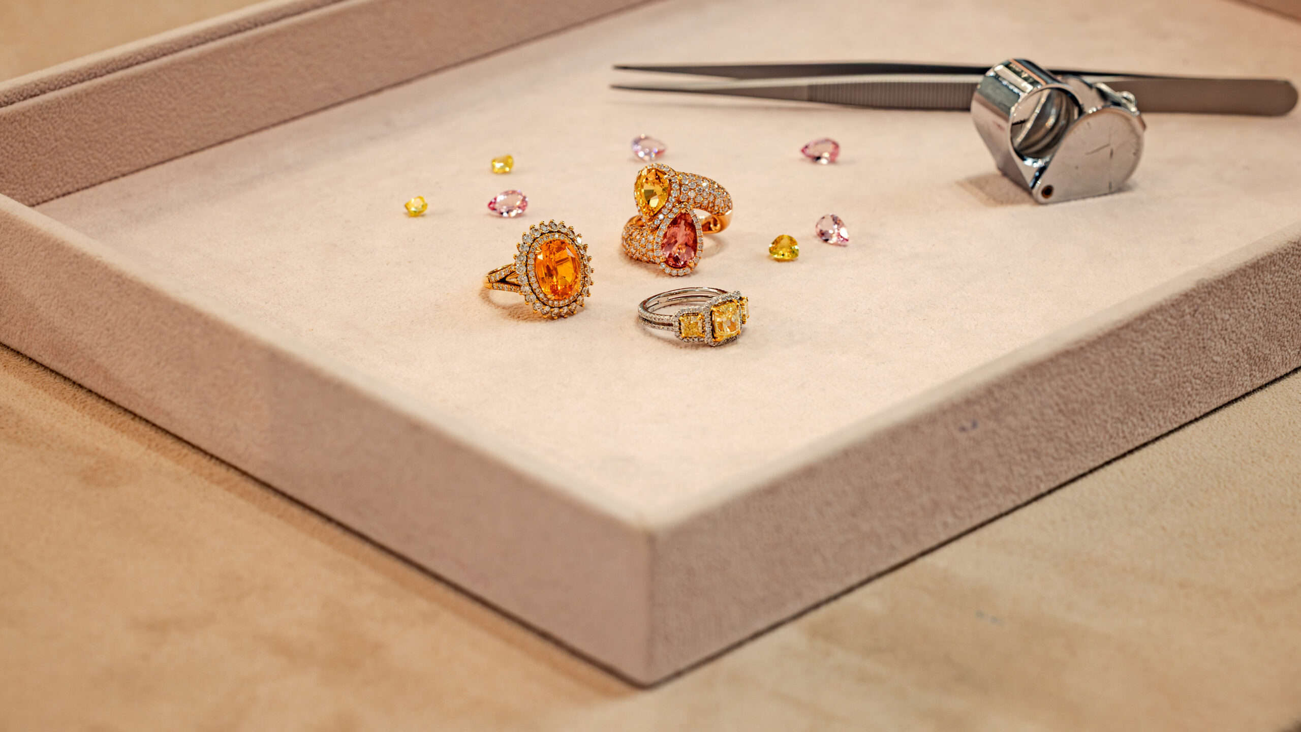
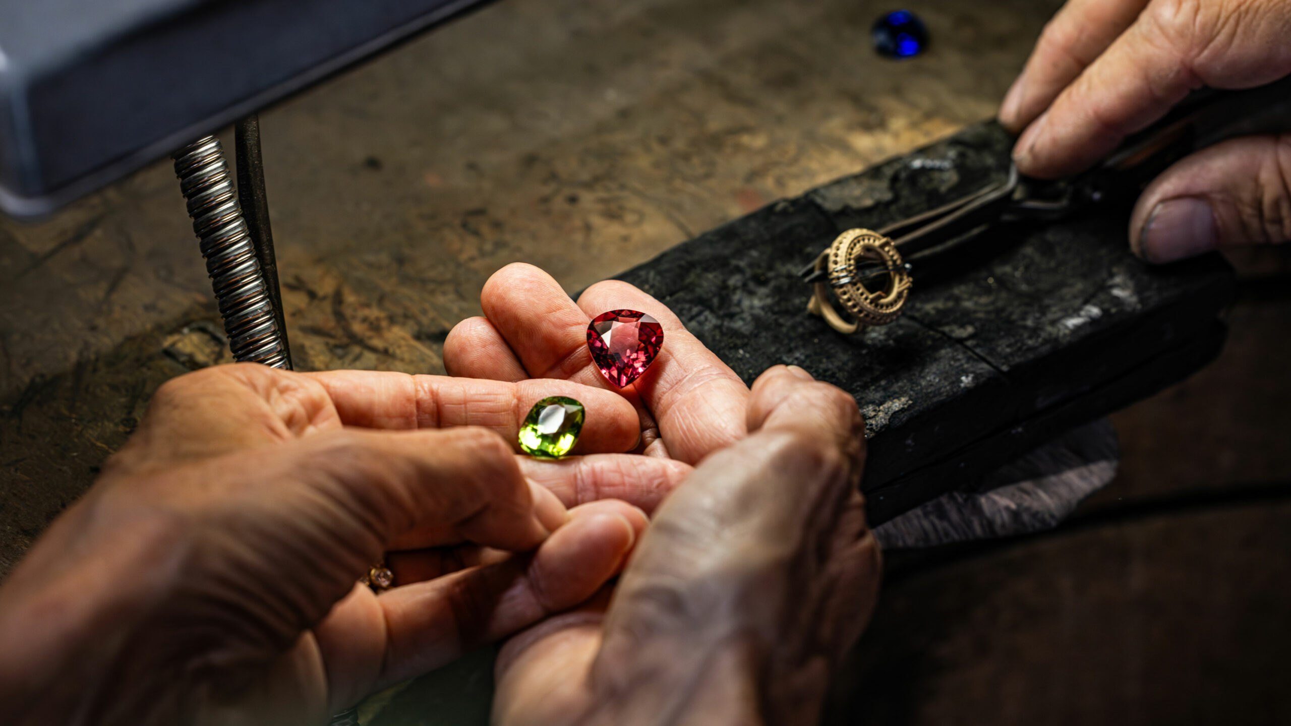
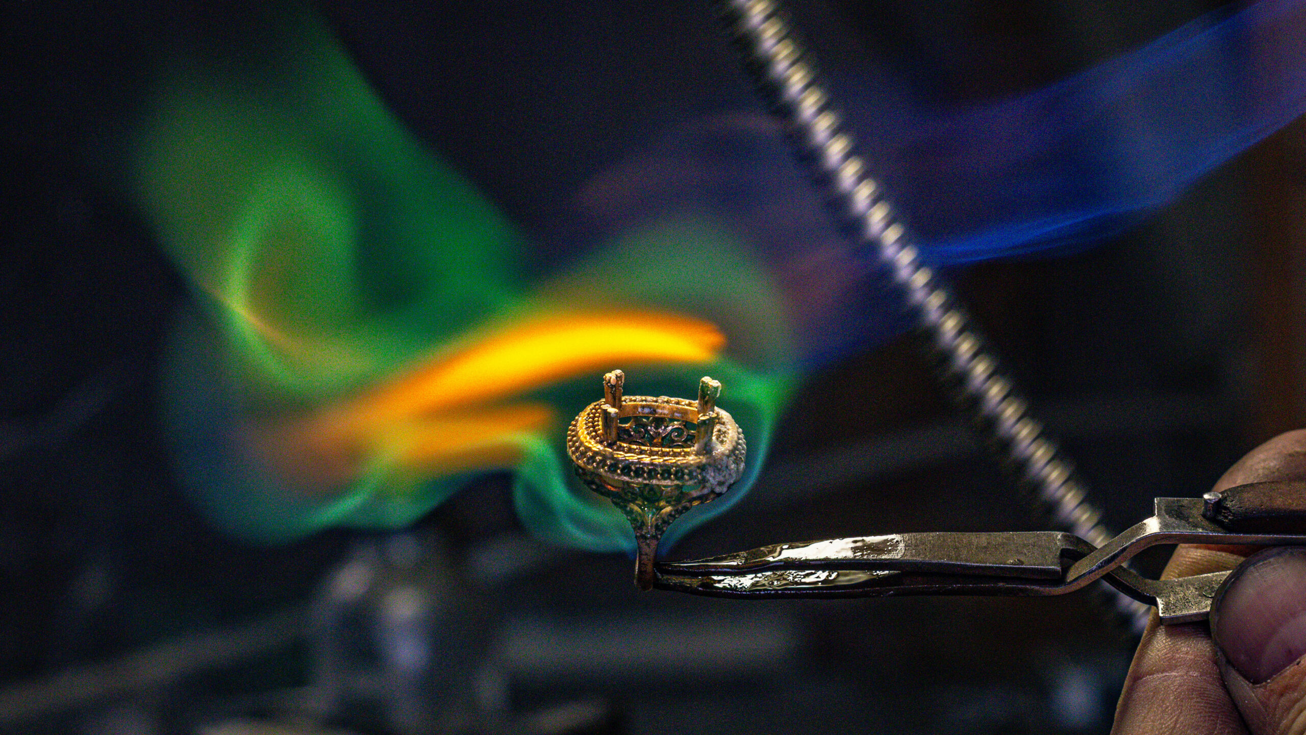
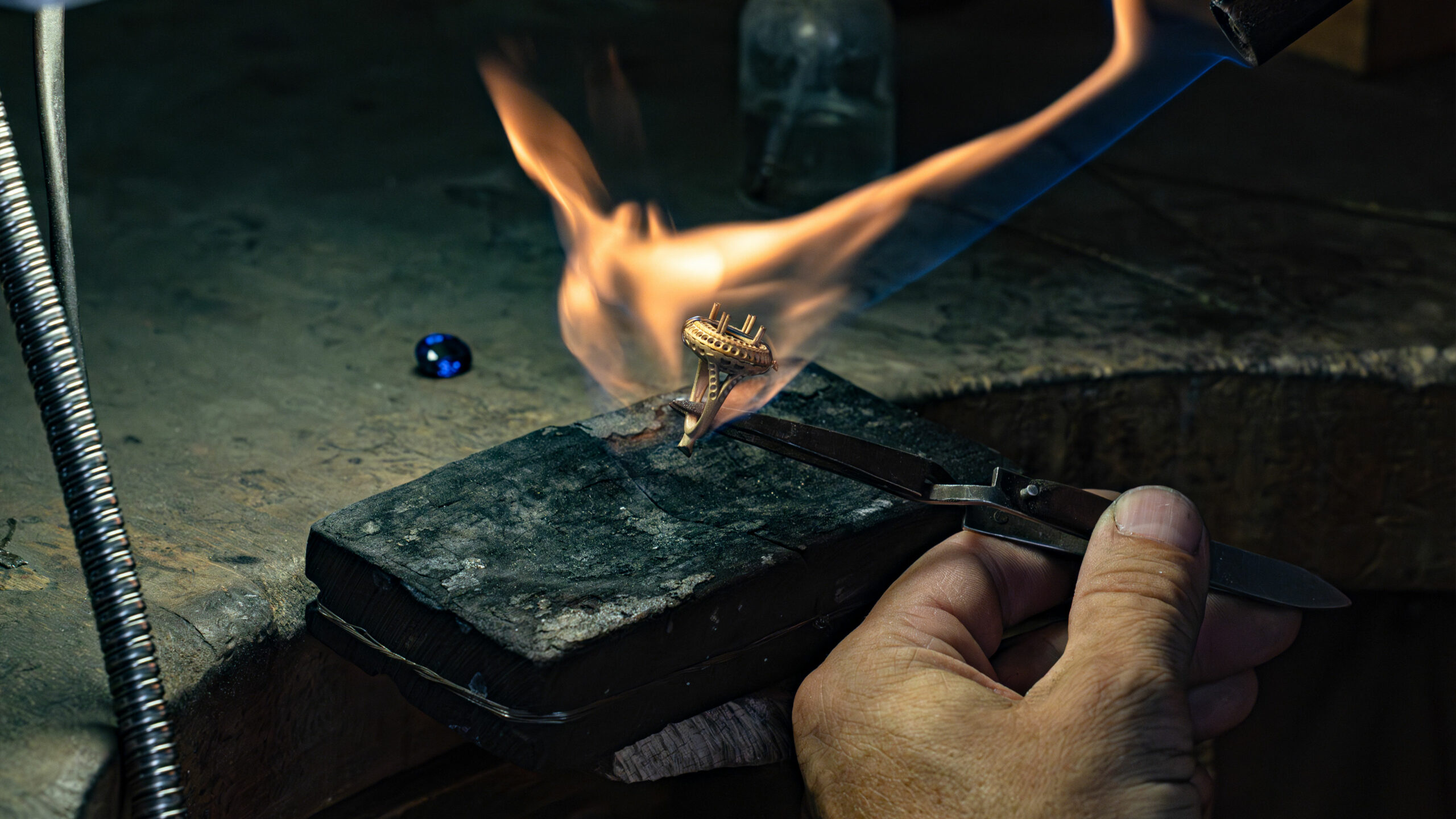
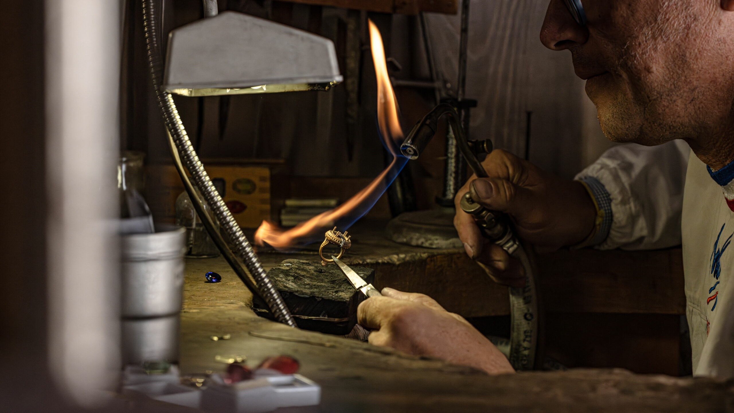
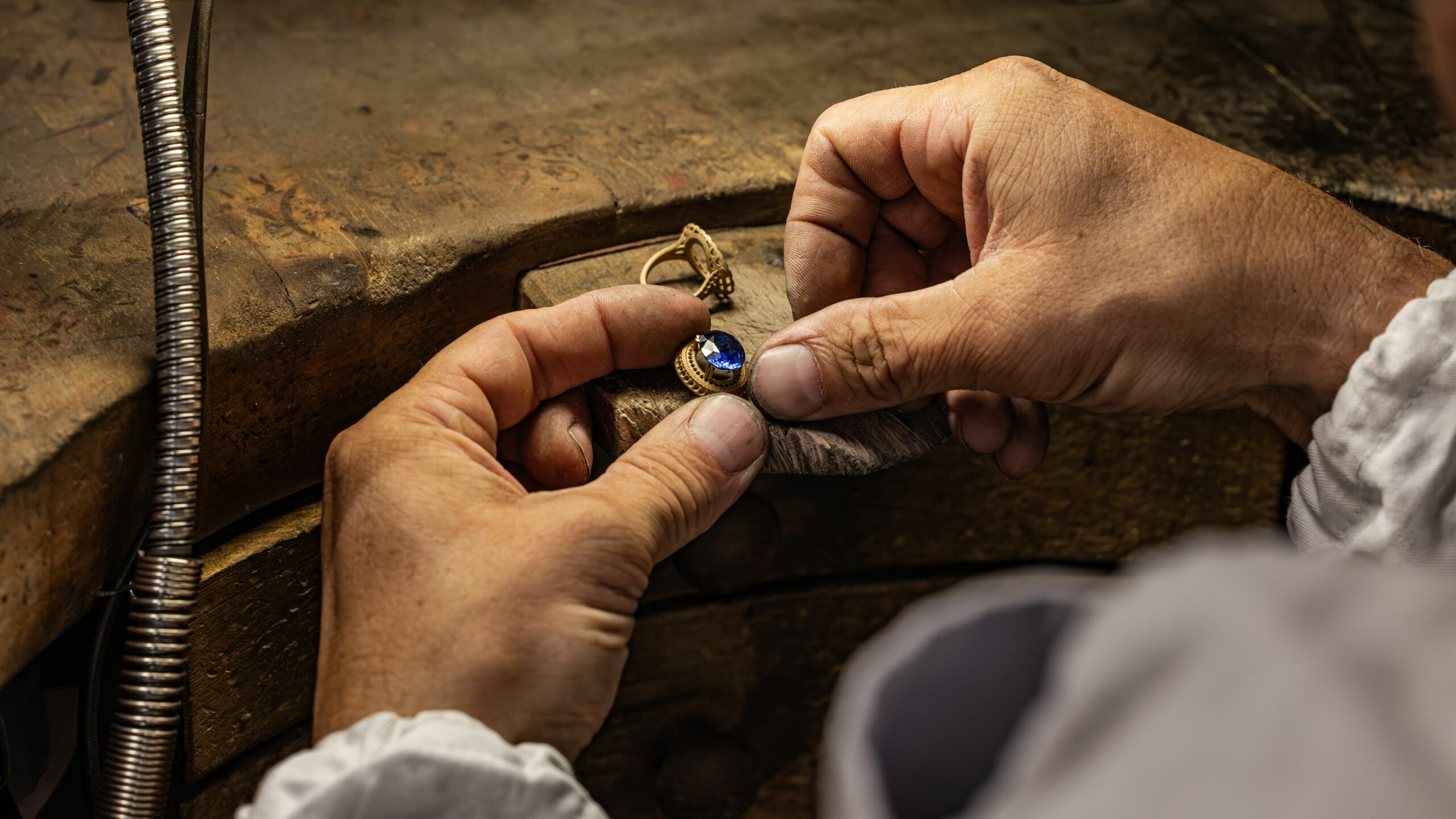
Elen Larcebeau, a leading jeweler on Rue Voltaire in Bordeaux, has entrusted us with producing photographs for its communications. The boutique, the lifestyle workshop, and its iconic products in the studio with floral artistic direction.

Elen Larcebeau Handcrafted Jewelry — Close-up Jewelry Photography · vrai studio
Elen Larcebeau Jewelry — Photography of Handcrafted Jewelry in Bordeaux · vrai studio
Elen Larcebeau Jewelry Store in Bordeaux — lifestyle photography atmosphere · vrai studio
Elen Larcebeau Jewelry, Bordeaux — Artisanal Photography · vrai studio
Elen Larcebeau Jewelry — Photography of Handcrafted Jewelry in Bordeaux · vrai studio
Elen Larcebeau — the atmosphere of a handmade jewelry boutique in Bordeaux · vrai studio
Elen Larcebeau Jewelry — close-up photography of handcrafted jewelry · vrai studio
Elen Larcebeau Jewelry — close-up photography of jewelry and lifestyle · vrai studio
Ambiance: Elen Larcebeau, Jeweler in Bordeaux — Boutique Photography · vrai studio
Elen Larcebeau Jewelry, Bordeaux — Artisanal Photography · vrai studio
Elen Larcebeau Jewelry — lifestyle jewelry photography in Bordeaux · vrai studio
Elen Larcebeau Jewelry Boutique, Bordeaux — Photography Atmosphere · vrai studio
Animated pear montage by Elen Larcebeau — artistic jewelry photography · vrai studio
Elen Larcebeau Jewelry — Photography of Handcrafted Jewelry in Bordeaux · vrai studio
Elen Larcebeau Boutique — the atmosphere of artisanal jewelry in Bordeaux · vrai studio
Elen Larcebeau Jewelry Store — Lifestyle Photography · vrai studio Atmosphere
Elen Larcebeau Boutique, Bordeaux — jewelry lifestyle photography · vrai studio
Elen Larcebeau Boutique — atmospheric photography of handmade jewelry · vrai studio
Elen Larcebeau Bordeaux — a lifestyle jewelry boutique atmosphere · vrai studio
Elen Larcebeau Boutique — a setting for photography and handmade jewelry · vrai studio

Elen Larcebeau is a Bordeaux-based jewelry house, renowned in Bordeaux for the quality and uniqueness of its designs. The collaboration with vrai studio two distinct projects.

The first is a photo essay of the boutique—its facade, interior, and workshop—intended to support the brand’s communications. The second is a studio shoot with full artistic direction and styling: staging the jewelry, selecting materials that complement the pieces, and setting up lighting to capture the precision of the jewelry craftsmanship. Photographing jewelry requires an understanding of what each piece embodies—the material, the shape, and the finish—before deciding how to showcase it. Art direction and styling are inseparable from the photography process when the subject is of such precision.

Art Direction, Styling, and Photography: Camille Gabarra
Elen Larcebeau Jewelry — Photography of Handcrafted Jewelry in Bordeaux · vrai studio

STUDY

Every project has its sketches

Elen Larcebeau Jewelry — jewelry packshot photography in Bordeaux · vrai studio

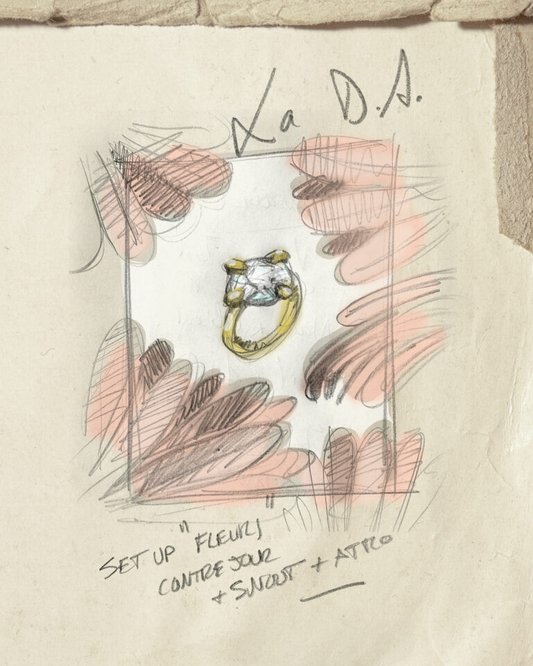
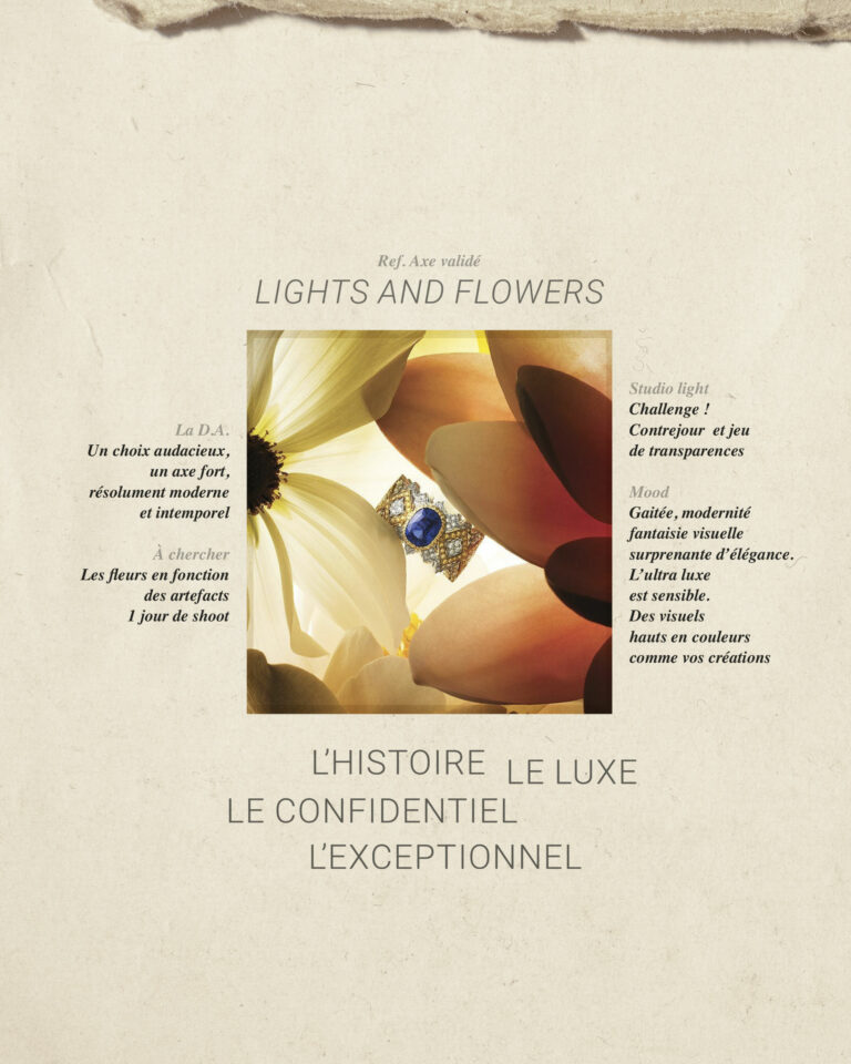
visual design axis

Ref. but with more breathing space around artifacts

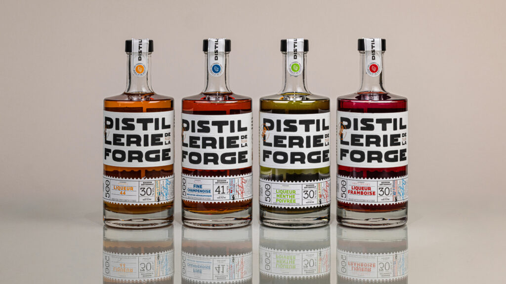
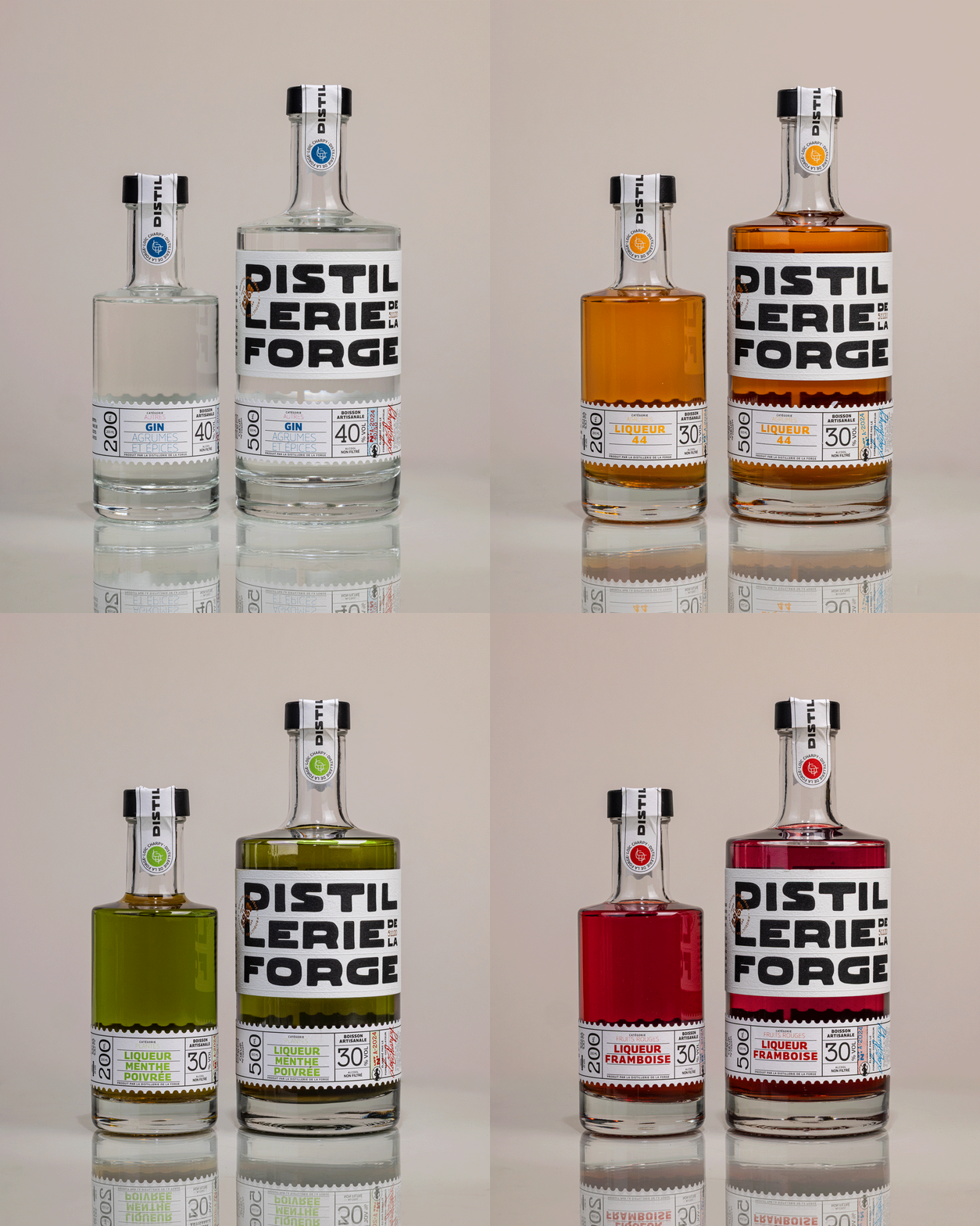
Distillerie de la Forge Spirits Bottles Distillerie de la Forge packshot for rebranded product line · vrai studio
Visual Identity for Distillerie de la Forge Logo and Brand Packaging · vrai studio

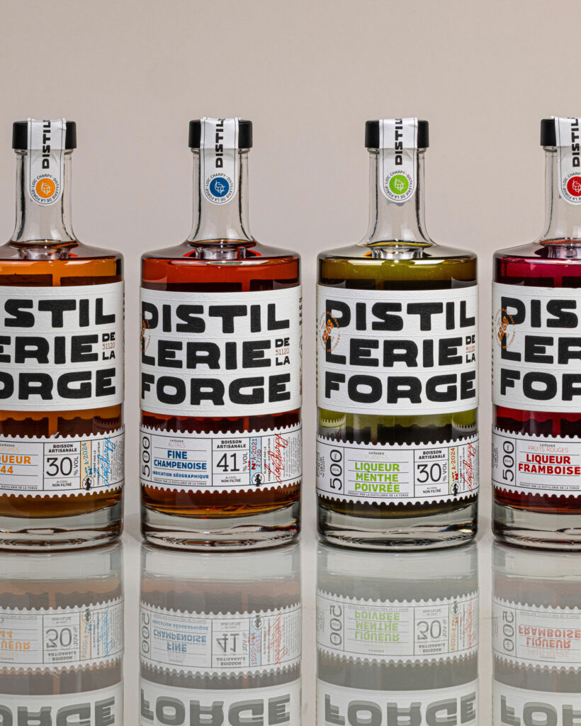
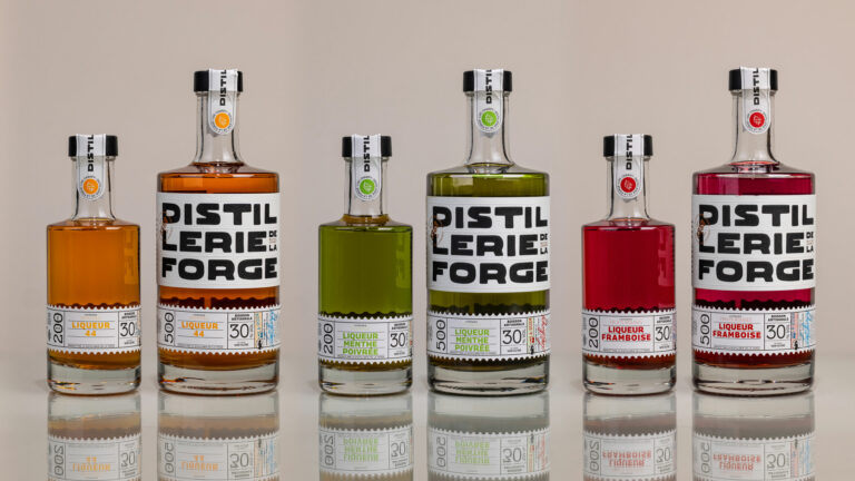
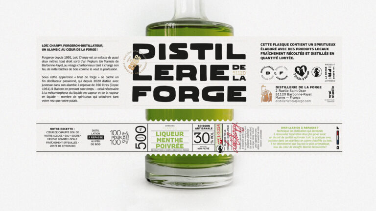
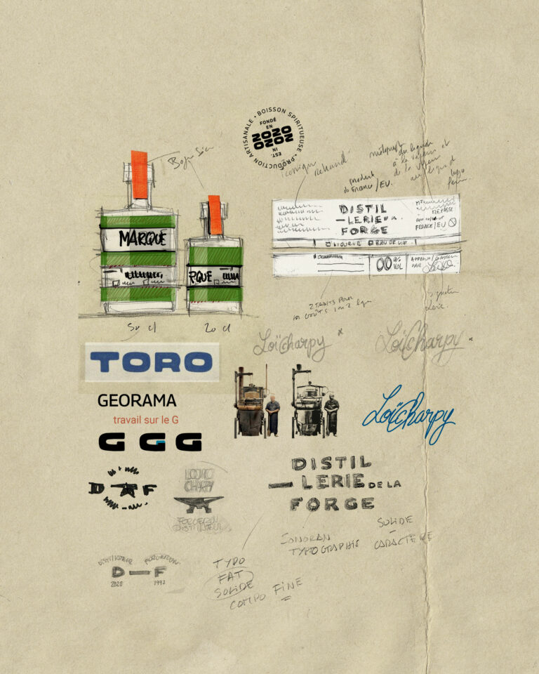
With over 24 references, this distillery needed to clarify its offering. We designed a double label - brand on top, flavour on the bottom - to simplify, distinguish and optimize their product range.

4 bottles Distillerie de la Forge spirits Distillerie de la Forge packaging line · vrai studio
Distillerie de la Forge Brand Distillerie de la Forge Visual Identity and Spirits Packaging · vrai studio
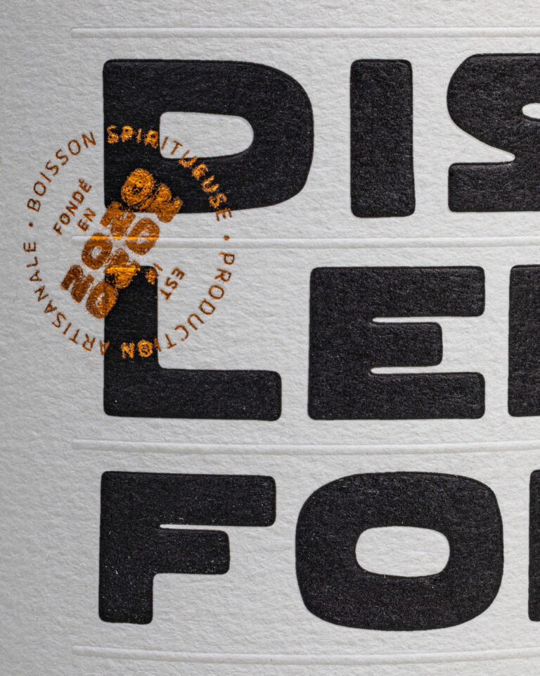
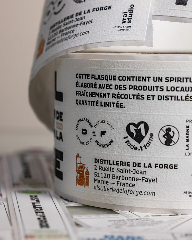
Distillerie de la Forge Label Distillerie de la Forge Artisanal Spirits Packaging · vrai studio
DLF Tab Animation — Distillery Branding · vrai studio
DLF Identity Animation — Distillery Branding · vrai studio
Distillerie de la Forge Bottle Distillerie de la Forge spirits packshot on a dark background · vrai studio
Distillerie de la Forge photography for artisanal spirits branding · vrai studio

B.A.T.

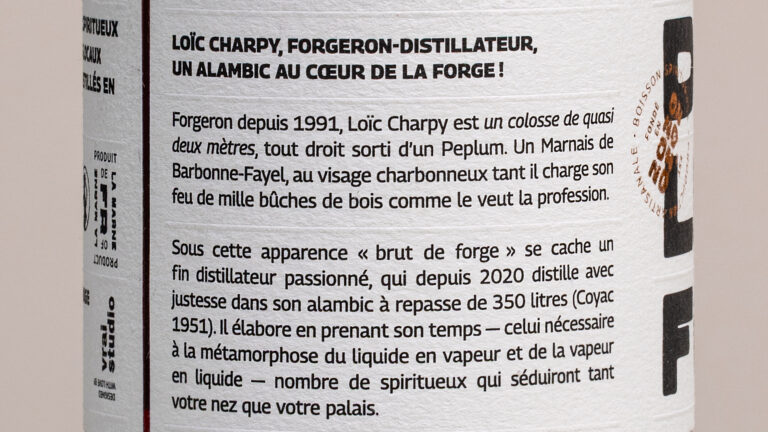
Loïc Charpy is a blacksmith and distiller based in Barbonne-Fayel in Champagne. La Distillerie de la Forge produces a wide range of artisanal spirits, including gins, brandies, and liqueurs, with a focus on working with materials and mastering fire.

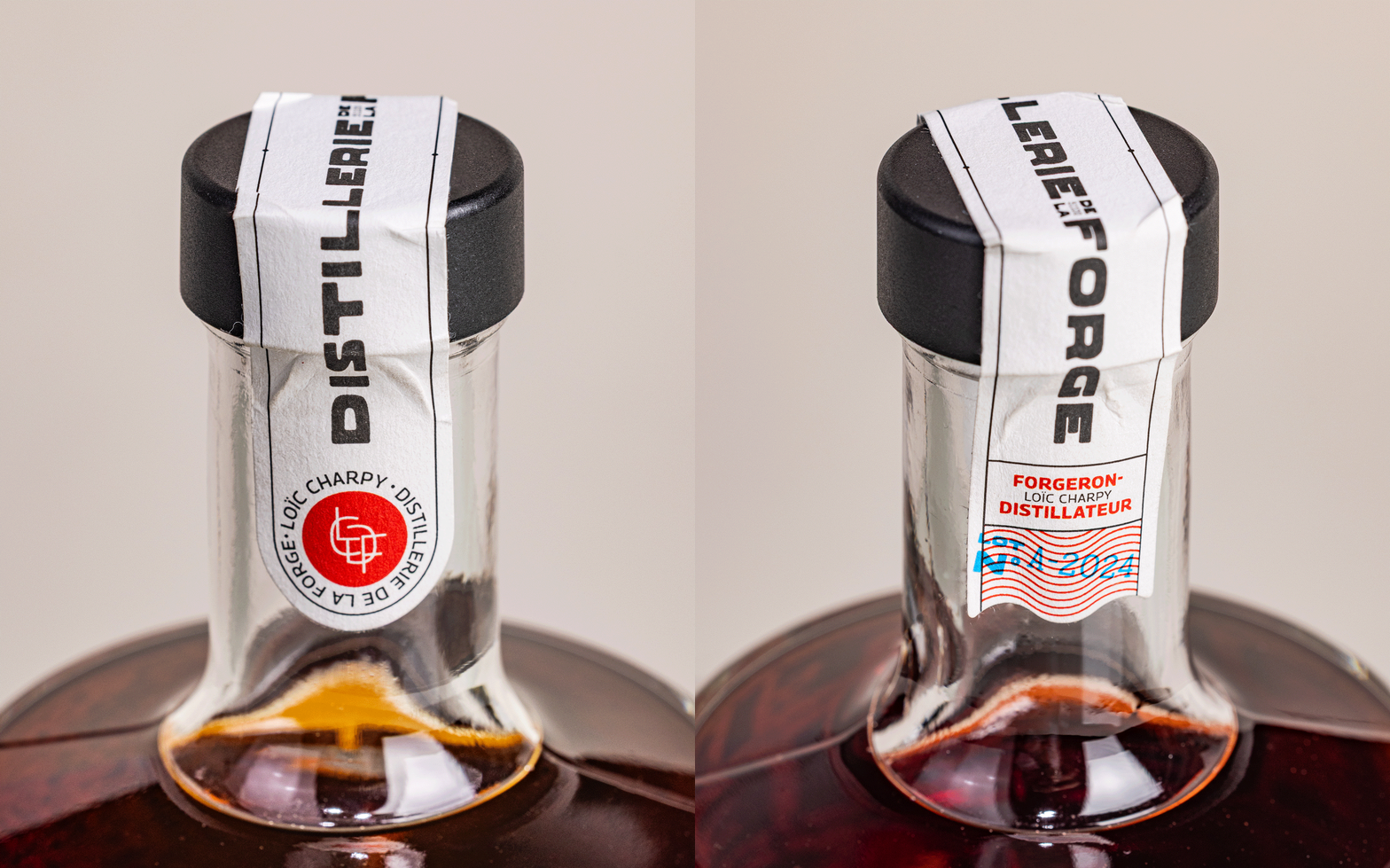
The challenge facing vrai studio was to build a brand identity that would be recognizable across more than twenty product variants. The solution is a two-tiered graphic system: a top-level brand label that is consistent and recognizable, and a bottom-level product label that is modular, capable of adapting to each product without diluting the overall identity. The storytelling—centered on the blacksmith, fire, steel, and the transformation of materials—informs every design choice and sets the brand apart from the typical conventions of artisanal distilleries. The project encompassed the logo, the graphic style guide, the complete bottle labeling, and product photography direction.

Art Direction and Photography: Camille Gabarra

Distillerie de la Forge Logo Distillerie de la Forge Visual Identity Design and Rebranding · vrai studio

SHARE

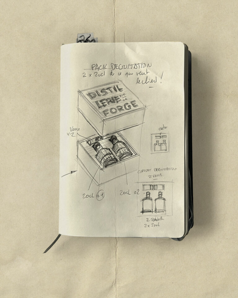
200 ML is all about sharing flavour!

Visual Identity for Distillerie de la Forge Spirits Brand · vrai studio

STUDY

A strong, visual principle

Ambiance Filon traiteur Food Photography and Visual Identity · vrai studio
Filon traiteur Brand Filon traiteur Visual Identity and Food Branding · vrai studio

Filon is a gourmet caterer that cooks good, ethical, homemade food. We created an F monogram for them, to accompany the architecture of the brand's furnishings, locations and proximity supports. Initially a delivery-only offer - starter, main course and dessert menus in 2 recycled cardboard bowls - Filon has since opened company restaurants in Paris and the Paris region.

Atmospheric photography for Filon traiteur socially conscious food branding · vrai studio
Filon traiteur Truck Filon traiteur Socially Conscious Food Brand Identity, Bordeaux · vrai studio
Filon traiteur Branding Campaign Filon traiteur Food Photography · vrai studio
Ambiance Filon traiteur Food Photography and Visual Identity · vrai studio
Animated illustration for Filon traiteur food branding · vrai studio
Branding for Filon traiteur packaging and visual identity for food · vrai studio
Ambiance Filon traiteur Food Photography and Visual Identity · vrai studio
Filon traiteur Brand Filon traiteur Visual Identity and Food Packaging · vrai studio
Filon traiteur Branding, Visual Identity, Food · vrai studio
Filon Large Bowl Animation — Food Visual Identity · vrai studio
Filon traiteur Salads Filon traiteur Food Photography, Socially Conscious Branding · vrai studio
Animation for Filon traiteur small bowl Filon traiteur visual identity illustration · vrai studio

We work with commissioned architects to design the first corner, including signage.

Ambiance Filon traiteur Visual Identity for Socially Conscious Food · vrai studio
Filon traiteur : Committed to Sustainable Filon traiteur — Photography, Ambience, Brand Identity · vrai studio
Filon traiteur Photography Filon traiteur Food Branding Atmosphere · vrai studio
Lifestyle Filon traiteur Socially Conscious Filon traiteur — Brand Photography · vrai studio
Lifestyle Photography: Filon traiteur Socially Conscious Food Branding · vrai studio
Lifestyle Filon traiteur — atmospheric photography · vrai studio
Filon traiteur — Food Photography · vrai studio
Lifestyle Filon traiteur Socially Conscious Food Photography · vrai studio
Lifestyle Photography: Filon traiteur Food in Bordeaux · vrai studio

Filon is a high-end Parisian catering company founded on seasonal cuisine, an eco-friendly approach, and a family-oriented philosophy. The project was born out of a partnership between an entrepreneur and a chef, both of whom are familiar with the work of vrai studio have confidence in its vision.

The project encompasses the entire brand identity—including the logo, graphic system, and typography—as well as its implementation in the physical space of the takeout location: the storefront, signage, wall-mounted menus, and wall graphics. The paper bags, boxes, bowls, business cards, and promotional materials all contribute to a cohesive brand experience, from the point of sale right through to the act of packaging. Filon’s brand identity is designed to be accessible without being generic, and recognizable without being flashy. A caterer who knows what they’re doing doesn’t need to say more than is necessary.

Art Direction and Photography: Camille Gabarra

Branding for Filon traiteur Food Visual Identity · vrai studio

PALETTE

One support, one shade

Visual Identity for Filon traiteur Packaging, Branding, and Socially Conscious Food · vrai studio

STUDY

When geology and monograms go hand in hand

The Procop Cube — A Guide to Artistic and Editorial Design Papers · vrai studio
The Procop Cube — a two-page guide to fine art papers · editorial design, just like vrai studio

Procop entrusts us with the redesign of its print guide. The Cube becomes an object box for print professionals. Beyond the samples, each range makes it easy to interact with other media or to leave a reference for your contact.

The Procop Cube — Procop Specialty Papers Overview Page · vrai studio
The Procop Cube — Procop Handmade Paper Guide Page · vrai studio
The Procop Cube — A Guide to Suppliers of Art Papers · vrai studio
Editorial Design: Le Cube Procop — printed guide on the table · vrai studio
The Procop Cube — Paper and Materials Page · vrai studio
The Procop Cube — A Guide to Artistic Papers: Ambience · vrai studio
The Procop Cube — Guide to Paper Set Design · vrai studio
The Procop Cube — Procop Paper Guide: Studio-Style · vrai studio
The Procop Cube — Special Papers Samples Page · vrai studio
The Procop Cube — Paper Samples Page · vrai studio

Our mission: to design an original, functional and easy-to-use swatch book

The Procop Cube in Action — Browse the Special Papers Guide · vrai studio
Procop Paper Guide in Context — Editorial Design · vrai studio
The Procop Cube — Guide to Paper Set Design · vrai studio

Procop is one of Europe's leading distributors of art and commercial papers, with a presence throughout the continent. The Cube is their main color swatch book, a standard reference for printers and graphic designers.

The existing product combined all the color swatch sets into a single block weighing one to two kilos—difficult to handle and not very user-friendly. The challenge for vrai studio was to redesign it as a desirable, modular object, designed for real-world use. The project falls under the category of product design: it involved considering handling, structure, content presentation, functionality, and user experience. The goal was not simply to create a beautiful object. It was to create an object that works—and that is beautiful precisely because it works. The photographic direction accompanies the launch of the redesigned color chart.

Art Direction and Photography: Camille Gabarra

The Procop Cube — Art Paper Guide Cover · Editorial Design: vrai studio Experience

PUZZLE

A snapshot of a workshop around the Cube
The Procop Cube — Inside Page: Paper Supplier Guide · vrai studio

STUDY

Every project has its sketches