- Art Direction
- Brand story
- Brand vocabulary
- Packaging
- Manufacturing management
- Photography
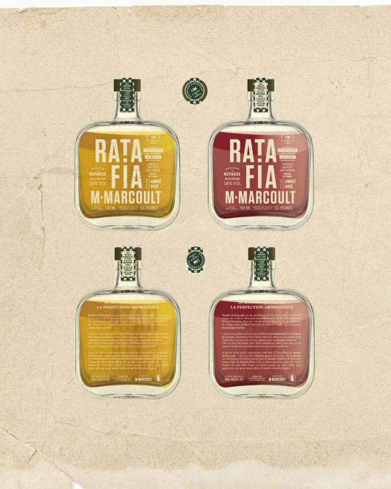
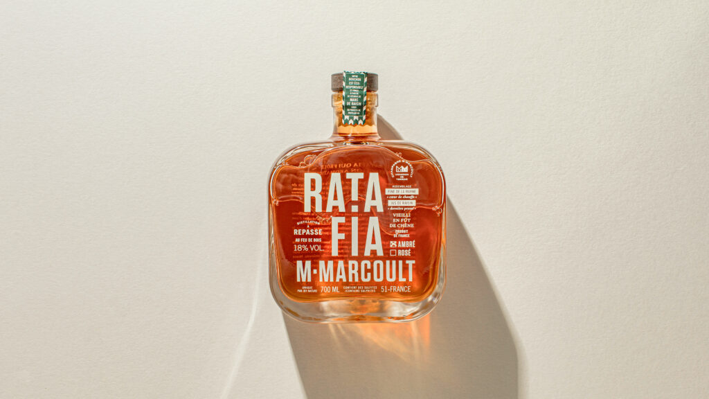
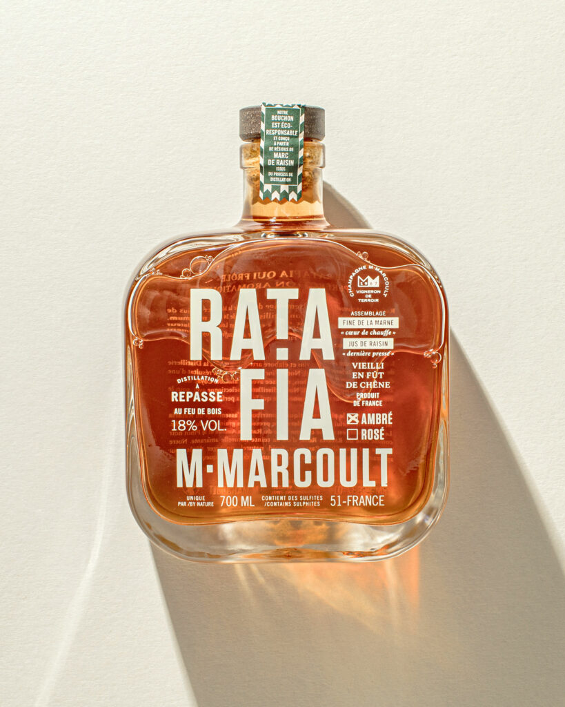
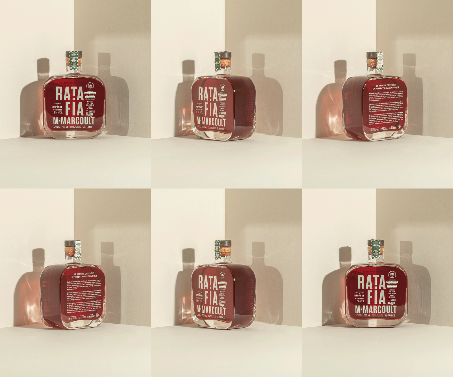
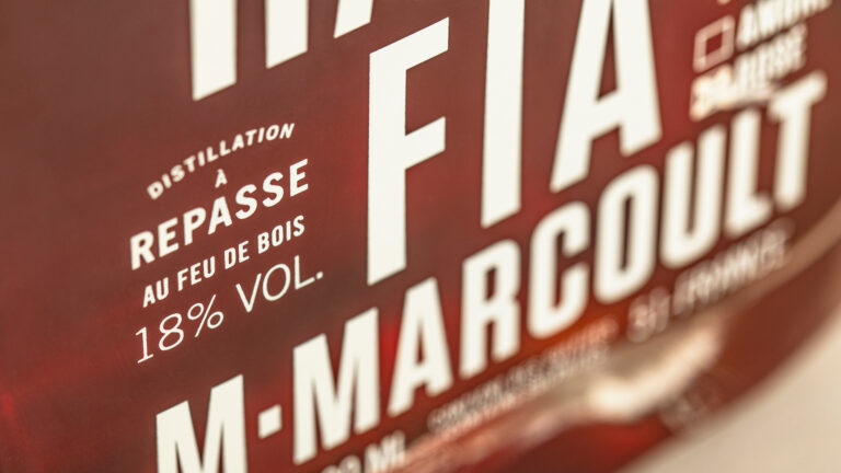
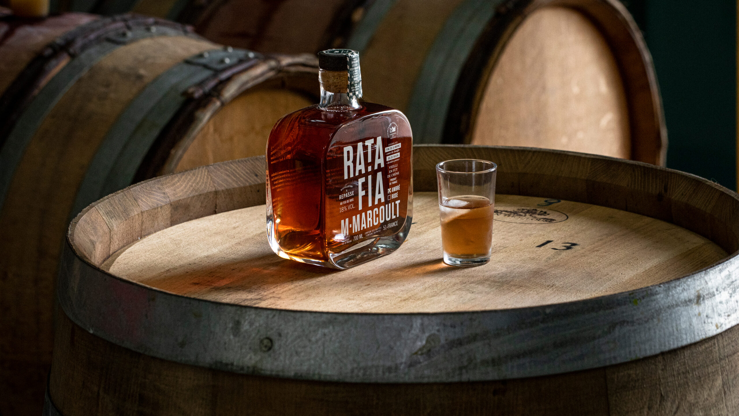
Following the rebranding of their champagne by us, Florence and Julien entrusted us with the creation of their flask of Ratafia, an artisanal amber (Chardonnay) or rosé (Pinot noir) spirit derived from champagne. A Peaky Blinders-style creation screen-printed directly on the glass in the Champagne brand's emblematic greige.

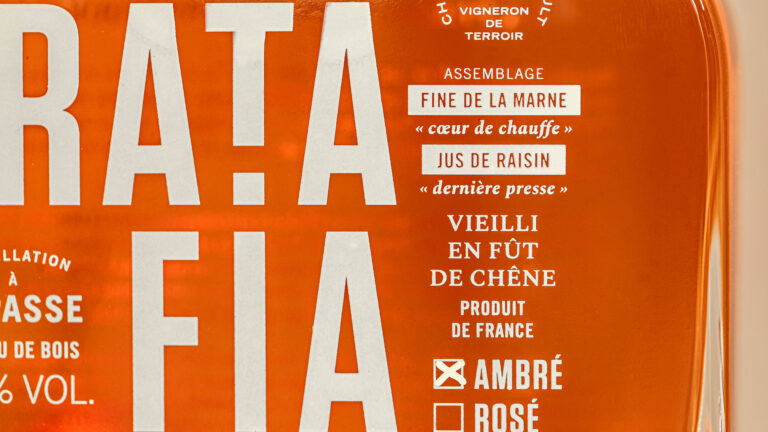
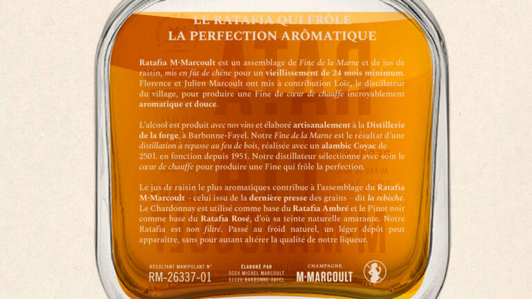
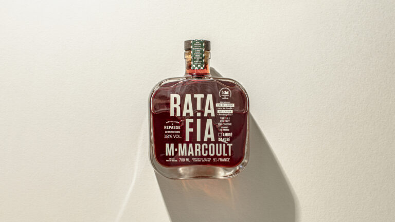
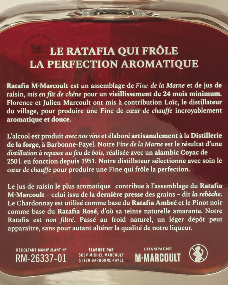
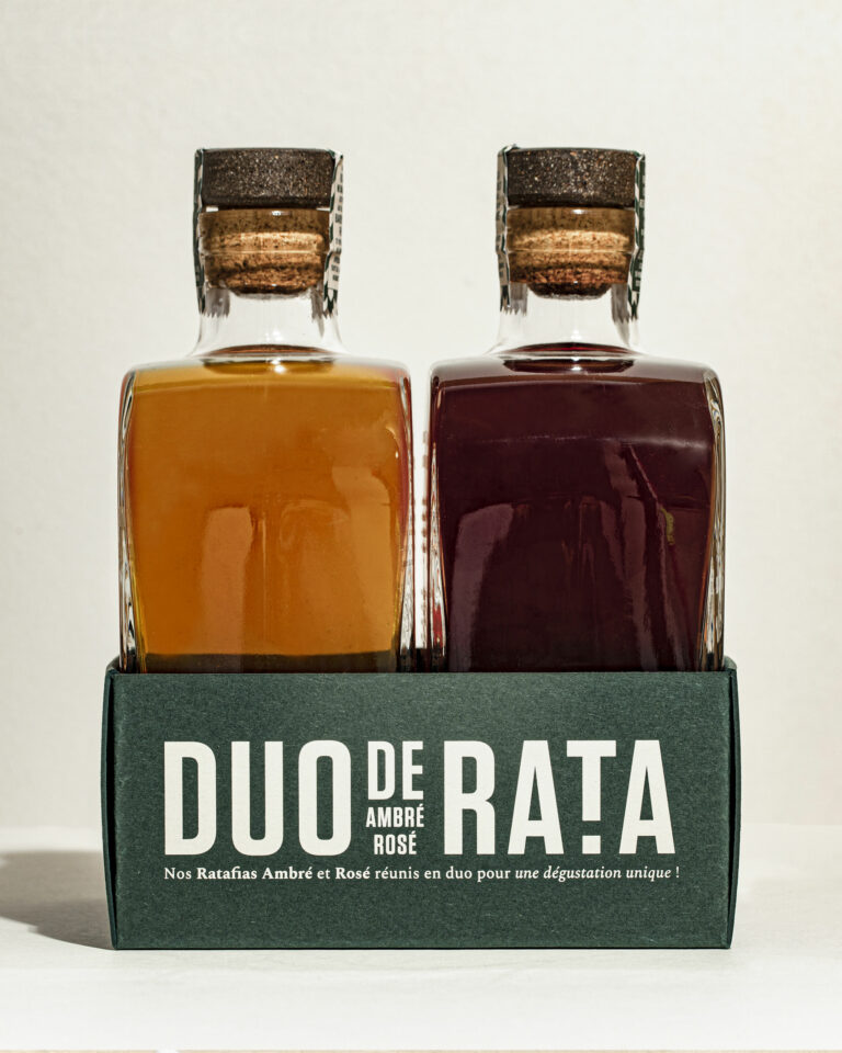
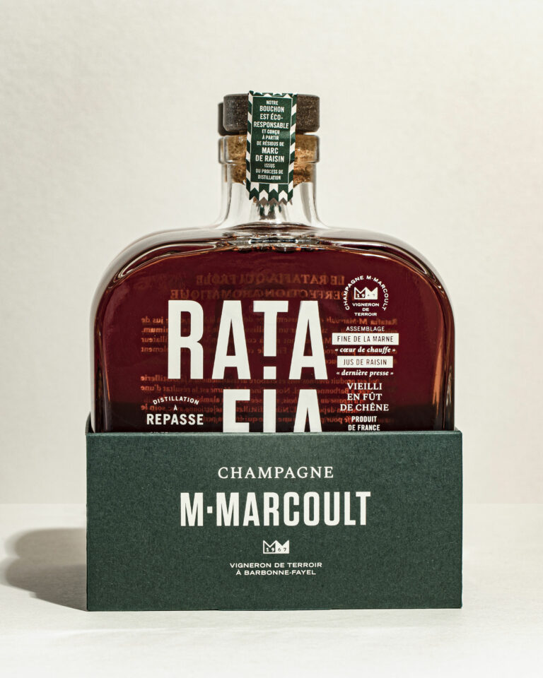
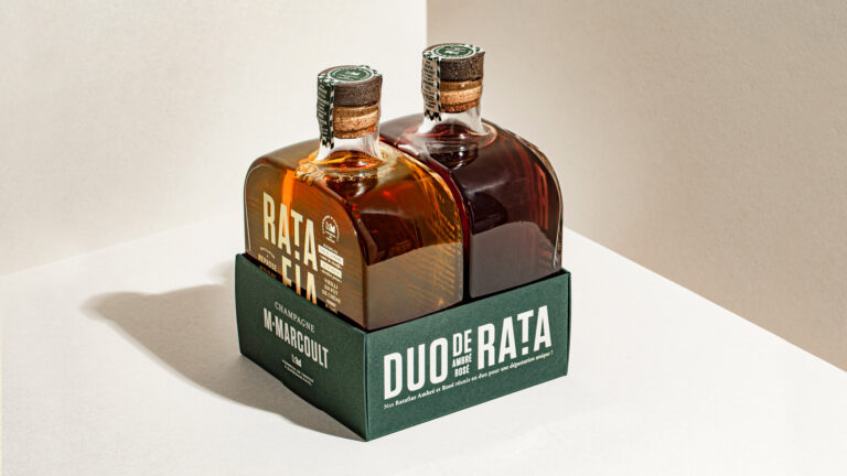
Champagne ratafia is a brandy made from grape juice and Champagne brandy, a niche, technically sophisticated product that deserves its own distinct identity within the M.Marcoult lineup.
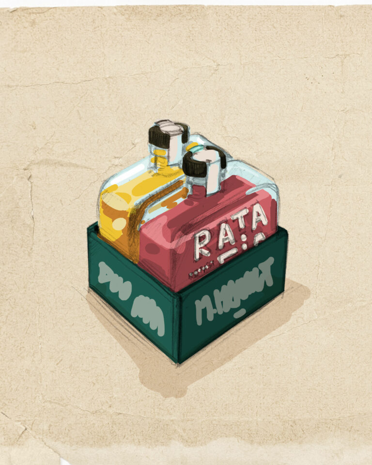
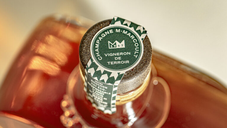
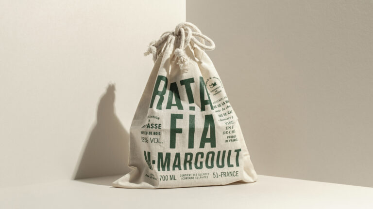
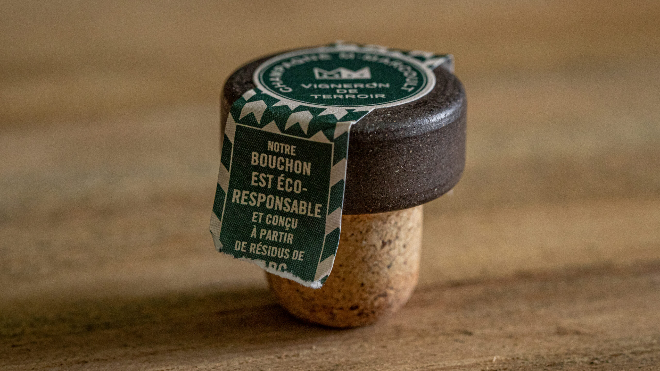
vrai studio selects the flasks and designs the packaging for the white and rosé ratafia, in direct consistency with the graphic system developed for the house’s champagnes. The bottle, the silhouette of the label, the colors and the typography are all crafted so that the ratafia stands as a natural extension of the brand, without any break in tone or formal imitation. The product photography direction combines scenes shot in the cellar with studio packshots, anchoring each image in the world of the estate. The ratafia tells the story of the same house, differently: through another product, another light, another moment of the harvest.
Art Direction and Photography: Camille Gabarra