- Art Direction
- Object design
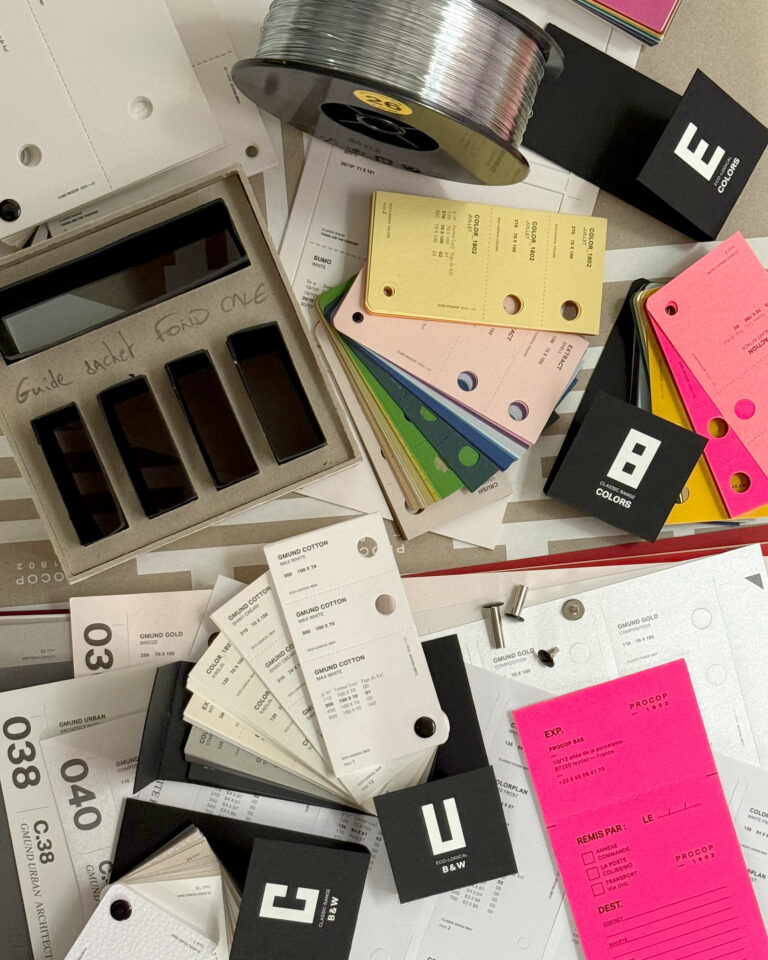
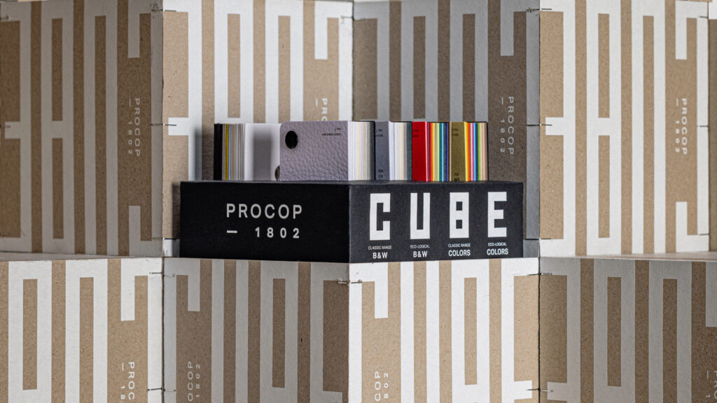
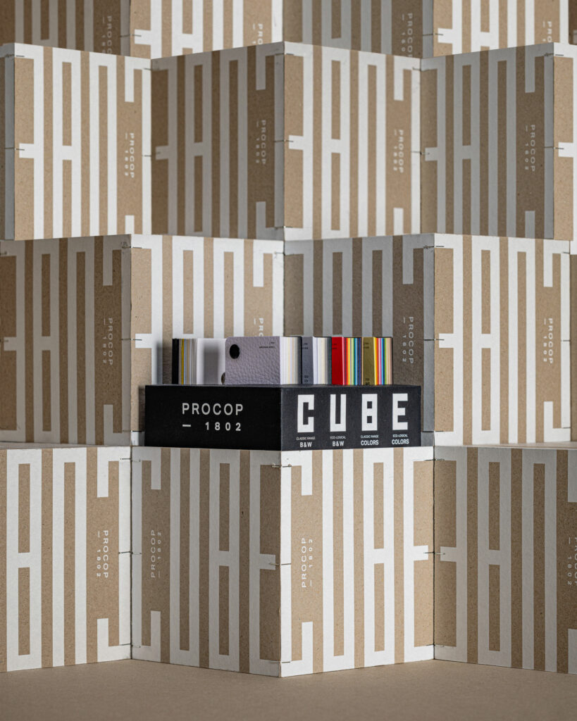
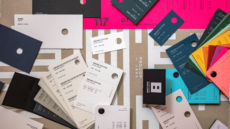
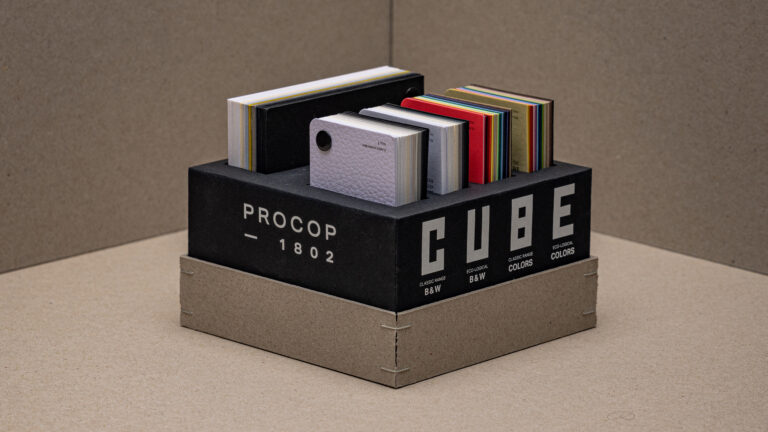
Procop entrusts us with the redesign of its print guide. The Cube becomes an object box for print professionals. Beyond the samples, each range makes it easy to interact with other media or to leave a reference for your contact.

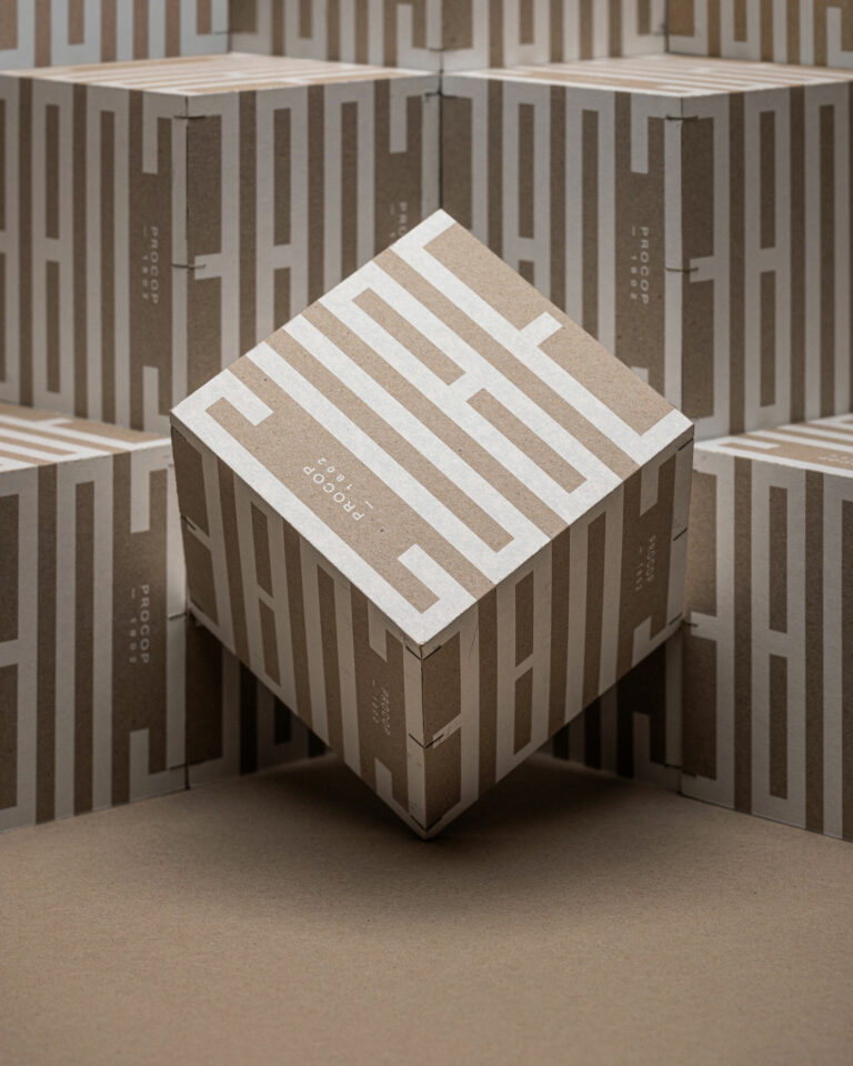
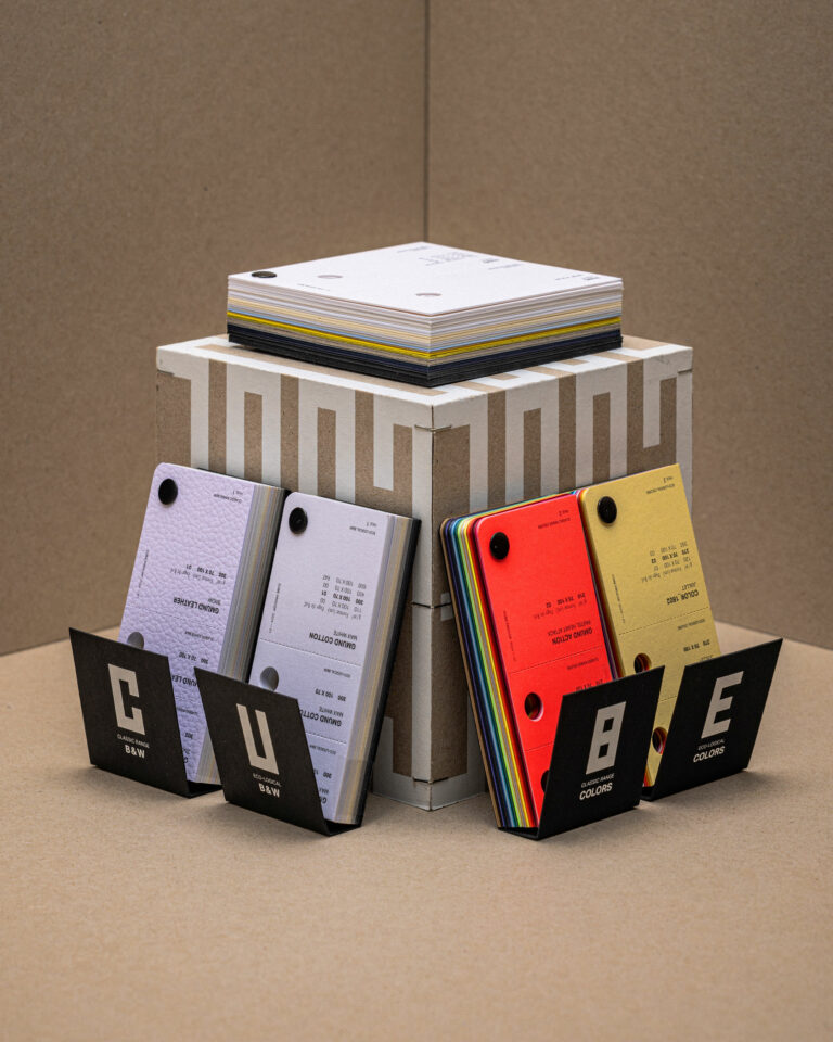
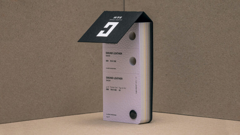
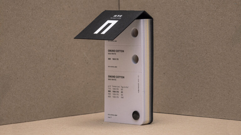
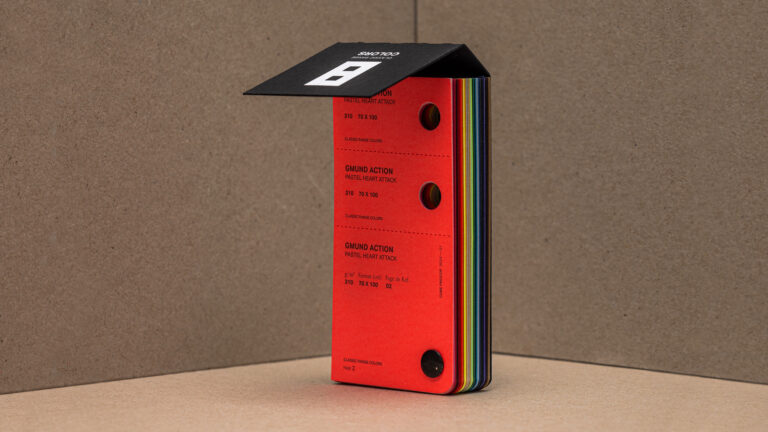
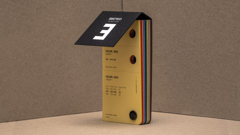
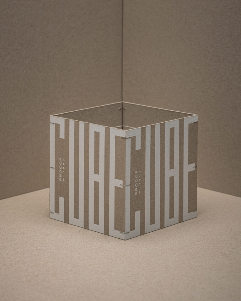
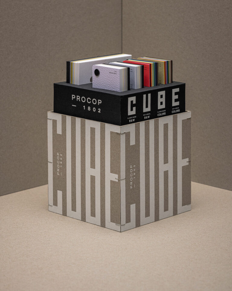
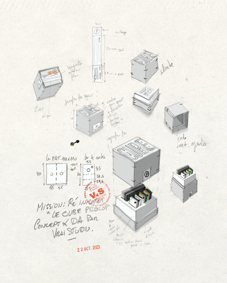
Our mission: to design an original, functional and easy-to-use swatch book
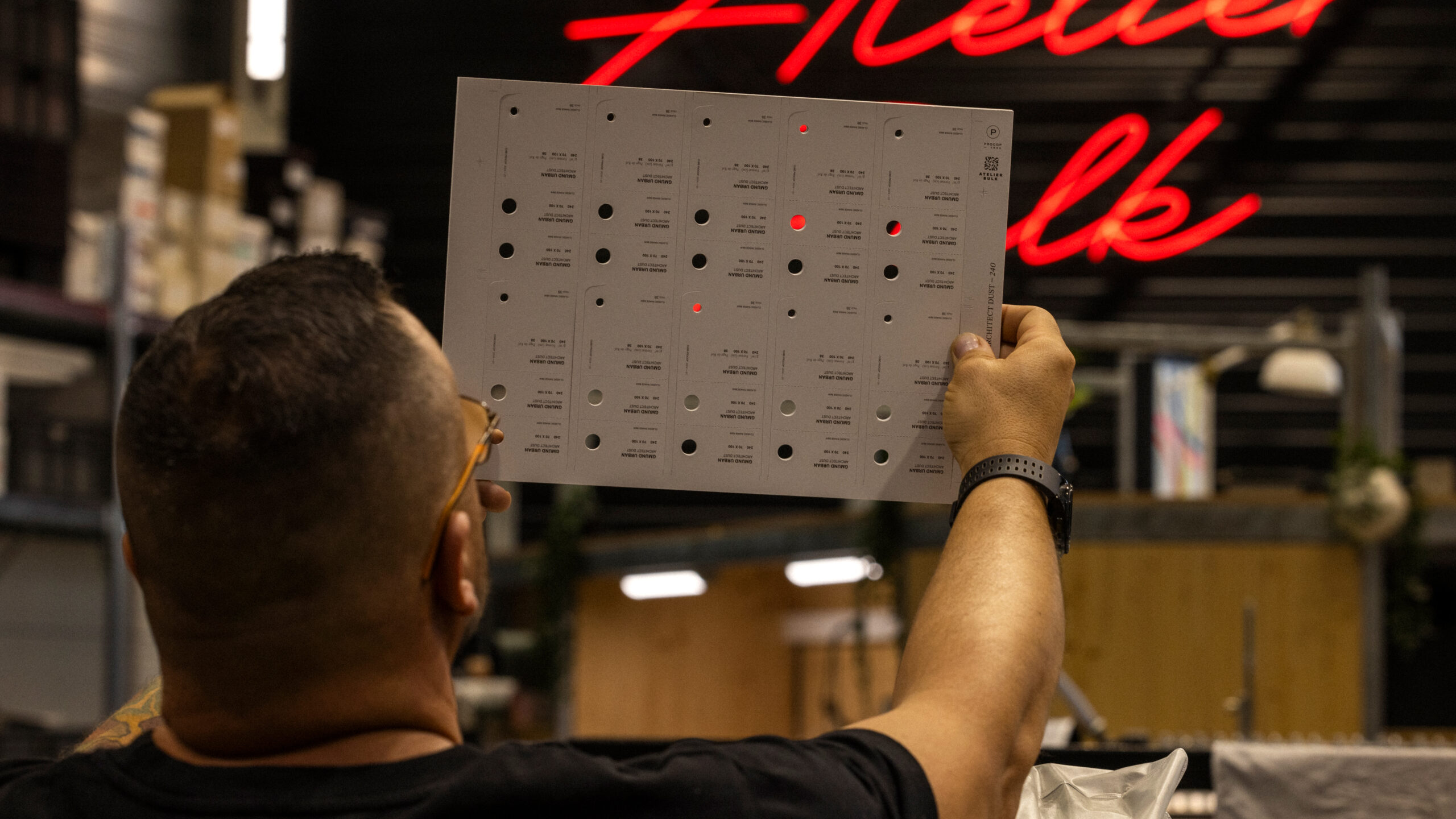
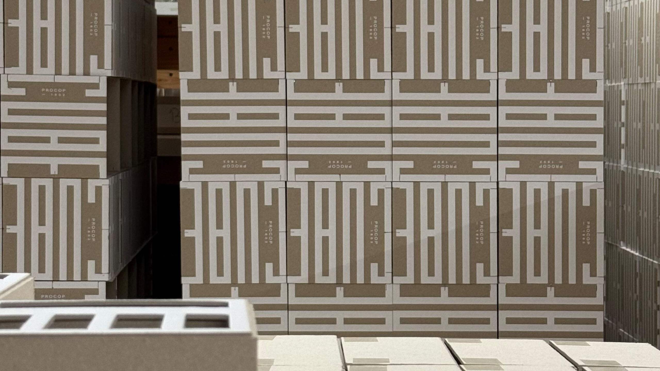
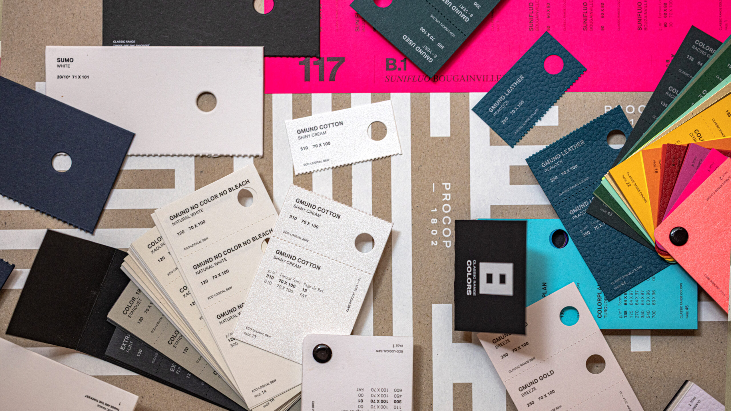
Procop is one of Europe's leading distributors of art and commercial papers, with a presence throughout the continent. The Cube is their main color swatch book, a standard reference for printers and graphic designers.
The existing product combined all the color swatch sets into a single block weighing one to two kilos, difficult to handle and not very user-friendly. The challenge for vrai studio was to redesign it as a desirable, modular object, designed for real-world use. The project falls under the category of product design: it involved considering handling, structure, content presentation, functionality, and user experience. The goal was not simply to create a beautiful object. It was to create an object that works, and that is beautiful precisely because it works. The photographic direction accompanies the launch of the redesigned color chart.
Art Direction and Photography: Camille Gabarra