Champagne M. Marcoult — Iconic Photography: Independent Winemaker · vrai studio
M. Marcoult's Bistronomique Cuvée — Champagne advertising campaign 2026 · vrai studio
  • Art Direction
  • Photography

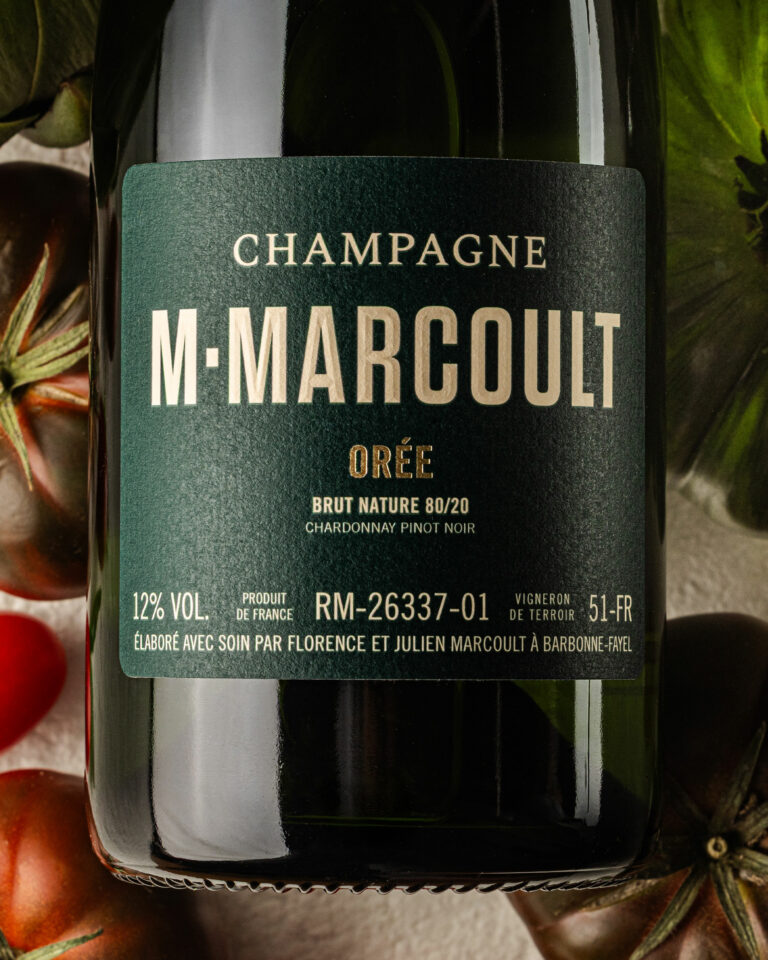
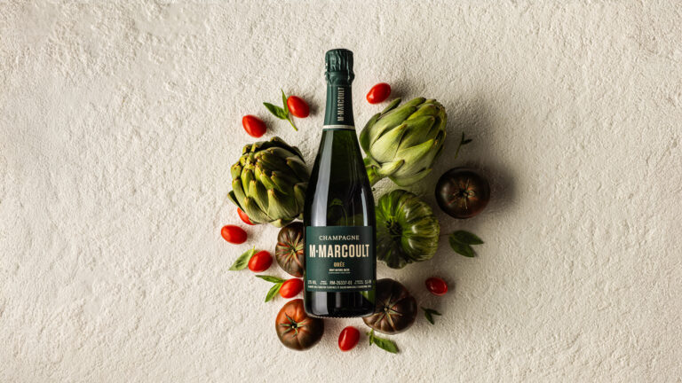
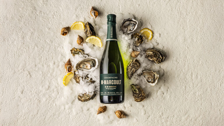
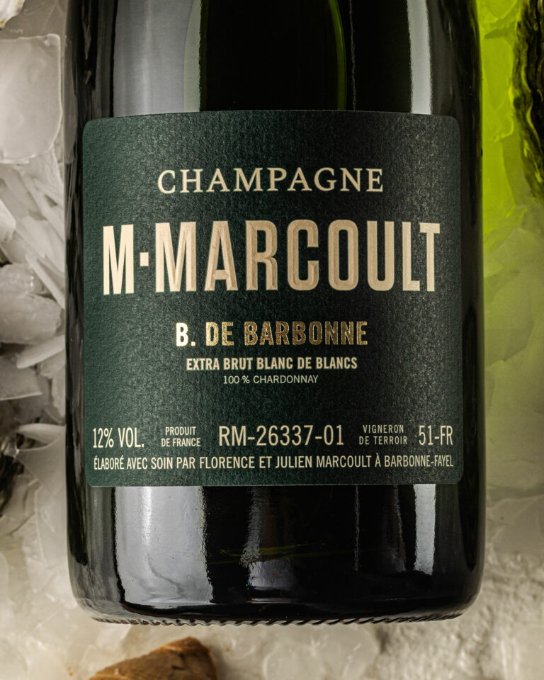
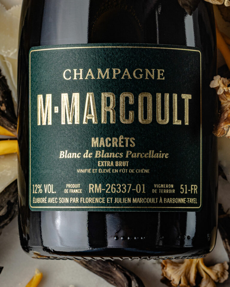
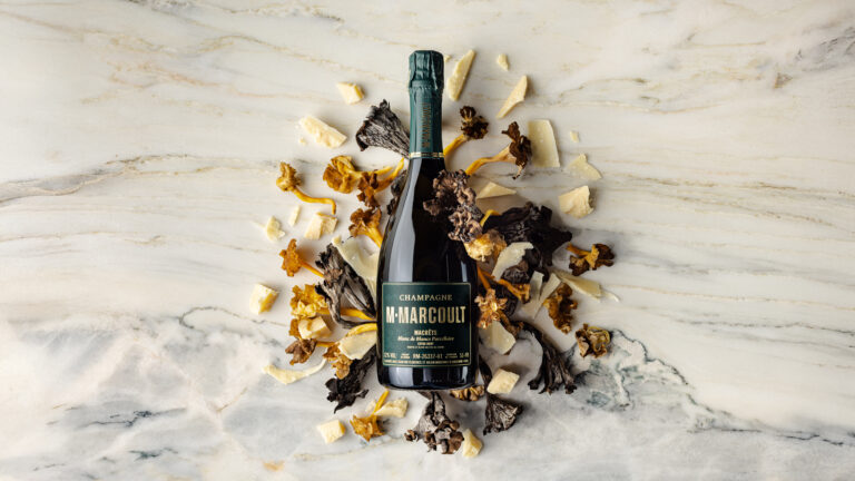
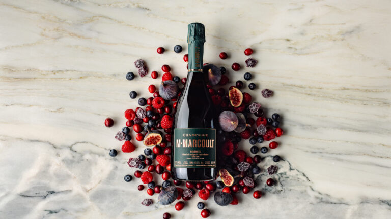
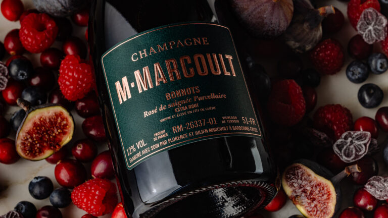
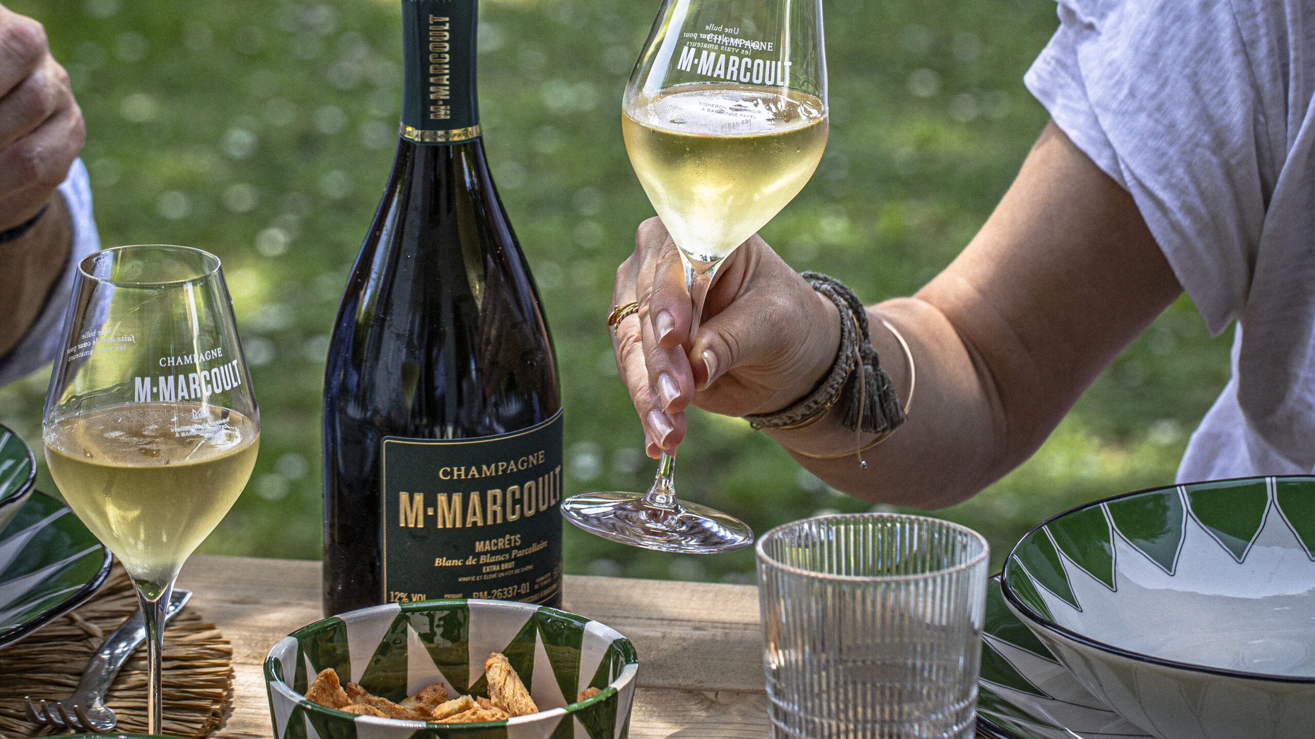
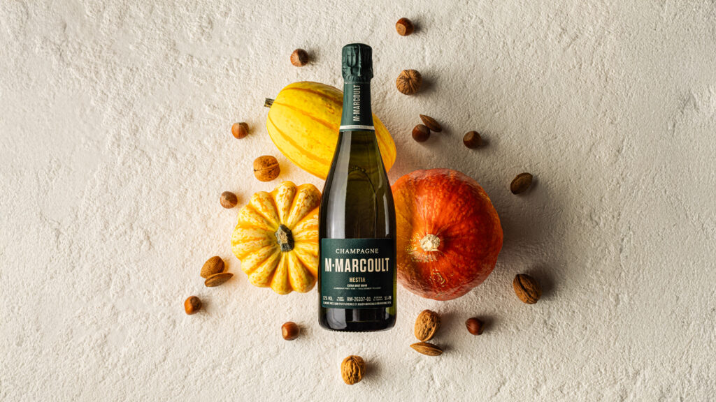
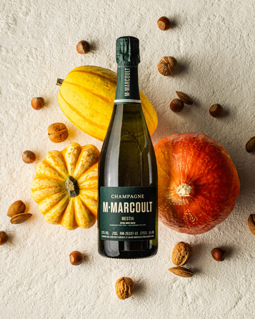
At the end of 2025, Mr. Marcoult entrusted us with the creation of his future communication visuals. As true epicureans, this time Florence and Julien asked us to highlight their pairings. We created compositions like color palettes. The visual impact comes from the unity of the whole, with no photomontage and no AI.

M. Marcoult Champagne Iconic Cuvées — 2026 campaign packshot · vrai studio
M. Marcoult's Iconic Champagne Collection — Brand Identity Photography 2026 · vrai studio
M.Marcoult Iconiques Bottle — Champagne 2026 packshot · vrai studio
M.Marcoult Iconic Collection — 2026 Champagne Campaign Packshot · vrai studio
M. Marcoult's Iconic Collection — Champagne advertising campaign 2026 · vrai studio
M. Marcoult Champagne's Iconic Cuvées — 2026 Photo Campaign Packshot · vrai studio
M. Marcoult Champagne Collection — Iconic Photography, 2026 Campaign · vrai studio
Champagne M. Marcoult — "Iconiques 2026" Photo Campaign · vrai studio
M. Marcoult Bottle — Iconiques Champagne 2026 packshot · vrai studio
Cuvée M.Marcoult Iconiques — Champagne campaign product shot · vrai studio

For the 2026 Champagne M. Marcoult campaign, the brief is clear: highlight the food-and-wine pairings within the range. The campaign is structured around two themes: the “Cuvées Bistronomiques,” photographed against a backdrop of “craillères”—the limestone formations of the Champagne region’s underground cellars—and the “Cuvées Gastronomiques,” set against a backdrop of white marble, which conveys a more formal, more elite feel.

The visual concept creates a carefully curated palette of pairings for each vintage. The bottle is simply positioned, in balance, always without any photo manipulation. The composition is built around the product and the elements that complement it, without artifice. Zero AI. One hundred percent real. This campaign is part of vrai studio annual partnership vrai studio the house, vrai studio the fifth year of continuous collaboration between Camille Gabarra and the teams at Champagne M.Marcoult.

Art Direction and Photography: Camille Gabarra
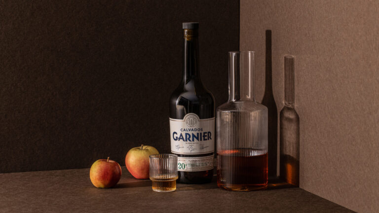
Calvados product shot setting, view 1 — Garnier branding · vrai studio
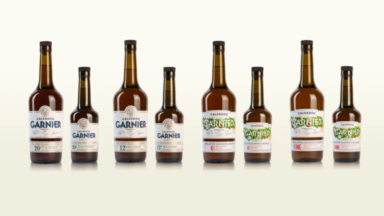
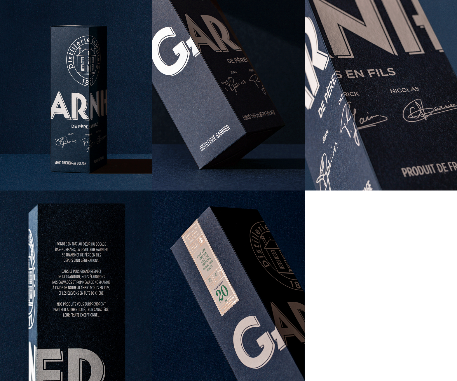
Product Line Promotion — Garnier Visual Identity · vrai studio
  • Creative Direction
  • Art Direction
  • Project management
  • Brand identity
  • Packaging
  • Photography
  • Brand story
  • Manufacturing management
  • Web design

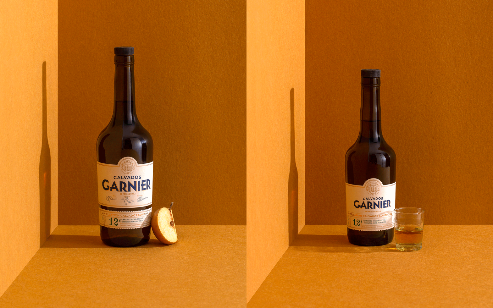
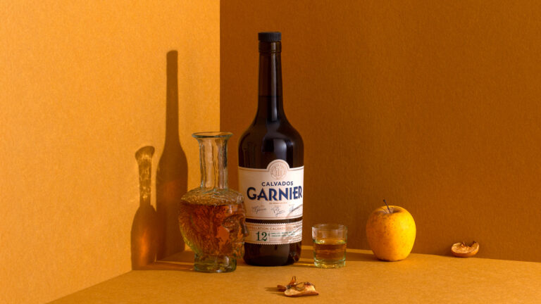
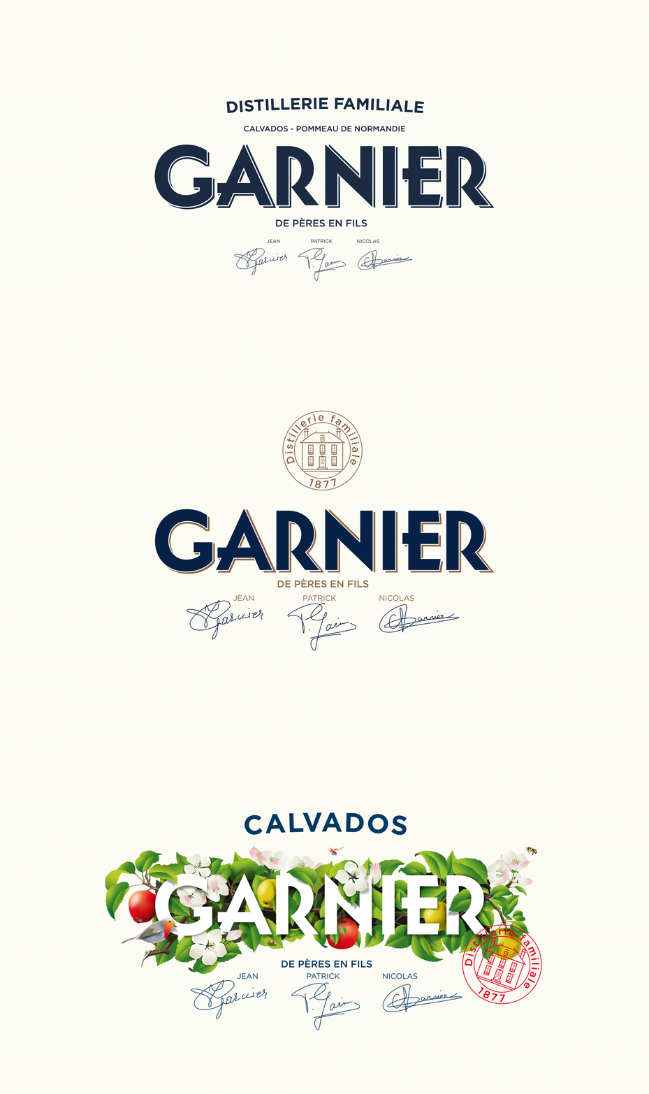
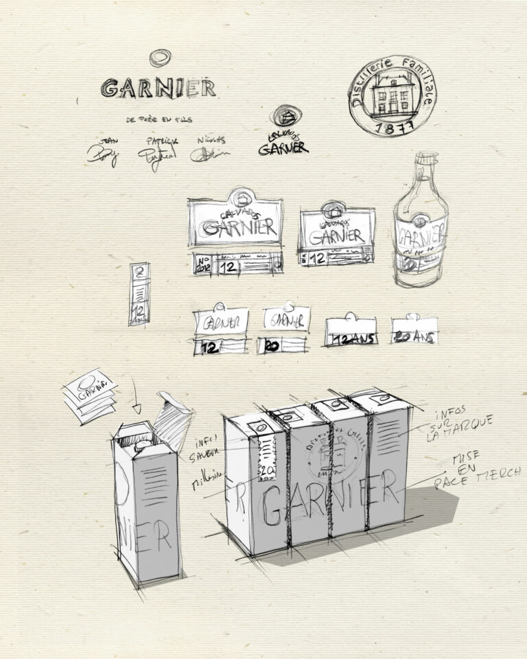
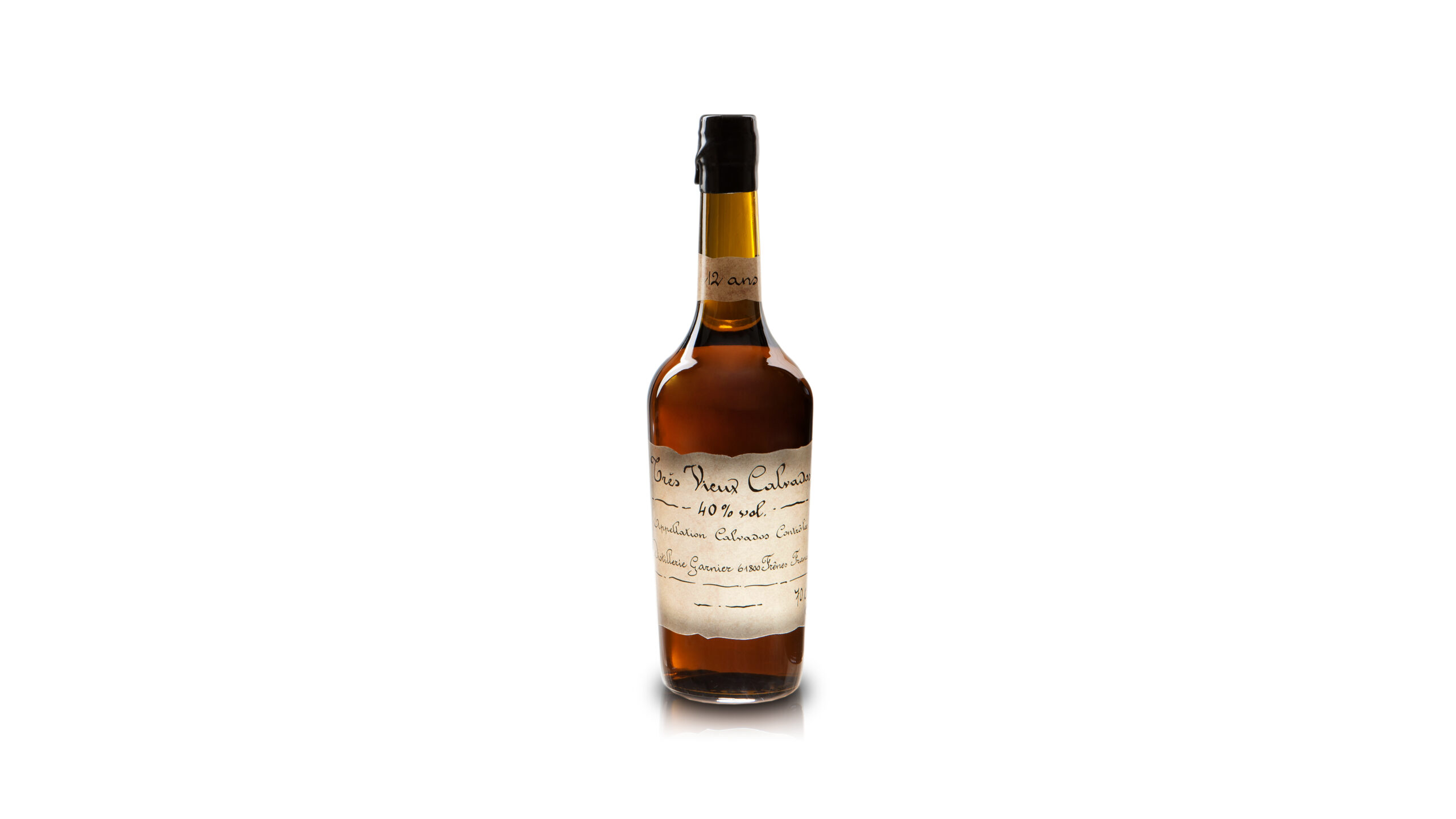
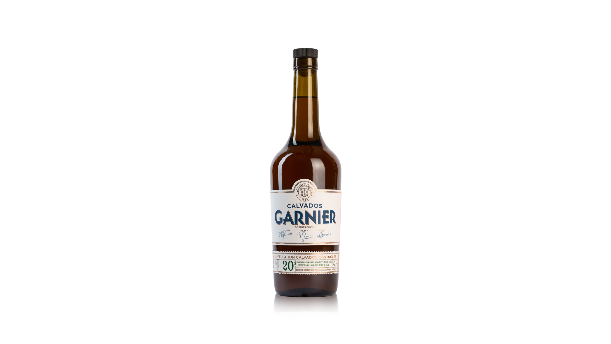
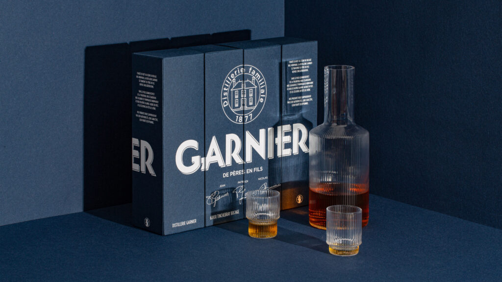
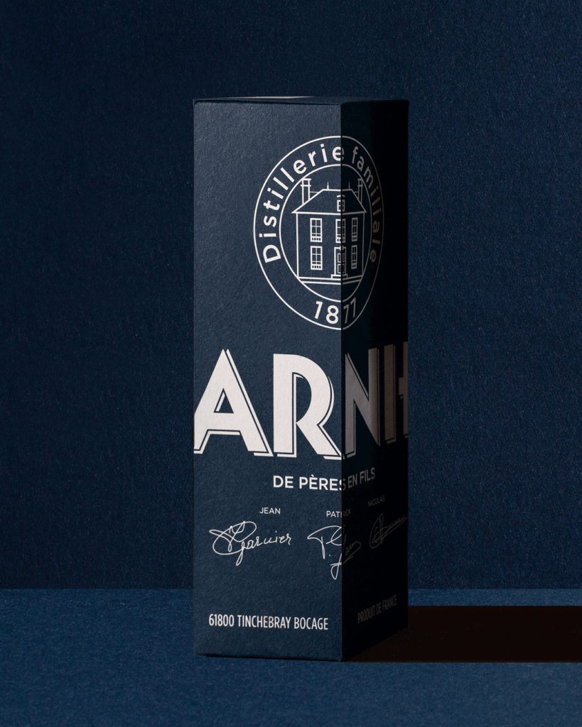
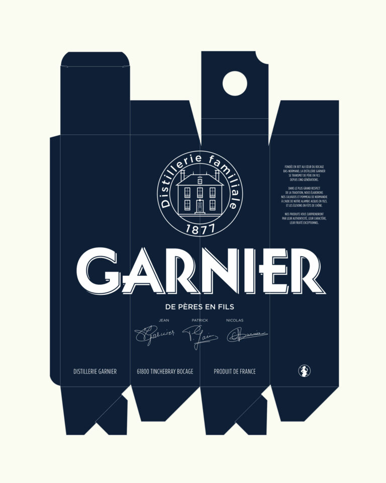
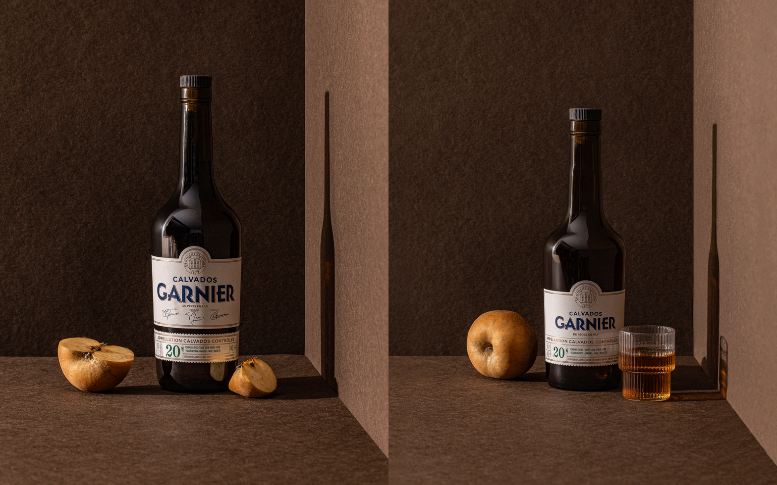
Since 1877, the Garnier family has been producing and distilling in the Normandy Bocage. Nicolas entrusted us with the redesign of his identity after aligning us with several agencies. The human touch and a taste for the real thing made the difference. A family crest, Art Deco typography and midnight blue set the brand apart. The offer was reorganized into two ranges: one young, with a metaphorical illustration of the apple tree cycle; the other traditional, with classic graphic codes.

Calvados product photography — Garnier branding · vrai studio

© Le Goff & Gabarra

Product Line Promotion — Garnier Visual Identity · vrai studio

© Le Goff & Gabarra

Calvados product shot setting, view 2 — Garnier branding · vrai studio

© Le Goff & Gabarra

Product Line Promotion — Garnier Visual Identity · vrai studio

© Le Goff & Gabarra

Product Line Promotion — Garnier Visual Identity · vrai studio

© Le Goff & Gabarra

Calvados product shot setting, view 3 — Garnier branding · vrai studio

© Le Goff & Gabarra

Logo Animation — Garnier Visual Identity · vrai studio

© Le Goff & Gabarra

Calvados product shot setting, view 5 — Garnier branding · vrai studio

© Le Goff & Gabarra

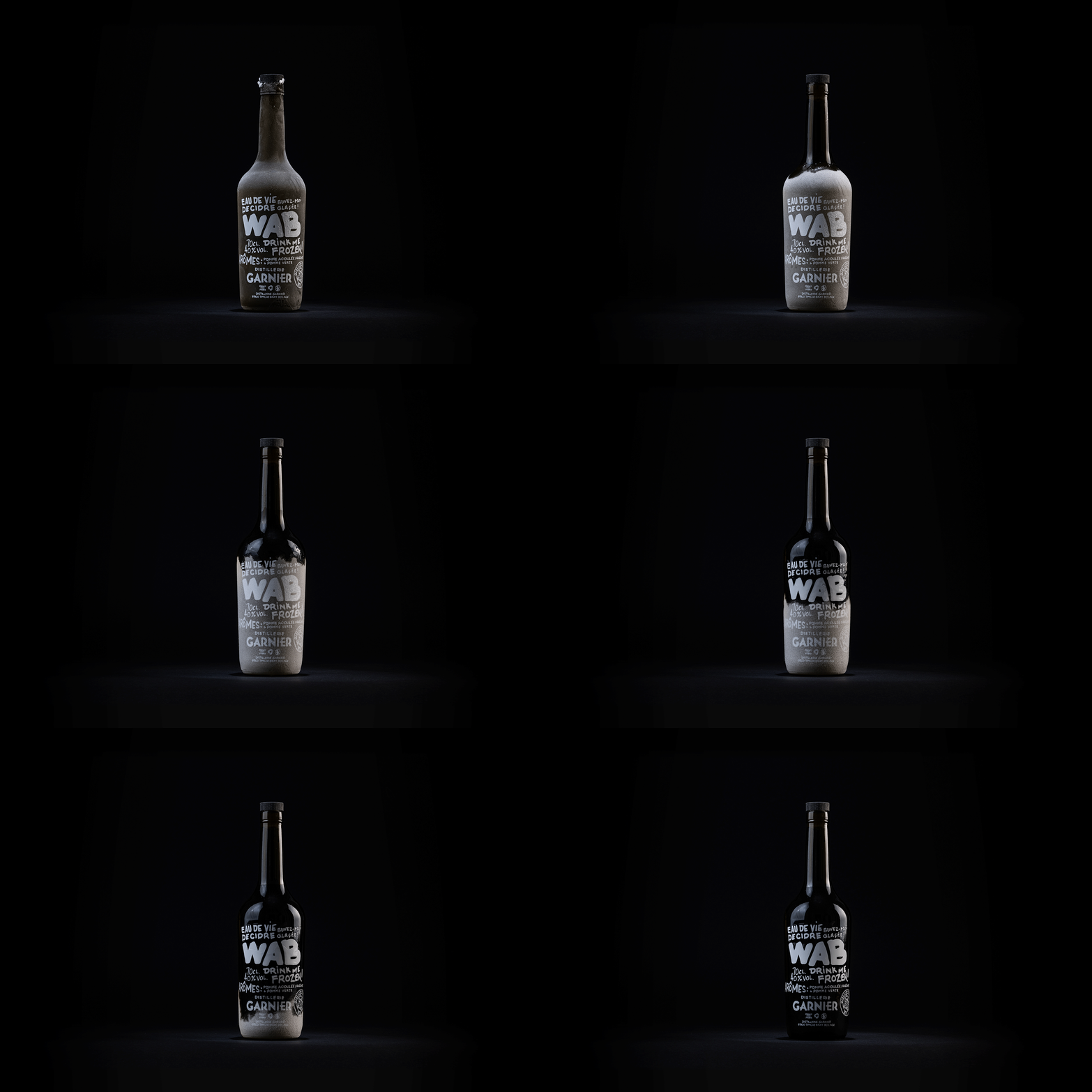
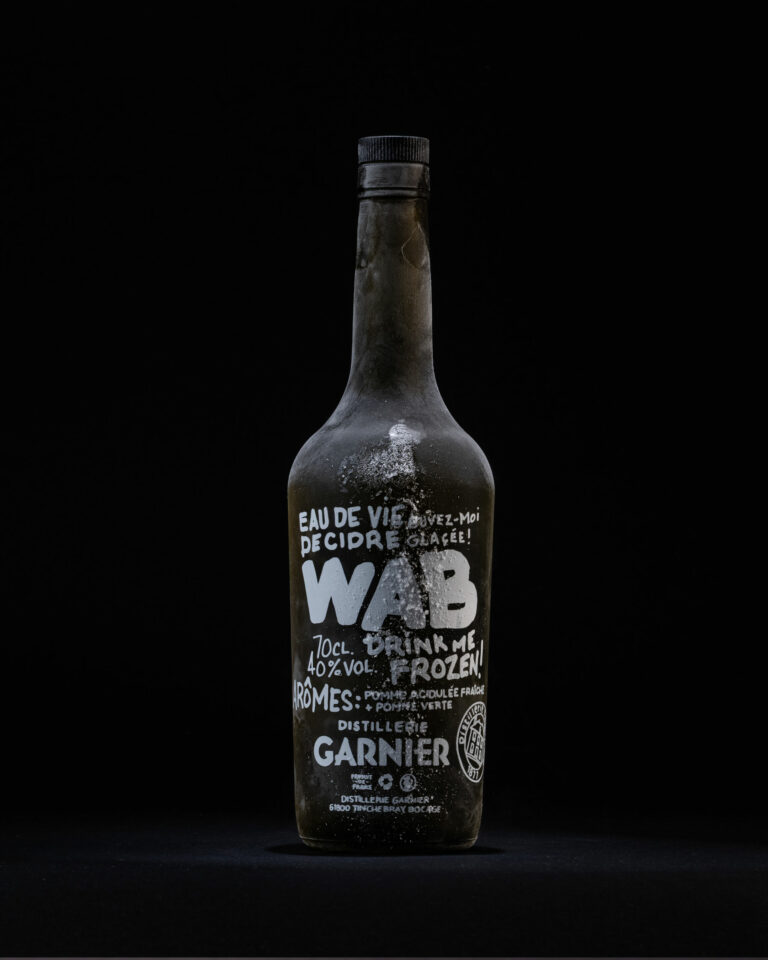
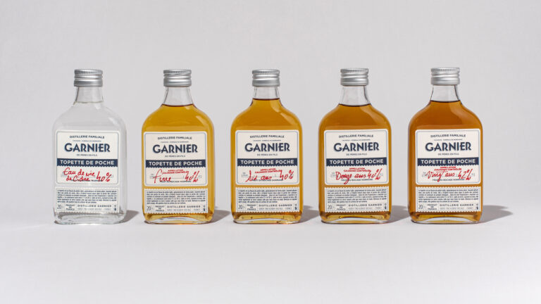
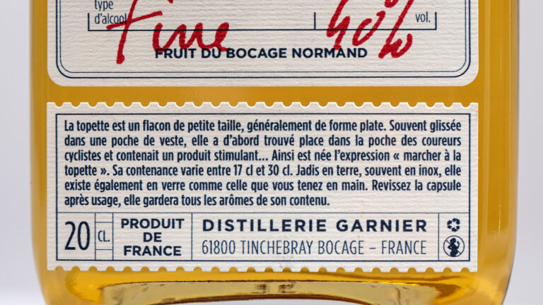
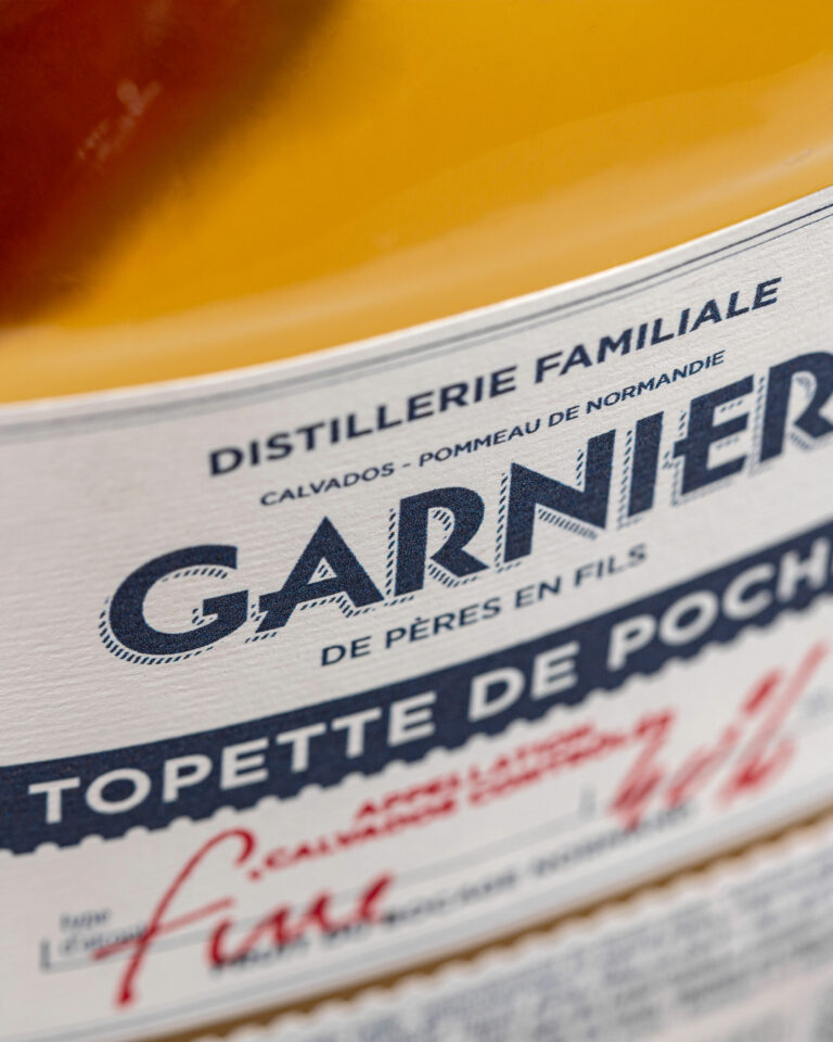
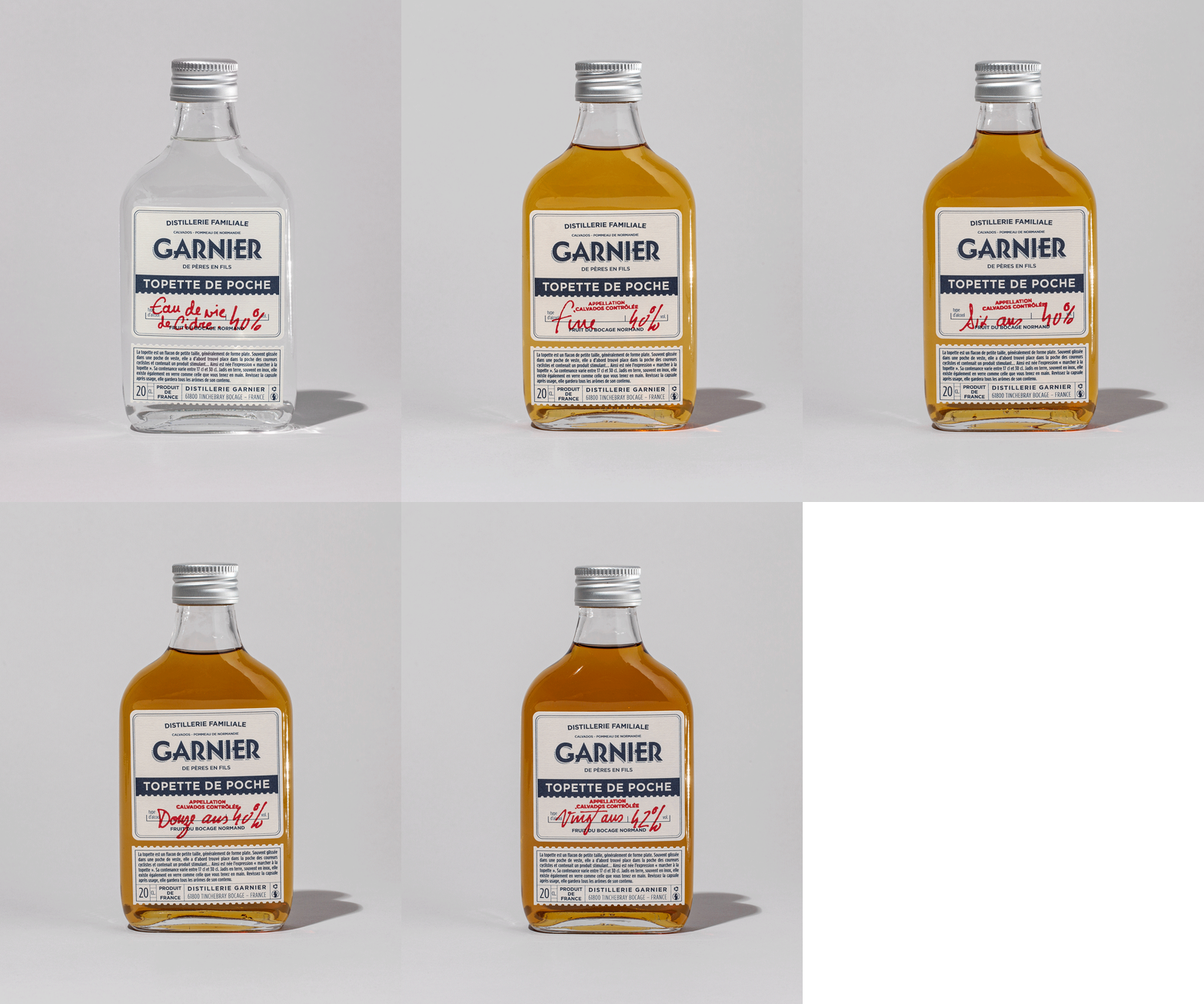
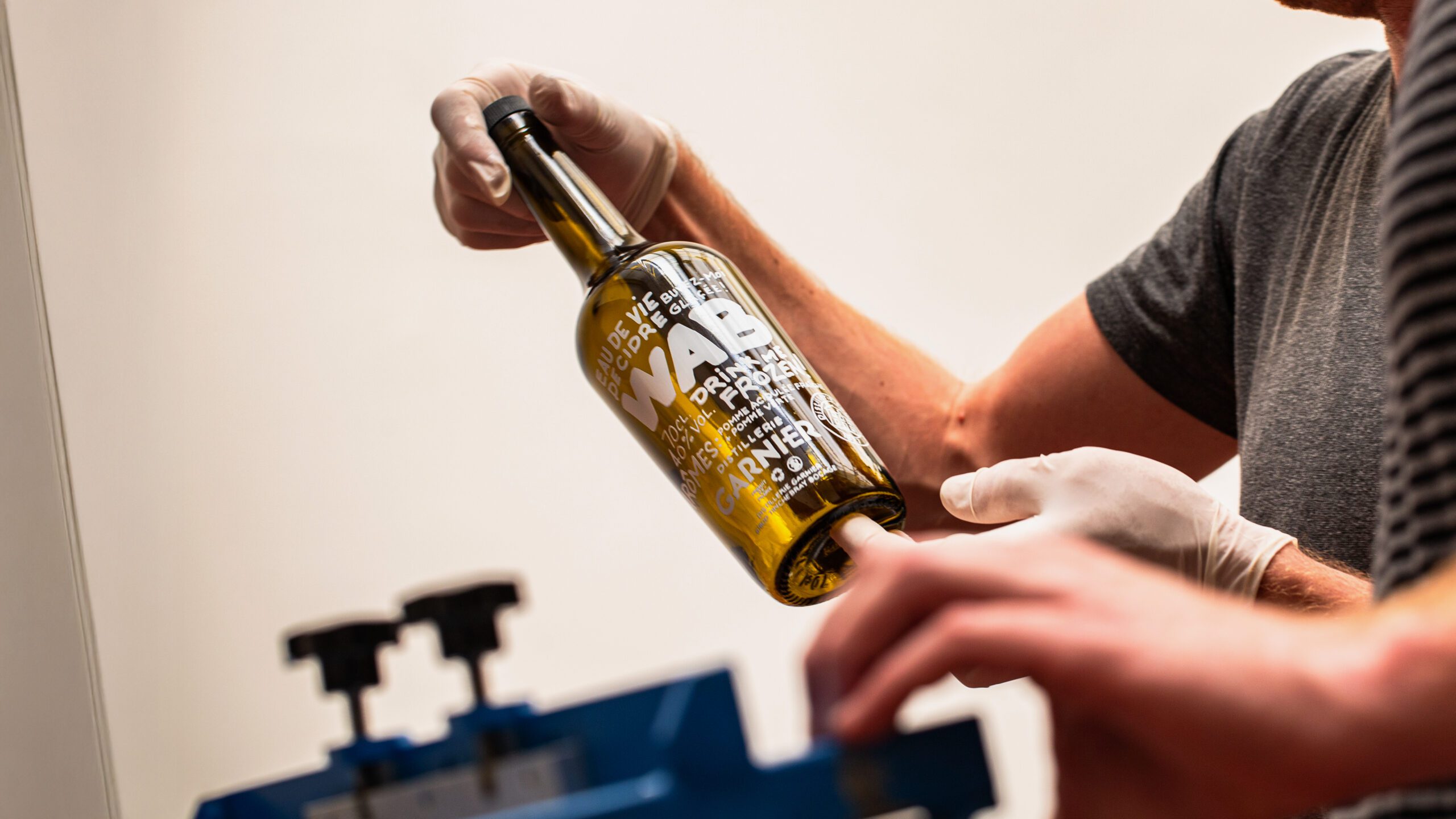
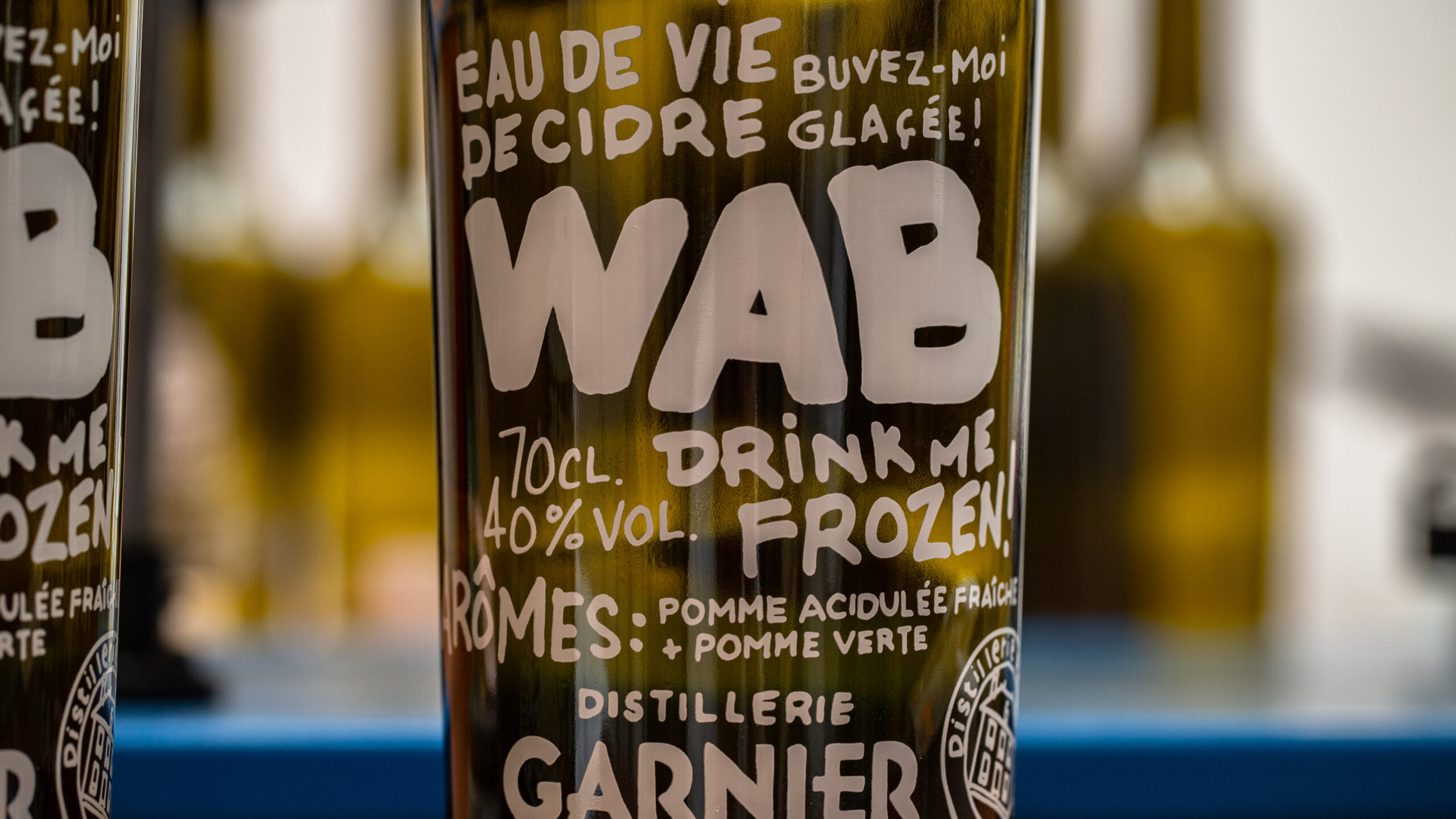
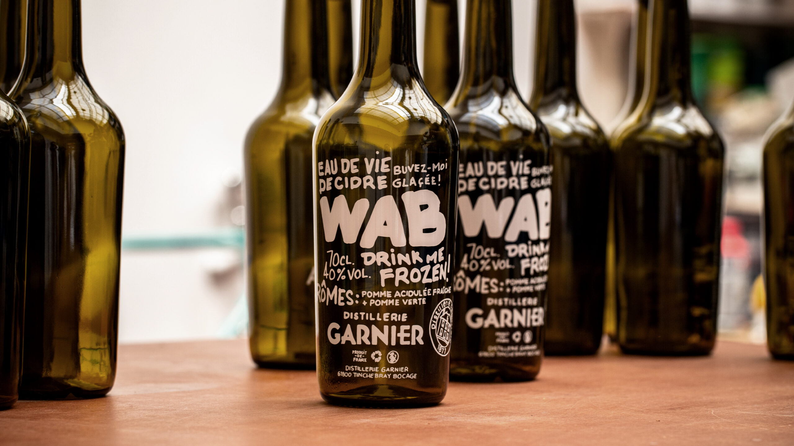
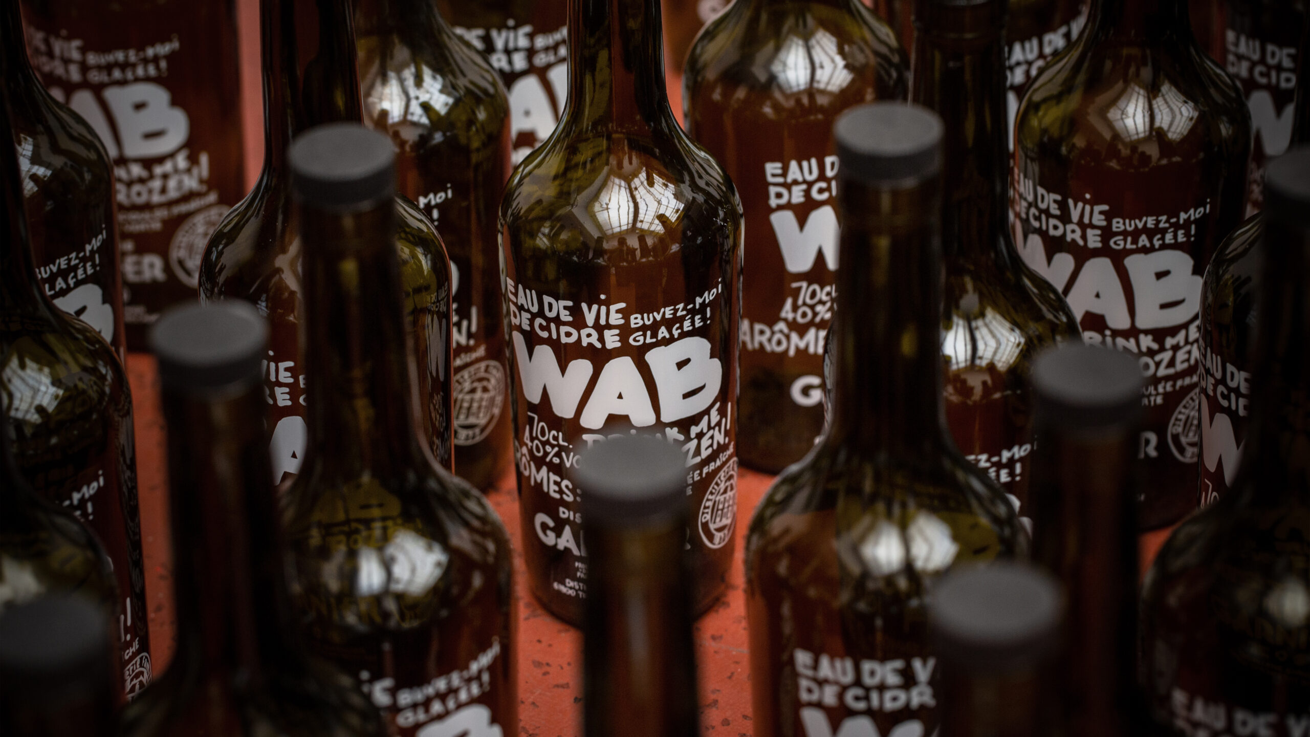
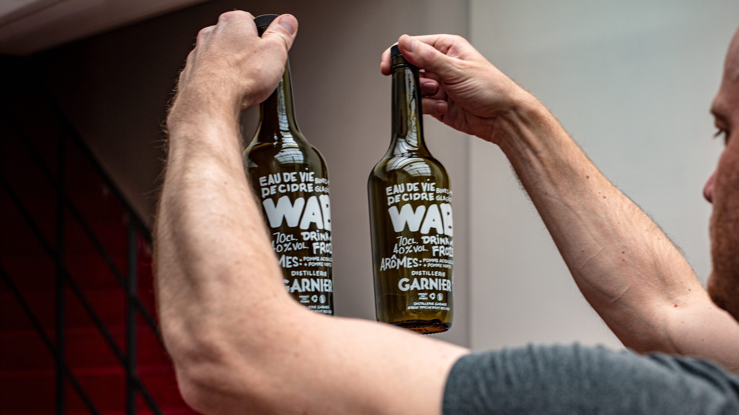
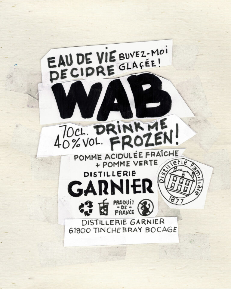
Two purely marketing-oriented products are developed on our advice: WAB – White Apple Brandy – echoes the codes of contraband, with no label and a message written by hand directly on the bottle; and the topette, a portable product that leaves a lasting impression and which Nicolas can fill on demand.

WAB Petite — Garnier Calvados packaging · vrai studio
WAB White Apple Brandy bottle, view 2 — packaging by Garnier · vrai studio
WAB White Apple Brandy bottle, view 1 — packaging by Garnier · vrai studio
Topette Nomade, View 1 — Garnier Calvados packaging · vrai studio

© Le Goff & Gabarra

Topette Nomade, View 7 — Garnier Calvados packaging · vrai studio

© Le Goff & Gabarra

Topette Nomade, View 6 — Garnier Calvados packaging · vrai studio

© Le Goff & Gabarra

"Topette Nomade" Animation — Garnier Calvados Packaging · vrai studio

© Le Goff & Gabarra

WAB in context, view 3 — Garnier product photography · vrai studio
WAB in use, view 2 — Garnier product photography · vrai studio
WAB in context, view 1 — Garnier product photography · vrai studio
WAB in context, view 4 — Garnier product photography · vrai studio
WAB in context, view 5 — Garnier product photography · vrai studio

Calvados Garnier is a Normandy-based calvados producer. Camille Gabarra was entrusted with the artistic direction and product photography during the first twenty years of her career, making this project one of the seminal works in the wine and spirits industry.

The project encompasses the brand’s visual identity and the photographic direction for its products. Rooting the brand in the traditions of artisanal Normandy spirits—without imitating generic market standards—is the same principle that now guides projects for Champagne M.Marcoult, Distillerie de la Forge Distillerie Monéger. In fact, it was through Calvados Garnier that Champagne M.Marcoult first discovered Camille Gabarra’s work, before contacting him several years later for a collaboration that has been ongoing since 2020.

Art Direction and Photography: Camille Gabarra
Concept Sketch 2 — Garnier Visual Identity · vrai studio

ASSEMBLY

Drawing, cutting, gluing...

Concept Sketch 1 — Garnier Visual Identity · vrai studio

STUDY

Starting with a sketch of intent, always

Brand Redesign, Before and After, View 1 — Garnier Calvados Branding · vrai studio Brand Redesign, Before and After, View 2 — Garnier Calvados Branding · vrai studio
Ratafia Atmosphere by M. Marcoult — Artisanal Brand Photography · vrai studio
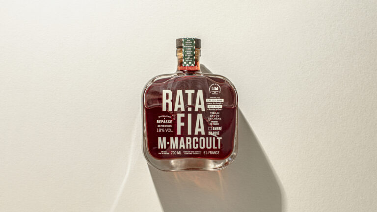
Ratafia M. Marcoult — bottle packshot, dark background, side view · vrai studio
  • Art Direction
  • Brand story
  • Brand vocabulary
  • Packaging
  • Manufacturing management
  • Photography

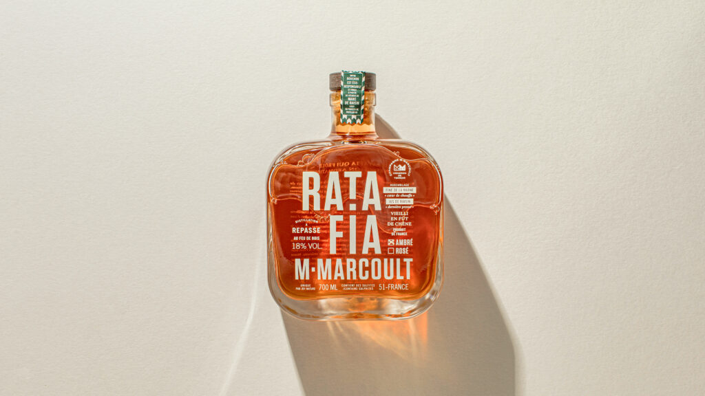
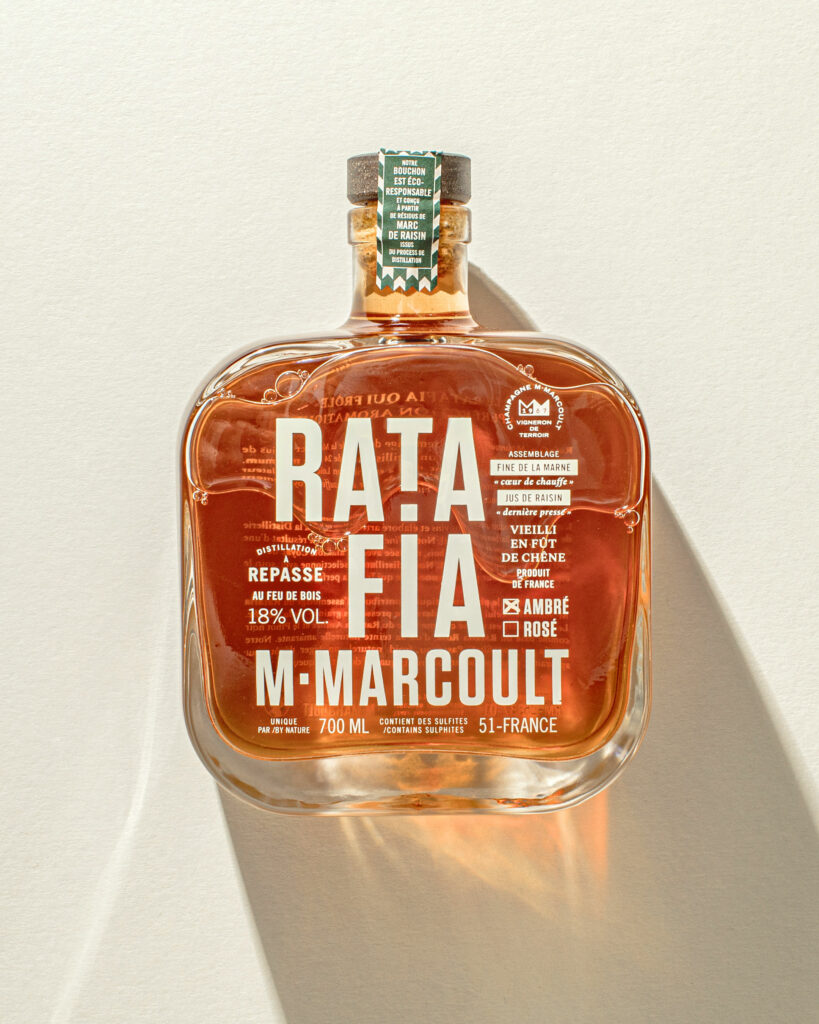
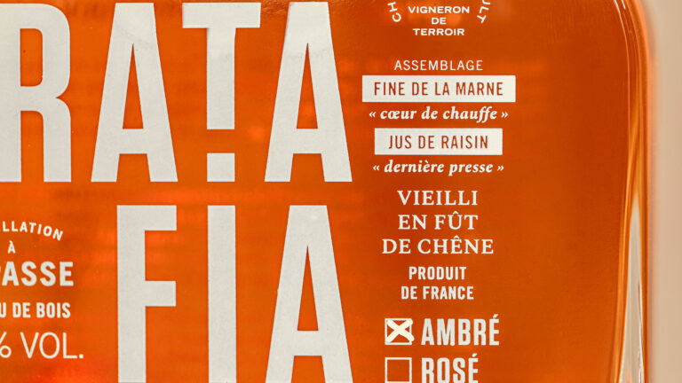
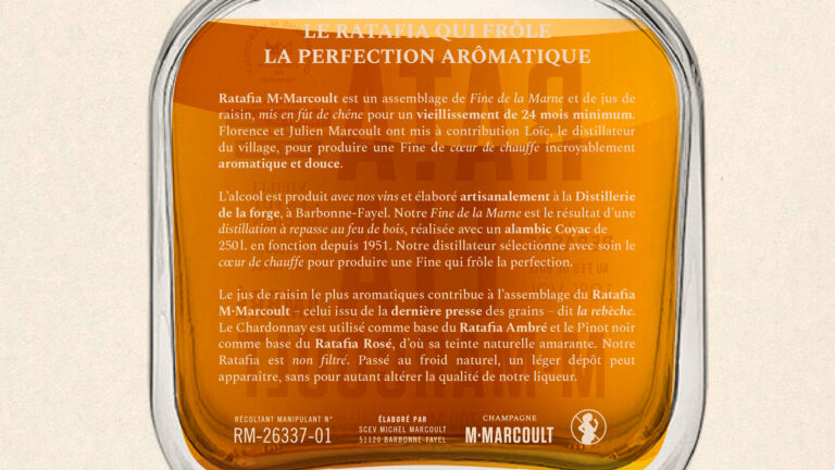
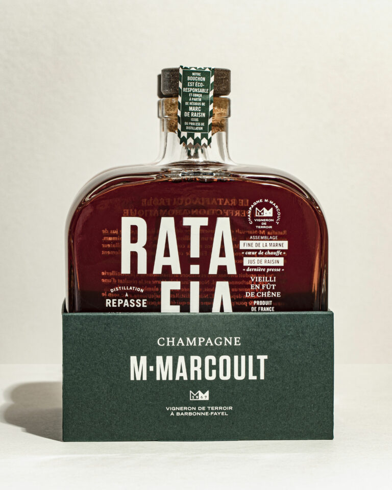
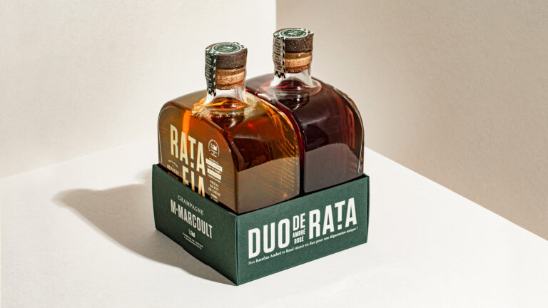
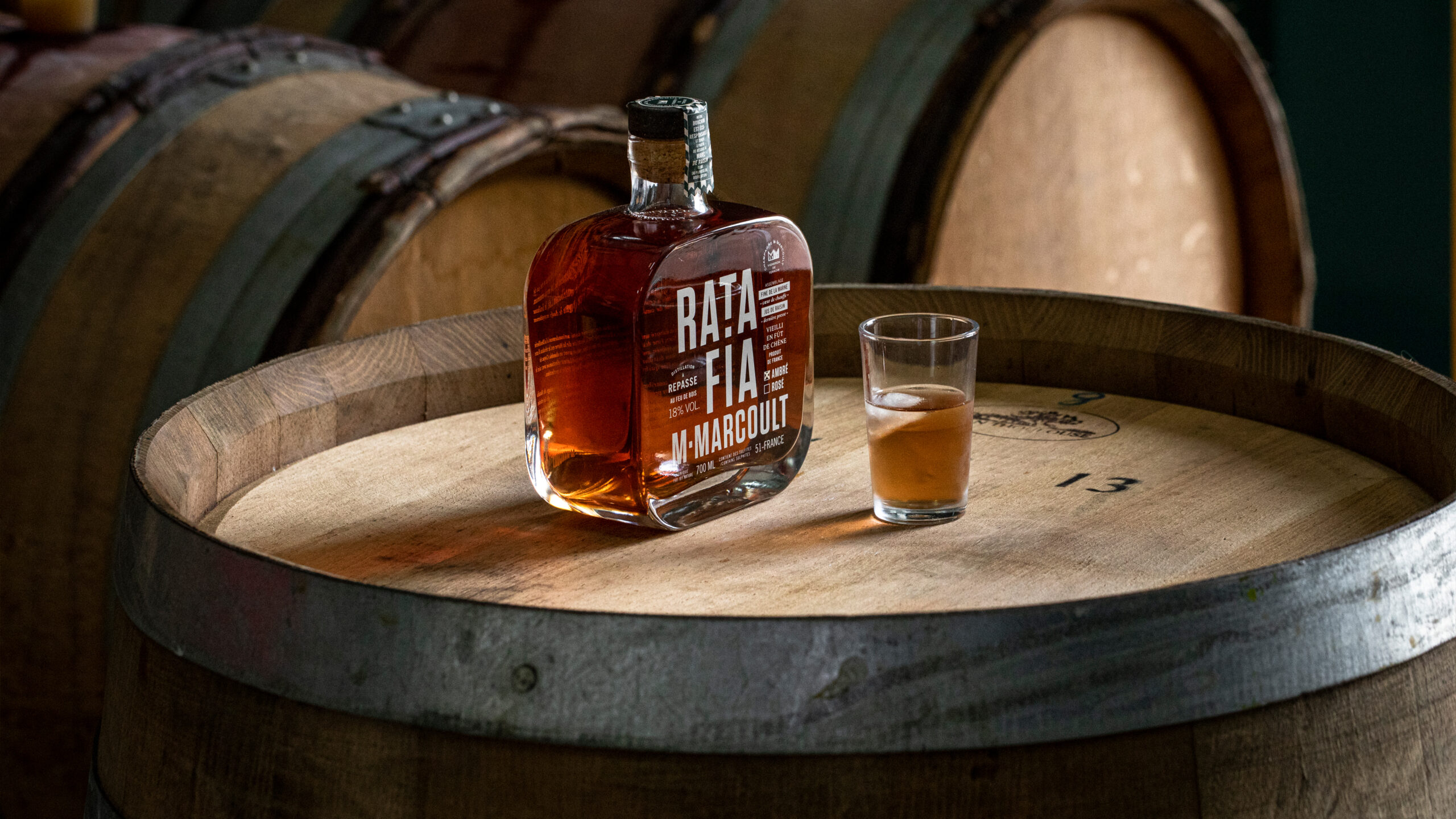
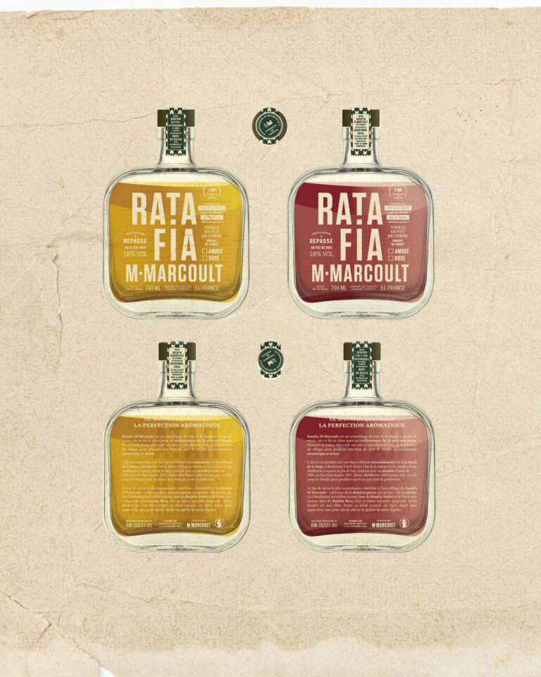
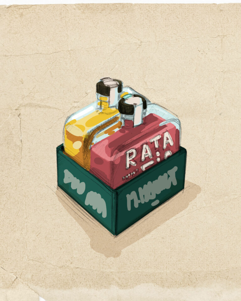
Following the rebranding of their champagne by us, Florence and Julien entrusted us with the creation of their flask of Ratafia, an artisanal amber (Chardonnay) or rosé (Pinot noir) spirit derived from champagne. A Peaky Blinders-style creation screen-printed directly on the glass in the Champagne brand's emblematic greige.

M. Marcoult Champagne Ratafia — atmosphere, visual identity, rebranding · vrai studio
Ratafia M. Marcoult — atmosphere, staging, lifestyle photography · vrai studio
Ratafia M. Marcoult — product photography capturing the atmosphere of champagne and local terroir · vrai studio
M. Marcoult Champagne Ratafia — atmospheric cellar photography · vrai studio
Ratafia M. Marcoult — bottle packshot, independent winemaker, Champagne · vrai studio
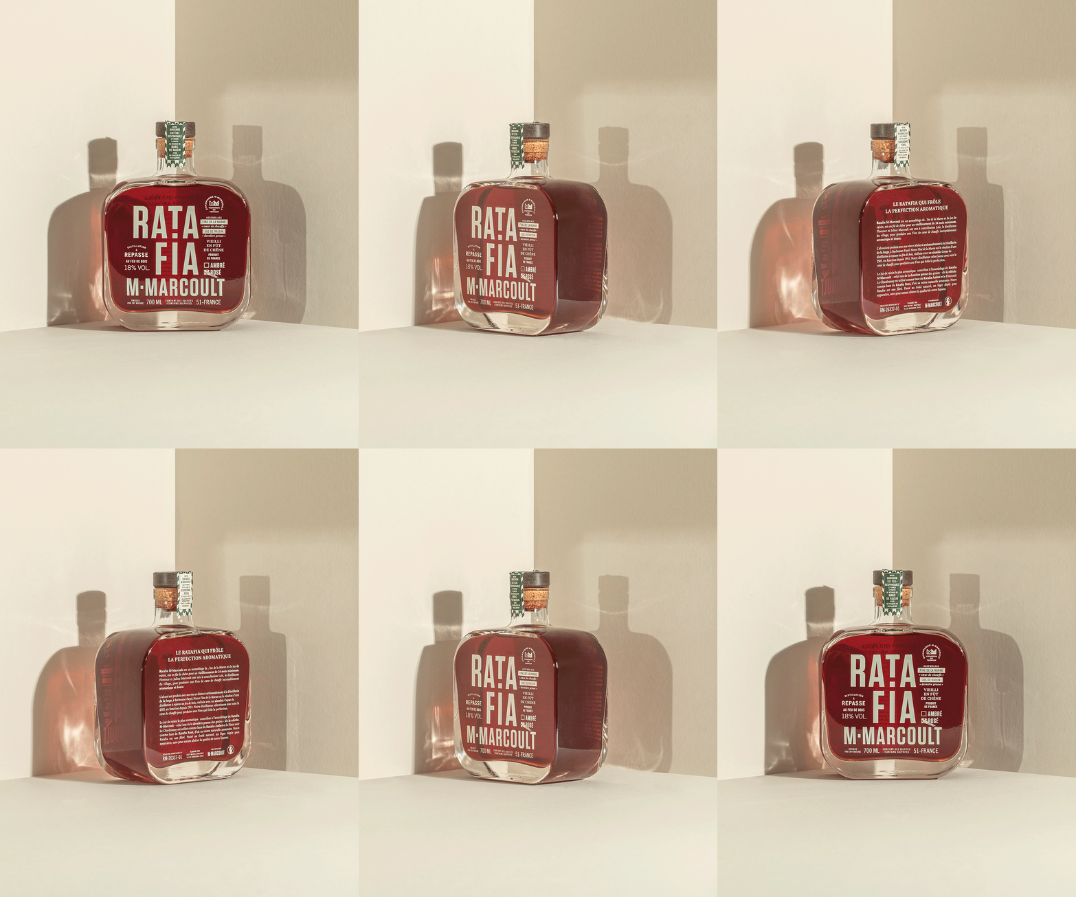
M. Marcoult Rosé Ratafia — 360° rotating packaging views · vrai studio
M. Marcoult Champagne Ratafia — atmospheric photography · vrai studio
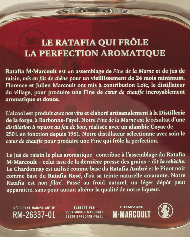
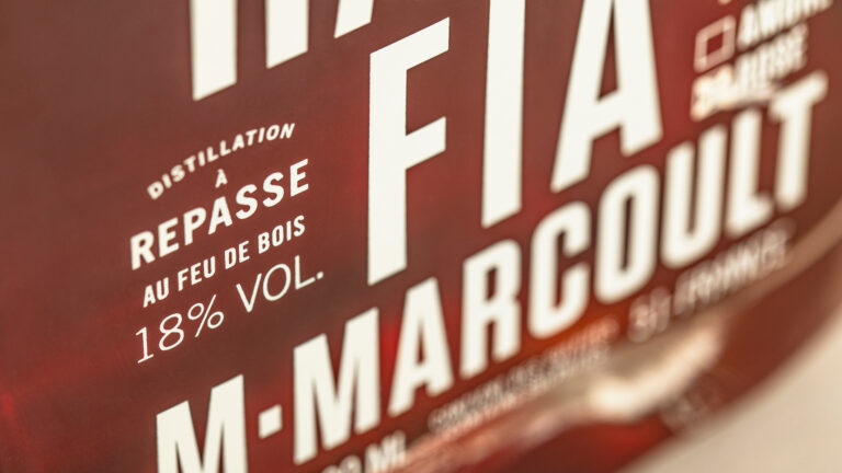
Close-up of the M. Marcoult Ratafia label — packaging typography · vrai studio
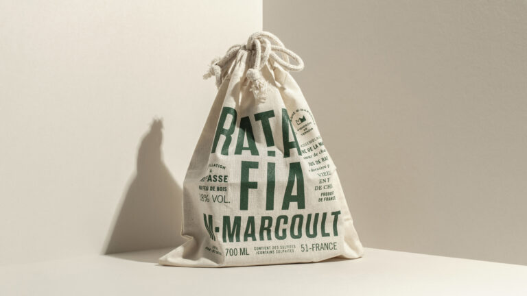
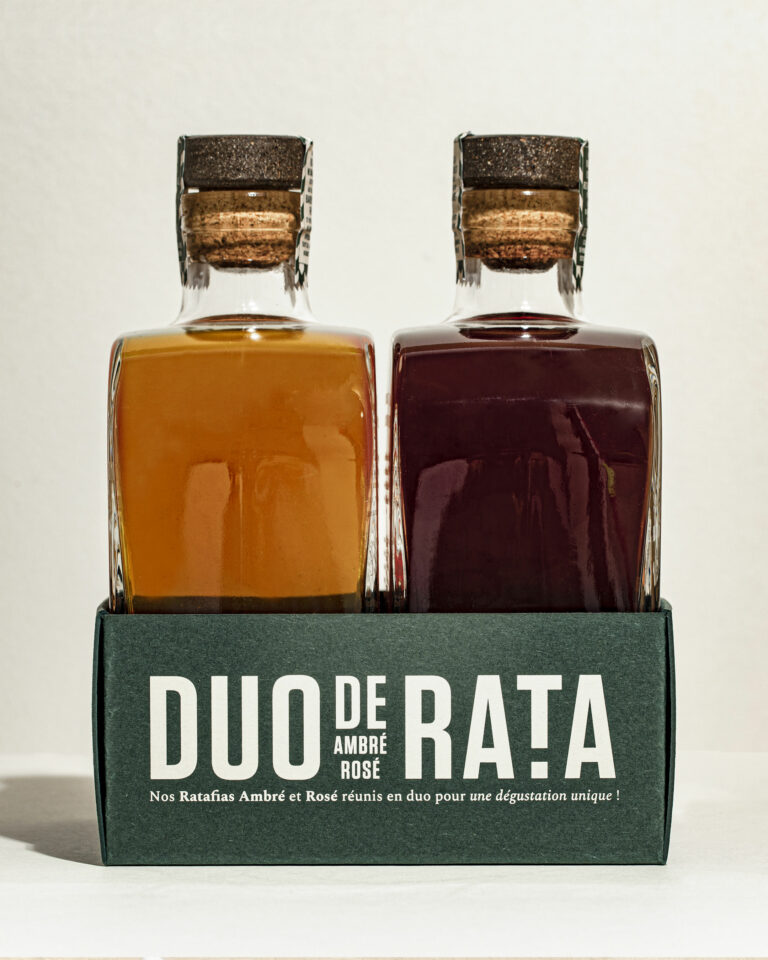
Ratafia M. Marcoult — product shots of the amber and rosé varieties · vrai studio
M. Marcoult Rosé Ratafia — packaging and label design · vrai studio
Ratafia Atmosphere by M. Marcoult — featuring artisanal champagne · vrai studio
Ratafia M. Marcoult Lifestyle — Tasting Table Set-Up · vrai studio
Ratafia M. Marcoult — lifestyle photography for a champagne brand · vrai studio

Champagne ratafia is a brandy made from grape juice and Champagne brandy—a niche, technically sophisticated product that deserves its own distinct identity within the M. Marcoult lineup.

vrai studio the bottles and designs the packaging for the white and rosé ratafia, ensuring direct consistency with the graphic system developed for the house’s champagnes. The bottle, the label’s silhouette, the color palette, and the typographic style are all crafted so that the ratafia stands as a natural extension of the brand, without any break in tone or formal imitation. The product photography direction combines scenes shot in the cellar with studio product shots, anchoring each image within the estate’s world. The ratafia tells the story of the same house, but in a different way—through a different product, a different light, and a different moment in the harvest.

Art Direction and Photography: Camille Gabarra
Ratafia Sketch by M. Marcoult — Visual Identity Creation Process for Champagne · vrai studio

VIRTUAL

Vector before production

Ratafia Study by M. Marcoult — packaging and brand identity design sketches · vrai studio

STUDY

Every project has its sketches

Monéger Pack, Nickel Finish — Heritage Spirits Packaging · vrai studio
Monéger Heritage Spirits — bottle packshot, visual identity · vrai studio

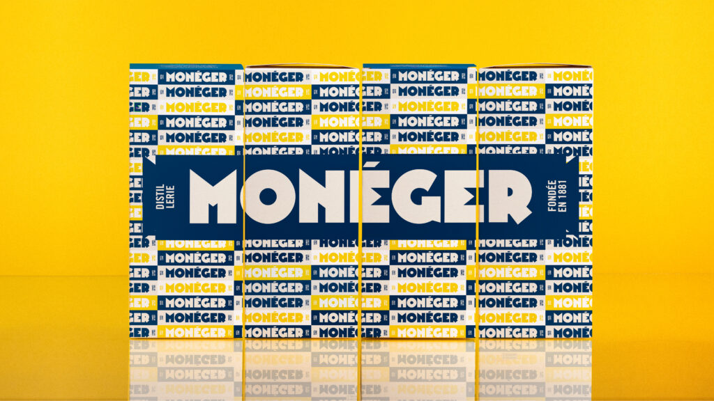
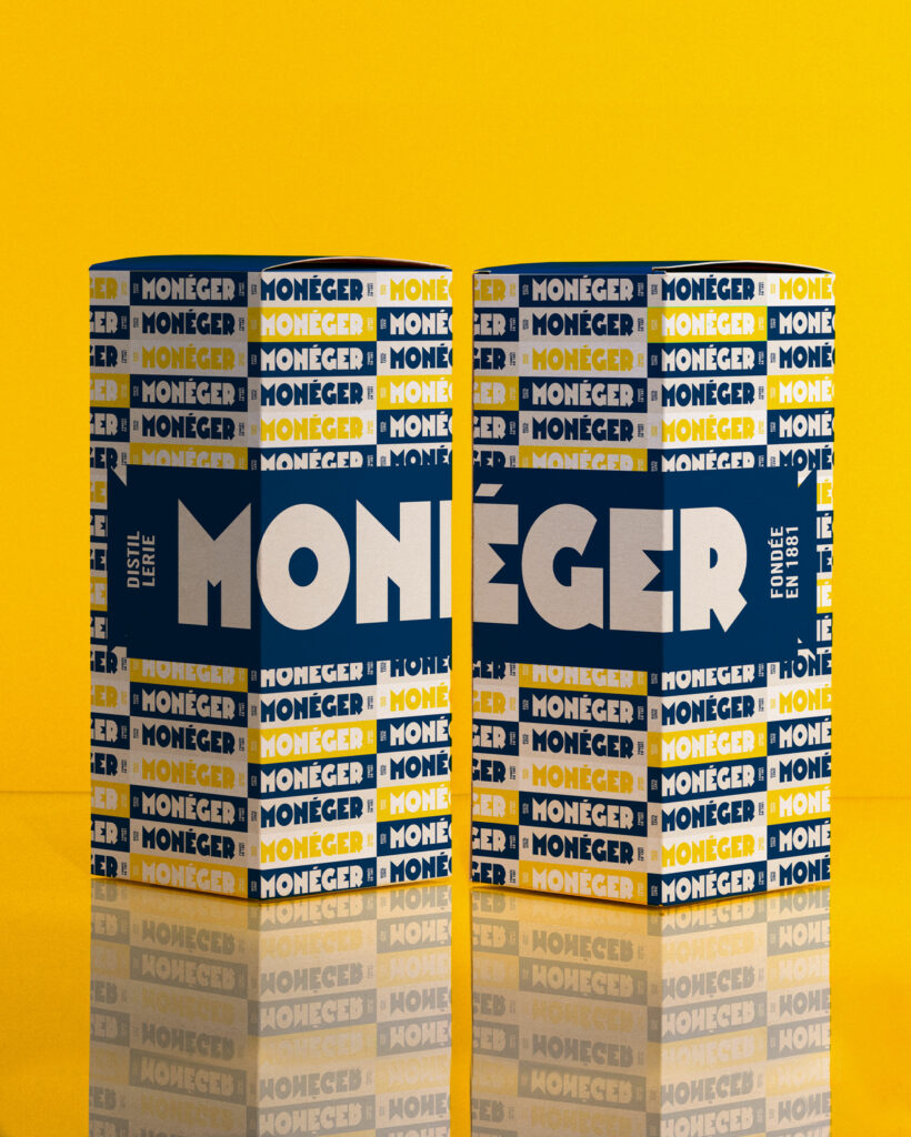
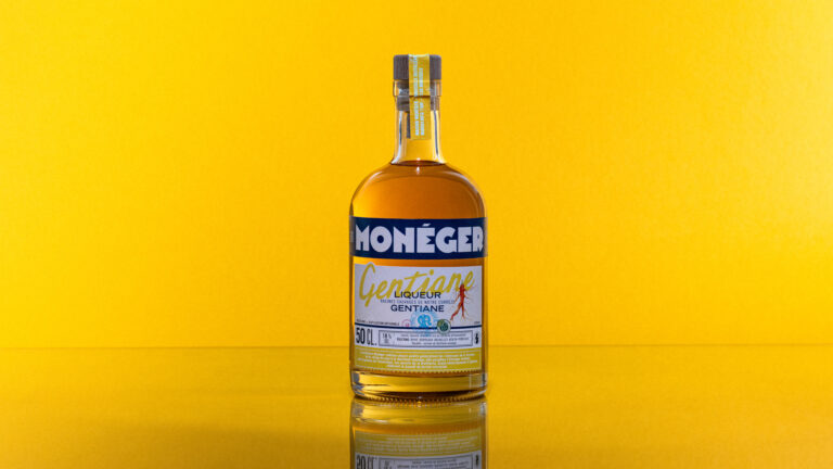
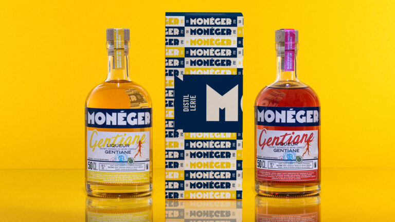
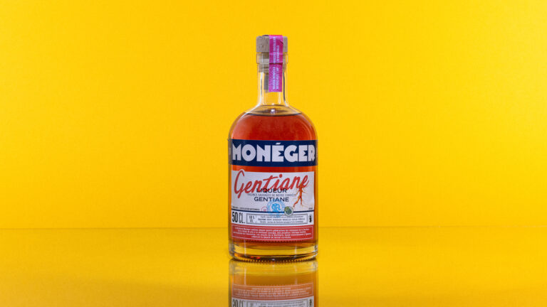
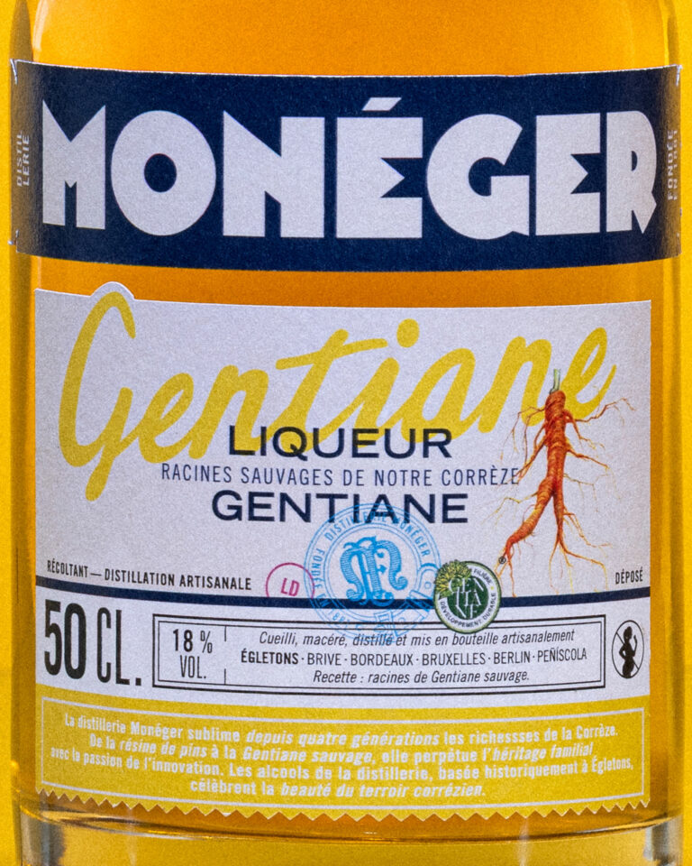
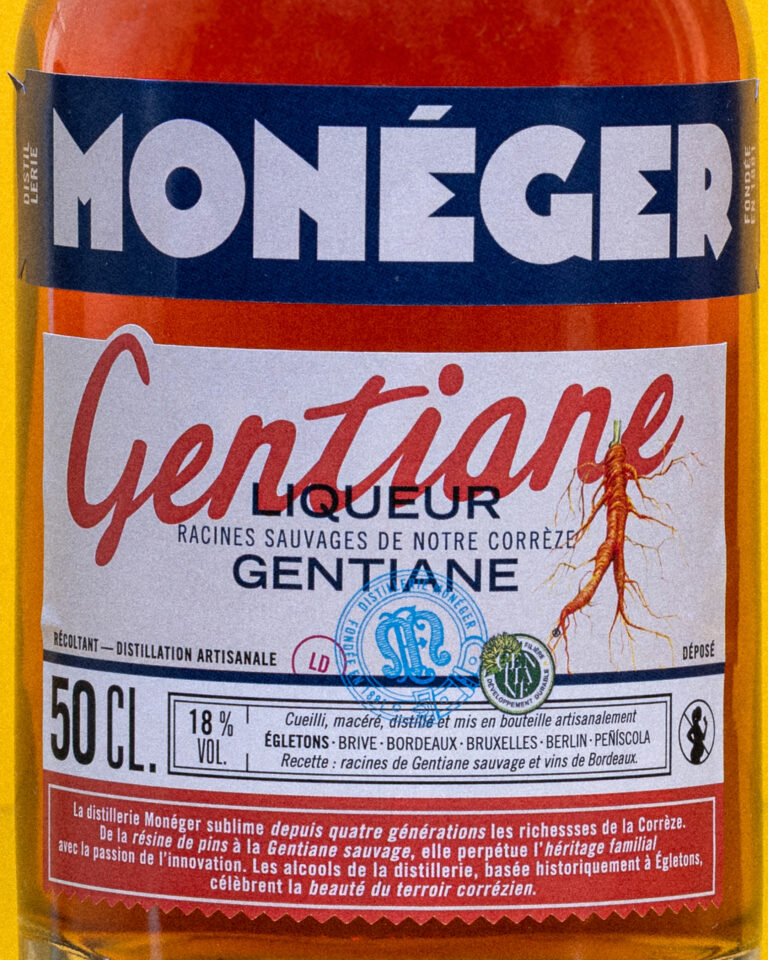
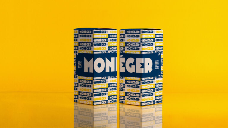
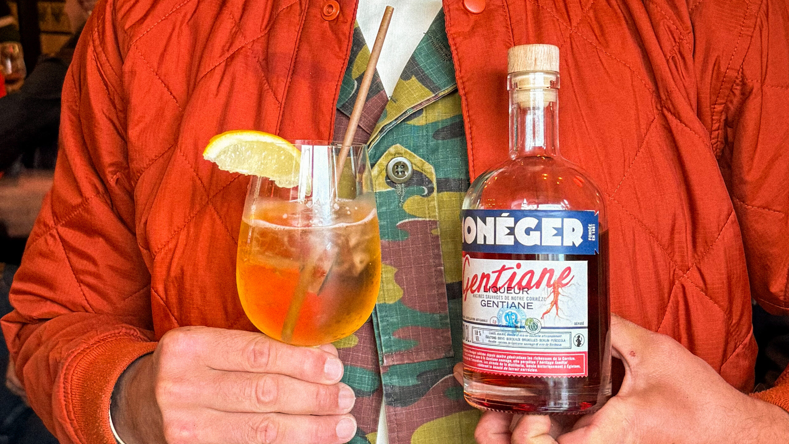
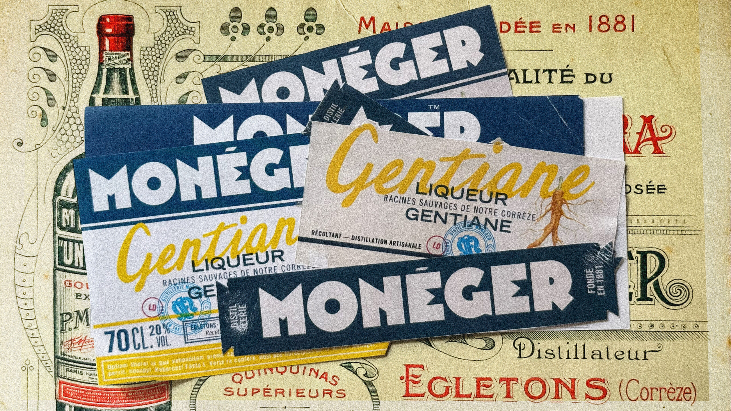
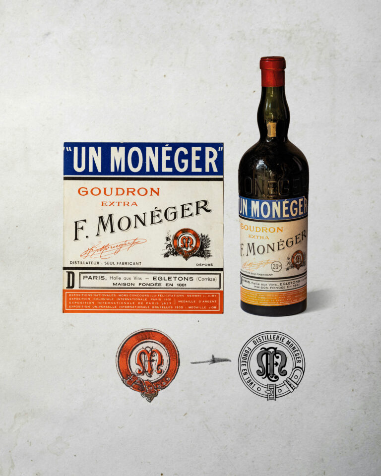
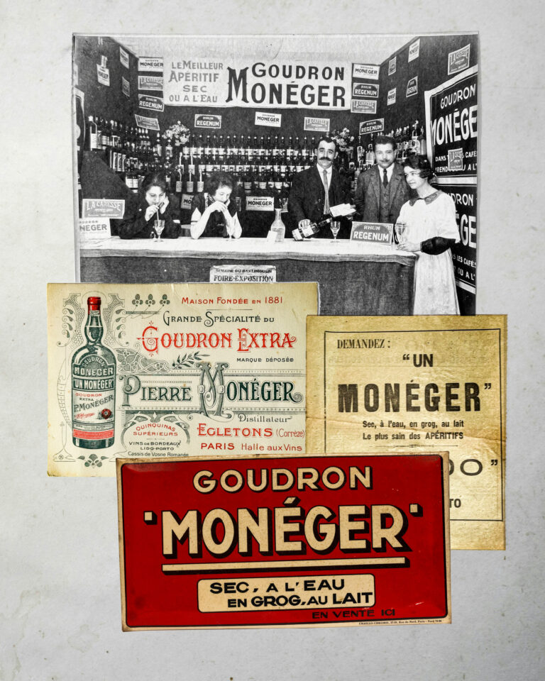
In 1881, the Monéger distillery was founded. In 2023, the identity is revised by the real thing. It will be derived from the brand's archives and the bottle of Goudron Monéger, the company's emblematic liqueur.

Monéger Branding — Artisanal Spirits Photography · vrai studio
Monéger Heritage Spirits Ambience — Branding Photography · vrai studio
Monéger Spiritueux — Atmosphere, Photography, Visual Identity · vrai studio
Monéger Product Shot — Visual Identity for Heritage Spirits · vrai studio
Monéger Spirits Product Shot — Handcrafted Label and Packaging · vrai studio
Monéger Spirits — atmospheric packaging photography · vrai studio

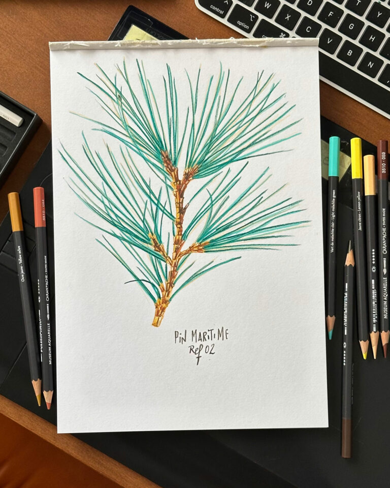
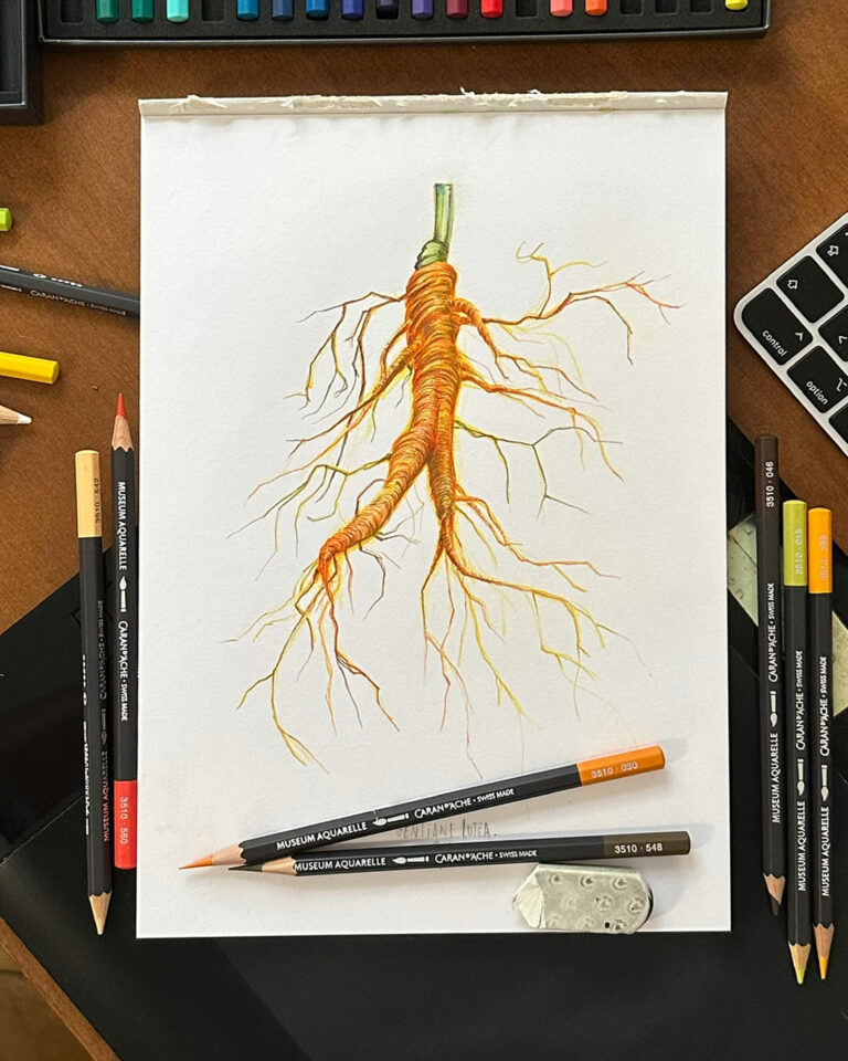
Creation of visuals in colored pencil to illustrate gentian root and the future "Tar" made from maritime pine sap.

Monéger Spirits Bottle — Brand Identity and Packaging · vrai studio

ANALYTICAL DRAWING

Sprig of maritime pine

Monéger Packaging — artisanal spirits, packshots, branding · vrai studio

ANALYTICAL DRAWING

Gentian root

Monéger Artisanal Spirits — Atmospheric Photography, Branding · vrai studio
Monéger Branding Ambience — Heritage Spirits Photography · vrai studio

Monéger is a family-owned brand of gentian-based spirits, founded in 1881, which ceased operations after World War II and was revived by the founder’s granddaughter. The project began with a sourcing trip to Corrèze to track down physical archives, bottles, labels, and historical artifacts that would inform the rebranding effort.

vrai studio the brand’s identity based on this archival material, seeking to ground the brand in its history without resorting to pastiche. The labels are designed as double-layered, laminated labels, with textural and embossed details crafted to convey the enduring nature of a brand returning after decades of absence. Reviving a century-old family brand requires understanding what it was before deciding what it will become. The Monéger rebranding is built on this logic: first rediscover, then propose.

Art Direction and Photography: Camille Gabarra
Monéger Bottle — heritage spirits product shot · vrai studio

1935

The original brand DNA label

Monéger Packaging — Artisanal Spirits Visual Identity · vrai studio

traces of the past

Great references

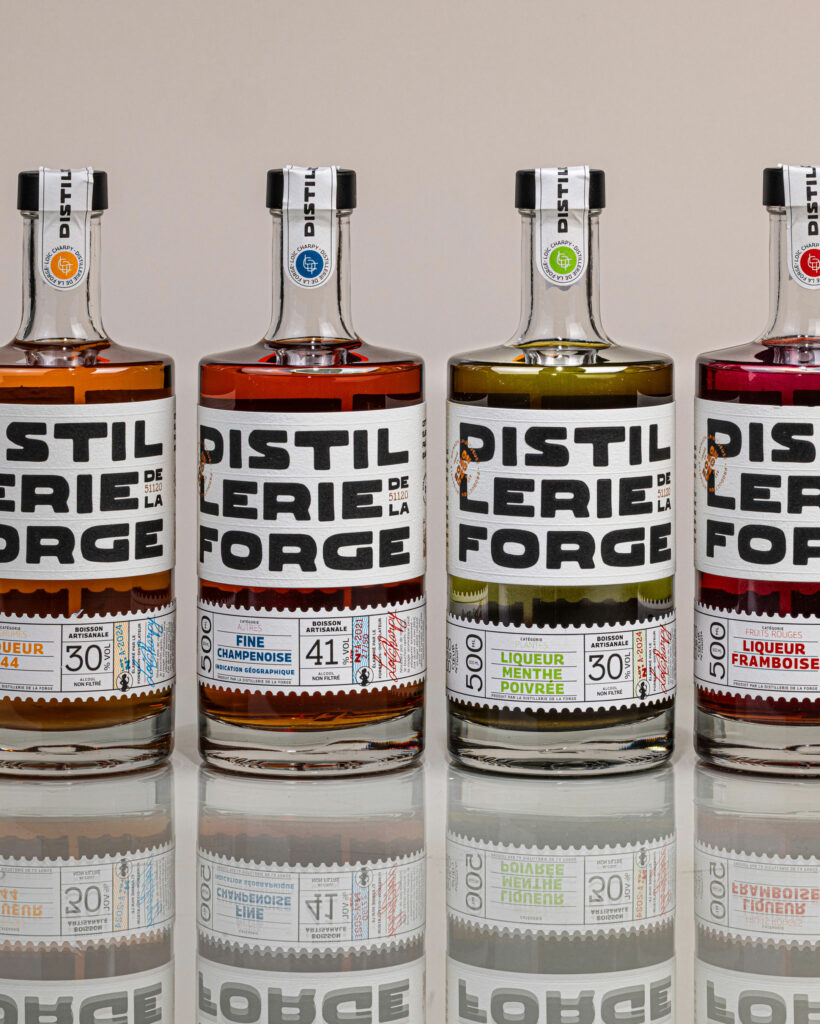
Distillerie de la Forge Spirits Bottles Distillerie de la Forge packshot for rebranded product line · vrai studio
Visual Identity for Distillerie de la Forge Logo and Brand Packaging · vrai studio

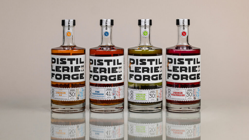
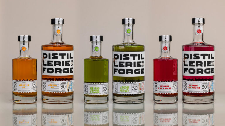
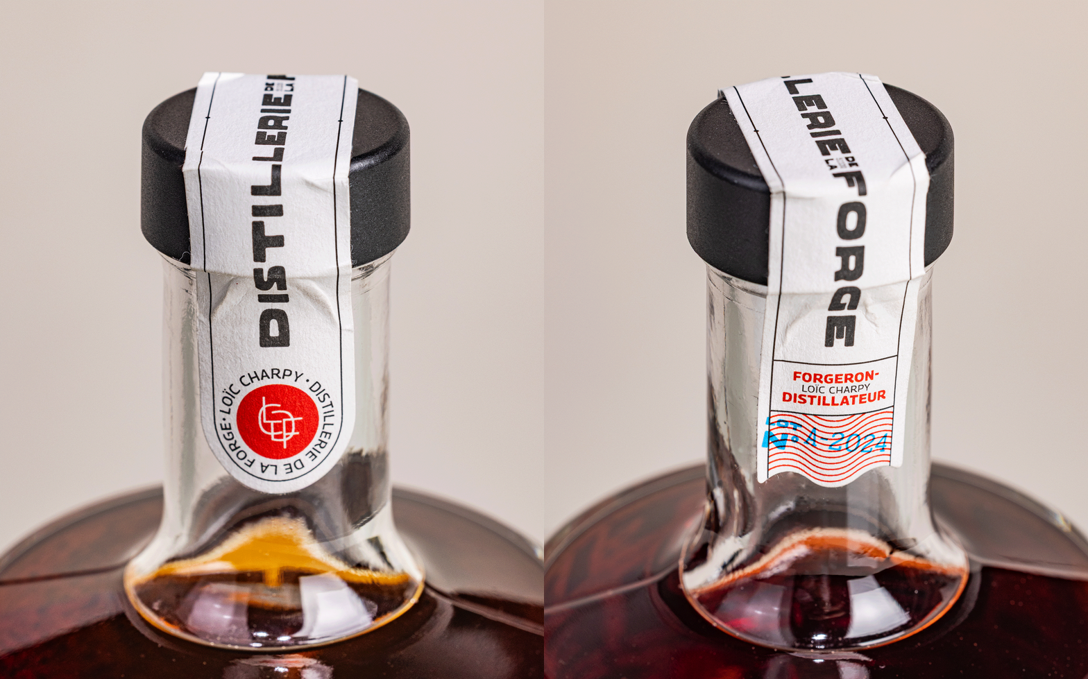
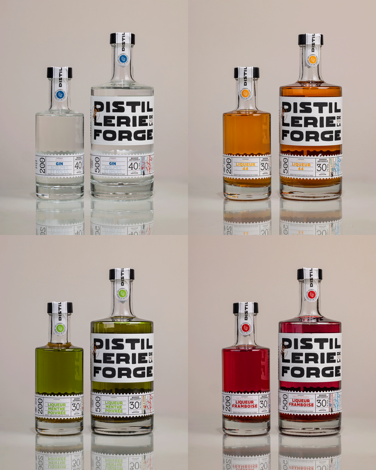
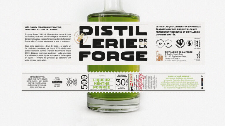
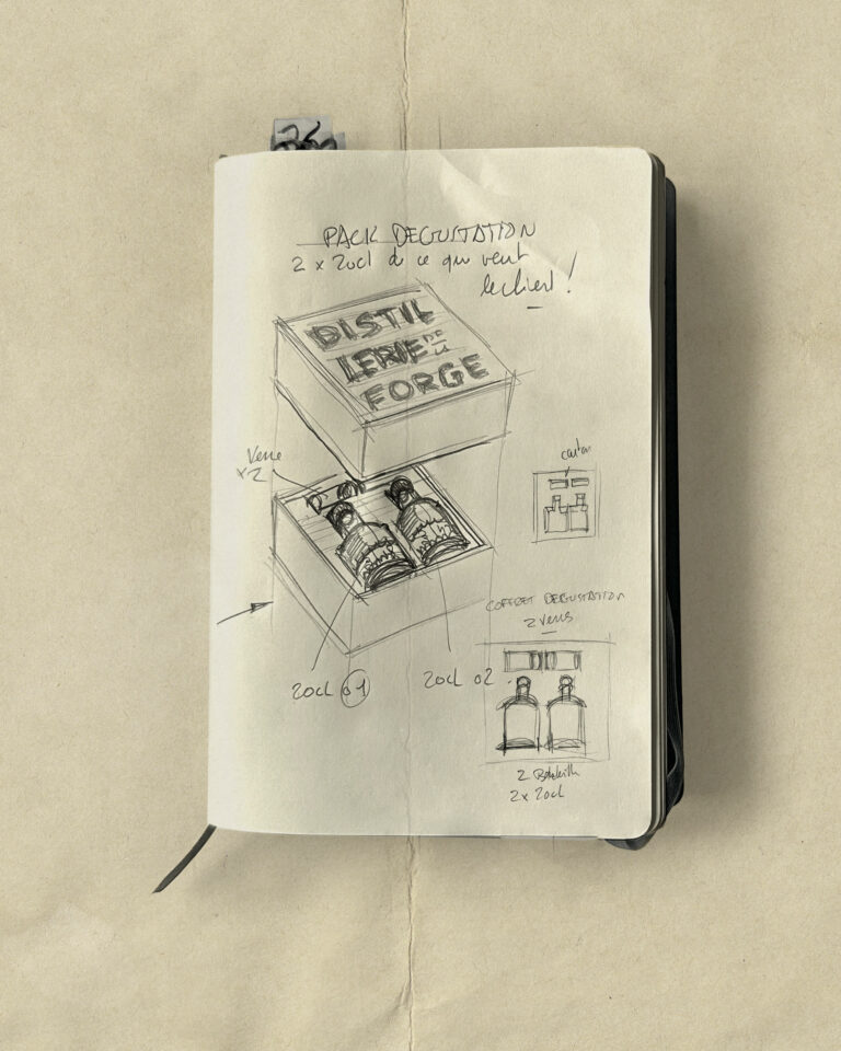
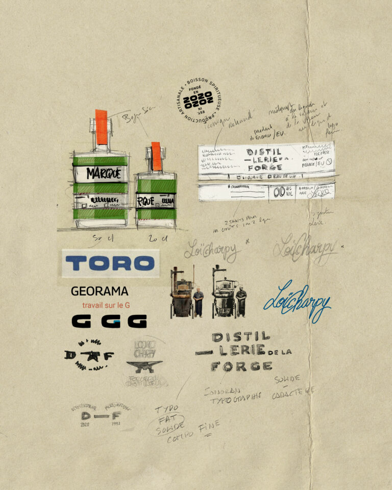
With over 24 references, this distillery needed to clarify its offering. We designed a double label - brand on top, flavour on the bottom - to simplify, distinguish and optimize their product range.

4 bottles Distillerie de la Forge spirits Distillerie de la Forge packaging line · vrai studio
Distillerie de la Forge Brand Distillerie de la Forge Visual Identity and Spirits Packaging · vrai studio
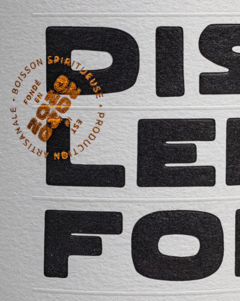
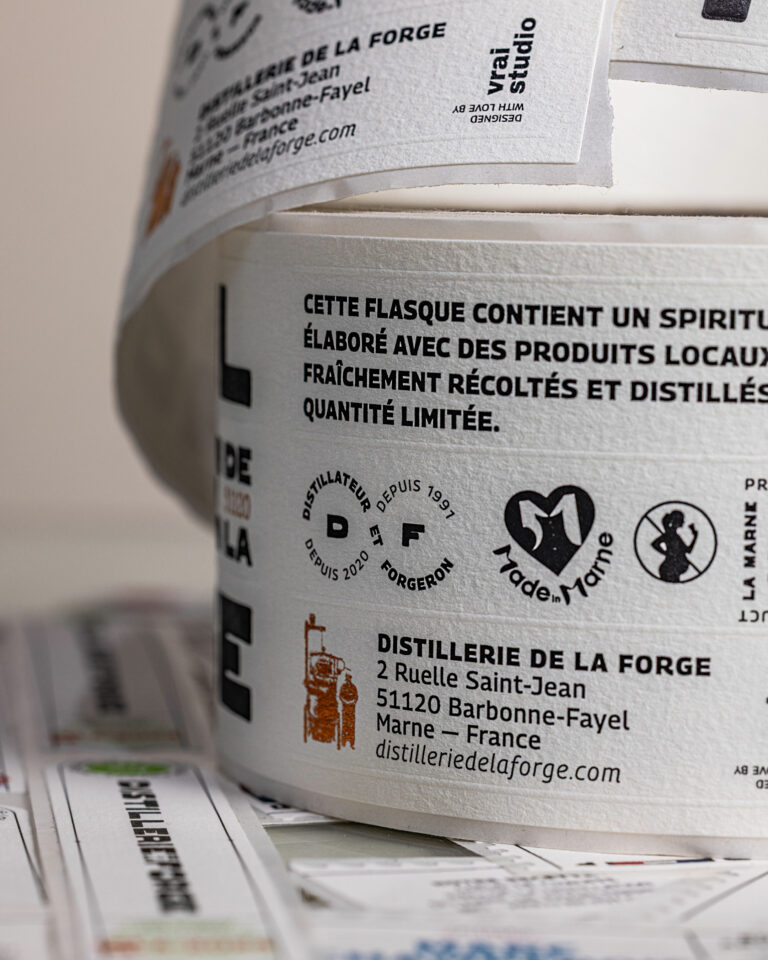
Distillerie de la Forge Label Distillerie de la Forge Artisanal Spirits Packaging · vrai studio
DLF Tab Animation — Distillery Branding · vrai studio
DLF Identity Animation — Distillery Branding · vrai studio
Distillerie de la Forge Bottle Distillerie de la Forge spirits packshot on a dark background · vrai studio
Distillerie de la Forge photography for artisanal spirits branding · vrai studio

B.A.T.

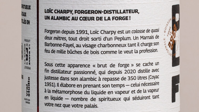
Loïc Charpy is a blacksmith and distiller based in Barbonne-Fayel in Champagne. La Distillerie de la Forge produces a wide range of artisanal spirits, including gins, brandies, and liqueurs, with a focus on working with materials and mastering fire.

The challenge facing vrai studio was to build a brand identity that would be recognizable across more than twenty product variants. The solution is a two-tiered graphic system: a top-level brand label that is consistent and recognizable, and a bottom-level product label that is modular, capable of adapting to each product without diluting the overall identity. The storytelling—centered on the blacksmith, fire, steel, and the transformation of materials—informs every design choice and sets the brand apart from the typical conventions of artisanal distilleries. The project encompassed the logo, the graphic style guide, the complete bottle labeling, and product photography direction.

Art Direction and Photography: Camille Gabarra
Distillerie de la Forge Logo Distillerie de la Forge Visual Identity Design and Rebranding · vrai studio

SHARE

200 ML is all about sharing flavour!

Visual Identity for Distillerie de la Forge Spirits Brand · vrai studio

STUDY

A strong, visual principle

Champagne Ambiance by M. Marcoult — Art Direction and Visual Identity Rebranding · vrai studio
Vue — Visual Identity by vrai studio
  • Project management
  • Creative Direction
  • Art Direction
  • Brand story
  • Brand identity
  • Packaging
  • Manufacturing management
  • Photography
  • Web design

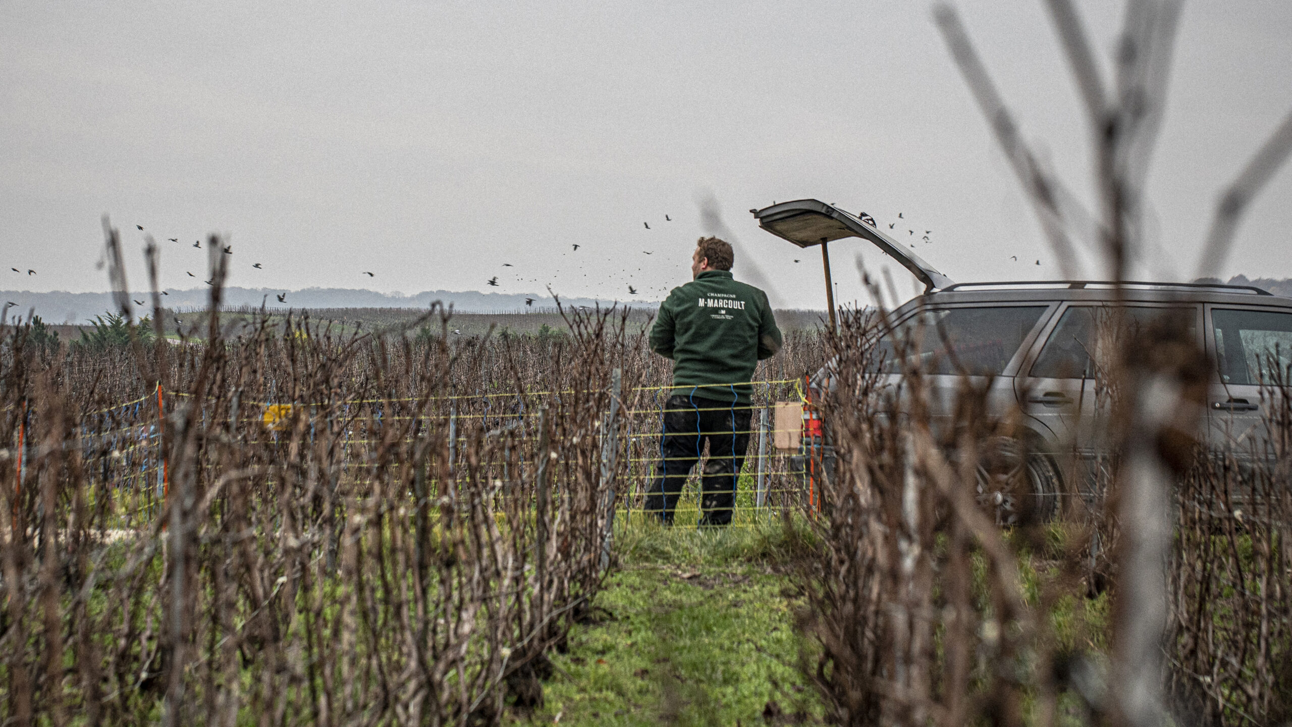
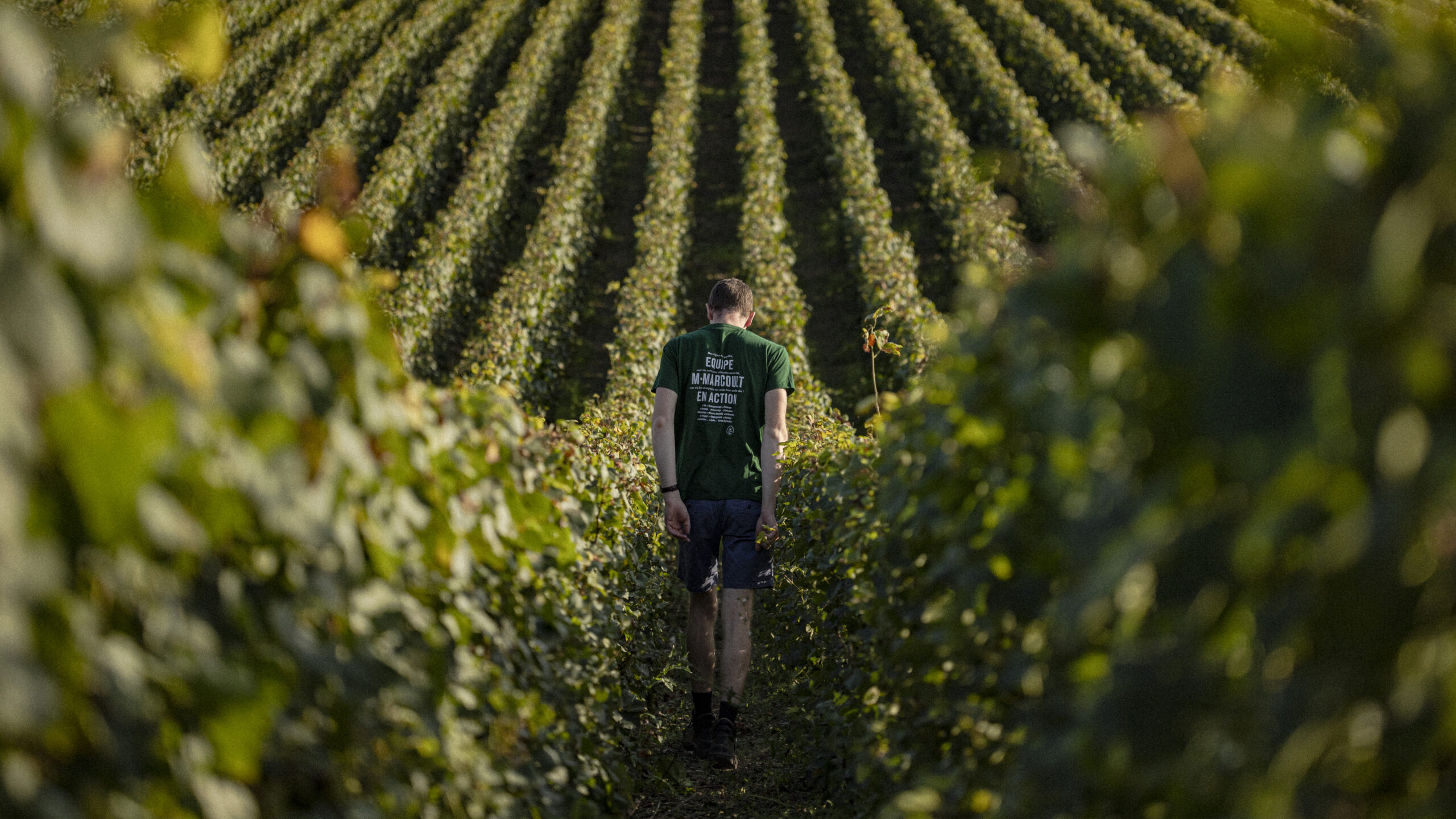
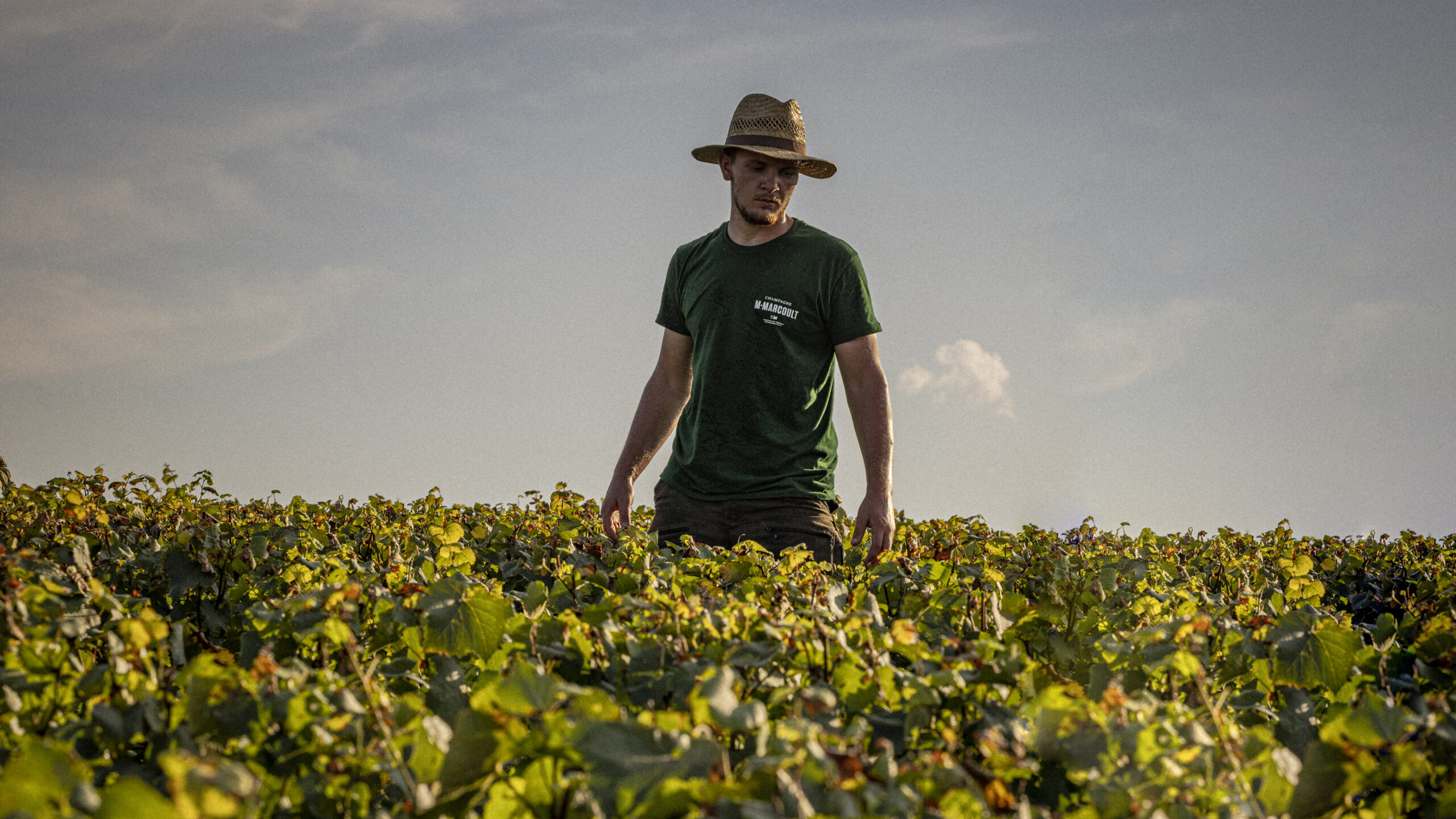
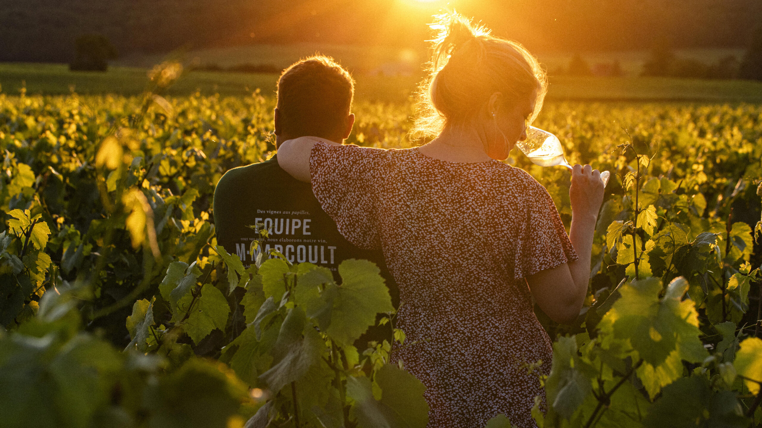
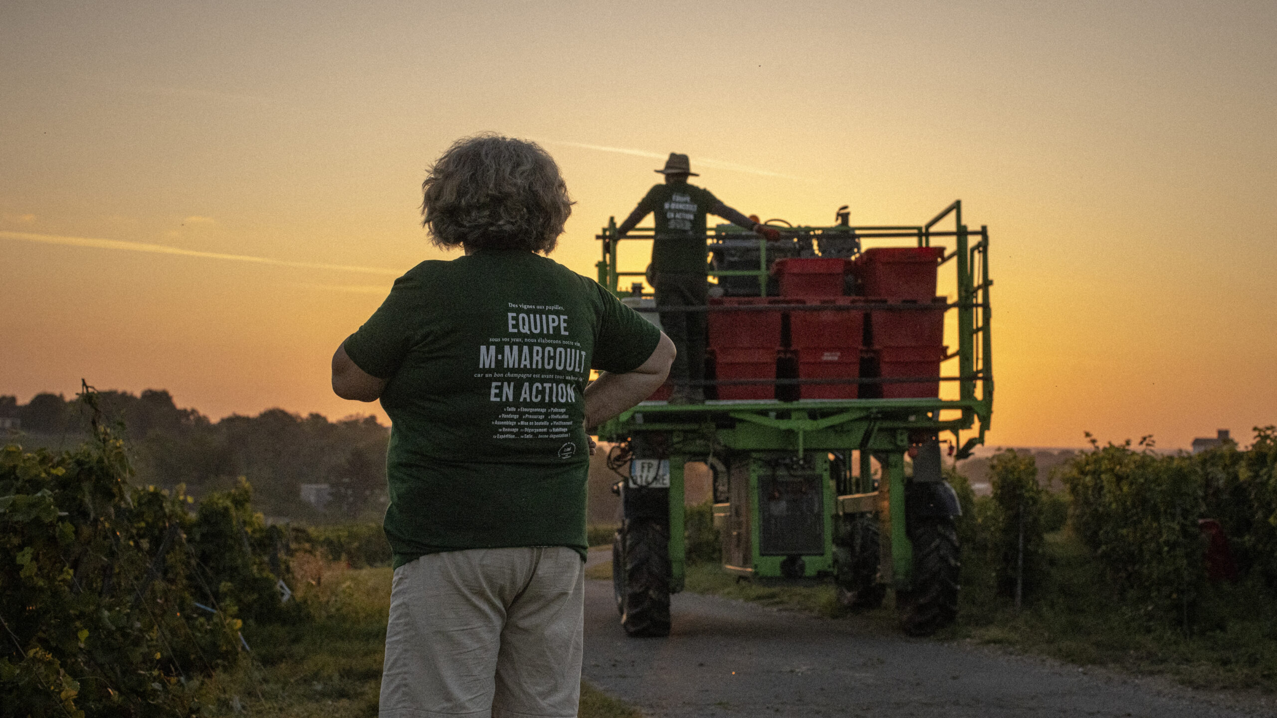
Florence and Julien Marcoult are independent winemakers deeply rooted in both their land and their values. From their estate on chalky soil in the Marne region, they produce a champagne that reflects their character: precise, unique, and uncompromising. Driven by a desire to fully express themselves, they share their name, their story, and their vision with us. Since 2021, united by a passion for authenticity, we have been supporting them in developing their brand identity, packaging, and photographic direction.

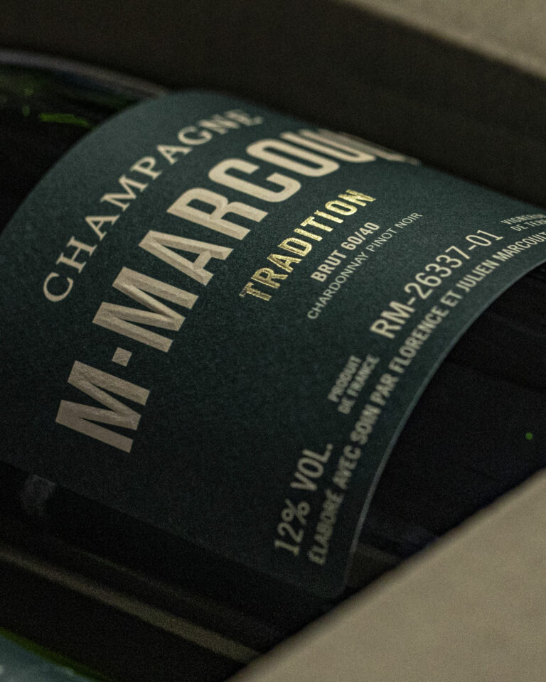
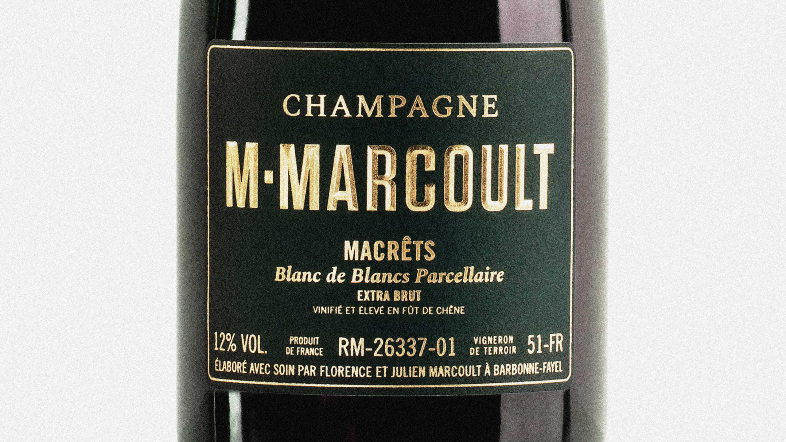
M. Marcoult Champagne Label — Typography and Visual Identity Branding · vrai studio
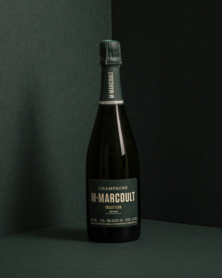
M. Marcoult Champagne Bottle — Packshot of packaging on a dark background · vrai studio
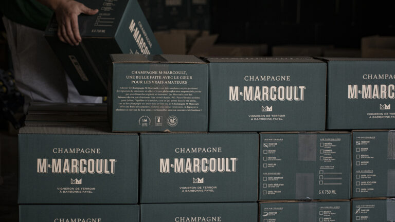
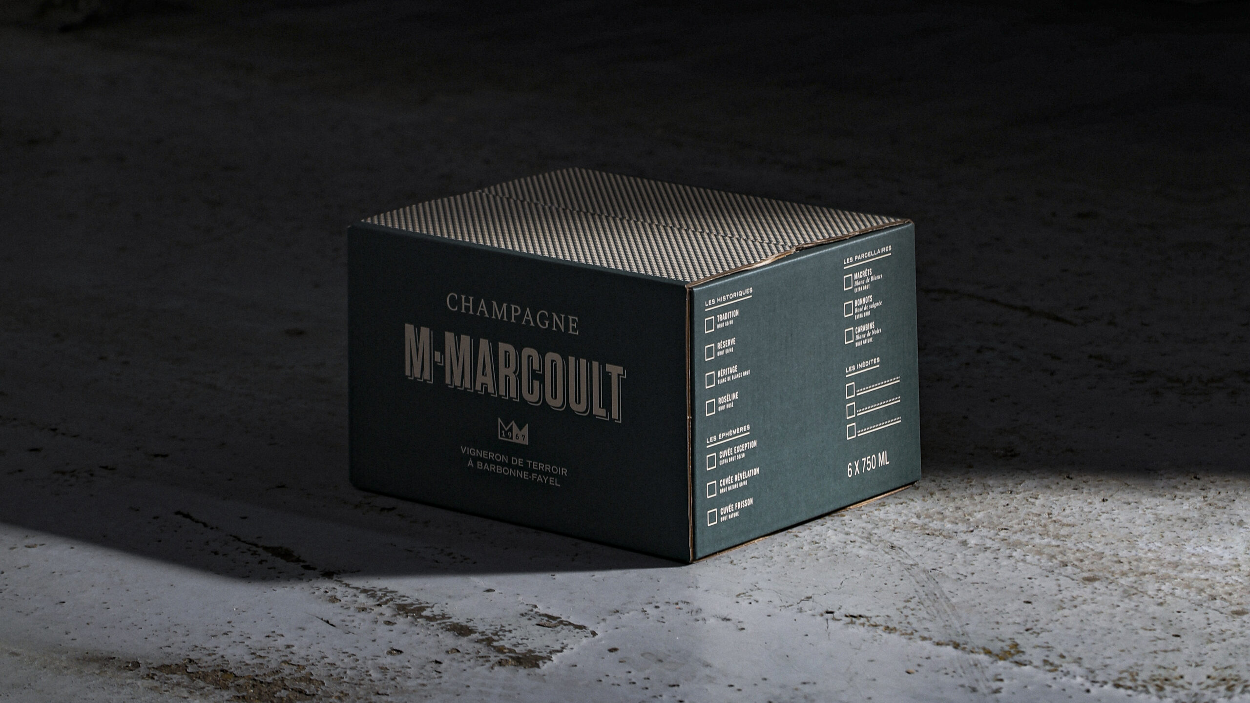
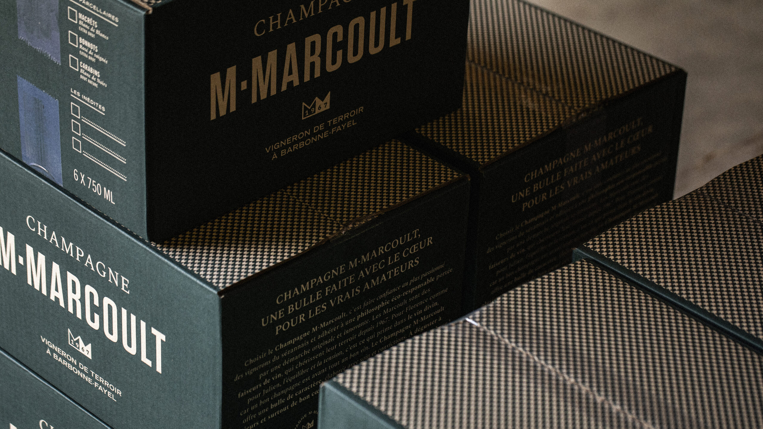
Stacked M. Marcoult champagne cases — packaging and brand identity · vrai studio
Close-up of M. Marcoult champagne cork — packaging close-up · vrai studio
Close-up of the M. Marcoult champagne label and logo — visual identity redesign · vrai studio
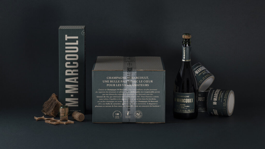
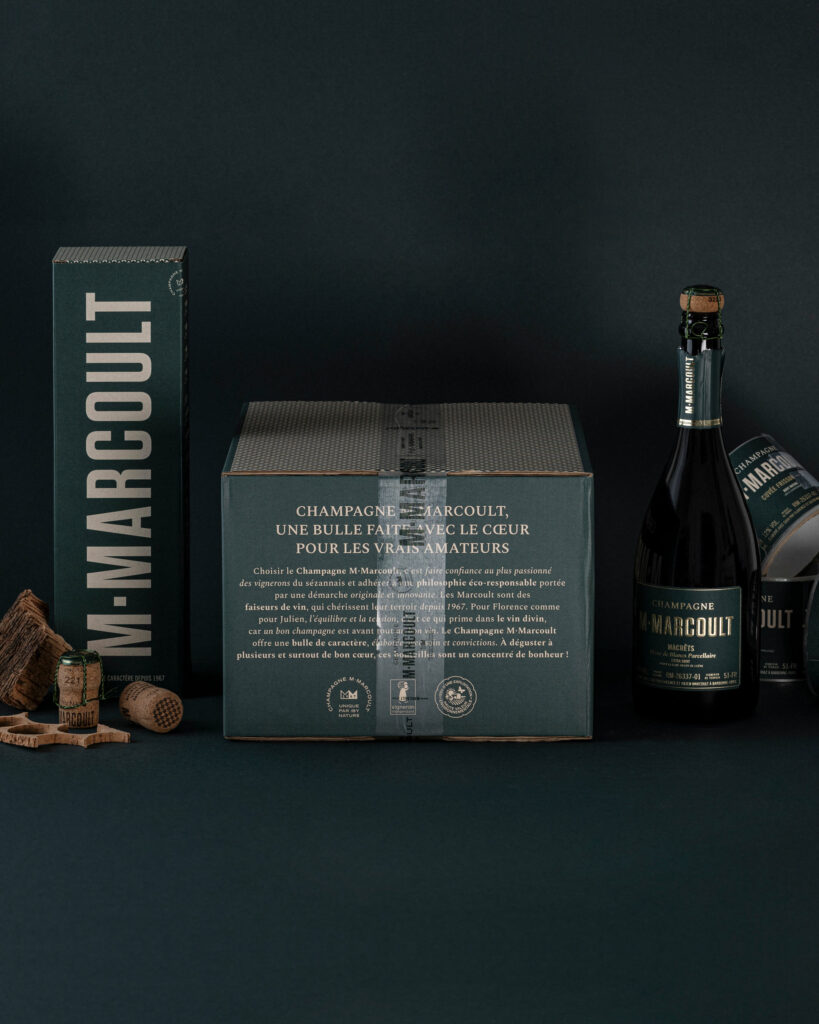
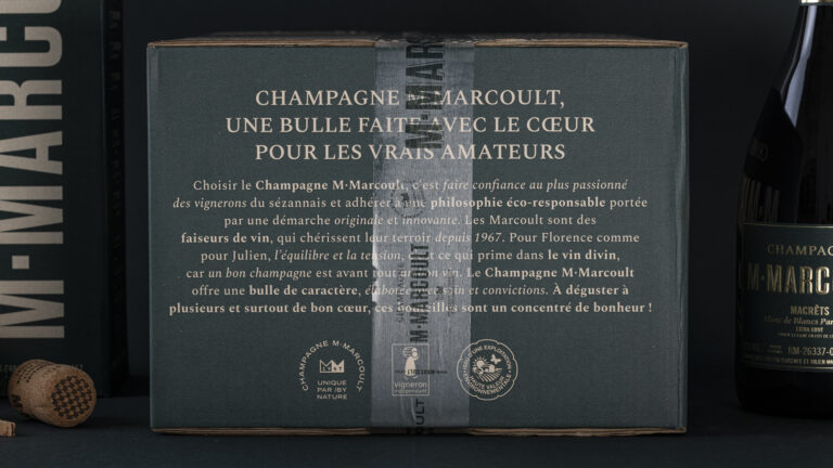
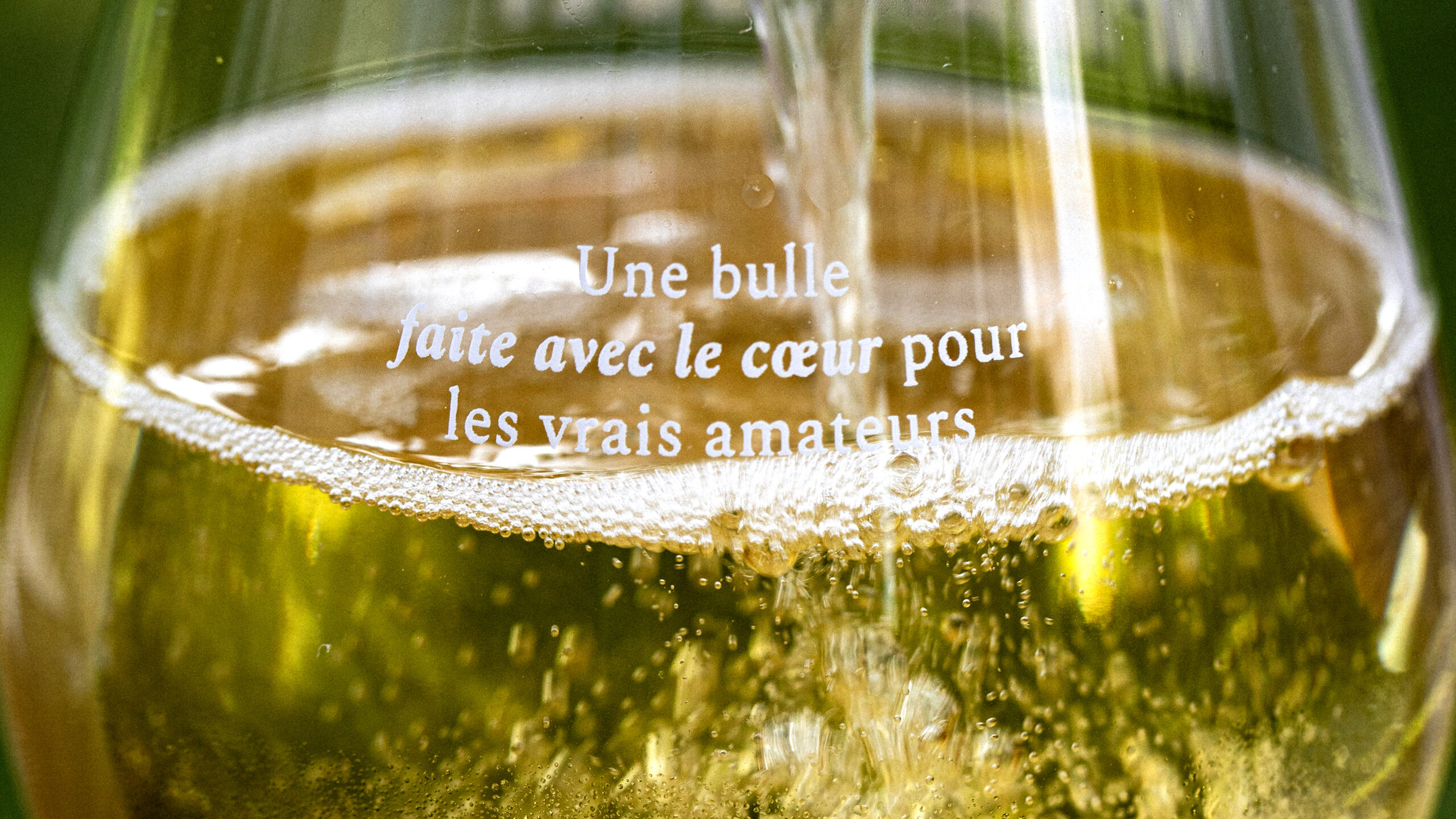
M. Marcoult Champagne Gift Set — tagline: “A bubbly made with love for true connoisseurs” · vrai studio

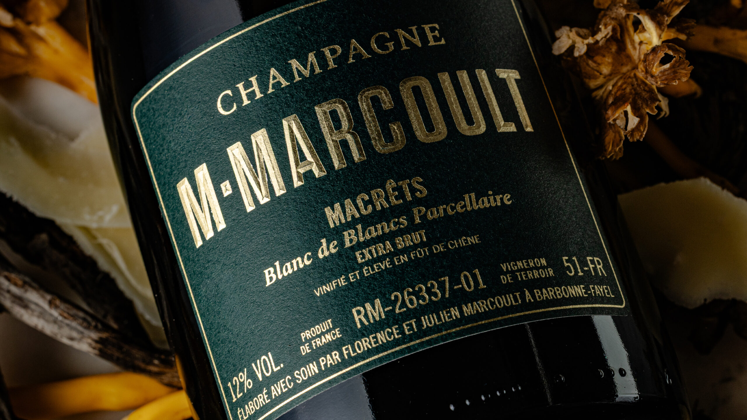
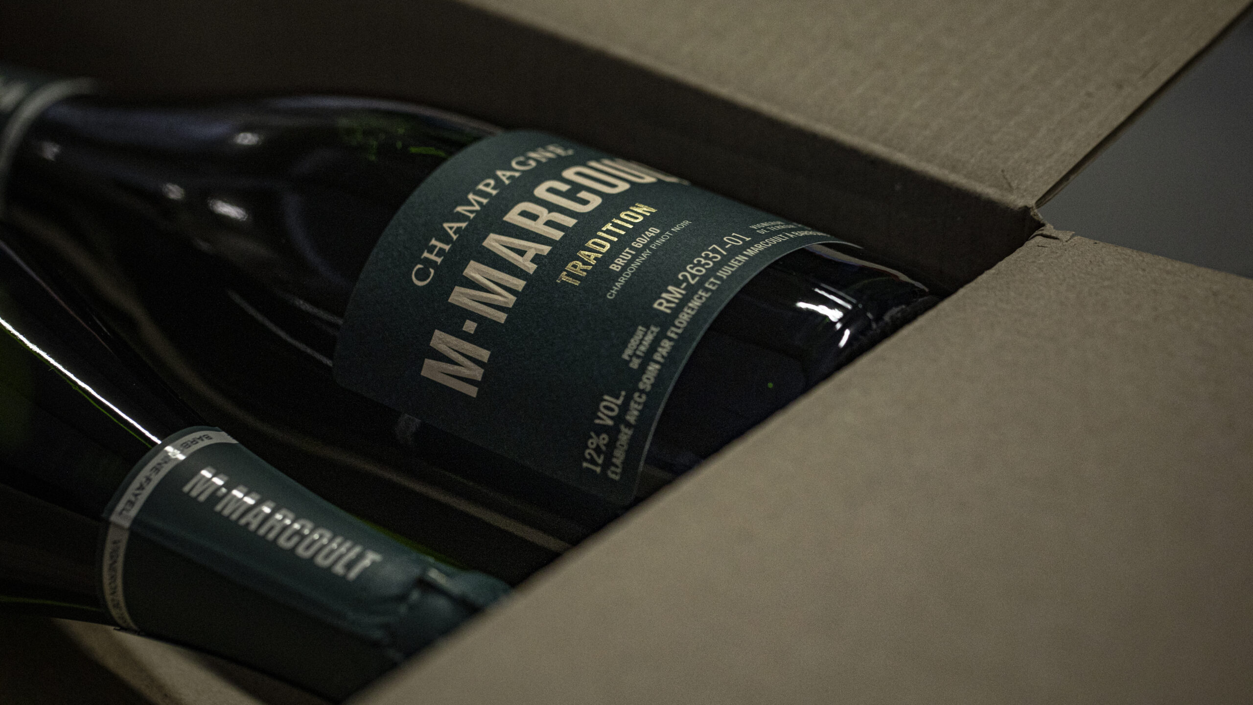
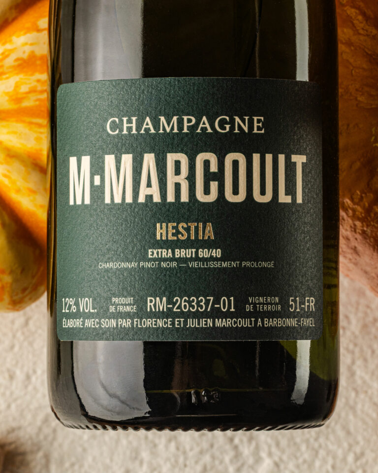
Our mission: to make the brand visible in a highly competitive environment. The keys to this identity: strong, contrasting colors, vineyard green and chalk greige; clear labelling with a neat hierarchy of information.

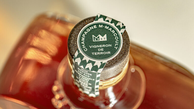
M. Marcoult Vigneron de Terroir Green Champagne Capsule — packaging close-up · vrai studio
Champagne Ambiance by M. Marcoult — photography for a local Champagne brand · vrai studio
M. Marcoult Champagne Cases in the Cellar — Storage and Packaging Design · vrai studio
Champagne Photography by M. Marcoult — Packaging and Visual Identity · vrai studio
Champagne M. Marcoult — bottle packshot and brand identity · vrai studio
Champagne styling by M. Marcoult — lifestyle and branding · vrai studio
Champagne M. Marcoult in a stylish setting — handcrafted bottle and packaging · vrai studio
Champagne Detail: M. Marcoult — Product Photography by an Independent Winemaker · vrai studio
M. Marcoult Champagne Brand Identity — Photography for a Winery · vrai studio
Champagne M. Marcoult — Packaging and Branding for Independent Winemakers · vrai studio
Champagne Tasting Atmosphere at M. Marcoult — Artisanal Lifestyle Brand · vrai studio
Champagne Photography by M. Marcoult — the atmosphere of a local winemaker’s cellar · vrai studio
Champagne M. Marcoult — Cellar Ambiance and Brand Identity Rebranding · vrai studio
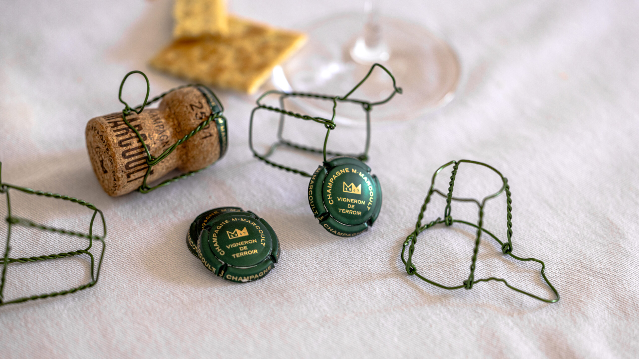
M. Marcoult Champagne Capsules and Wire Cages — Brand Identity Accessories Details · vrai studio
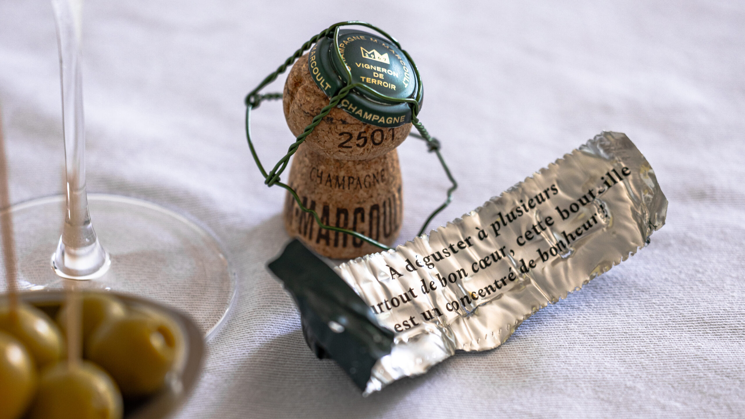
M. Marcoult Champagne Wire Cage and Foil — Artisanal Tasting Lifestyle · vrai studio

Champagne M. Marcoult, a family-owned Champagne house founded in 1967, began the transition to the third generation in 2020 with a clear goal: to transform a long-established estate into a distinctive and desirable brand.

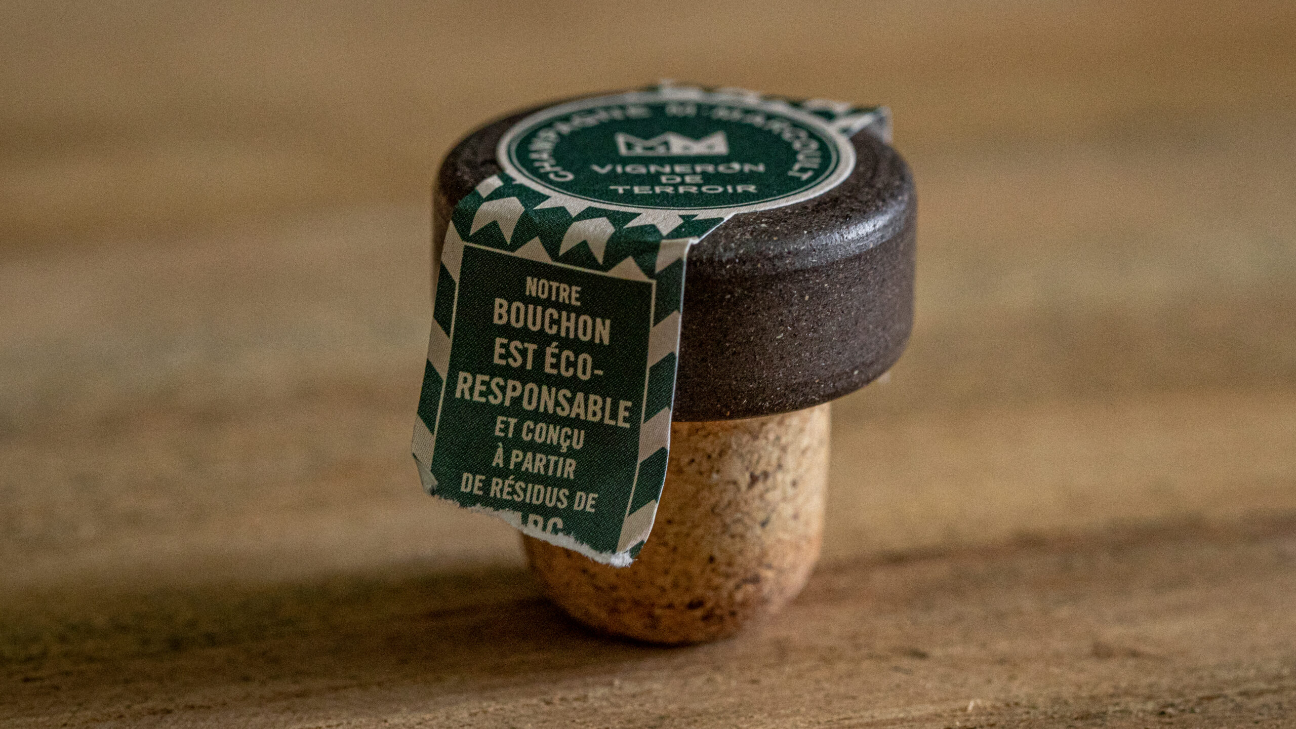
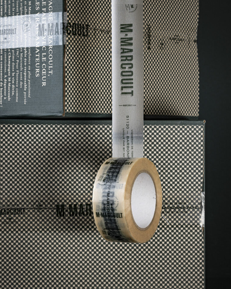
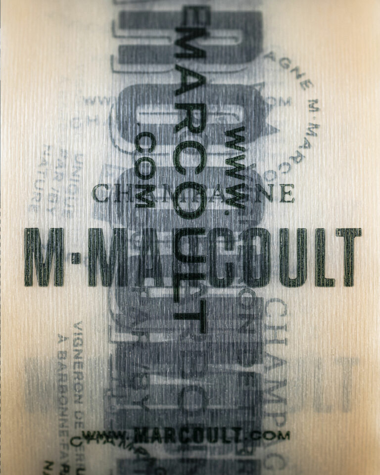
The project entrusted to vrai studio the entire brand identity, including naming, logo, monogram, typography, and color palette, as well as packaging for the full product line—labels, caps, neck labels, stoppers, and boxes. The color scheme—vineyard green and the “greige” of the Craillères—deliberately breaks with conventional champagne design conventions. Upon delivery, the impact was immediate: within six months, the house sold the equivalent of a full year’s worth of product. The partnership has naturally continued, encompassing photo shoots at the estate, studio product shots, the website, and print materials. Since 2024, vrai studio the house through an annual partnership.

Art Direction and Photography: Camille Gabarra
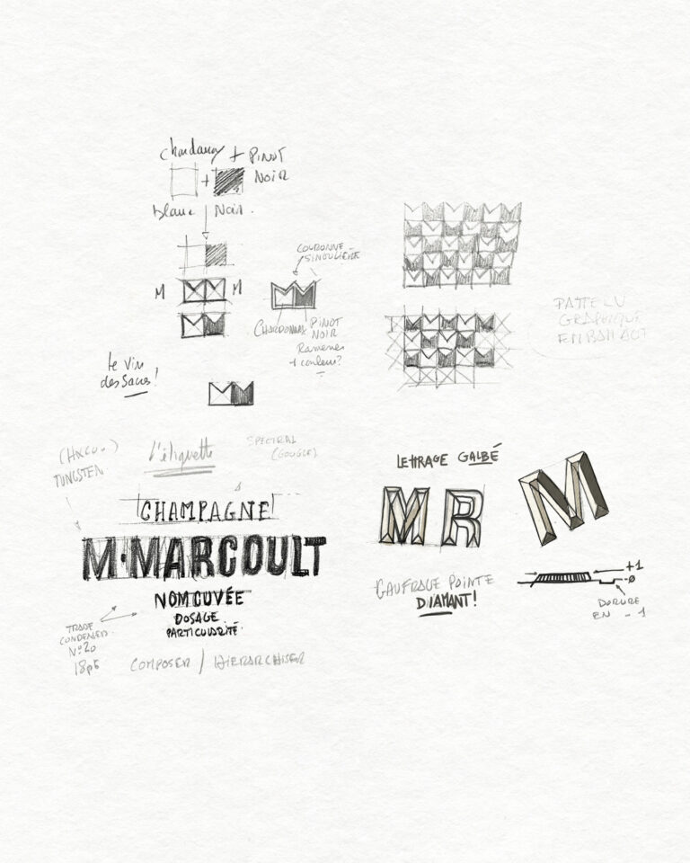
M. Marcoult Champagne Study — Sketches and Concepts for Visual Identity and Rebranding · vrai studio

STUDY

Every project has its sketches

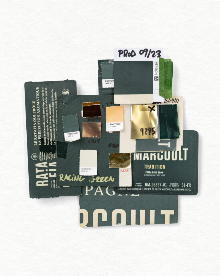
M. Marcoult Champagne Color Chart — Materials and Colors Palette for Visual Identity · vrai studio

NUANCIER

A good summary of the materials and shades of the M.Marcoult champagne brand

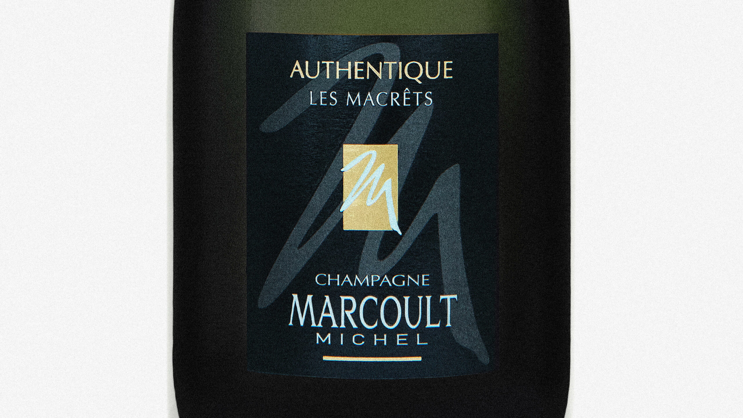
M. Marcoult Champagne Brand Identity Before Redesign — Old Brand Packaging · vrai studio M. Marcoult Champagne Identity After Redesign — New Branding · vrai studio