
- Creative Direction
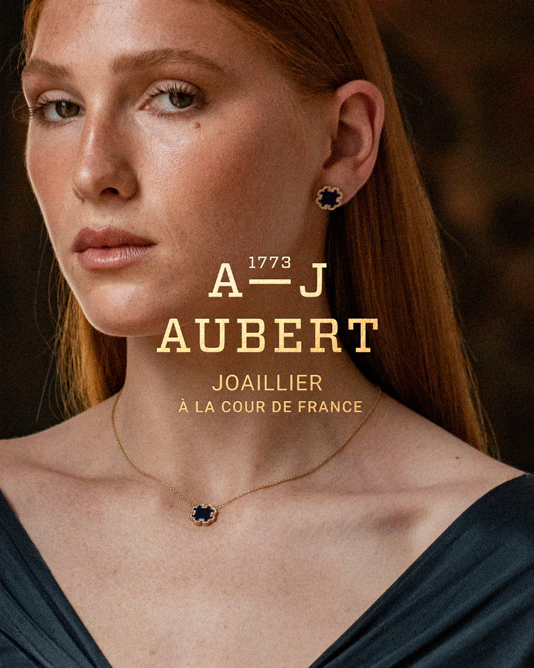
- Art Direction
- Project management
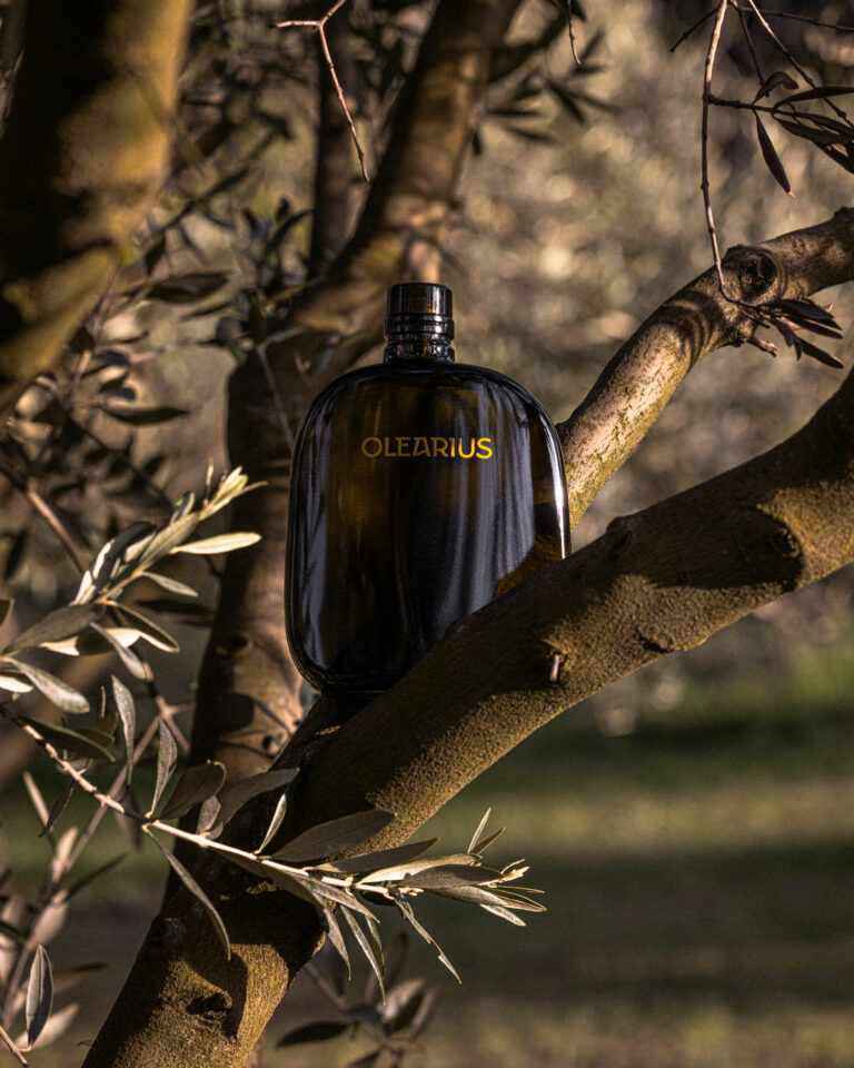
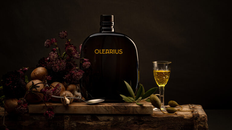
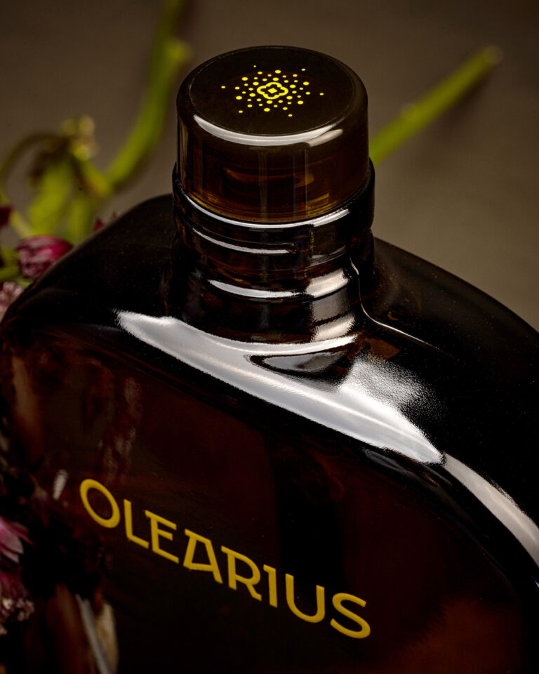
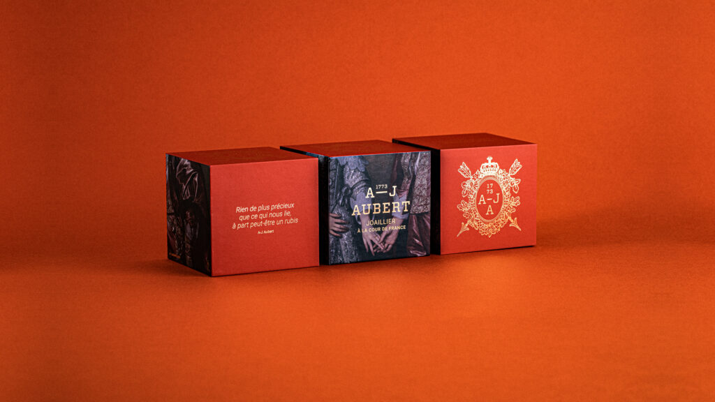
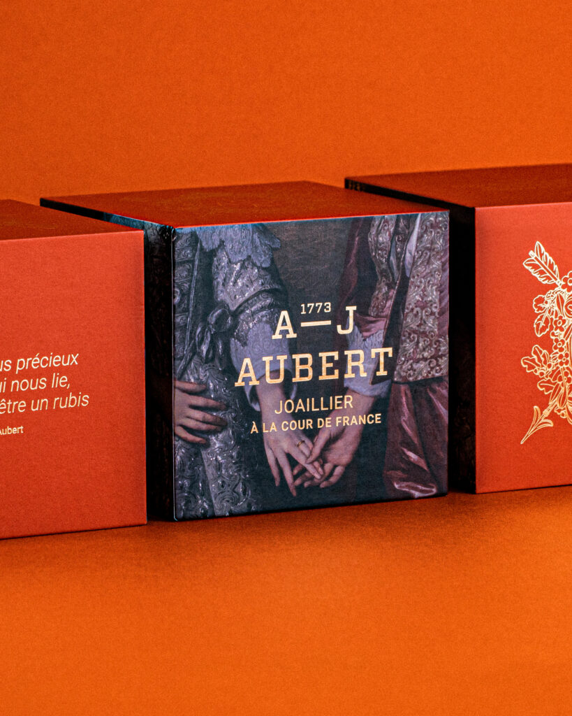
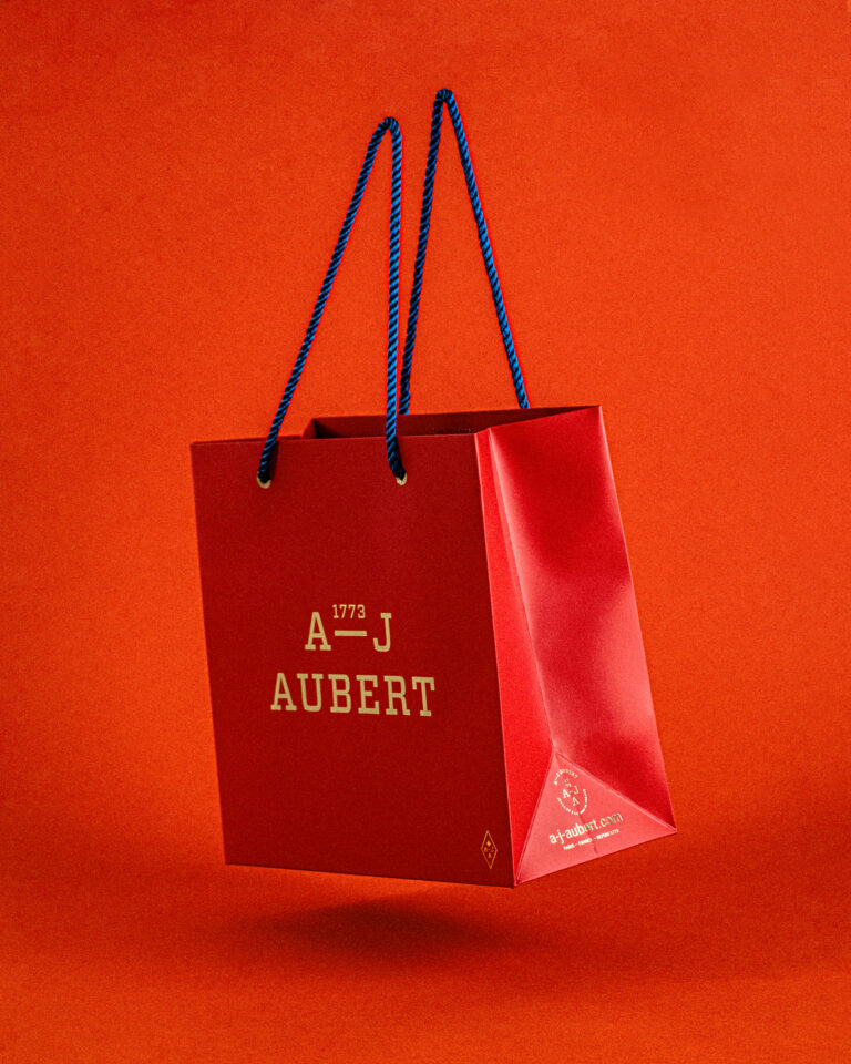
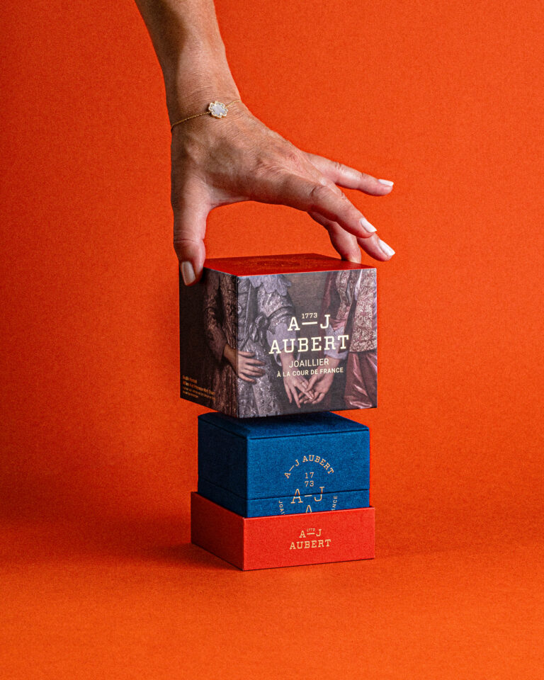
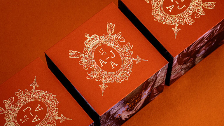
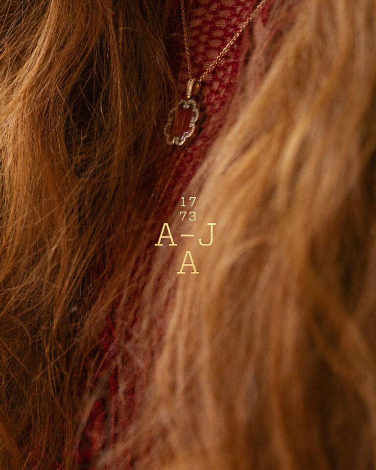
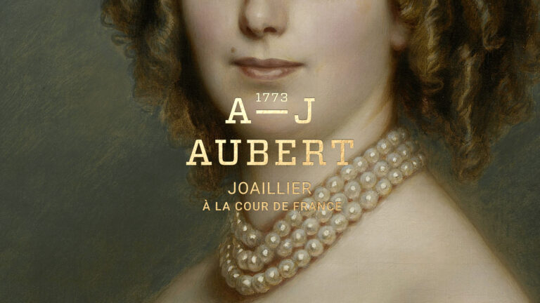
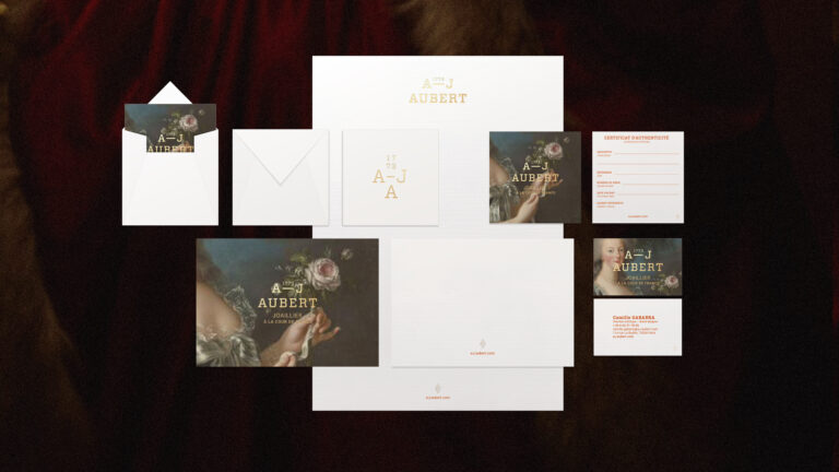
- Brand identity
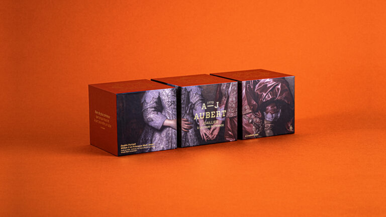
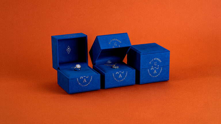
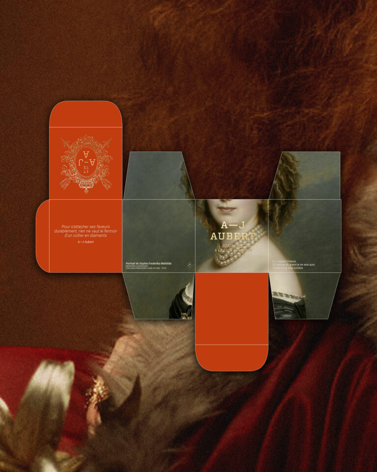
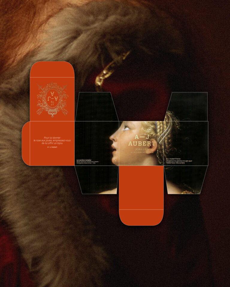
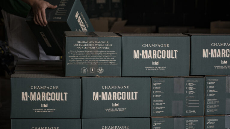
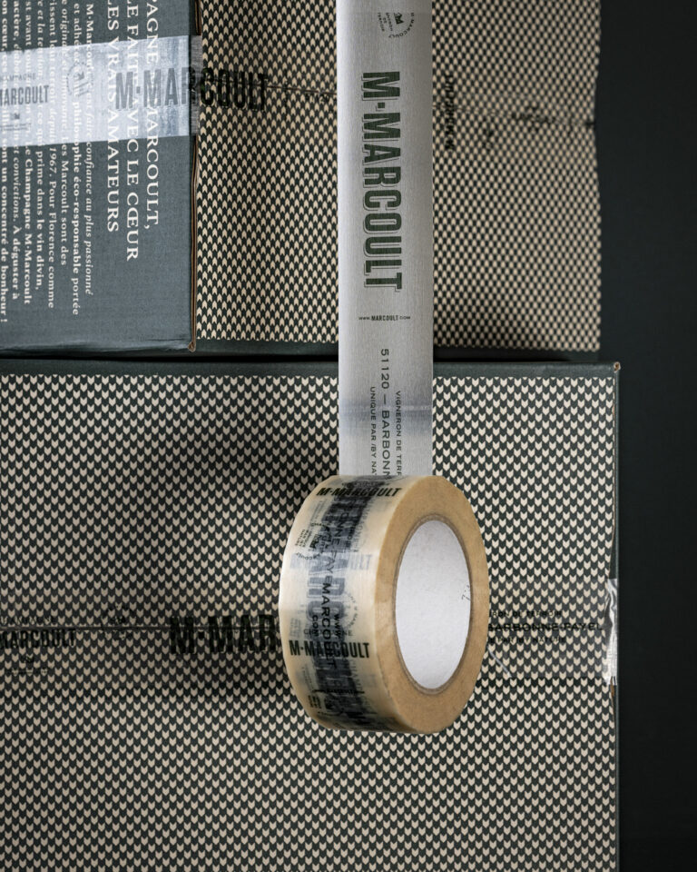
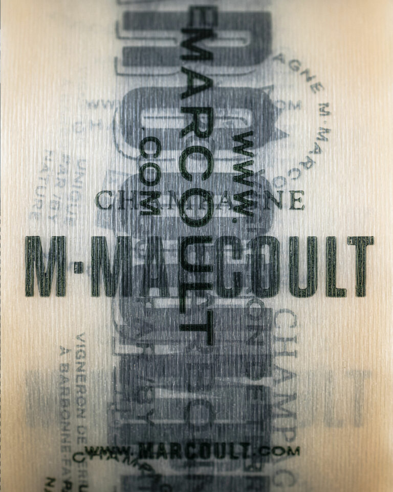
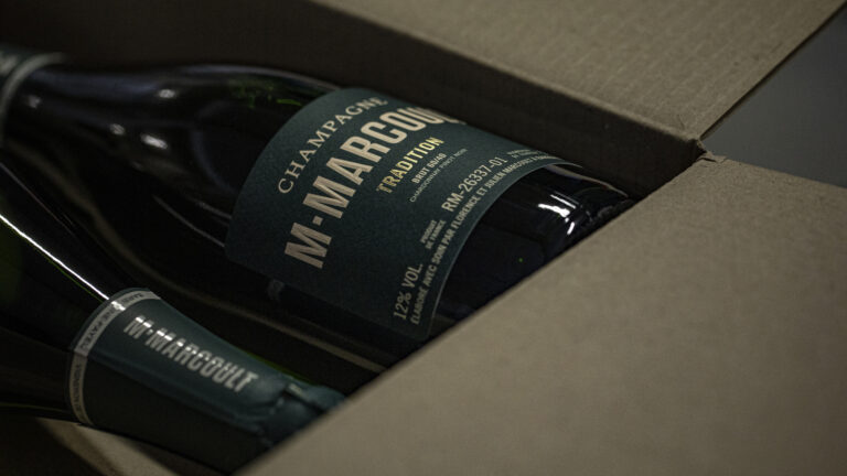
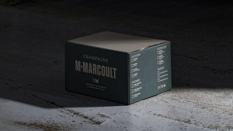
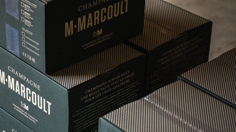
- Packaging
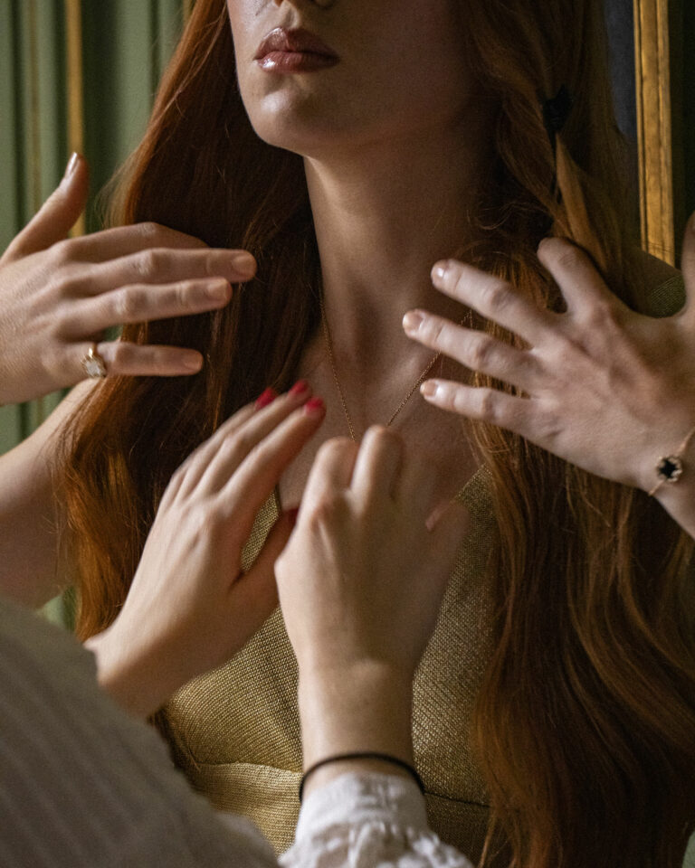
- Photography
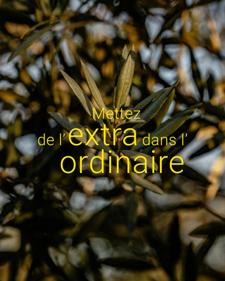
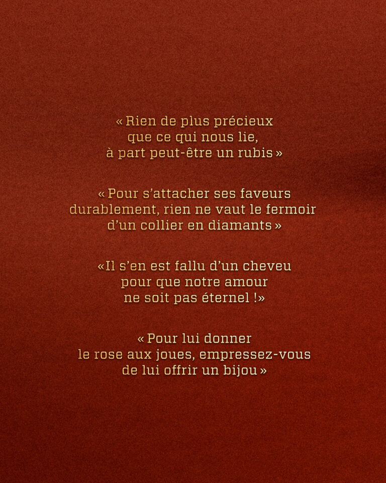
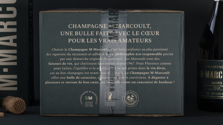
- Brand story
- Manufacturing management
- Web design
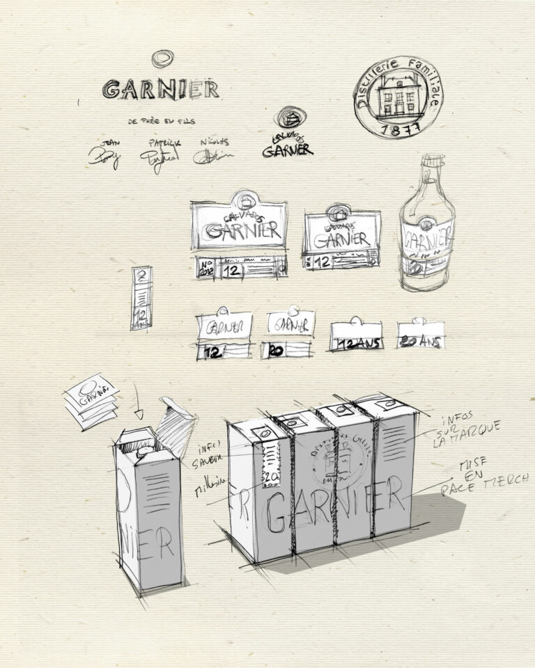
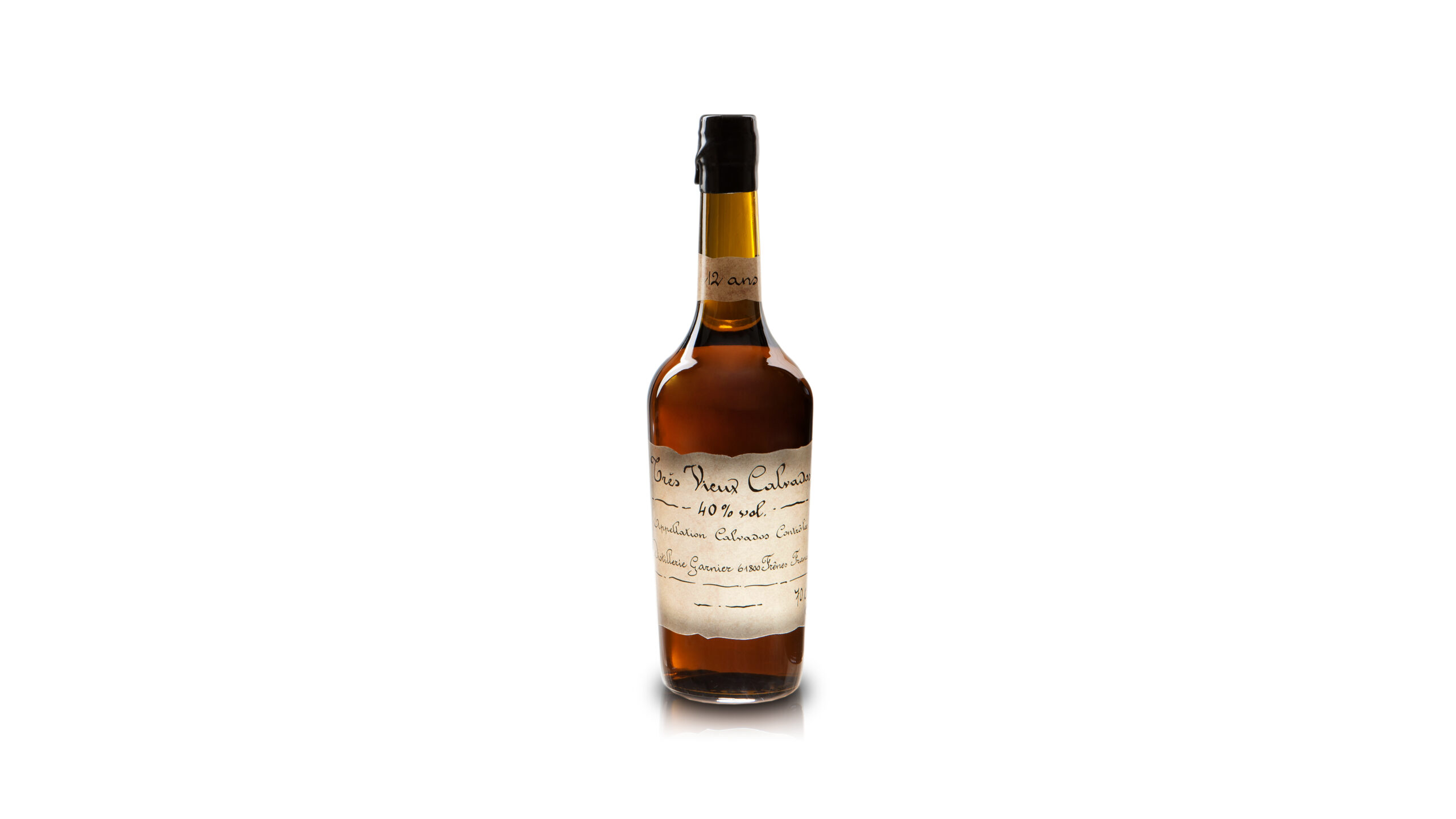
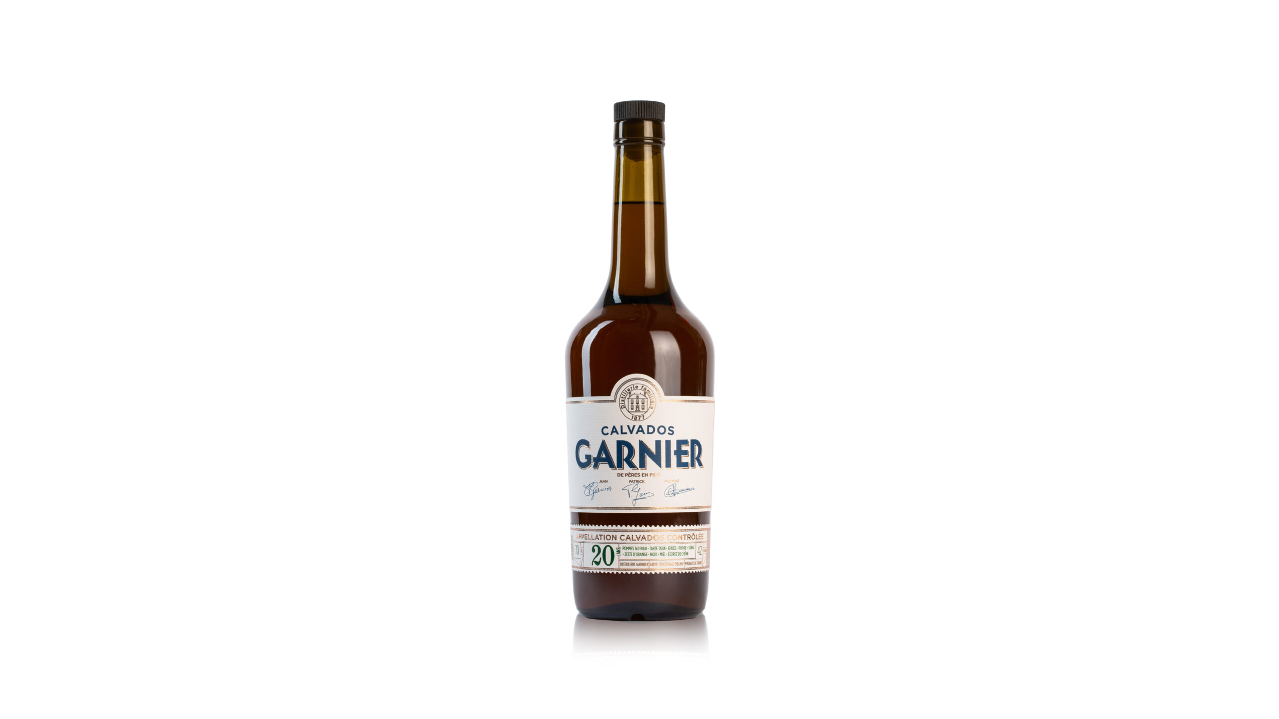
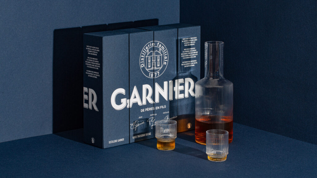
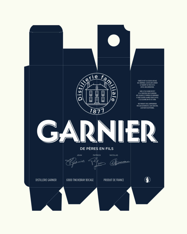
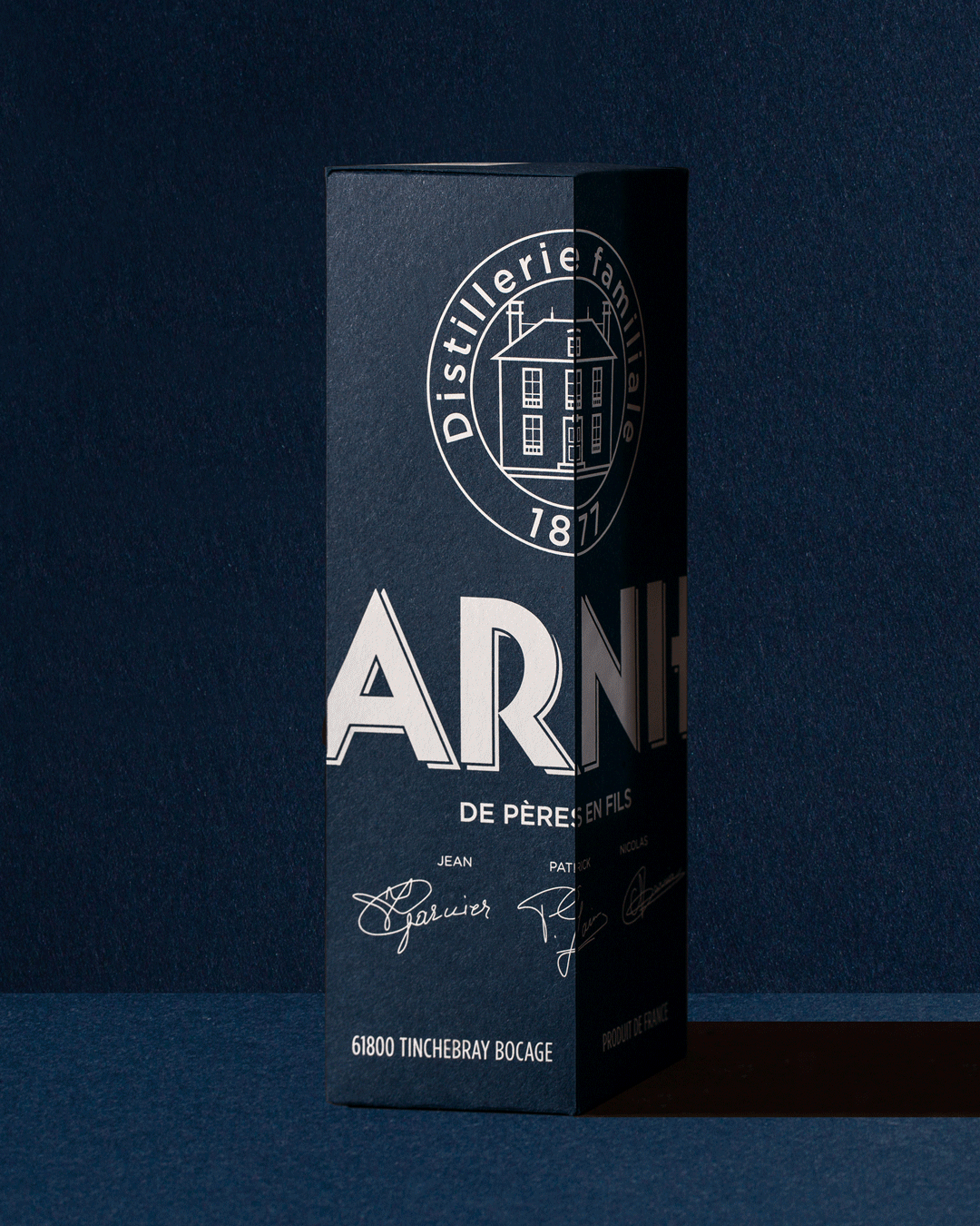
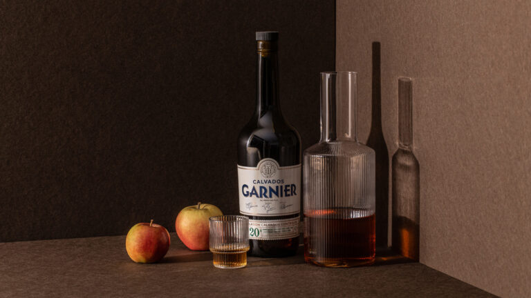
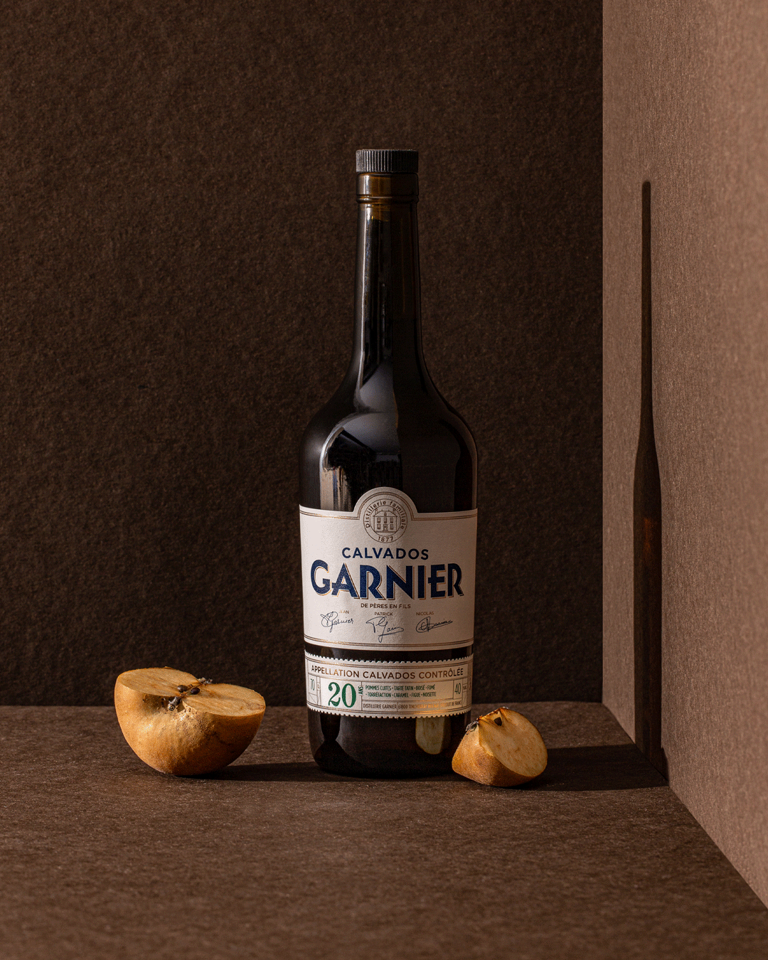
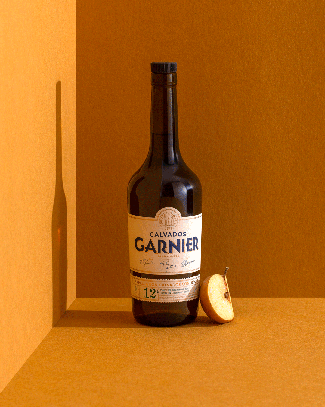
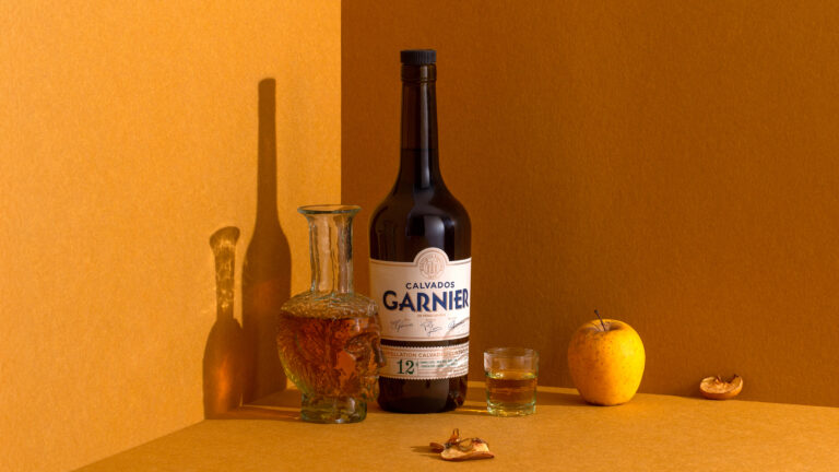
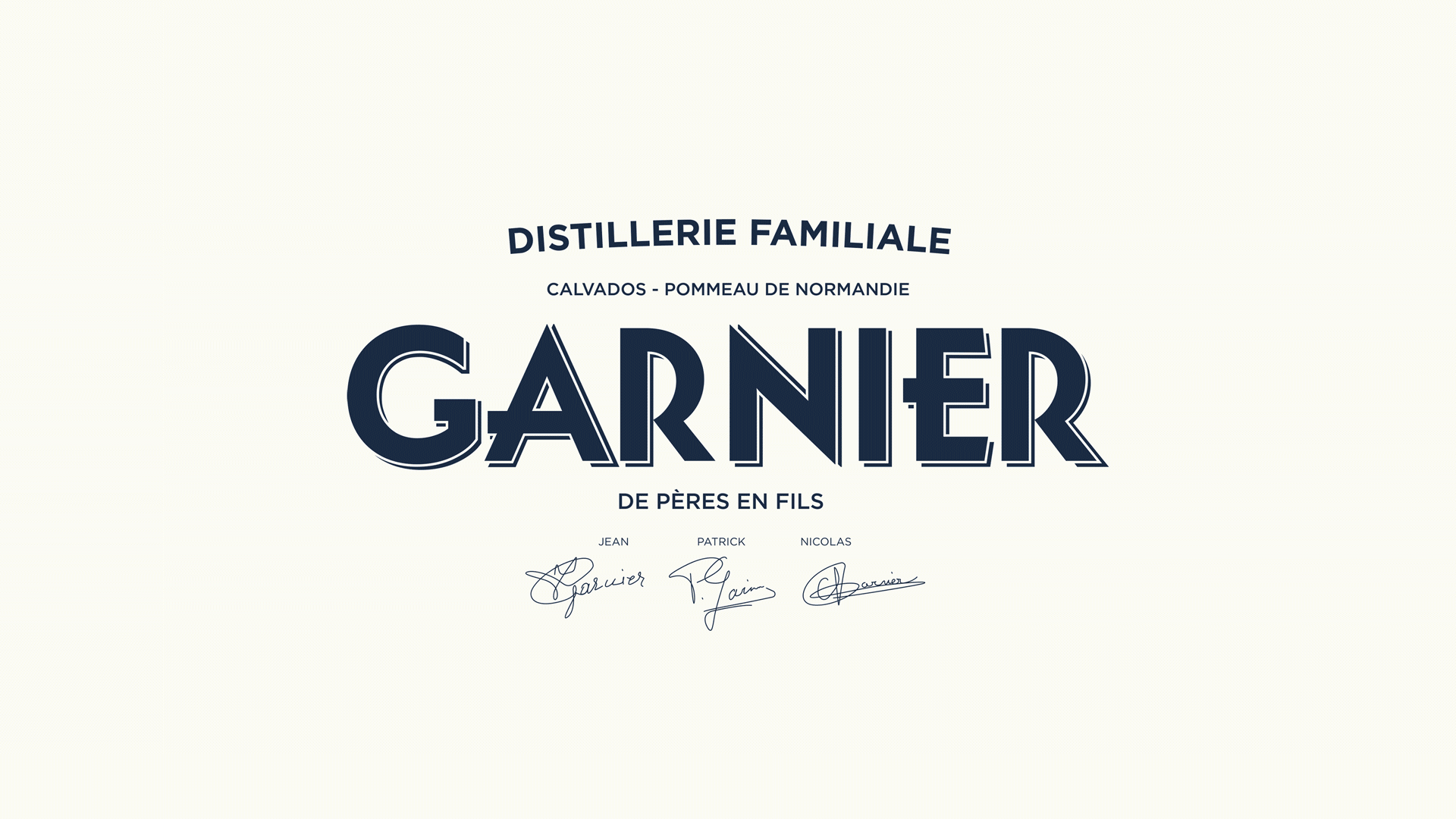
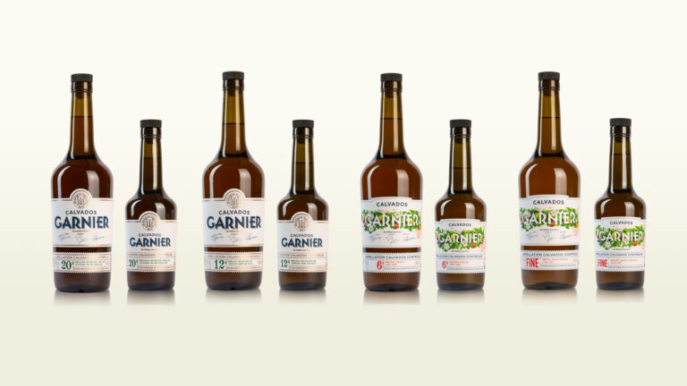
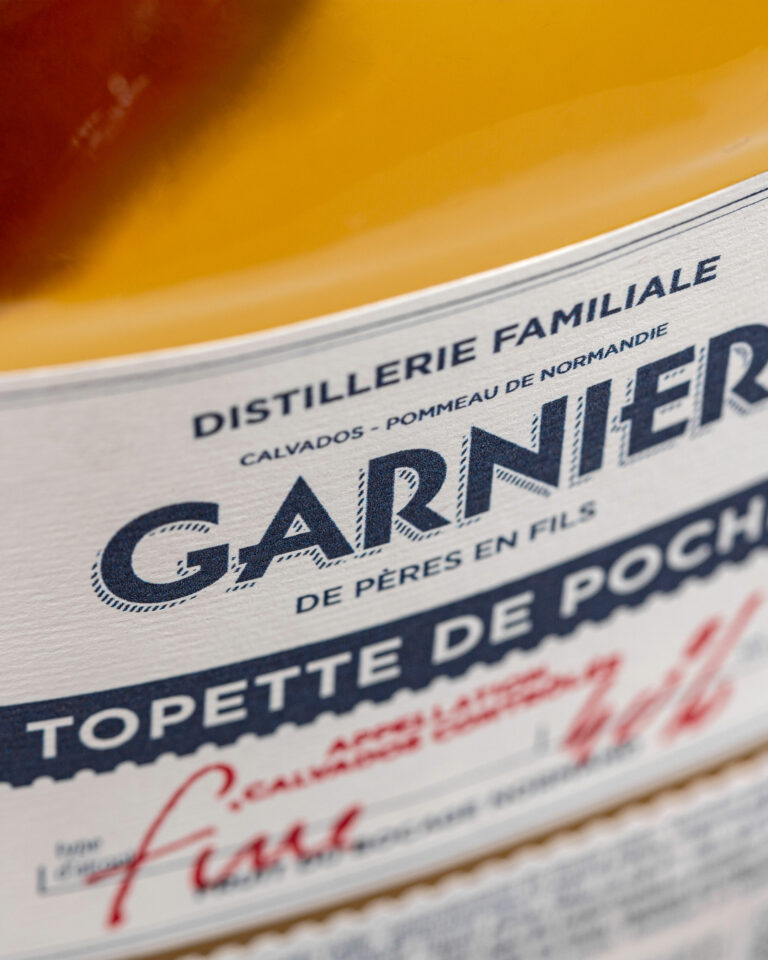
Since 1877, the Garnier family has been producing and distilling in the Normandy Bocage. Nicolas entrusted us with the redesign of his identity after aligning us with several agencies. The human touch and a taste for the real thing made the difference. A family crest, Art Deco typography and midnight blue set the brand apart. The offer was reorganized into two ranges: one young, with a metaphorical illustration of the apple tree cycle; the other traditional, with classic graphic codes.
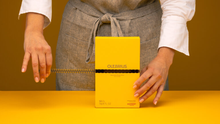
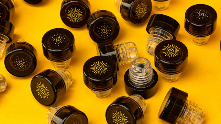
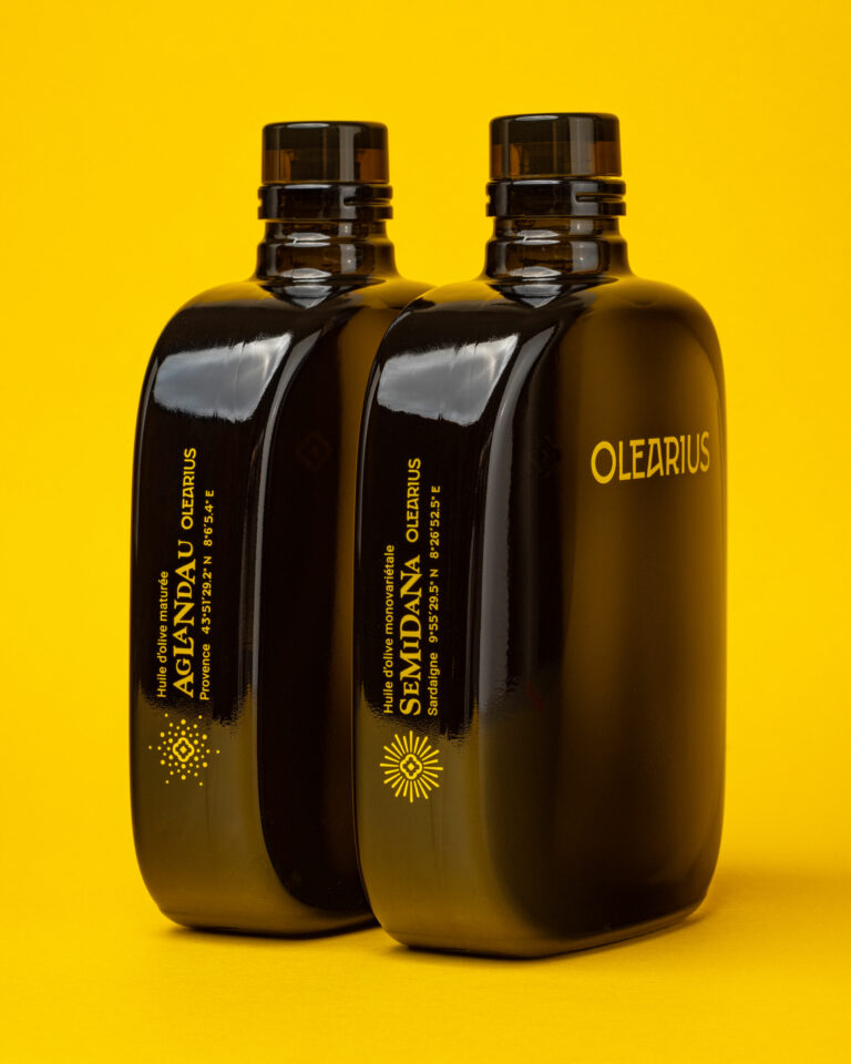
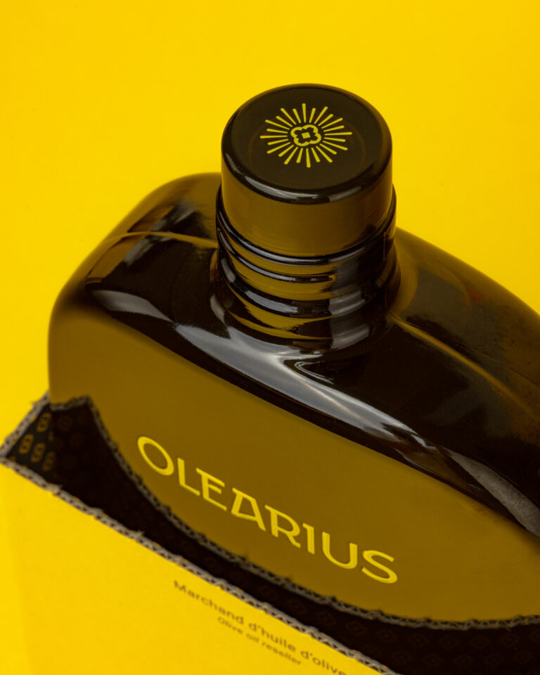
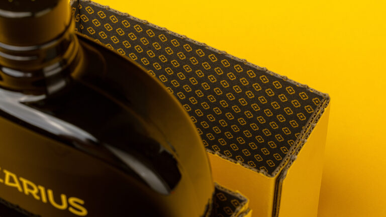
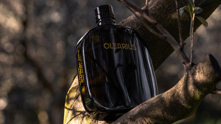
© Le Goff & Gabarra
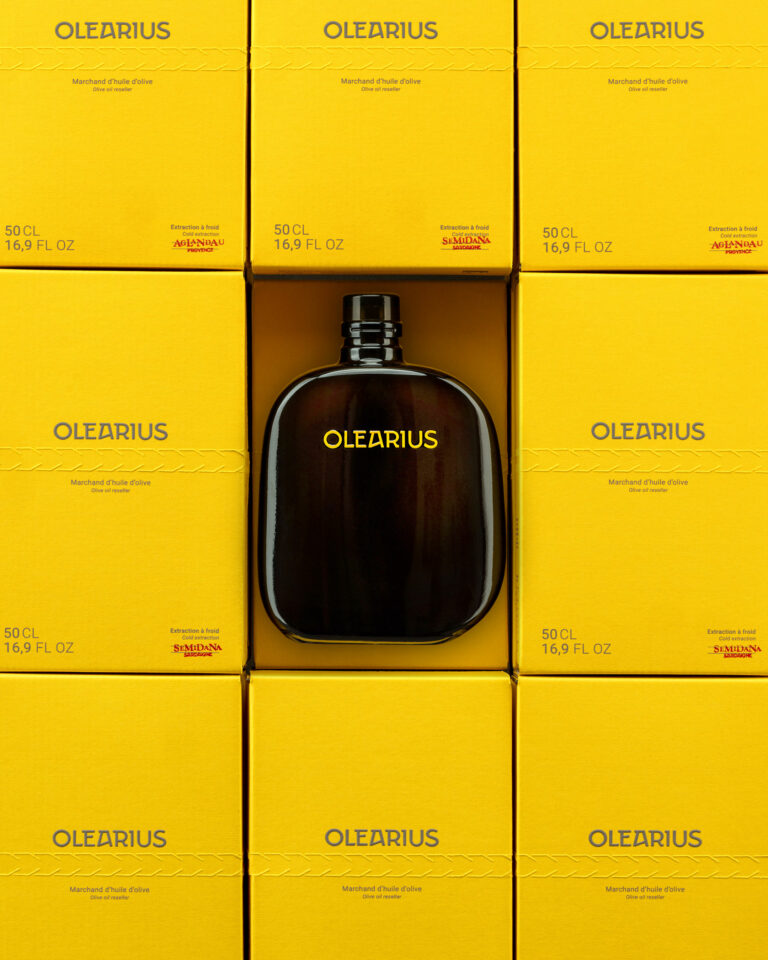
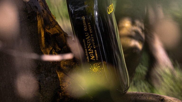
© Le Goff & Gabarra
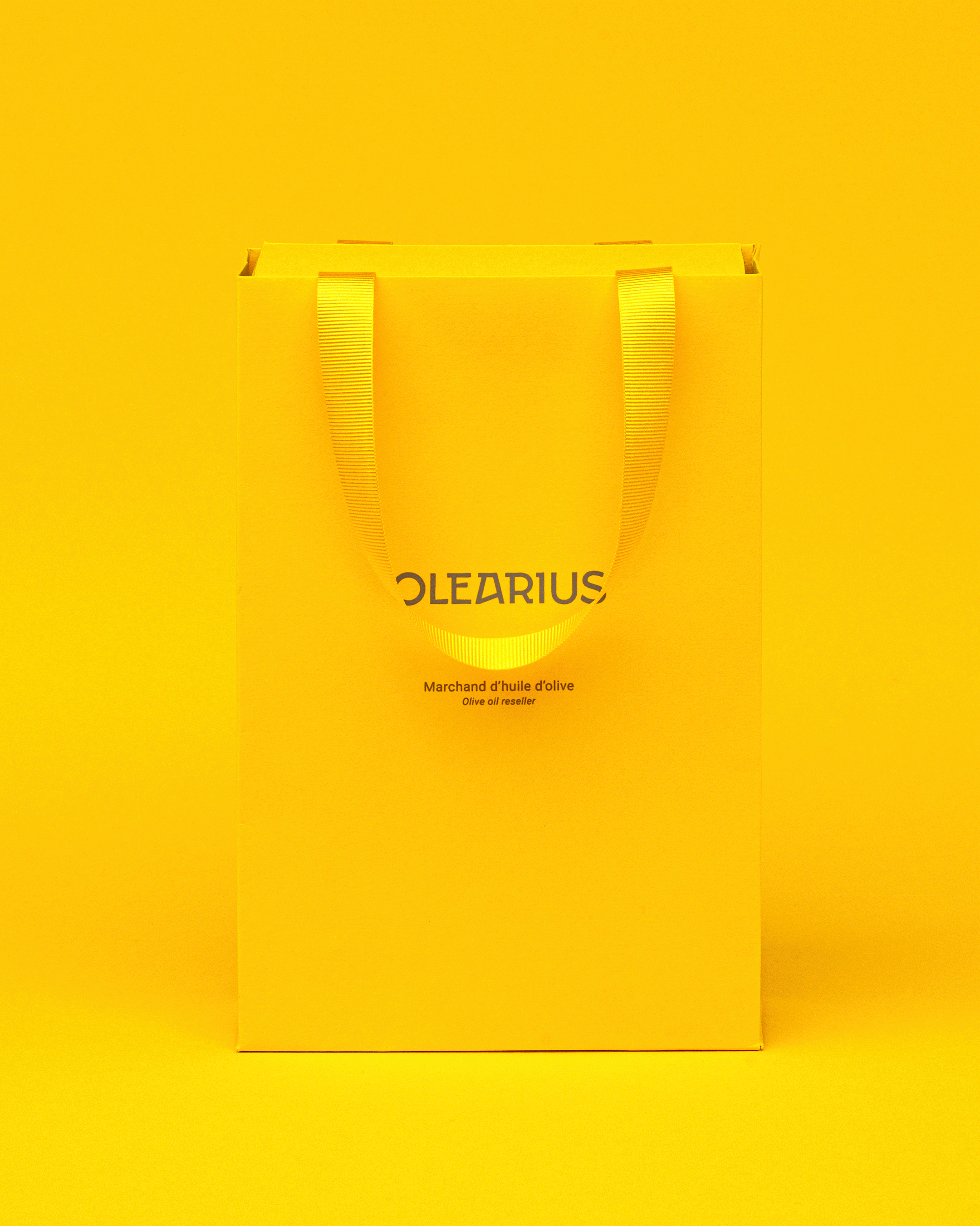
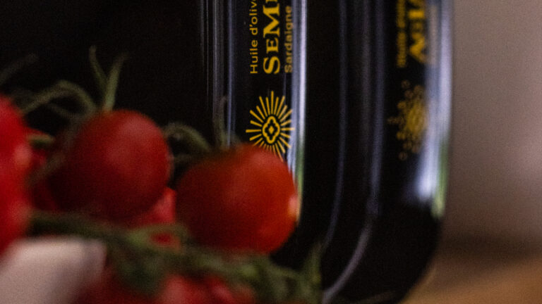
© Le Goff & Gabarra
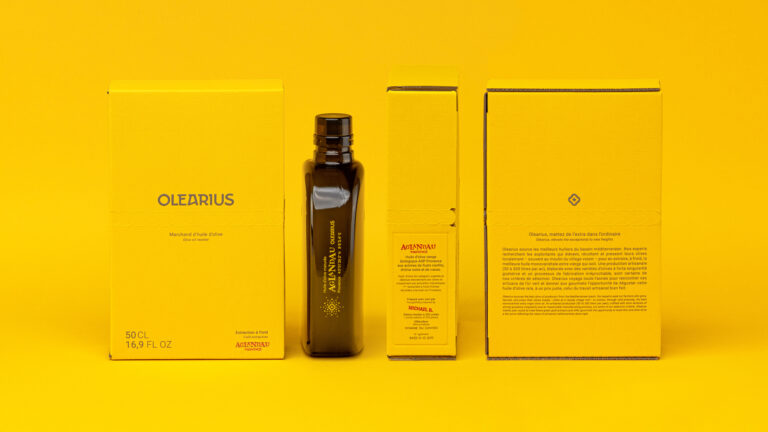
© Le Goff & Gabarra
© Le Goff & Gabarra
© Le Goff & Gabarra
© Le Goff & Gabarra
© Le Goff & Gabarra
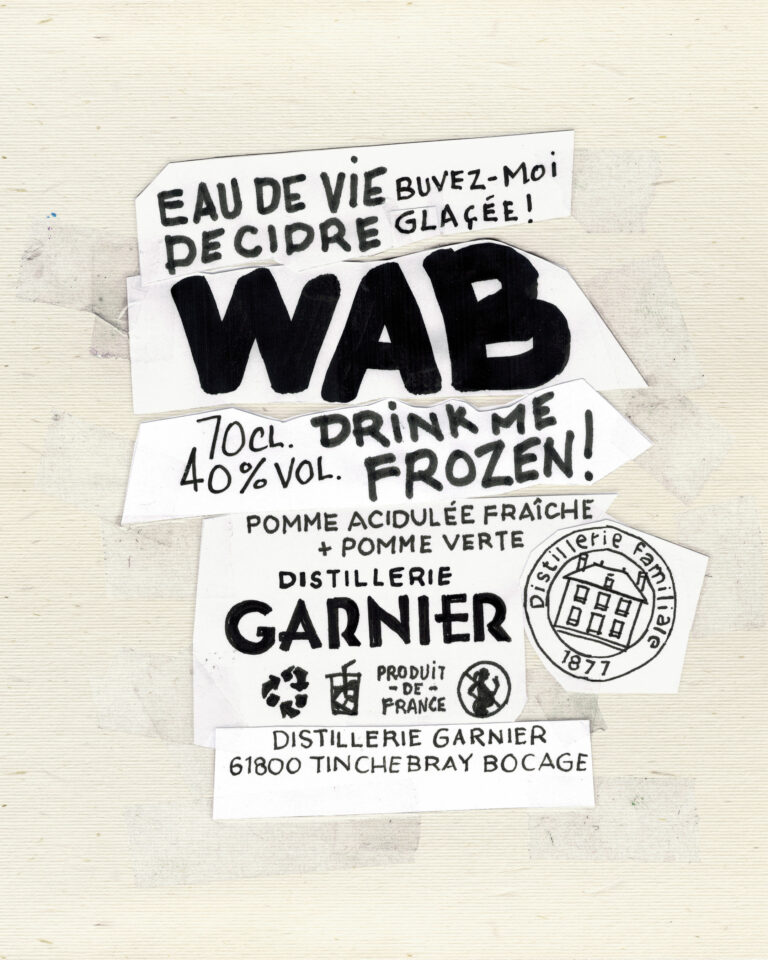
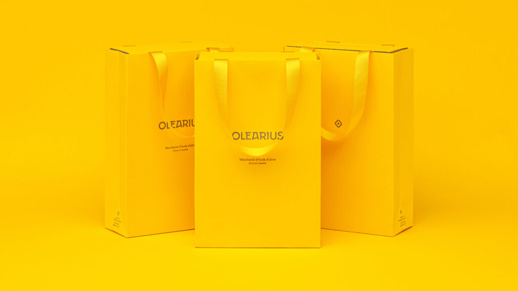
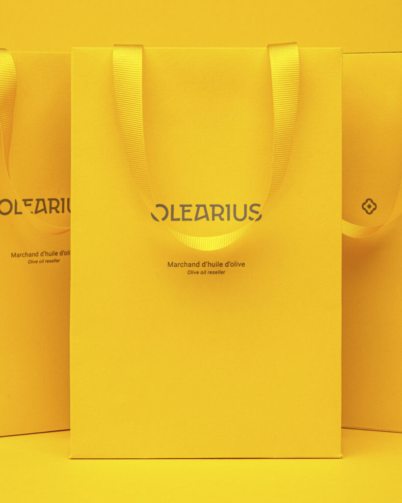
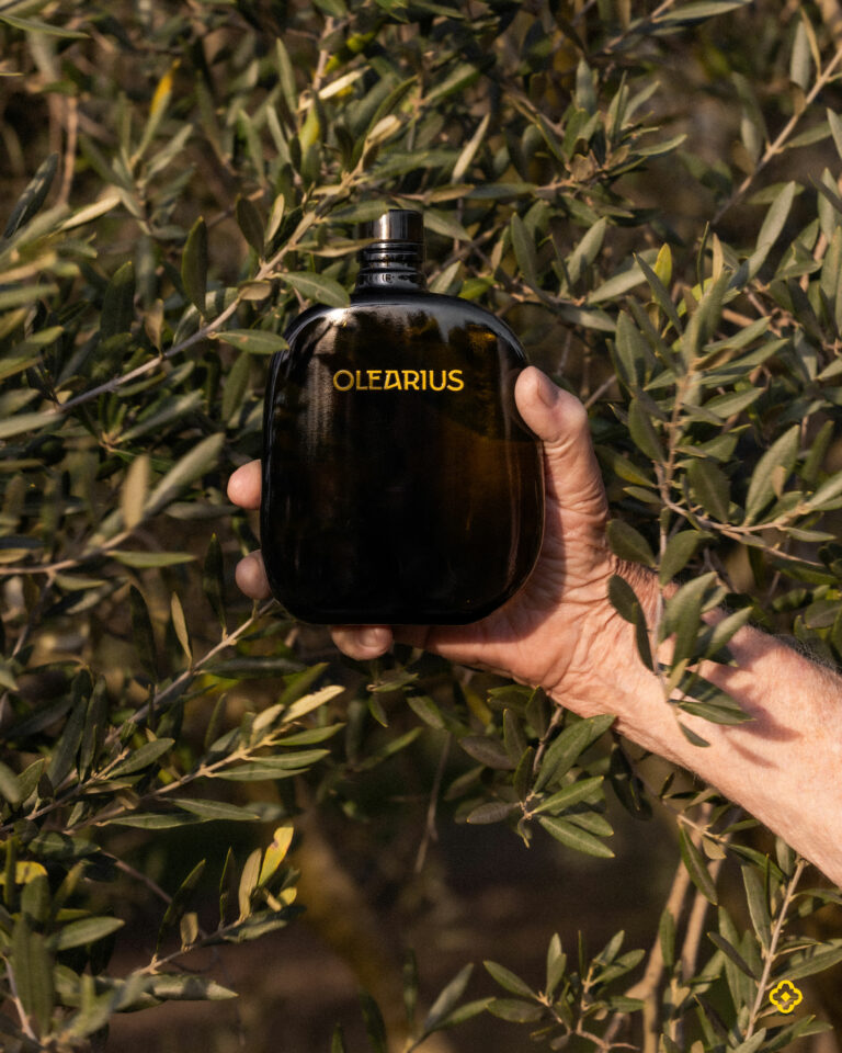
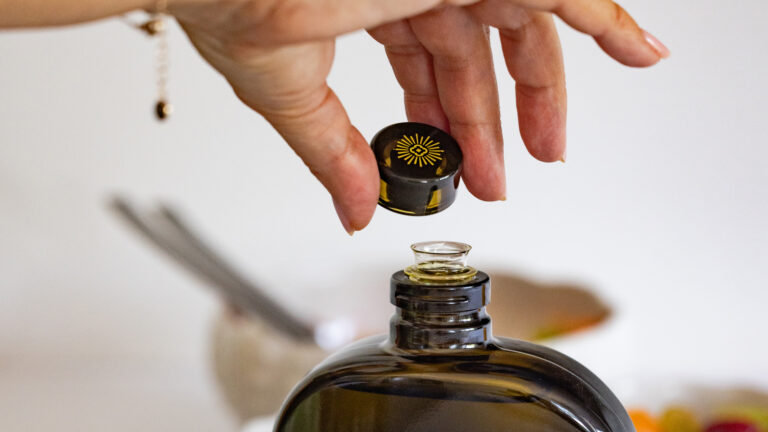
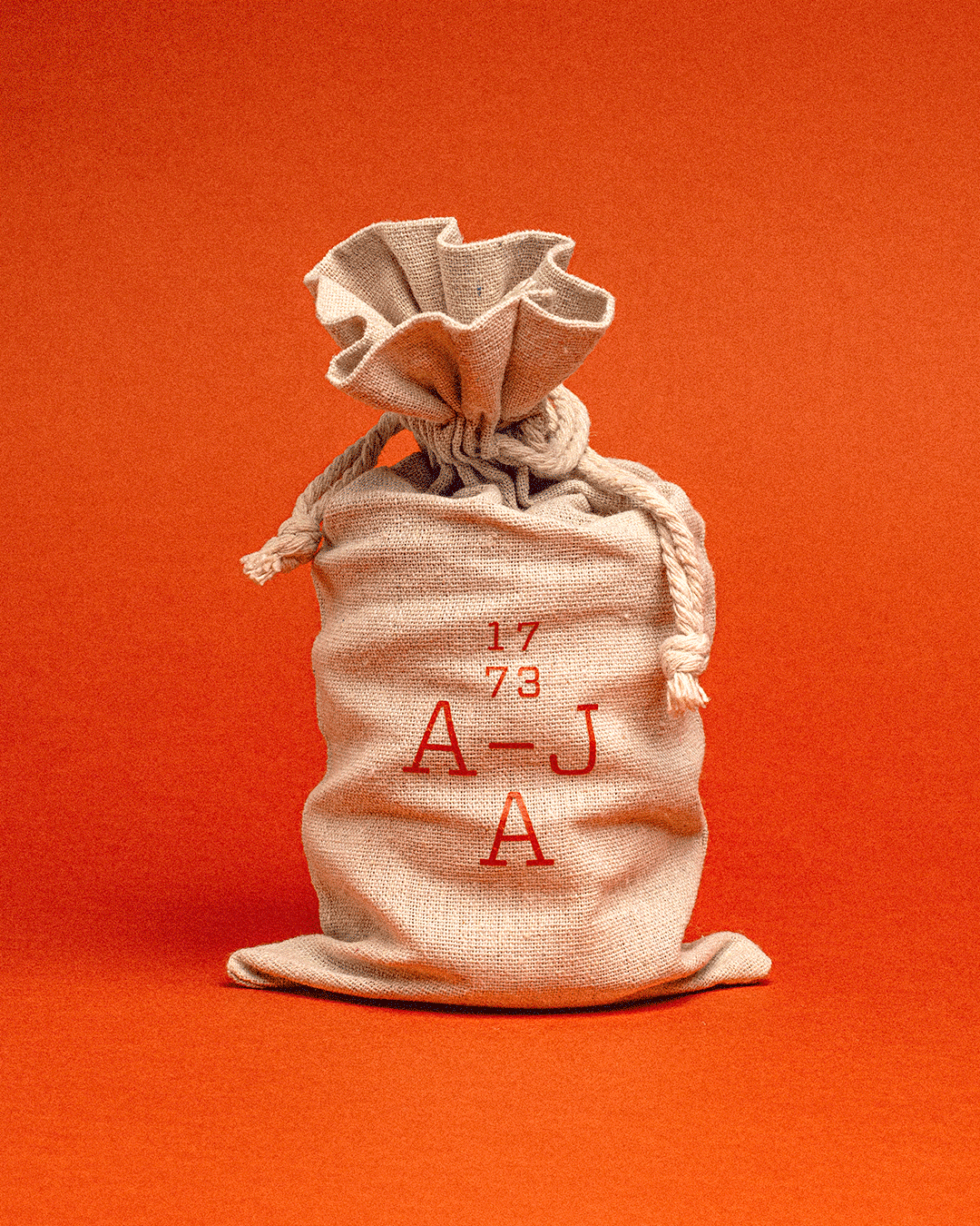
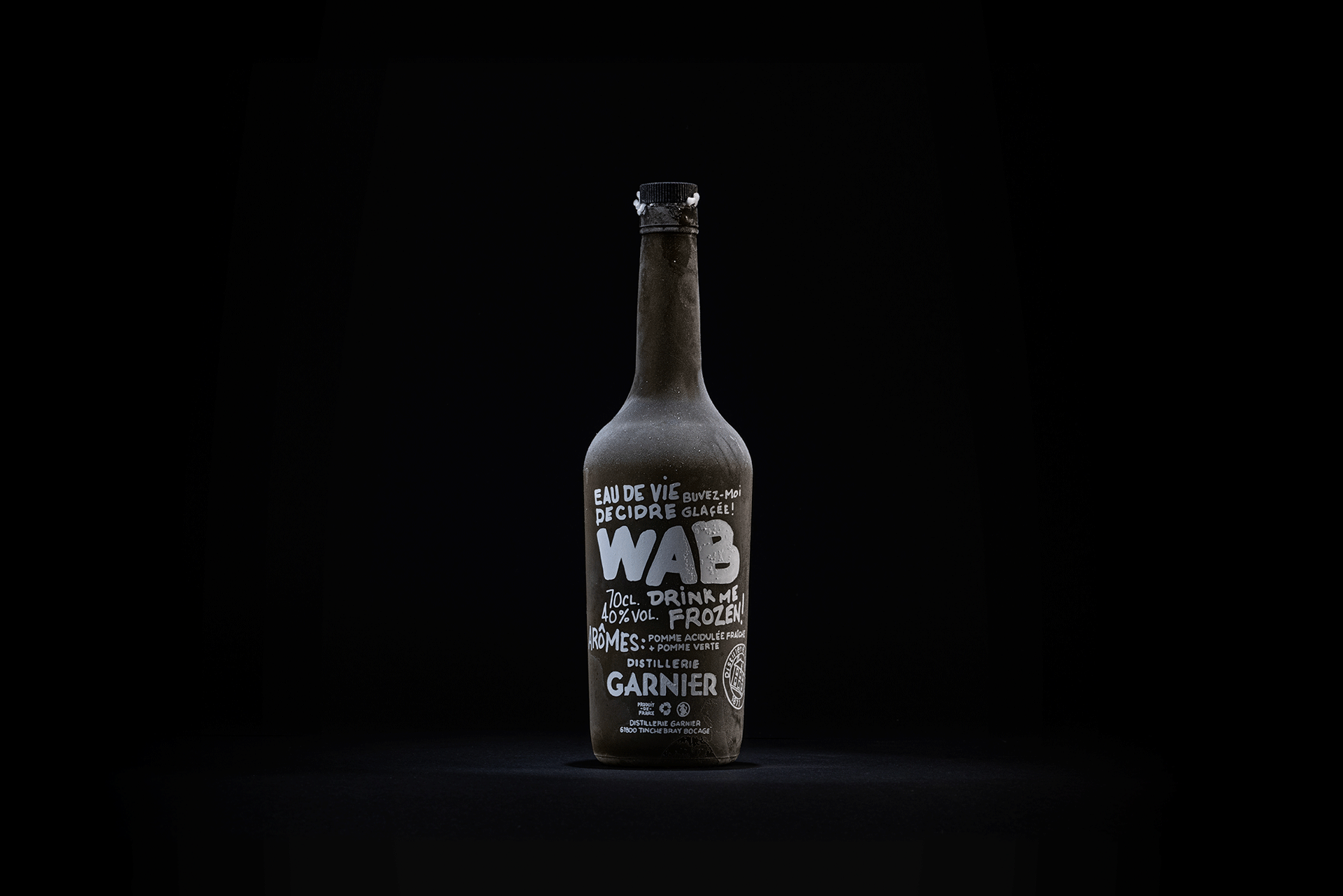
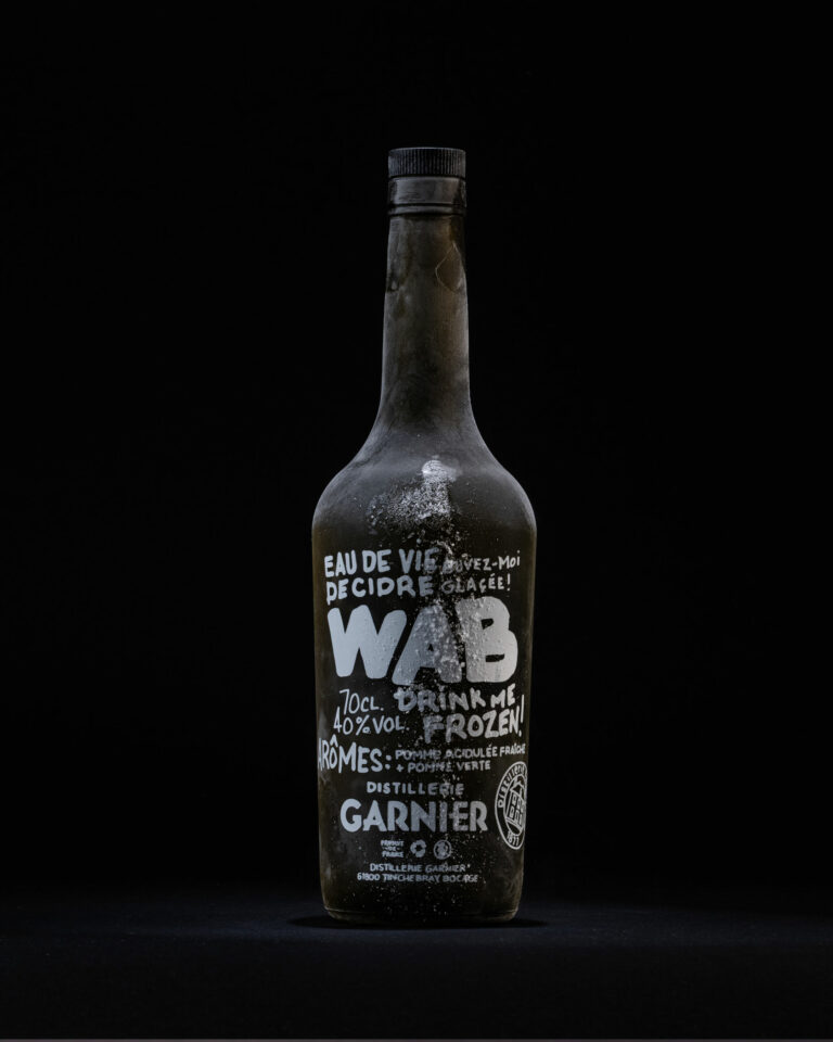
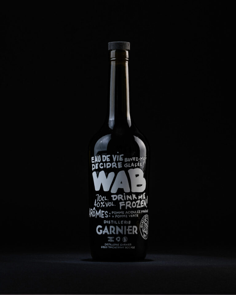
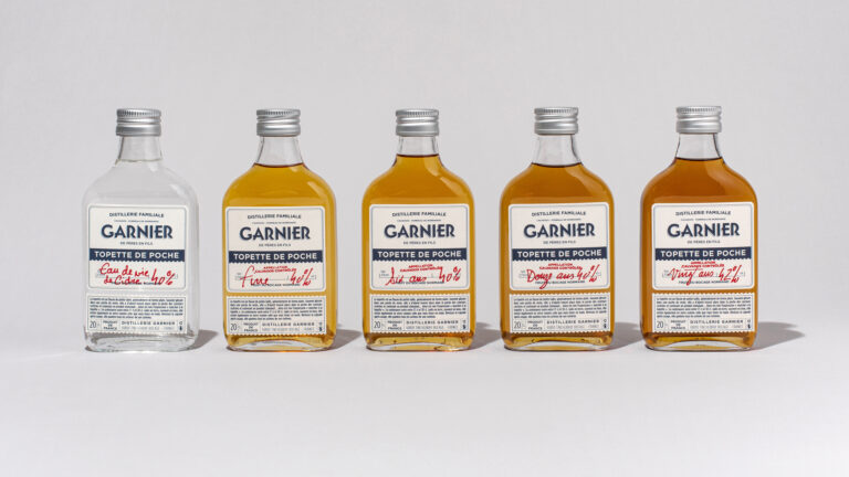
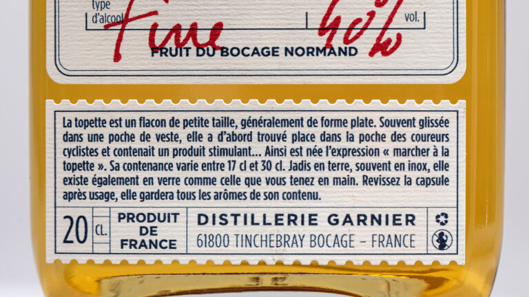
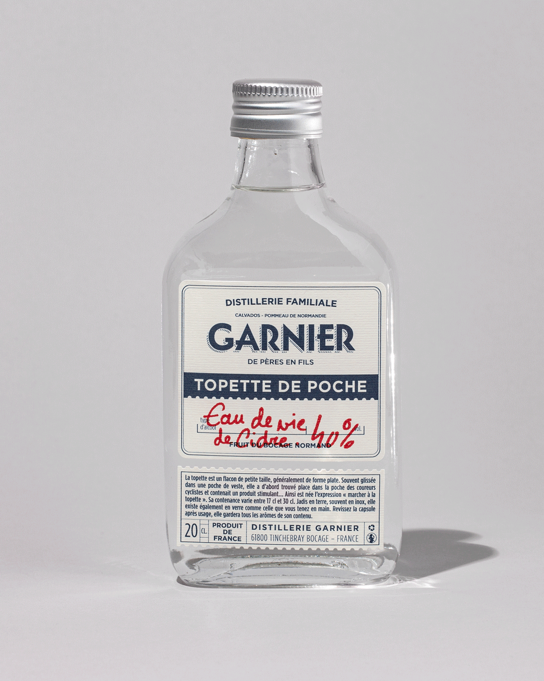
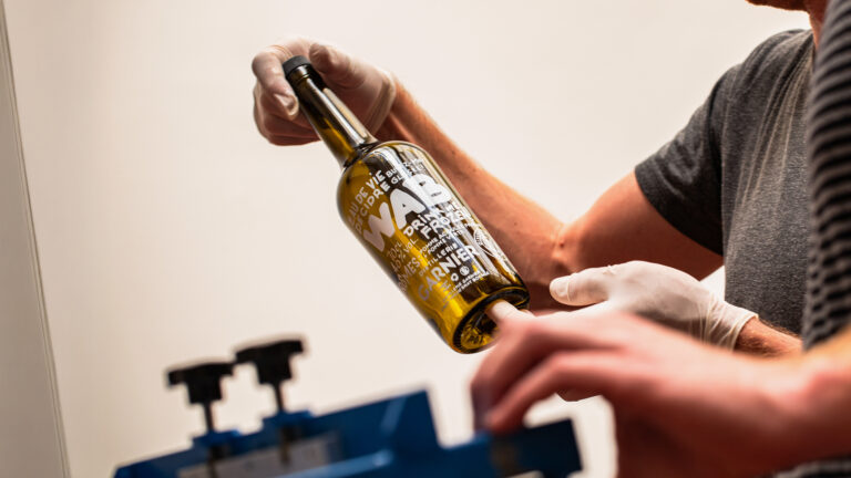
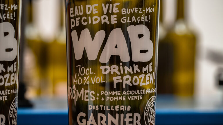
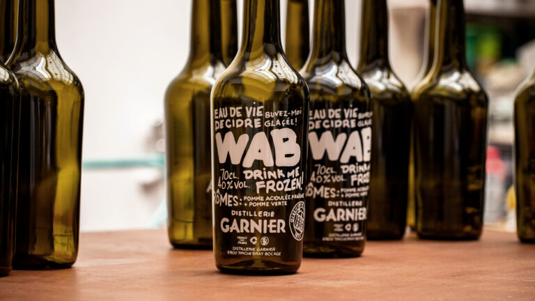
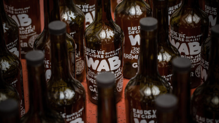
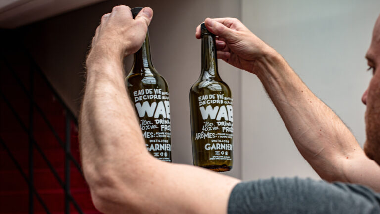
Two purely marketing-oriented products are developed on our advice: WAB – White Apple Brandy – echoes the codes of contraband, with no label and a message written by hand directly on the bottle; and the topette, a portable product that leaves a lasting impression and which Nicolas can fill on demand.
© Le Goff & Gabarra
© Le Goff & Gabarra
© Le Goff & Gabarra
© Le Goff & Gabarra
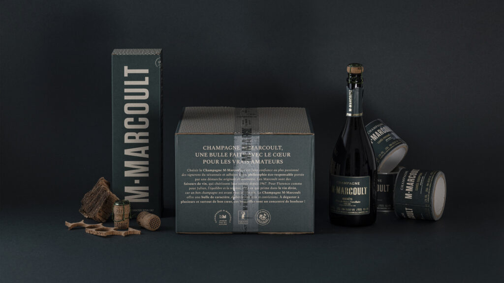
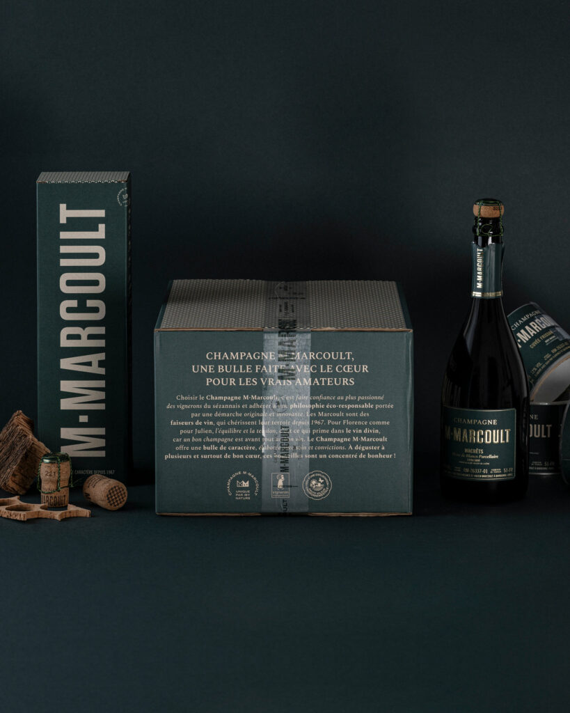
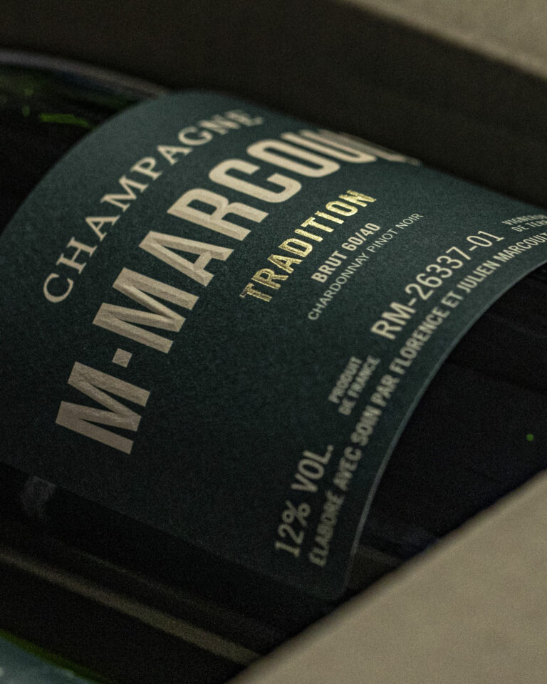
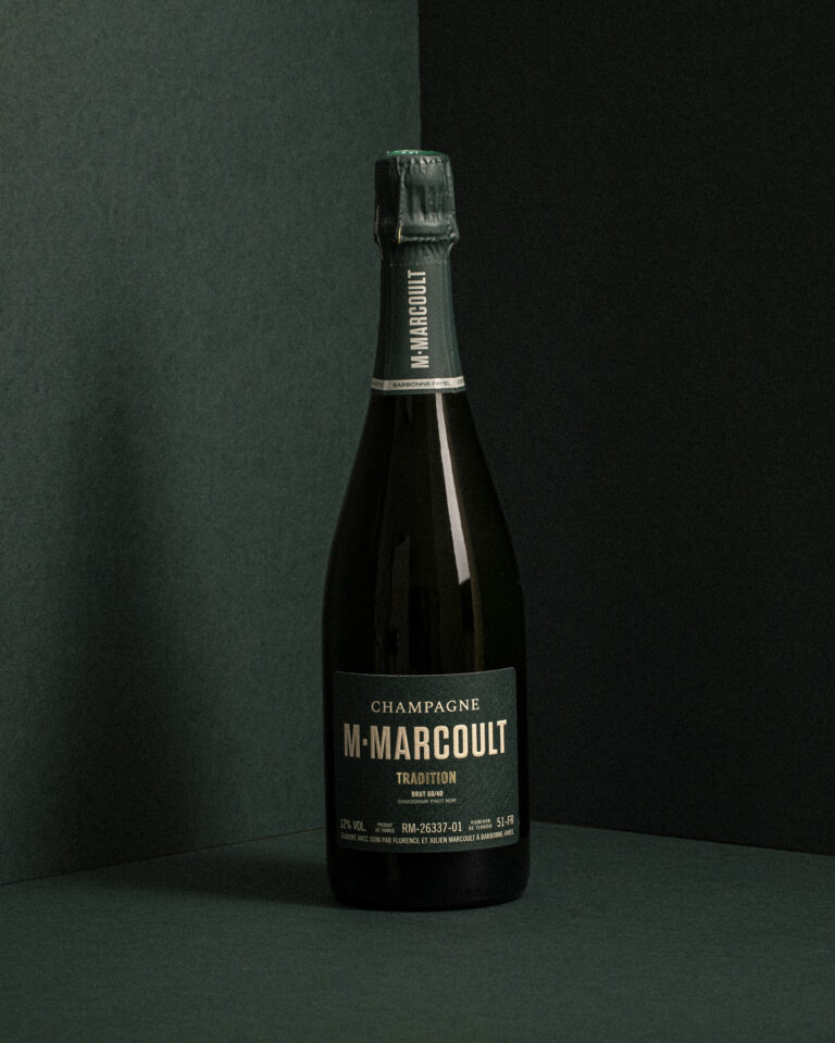
Calvados Garnier is a Normandy-based producer of premium calvados. Camille Gabarra was entrusted with the artistic direction and product photography during the first twenty years of her career, making this project one of the seminal works in the wine and spirits industry.
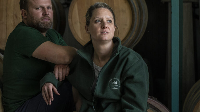
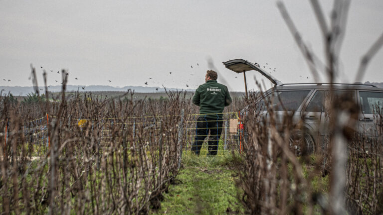
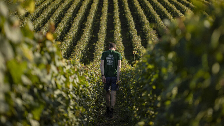
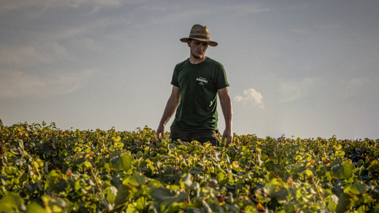
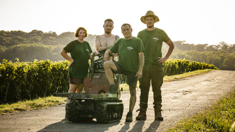
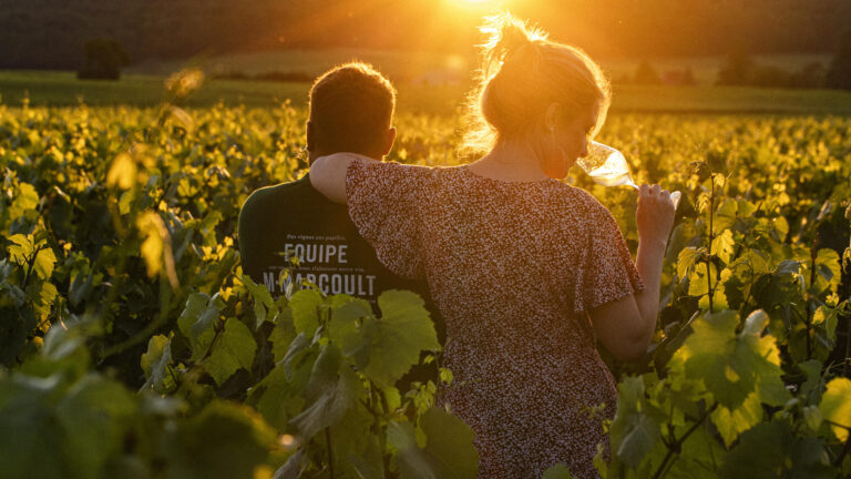
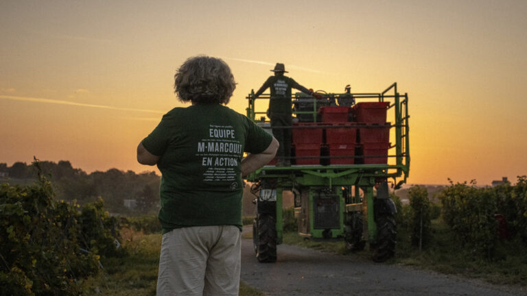
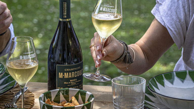
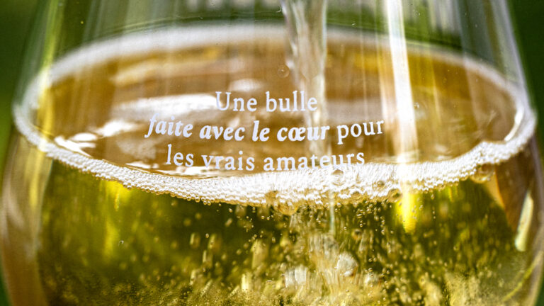
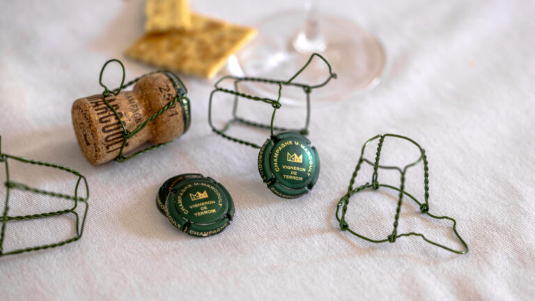
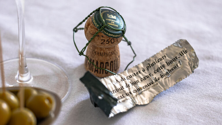
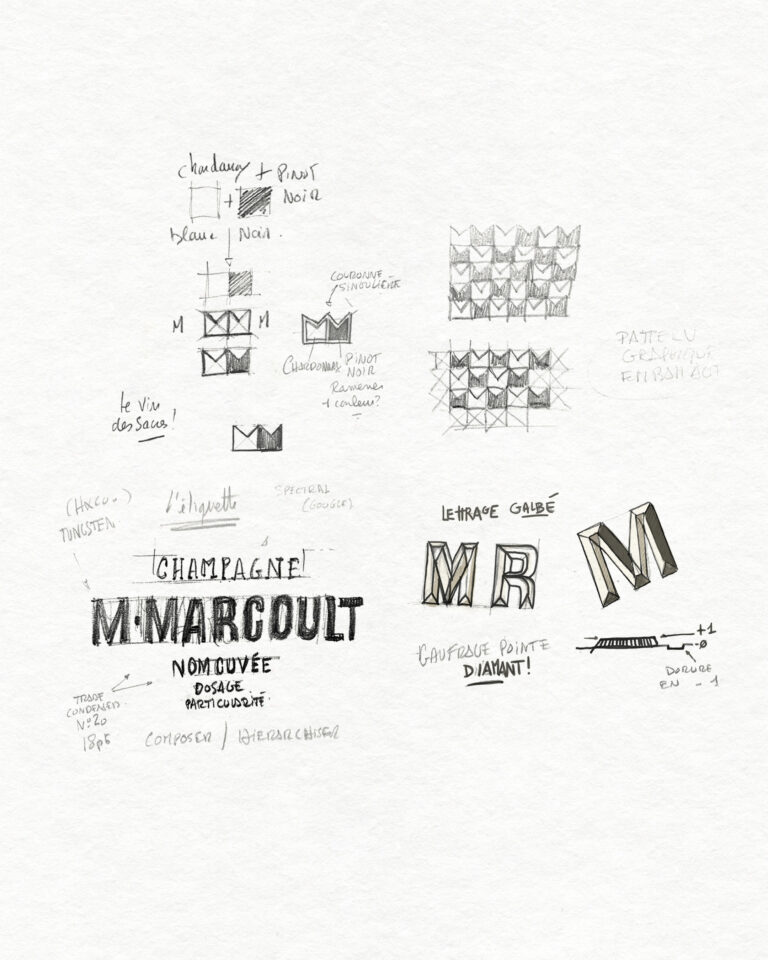
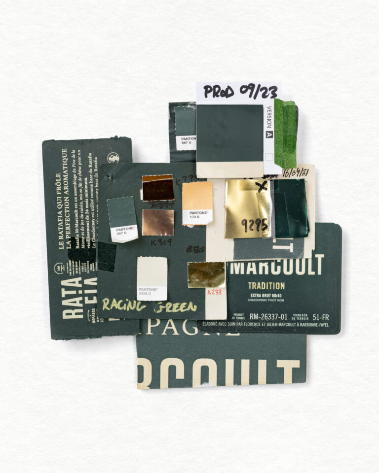
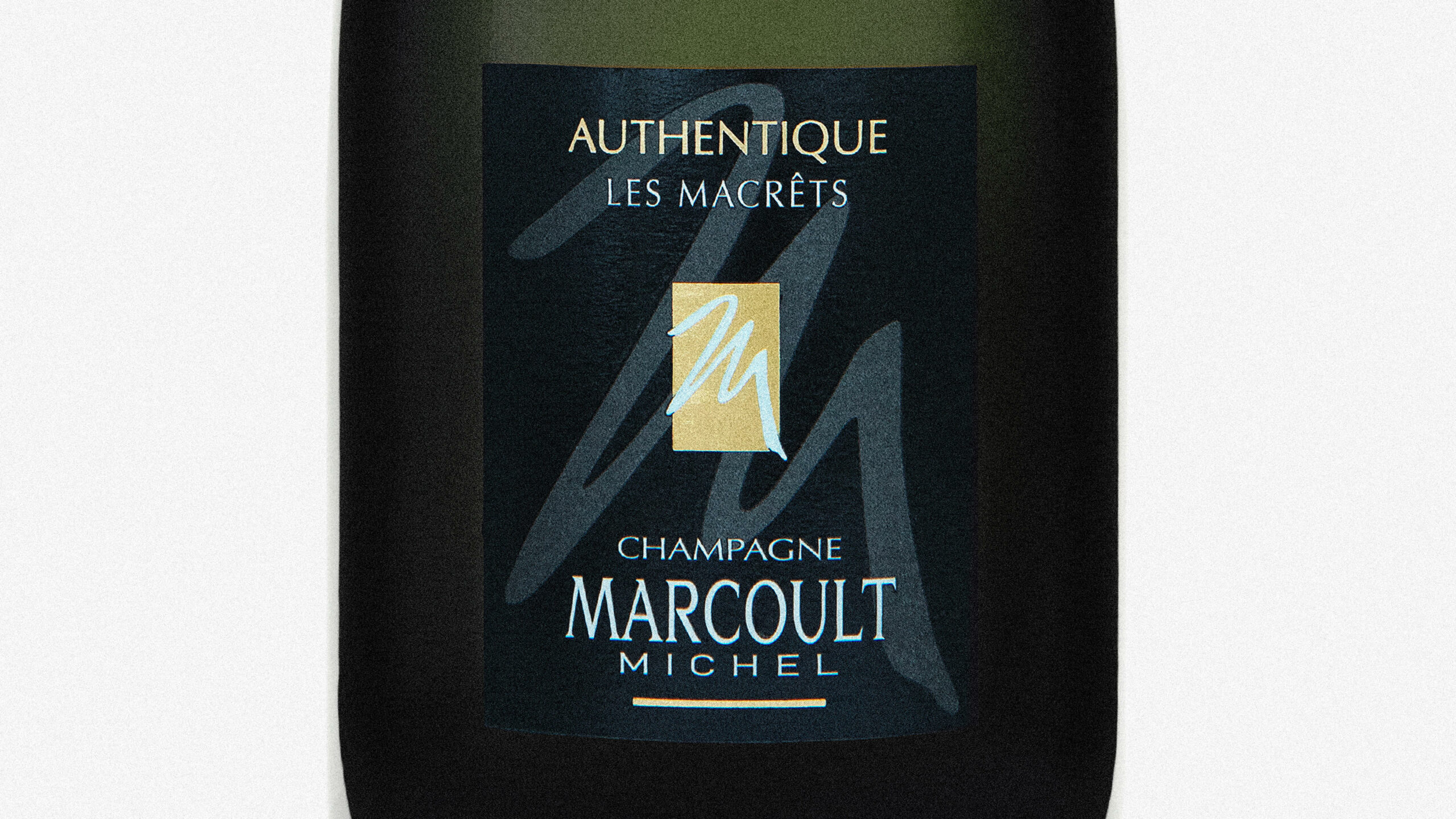
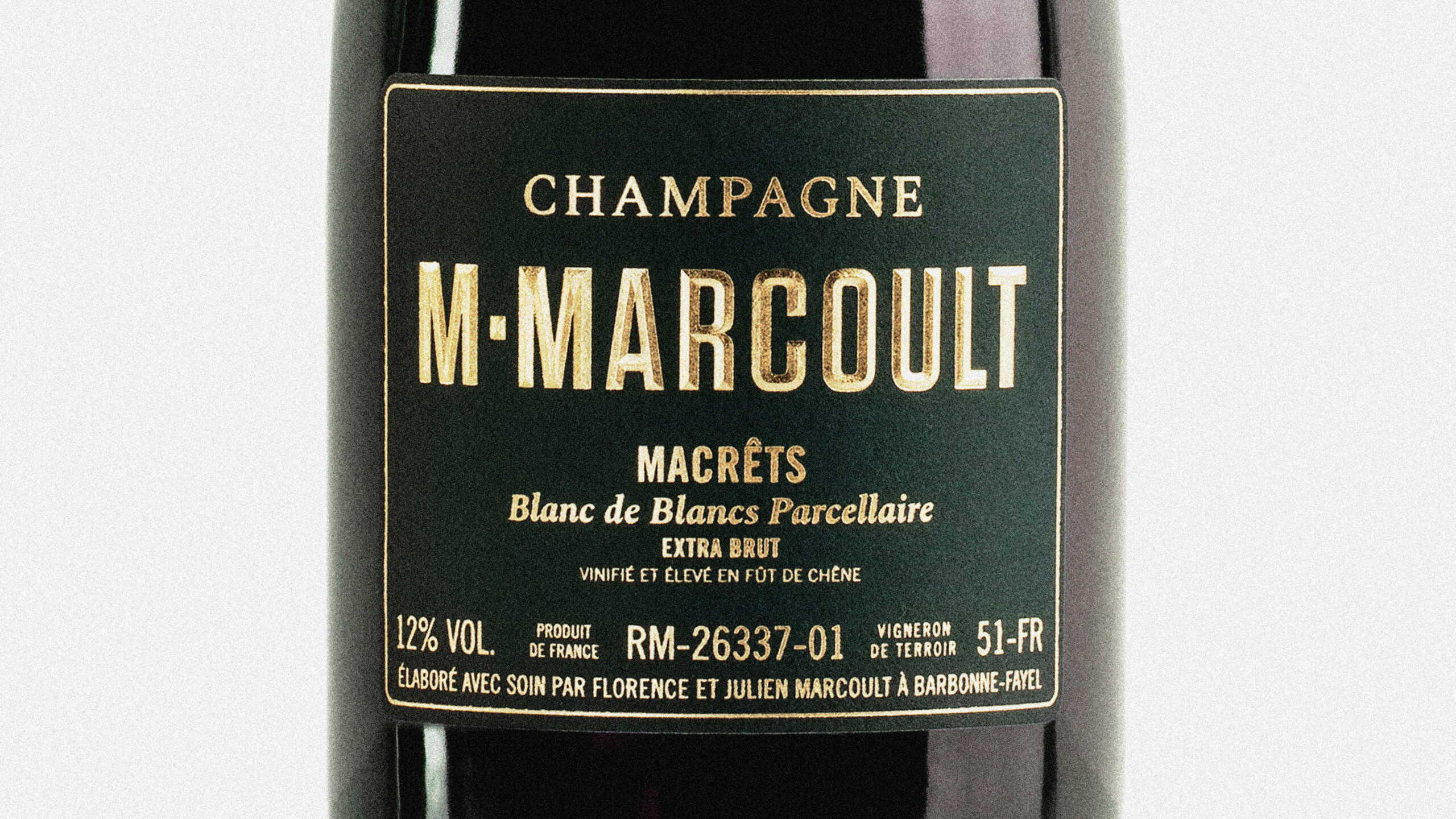
The project encompasses the brand’s visual identity and the photographic direction for its products. Rooting the brand in the traditions of artisanal Normandy spirits—without imitating generic market standards—is the same principle that now guides projects for Champagne M.Marcoult, Distillerie de la Forge Distillerie Monéger. In fact, it was through Calvados Garnier that Champagne M.Marcoult first discovered Camille Gabarra’s work, before contacting him several years later for a collaboration that has been ongoing since 2020.
Art Direction and Photography: Camille Gabarra