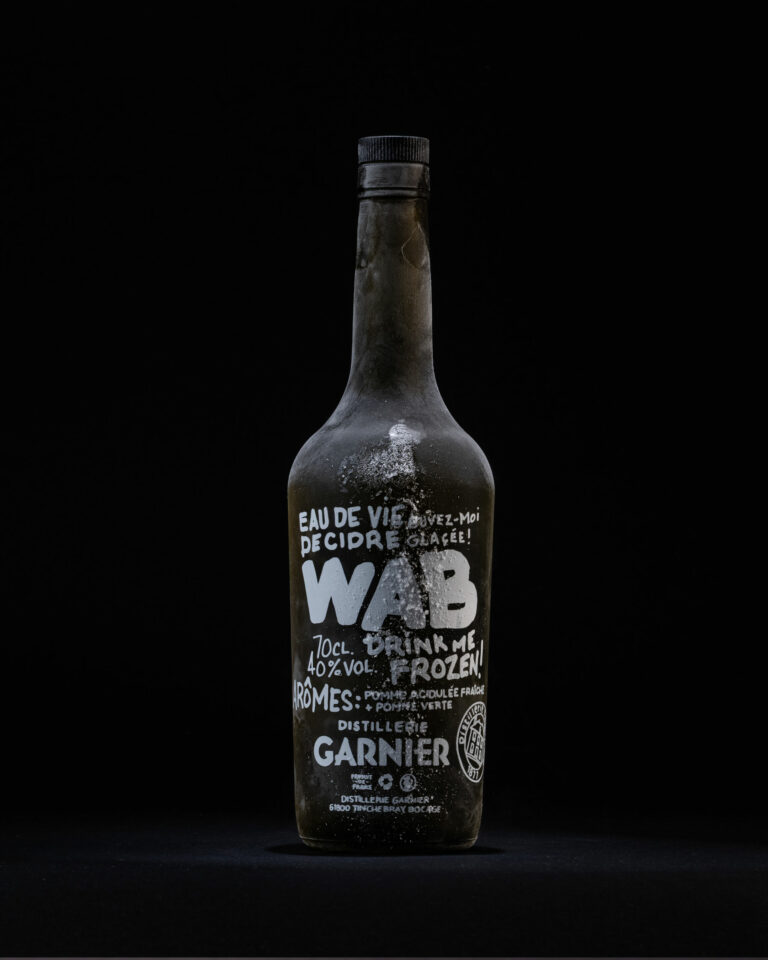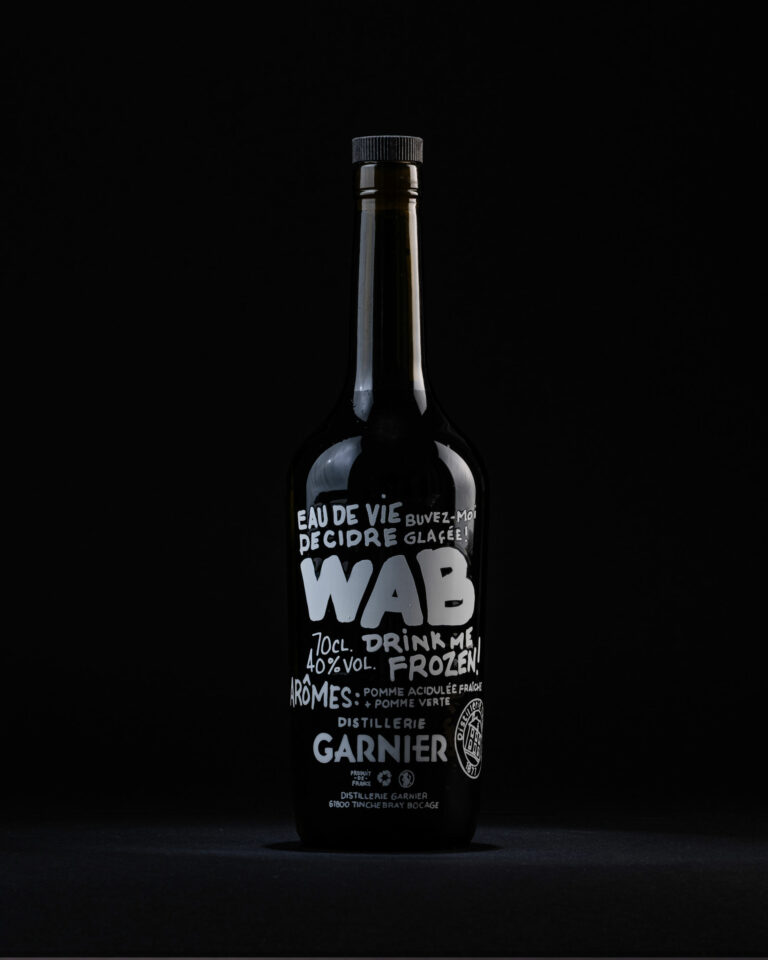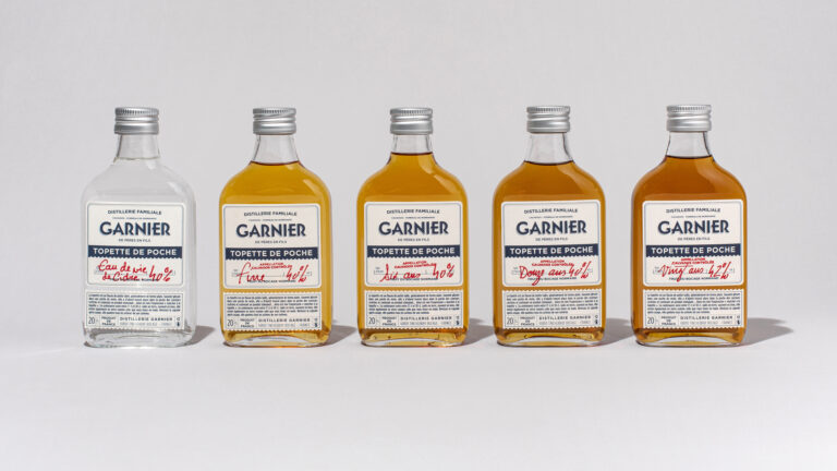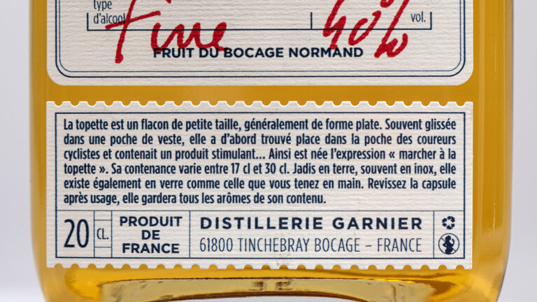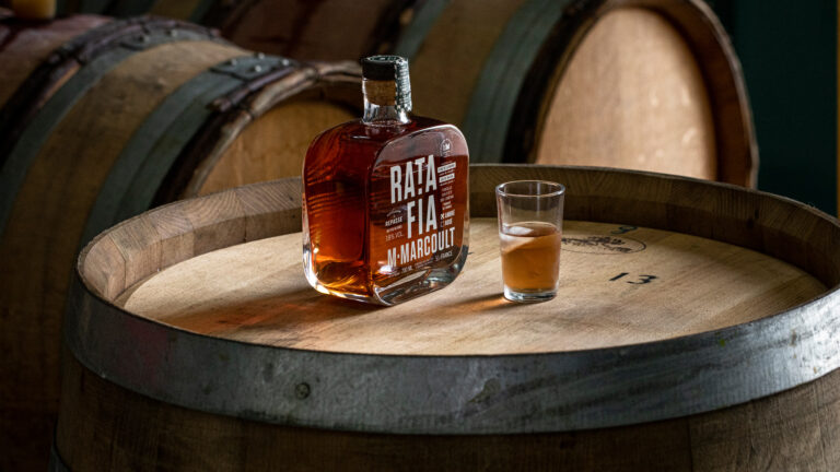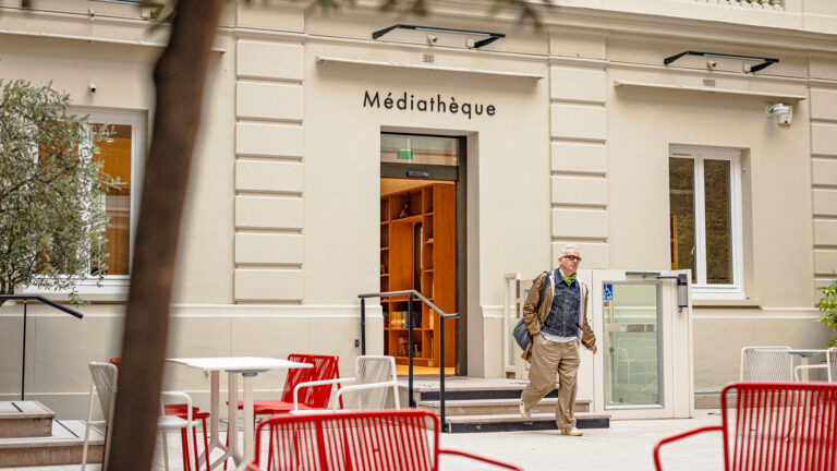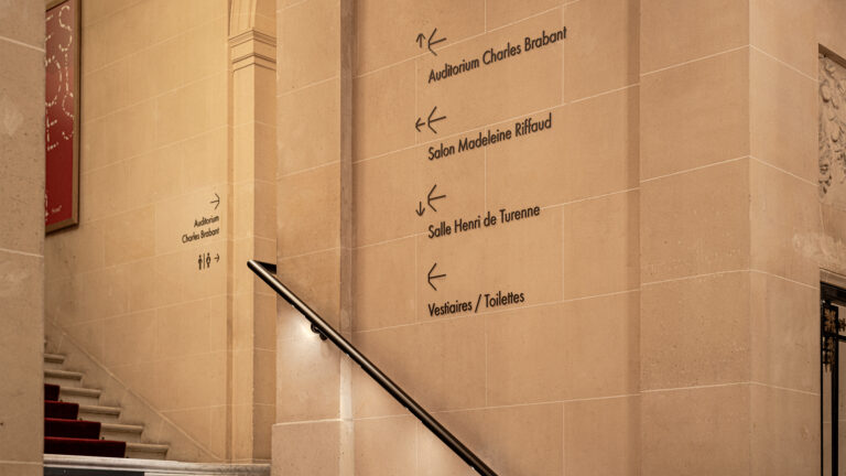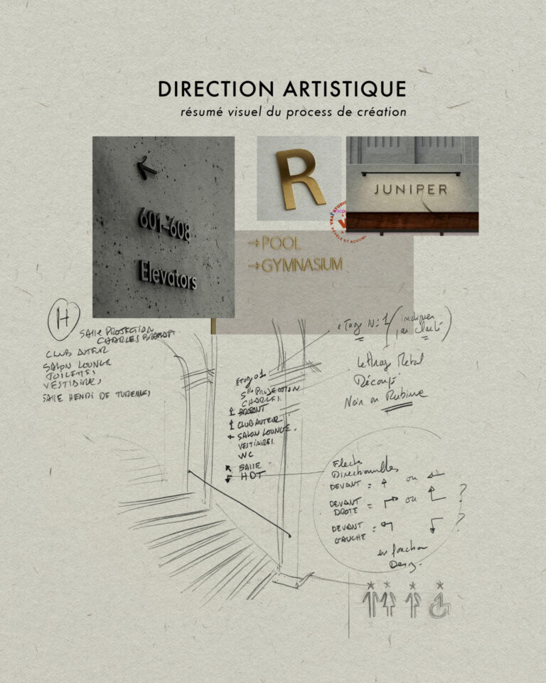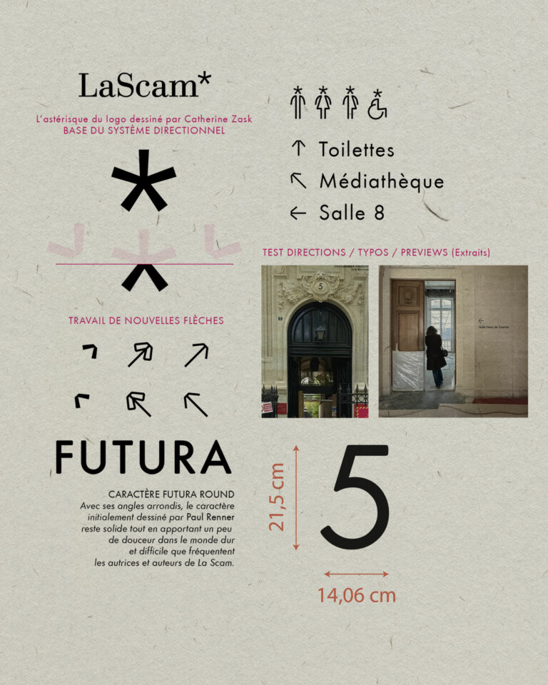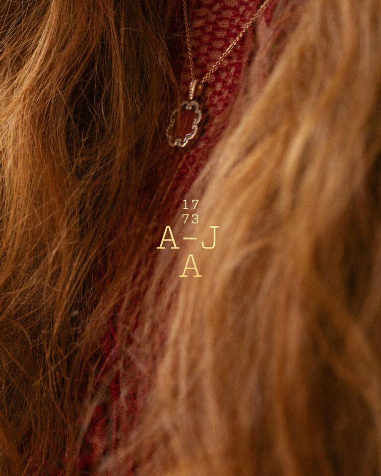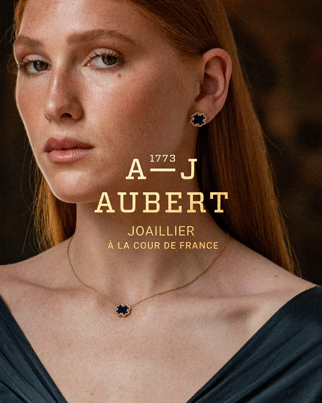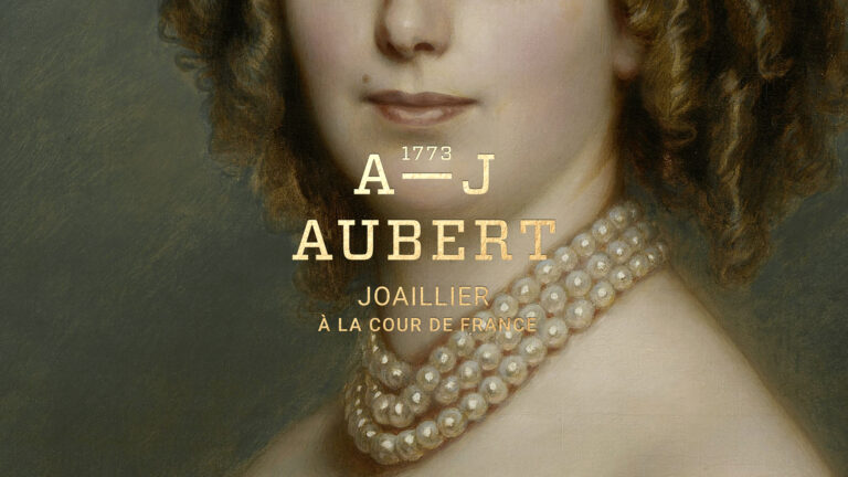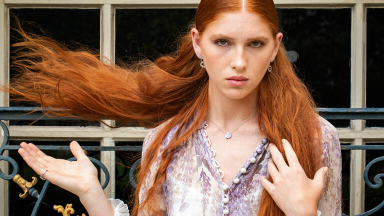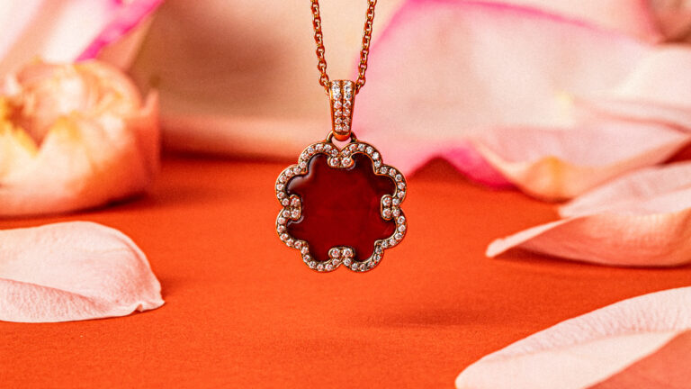
- Art Direction
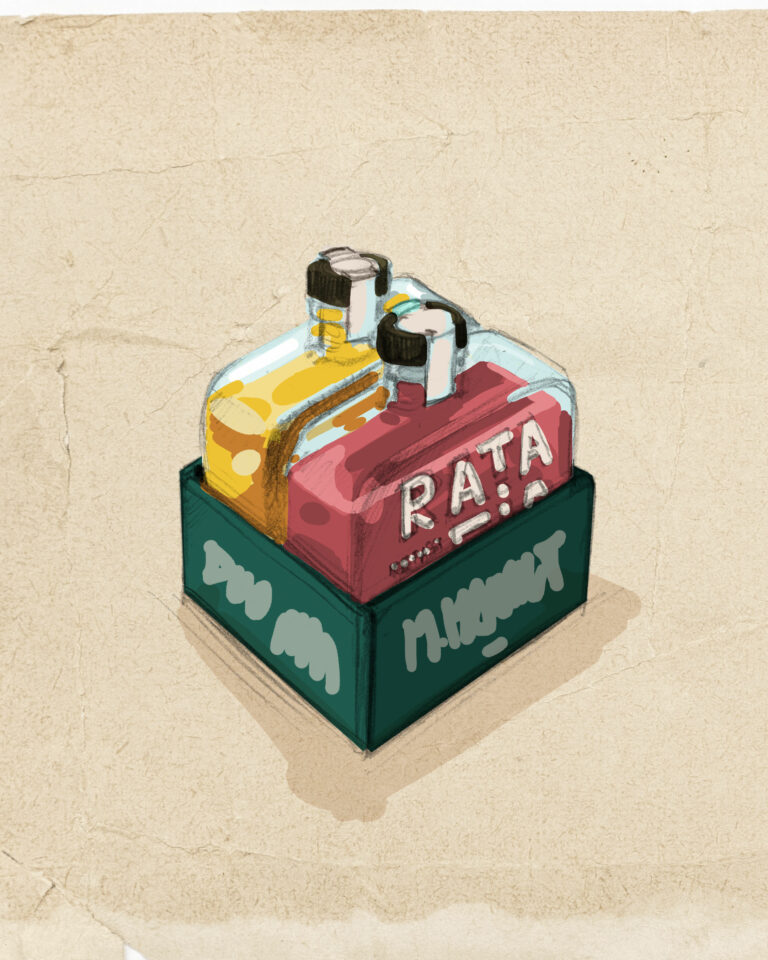
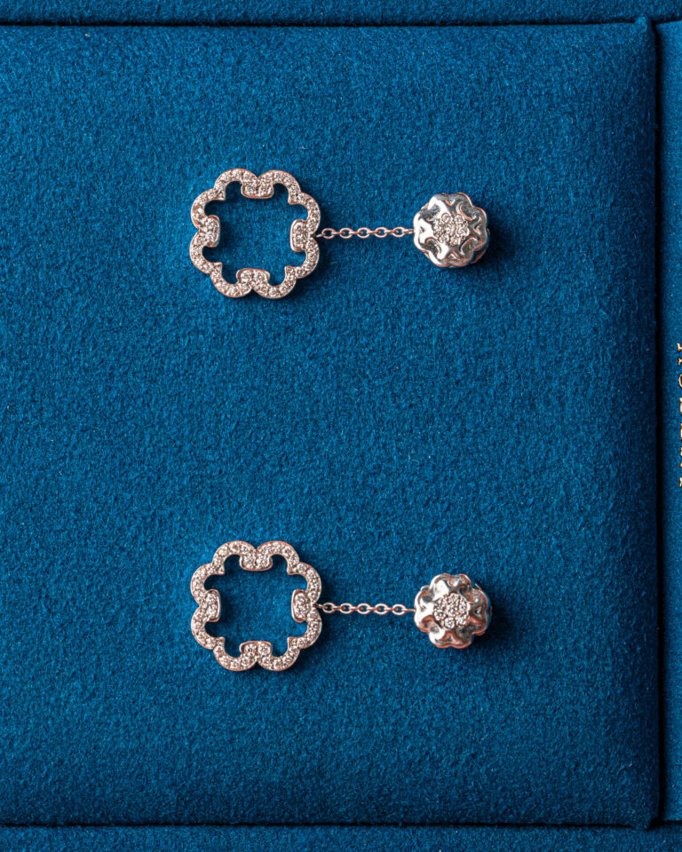
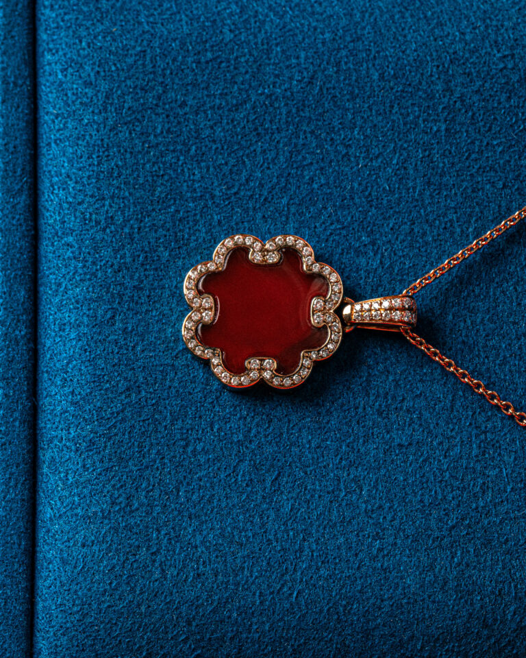
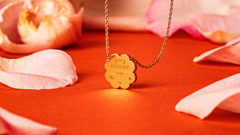
- Object design
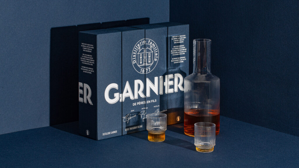
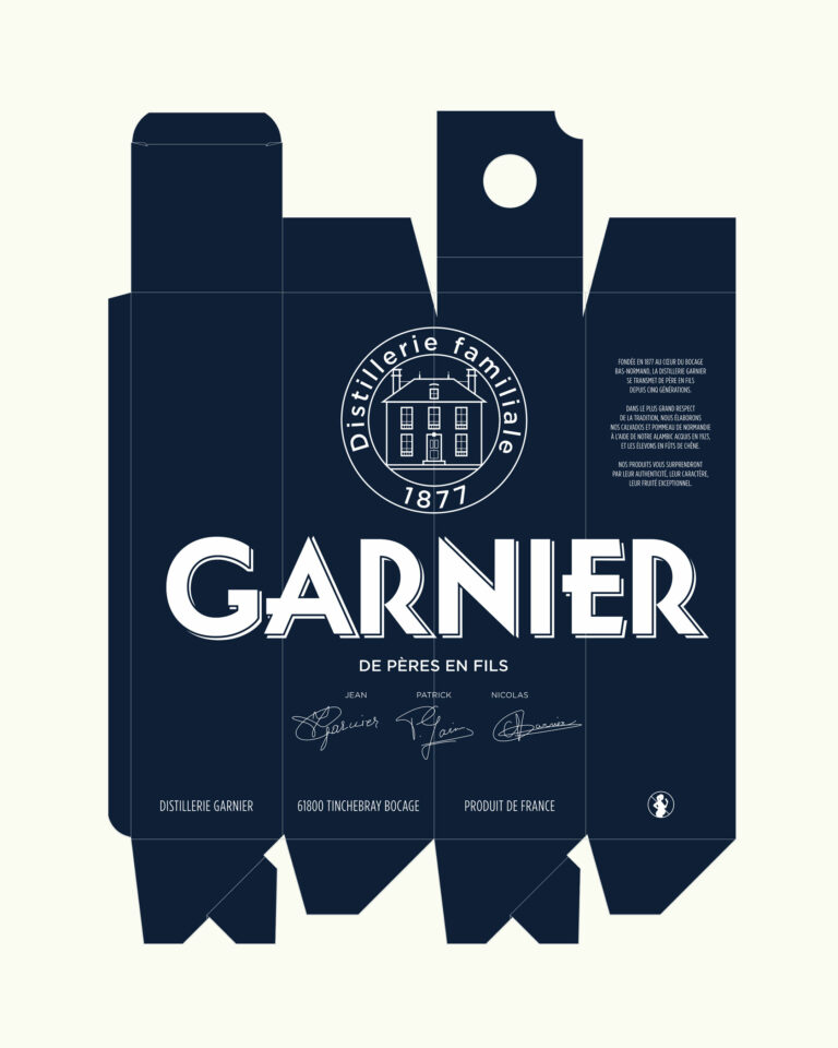
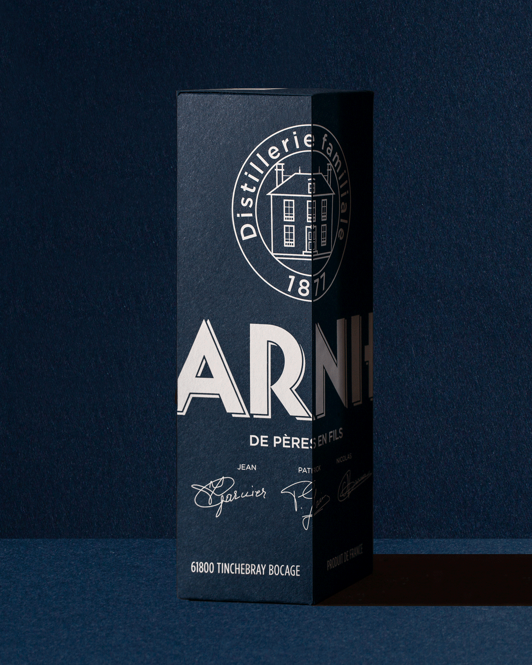
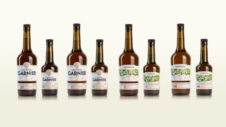
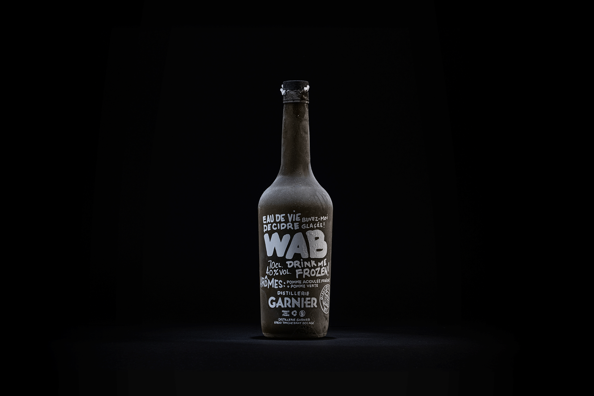
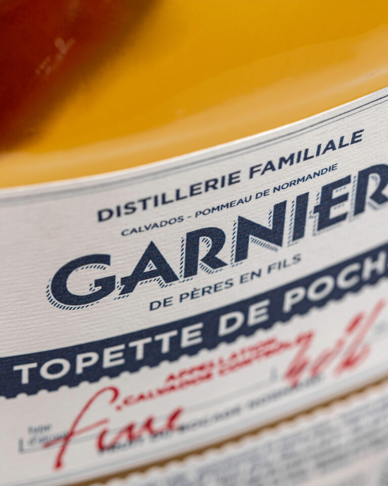
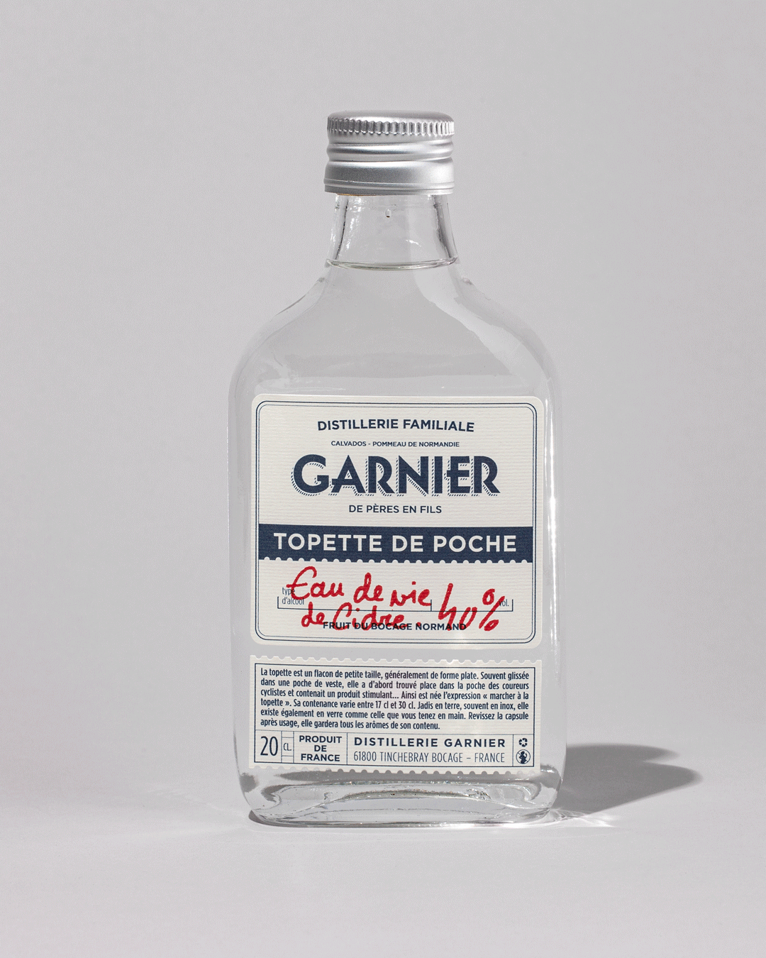
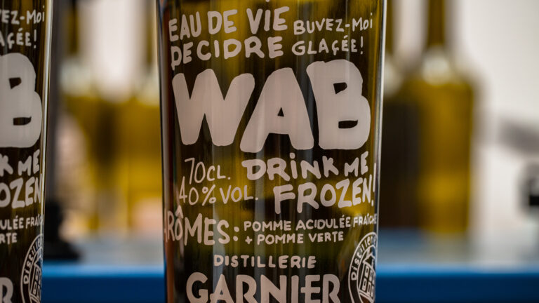
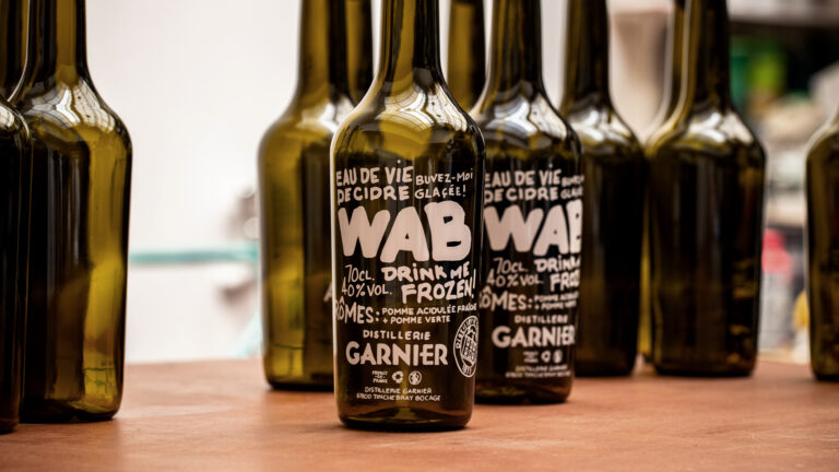
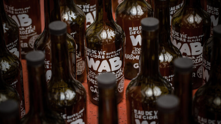
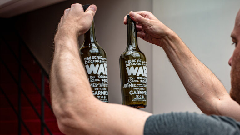
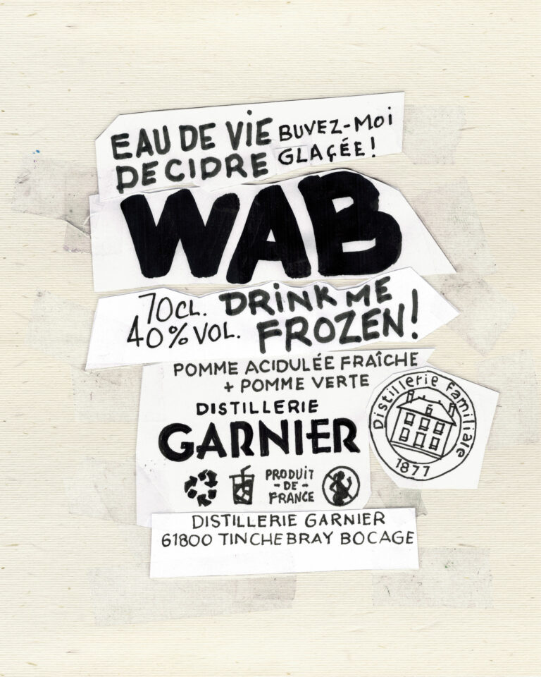
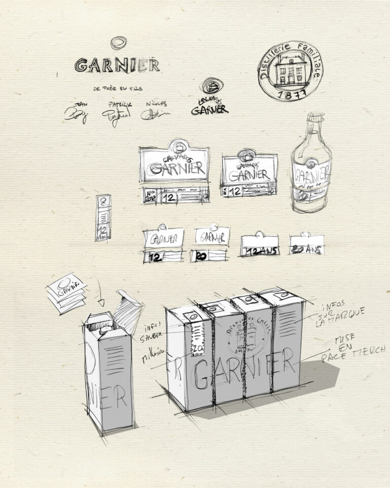
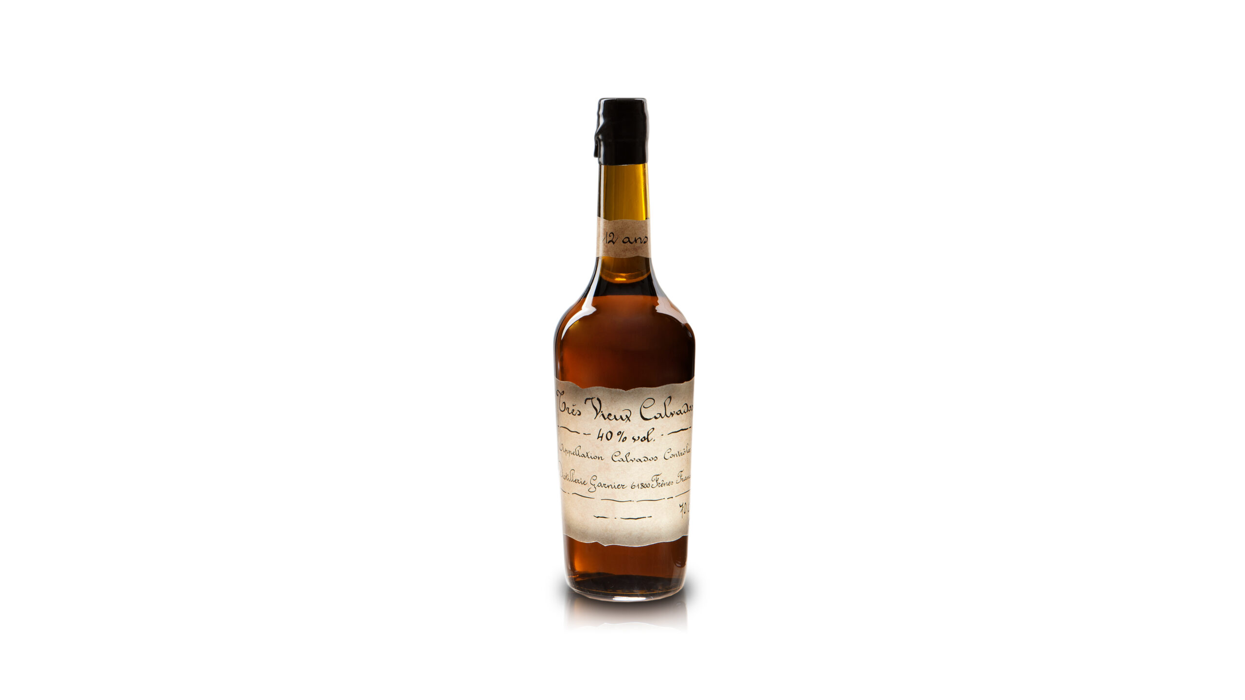
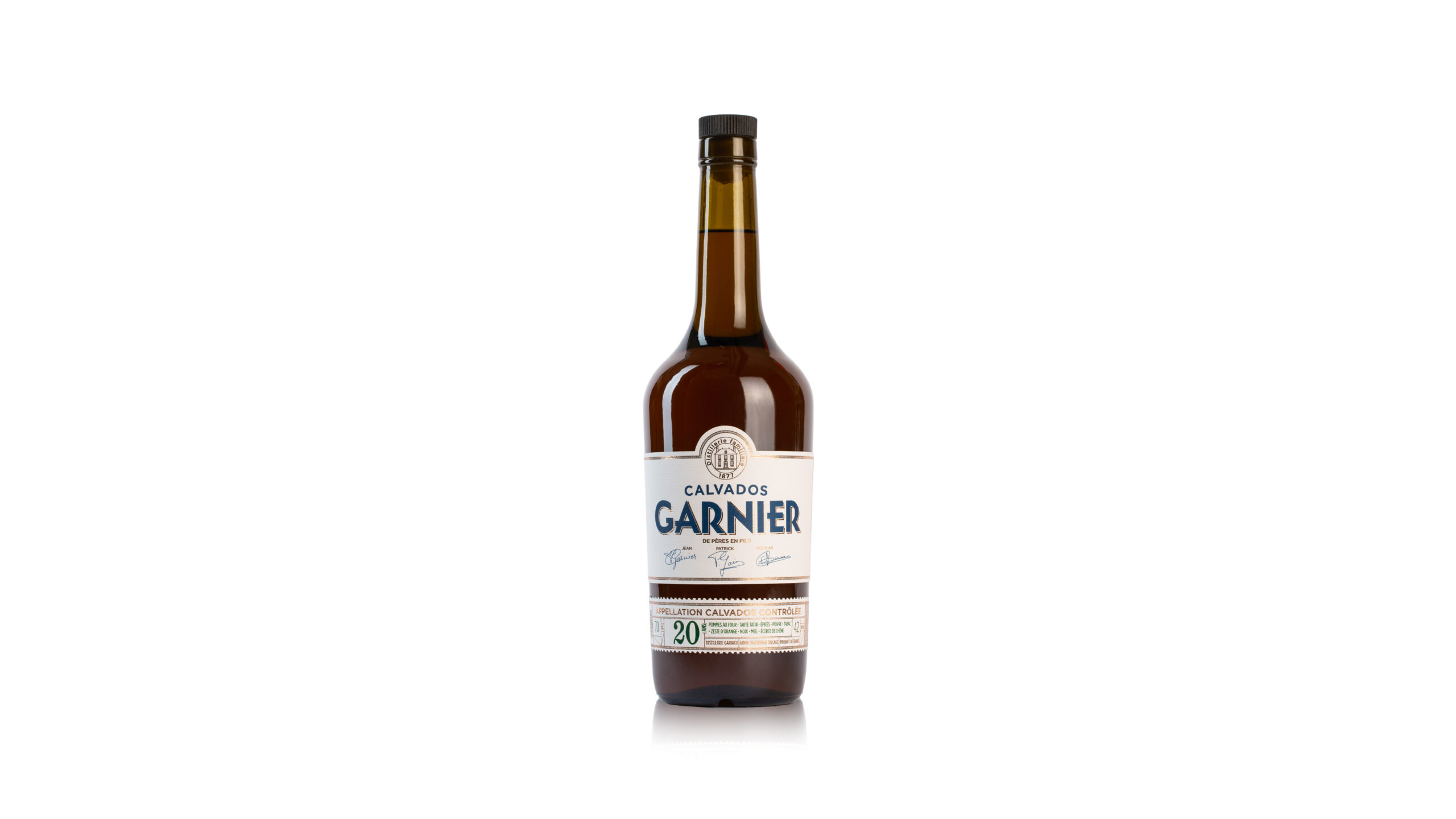
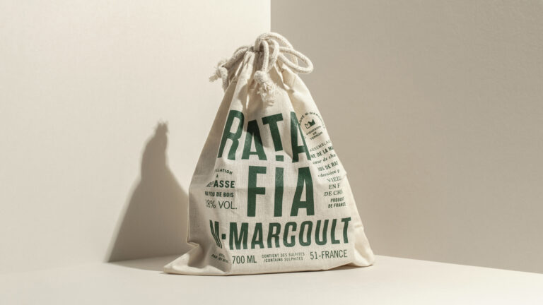
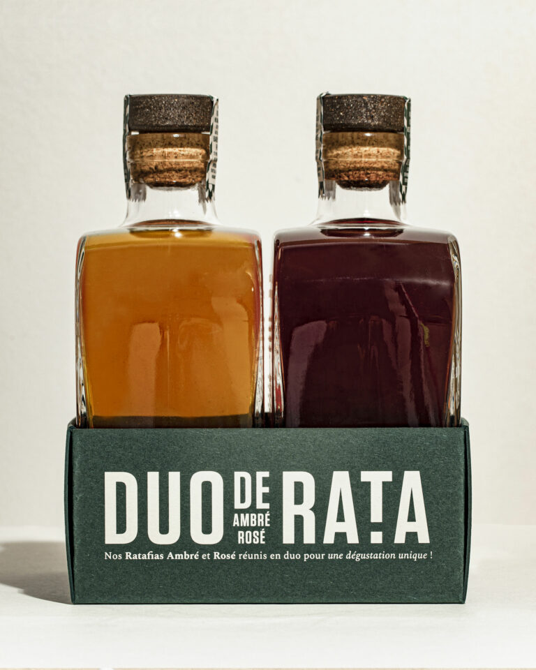
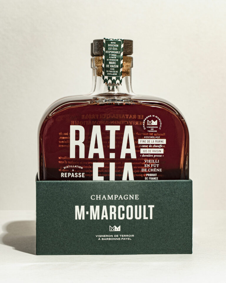
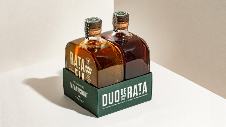
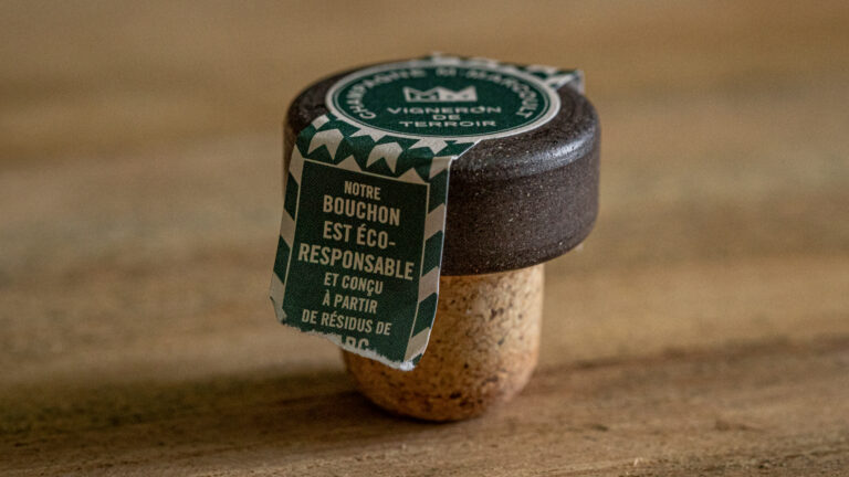
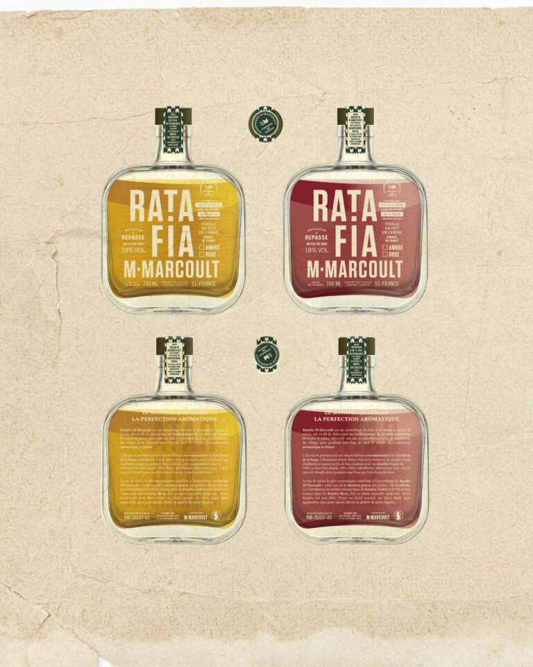
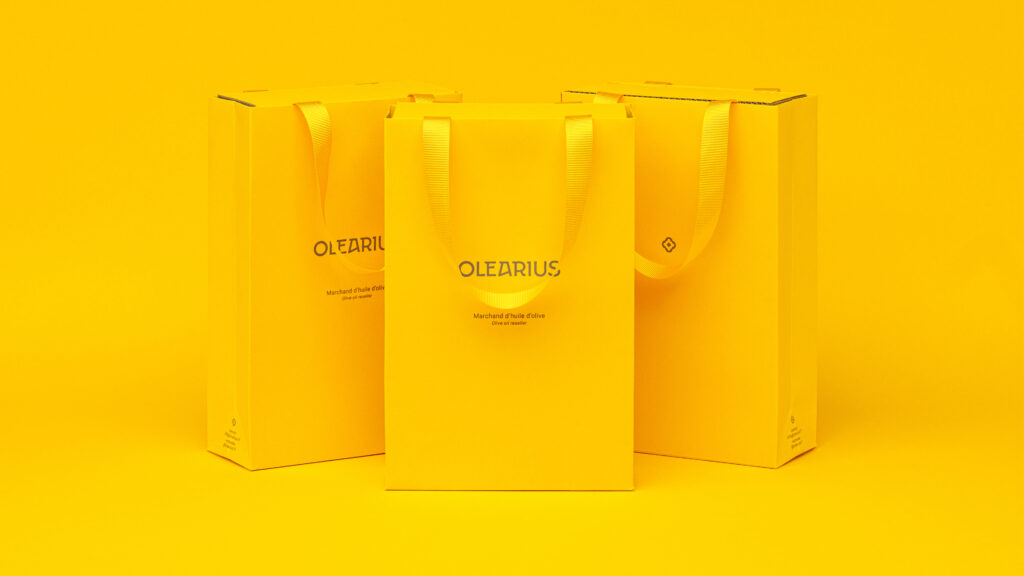
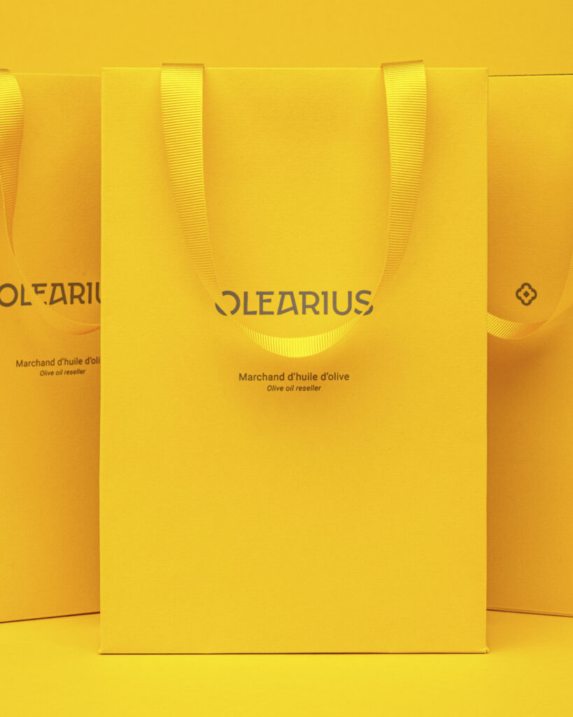
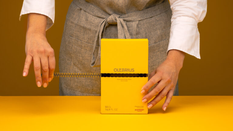
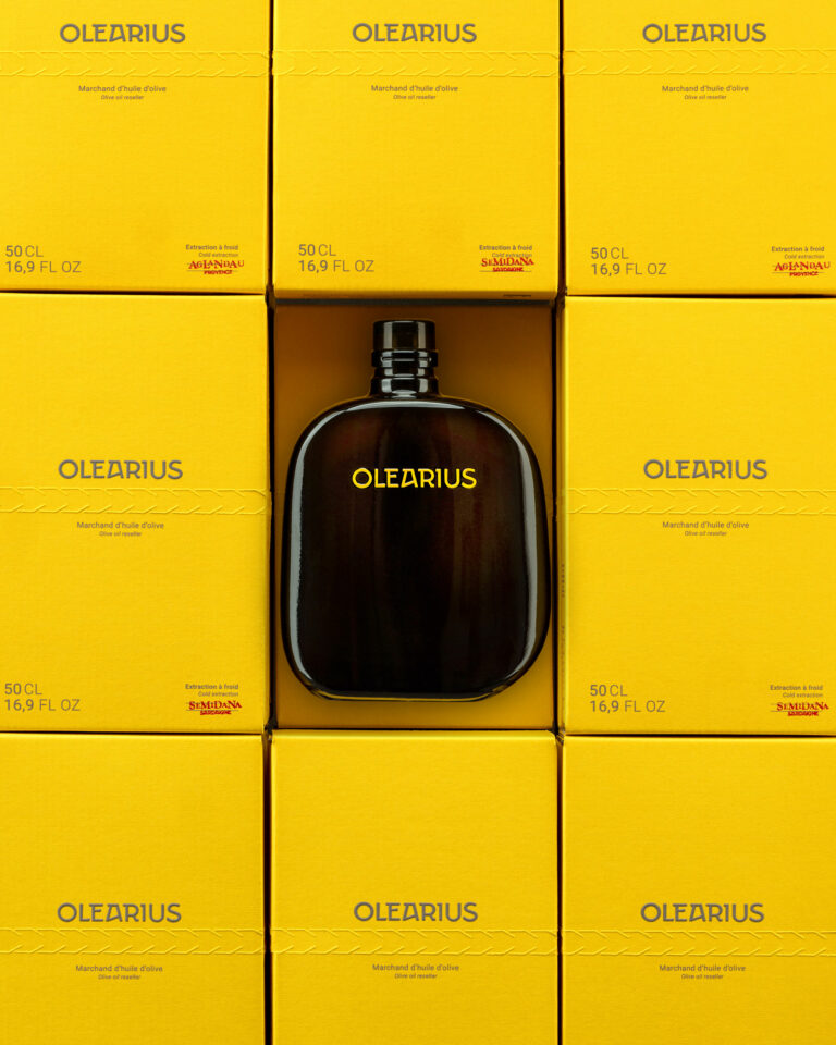
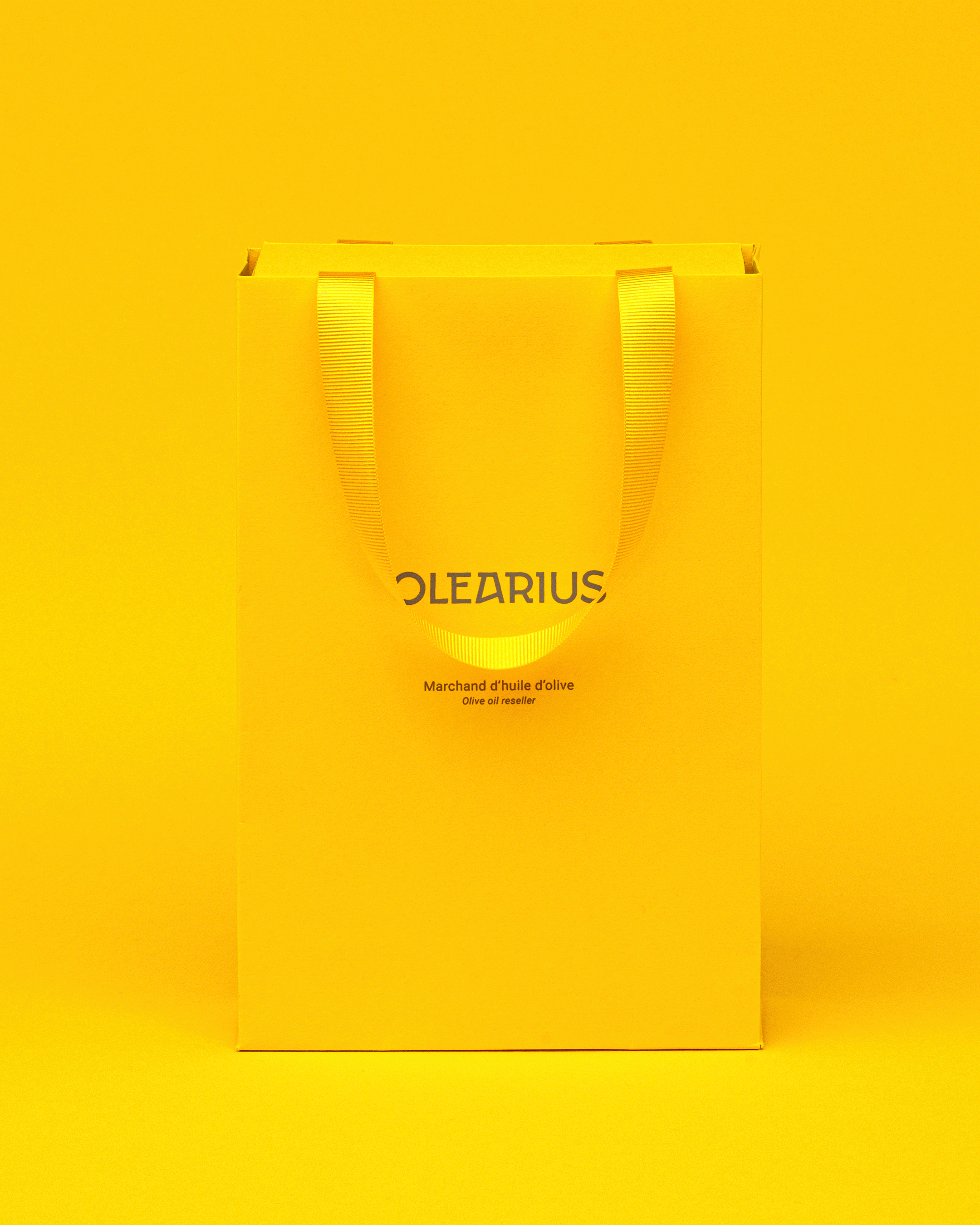
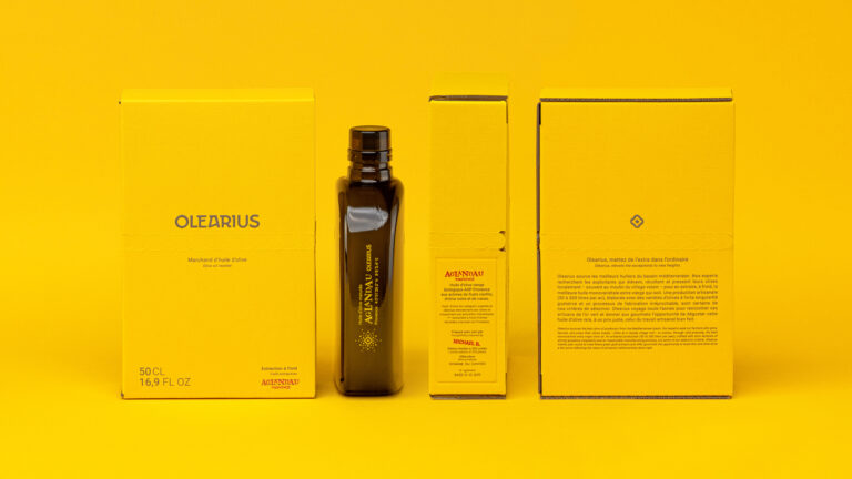
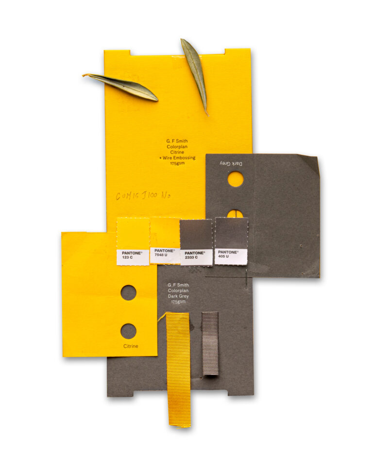
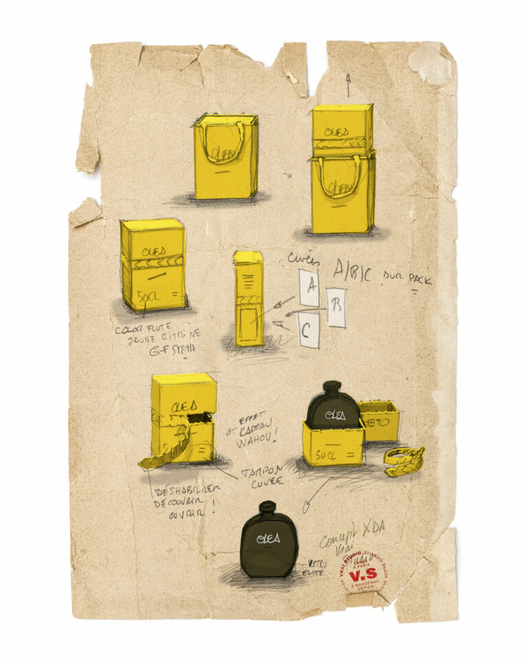
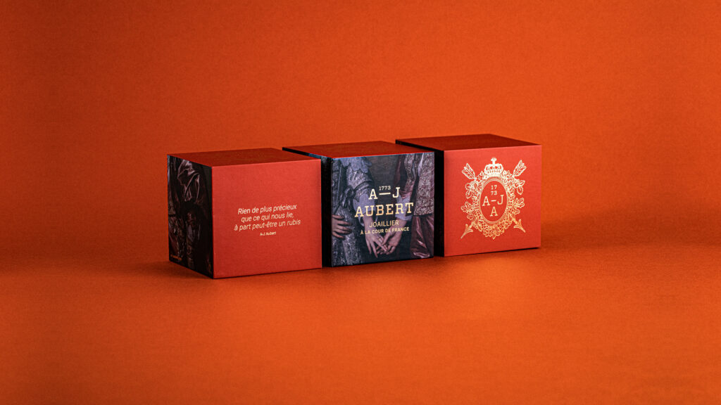
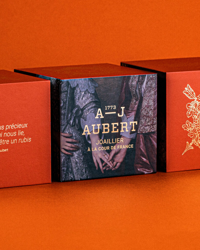
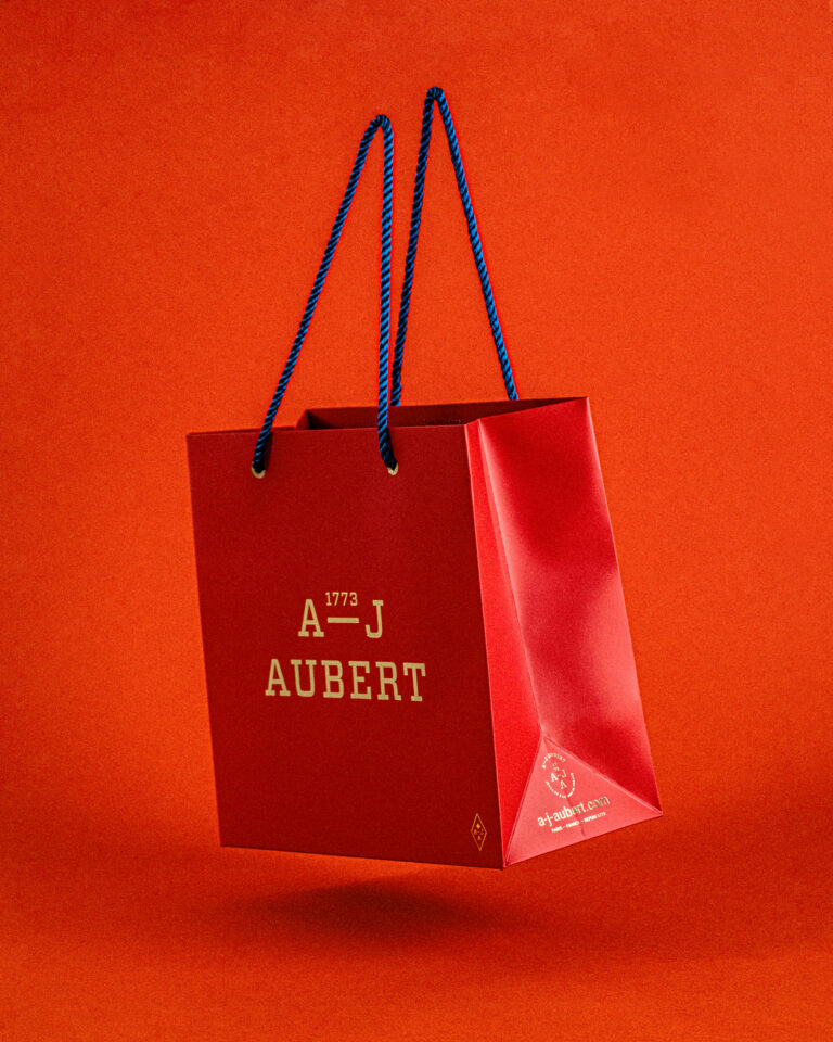
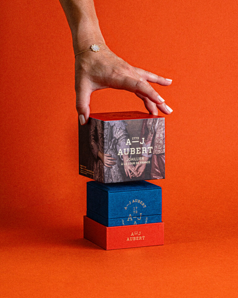
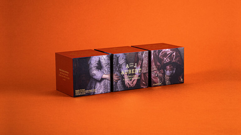
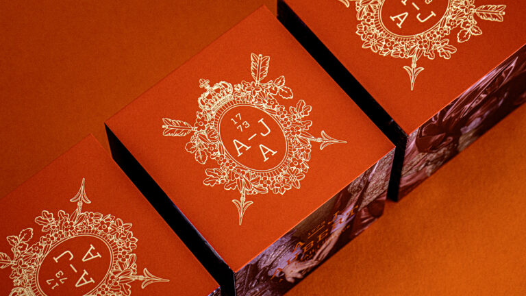
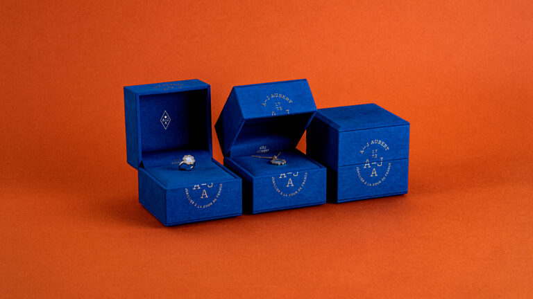
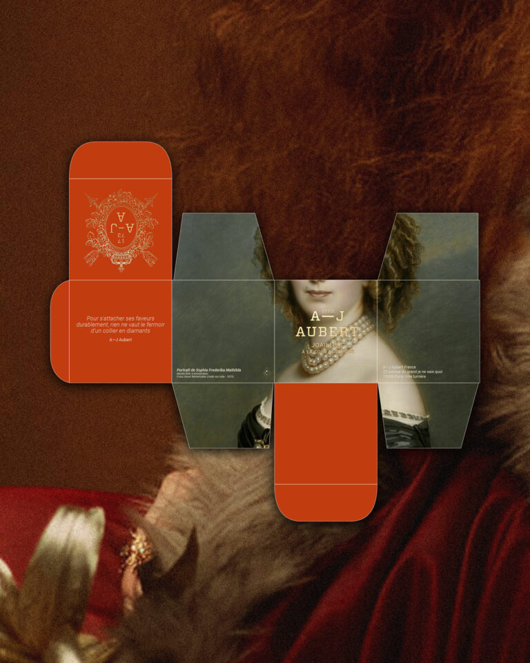
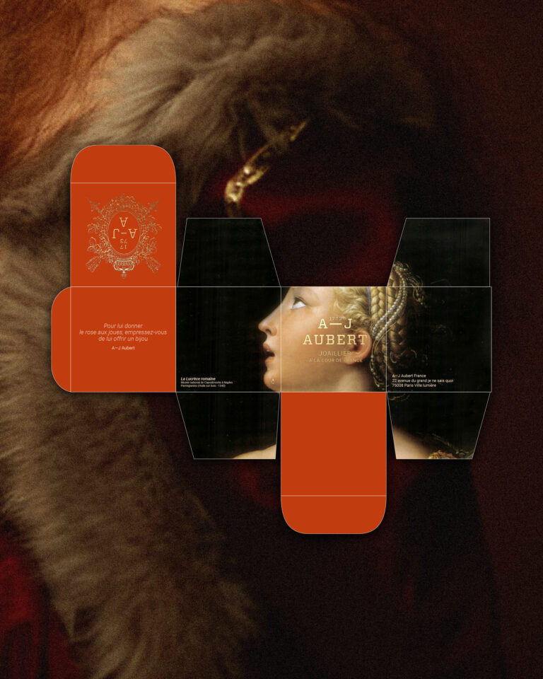
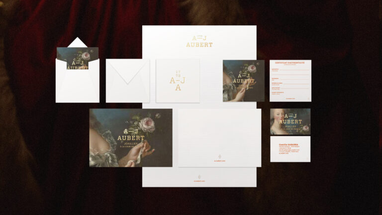
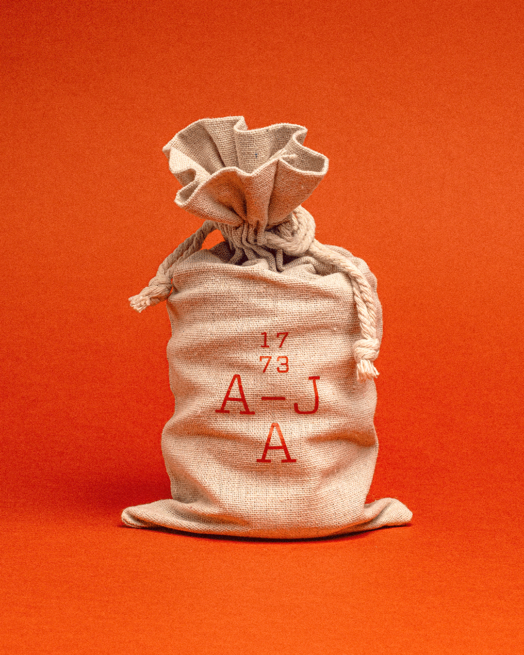
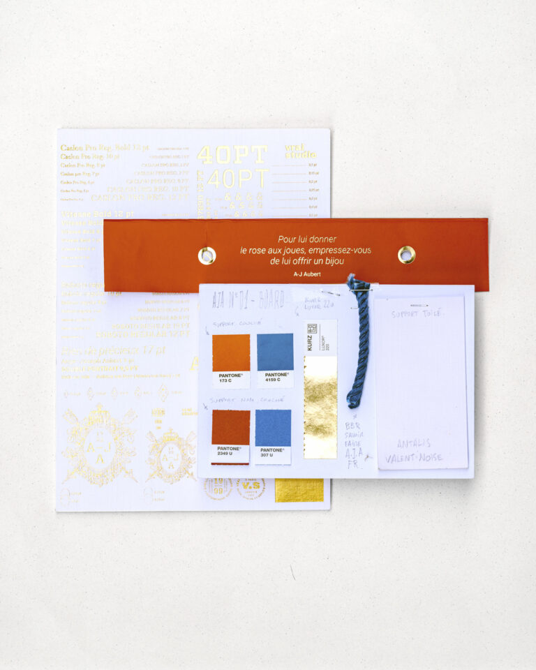
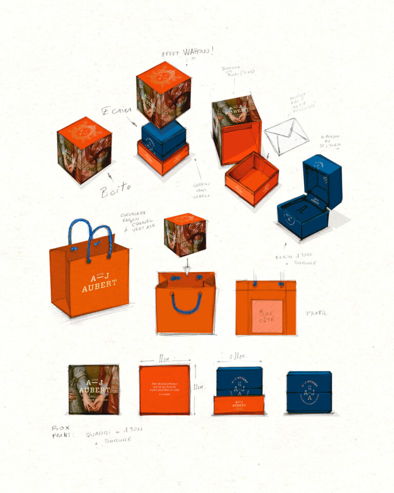
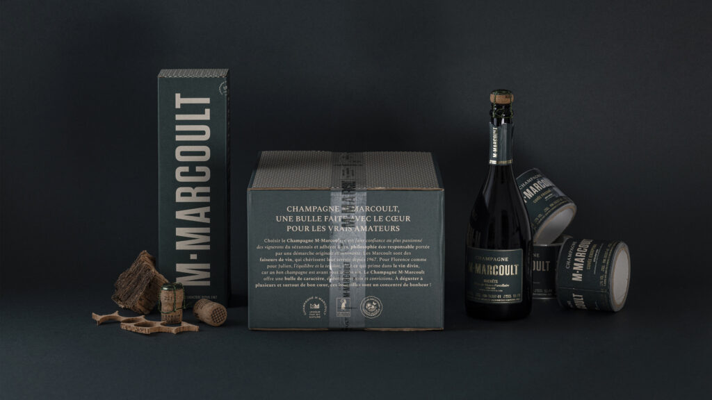
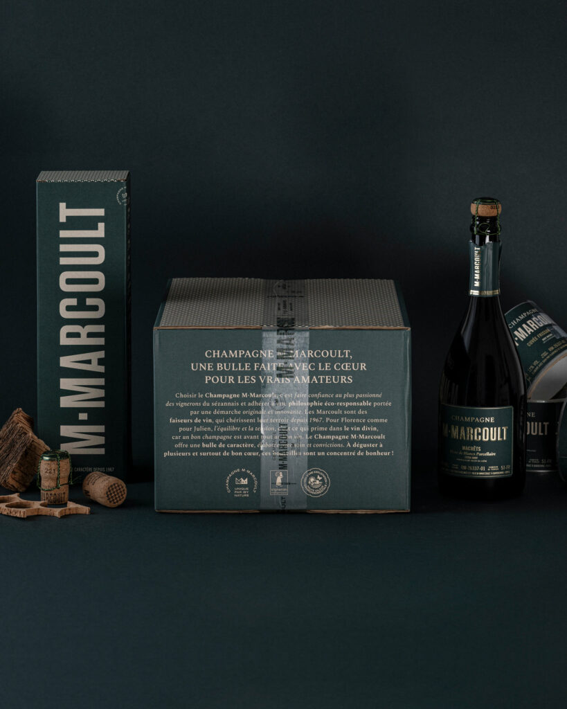
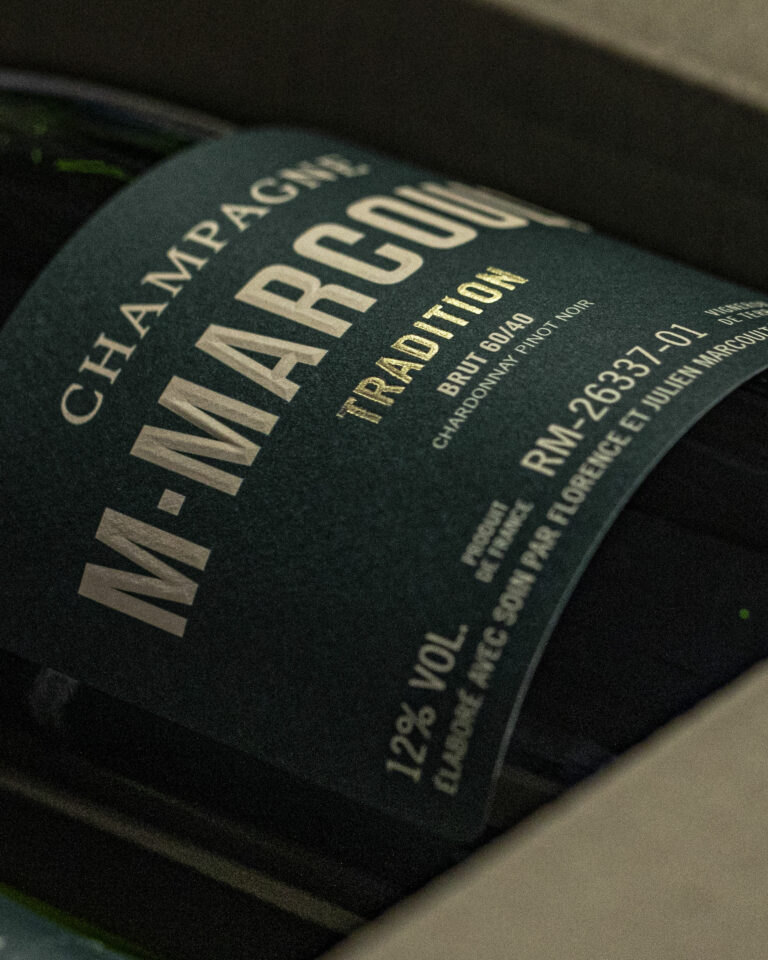
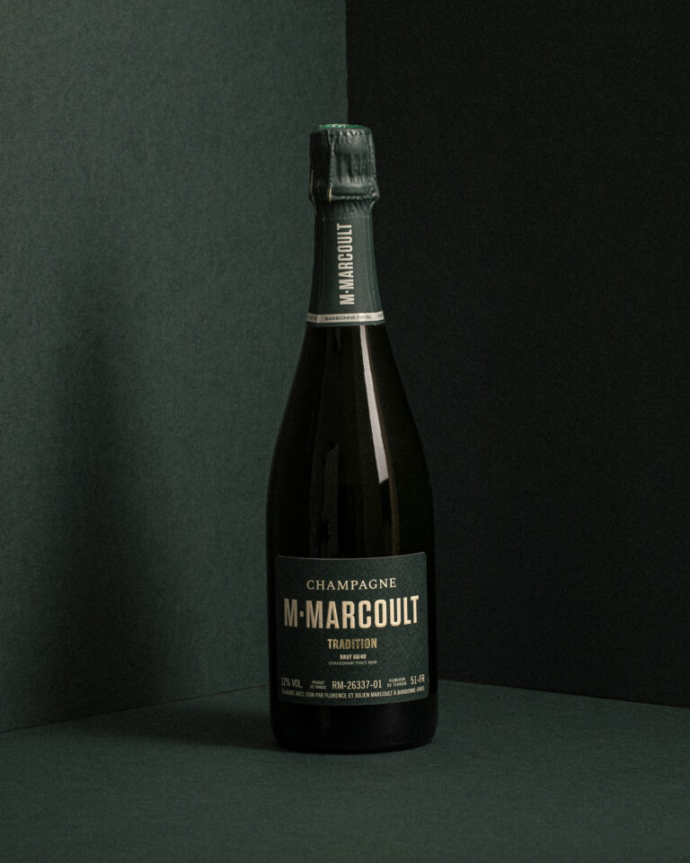
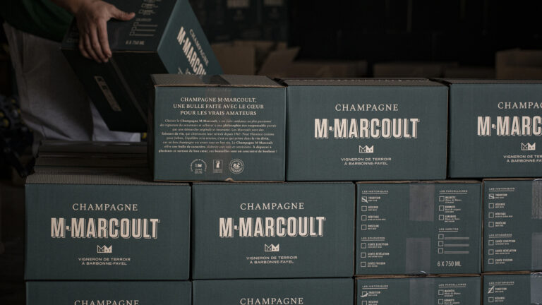
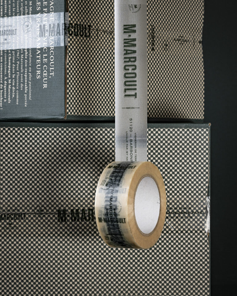
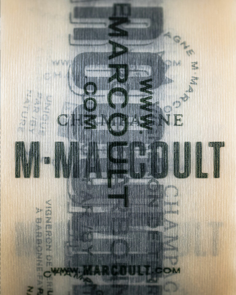
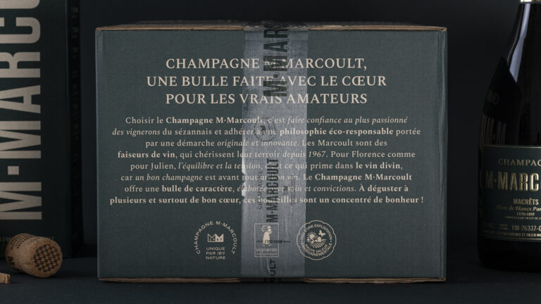
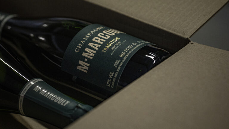
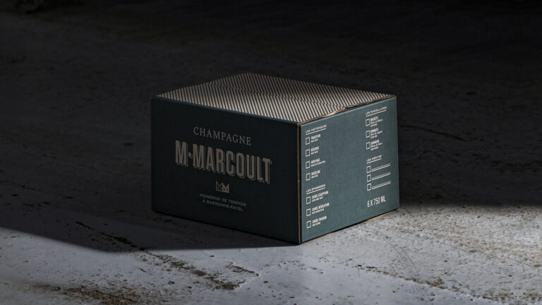
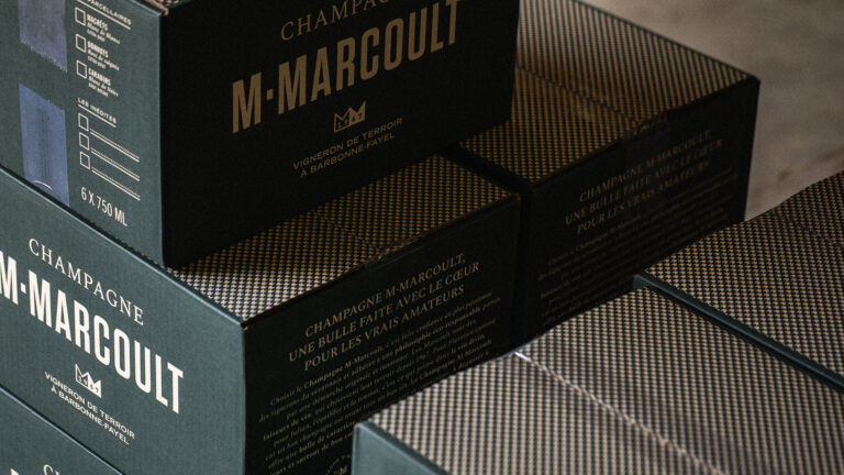
- Packaging
- Project management
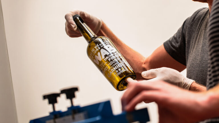
- Manufacturing management
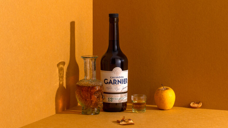
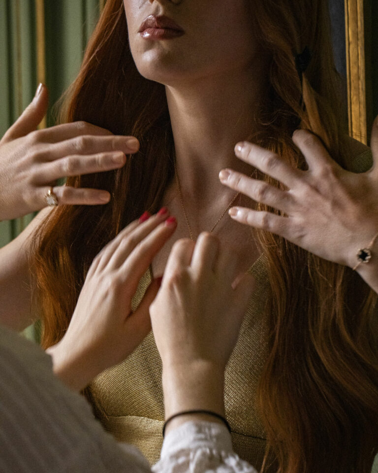
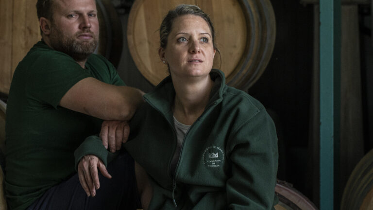
- Photography
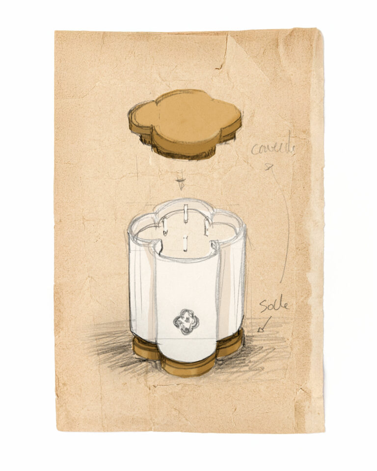
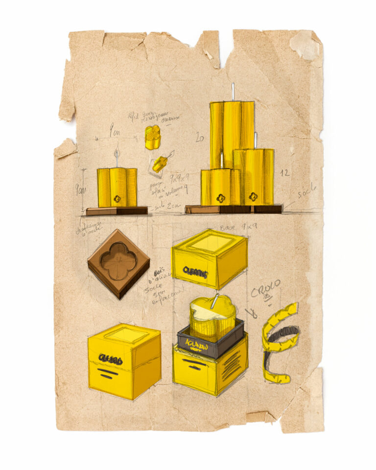
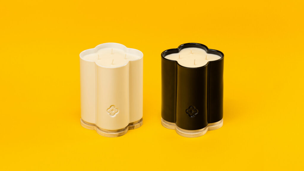
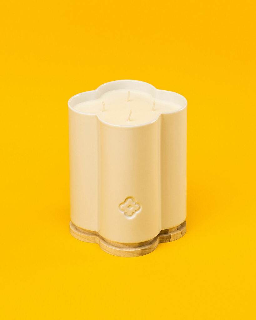
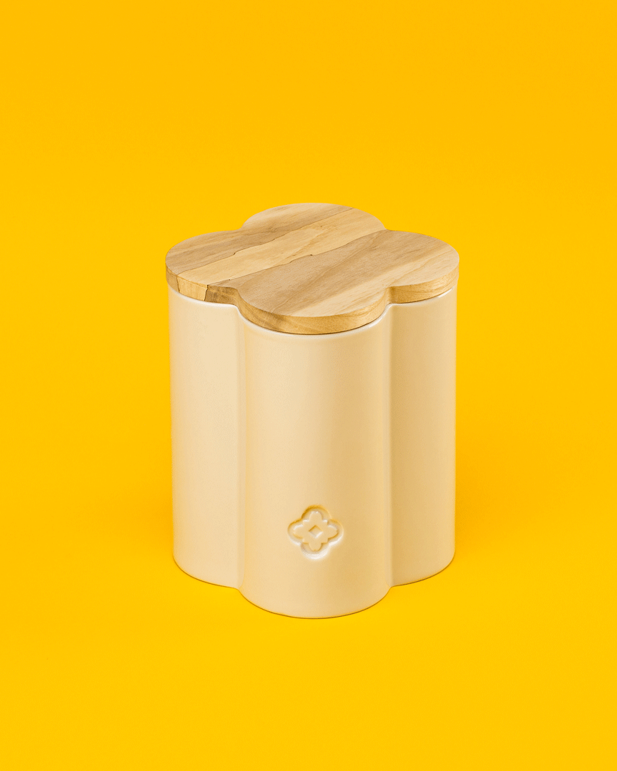
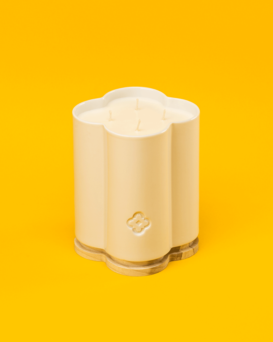
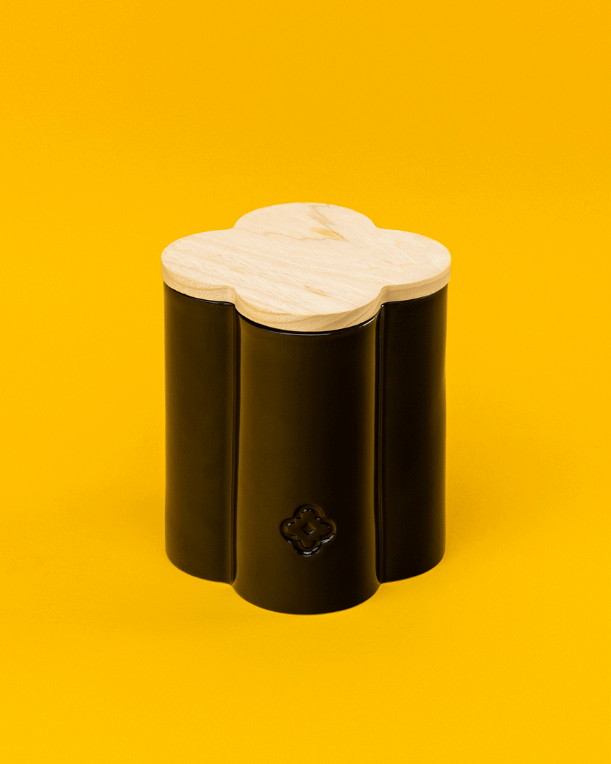
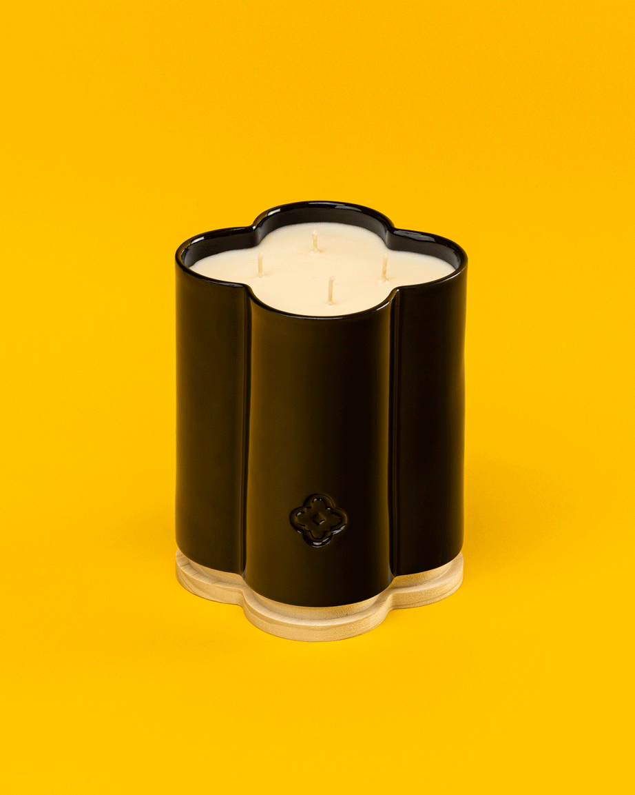
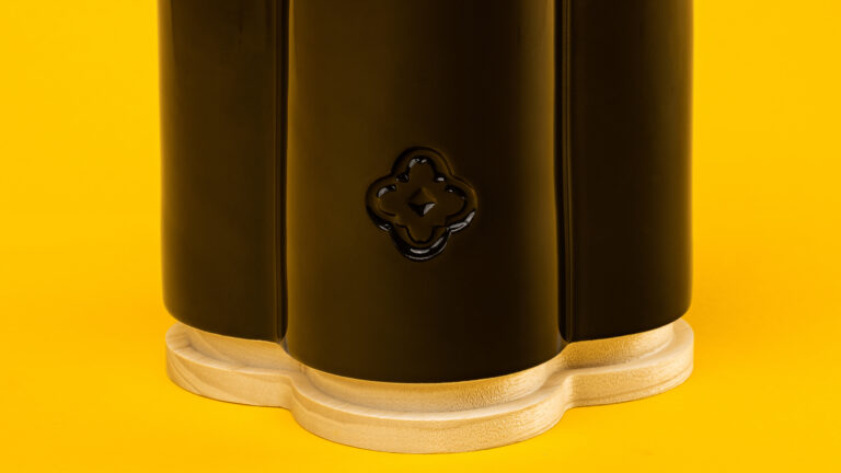
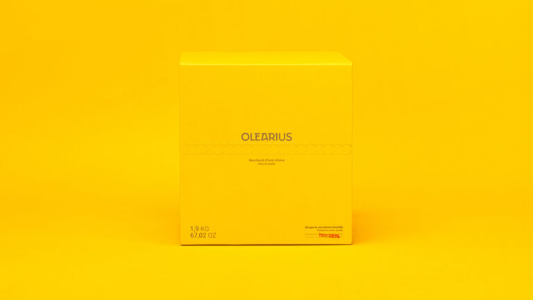
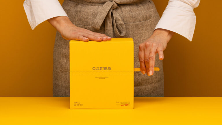
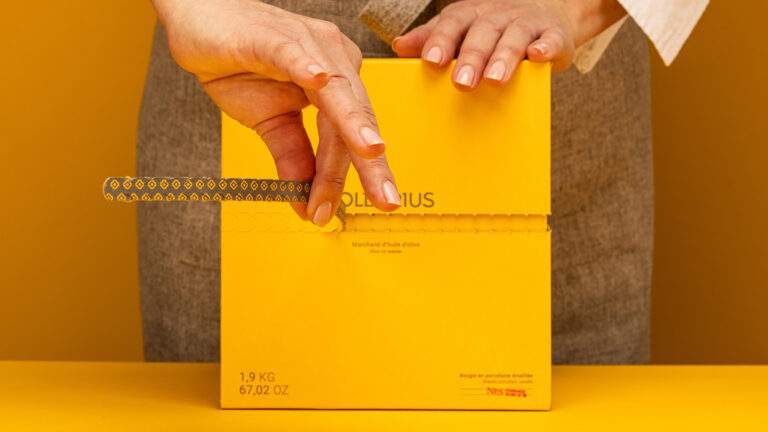
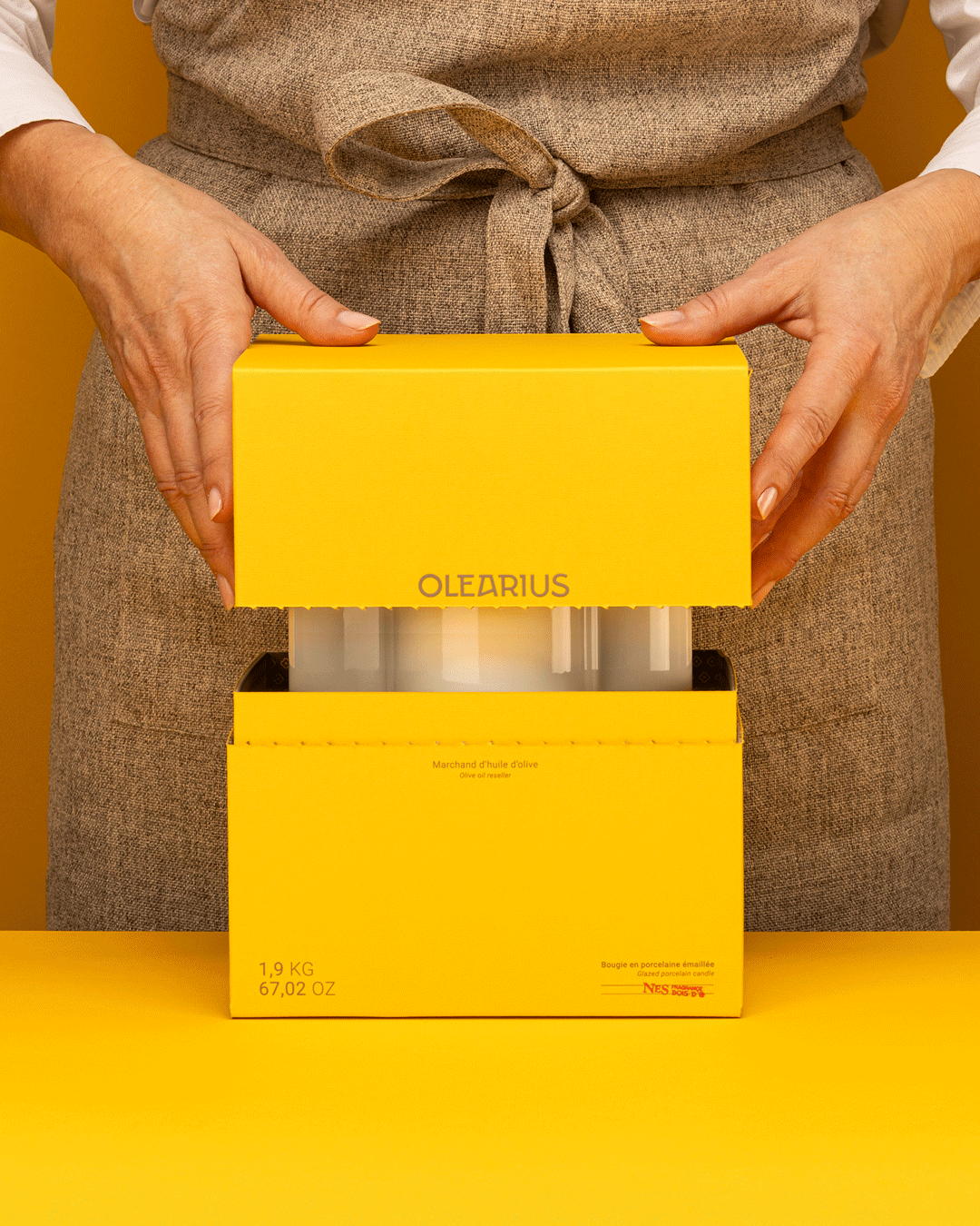
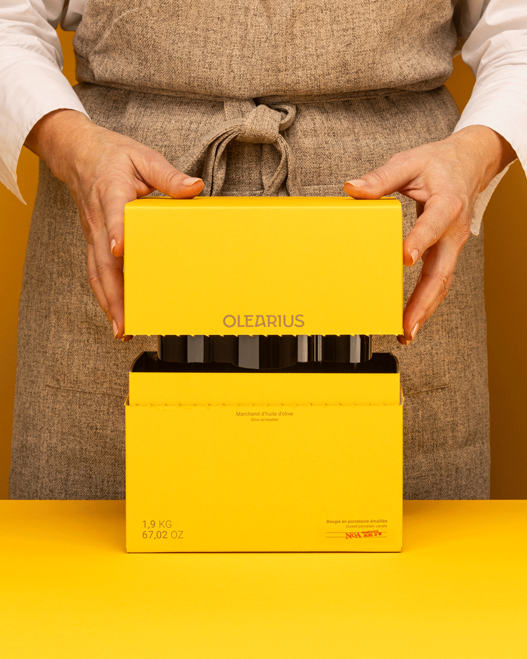
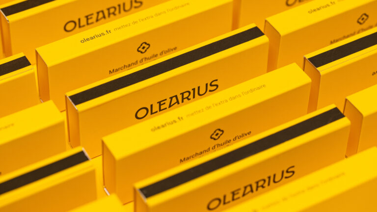
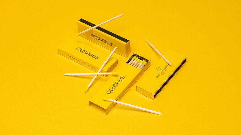
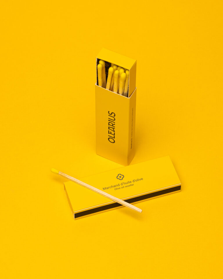
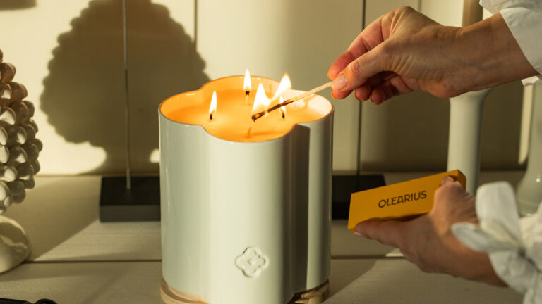
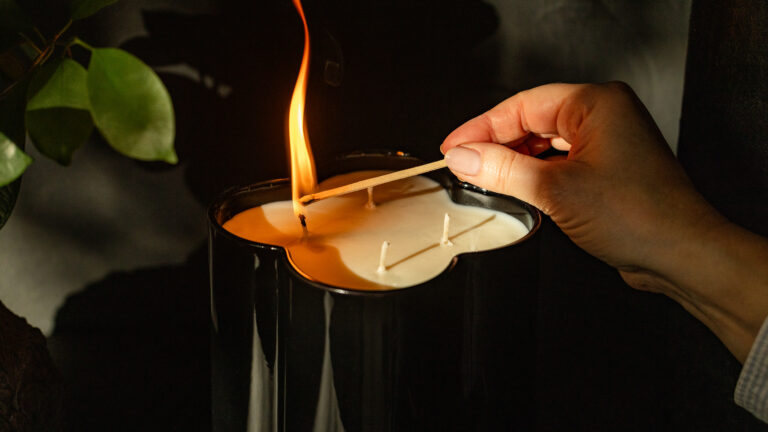
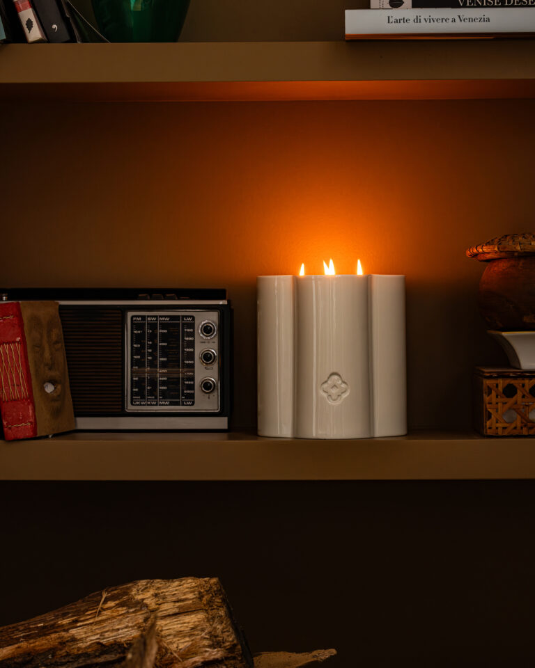
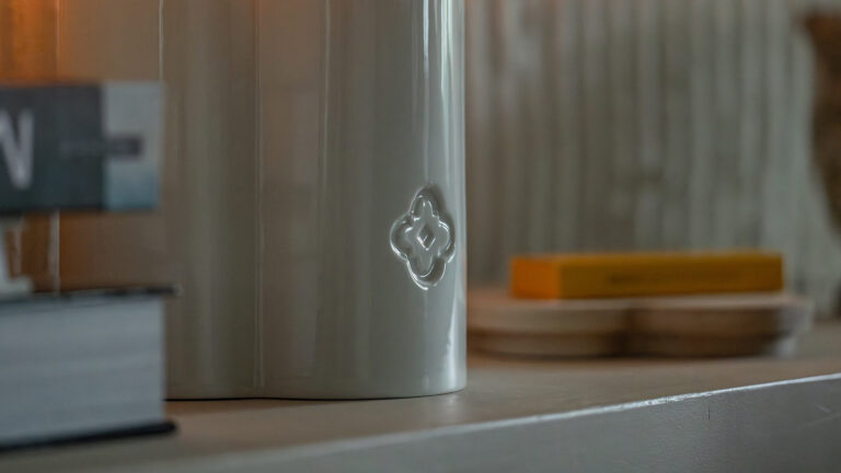
Olearius has entrusted us with the creation of their home candles and packaging. This time, vrai studio designing objects. These handcrafted candles, featuring a contemporary design created by us, are made of Limoges porcelain. Accompanied by a box of matches, these two candles expand the product line.
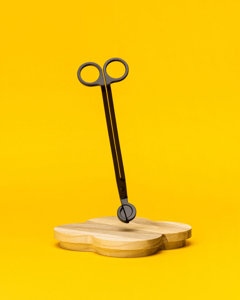
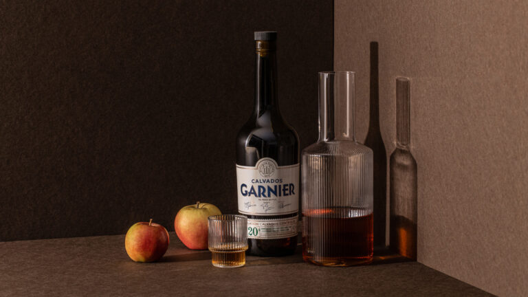
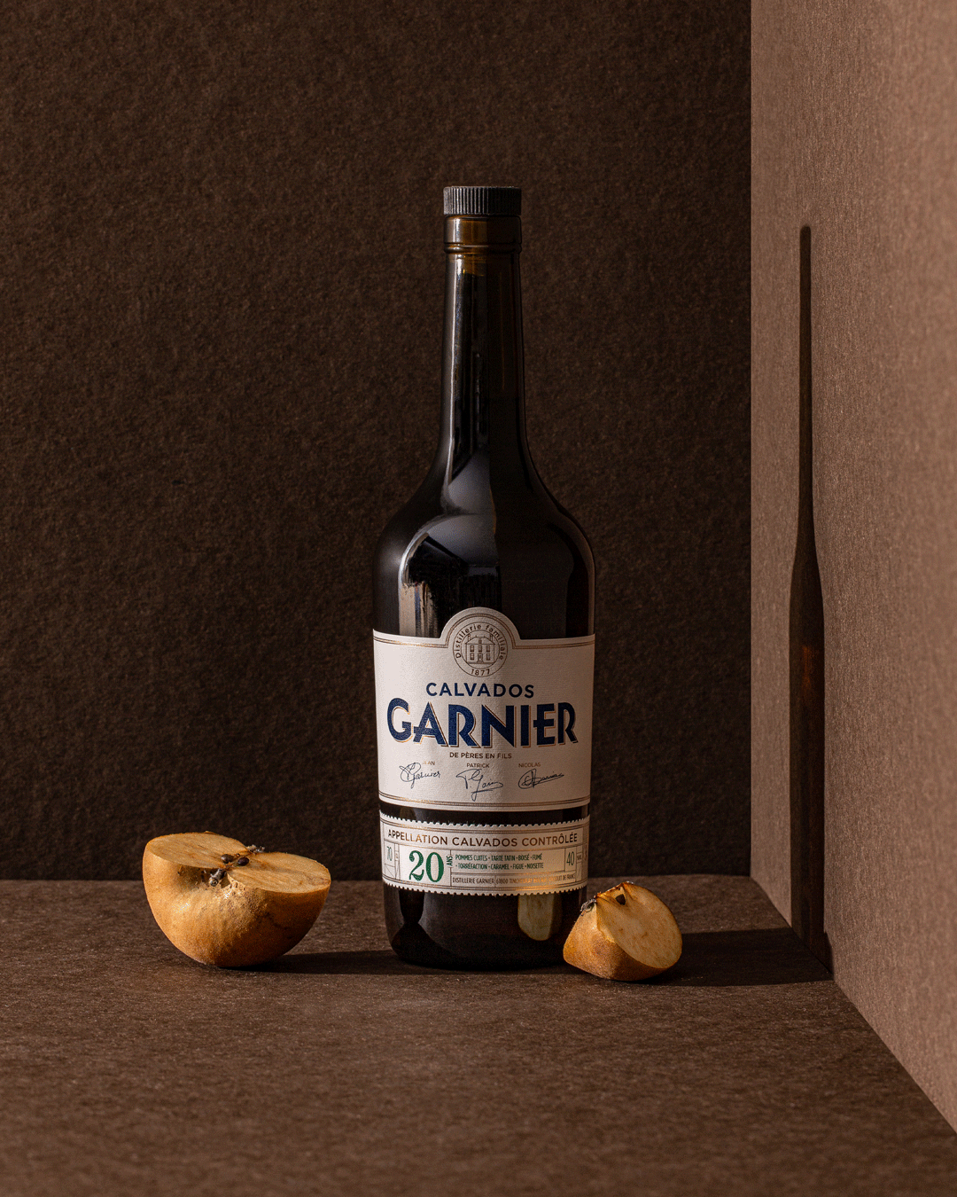
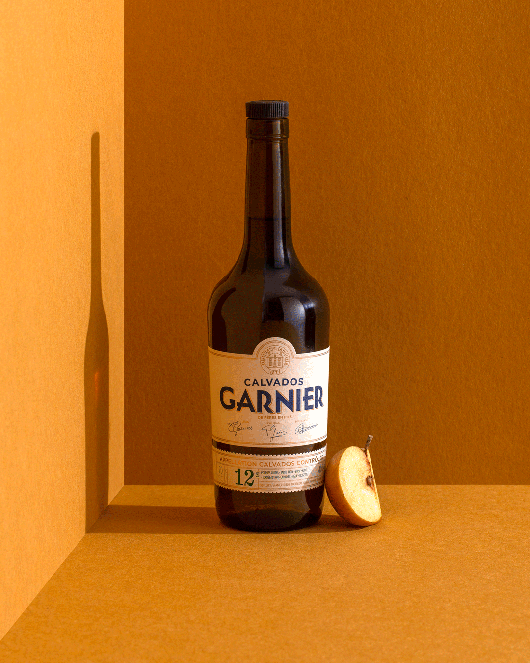
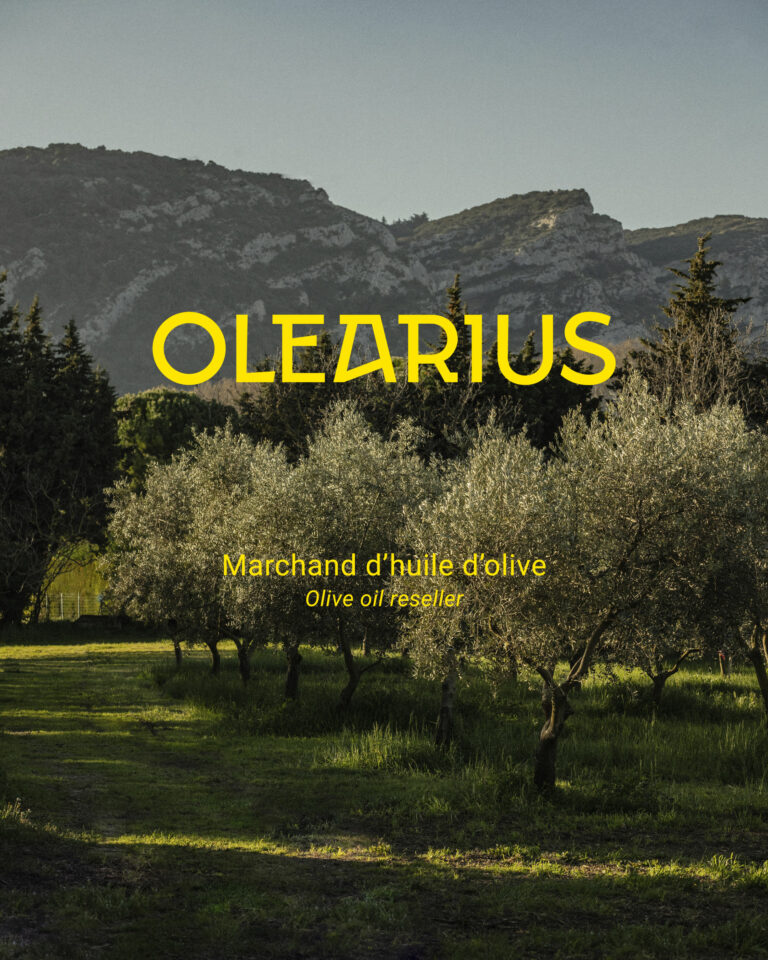
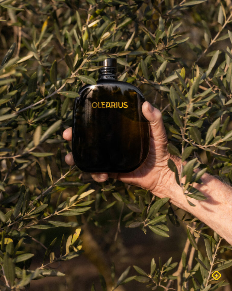
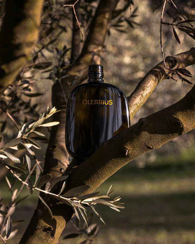
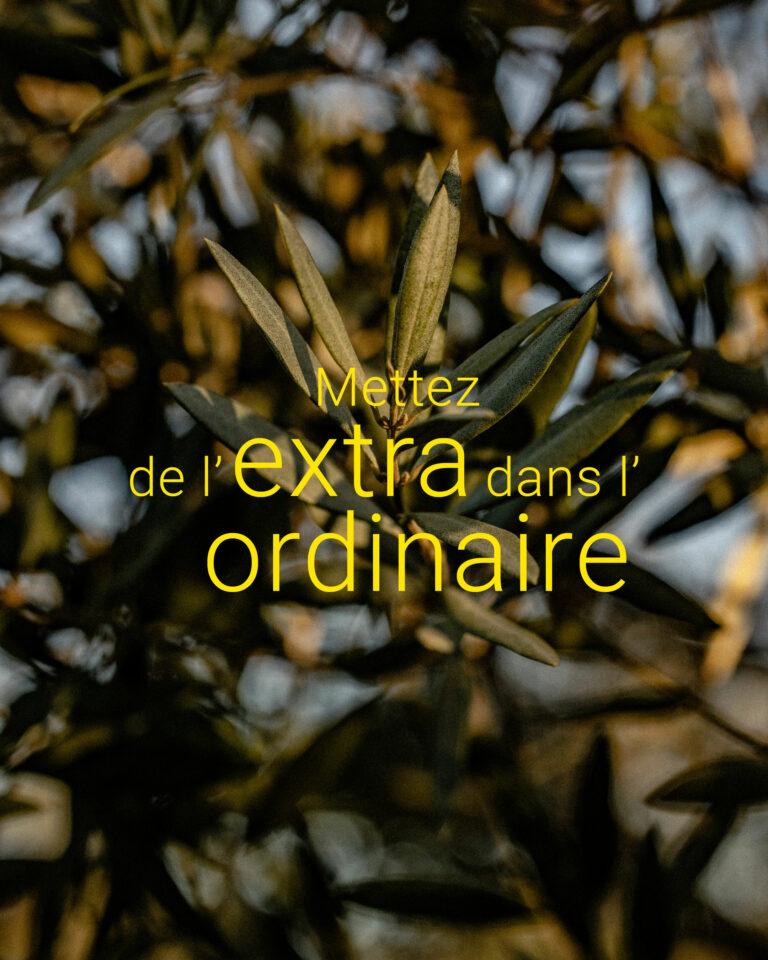
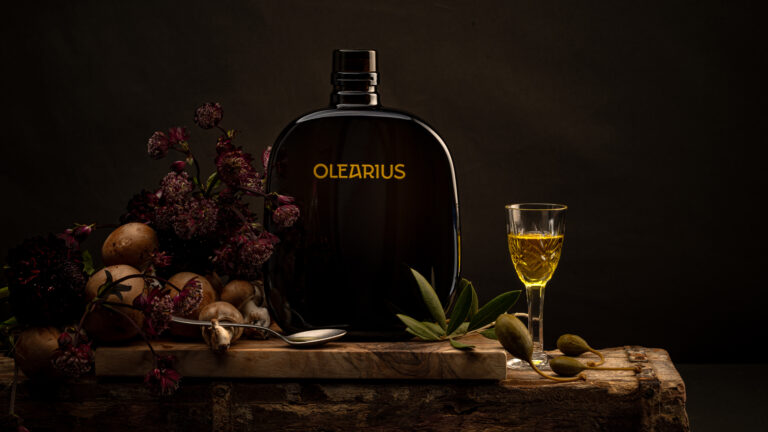
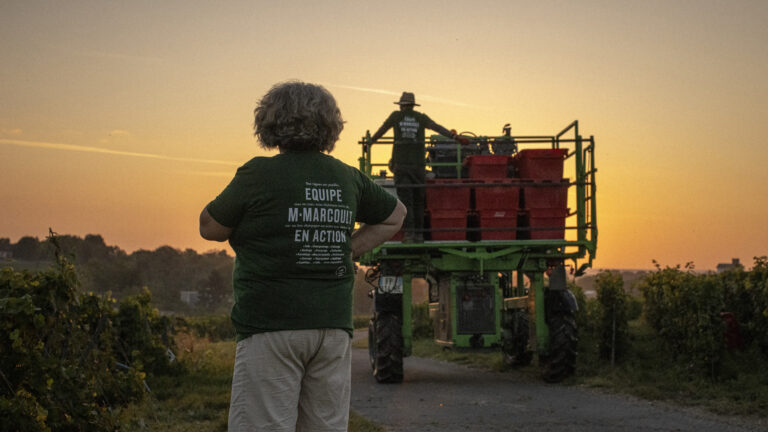
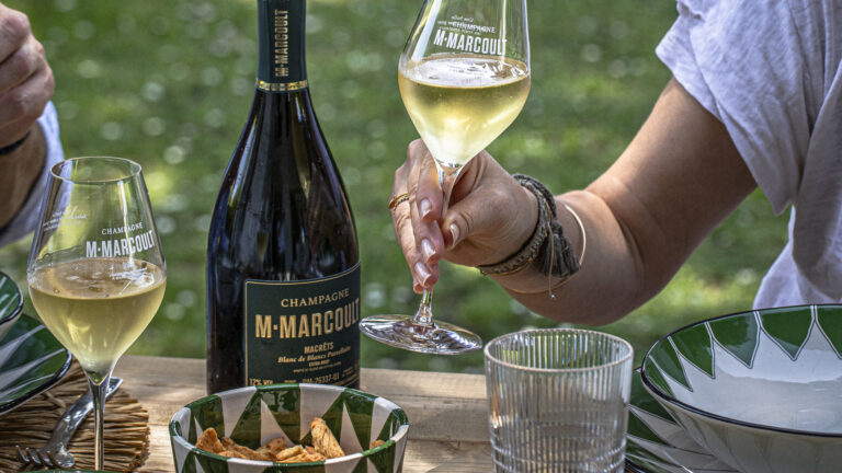
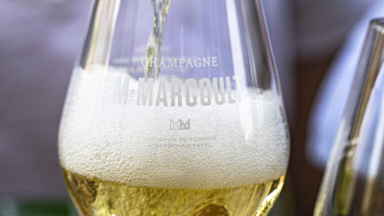
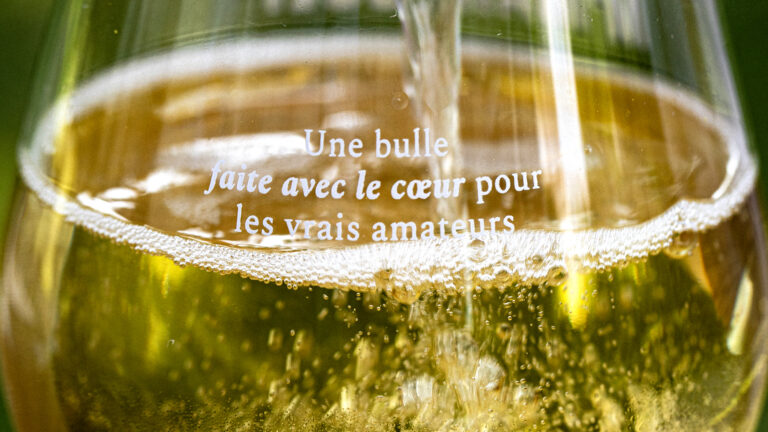
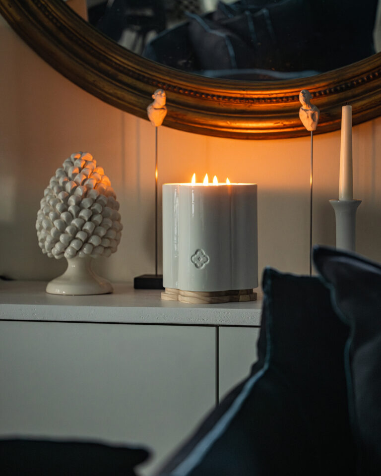
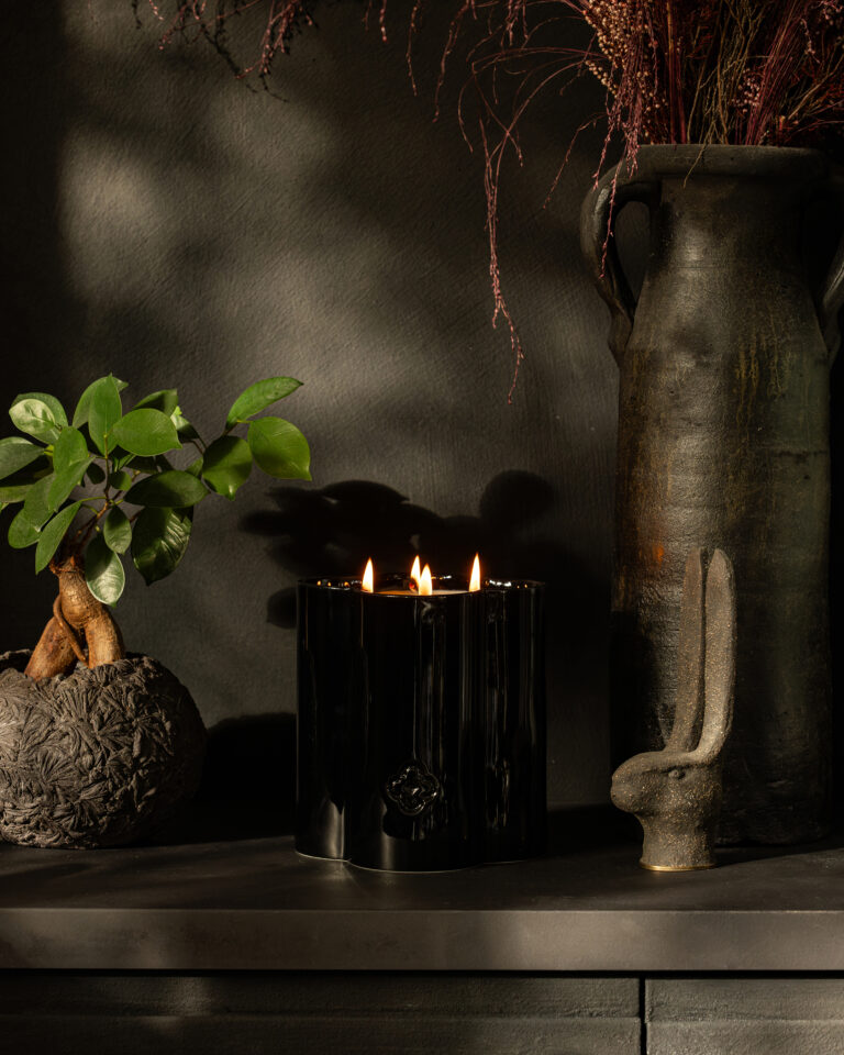
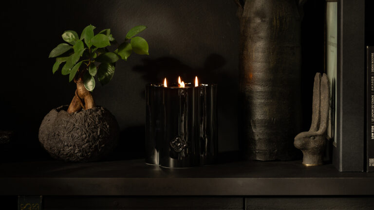
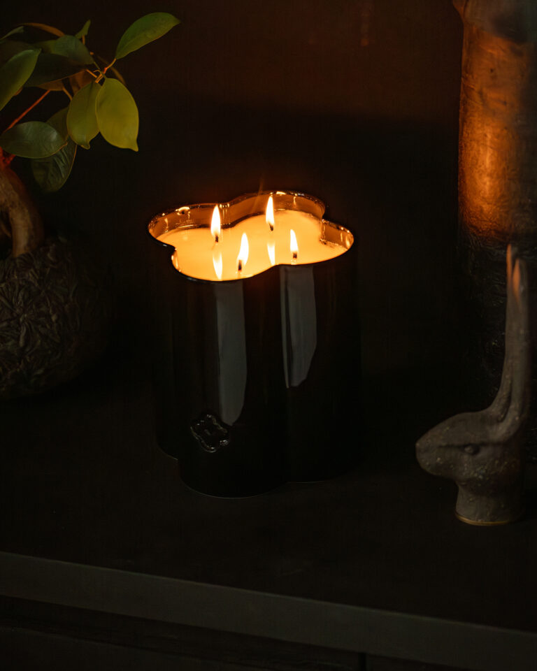
Products in their environment, decorative mood for communication

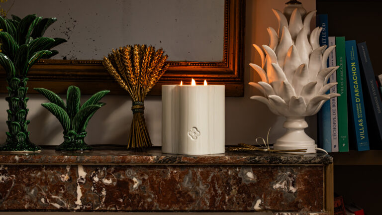
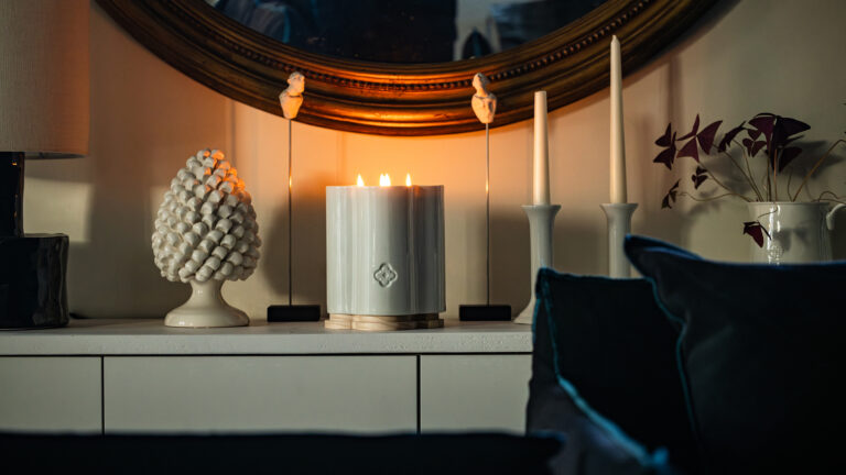
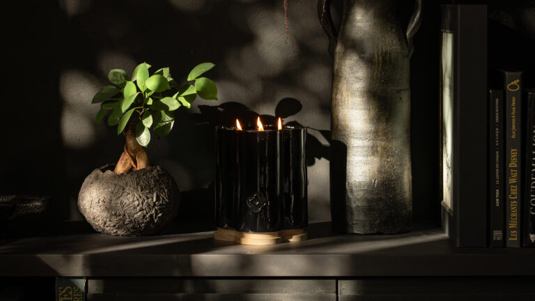
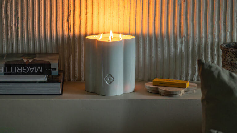
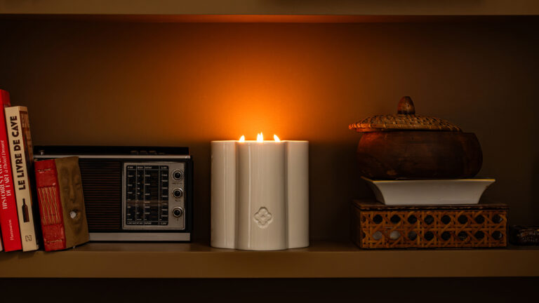
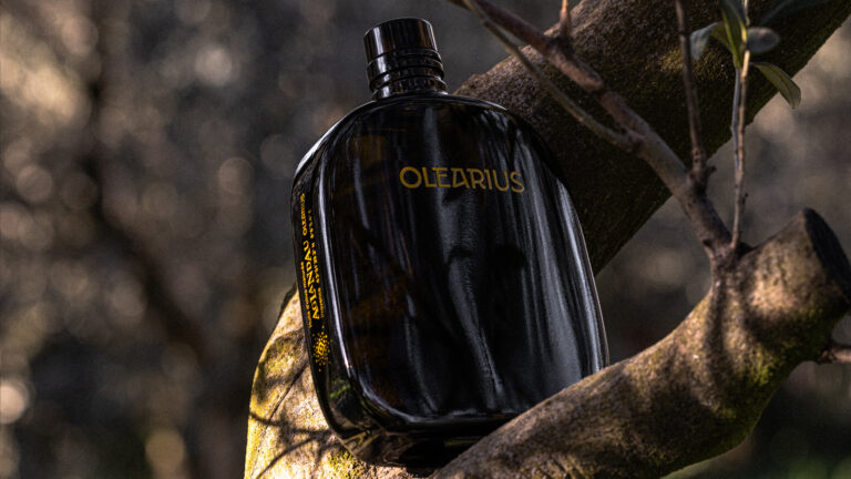
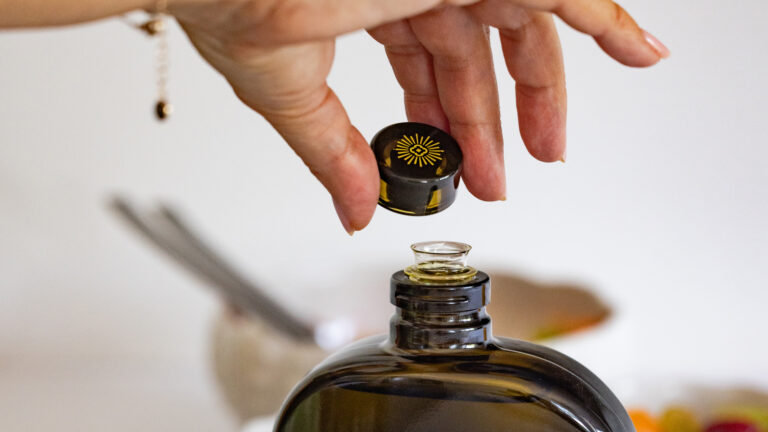
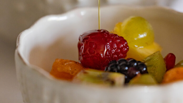
For Olearius, the candle is not a spin-off product. It is a natural extension of the brand into the world of home goods, designed with the same attention to detail as its olive oils.
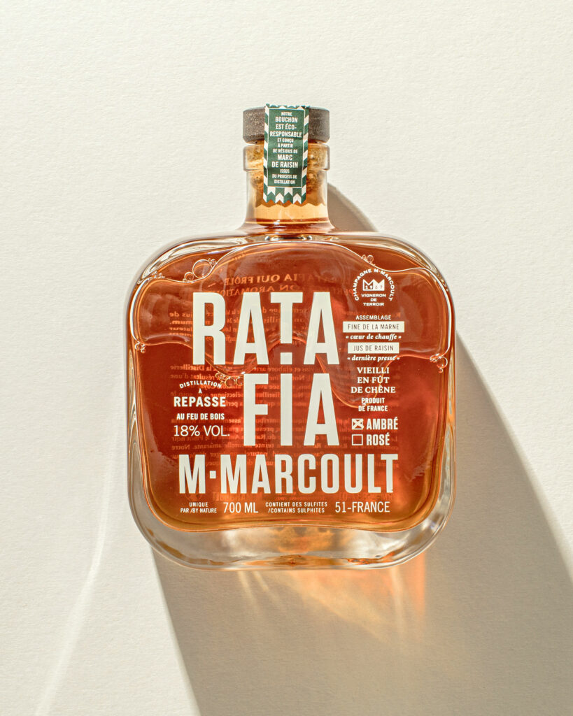
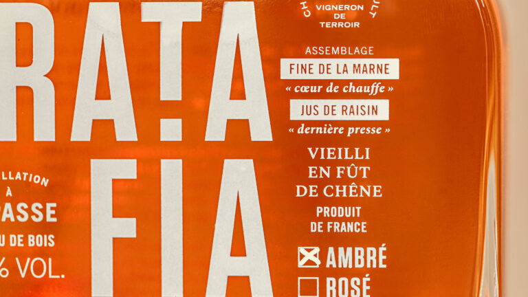
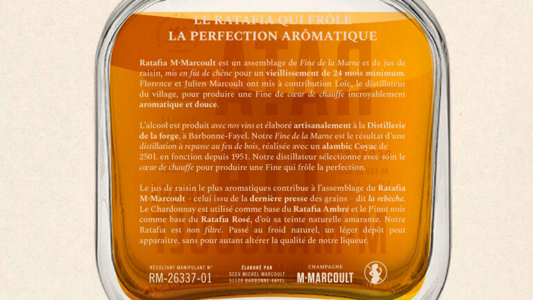
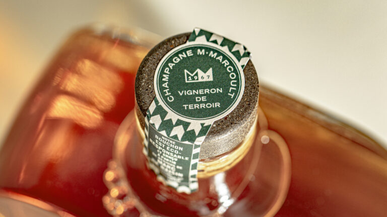
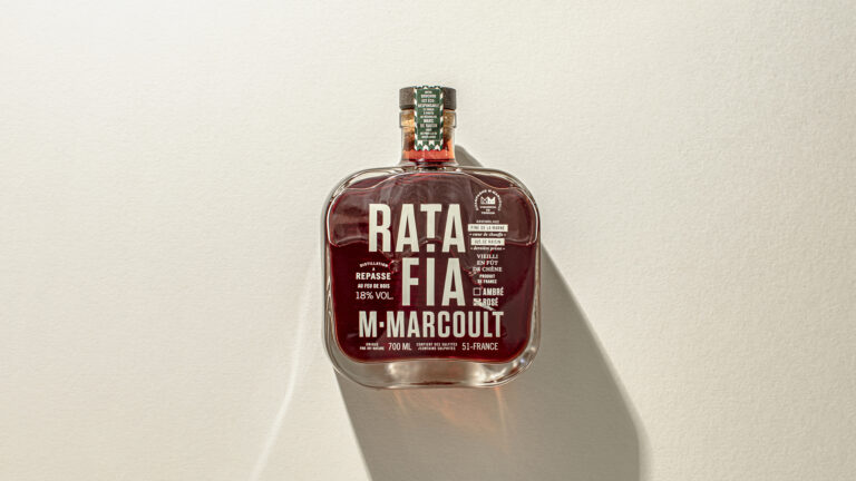
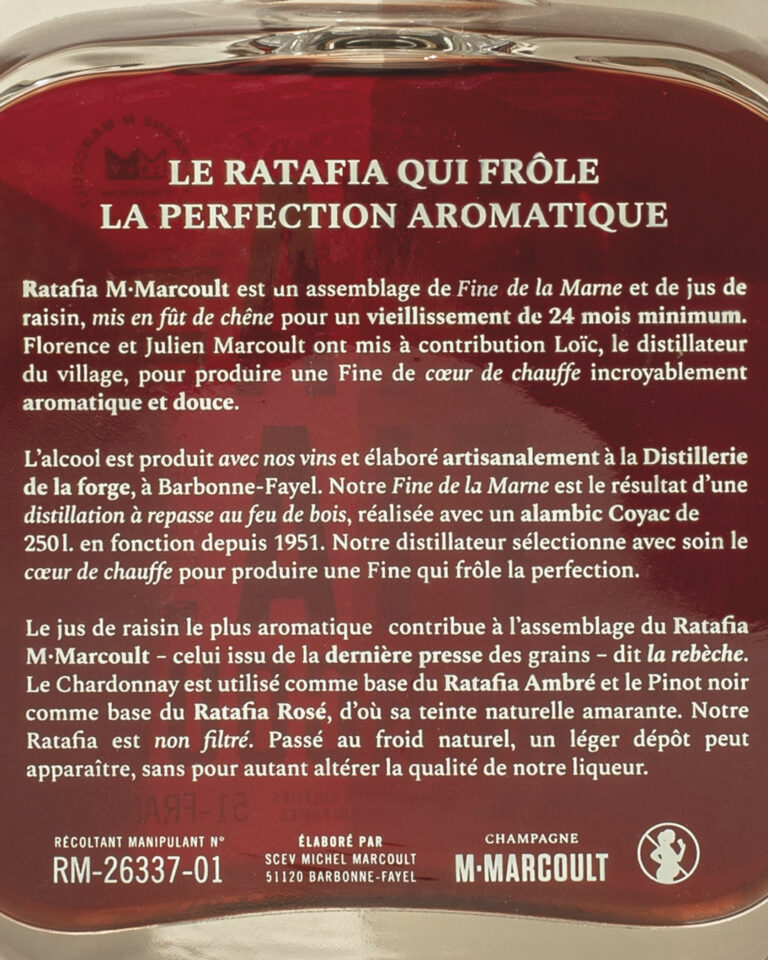
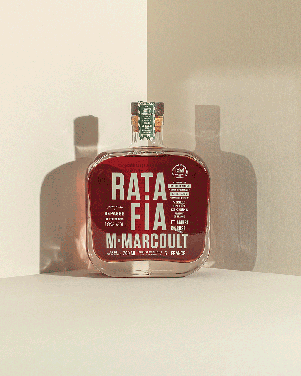
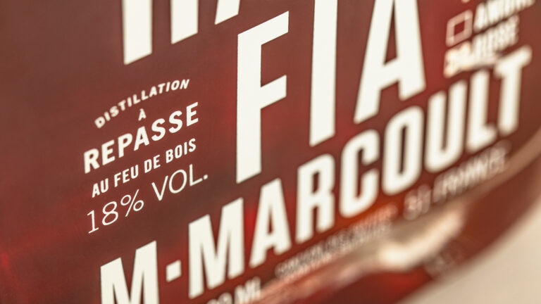
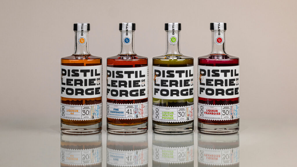
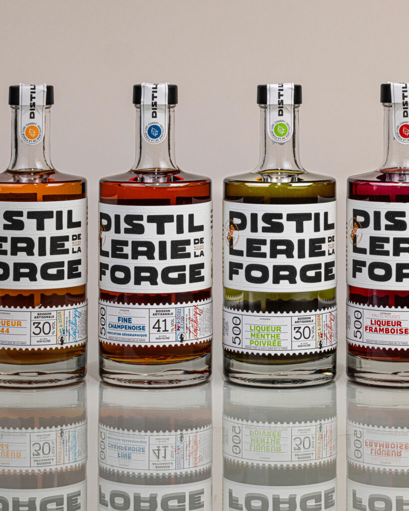
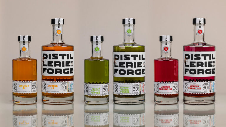
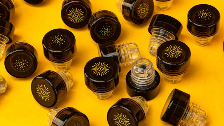
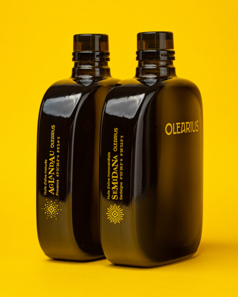
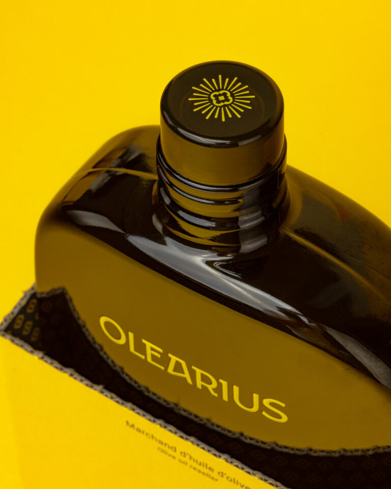
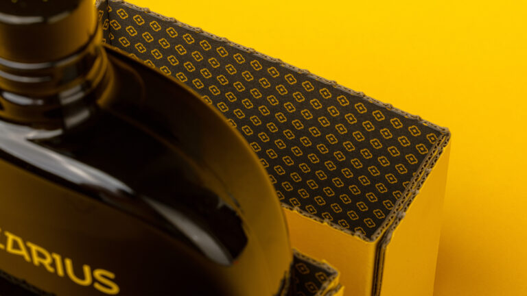
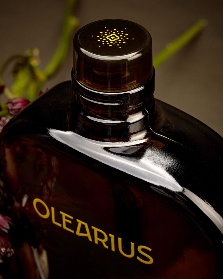
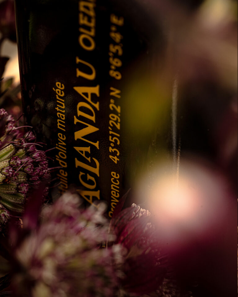
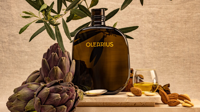
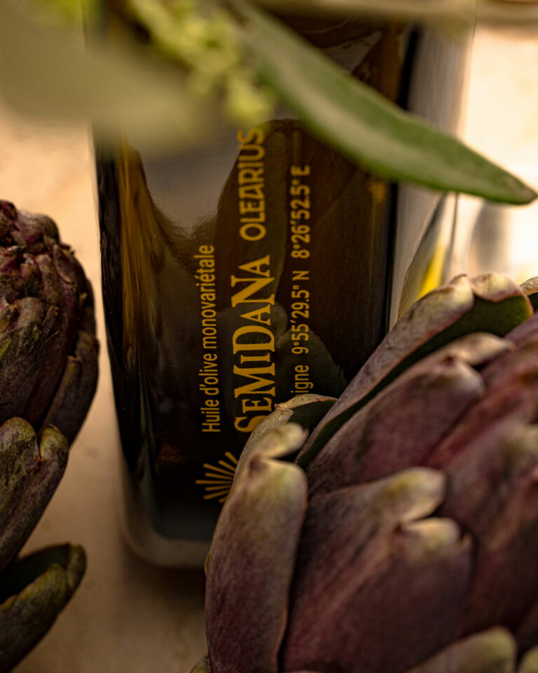
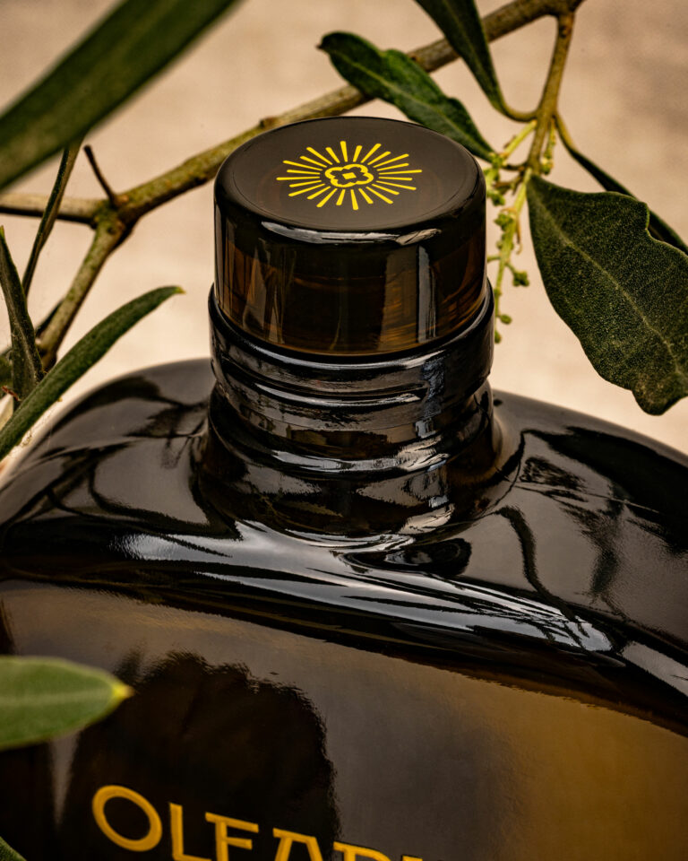
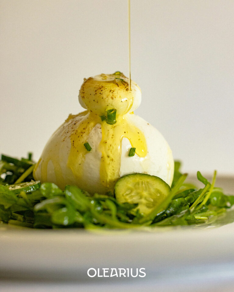
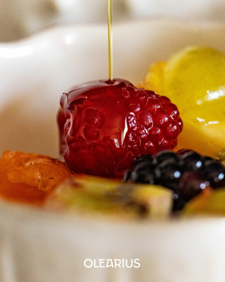
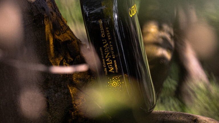
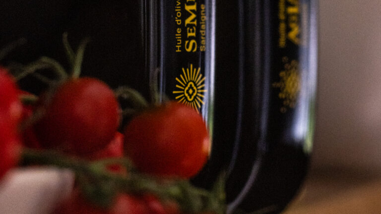
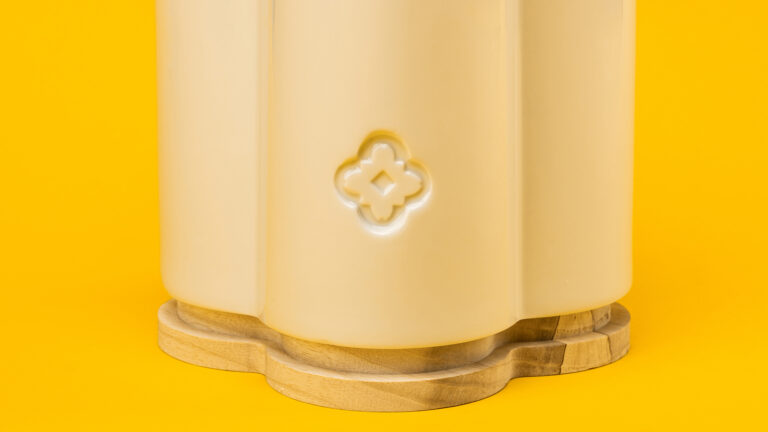
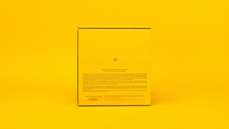
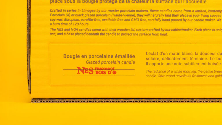
The project began with a search for French porcelain manufacturers, followed by a prototyping phase to find the exact container that would match the brand’s premium positioning. The choice fell on white Limoges porcelain and black Haute-Vienne porcelain, two noble materials associated with durability and quality. The artistic direction for the packaging is identical to that of the olive oil. The product photography creates a minimalist aesthetic, with compositions based on contrasts between materials—ceramic, wax, and natural light. The object is prominent, clear, and authentic. The packaging does not seek to overshadow the object itself.
Art Direction and Photography: Camille Gabarra